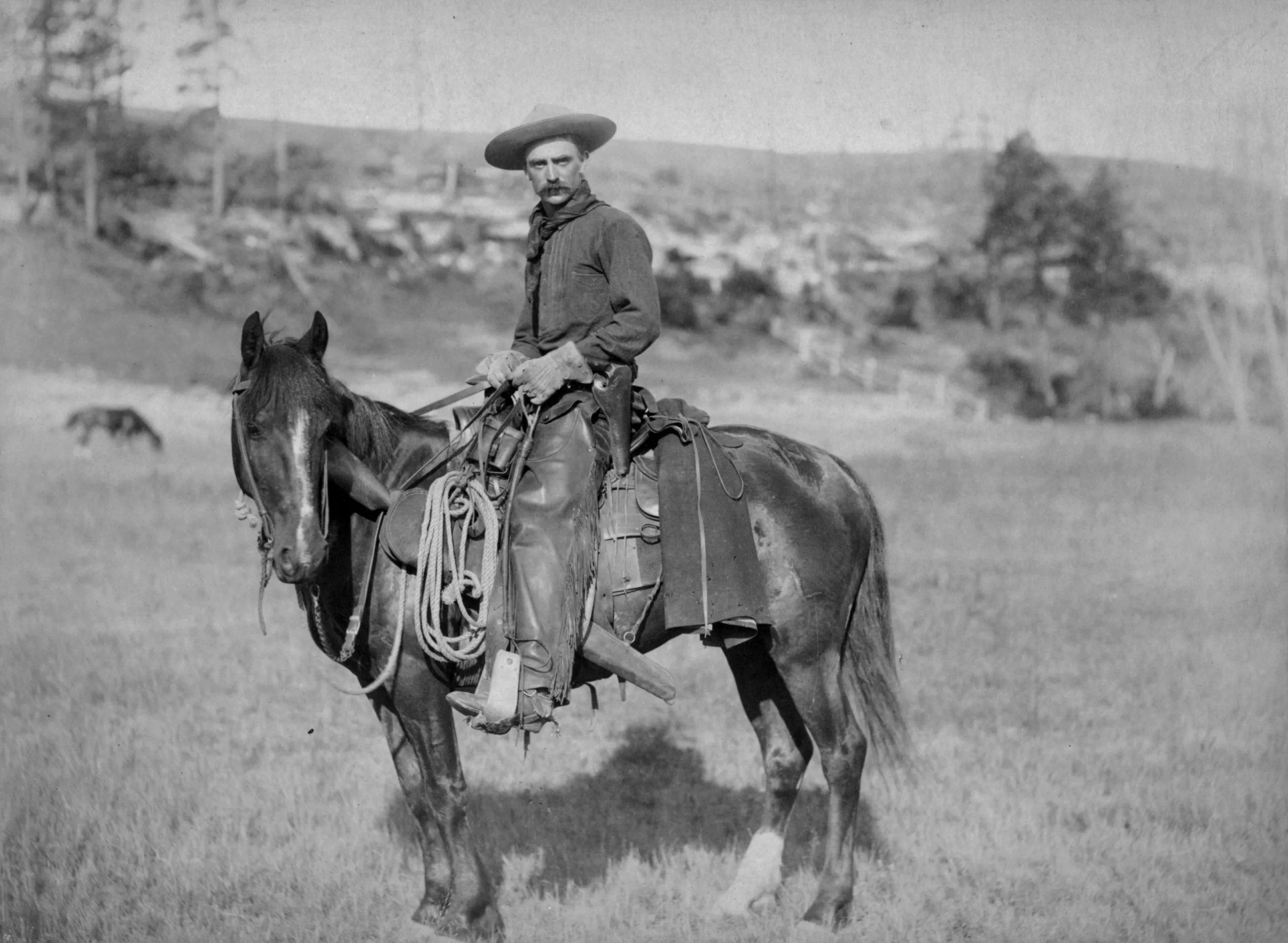
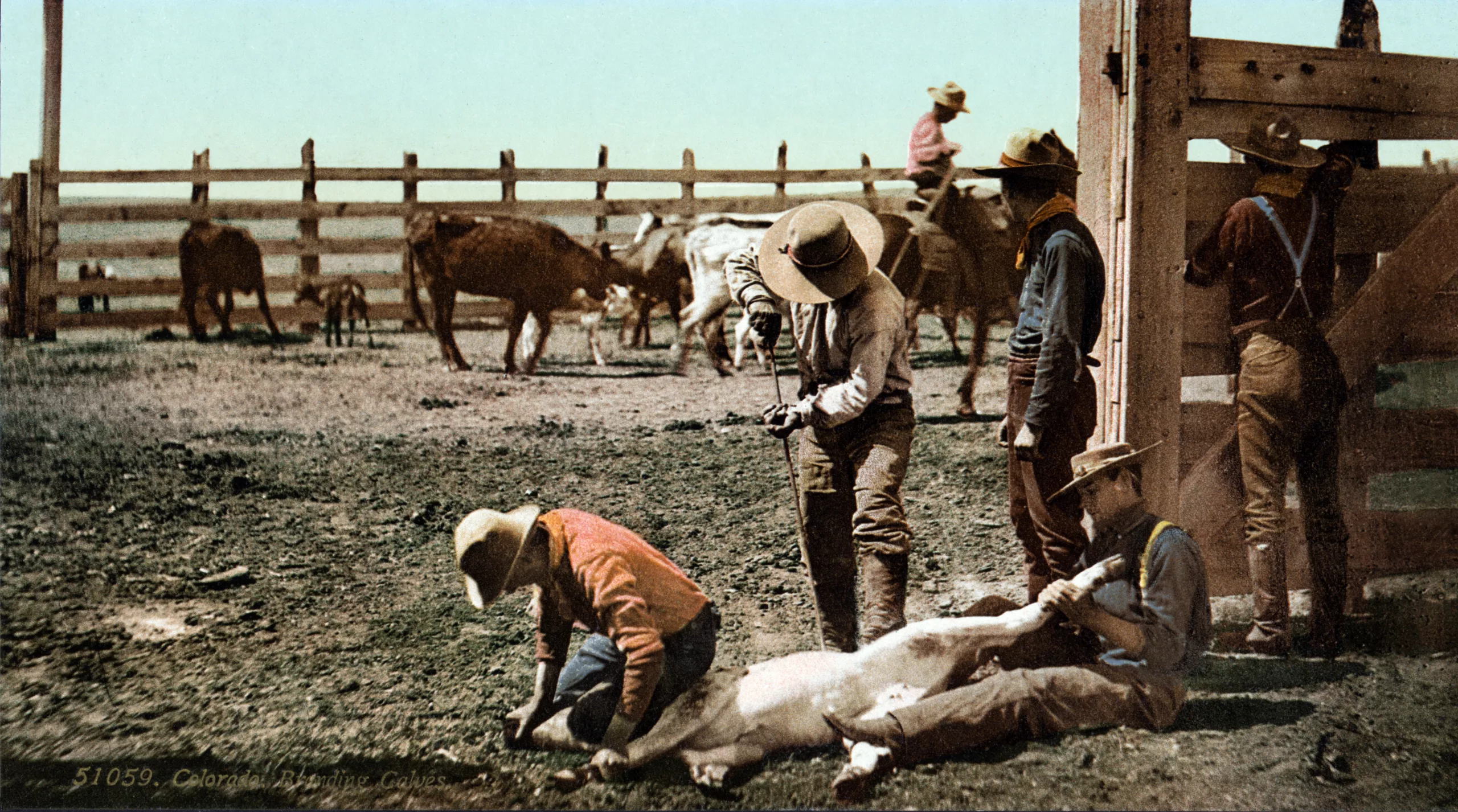
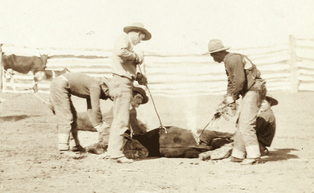
Hot-iron cattle branding: brand on the skin
Following our article about the origin of the word branding, we further develop the double meaning of cattle brands and marks.
A brand to exalt a name
In antiquity, and as early as in Egypt or in the Roman Empire, livestock (and slaves or fugitives) were marked with a cartouche symbol to signify that they belonged to a master, or to protect them from bad luck (livestock, not men).
Quality works or handicrafts were also marked with monograms indicating the names of kings and gods (or both) to whom they were dedicated. These monograms, ancestors of our signatures, were used to exalt the names of kings and Gods. They did not indicate the names of the craftsmen and artists themselves, but those of the masters who used them.
In the Middle Ages, artists and craftsmen gradually gained their freedom and henceforth signed / marked their possessions with their names, initials or monograms. This is the beginning of branding, of “marking”: the affixing of a mark, sign of ownership. These markings had a triple role: to indicate a name and belonging (branding) but also to differentiate it from others (visual identity) and to sublimate it (graphic design). Aesthetics played a role; these people were artists and were not limited to simply placing their initials.
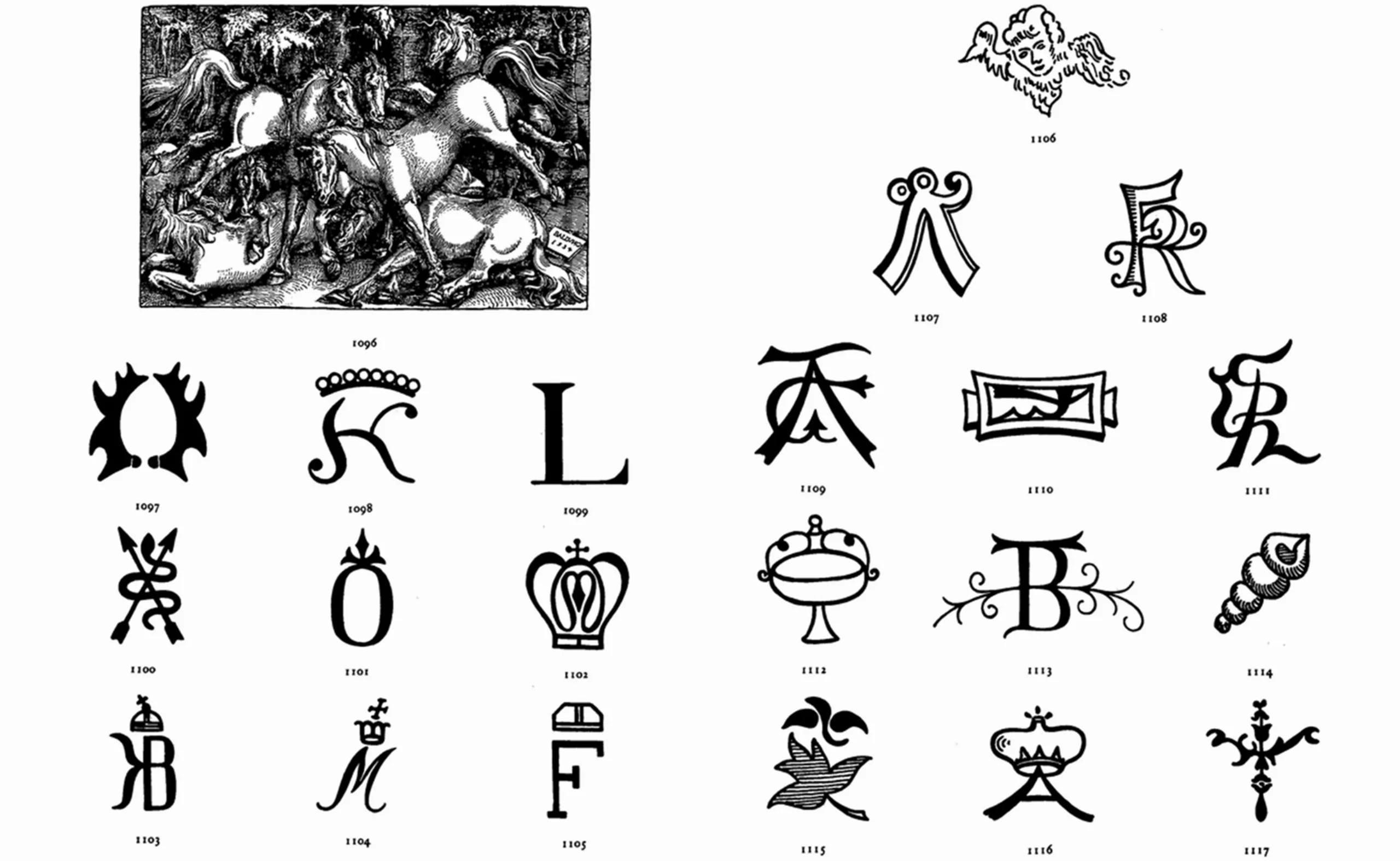
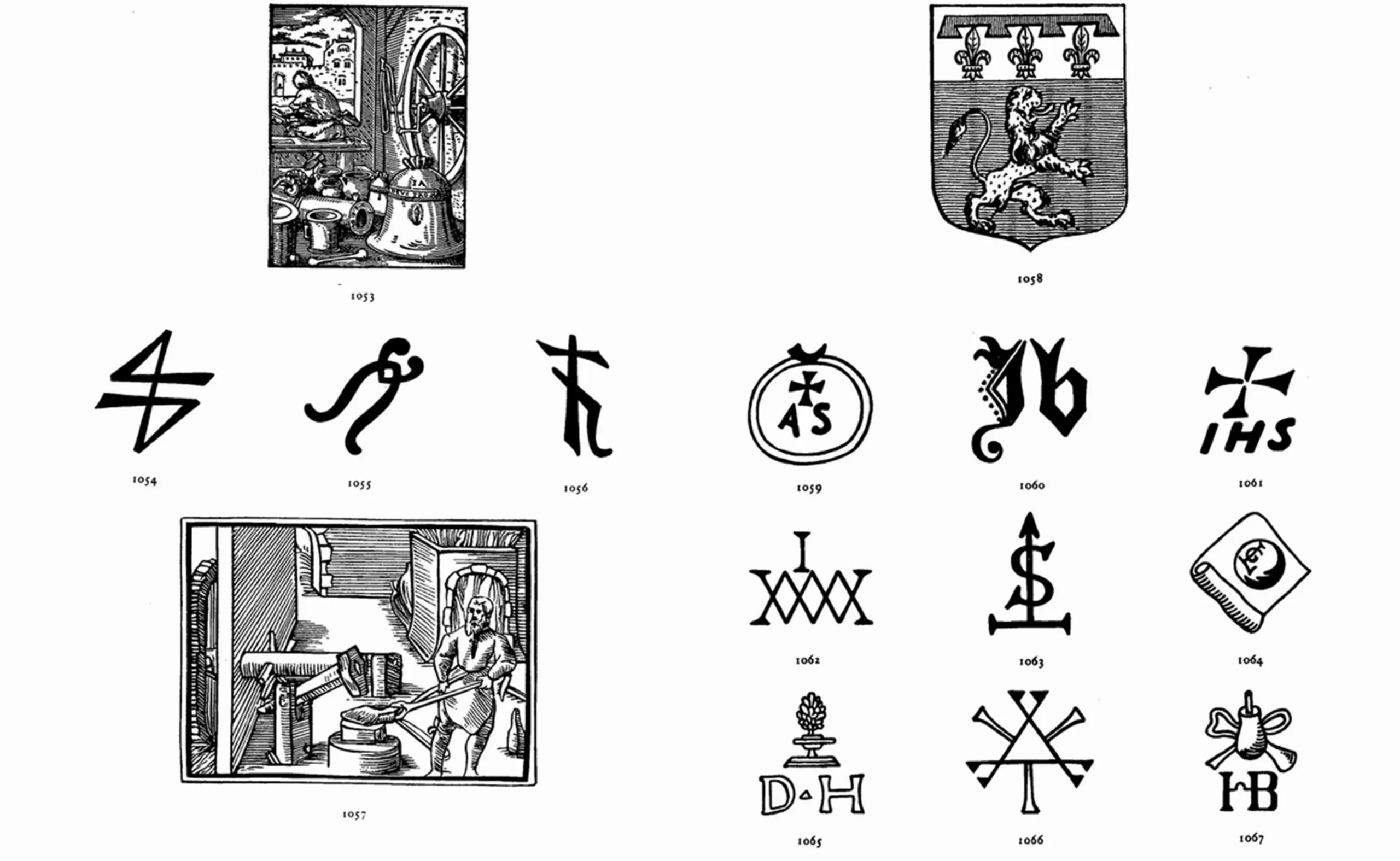
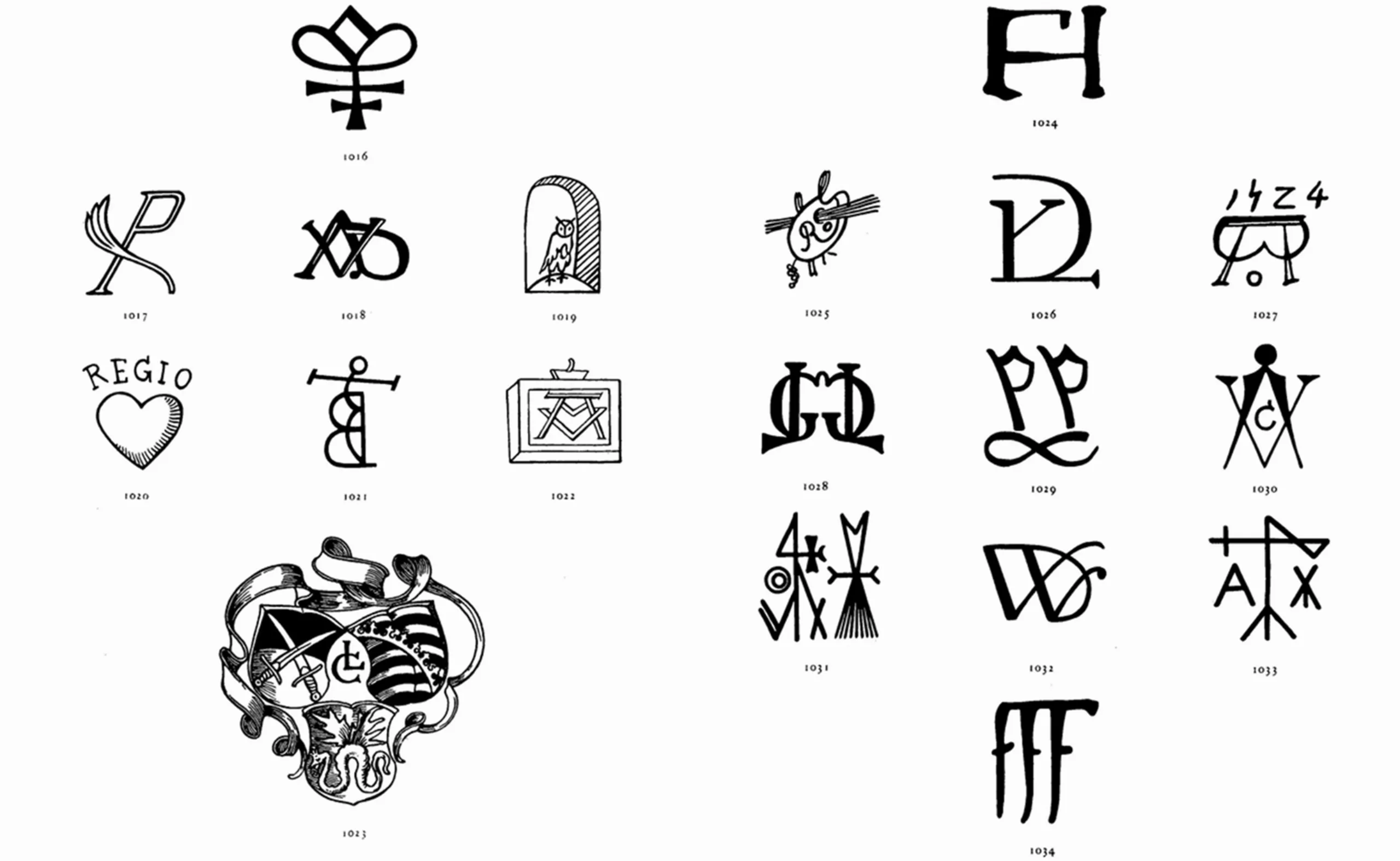
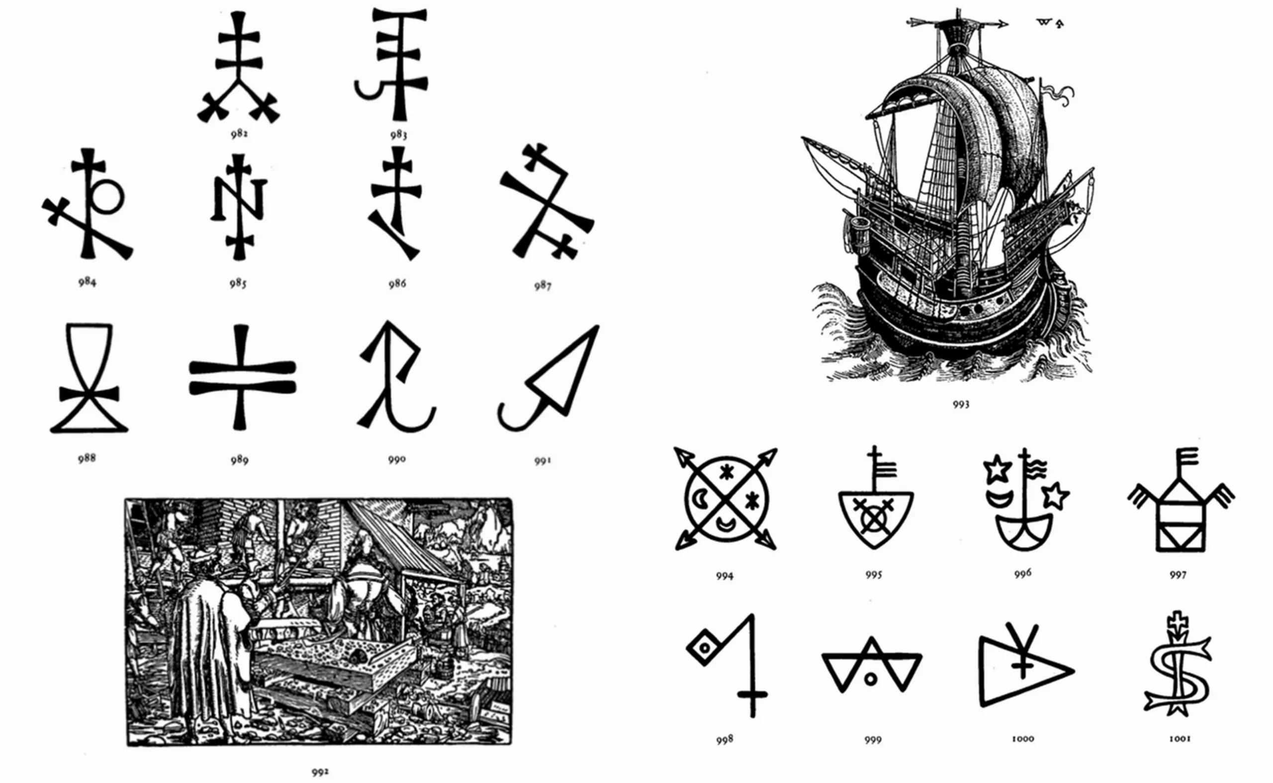
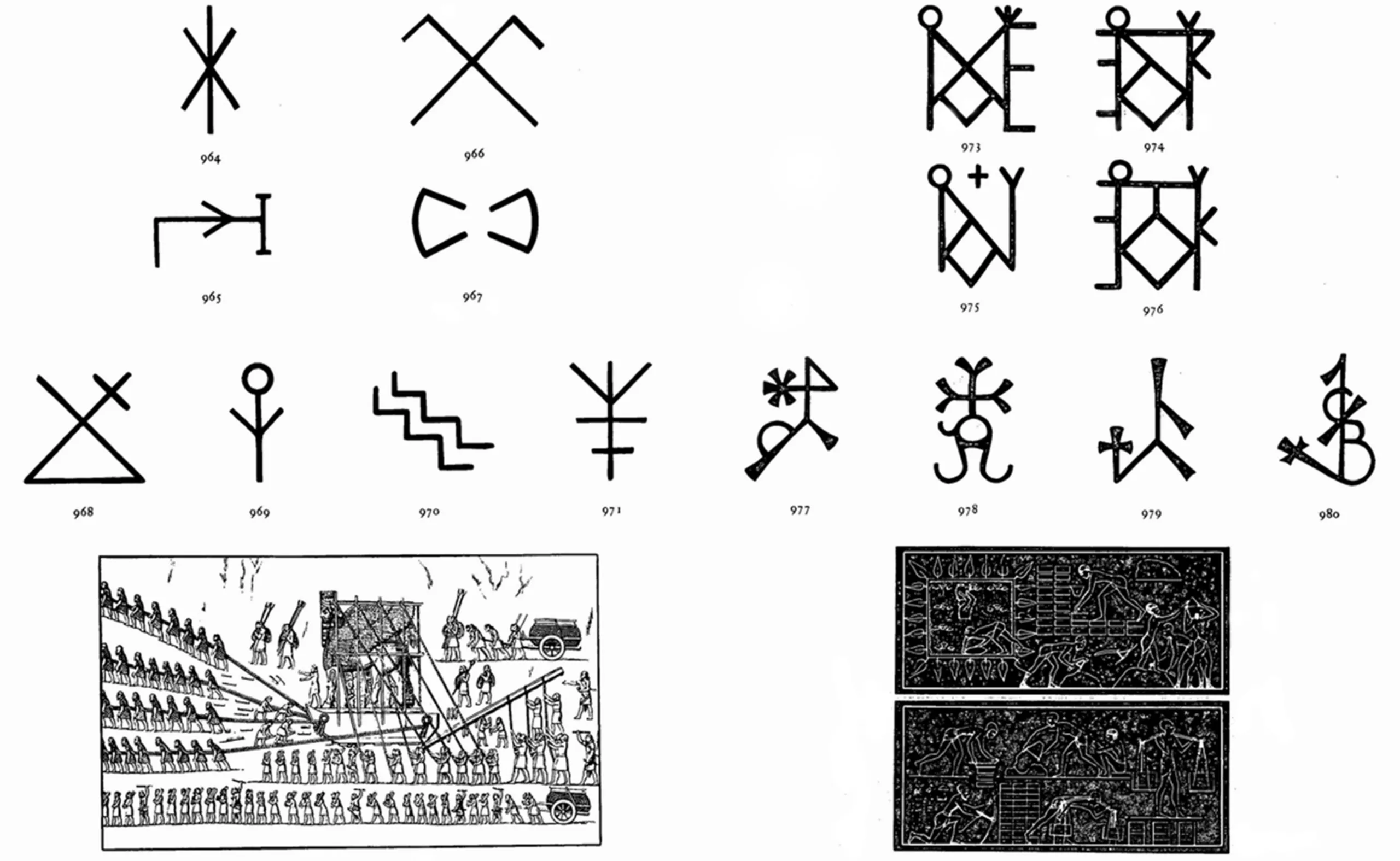
These images, taken from the book Symbols, Signs & Signets by Ernst Lehner, 1950 (fascinating!), testify to the rich aestheticism and variety of monograms and marks of blacksmiths, painters, stonemasons, merchants, horse breeders (1096 to 1105) or potters, all over the world. These abbreviations sometimes remind us of cuneiform writing or alchemy motifs.
Horse breeders on the left, and potters on the right (15-16th centuries) :
Medium as a constraint
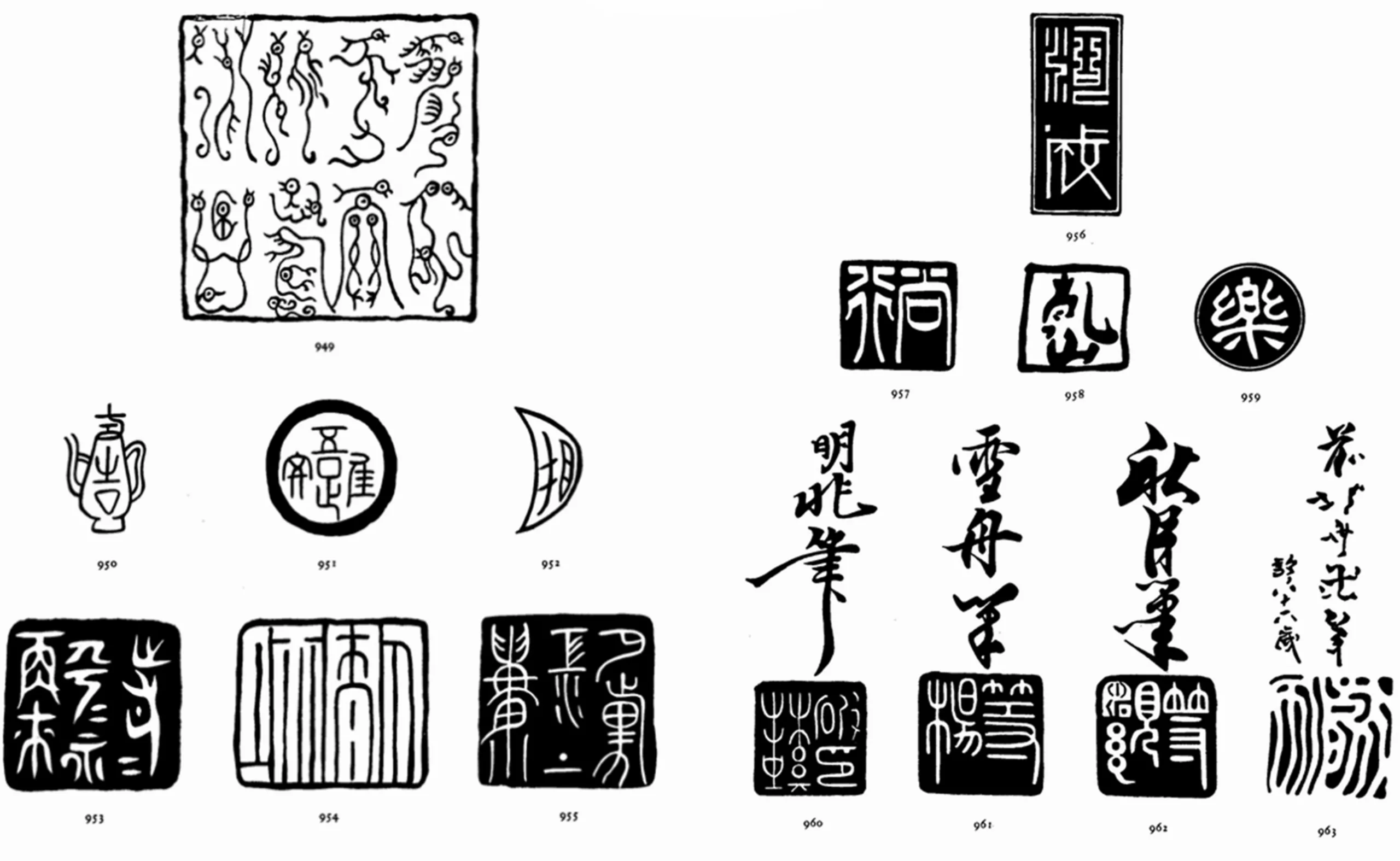
We can see that depending on the culture (as on this last plate: Chinese seals on the left, -215 BC for n°949, and Japanese around the 15th century, on the right) the marks are not visually expressed in the same way, which is also due to their medium. The “logo” of a painter or a sculptor cannot be thought or realized in the same way because of the technical requirements of the material. Paper obviously leaves much more freedom and ease than stone.
Today the constraints are the same: a logo is not designed the same way depending on whether it is intended to be digital, on paper, in a very small scale (a territorial brand on a number plate for example) or in 3D in space.
A hot hyeroglyph brand
The Spaniards were the kings of branding. They used to mark their possessions with the family’s coat of arms, including their cattle. At the beginning of the 16th century, the Spanish conquistadors landed in America and imported cattle by boat. They built an empire from Peru to Mexico, and fortunes were created with the breeding of the cattle, which bore the marks of their owners. Gradually, the rancheros moved North of America, to “New Mexico” (American Southwest) in Texas and California where the descendants of conquistadors employed the local population. When the Spaniards left around 1820, the land was bought back by settlers, and some Americans (Native and colonists) worked as vaqueros, or cowboys.
Below, illustrations of famous Hispano-American cattle brands which became ranch brands (such as Don José Tomas Talamantes, 1268, Maria Francisco Cordova, 1295, the 7U7 ranch, 1296) around 1845 and 1890 in Californie, Texas and Oregon.
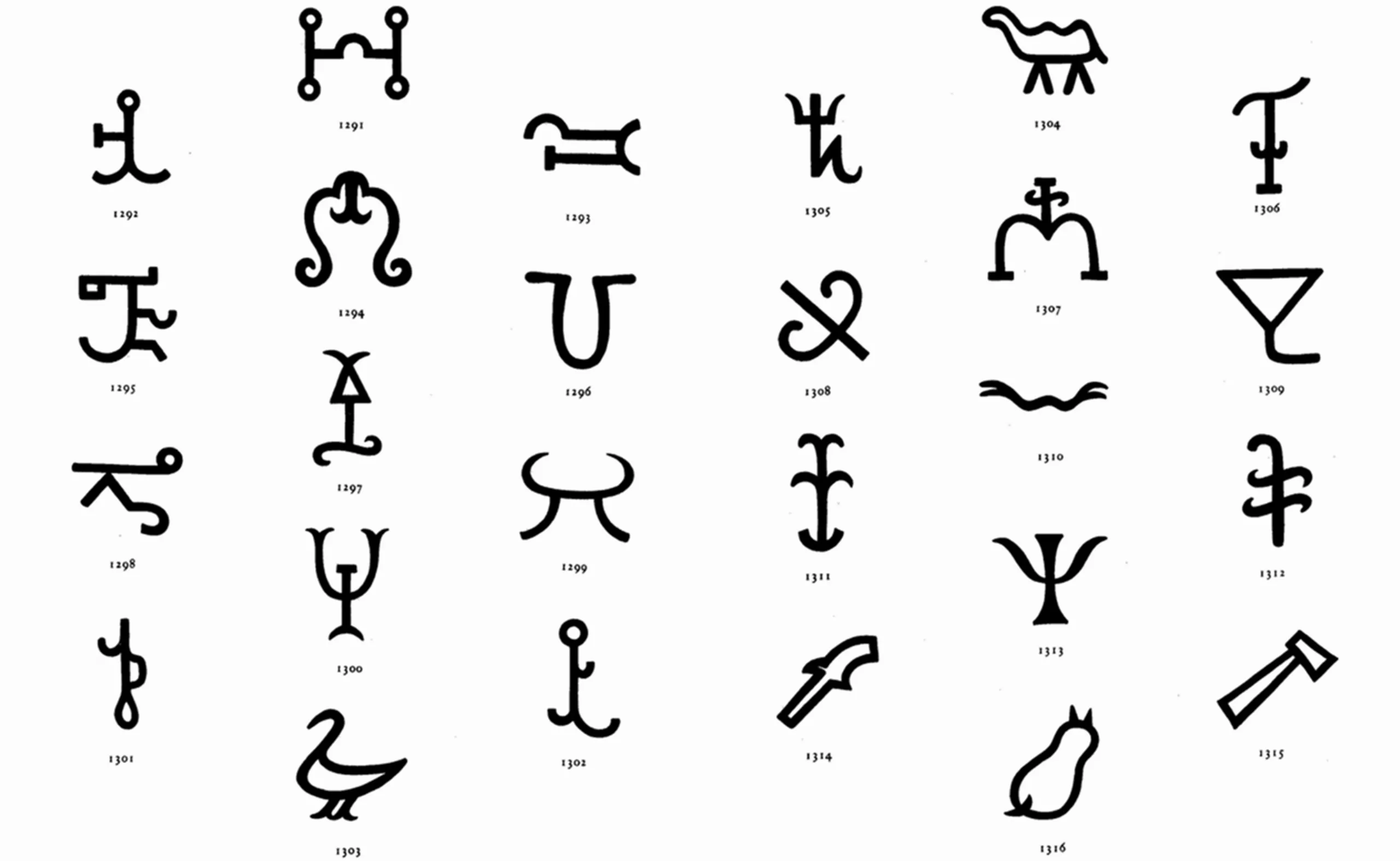
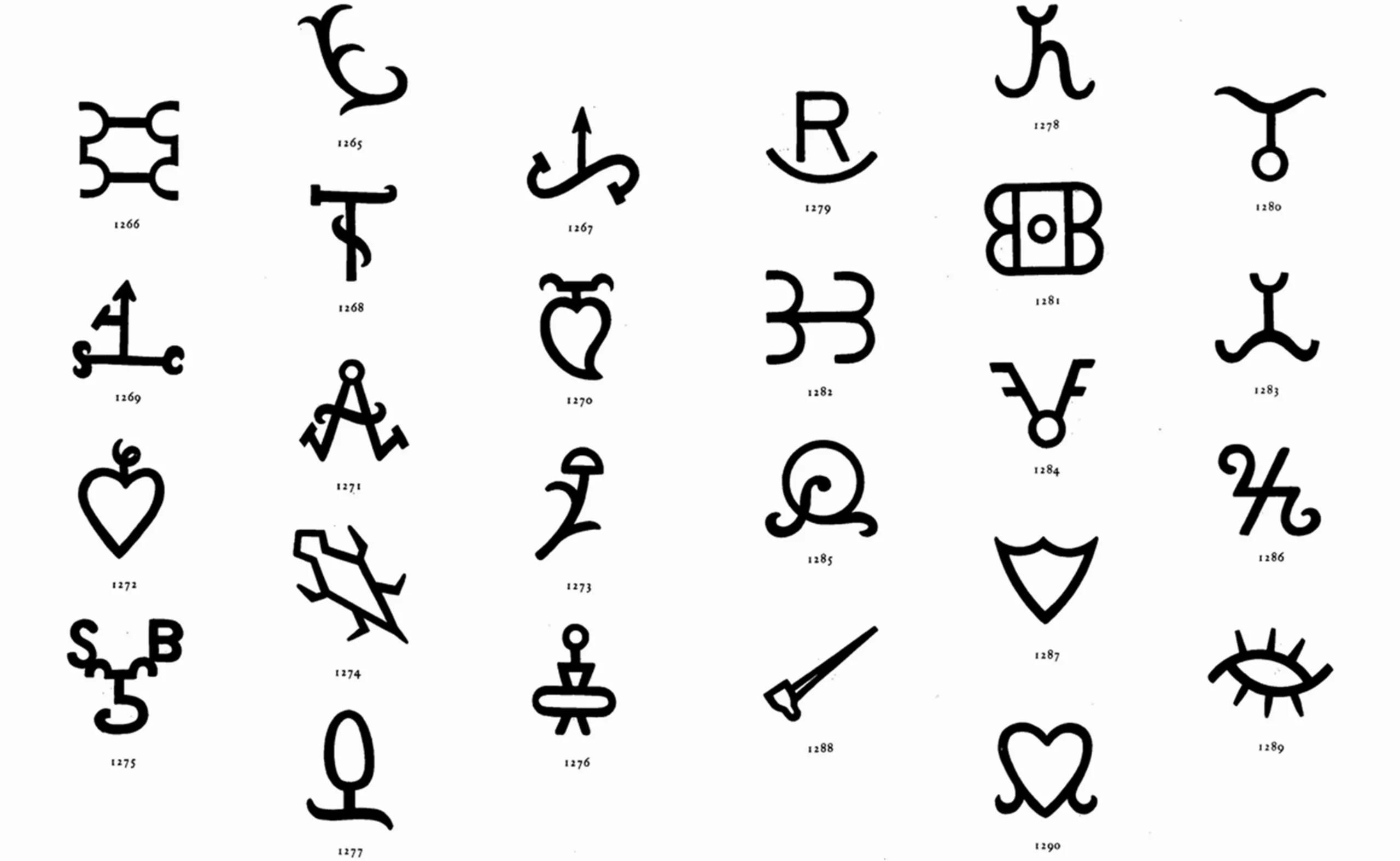
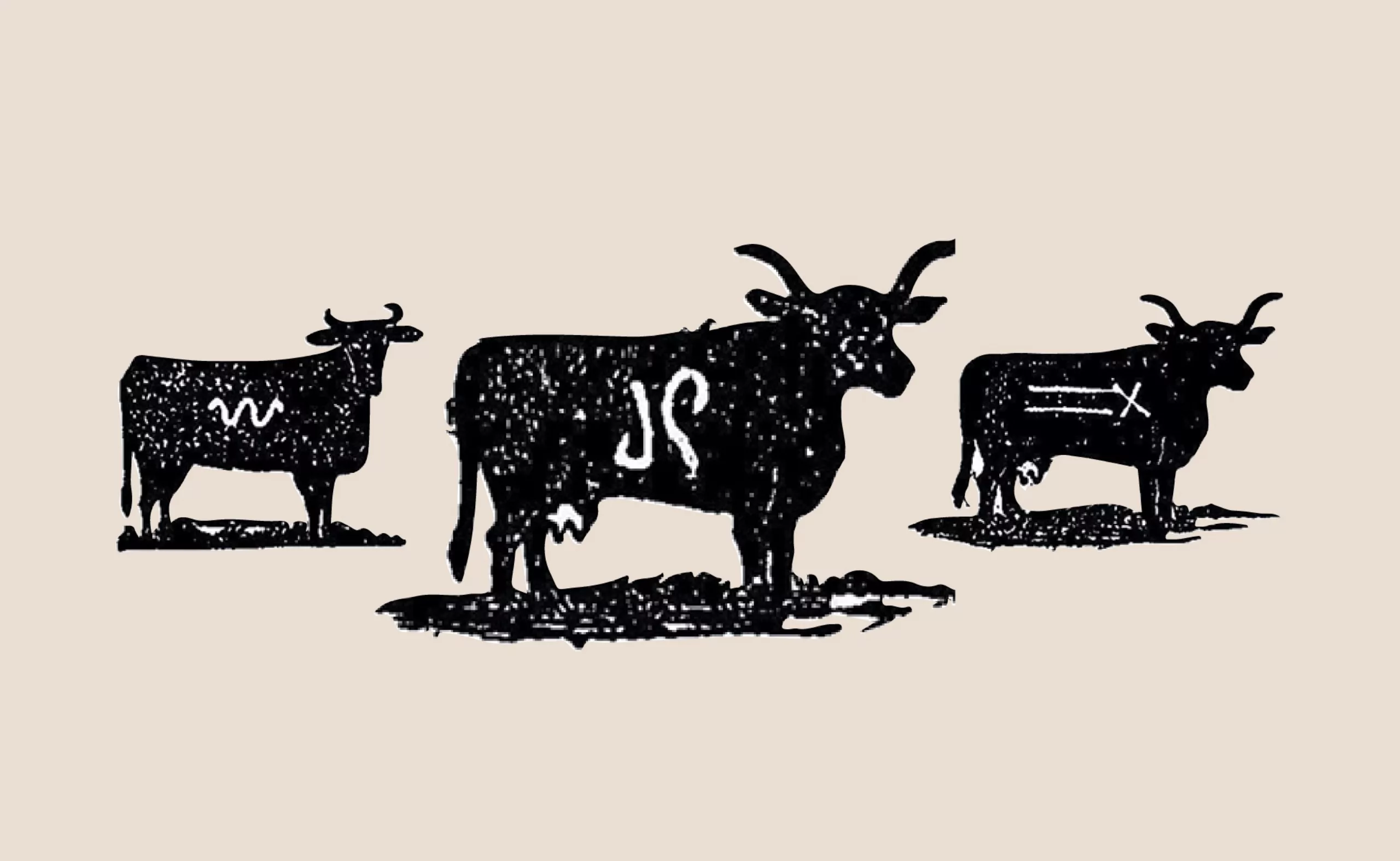
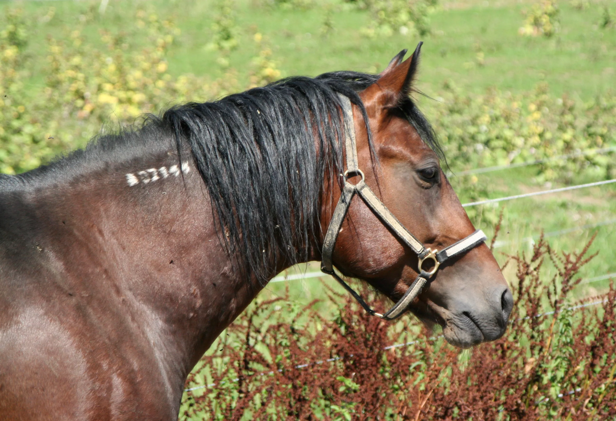
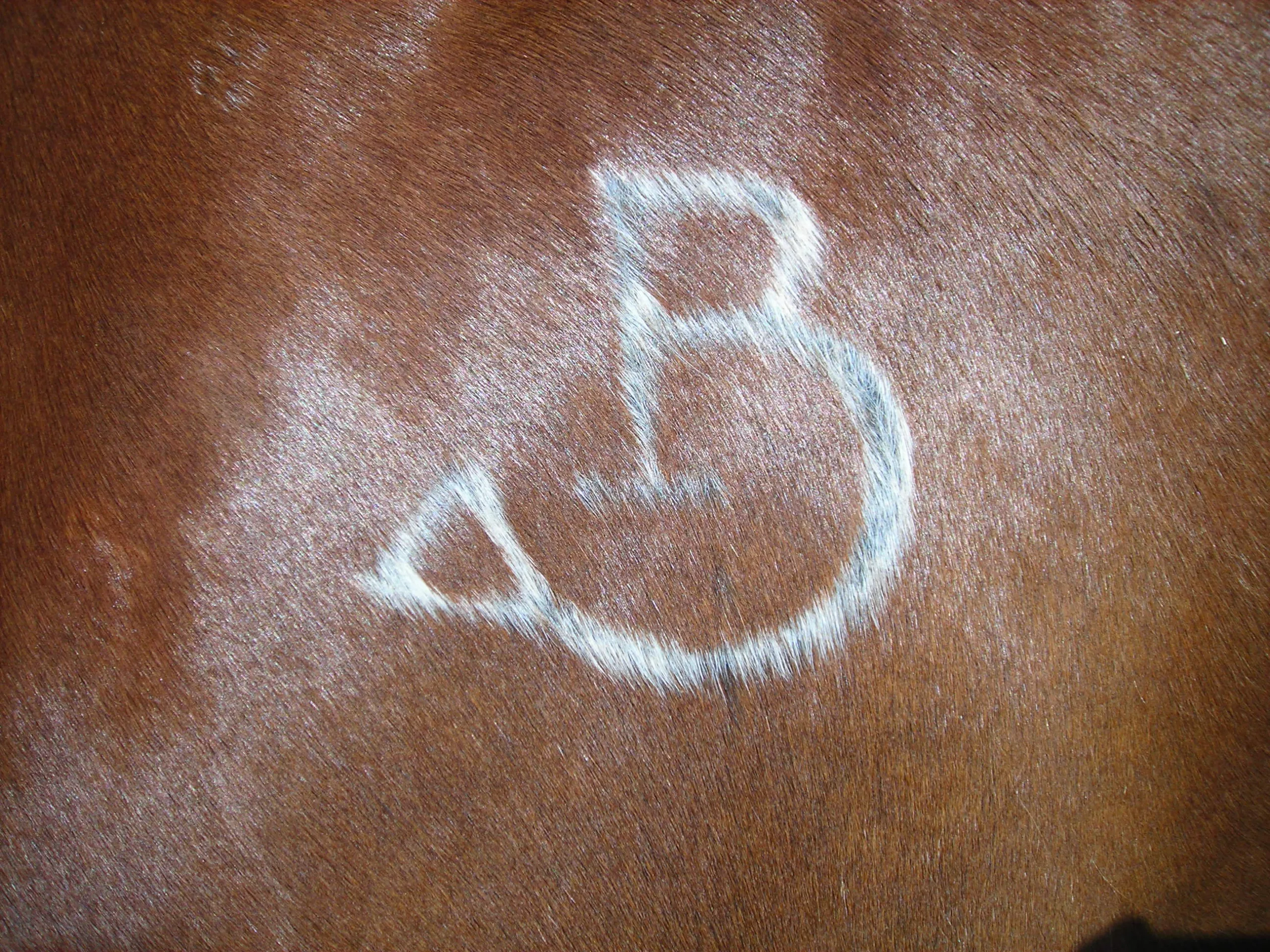
Oxen, horses or sheep are hot-iron branded on their flanks, neck or rump: these are called “pyroglyphs“, an invented word associating pyromaniacs and hieroglyphs. The combination of several symbols forming a new one creates a mark (on the skin of the beast, but also in the sense of branding, sign of distinction), a name, as hieroglyph cartouches. The symbols are combined in ligatures, framed, or circled.
In the beginning, brands were rather artistic, inherited from the monogram tradition of the craftsmen mentioned above, although the “animal skin” material didn’t allow any fantasy or finesse and required a large basic symbol. Nevertheless, they were quickly simplified, to keep up with the increase in the number of animals and the proportional hot-iron marking rate.
A brand catalog with a syntax and corporate identity guide
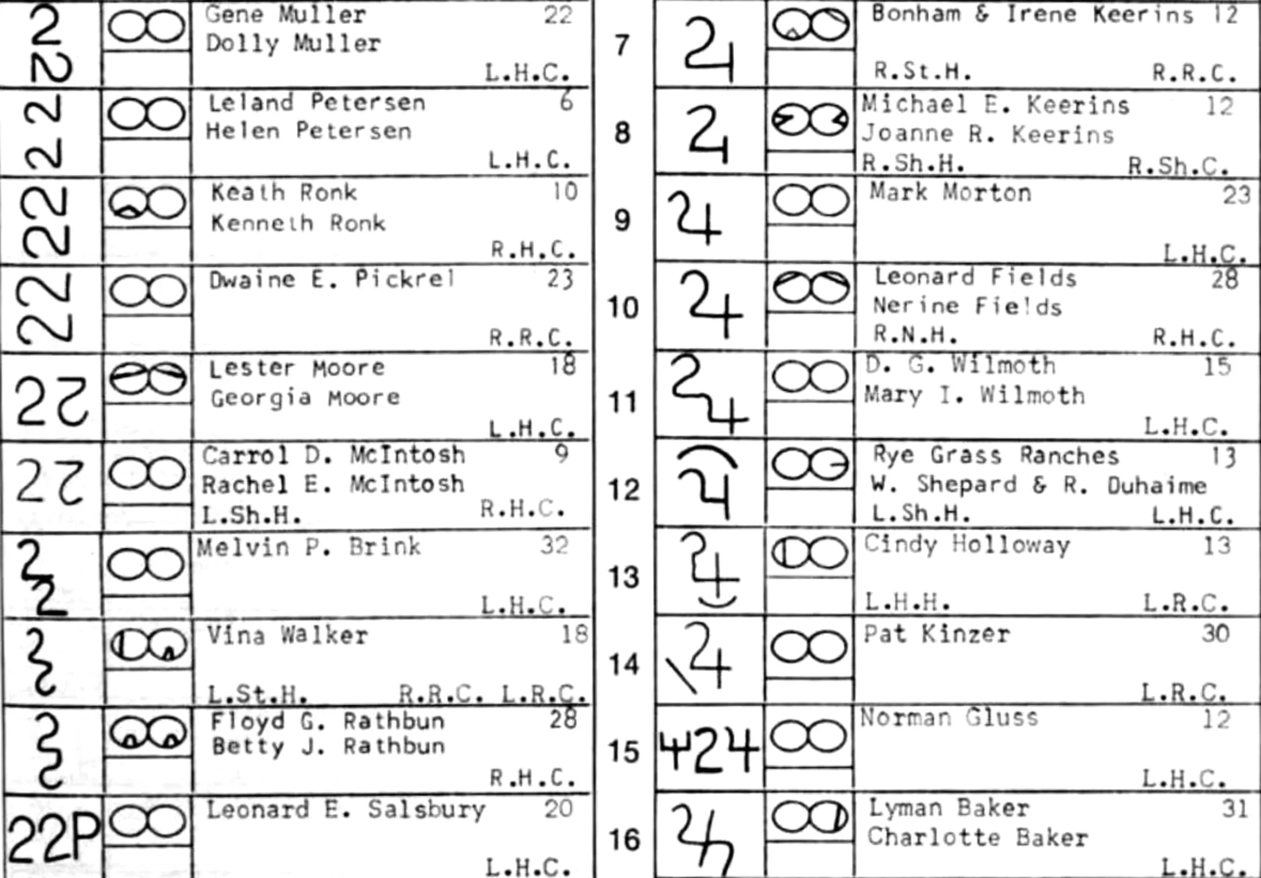
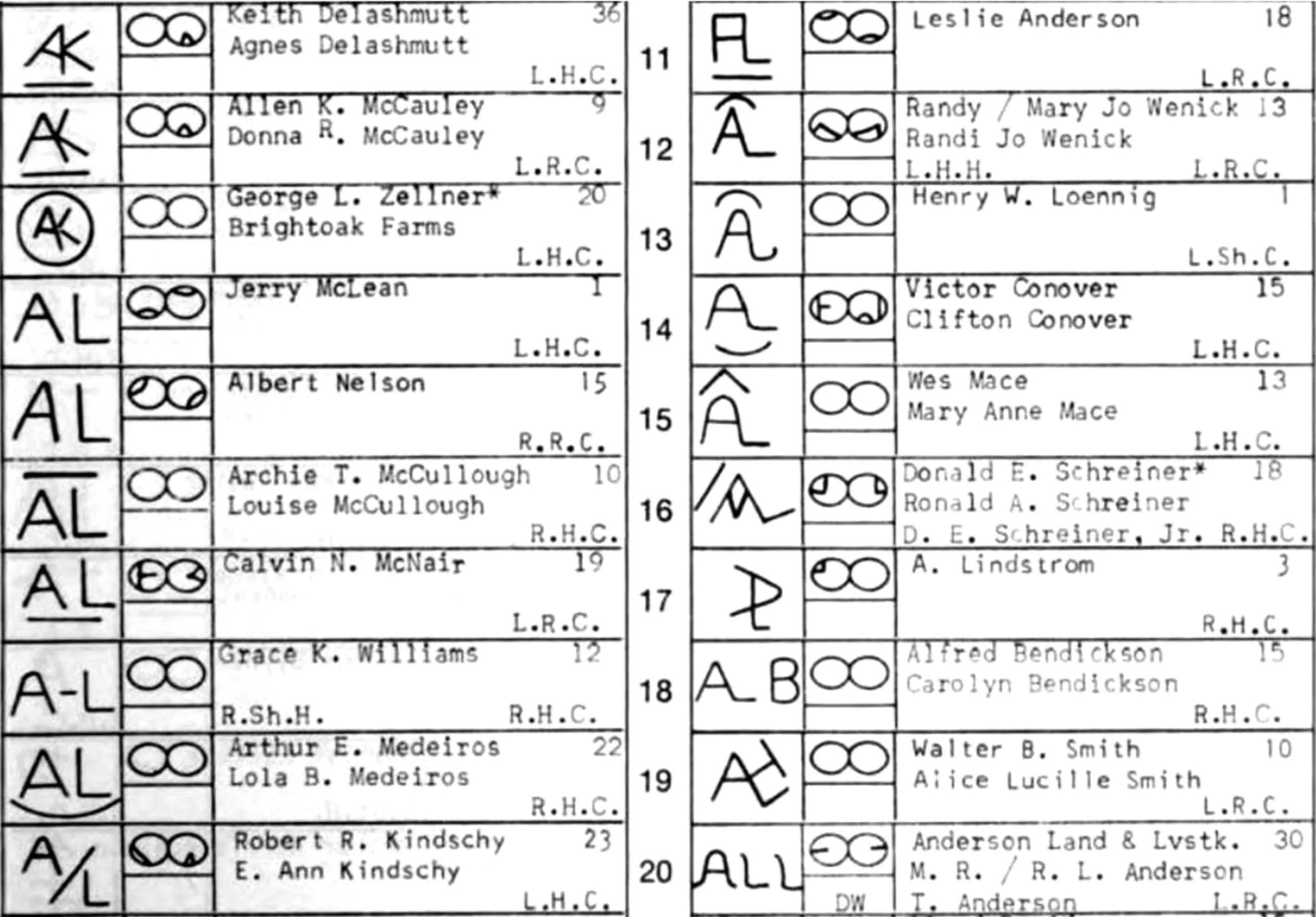
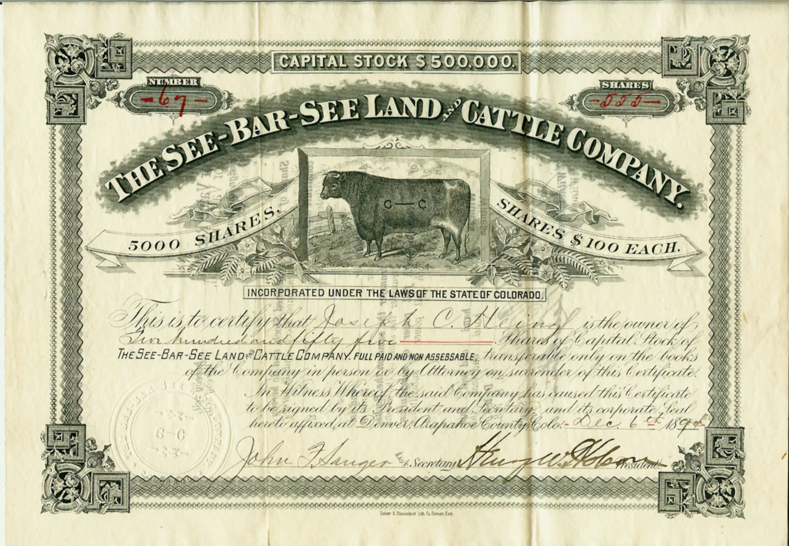
With this increase, brands required a register. As their main purpose was to prevent theft, each acronym had to be known by the authorities. Using the word branding for cattle becomes proper as it comes with specifications, a graphic charter and a name and logo registration. Below are some livestock brands from the Hot Irons: Heraldry of the Range book by Oren Arnold, 1940 published in Life magazine on June 10, 1940.
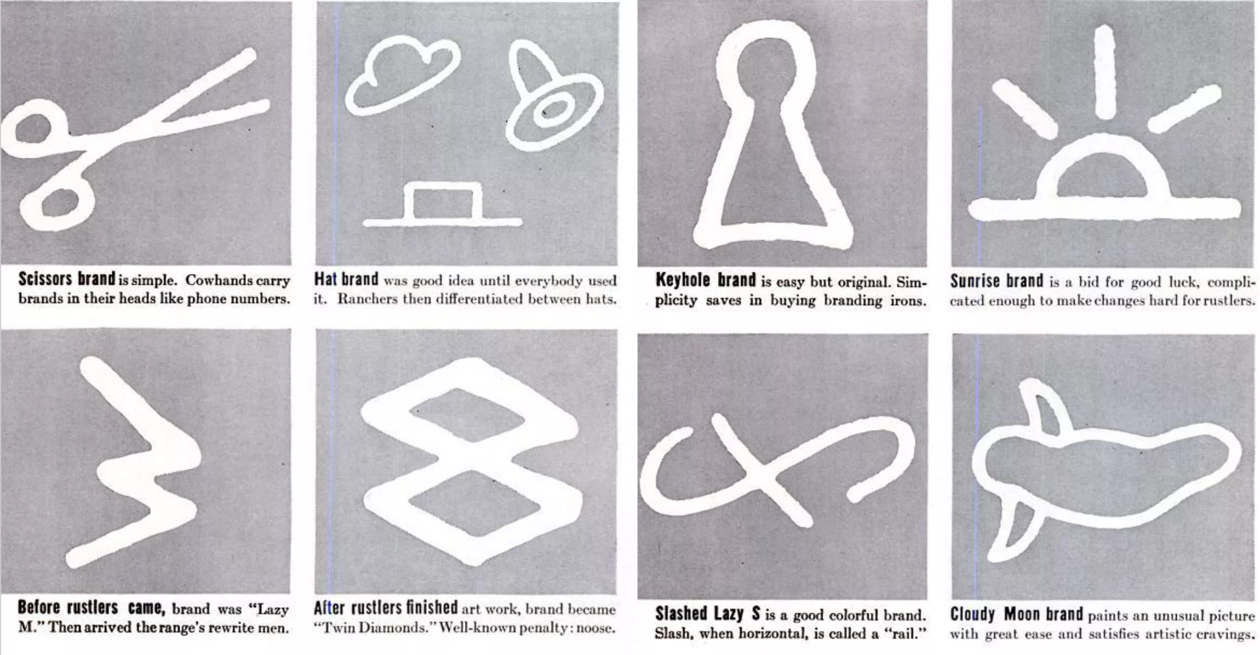
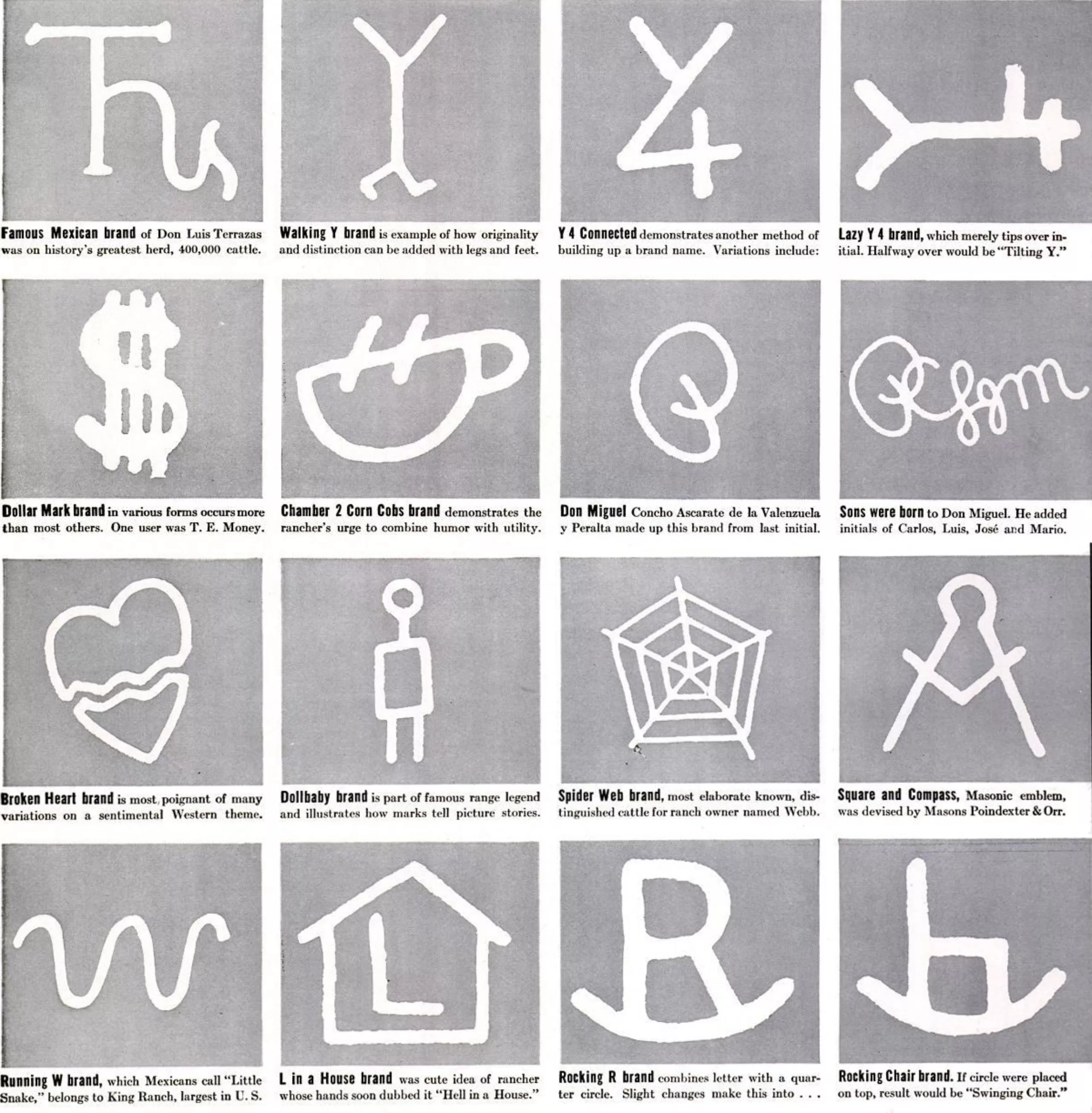
Sometimes the same marking existed more than once, but in this case it had to be positioned at different places on the animals. The pyroglyphs are catalogued and registered as trademarks in “brand registrations” catalogs, then validated by officials. They make it possible to tax the owners.
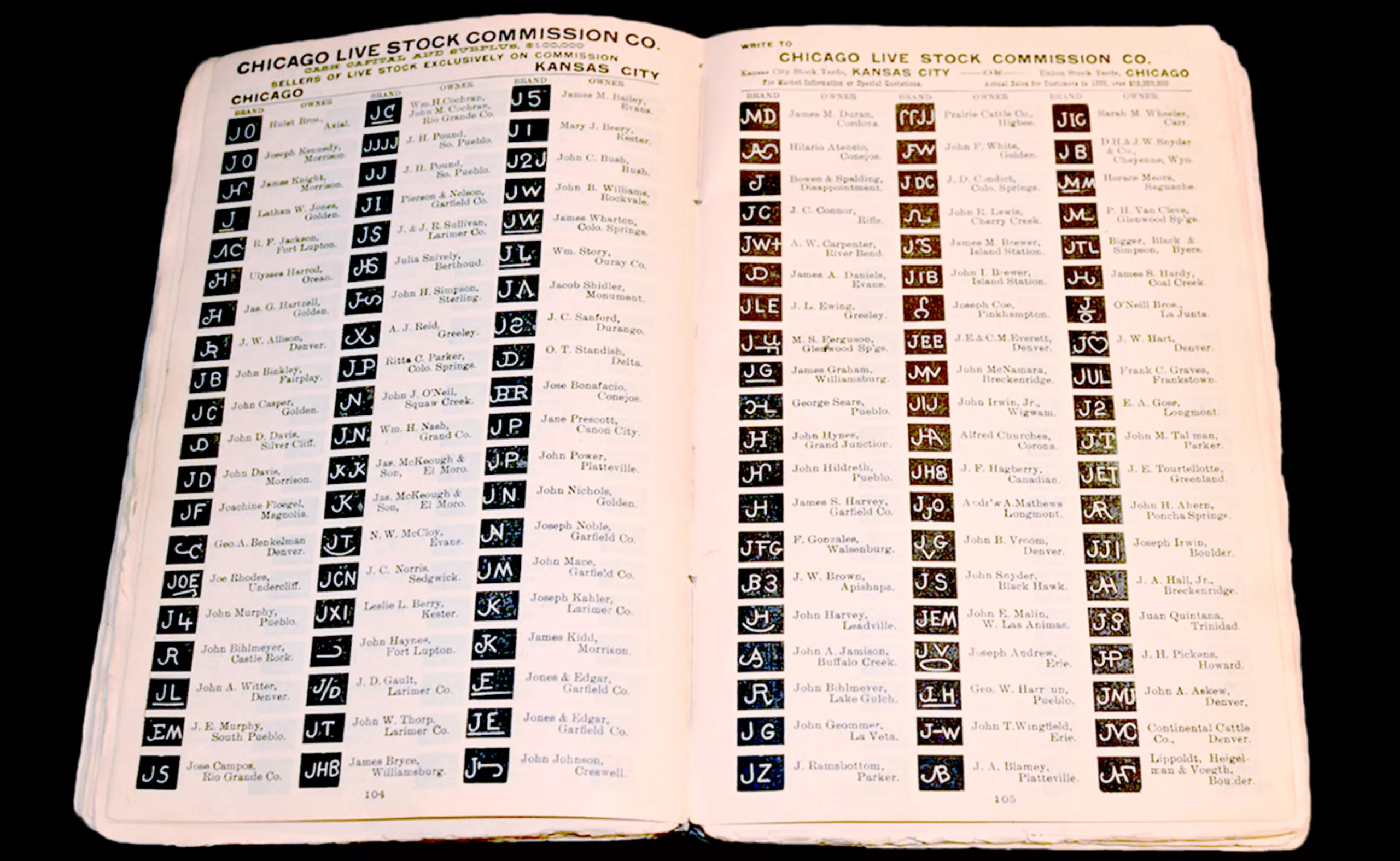
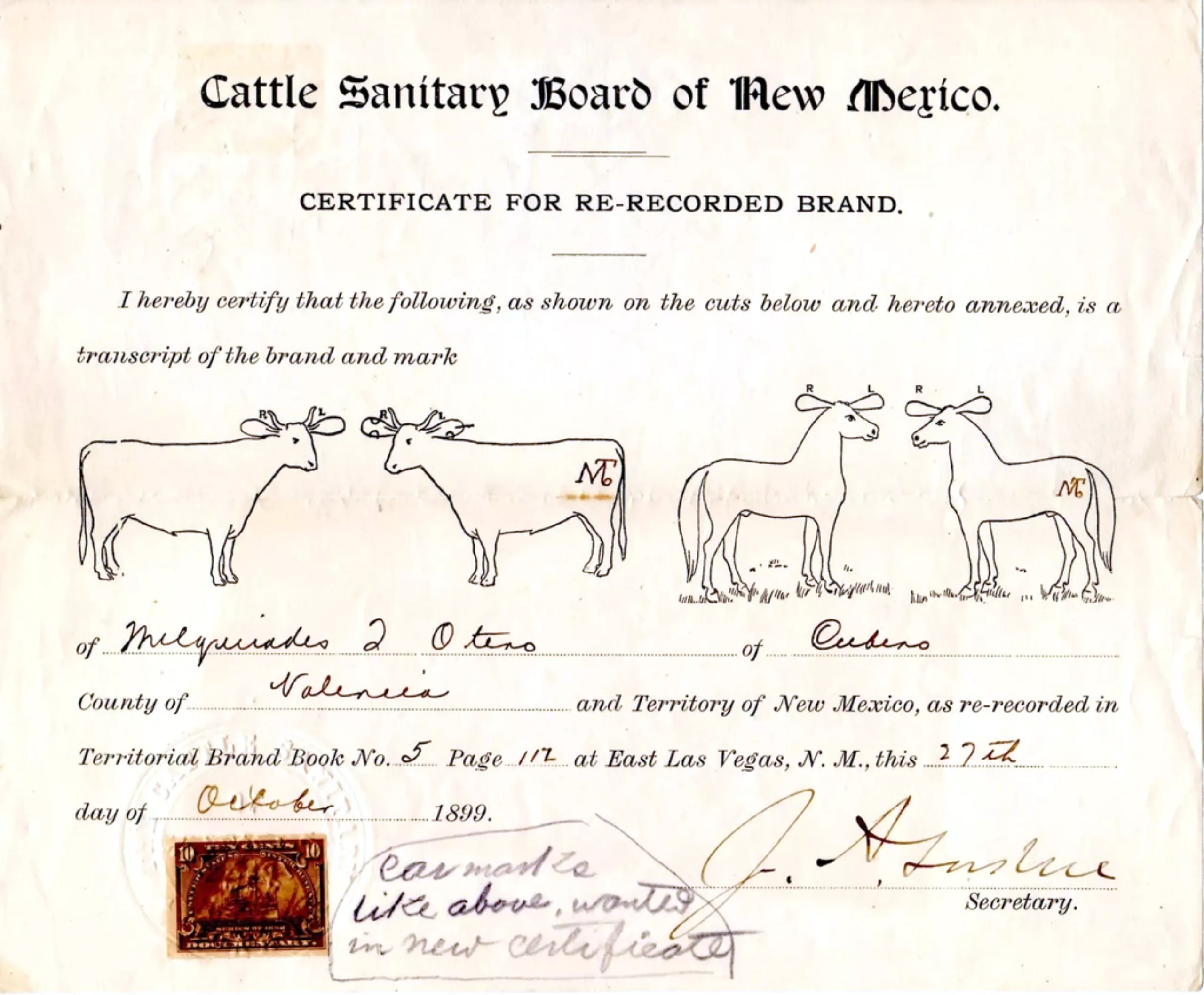
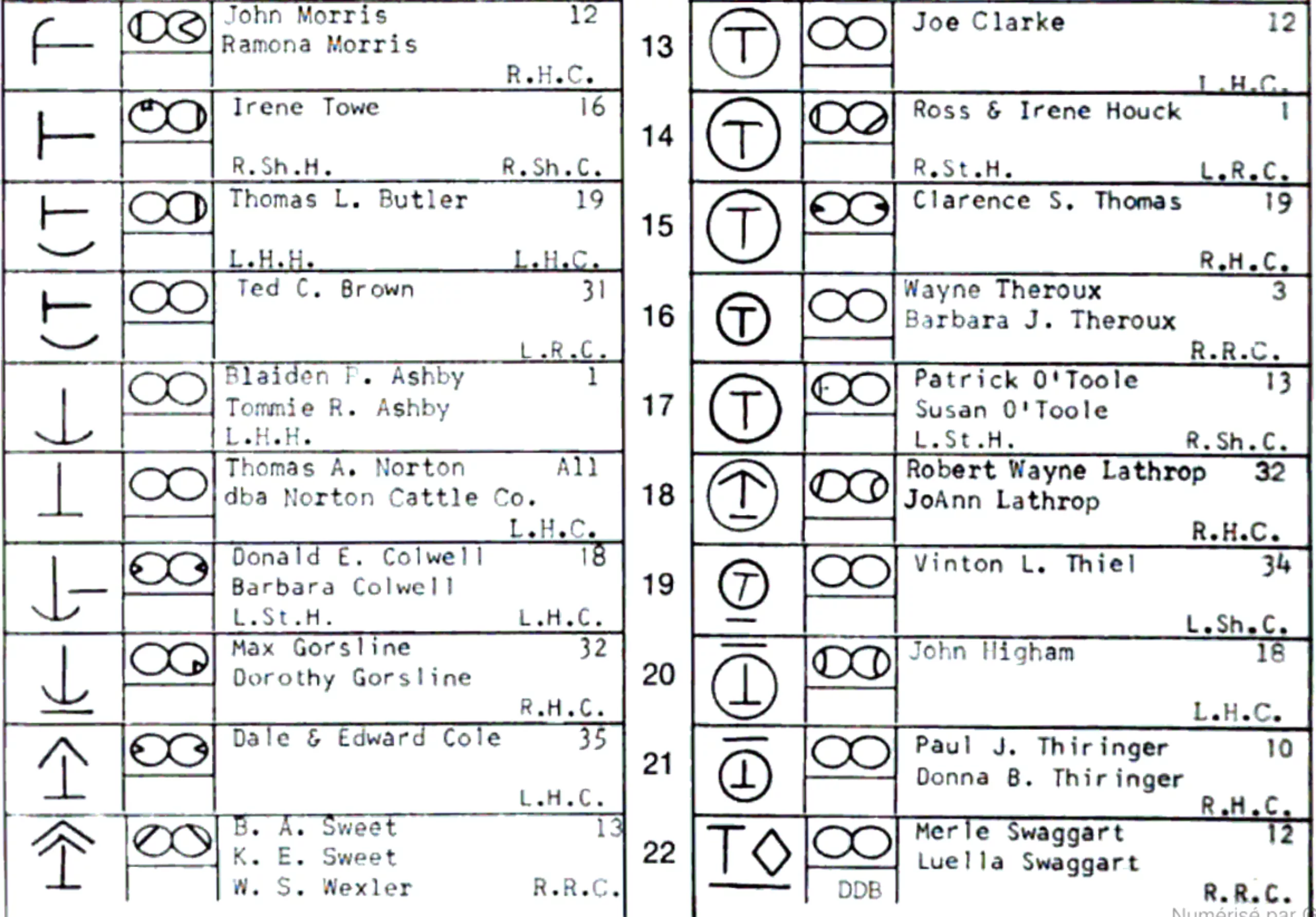
For example, here are some logos found in a catalog of cattle brands in Oregon, 1975. The symbol appears on the left, the 2 circles indicate if the mark appears on the ears, followed by the names of the owners, the place and side of the mark, and whether it is a horse (H) or a cattle (C). We can see the use of a specific alphabet and titled signs.
A visual and vocal brand
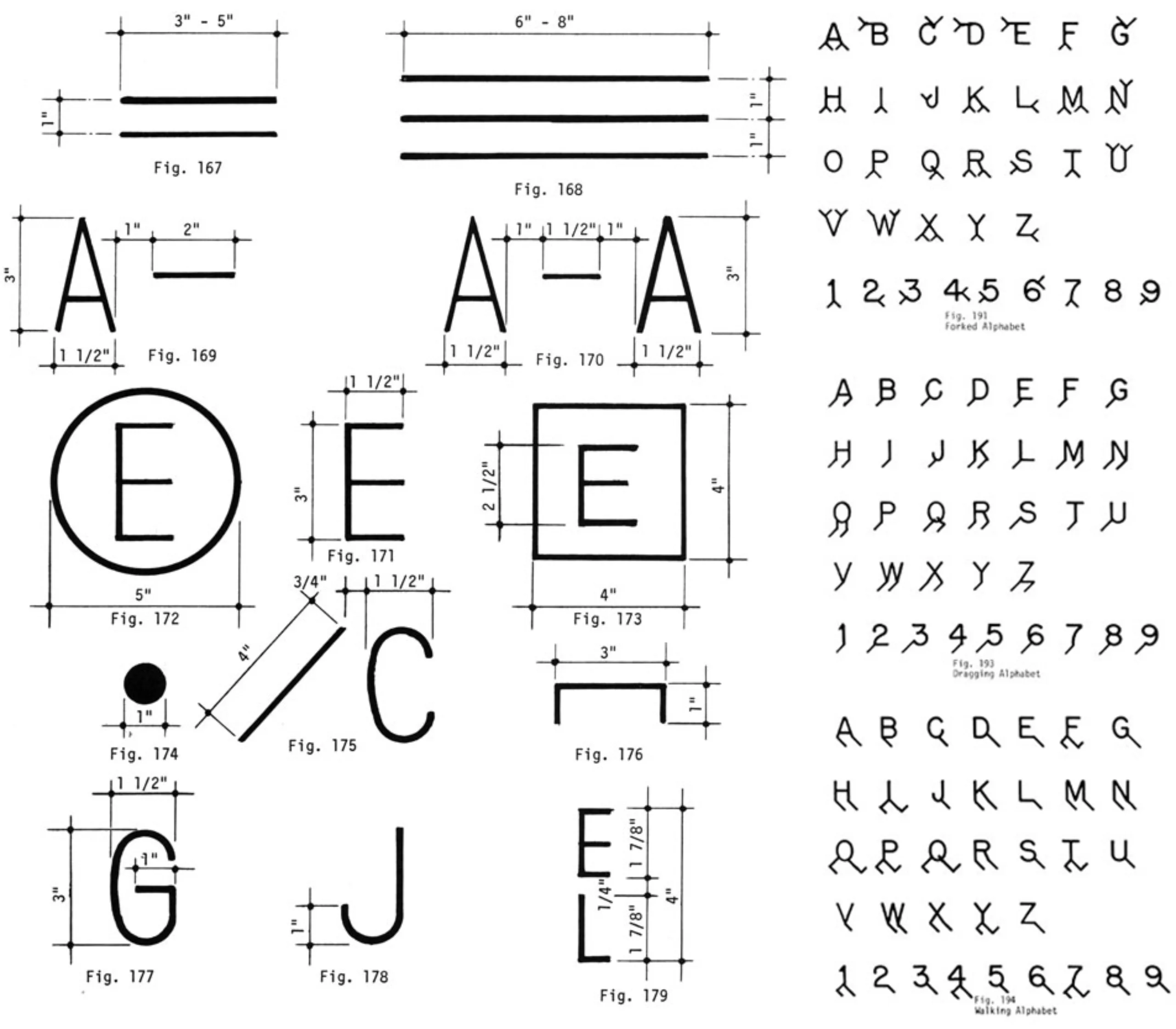
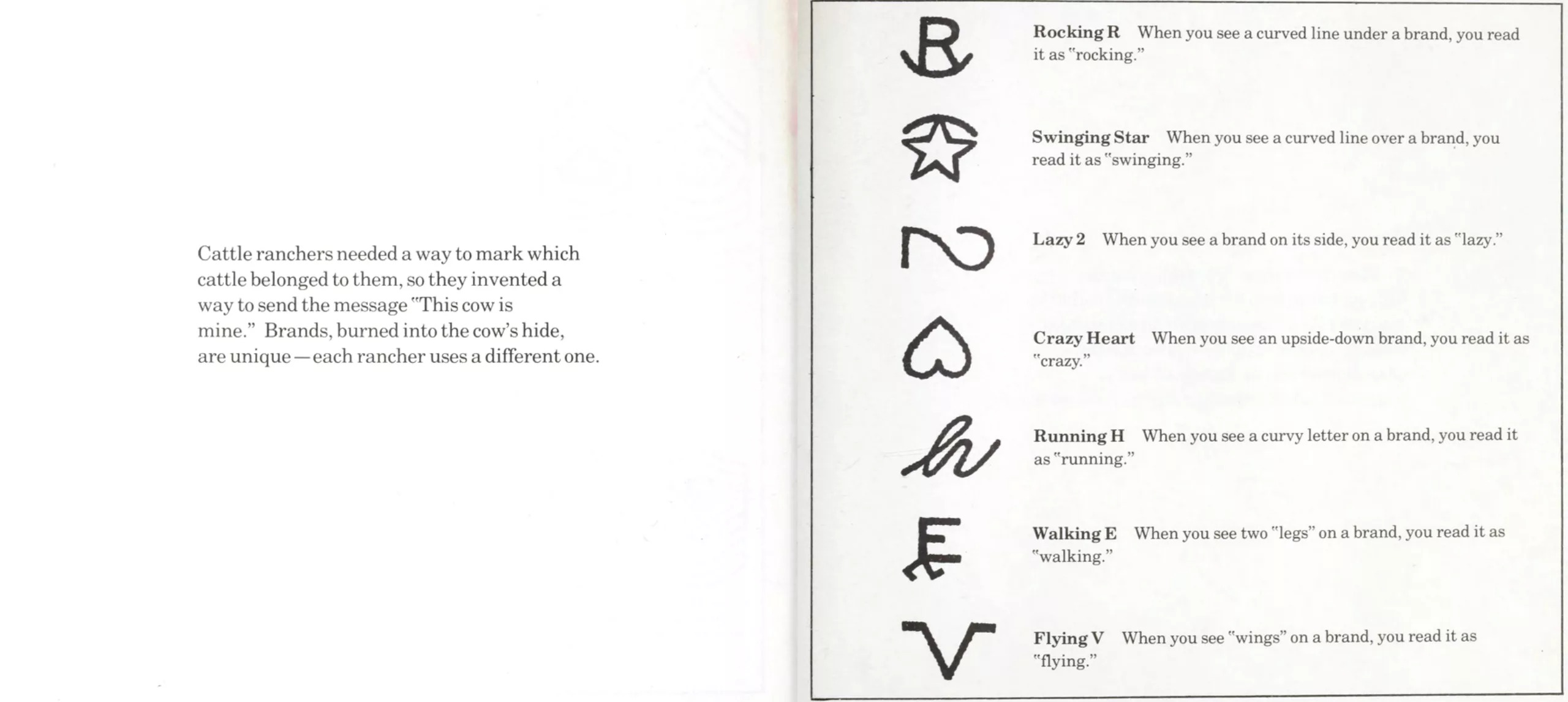
For the sake of simplicity, these brands gradually lost their artistic side to focus on the branding function, pure and minimalistic. Above all, their essence was to mark a property. Numbers and letters were then used, to which syntax was added: “feet”, “wings” or degrees of inclination, in addition to patterns such as arcs, stars, hearts etc. There are few symbols but an unlimited number of possible combinations: each breeder must have his own unique code. The Manual of Brands and Marks by Manfred R Wolfenstine (1970) gathers alphabets created especially for cattle branding, which can be seen on wemadethis’ website. Below, the wings and legs alphabets.
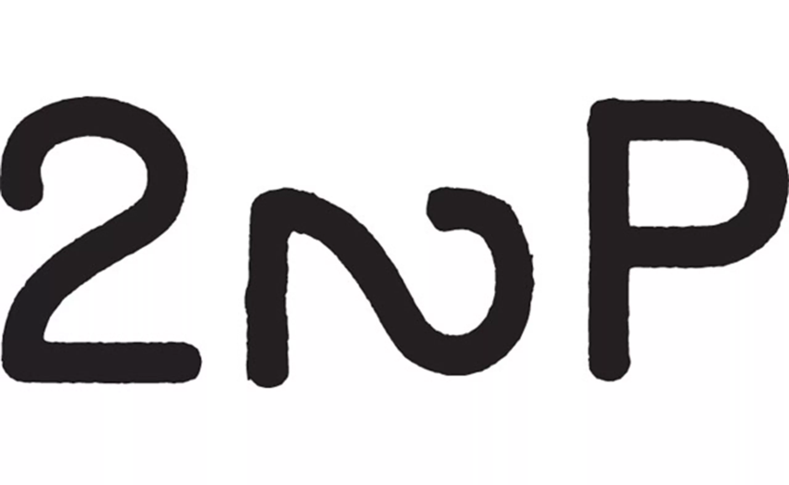
Unlike monograms which were purely aesthetic and visual, livestock branding can be read aloud like “walking Y brand”, or create puns such as “too lazy to pee” (22P) depending on the symbols used. The brands can be read from left to right, top to bottom and from outside to inside (when the letters are circled or framed), which is unique in the world of branding. Actually, the ® and © signs are surely inherited from the American cattle branding codes!
Below is a page from Sending messages by John Stewing that explains the construction and pronunciation of logos. A cursive letter is read “running”, legs under a letter are read “walking”, an arc above a symbol is pronounced “swinging”. An inverted sign is read “crazy” and a tilted one is “lazy”.
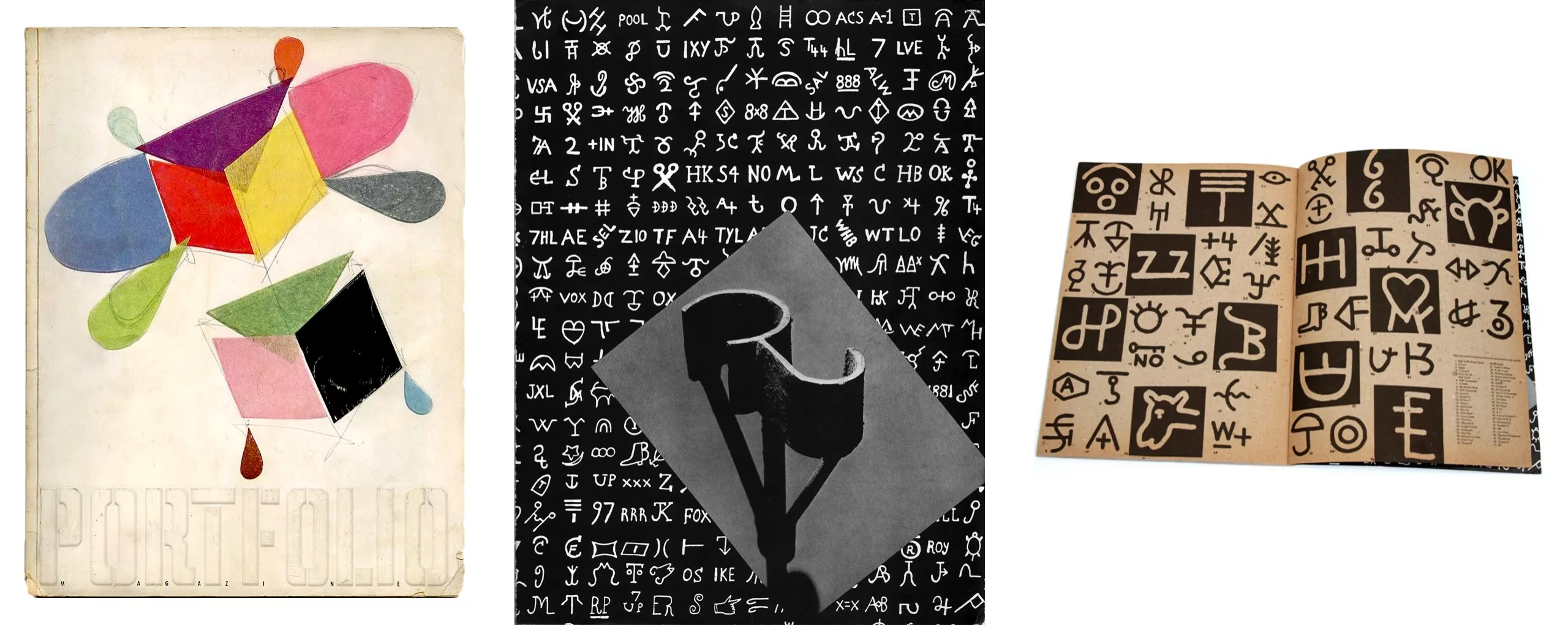
Magazine Portfolio #2 by Franck Zachary under Alexey Brodovitch’s artistic direction in 1950 devotes 4 pages to these hot-ironed cattle brands, which were already remarkable in the graphic world back then.
No logo and counterfeit : a matter of belonging
Those who refuse to mark their animals are called mavericks in reference to Samuel Maverick who opposed the hot-iron marking of his herd. Some claimed that he could thus steal cattle from neighboring ranches, but he said he simply didn’t want his animals to suffer. Today a maverick is by extension any person who is stubborn in his desire for independence. Already at that time the no logo was a way to show a desire to belong to no one. Would this mean that non-branded animals belong to everyone, or in the opposite, have no masters?
As with consumer brands, cattle brands must be simple enough to be recognized, but complex enough not to be changed – a P into a B for example, which was very common. Counterfeiting and theft are still happening and farmers need to increase their efforts to brand their cattle. Nowadays, for example, animals can be freeze-branded with liquid nitrogen, which depigments the hair which then grows back white for life, or they use microchips or GPS.
Because in the end, the main objective of branding is to show that you own the animal that you brand. Drawing a parallel today, wearing brands on our clothes or on everyday objects, we may wonder if we have not become the herd of modern cowboys -even though we are hopefully not hot-iron branded. As we explained in our first article on the etymology of branding, it is up to corporations to communicate well in order to engage in a dialogue so as not to treat people like cattle.
Perhaps it would be better to return to the original use of branding and monogrammed logos, which consisted in sublimating an identity, to highlight its owner.
On the subject
-

Minimalism: aesthetics of sobriety
Both a visual or life discipline, minimalism has become a questionable trend and consists in simplifying to keep only the essential.
-
Picture stones, fascinating natural wonders
The stones of the French Museum of Natural History design patterns and natural landscapes, fascinating mineral creations of millions of years.
-
Black and blue: registered and exclusive colors?
When artists are the users of an exclusive color, one may wonder if it is the color or its symbolism that unleashes the passions.