Villejuif_visual_identity_header_logo

2023

City of Villejuif's new visual identity
A redesigned logo to reflect more strongly the city's values

Located in the Grand Paris metropolitan area, less than 2km south of the capital, Villejuif is the 6th largest city in the Val de Marne. It's an area steeped in history and marked by popular, working-class and militant values.
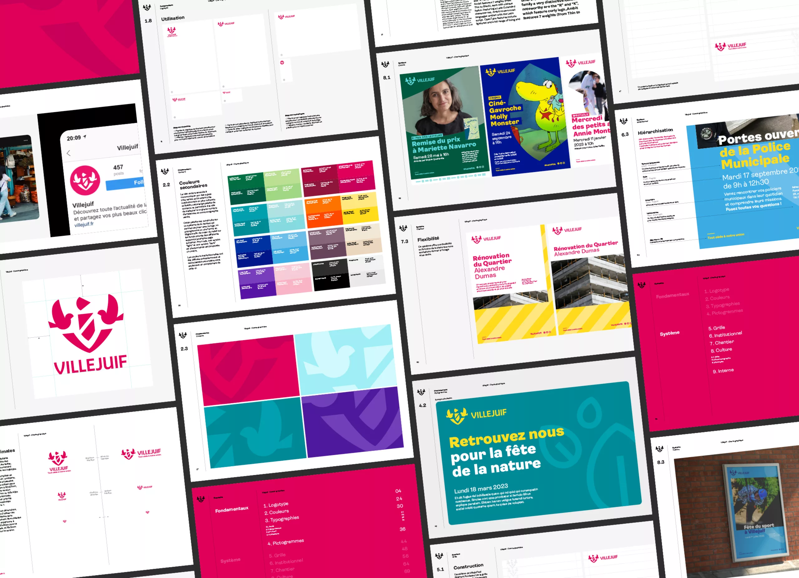
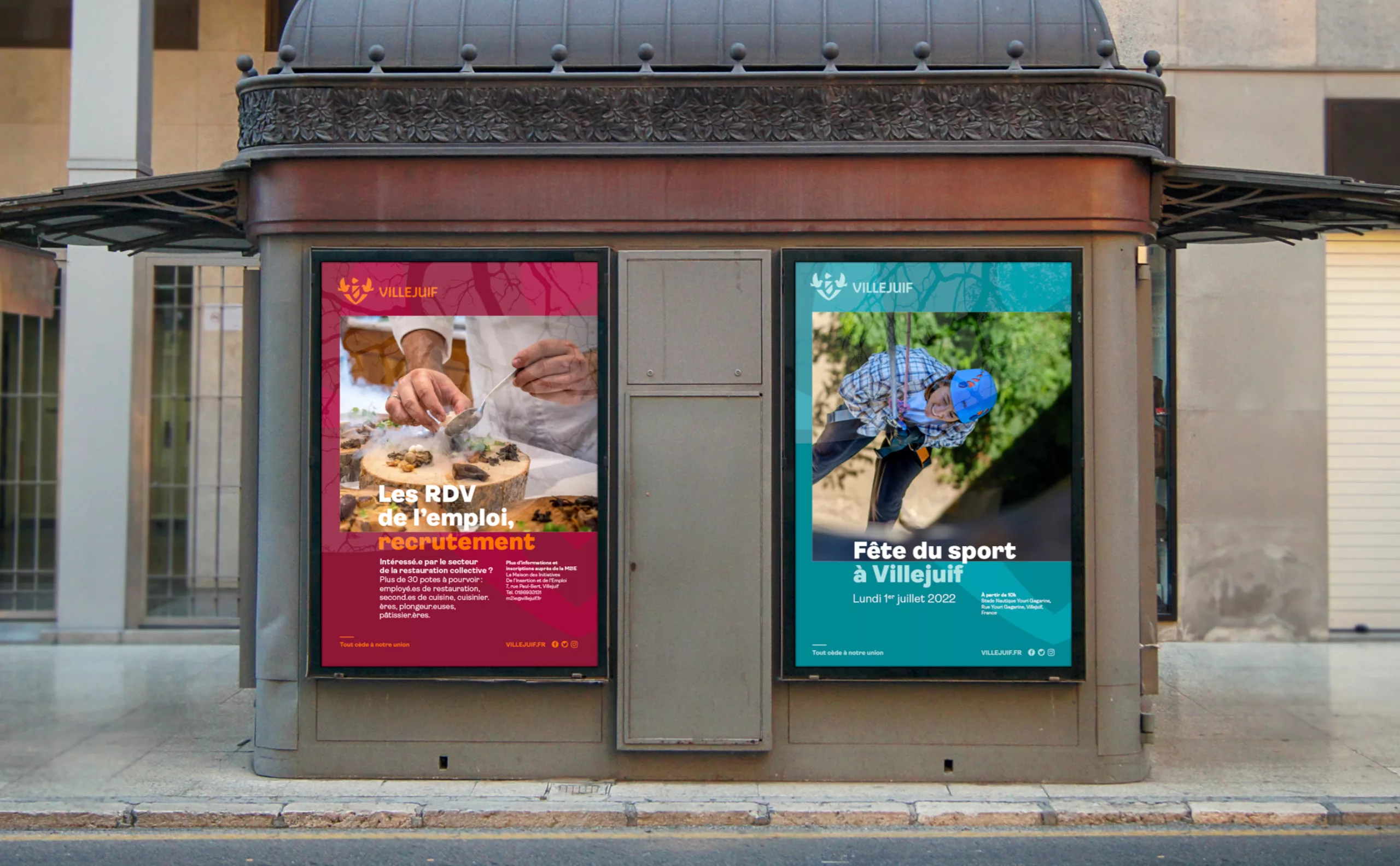
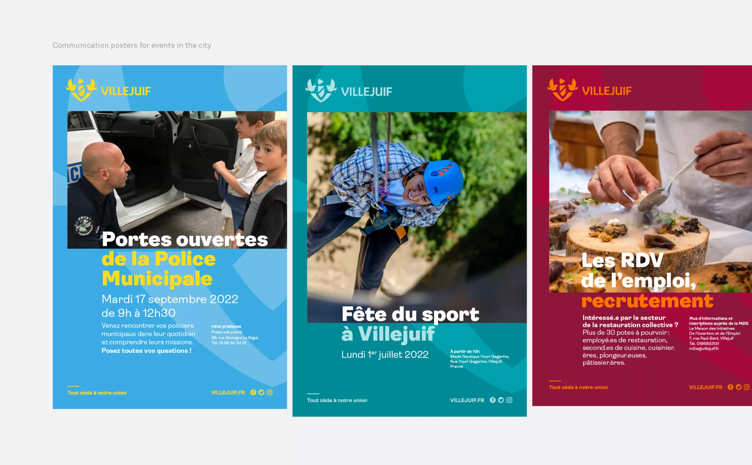
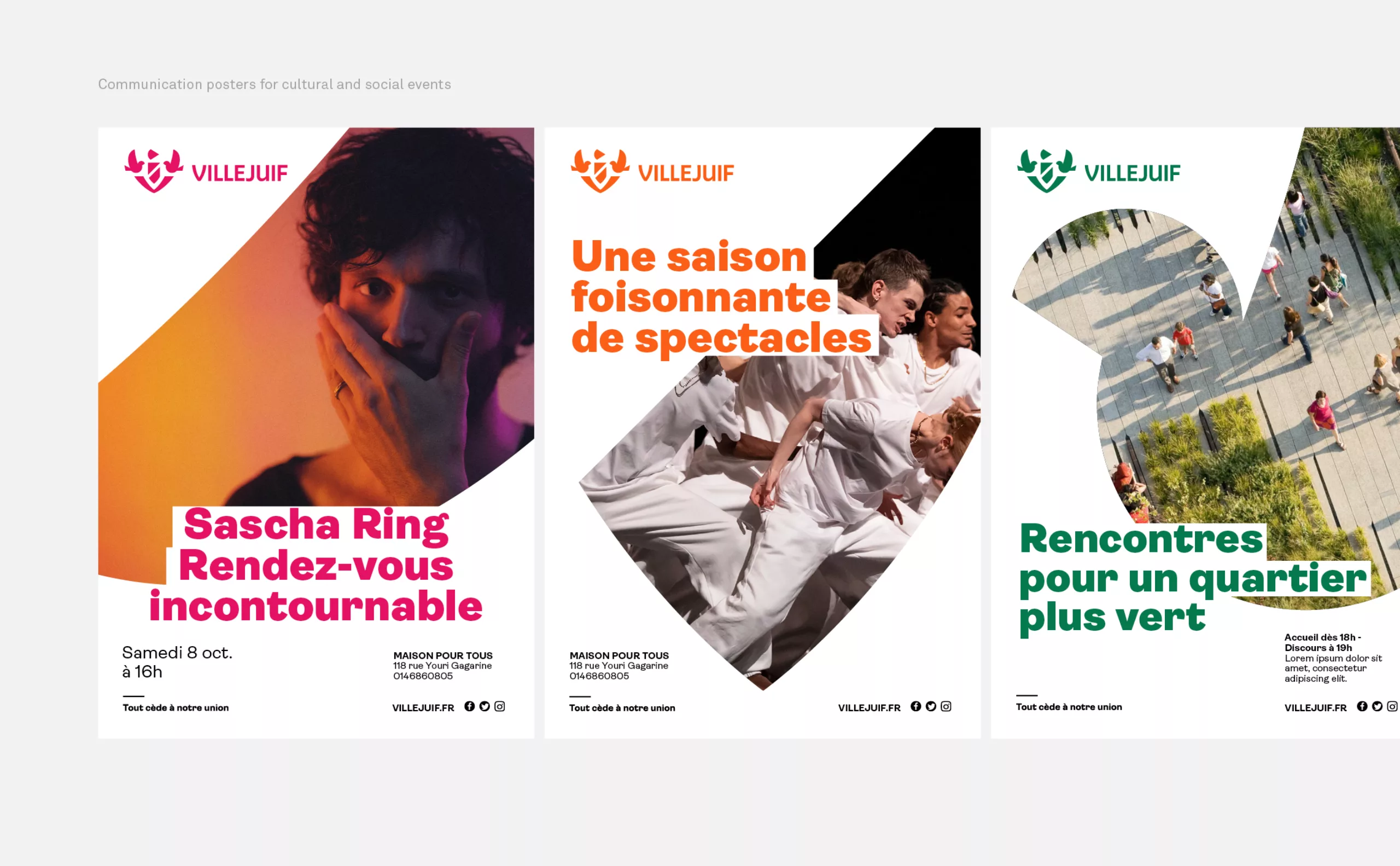
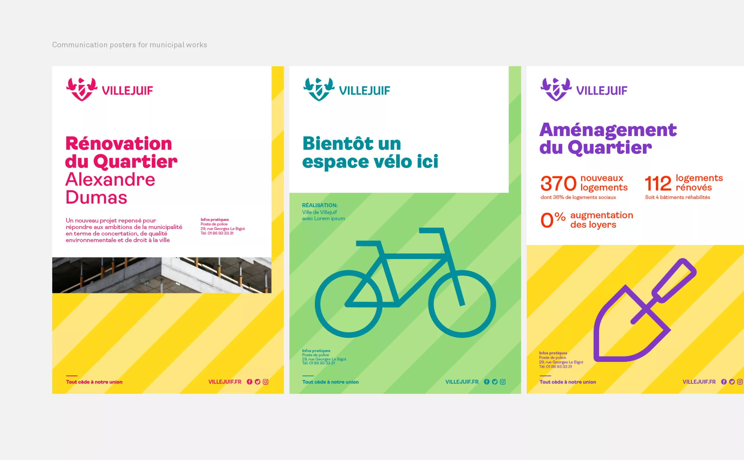
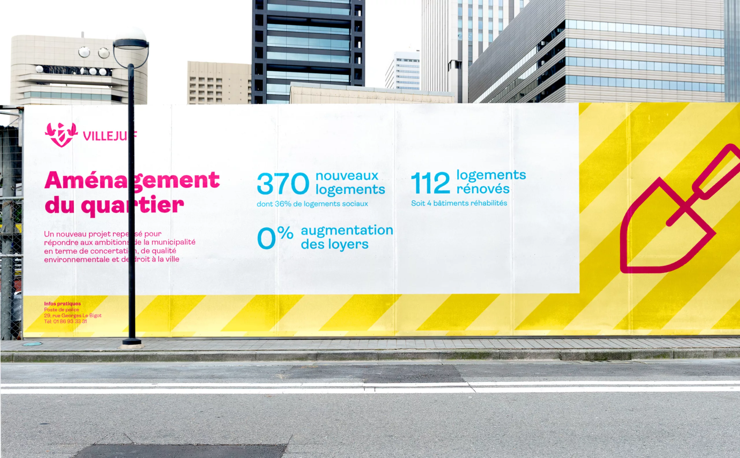
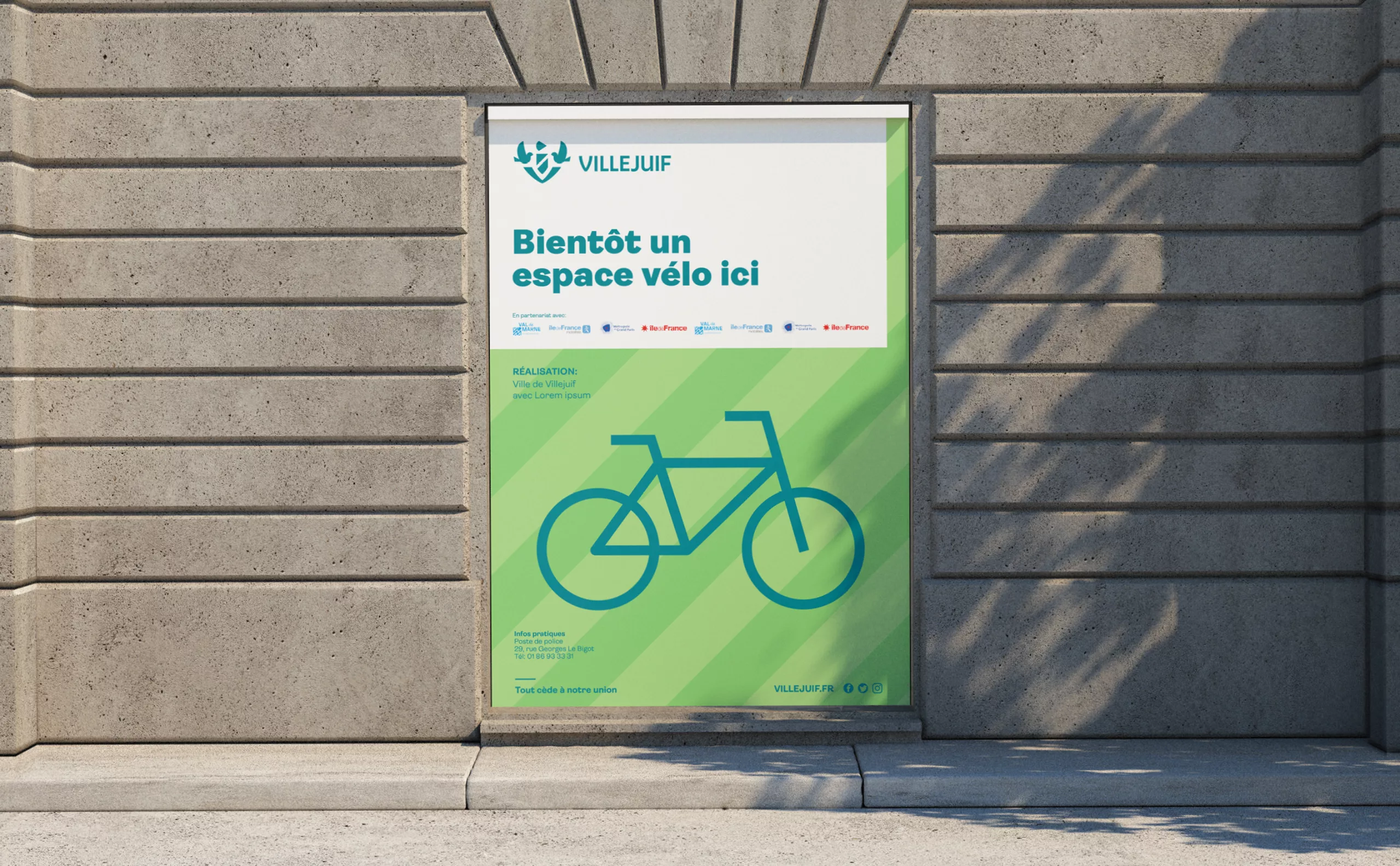
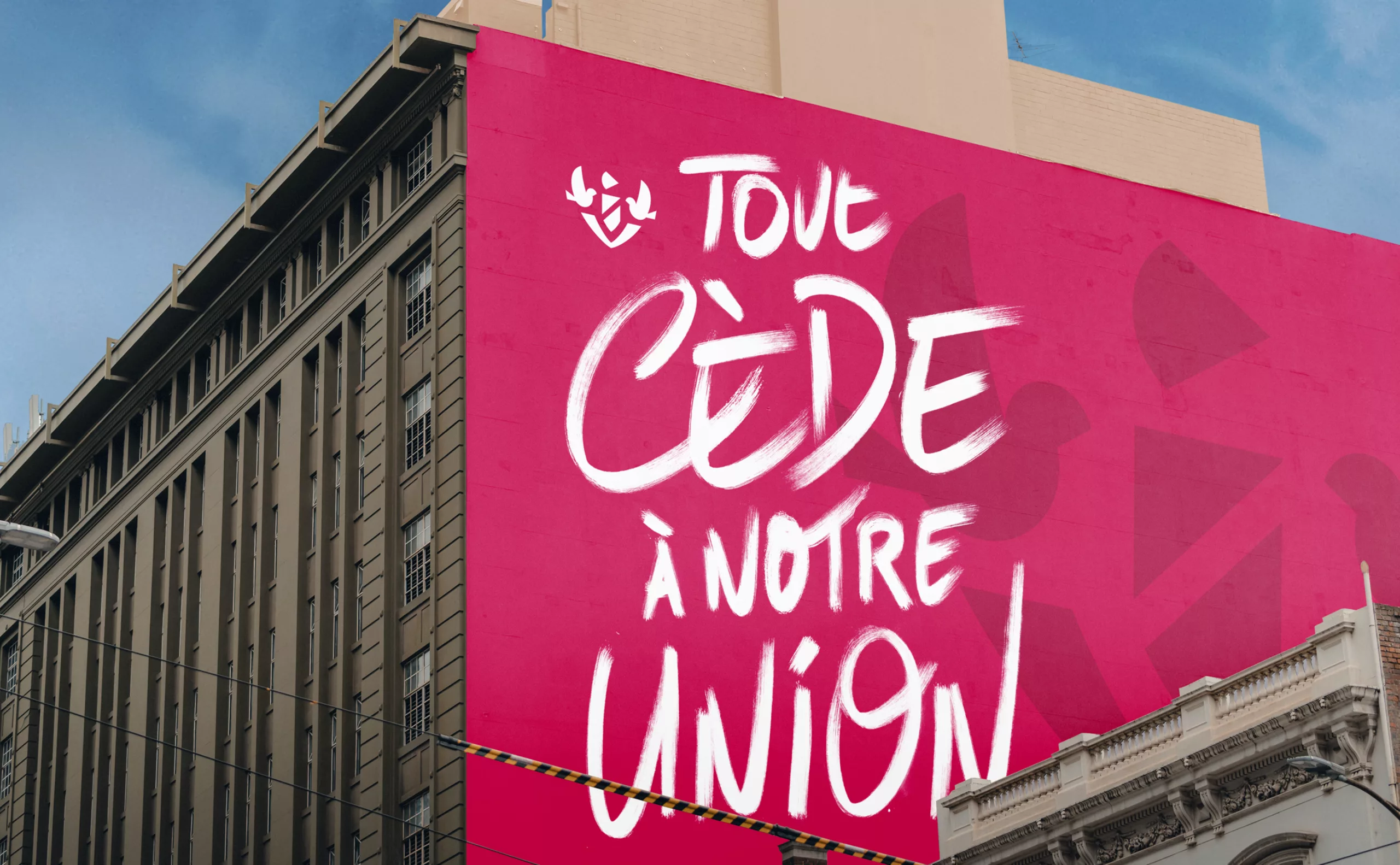
For several years, the city's communications had been suffering from a dilution of its messages, unattractive graphics and imperceptible urban branding. Villejuif commissioned Graphéine to overhaul its visual identity, with the aim of breathing new life into its image and communications.
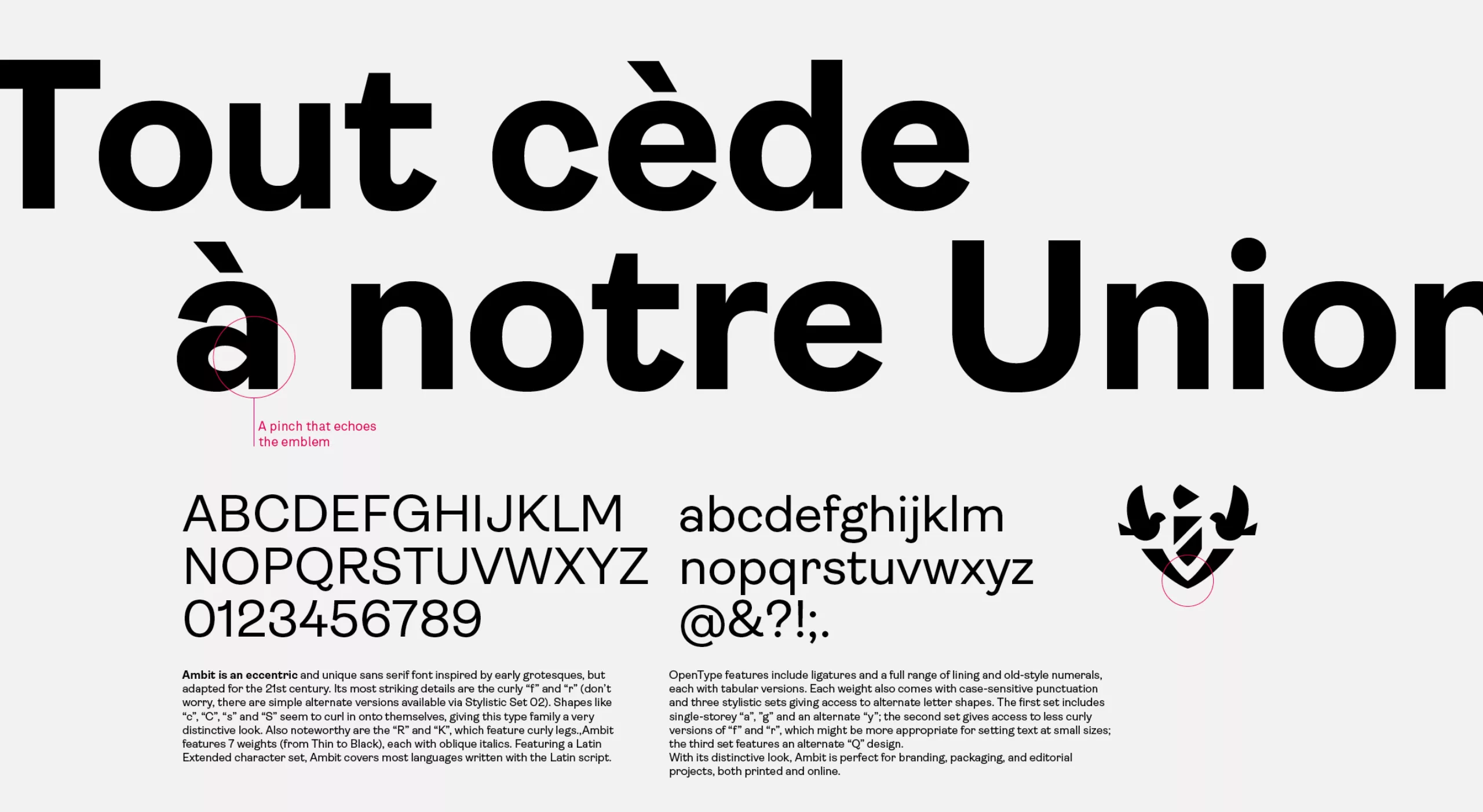
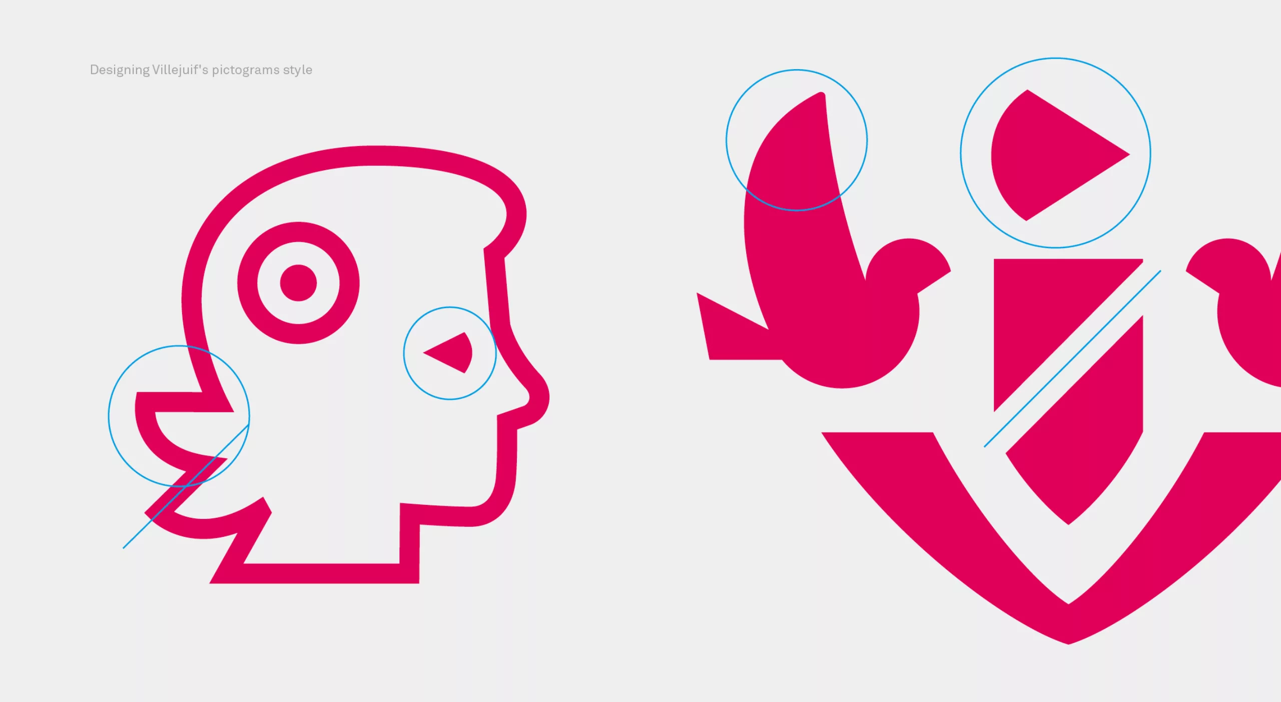
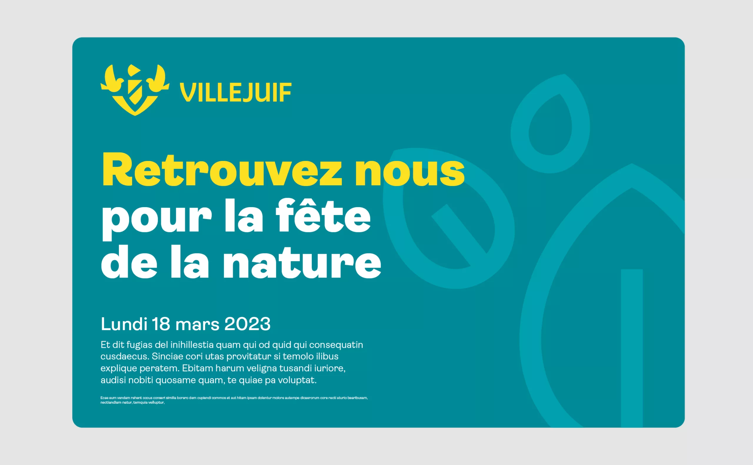
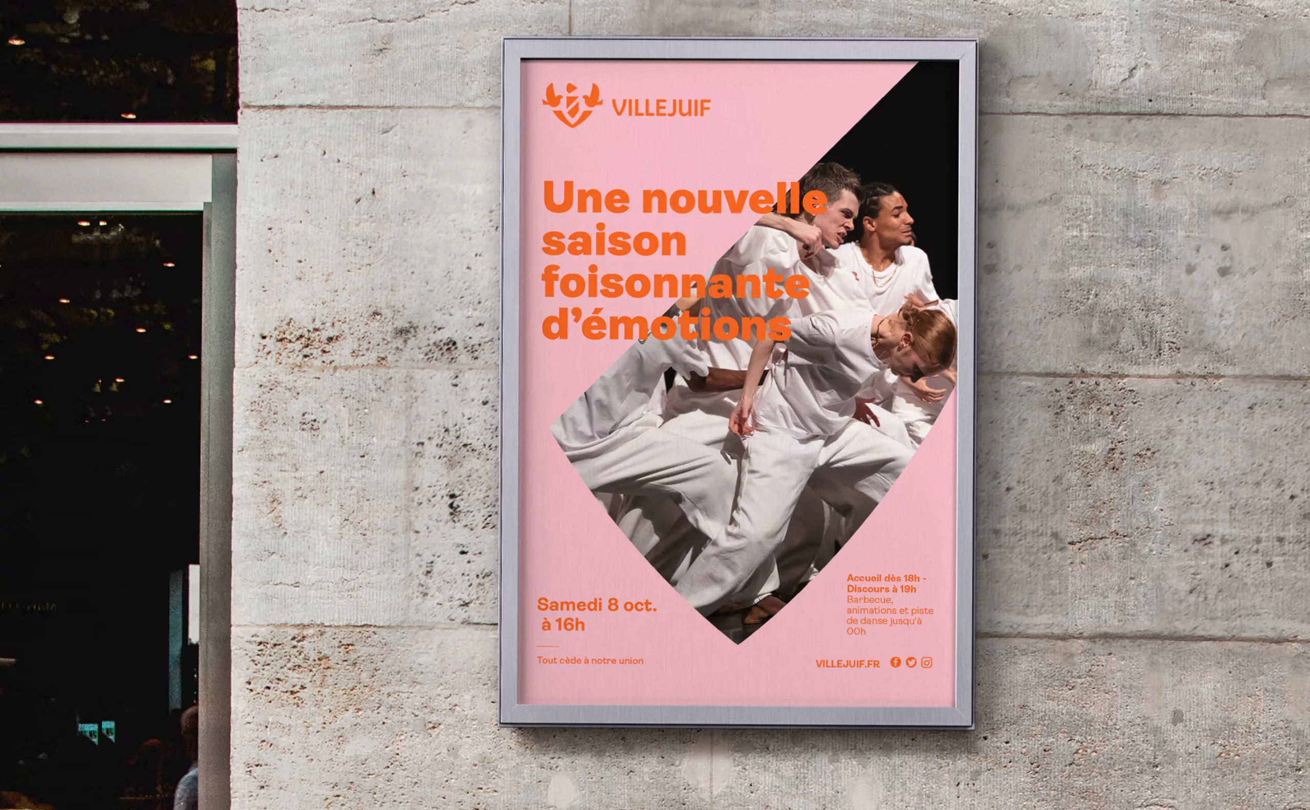
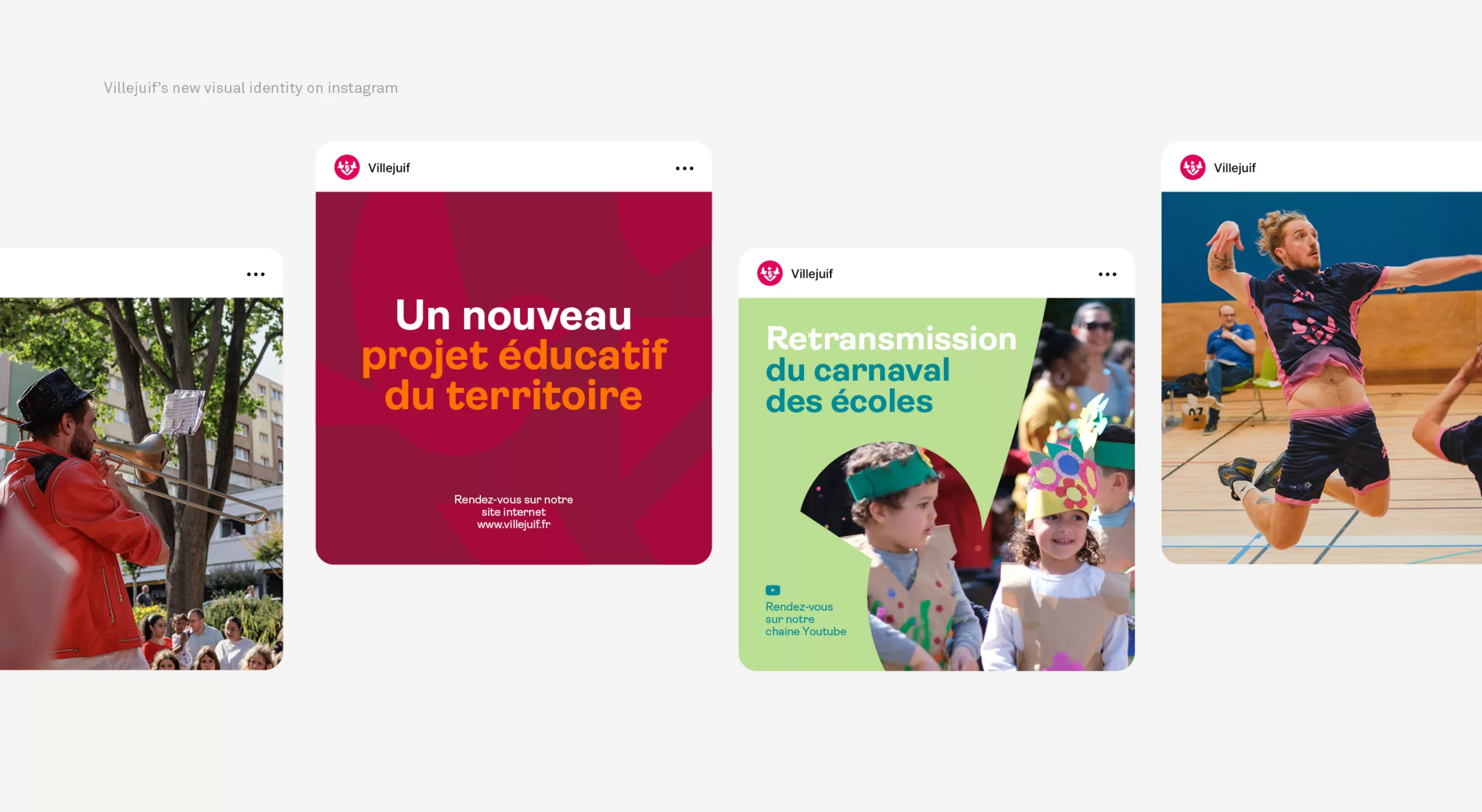
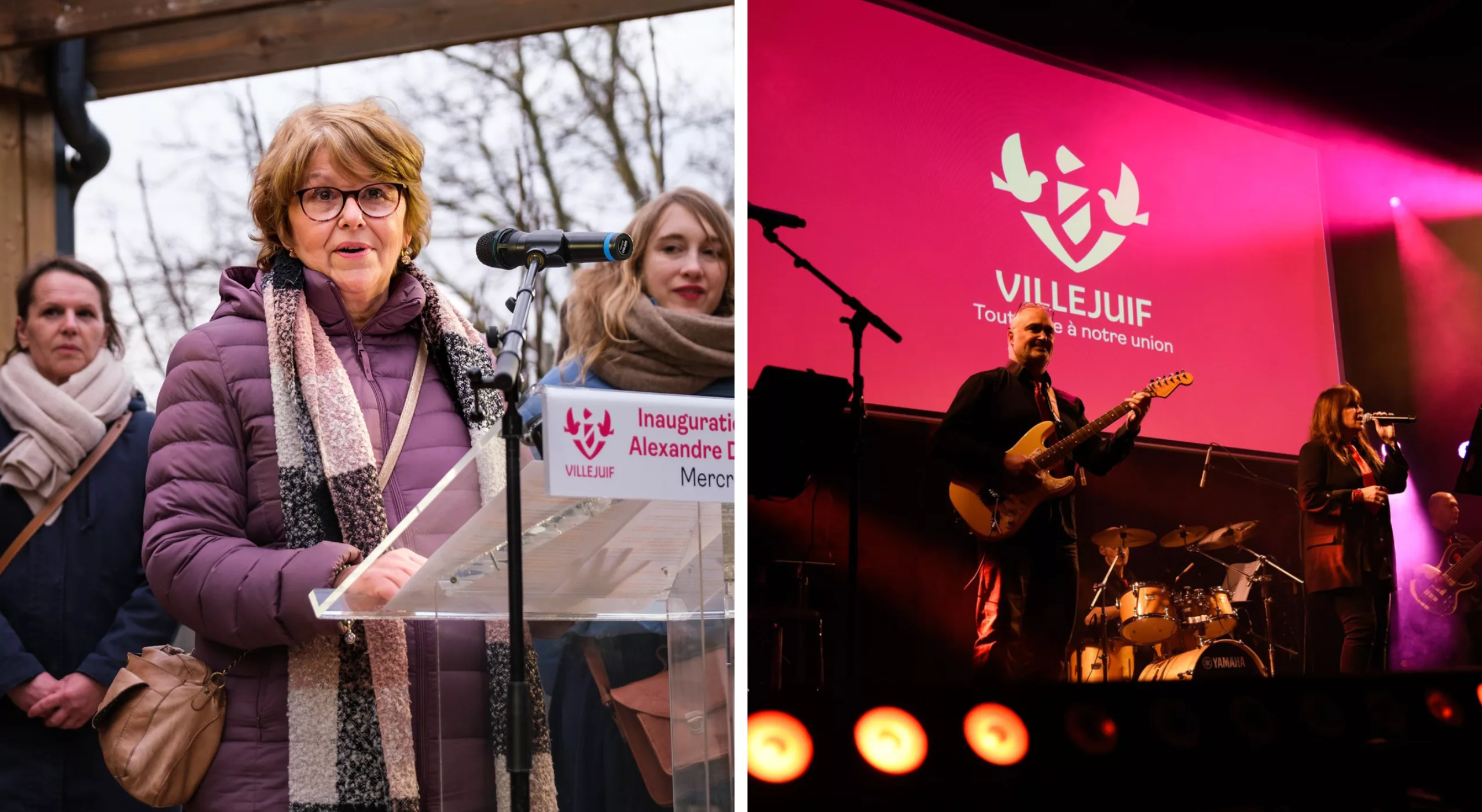
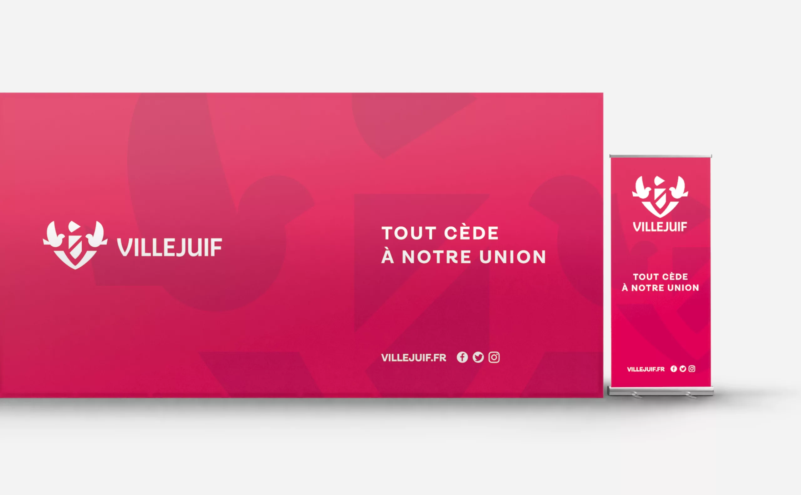
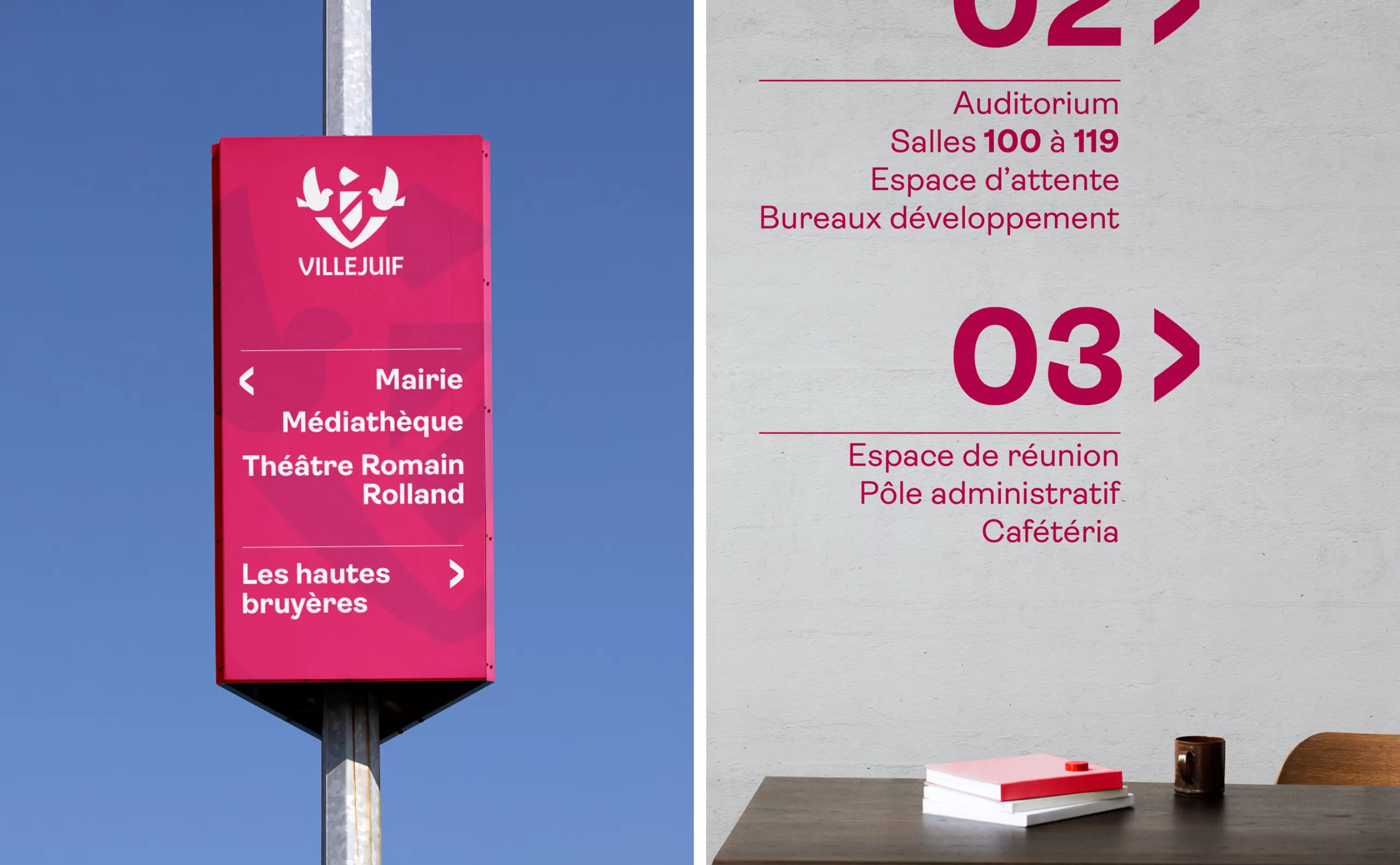
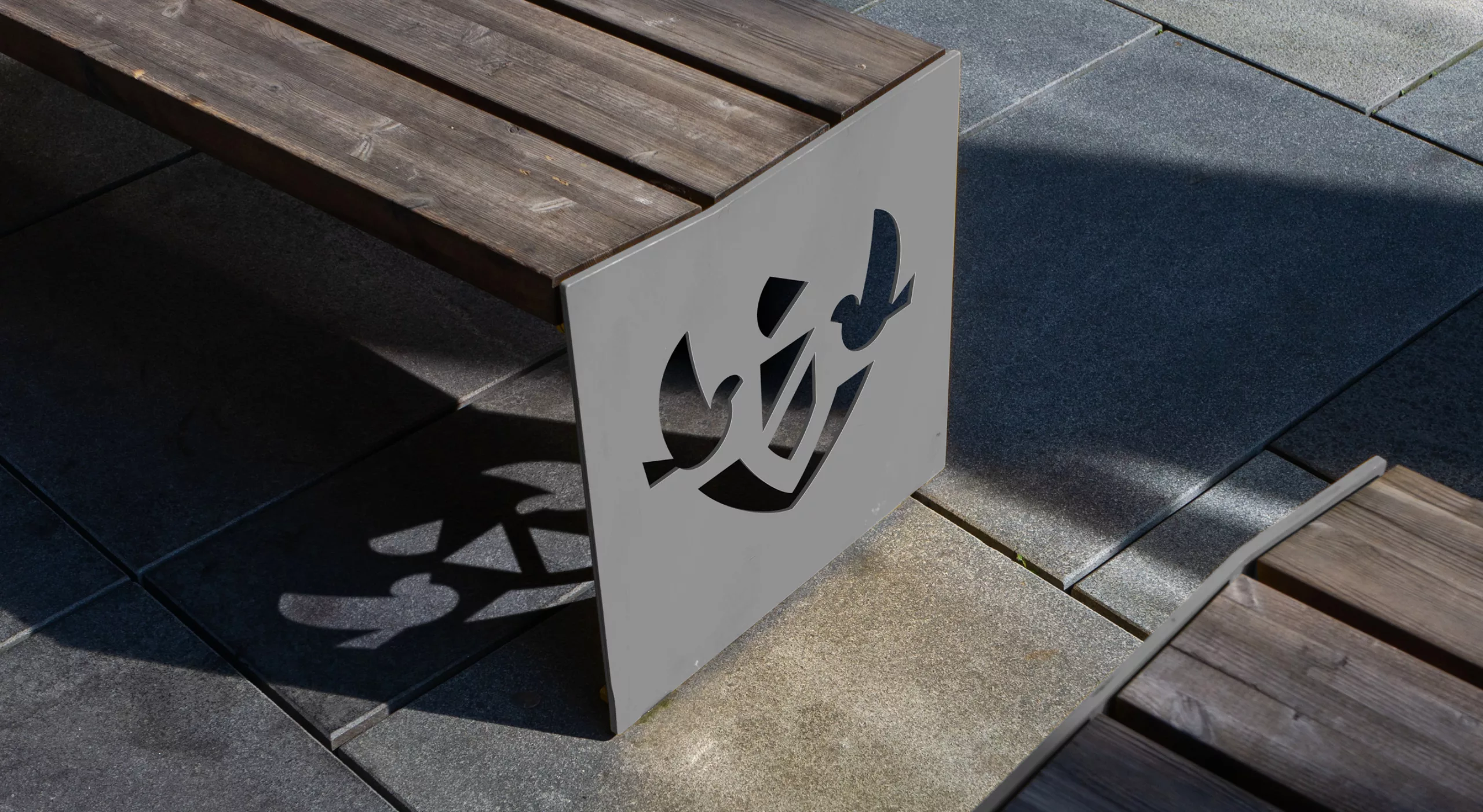
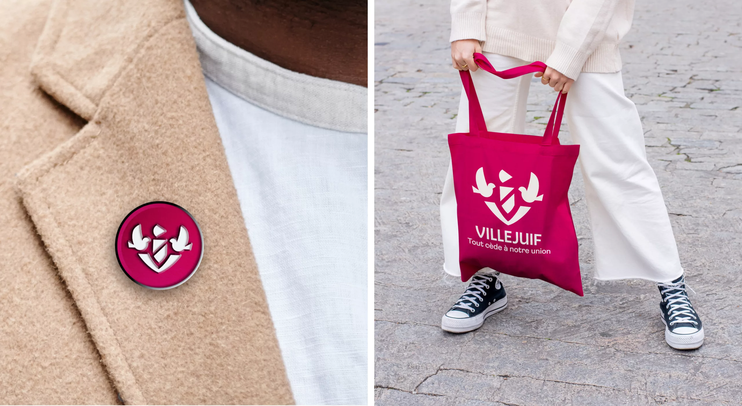
Villejuif's last logo was based on the city's coat of arms. Unlike most territorial coats of arms, it was not created in medieval times, but during the French Revolution. We wanted to modernise this emblematic symbol while preserving its historical attributes.

A new logo that draws its symbolism from the historic coat of arms

Until now, the city's logotype was a line drawing of the coat of arms enclosed in a purple cartouche. This 'banner' enclosed the heraldic symbols and kept them too small. The coat of arms, although redesigned, was too complex and posed numerous problems in terms of legibility and reproduction on all of the city's media. We redesigned the logo, retaining only its essential symbols. Its graphic style has been completely revised to adapt to today's communication media. The aim was to use the heraldic coat of arms as the starting point for the creation of the new logo.

Simpler, more legible and more popular, Villejuif's new emblem highlights the strong elements of its history. The doves, symbols of peace, freedom and collective movement. The drape worn by the birds supports the motto that unites the population. In the centre, the column represents the Republic. The axe recalls the will to defend the Revolution. The silhouette of the sign reveals the whole of the great "V" of Villejuif. This lettering dimension of the new logo unifies all the elements in a dynamic collective movement.

The historic magenta colour has been revitalised in a "union red" for corporate communications, and is complemented by a secondary range for all communications. The colours are vibrant, contrasting and luminous, expressing a joyful, up-to-date and resolutely optimistic identity.

Une nouvelle charte graphique cohérente et déclinable

Villejuif had a disparate set of media at its disposal, which made it difficult to assert and recognise its visual identity. The logotype had to be given a central place again, to enable the new visual identity system to be branded systematically, with impact and recognisability. By bringing coherence, we have given a voice back to the city's communications. The logo now has pride of place and makes it easier to identify communications.

A set of shapes taken from the emblem has been used to develop a window layout that gives pride of place to photographs. We have also developed a library of exclusively designed pictograms. The pictograms are an alternative to the "all-photo" approach to the city's practical communications media.

Three typefaces are used to create the graphic identity. The main typeface for the new identity is Ambit, distributed by the CoType foundry. Ambit directly echoes the design of the emblem, with its curves and juxtapositions of letters. It is a typeface with a warm and welcoming roundness, perfectly in tune with the city's values. The Basier Narrow and PT Serif typefaces enhance the charter. These functional typefaces complement the editorial style and provide good legibility for signage.

A new visual identity to reflect Villejuif's commitments

The motto "Everything yields to our union" embodies the values of the city, and we wanted to assert it as the signature of the territory. It thus takes centre stage and becomes a message in its own right. The term "union", which so aptly characterises the solidarity of the people of Villejuif, is used to identify the city's 3 pillar commitments: citizenship, solidarity and ecological transition.

Villejuif's commitments and values have shaped and continue to shape its visual identity. Inspired by a revolutionary and popular history, the new identity reinforces the city's 3 fundamental values: hospitality, solidarity and care. The collective strength embodied by its motto underpins the image of a city for all, co-constructed with its residents and strengthened by its public service.

Contexte

A qualitative survey and an opinion poll were used to carry out a detailed analysis of how the town's communications are perceived. This diagnosis revealed an initial lesson about the identity of the Villejuif area: its identity is not perceived in a specific way. It is not negative, but neutral, as if it had not been revealed. Communication suffers from a scattering of messages, unattractive graphics, imperceptible and inconsistent urban branding, and a general lack of visibility and coherence.

Objectifs

The aim of the new visual identity is to raise the profile of the city's activities, consolidate the interest of local residents, and promote and provide better information about public services. Villejuif's ambition is to have a more prominent and cheerful brand image, with a redesigned logo that is easier to read and better designed. The new visual system will have to establish placements that distinguish the identity and enable co-branding and cross-partnerships to be envisaged, with principles for the use of logos that are better defined on web or printed surfaces. The graphic charter will include stationery, desktop publishing, a range of tools for deploying 360° campaigns, and a review of the ecosystem of communication media. The agency will carry out a diagnostic to lay the foundations for the graphic redesign of the town's new website.


Share this project:
Project expertise:
Logo creation, visual identity and graphic guidelines.
Type of client:
Institutional communication agency, public communication for cities and territories, government institutions, social partners and public administrations.

Related projects: