Behind the scenes of Facebook’s visual identity
The American designer, Ben Barry, details on his blog the work he did while he was a designer at Facebook. His work consisted mainly in working on the design of the brand. A unique opportunity to discover the backstage of the American giant…
Ben Barry’s CV
Ben Barry started at mark in 2008. Before taking on the challenge of redesigning Facebook’s identity, he first graduated from the University of North Texas. His first job was for a screen printing store in Austin, Texas.
There he honed his skills on a wide spectrum of subjects (packaging, merchandising and lots of posters too!). He also went through John Bielenberg’s experimental design education program, where he explored the role graphic designers can play in encouraging social change.
When Mark opened the door for him, Facebook already had a visual identity designed by the agency CubanCuncil and Joe Kral. [ For the record, Twitter’s logo was also designed in CubanCuncil’s office, but not by them… by Linda Leow, who shared their office at the time. ]
The identity was already ultra simple and effective. A white typography (klavika) on a blue background for a logo that avoided the web 2.0 effects so common at the time. Ben was in charge of applying this graphic charter and making it evolve according to the needs.
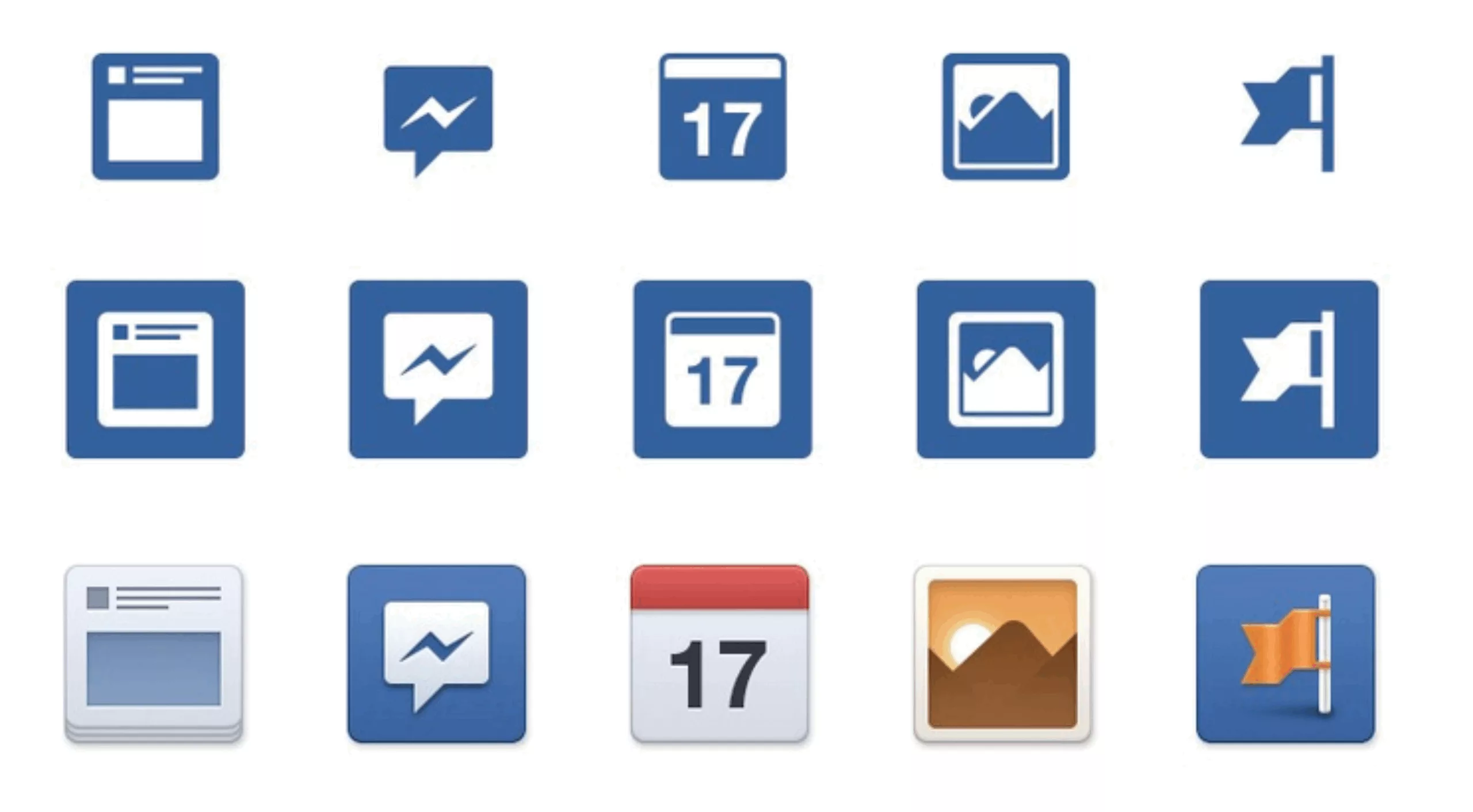
He says that during those years of strong growth, the identity was not really the priority. The developers, who were relatively autonomous in their developments, were regularly asked to design new logos or icons themselves. As a result, dozens of versions of the logo appeared…
A hackaton to redesign the logo
Ben and his friends decide to organize a hackaton in 2009 to try to remedy this inconvenience. They give themselves 48 hours to rethink the identity. They get out their pencils and have fun!
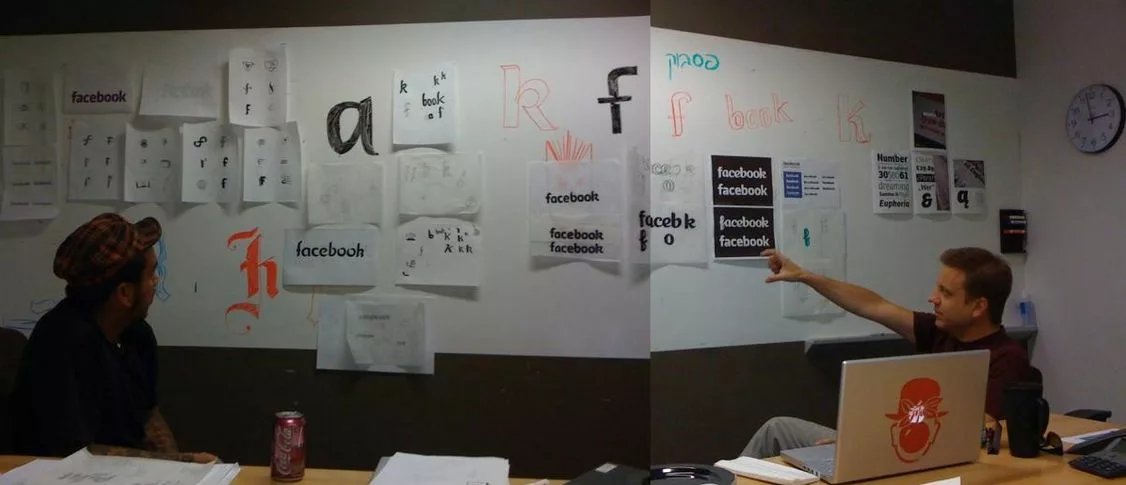
They end up with the following result… which will remain in a box.
![]()
The camera app
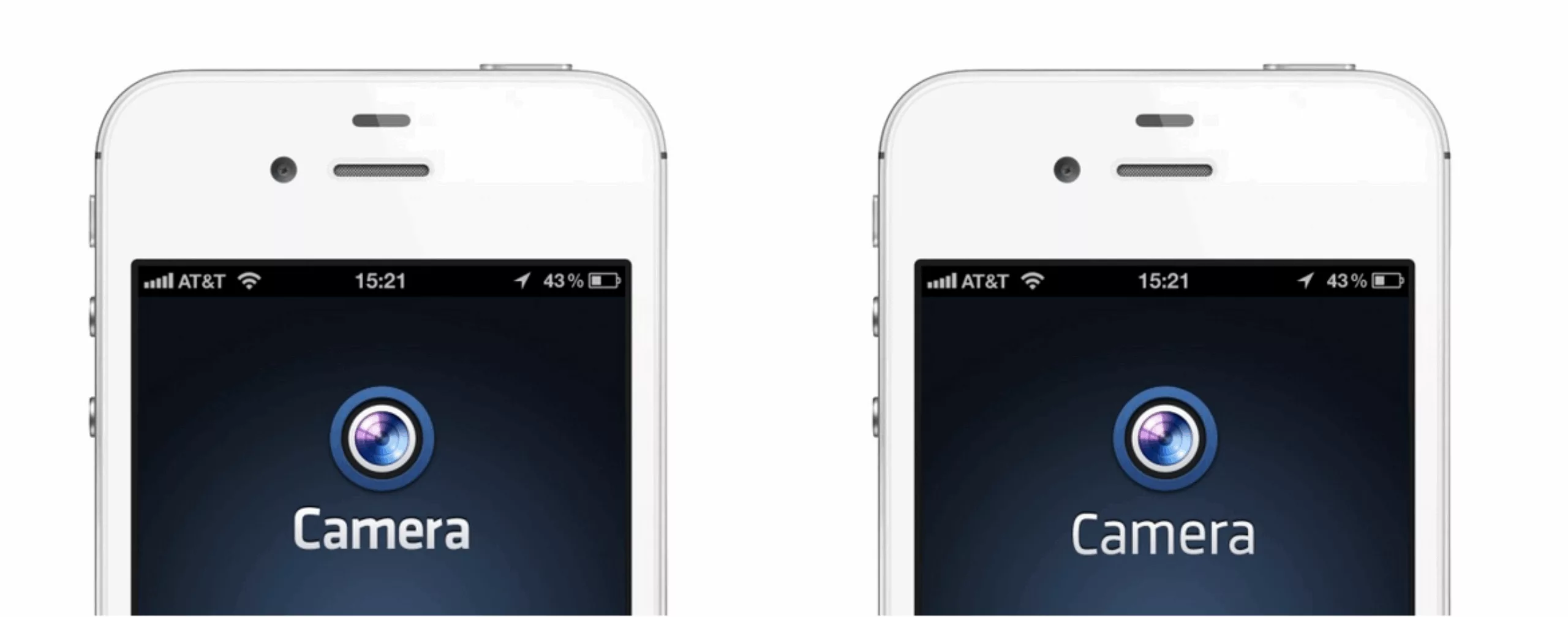
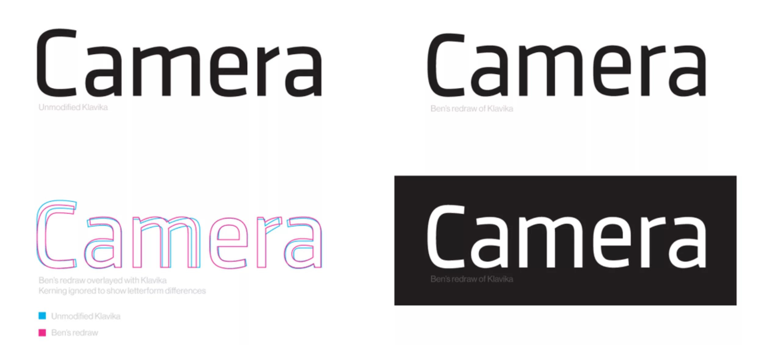
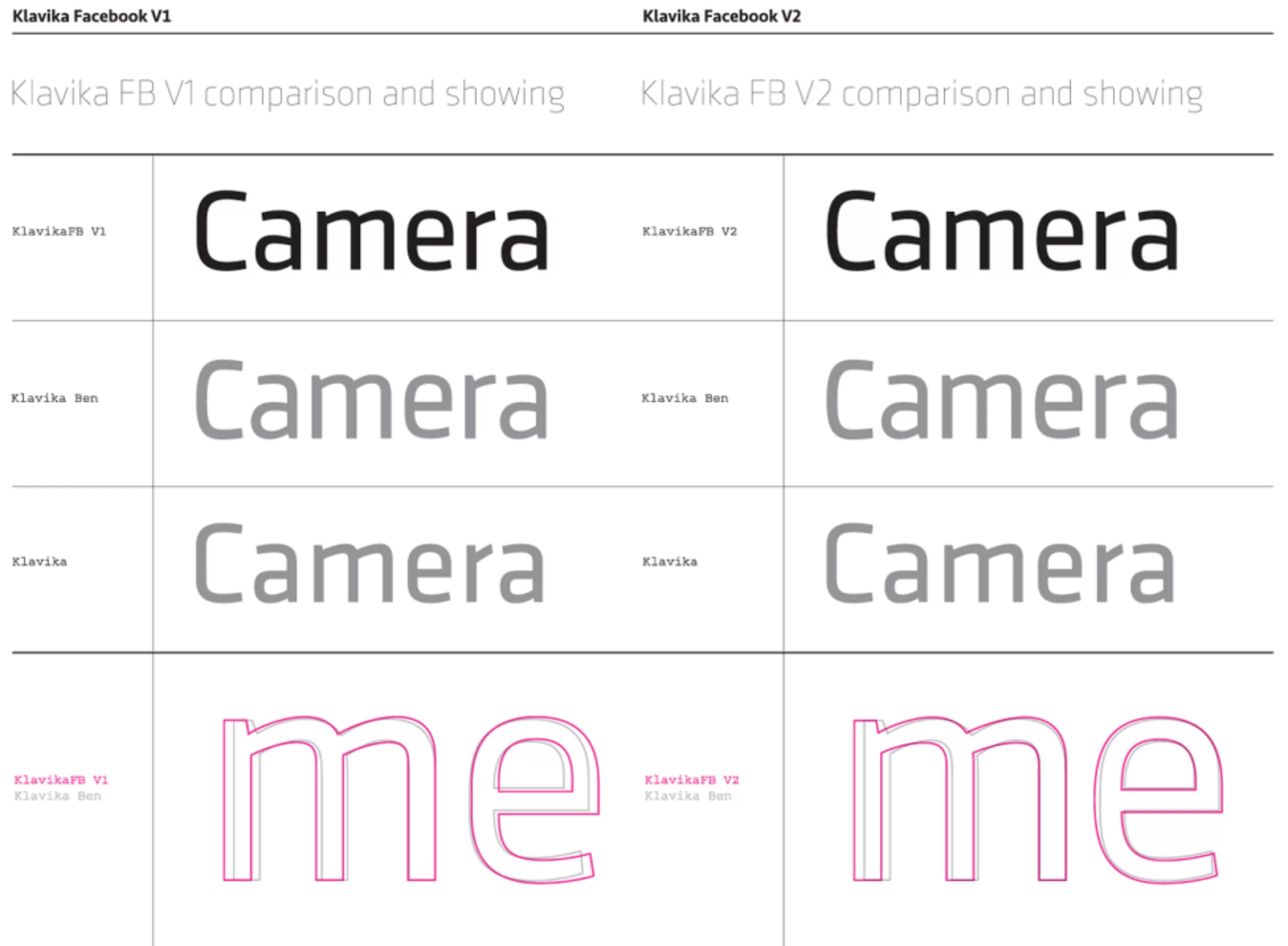
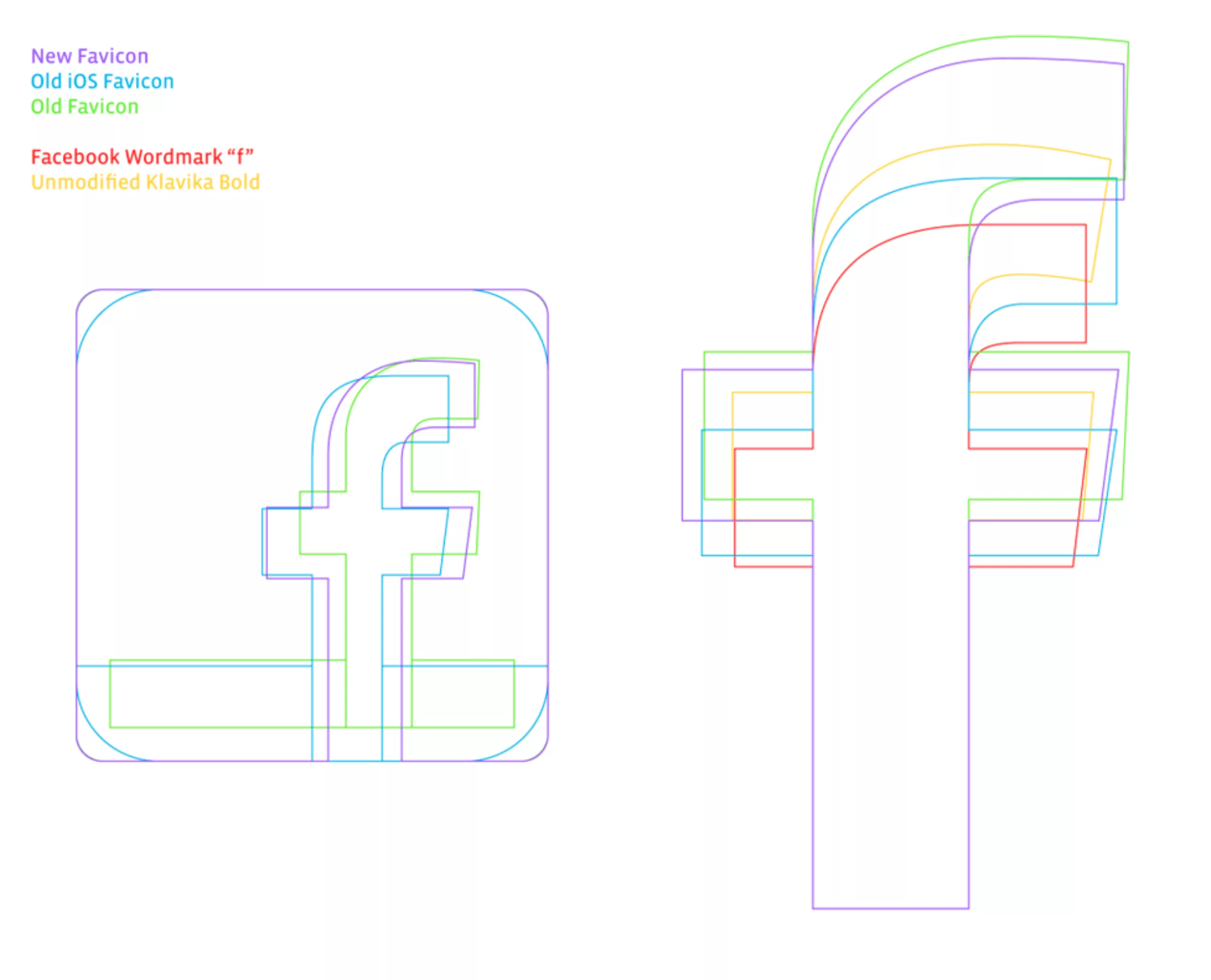
The first opportunity to try to shake up the identity comes in 2012 when his fellow developers were working on the camera app interface. Seeing screens go by on the intranet, he thought to himself that the use of the Klavika typography was too rigid. And he started trying to redesign it in a more humanistic way.
[ on the left the original Klavika – on the right the redesigned version ]
Typography
Despite the commercial failure of the application, his work on the typography was well received internally. So he decided to entrust the redesign of the typography directly to the author of the Klavika “Eric Olson”.

The graphic charter
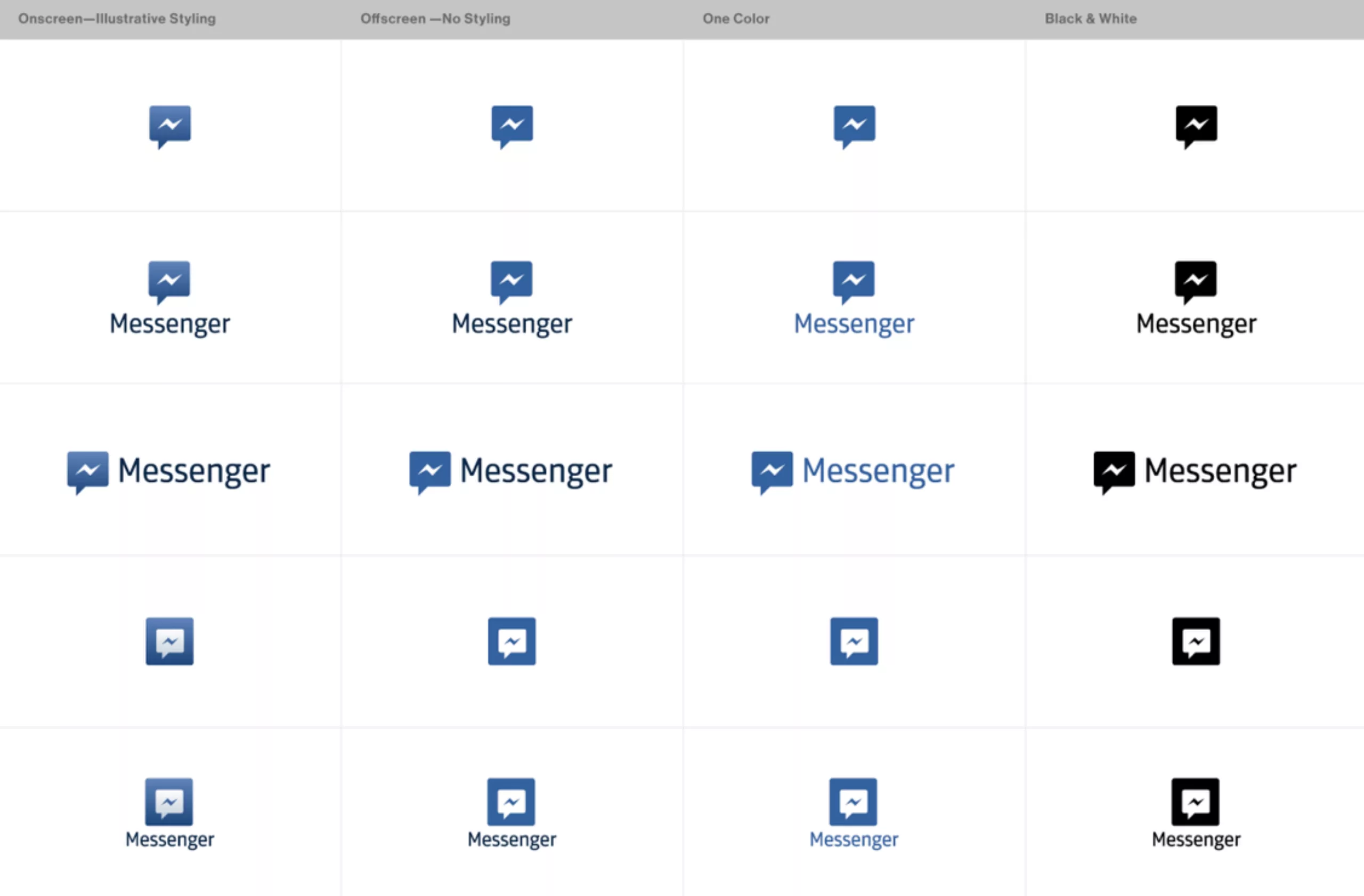
With the typography finished, he tackles the rest. To continue with the icons.
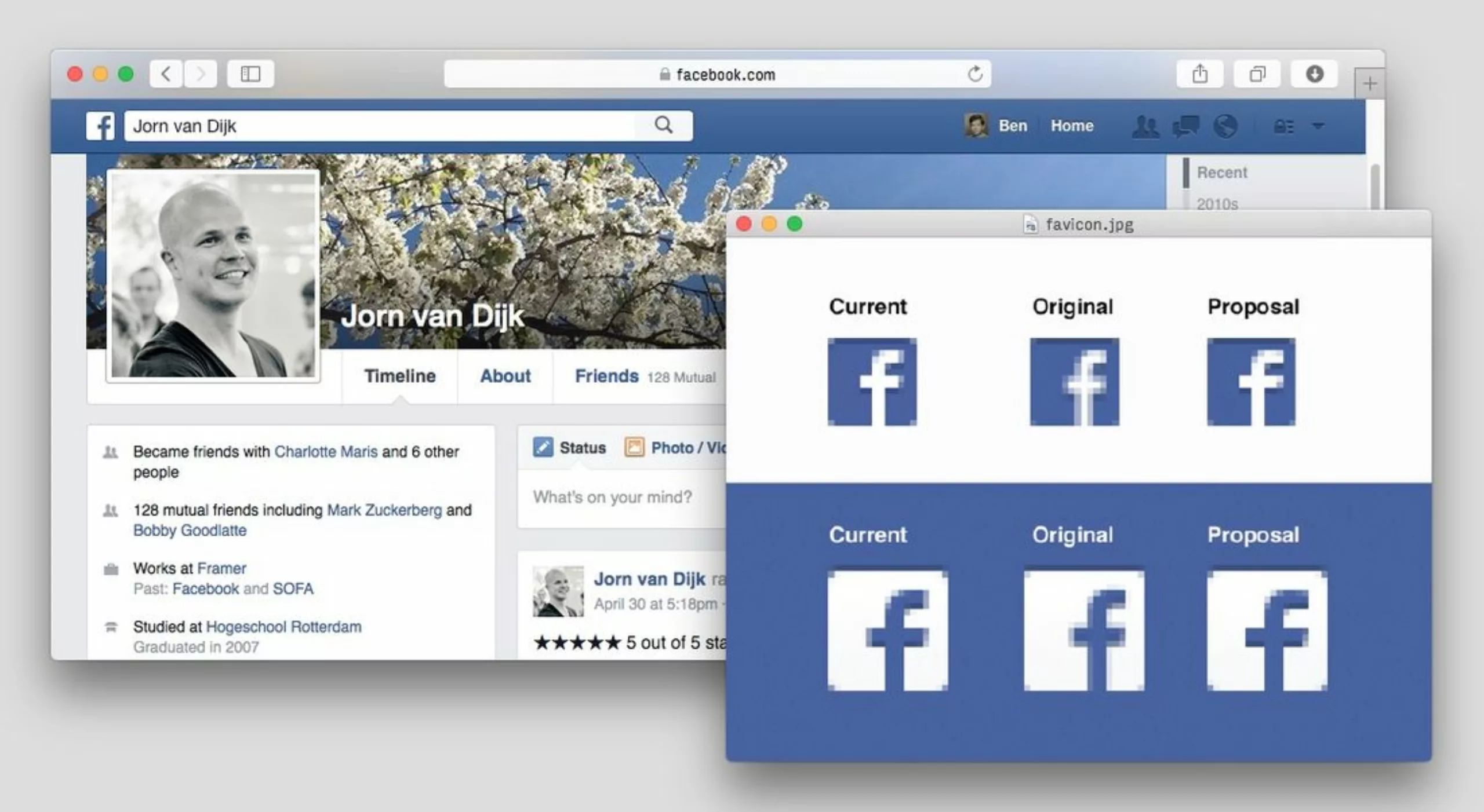
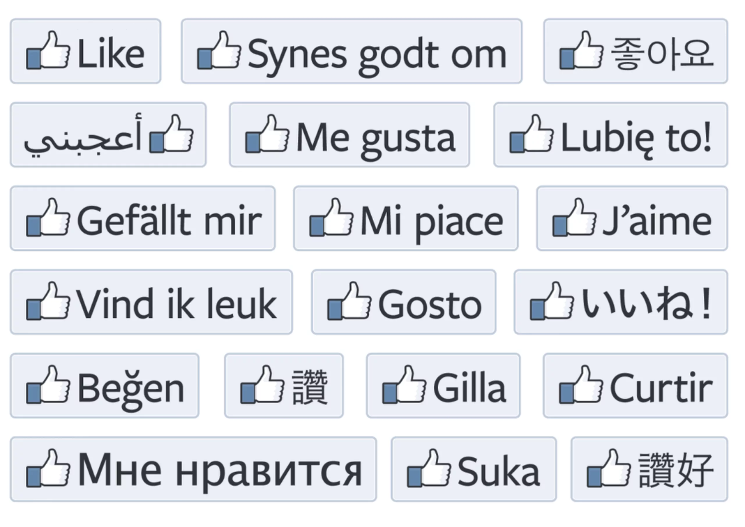
His fear was to have to type “Facebook logo” in Google. Not that Google is the sworn enemy of Facebook, but just because he discovered new versions of the logo every day!
![]()
So he starts by redrawing the favicon first… If it works in 16x16px… it should work elsewhere !


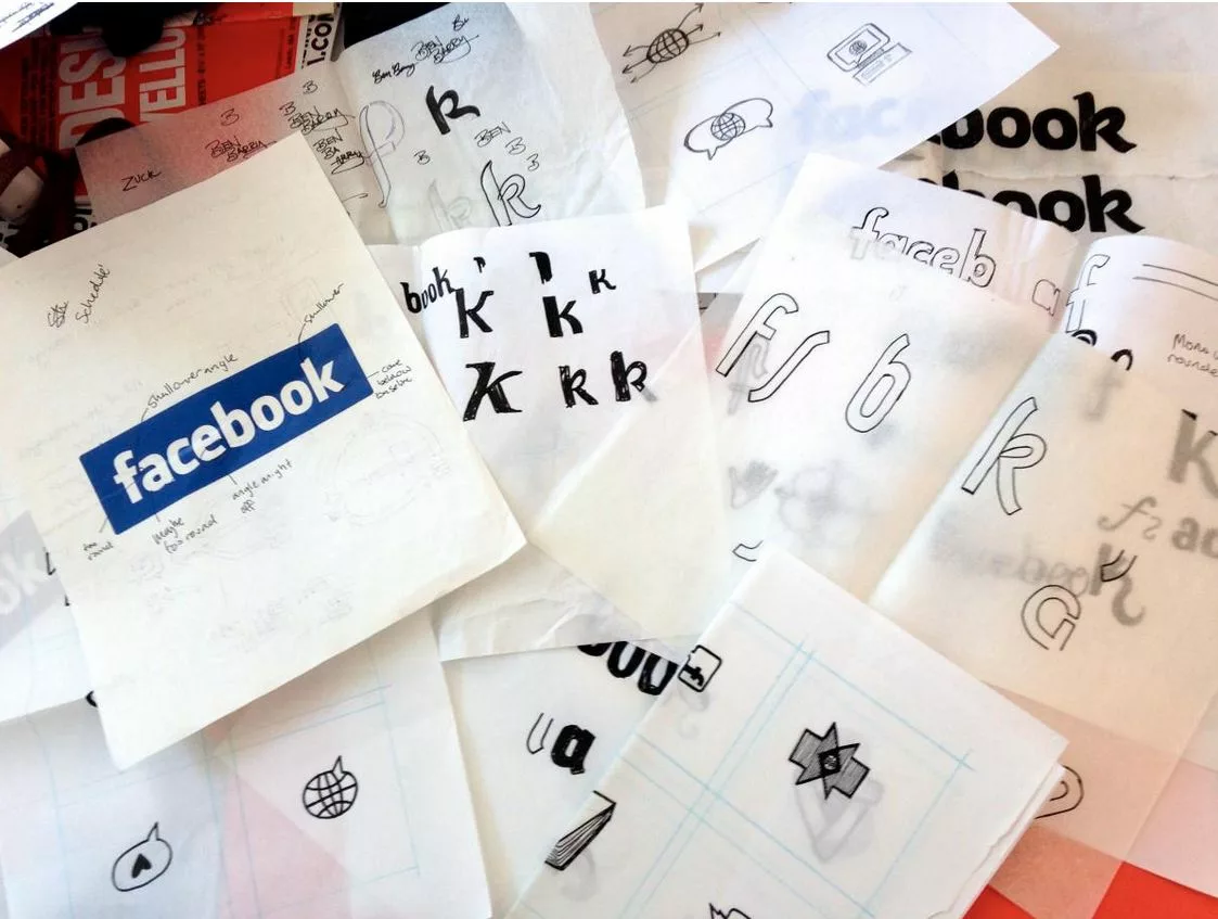
And the logo?
As a logical consequence of his work, we were expecting to see the Facebook logo redesigned. Of course Ben thought about it… he even worked on it! But his work, although approved in high places, will not be implemented immediately… In the meantime, Ben Barry left Facebook to found his design agency Office of Ben Barry.
![]()
The end of the story?
![]()
We will have to wait a few more months to see the logo of Facebook evolve.
Indeed, since 2005, the logo composed with the character “Klavika” of Eric Olson had not changed. It is done!
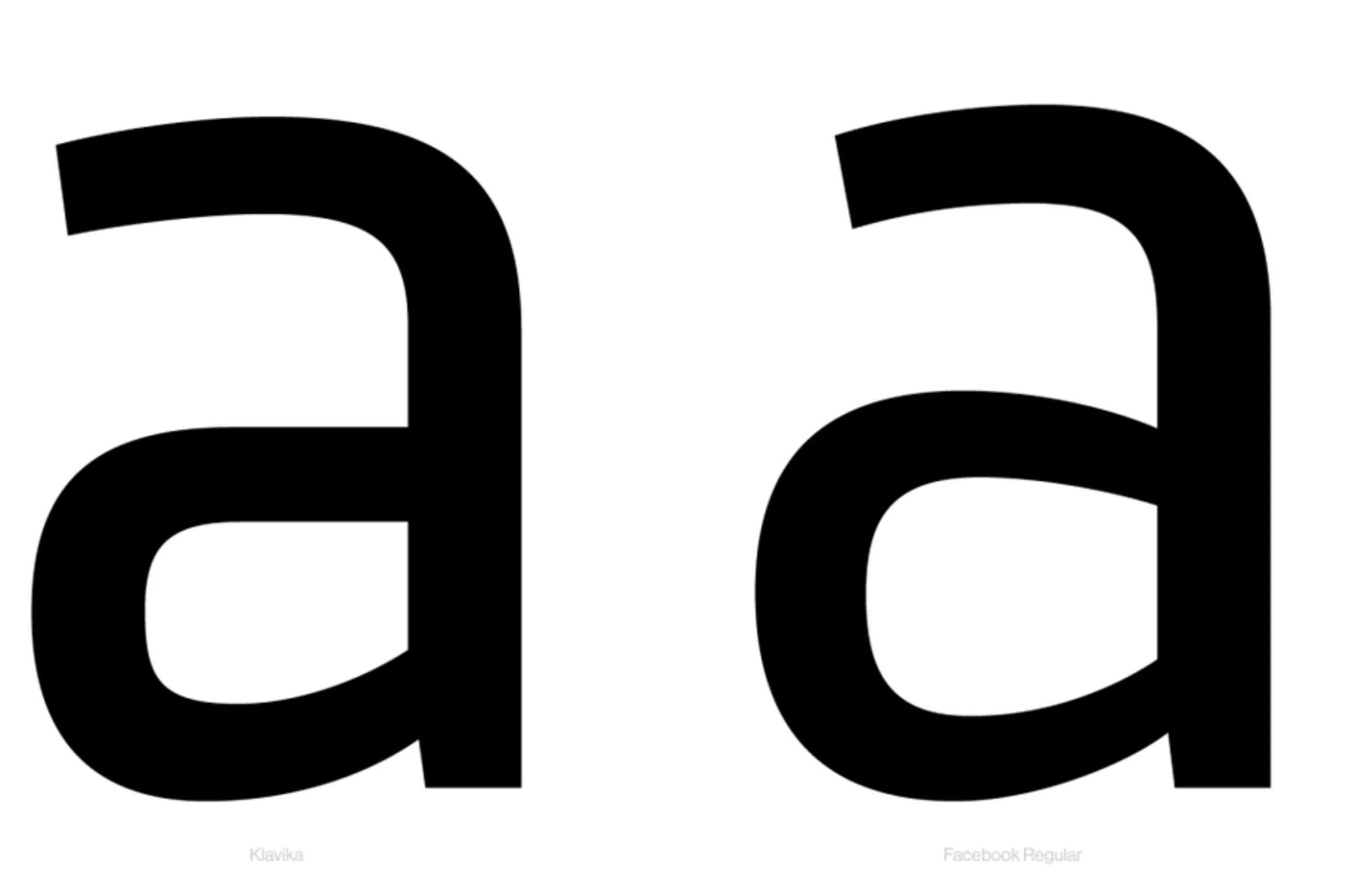
If the somewhat rigid and serious aspect of the typeface “Klavika” could have produced a serious and reassuring effect at the launch of the start-up, it turns out that times have changed. The new typographic choice is therefore much more round and friendly.
We can notice several changes (certainly subtle for non-graphic designers), starting with the “a” which changes shape to become a “round”. The “o” and “e” are rounder, and the “b” has a more traditional design.
The whole is rather harmonious, and some experts see a link with the Franklin Gothic typeface.
![]()
A strange feeling?
The strangest thing is that after 10 years of seeing this logo dozens of times a day, when I discover this new logo, I have the impression that it’s not “Facebook” that “speaks” to me. Apart from the “f”, there is not much of the spirit of the previous logo. The angles at the top of the rising letters have almost disappeared, the shape of the “b” has become commonplace again…
In short, it’s a surprising change, which has the merit/shortcoming (you choose) to make a line on the past. We’ll probably have to talk about it again in ten years, when we’ll have seen this logo several billion times!
On the subject
-
New logo for OM: analyzing a sports crest
OM will soon be changing its logo. This is an opportunity to delve into 125 years of heritage to understand the challenges of the future.
-

Groupama’s new visual identity, a logo in the open countryside
Groupama has just unveiled a new logo that updates its graphic design by abandoning its campaign in favor of a “startup” aesthetic.