CadoMaestro_Brand_design_logo_header

2022

CadoMaestro - New brand identity
Cadeau,Maestro! becomes CadoMaestro

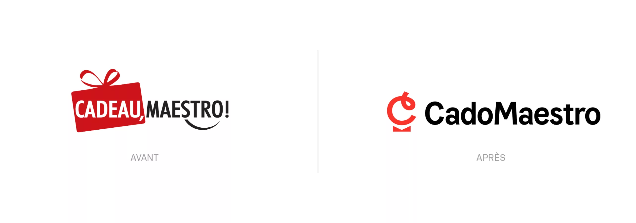
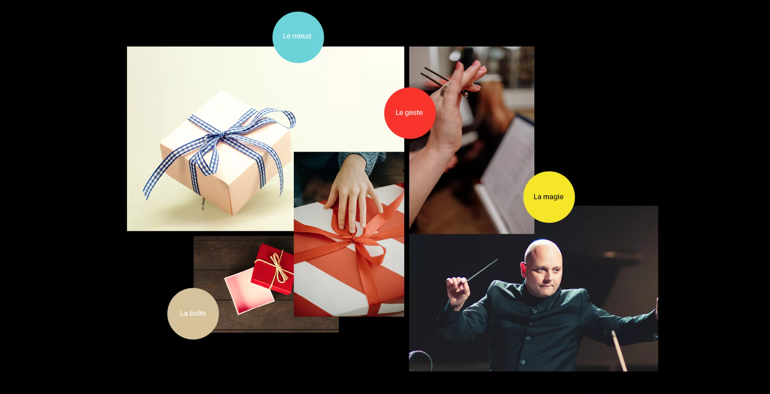
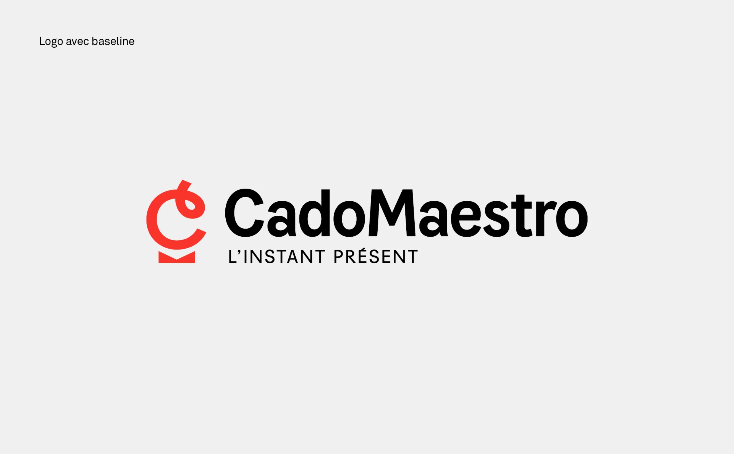
Founded in 2009, Cadeau,Maestro! is a specialist in original and customisable gifts on the internet. The selection of products, the know-how of a French company on a human scale and its family spirit make the brand stand out. Far from the gadgets imported throughout the world, Cadeau,Maestro! values its teams and its customers. Its current development involves the creation of a professional section with business gifts.

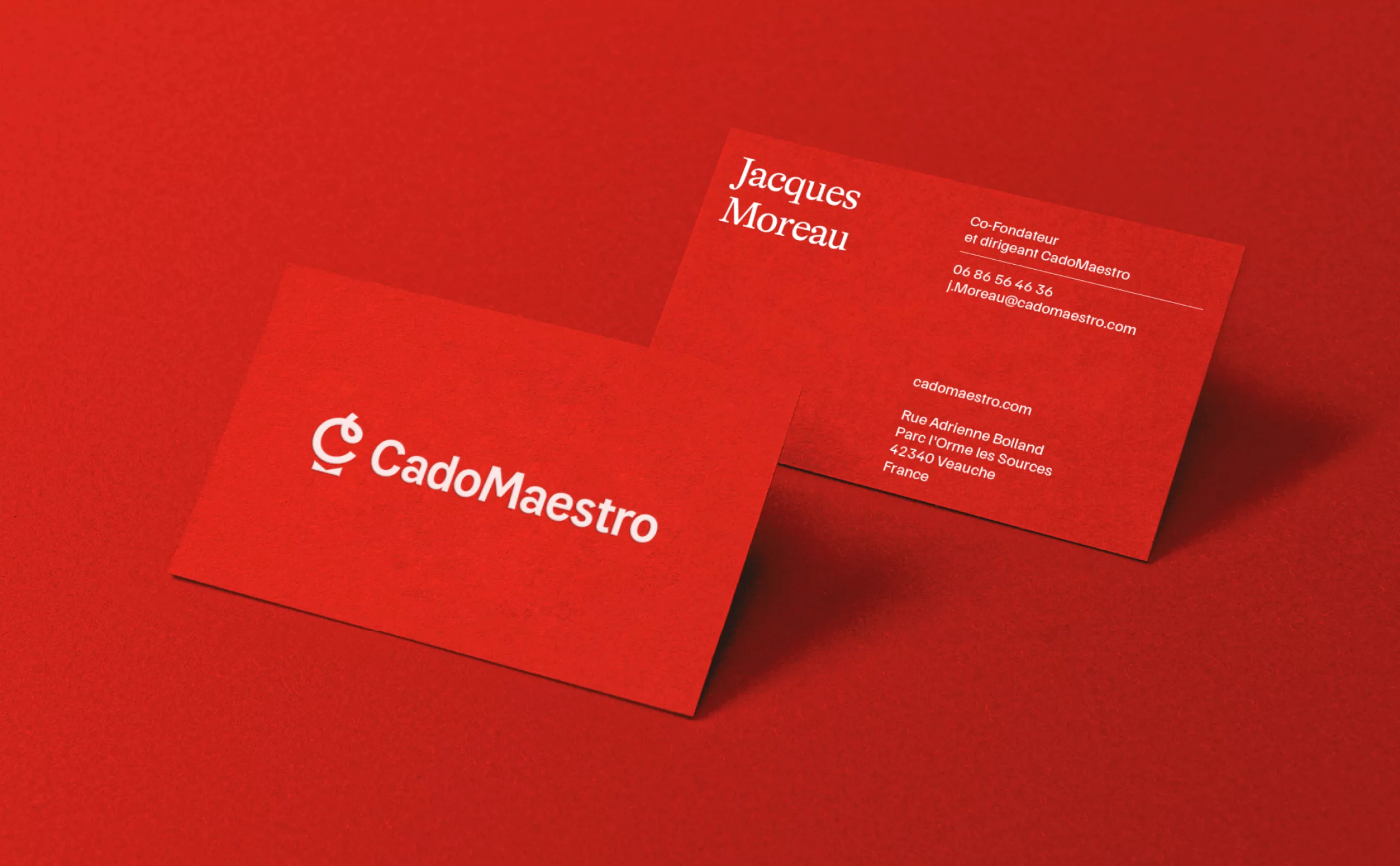
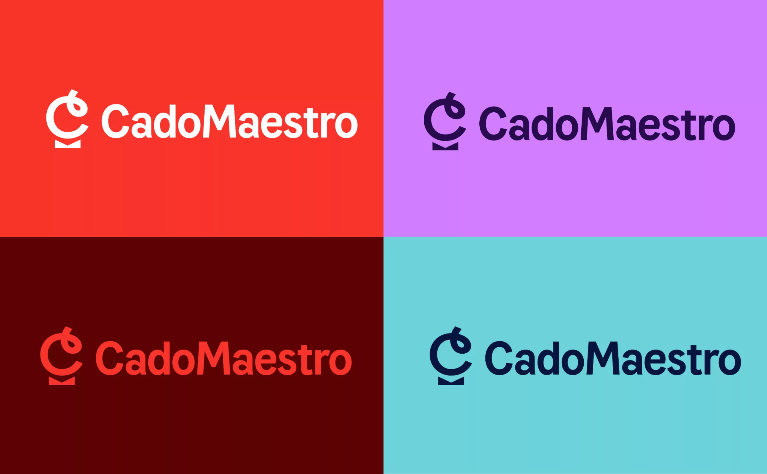
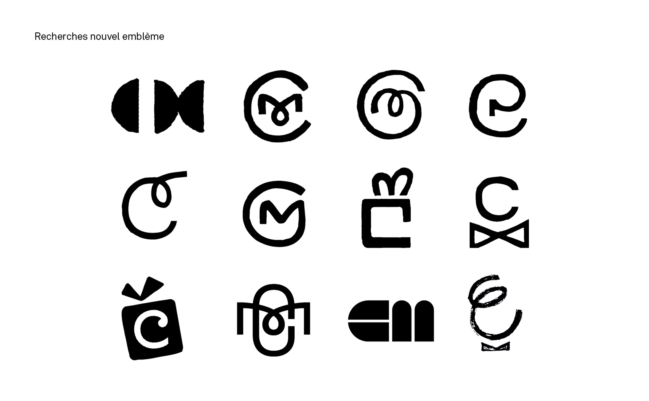
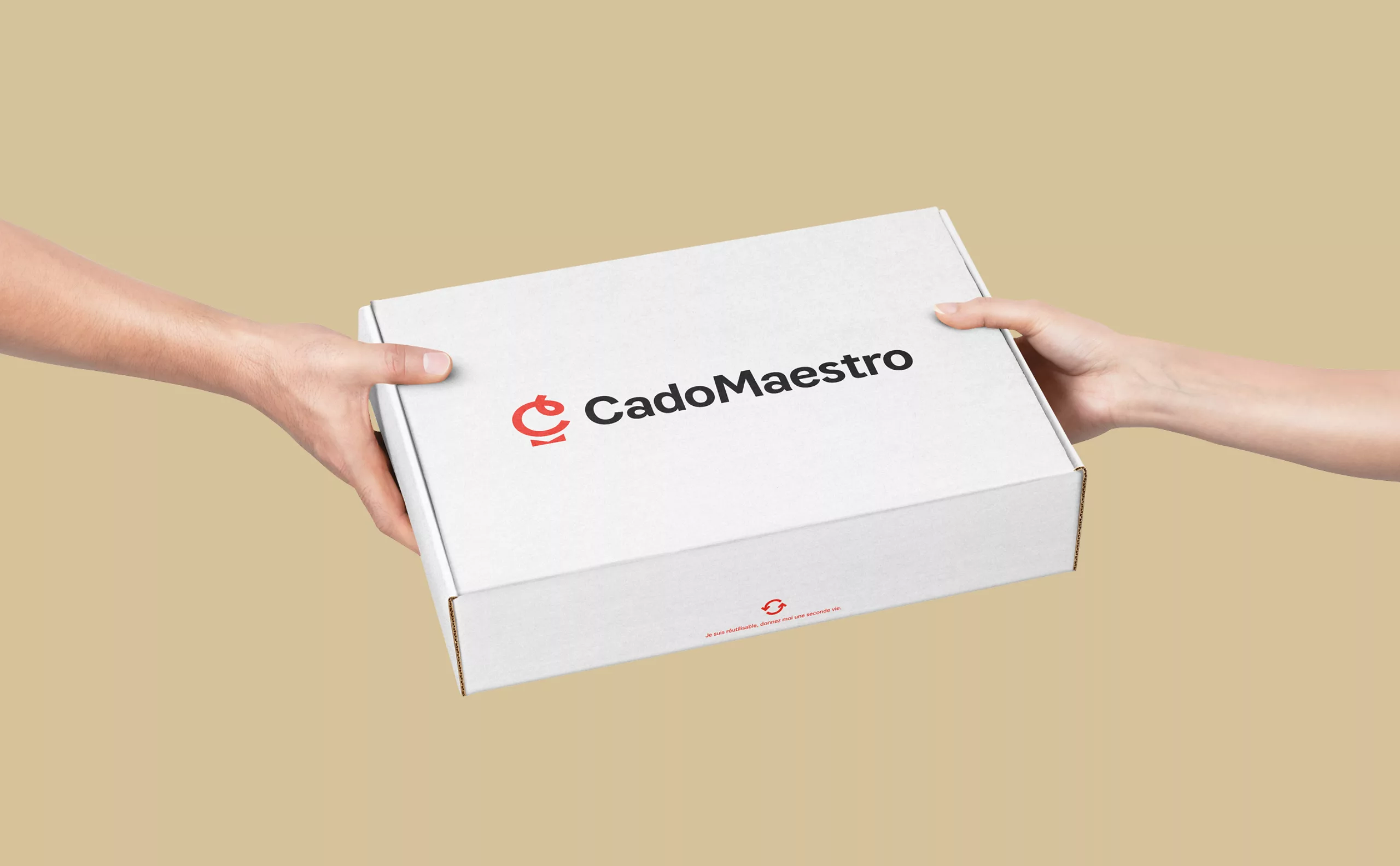
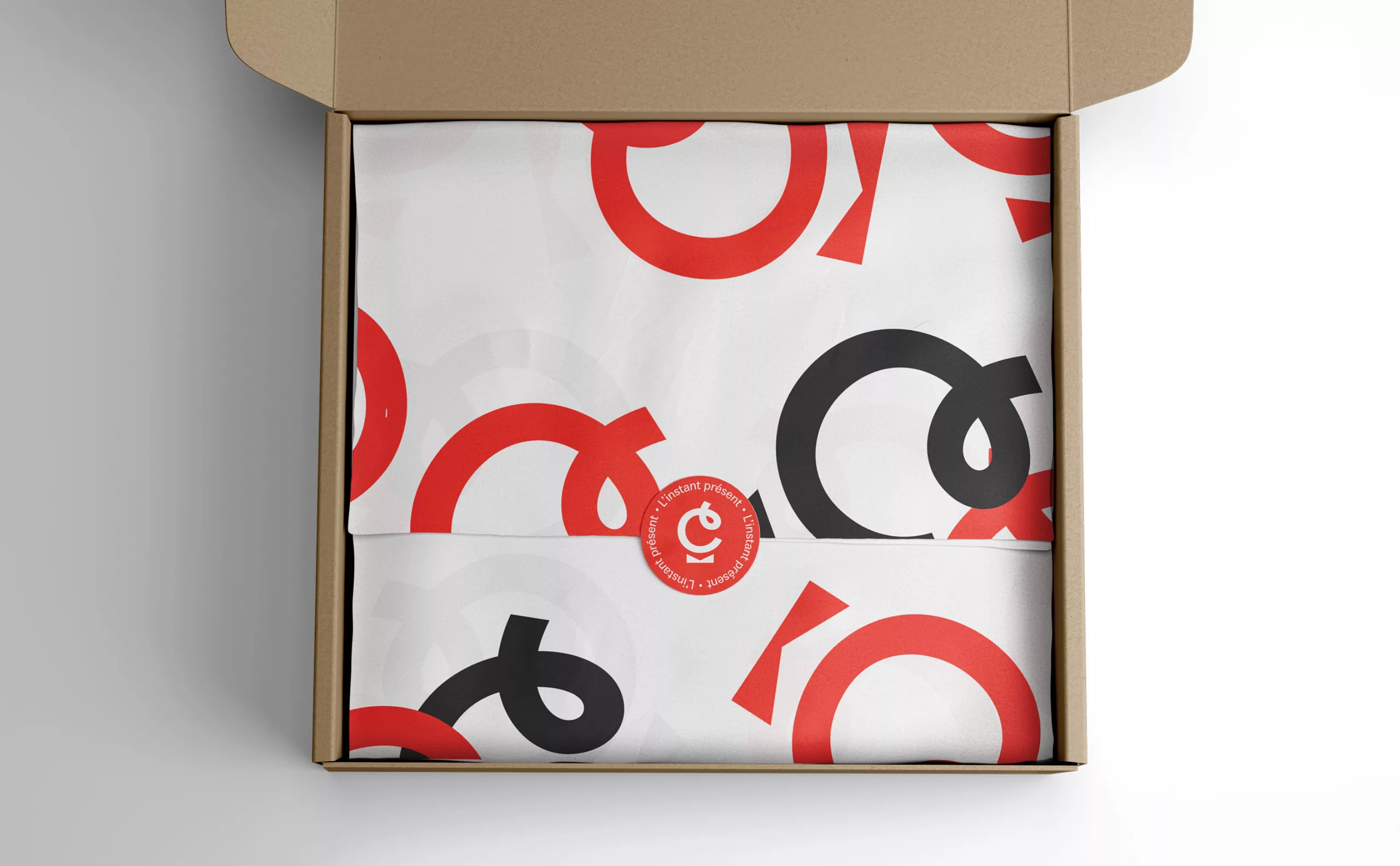
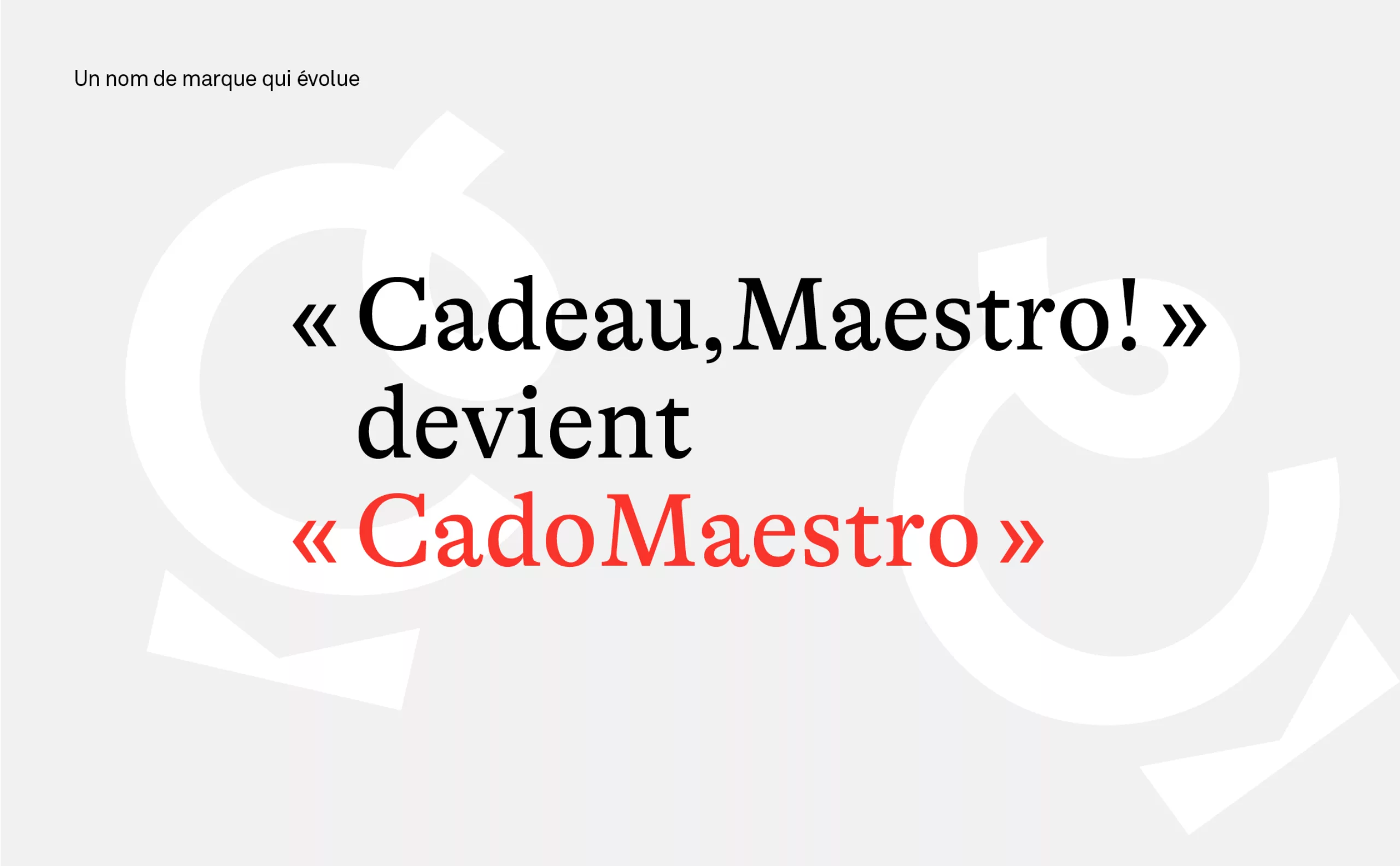
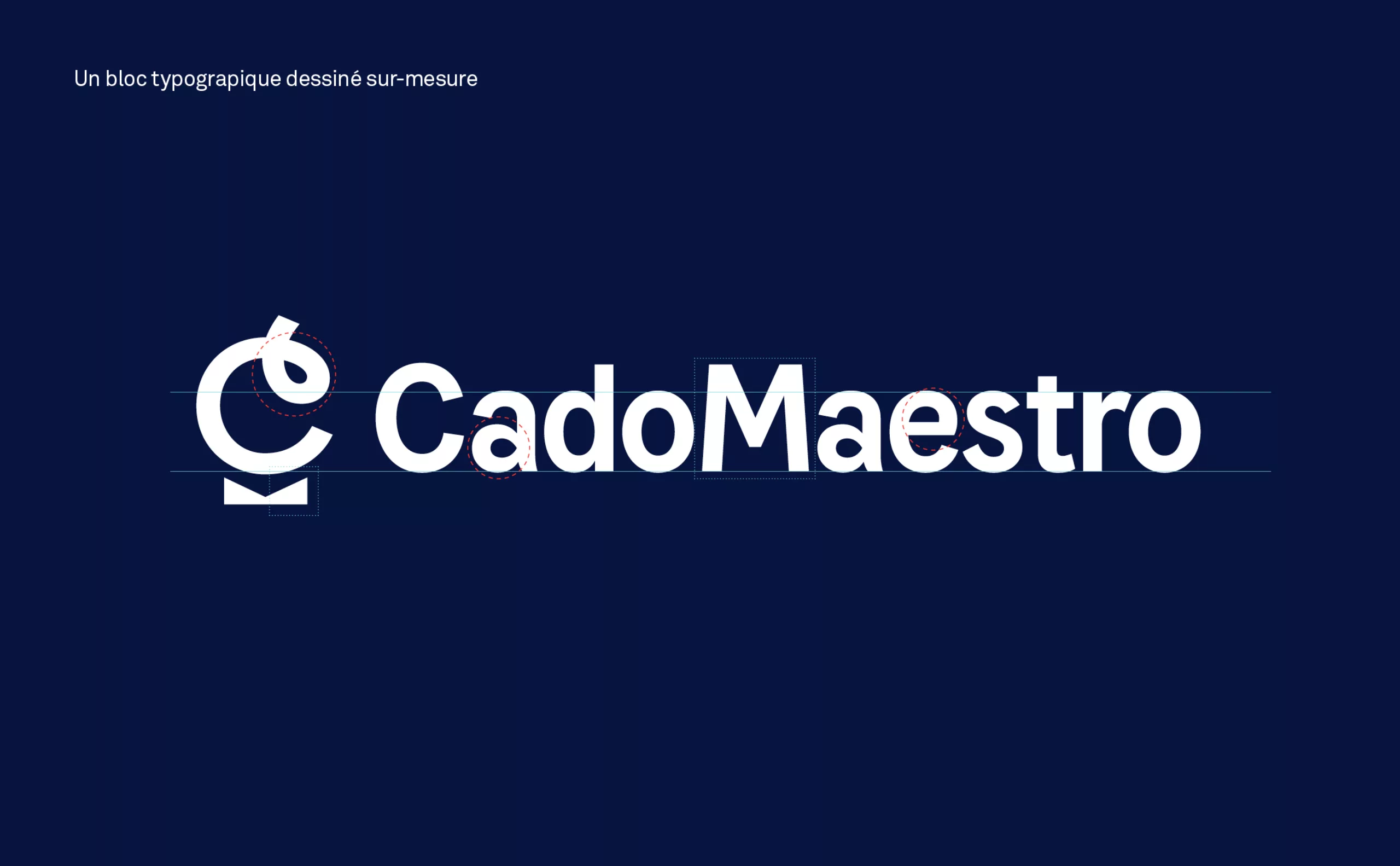
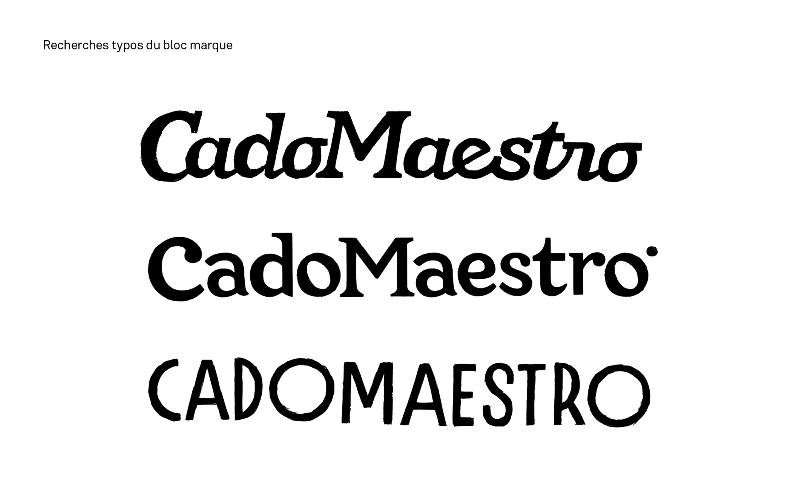
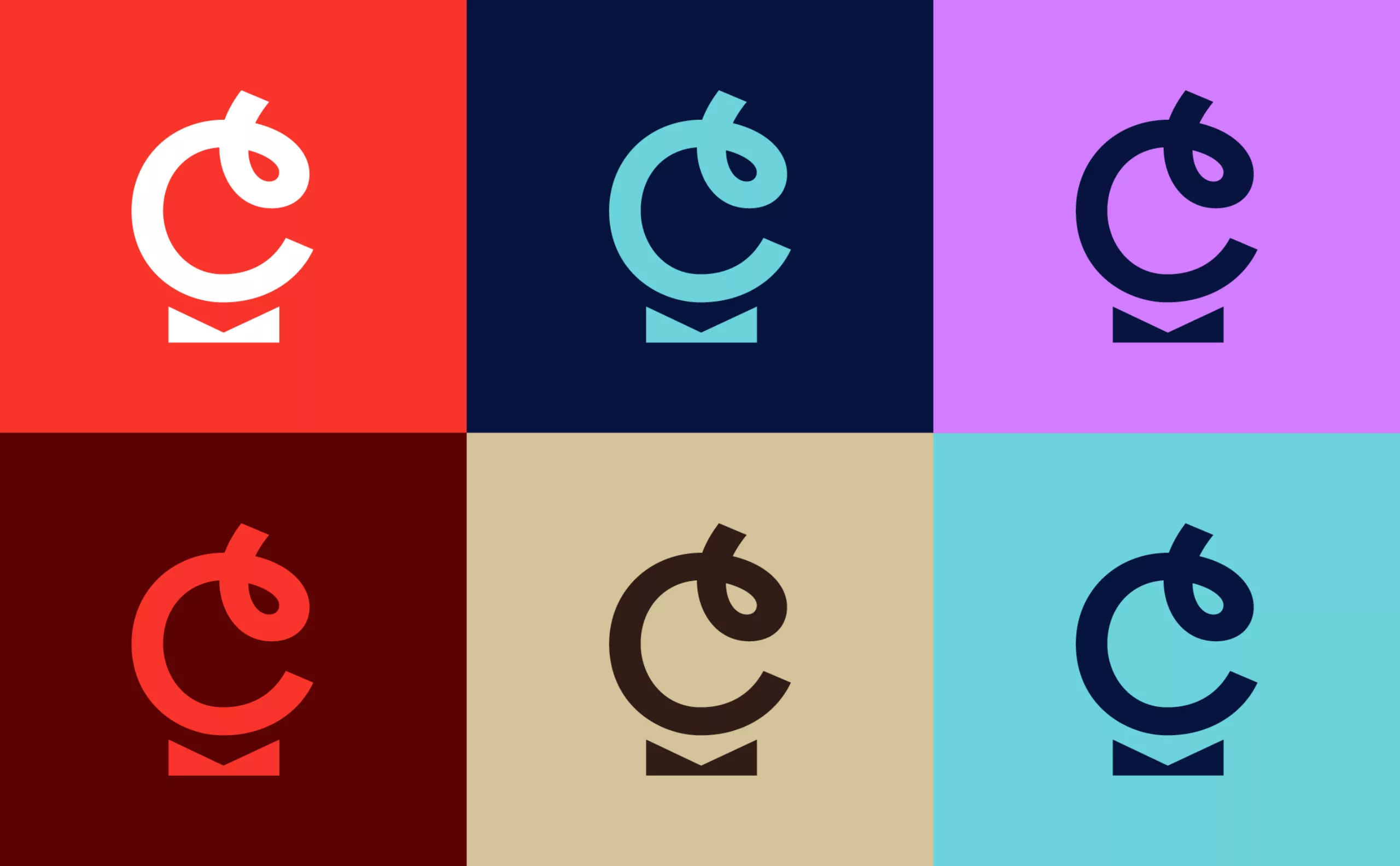
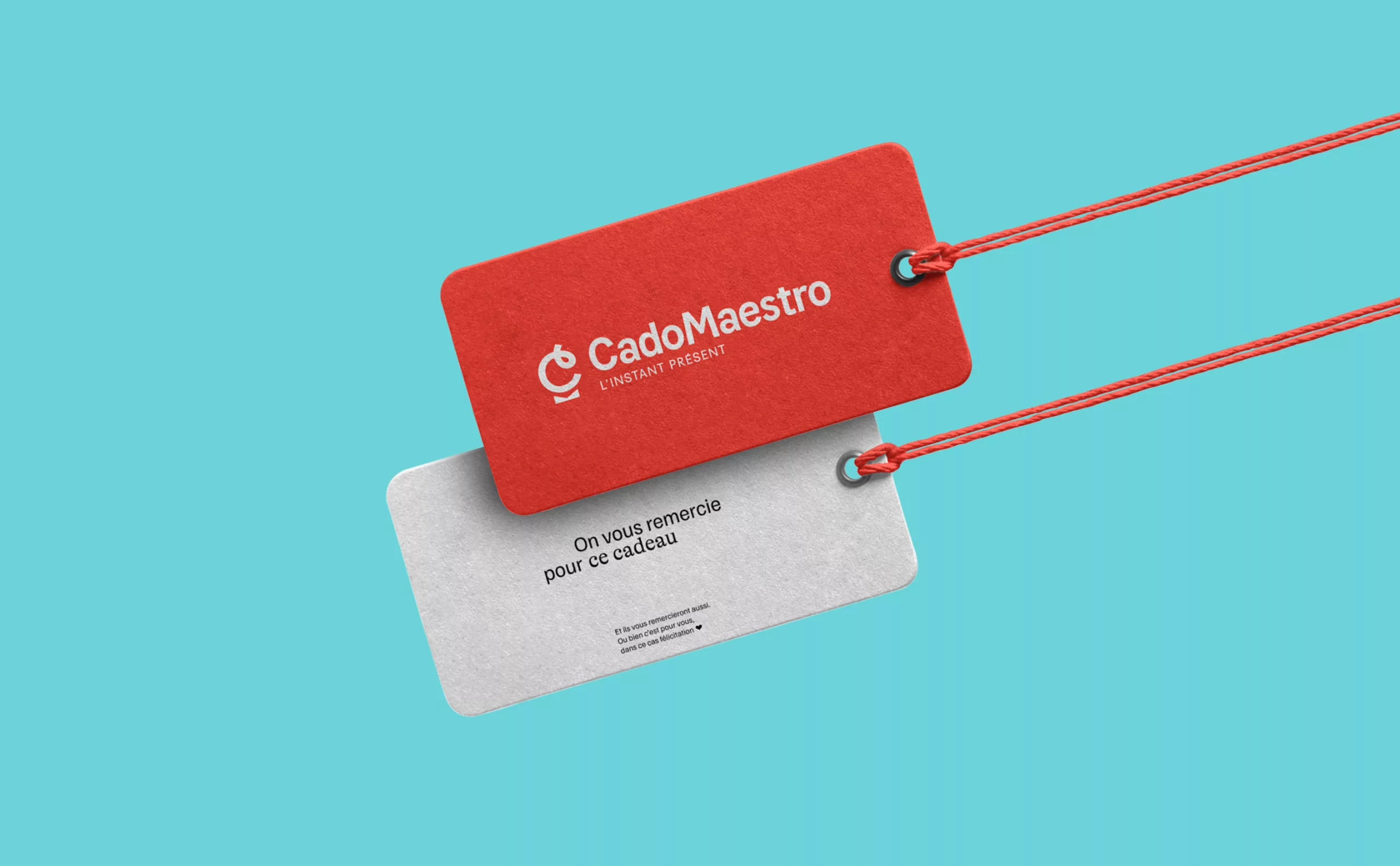
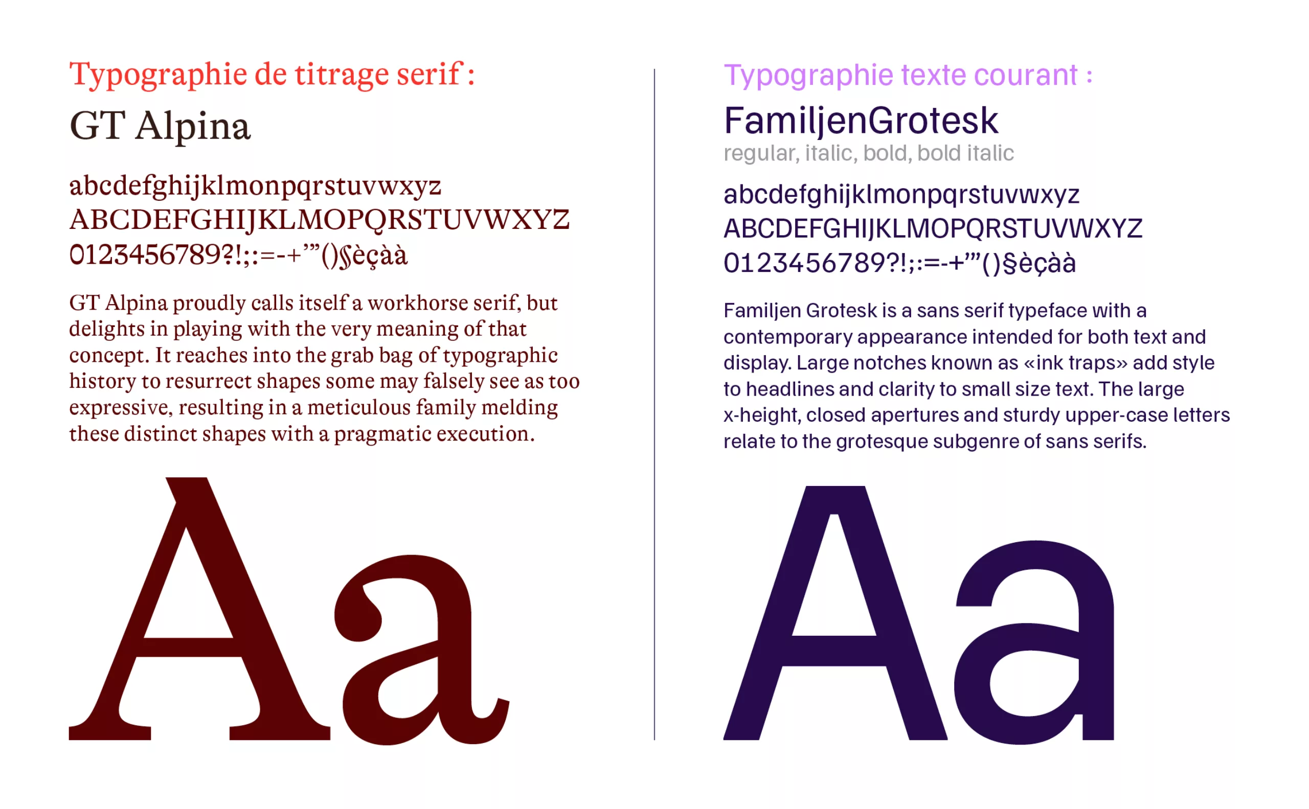
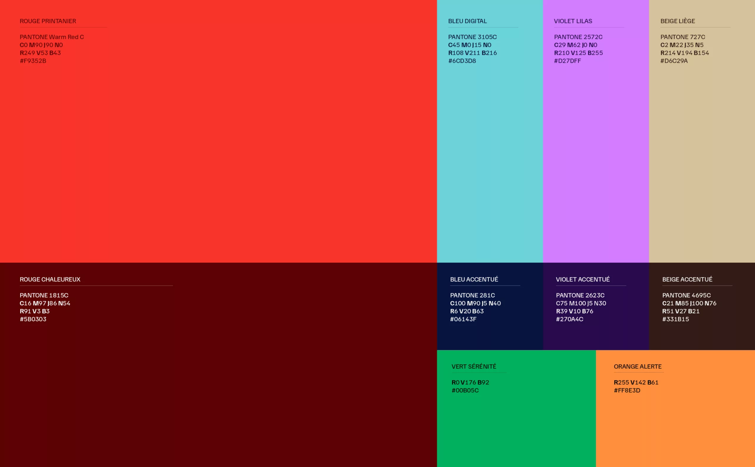
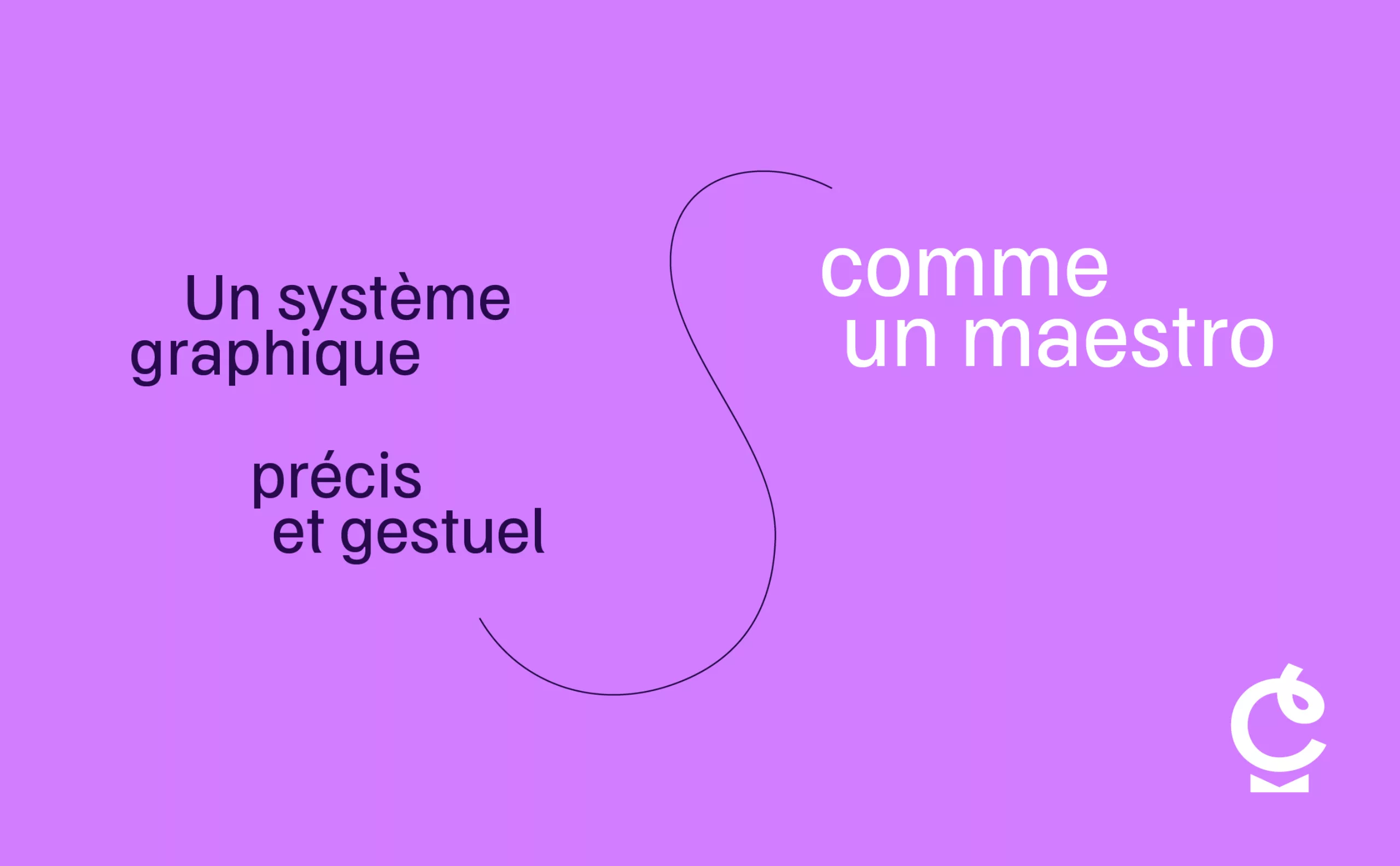
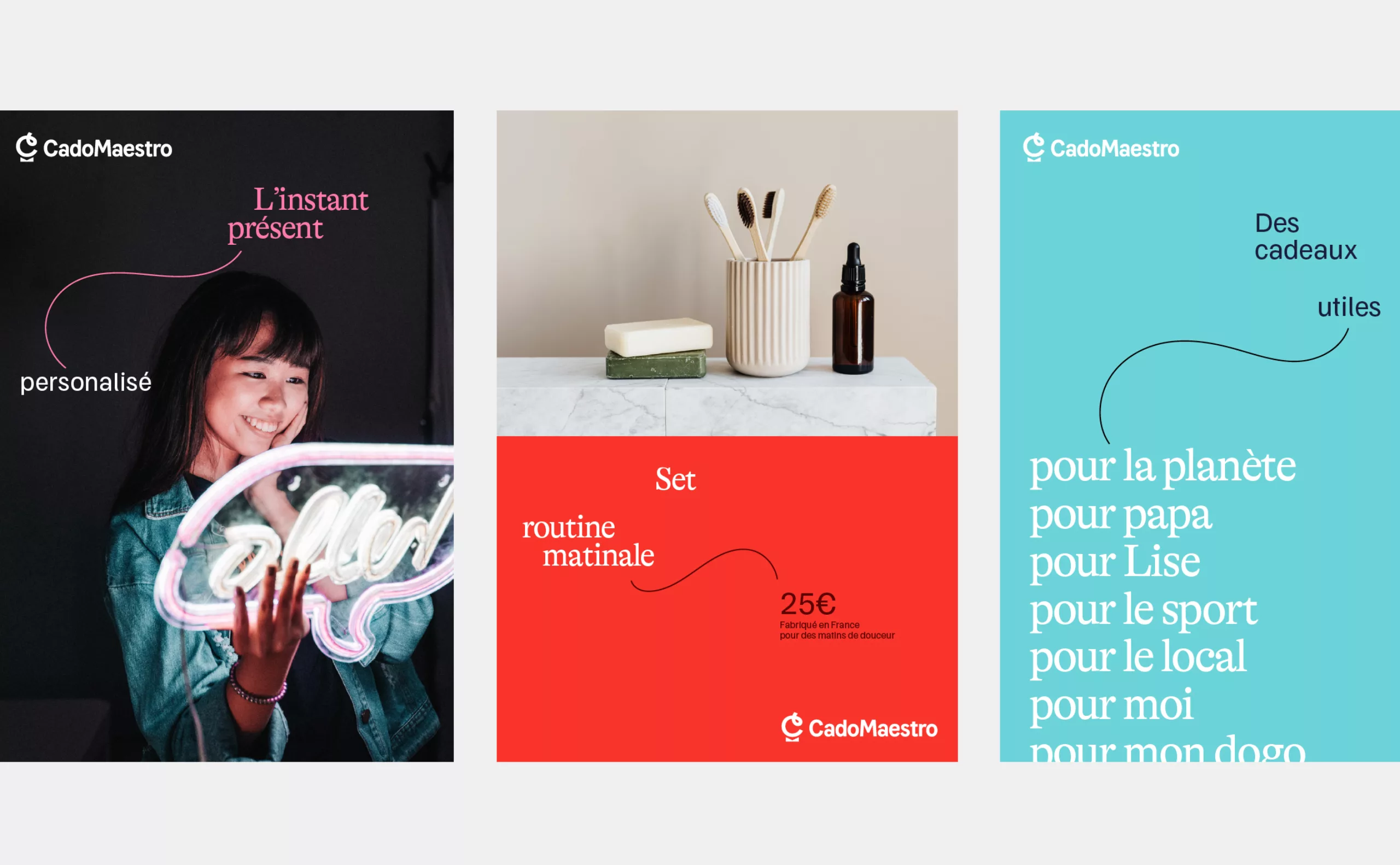
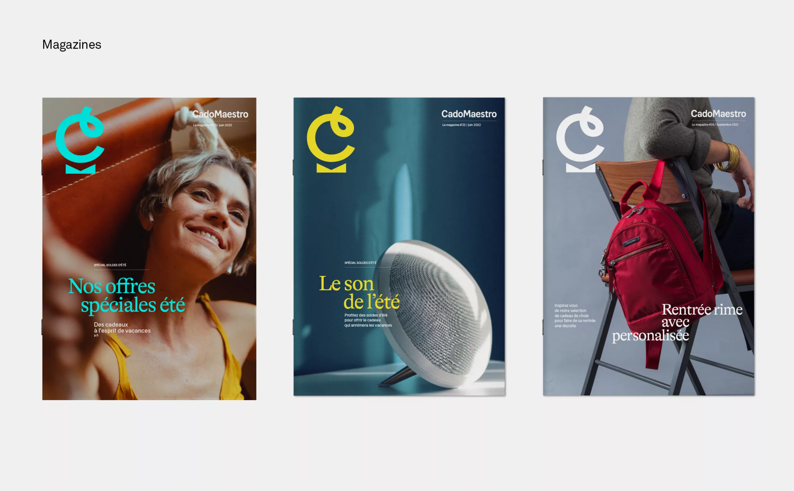
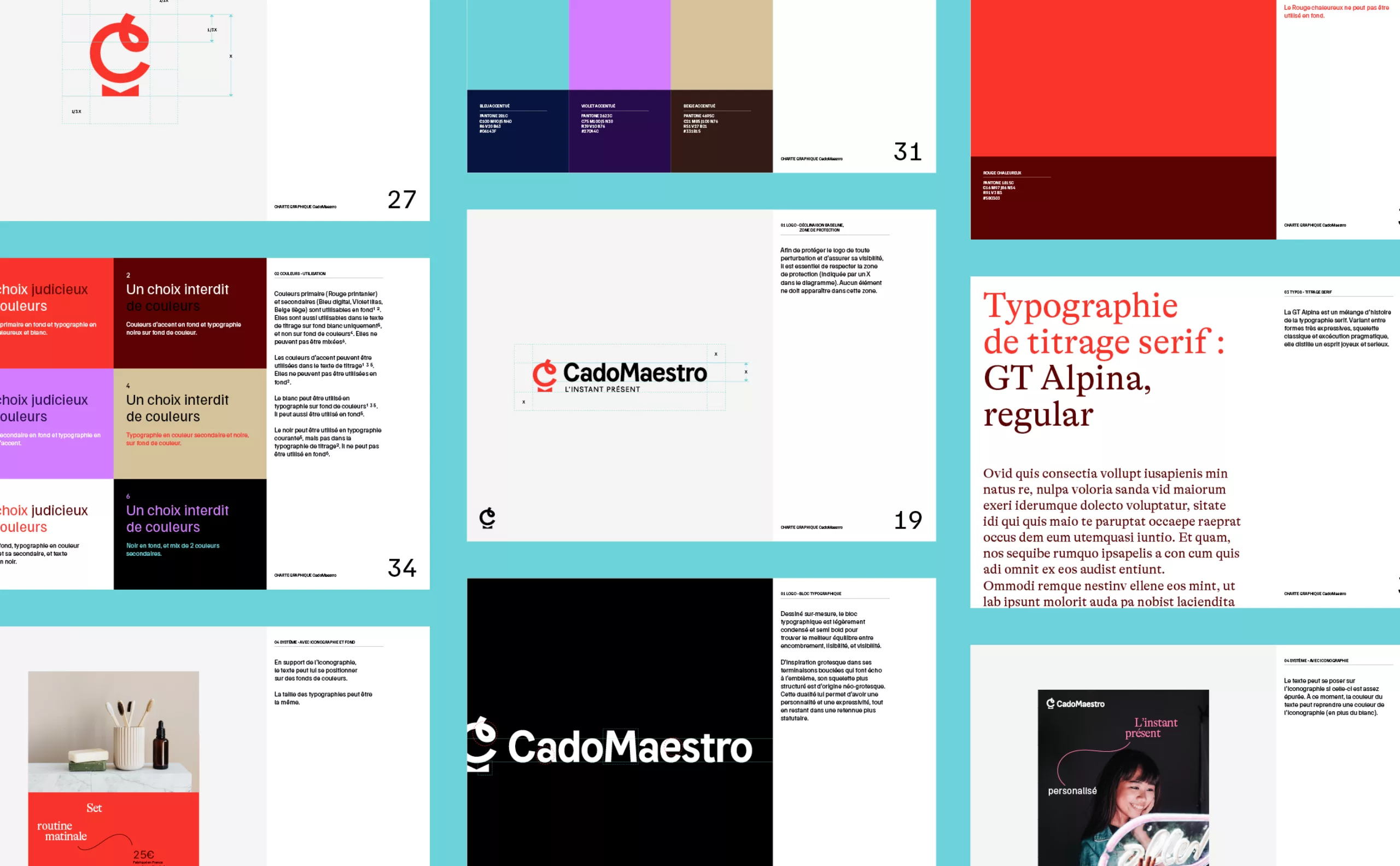
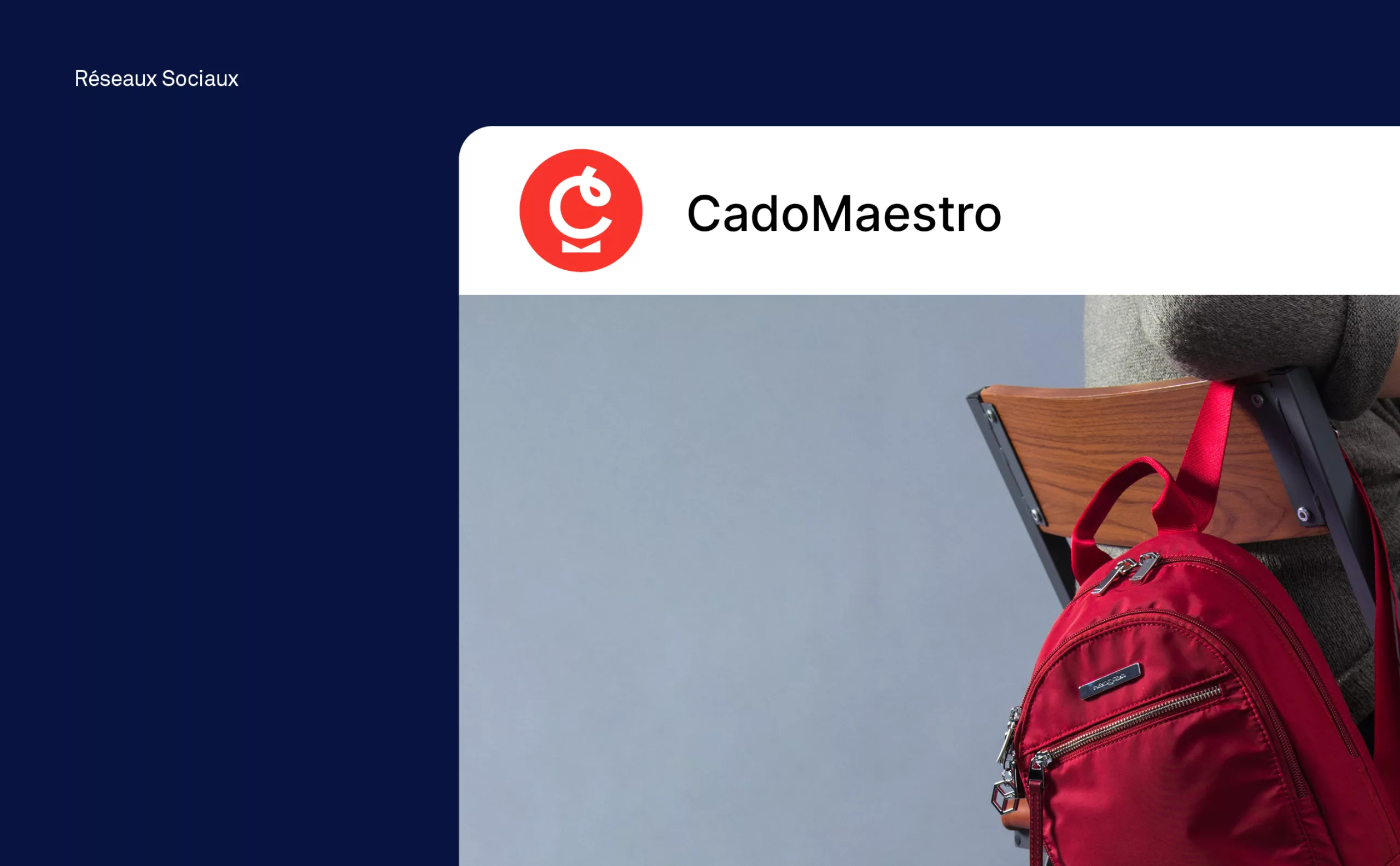
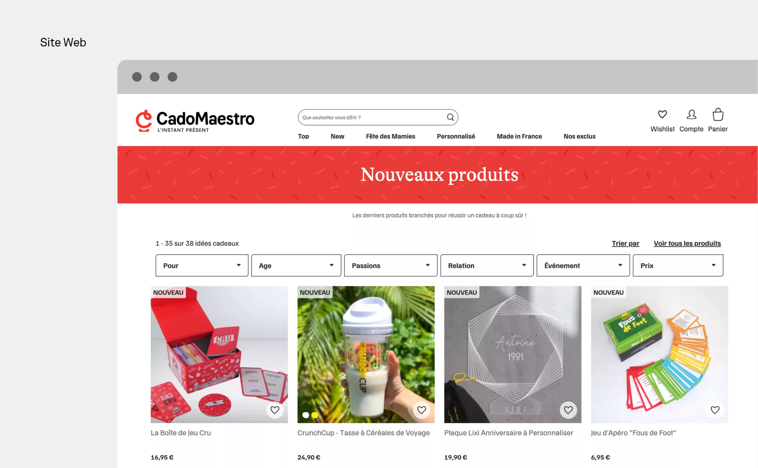
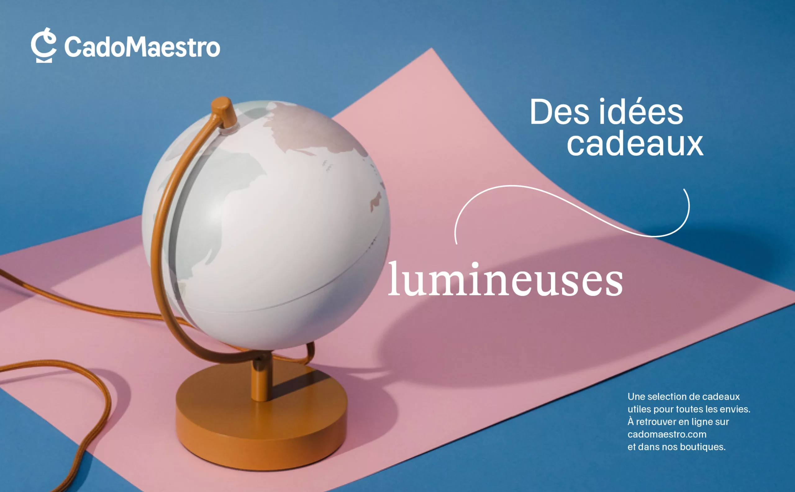
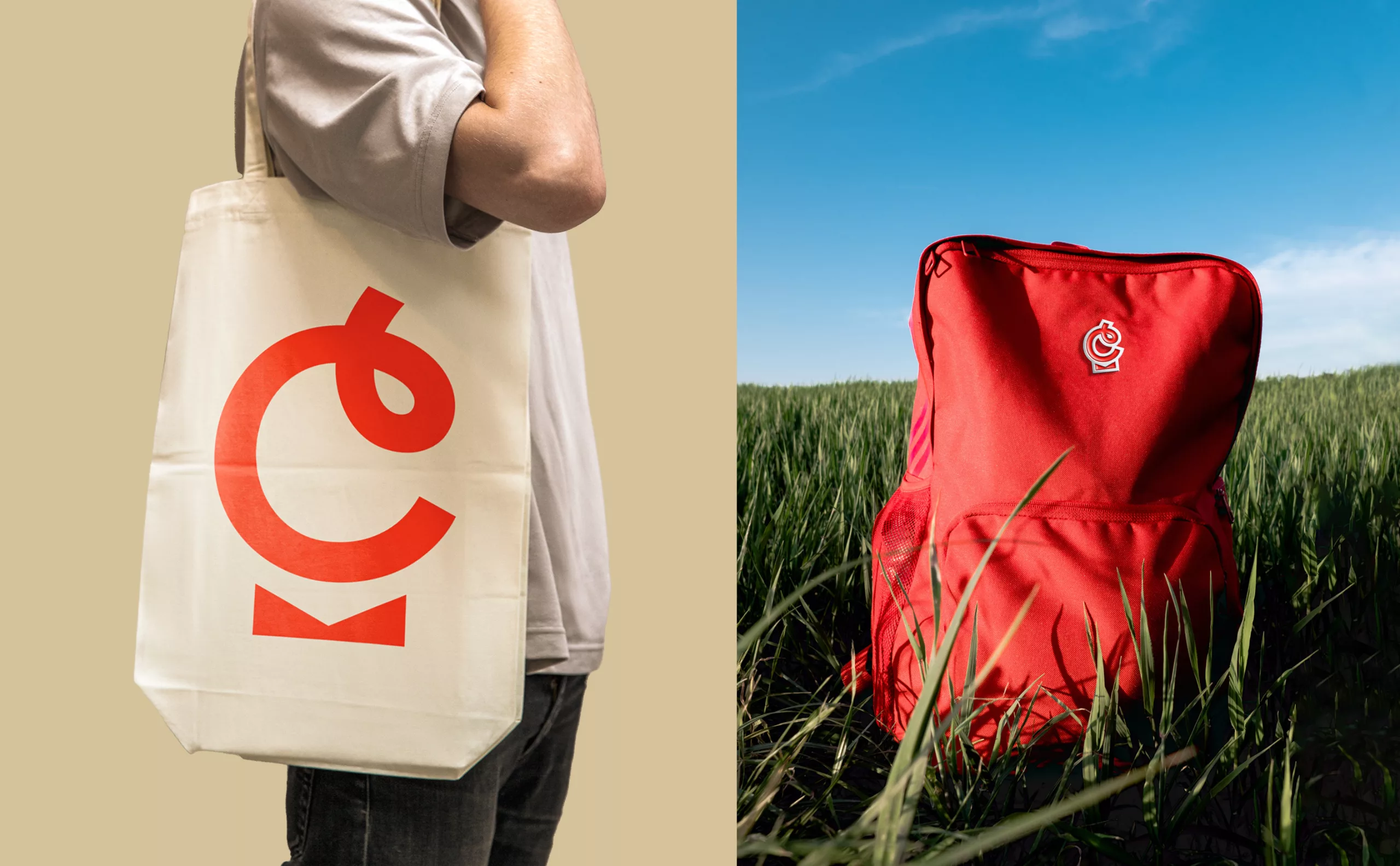
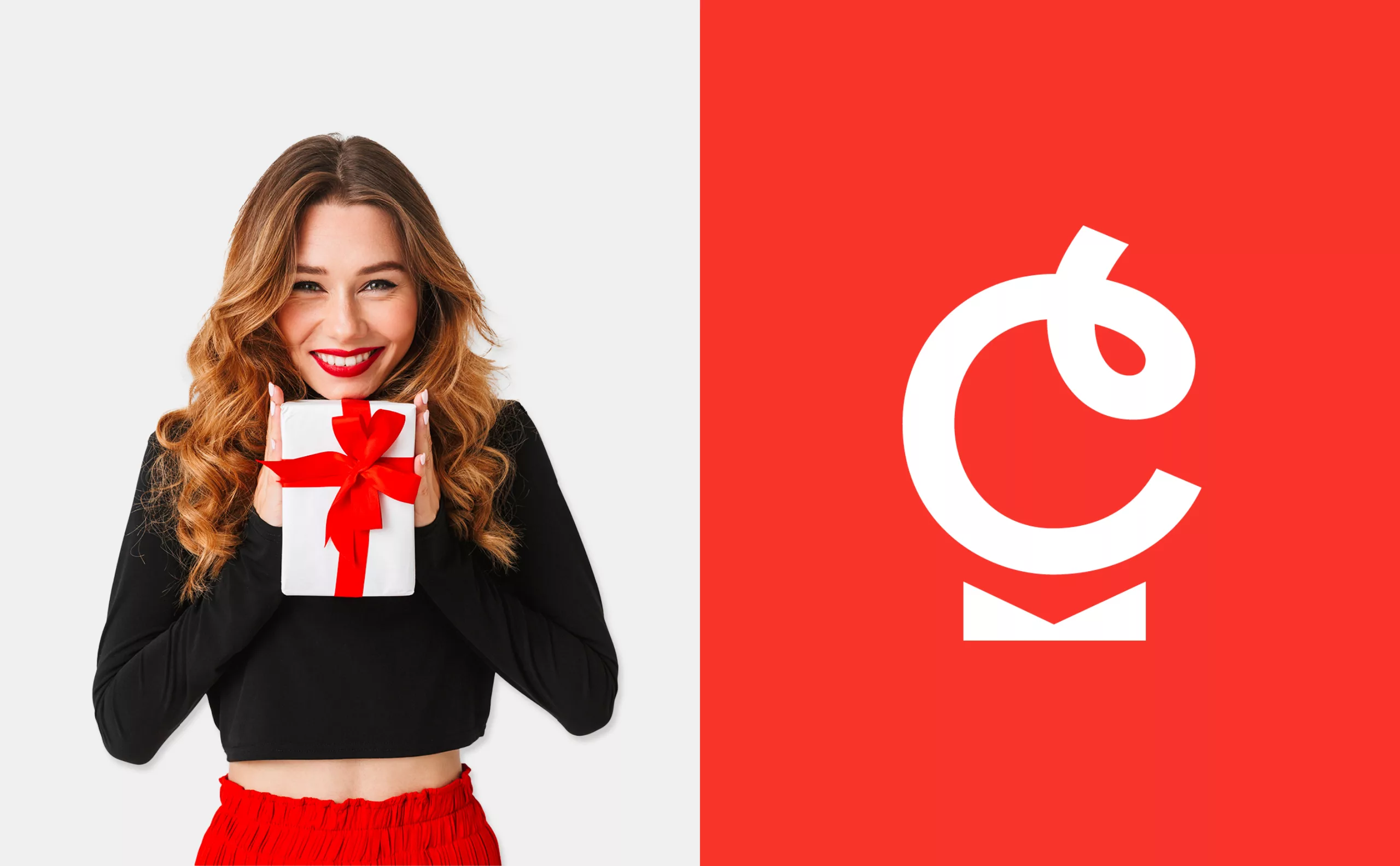
Cadeau,Maestro! wanted to revise its logo and brand territory to be in line with a new, more premium positioning. Graphéine modernised Cadeau,Maestro!'s brand image by assisting its teams with naming and visual identity consulting and creation.

A new brand name with a change of script

Our first recommendation was to change the spelling of the brand name. "Cadeau,Maestro!" becomes "CadoMaestro". This change retains the DNA of the company name in a more distinctive and shorter version, and therefore more impactful. Changing the way the brand is written was a major challenge. The importance of this seemingly minor change can be seen in the number of media in which the brand name appears. The pronunciation remains the same in order to maintain the brand's reputation.

The repetition of the O at the end of Cado and Maestro creates a graphic and sound resonance. This allows it to be written as one word, without spaces. Conceptually, the CadoMaestro brand becomes even more original and distinctive. This strengthens the brand and frees the imagination for product development. The simplified spelling also makes the brand easier to understand for the international market.

Redesigning Cadeau Maestro’s logo

Cadeau,Maestro! aimed to improve brand awareness and differentiate itself from the market. In the old logotype, the "gift" pictogram enclosed the word "Gift". Furthermore, this symbol was not designed to stand alone, nor to be a strong brand emblem. By removing the gift from the background, it improves the readability of the brand. The typographic block was redesigned and customised to reflect the aesthetic of the gift bow in the letters a.

The comma between Gift and Maestro was cutting off and unnecessarily complicating the brand name. The final exclamation mark made the brand name seem like an interjection. The smile under Maestro was very reminiscent of the Amazon logo and added yet another unnecessary graphic element. All of these distractions have been removed to create a more readable logo.
With the logo, we also delivered a range of colours to install the new graphic charter. The brand's emblematic red has evolved to become fresher.

A new emblem to strengthen the brand

Until then, the brand did not really have an emblem. CadoMaestro lacked this to develop the product range. When the logo was used, the design was too 'advertising'. The emblem is the answer to this problem. It embodies the brand without being an advertising object. We have kept the idea of the gift by capturing the dynamics and emotion of its opening. The new ribbon emblem reveals the initial C of the brand and embodies the gesture and figure of the orchestra conductor. The opened gift package underlines the friendliness of the big "C" by becoming a bow tie, while creating in negative the M of Maestro.

The new CadoMaestro visual identity supports the company's evolutionary strategy. It is an optimistic and warm new image that brings the brand even closer to its customers. Its premium positioning offers potential for the development of new product lines.

Context

With 600,000 customers and 700,000 orders shipped since its creation in 2009 in Saint-Etienne, the e-commerce company Cadeau,Maestro! now based in Veauche, dominates the French "original gift market on the Internet". Decorative items, high-tech, games, cooking, travel, love, wellness: it offers 3,000 references and 1,000 customizable gifts, a fast-growing niche like B2B and private labels.

Objectives

According to Sylvain Bruyère, co-founder of the company with his partner Charline Sagnard, Cadeau,Maestro! can no longer be a simple e-business. The logo and the new charter must better reflect the qualitative dimension of Cadeau,Maestro! products. The aim is to move away from the "gadgetry" image that some customers may have when visiting the website.


Share this project:
Project expertise:
Logo creation, visual identity and graphic guidelines. Creation of brand and company names.
Type of client:
Communication agency in the consulting and services sector. Strategy or management consulting, operational consulting, digital services companies (ESN) formerly SSII or SS2I, but also all services to companies, or "B to B services" (for business to business).

Related projects: