Renaissances_brand_identity_logo_header

2022

Renaissances, real estate promotion - Brand identity
To rehabilitate a building is to write a new paragraph in its history

Groupe Bâtisseurs d’Avenir, with more than 30 years of experience in real estate development, has been responsible for the rehabilitation of many buildings. Renaissances Promotion was born from this rich experience, an additional expertise at the service of projects and territories. Renaissances works for the development of a living heritage, open to the city, which gives meaning to real estate and urban projects.

Graphéine accompanied Renaissances in the definition of its brand story, the creation of its visual identity and its communication materials.

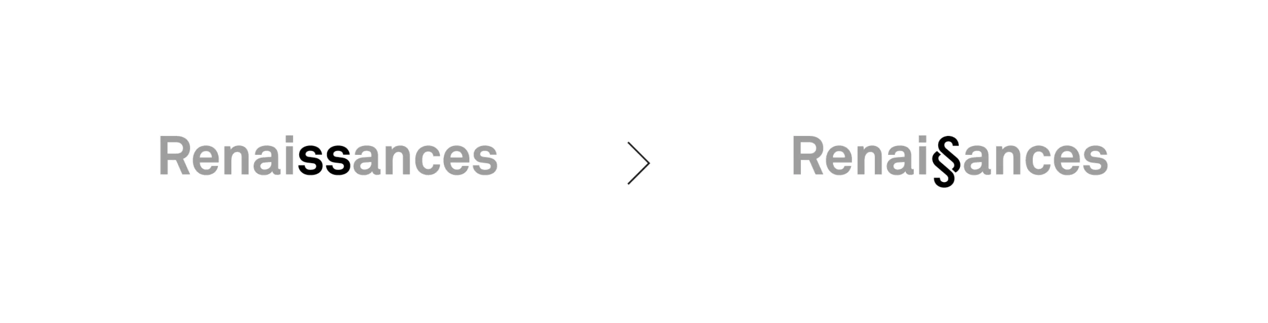
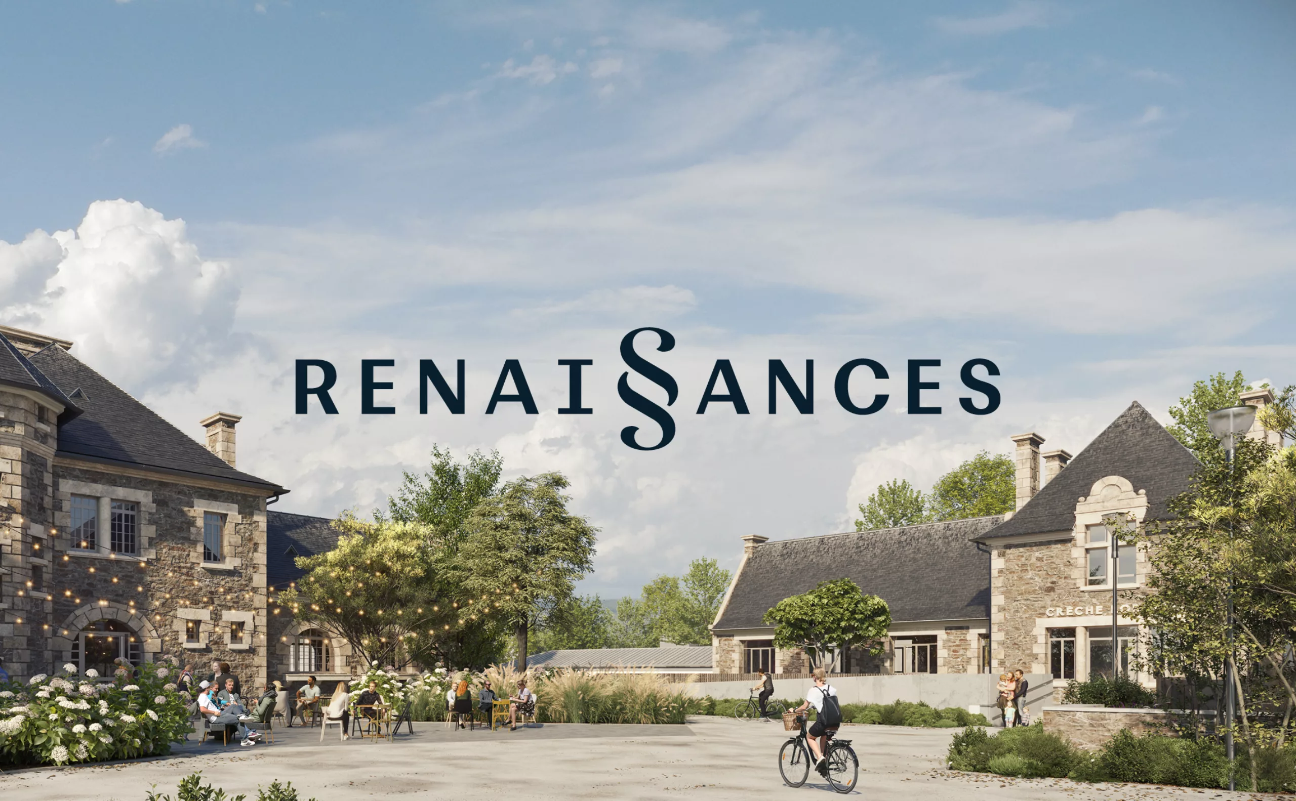
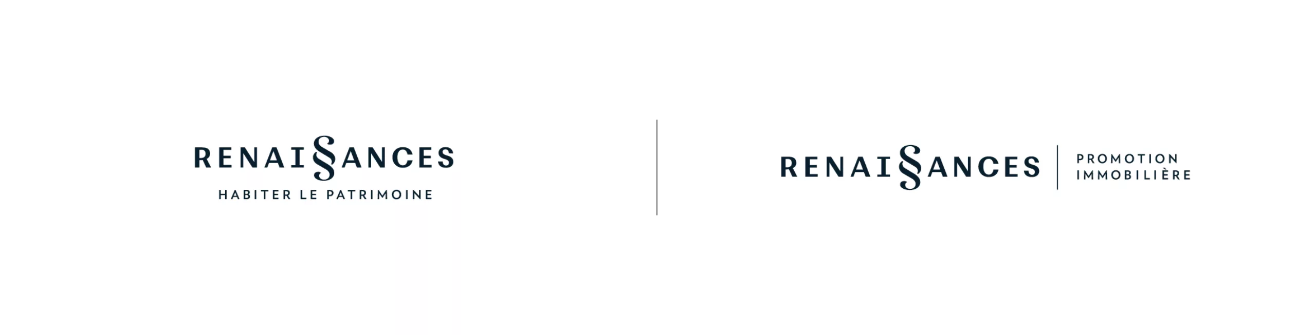
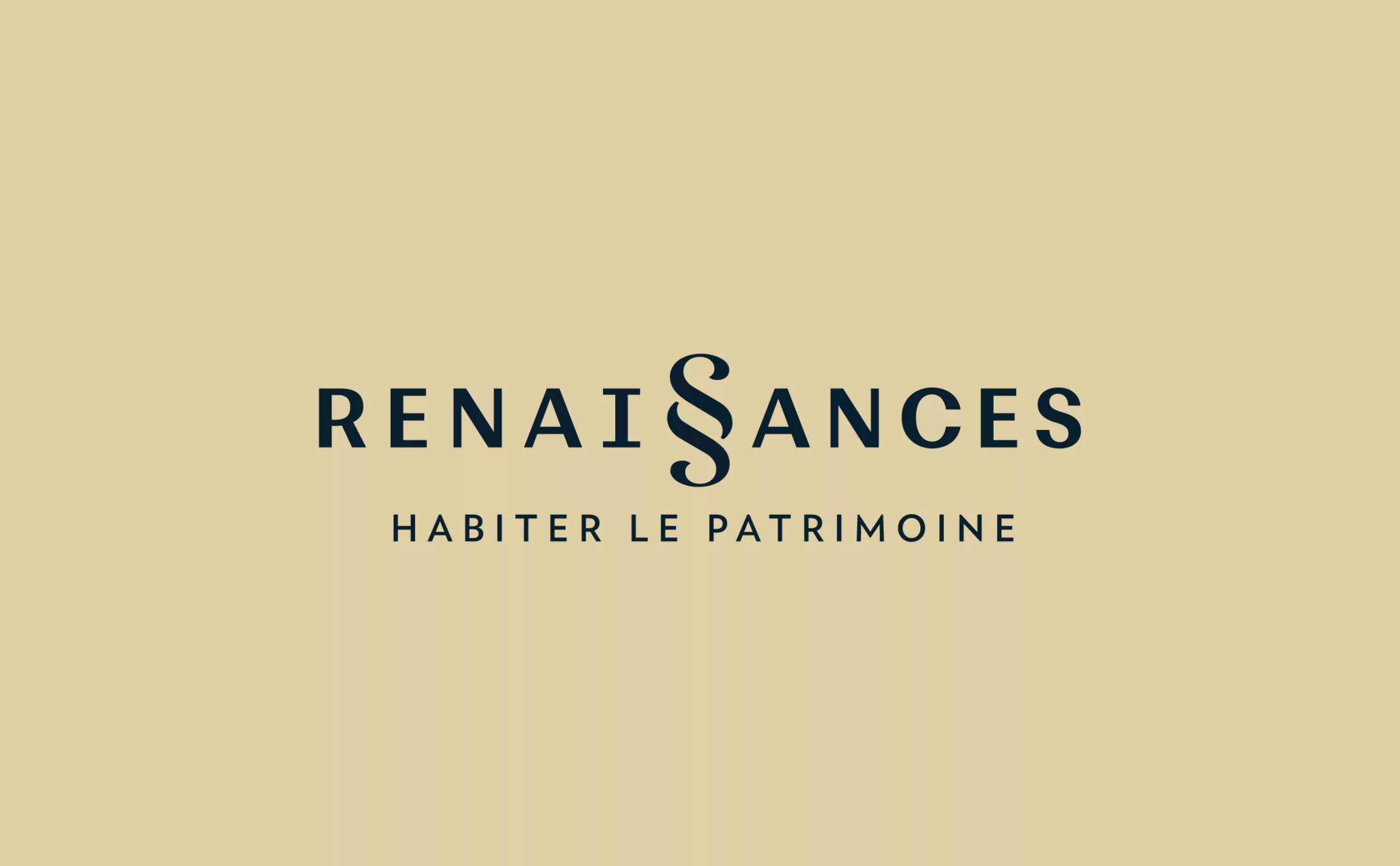
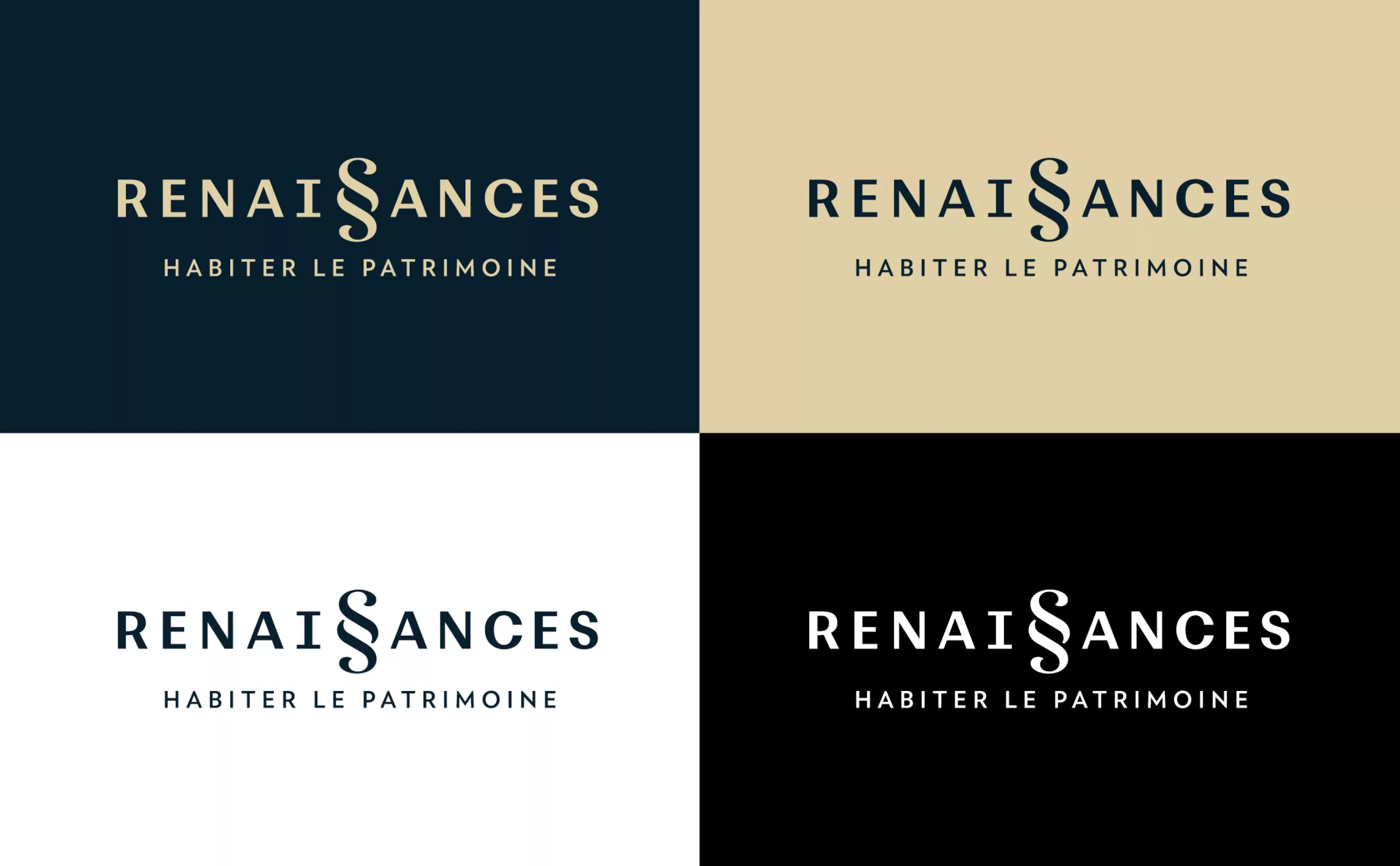
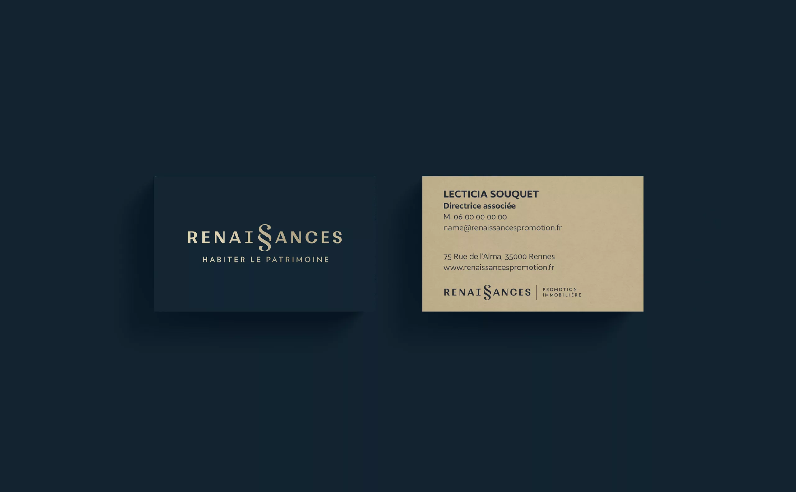
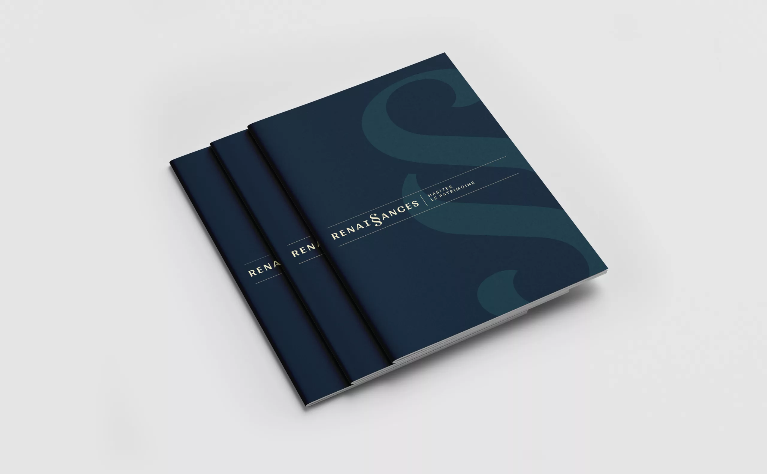
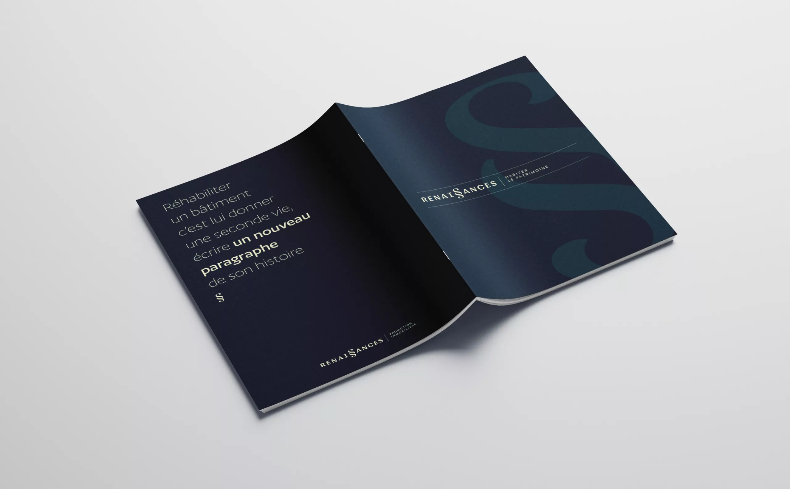
Renaissances becomes Renai§ances
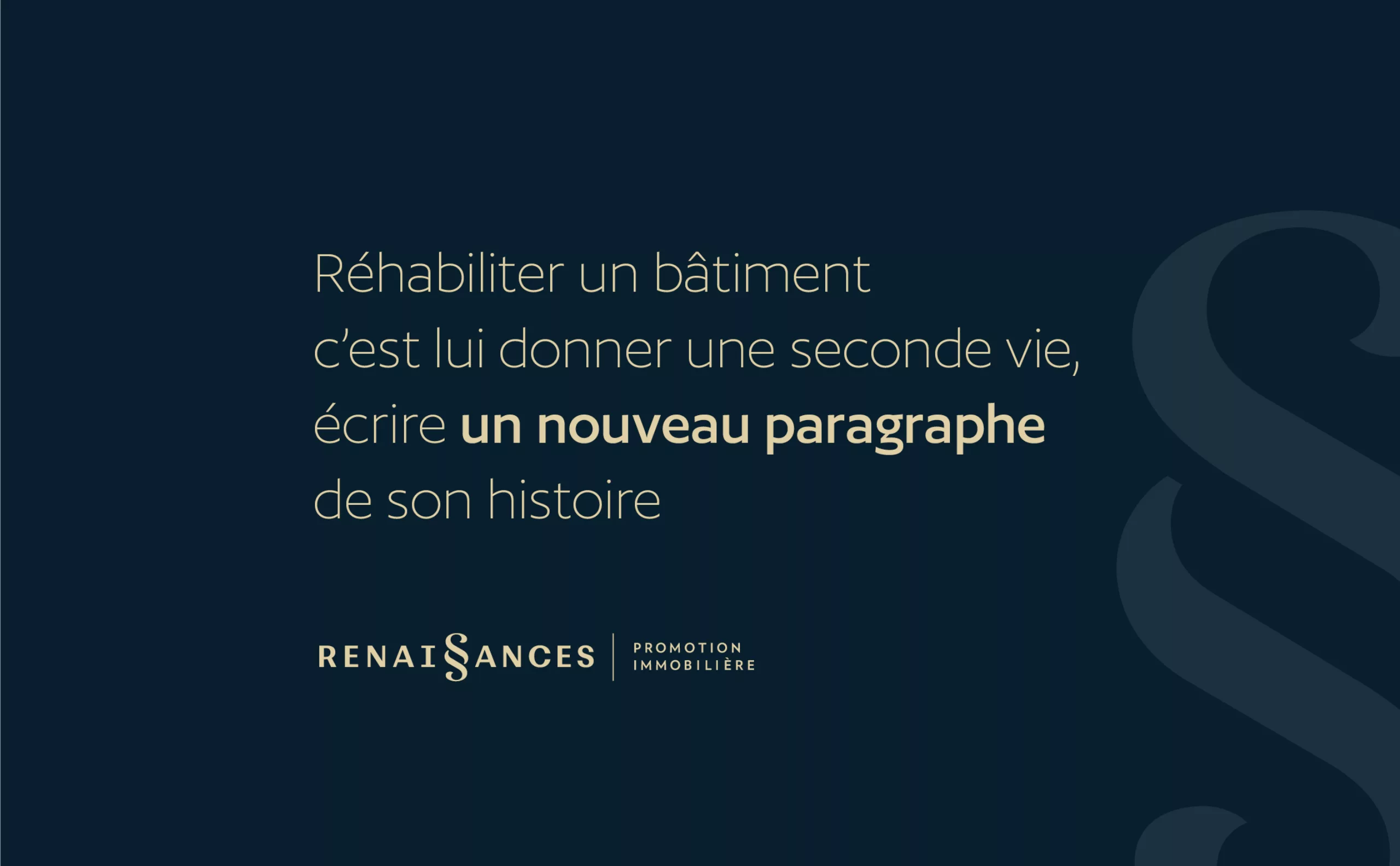
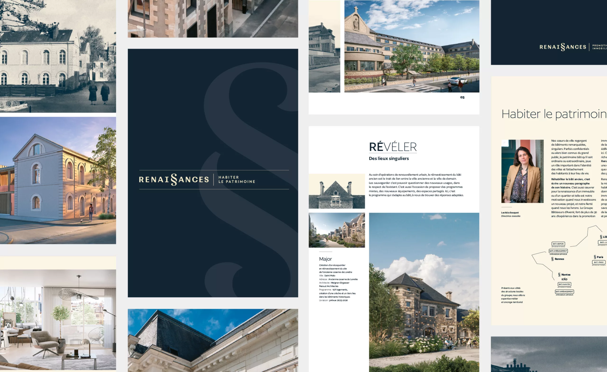
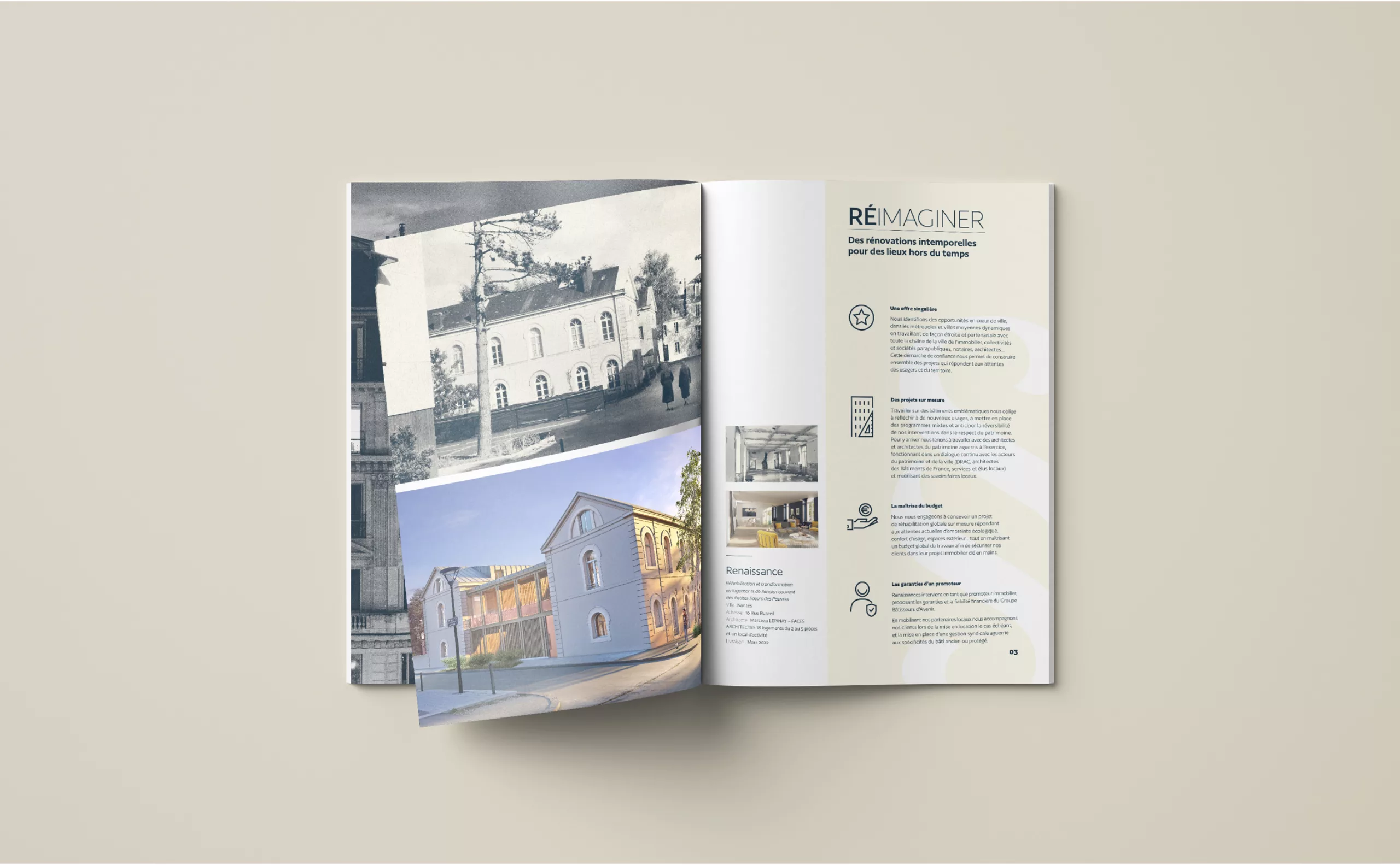
"To rehabilitate a building is to give it a second life, to write a new paragraph in its history. It means prolonging a strong link between the different stages of its history to create a living and inhabited heritage. This is to promote a heritage place of life ". We built the history of the brand with the creation of this introductory text which sets out the vocation of Renaissances. It's also this text that led us to the creation of its visual identity.

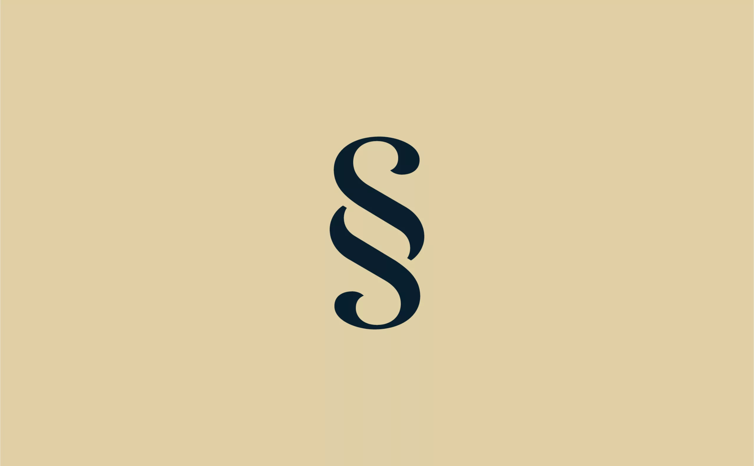
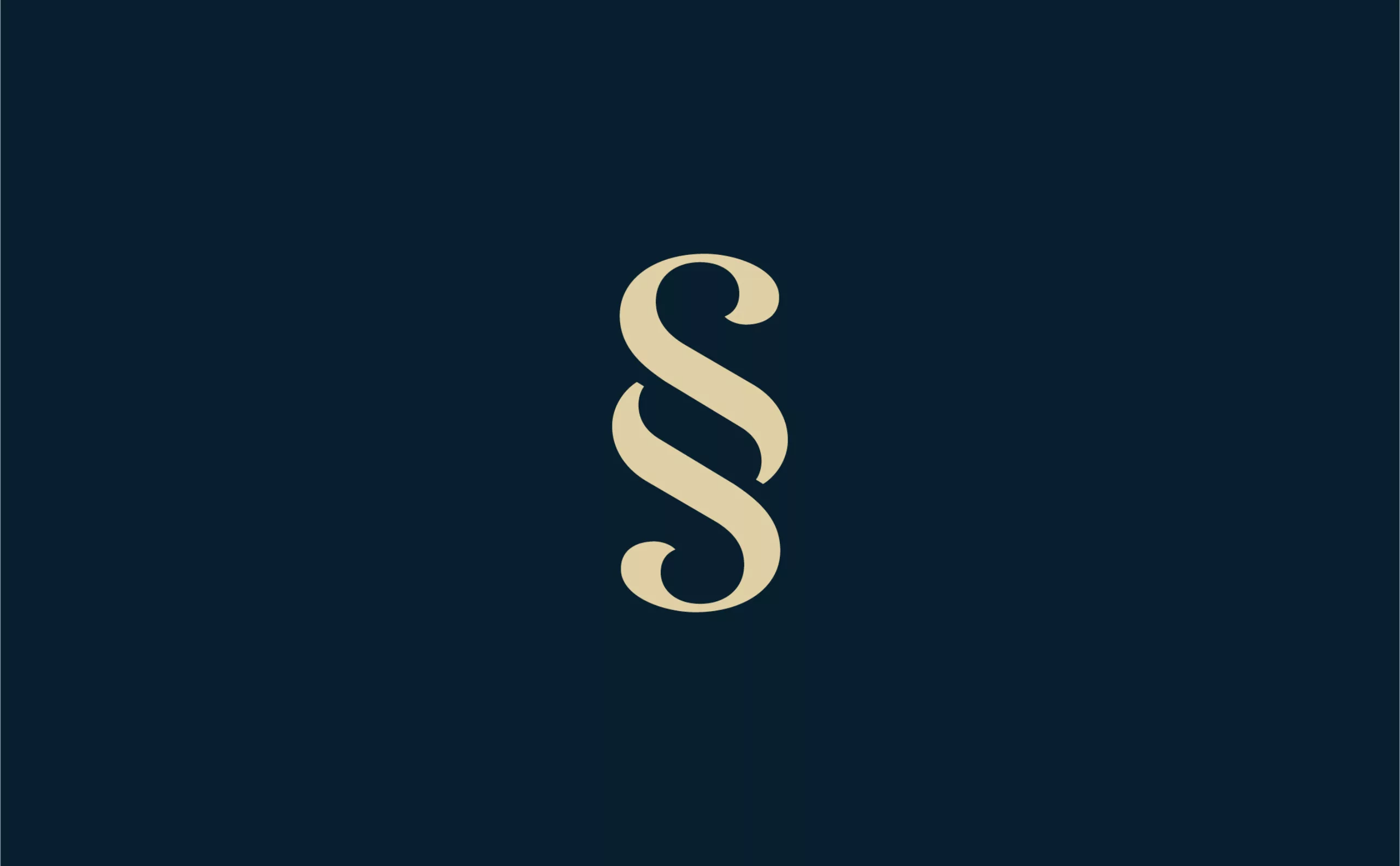
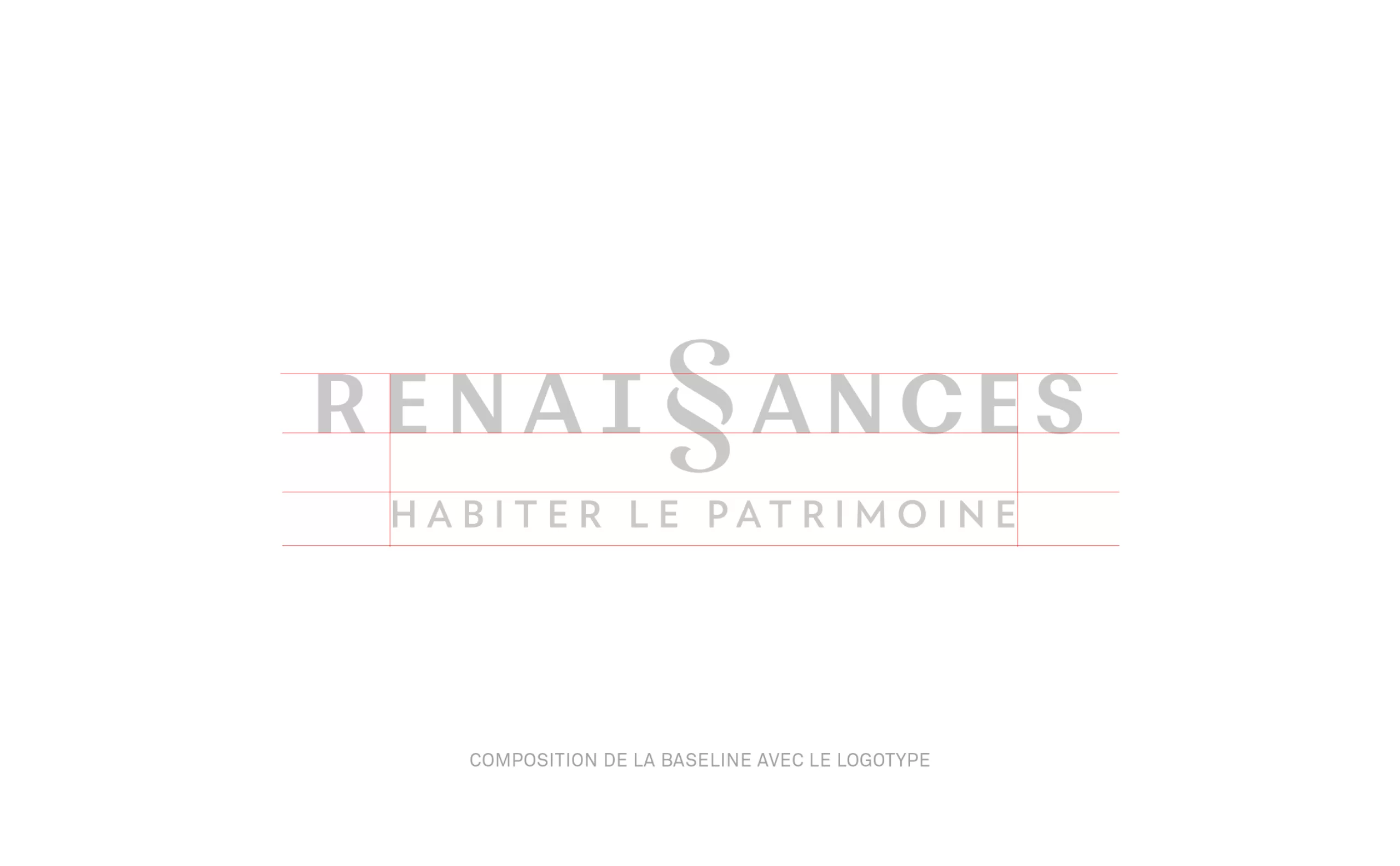
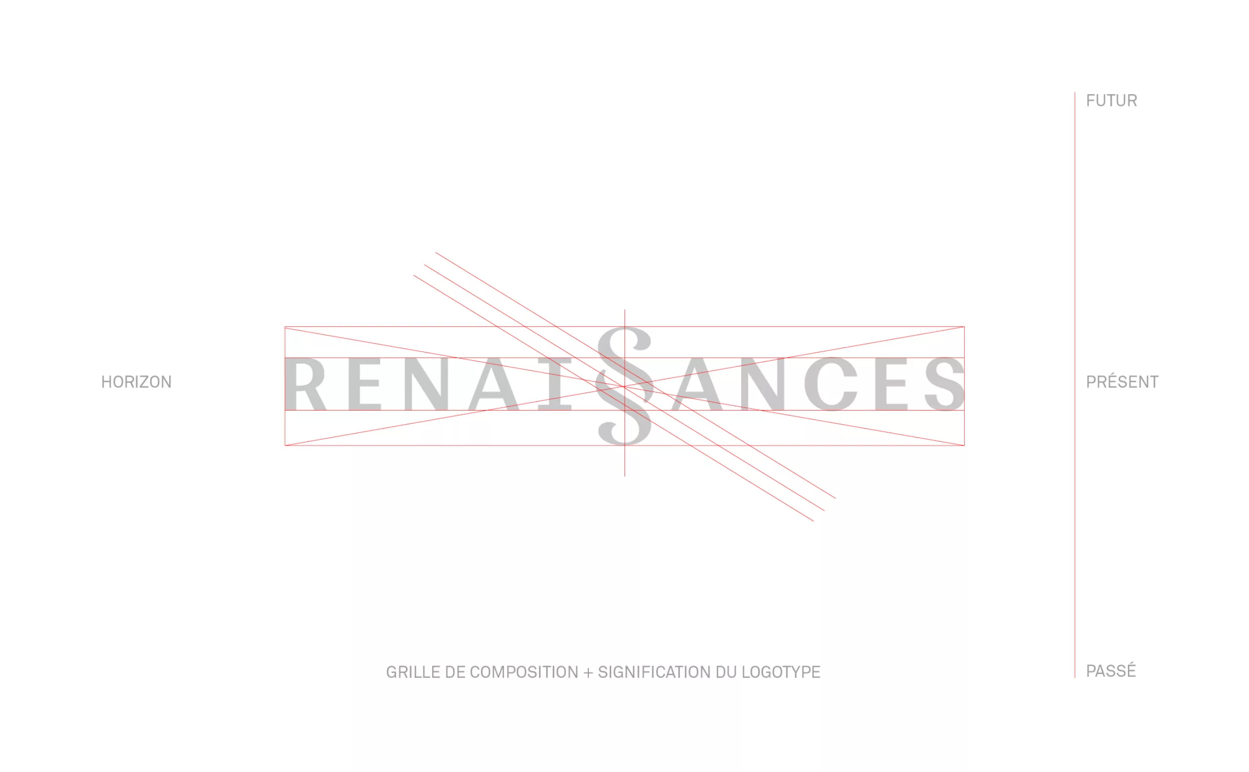
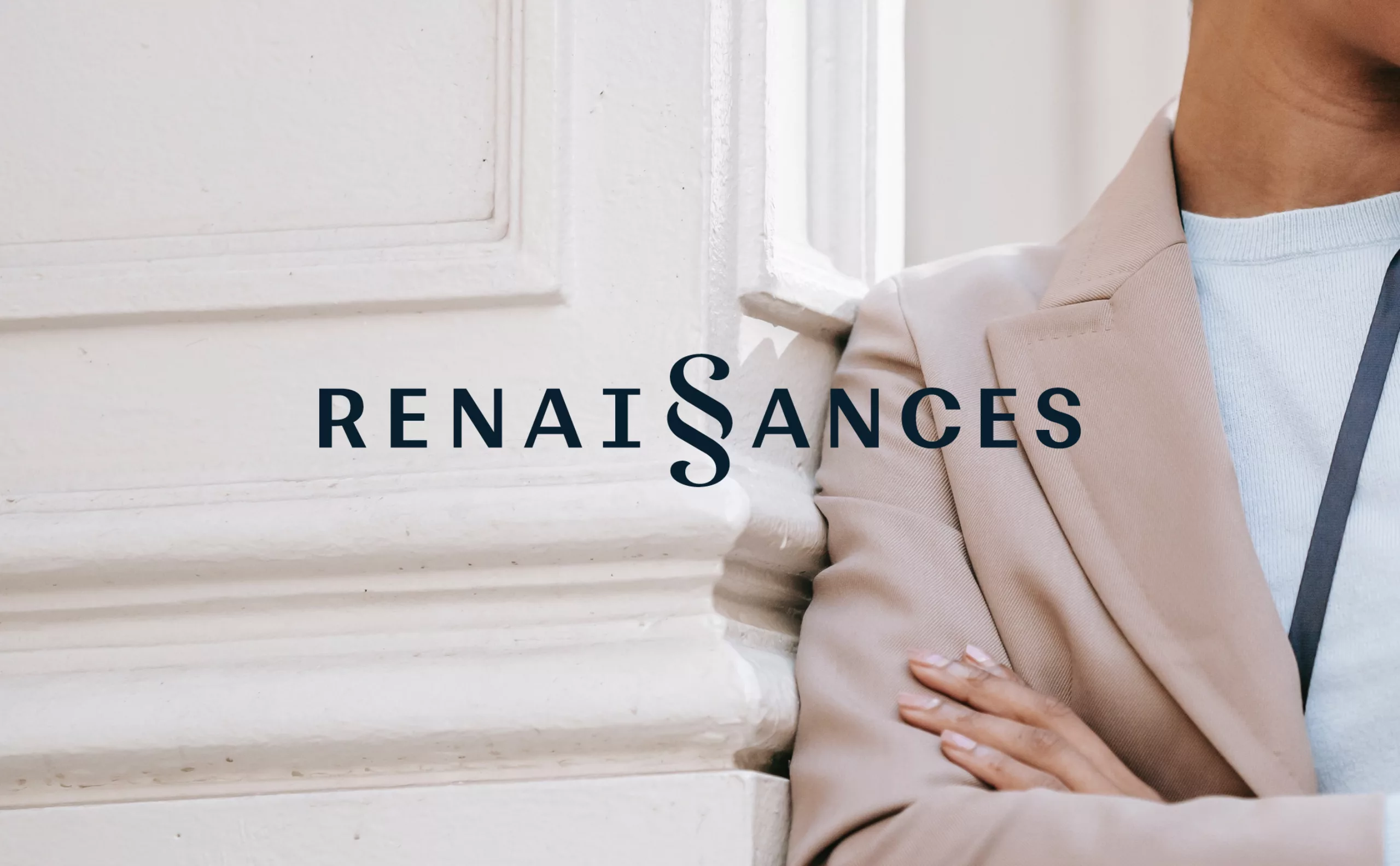
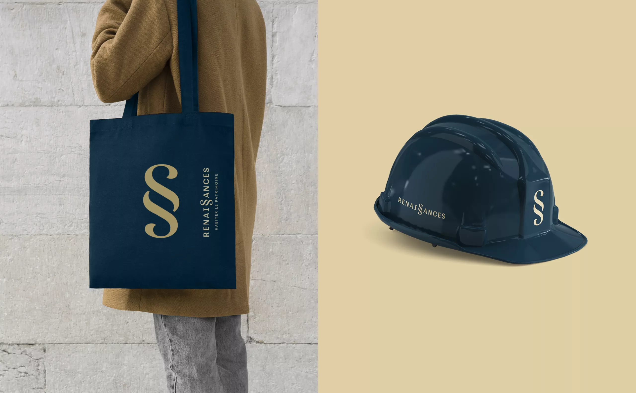
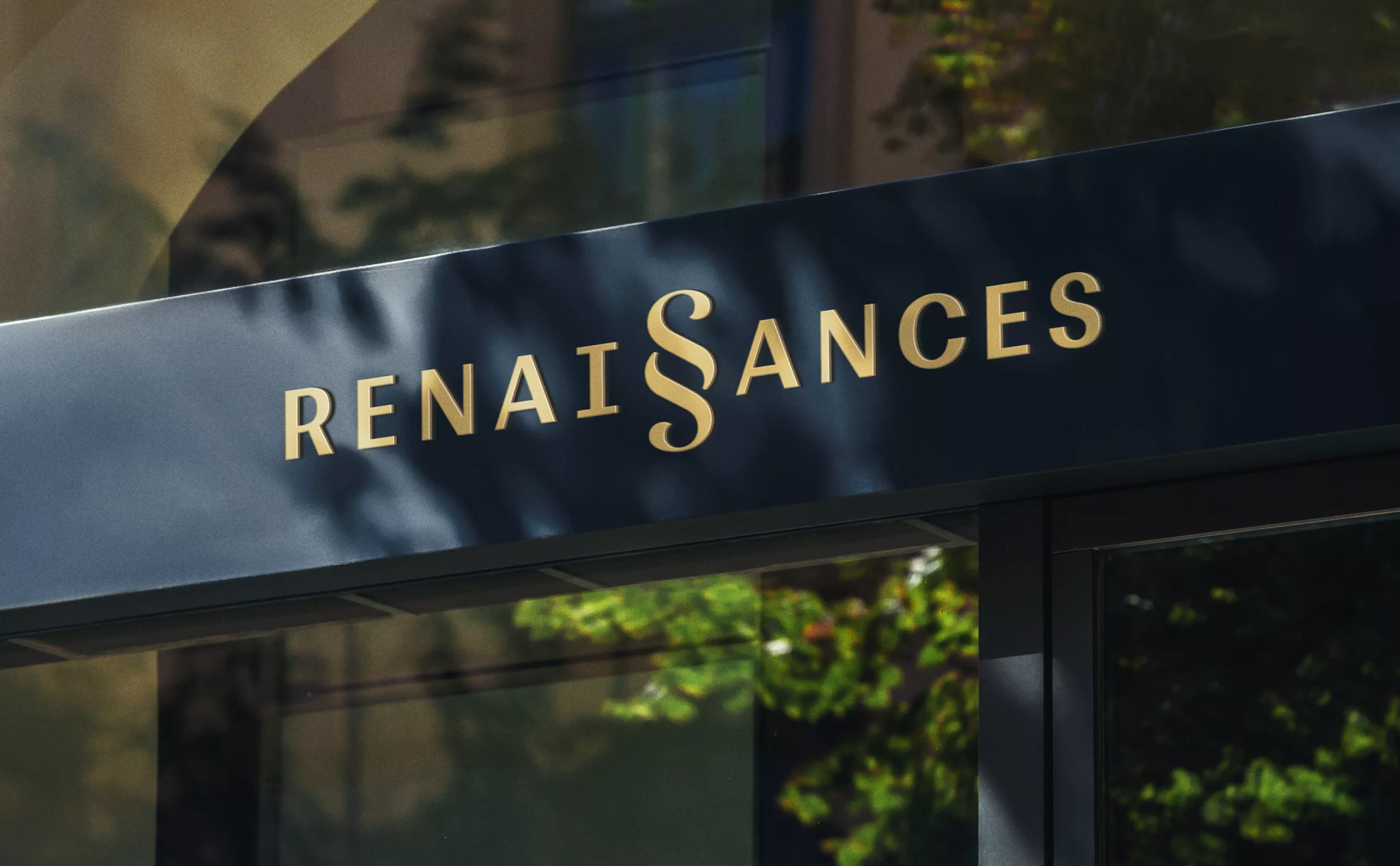
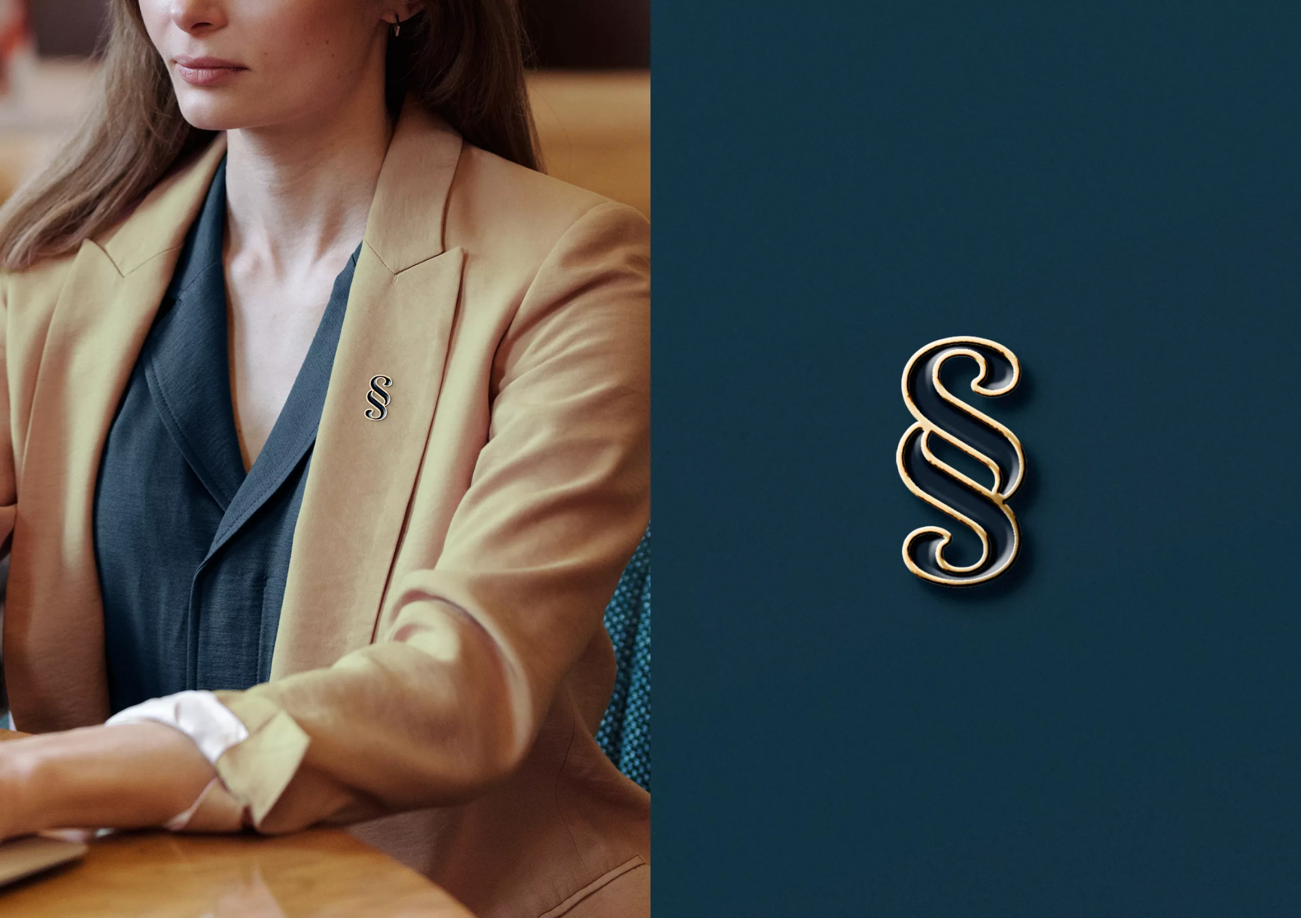
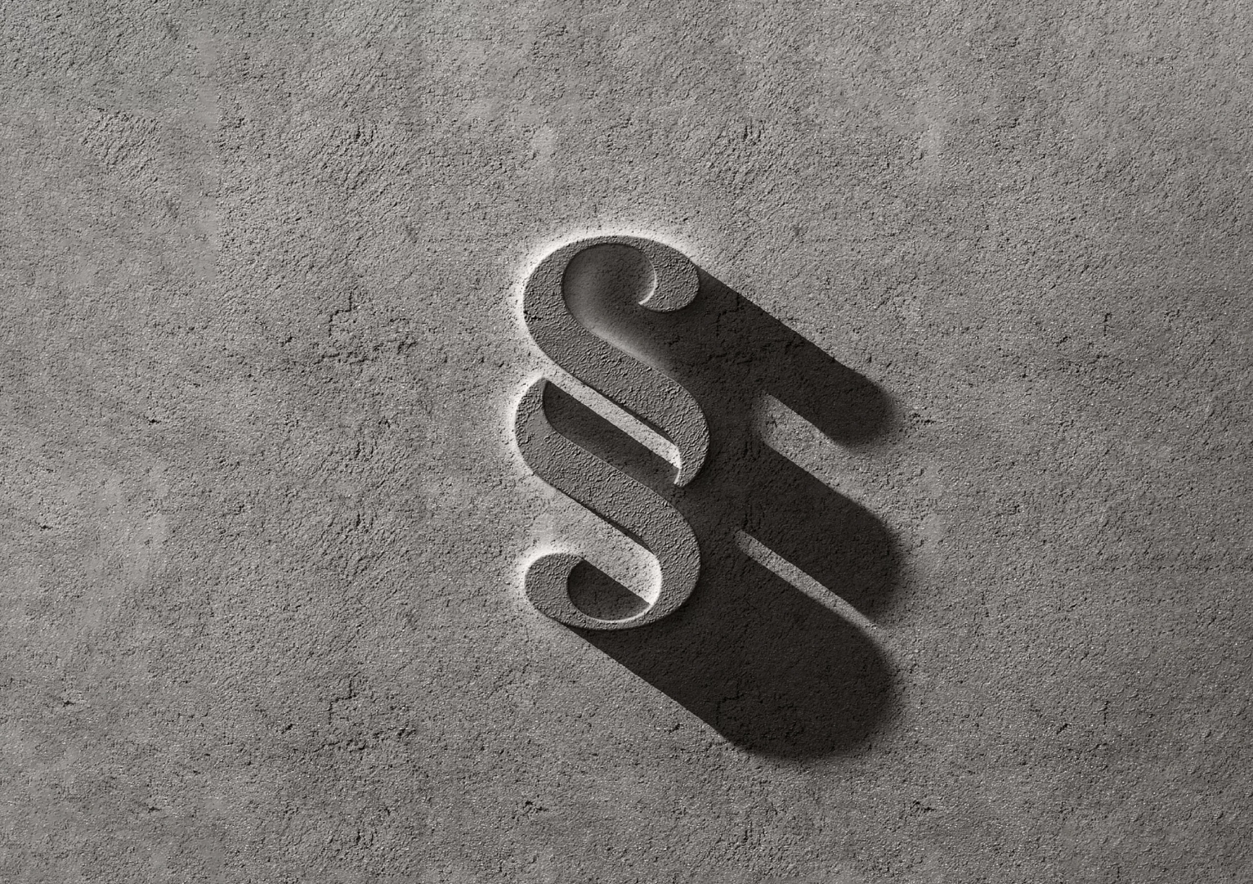
The creation of the Renaissances logotype is a custom design of the Renaissances lettering that incorporates an emblem in the center of the word. The central repetition of the two S's of Renaissances becomes a typographic ligature known as the paragraph symbol. This emblem tells the entrepreneurial project "Renaissances" in an impactful and poetic way. The vertical and curly spelling of the paragraph symbol also communicates the idea of architecture and ornamentation. The doubling of the S communicates the idea of rebirth, while creating a strong historical link between past, present and future.

This typographic trick instantly gives the word an original design and creates a distinctive brand name. The emblem can be used alone or as a watermark to dress up the backgrounds. It creates a narrative dimension in a simple and minimalist formalisation of the logotype. This refined style guarantees a modern and timeless graphic identity.

A " typographic " logotype that articulates past, present and future

This intention is also embodied in a sans serif typographic style with a composition in capital letters that reinforces the architectural dimension of the logotype. This aesthetic choice combines the ancient and the modern to correspond both to projects for the preservation of singular architectural heritage, and to the rehabilitation of urban living spaces in the heart of cities.

There are two versions of the logotype which are distinguished by the addition of a secondary title. The logotype known as "external communication" uses the addition of a slogan "Habiter le patrimoine" composed under the logotype. The logotype called "institutional" uses the baseline "Promotion immobilière" composed with a vertical line to the right of the Renaissances logotype. A high contrast color code completes the expression of the brand with a slate blue and a golden beige. Both evoke the noble materials of the building.

By having an emblem in the center of its name, the title becomes a unique and memorable graphic object: Renaissances becomes a strong brand that carries and effectively communicates the values of its founders.

Context

Real estate developer, Renaissances offers a comprehensive range of rehabilitated real estate. Renaissances, real estate development is a creation of the Group Bâtisseurs d'avenir. Both companies are historically located in Rennes but have several local structures that create a network of expertise on the national territory.

Objectives

Creation of a visual identity and a graphic charter to distinguish and enhance the brand "renaissances" in the sector of rehabilitation and preservation of built heritage, from architectural monument to living space located in the heart of the city. Create a logotype that gives a strong personality to the brand name of the activity. To create a modern and high-end brand territory that corresponds to the real estate development sector.


Share this project:
Project expertise:
Logo creation, visual identity and graphic guidelines.
Type of client:
Communication in the industry, construction and public works sector.

Related projects: