Heliophore, the animated paper

In 1930, Louis Dufay invented a printing process on aluminium foil inspired by the iridescence of Morpho butterflies’ wings. He was already behind the Dufaycolor technology used since the beginning of the century in colour photography. We’ve written another article on the topic. Keen butterfly collector, he discovered that the streaks on the wings of the Morpho, these majestic blue butterflies, allow light to be reflected. He then invented a method to recreate these effects: the heliophore.

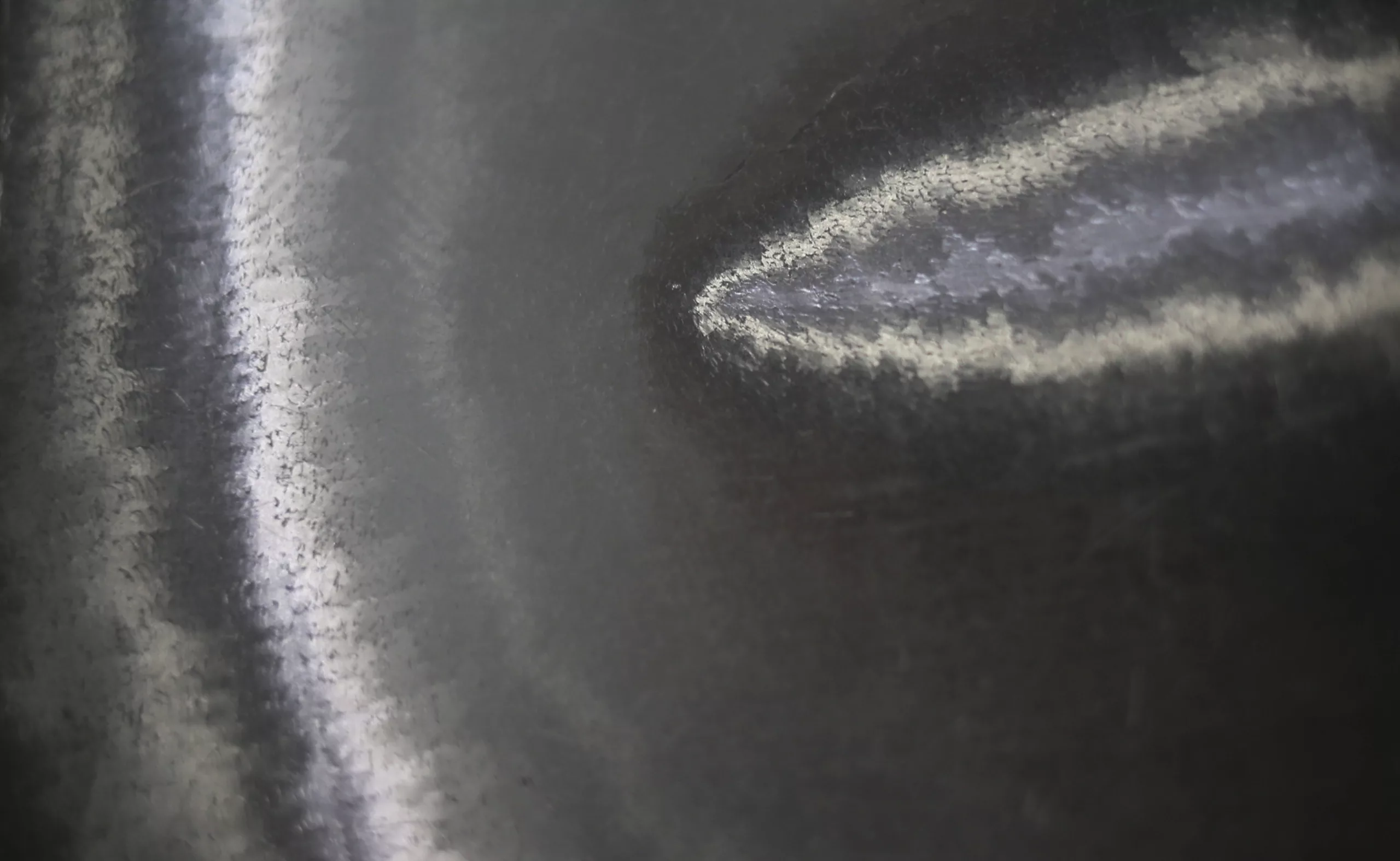
This technique of biomimicry is “a visual animation system of metallized colored plates which exploits the reflection of incident light through a grid of 24 lines per mm oriented at various angles to achieve amazing spatial effects with the movement of the support or light sources. This is a very interesting technique,” as Thierry Chancogne and Catherine Guiral explain in their article on the heliophore. To put it more simply, these are metallic sheets engraved by hand over a matrix, which reflect the light and give an impression of an animated, moving, sparkling visual. A new patent was filed in 1932.
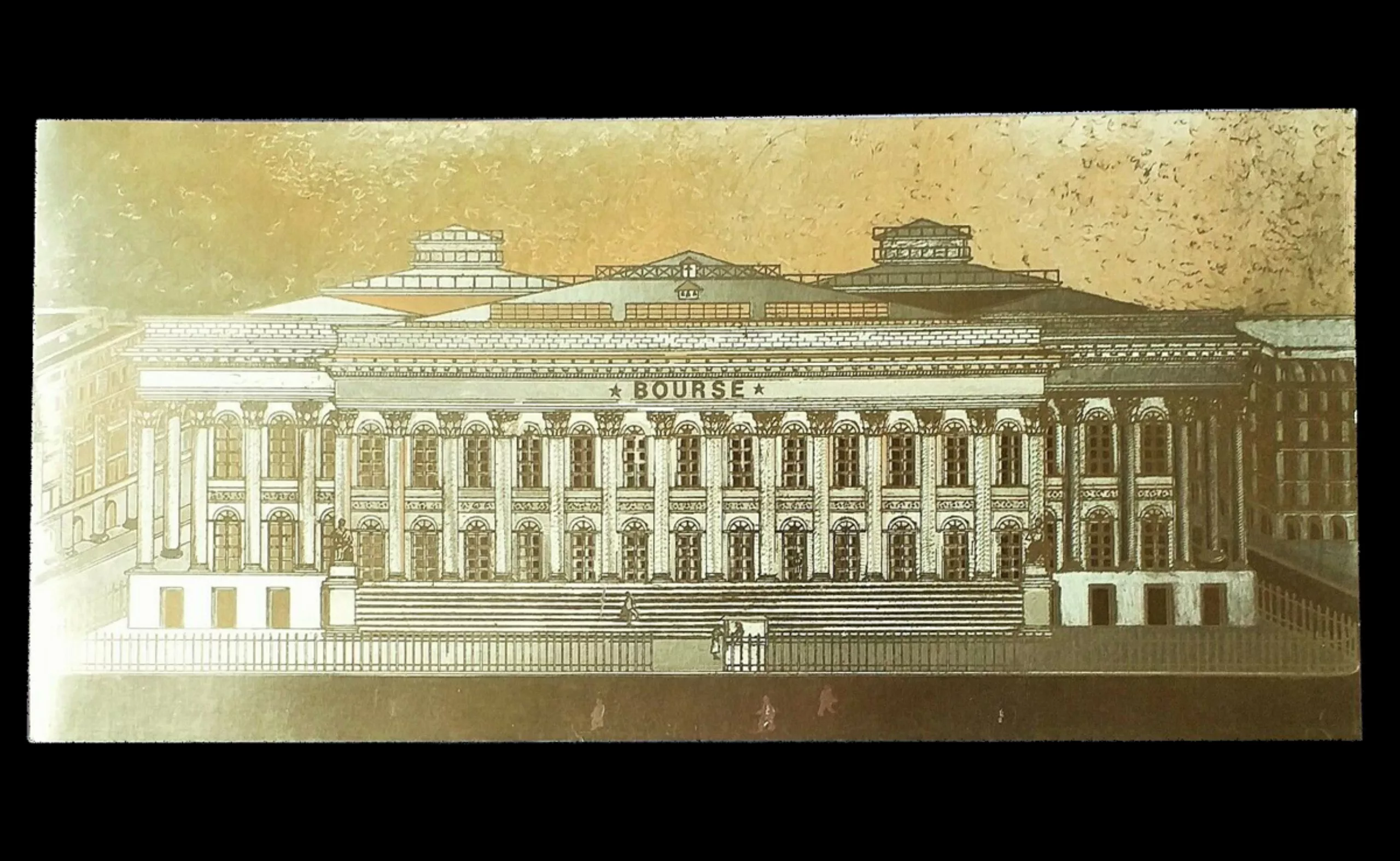
On the technical side, the heliophore is halfway between a craft and an industrial process. It is made with “a complex of coloured aluminium foils glued on a layer of wax and laminated on cardboard embossed with plastic matrices hand engraved by designers”. Louis Dufay died suddenly in 1936, but his invention continued to live on in his family, notably with the creation of the Imprim’Hélio printing works.
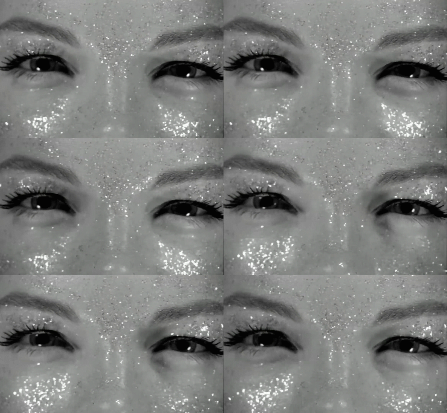
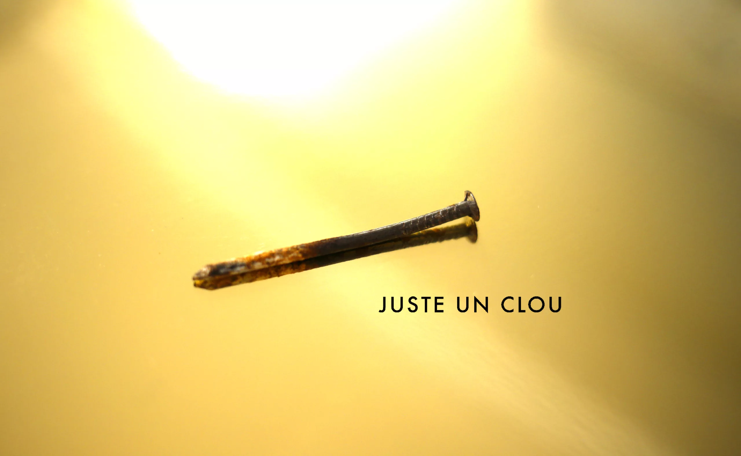
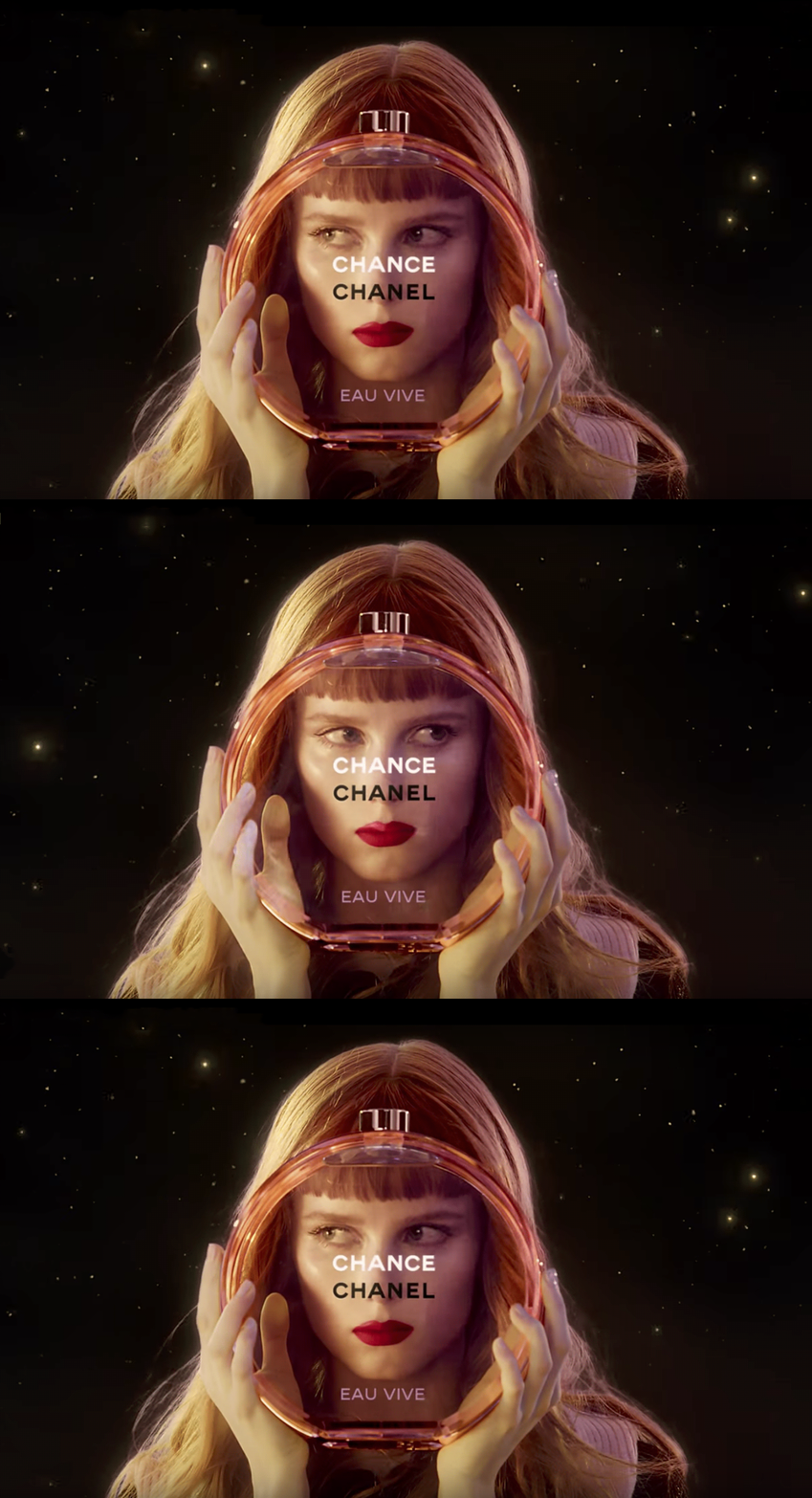
Nothing better than a video to illustrate the paper “in action” The images are taken from the video Hélio Studio.
This long video (Louis Dufay, La Couleur et l’Héliophore) also explains the whole process of creating the heliophore and the life of Louis Dufay.
The past technology from the future
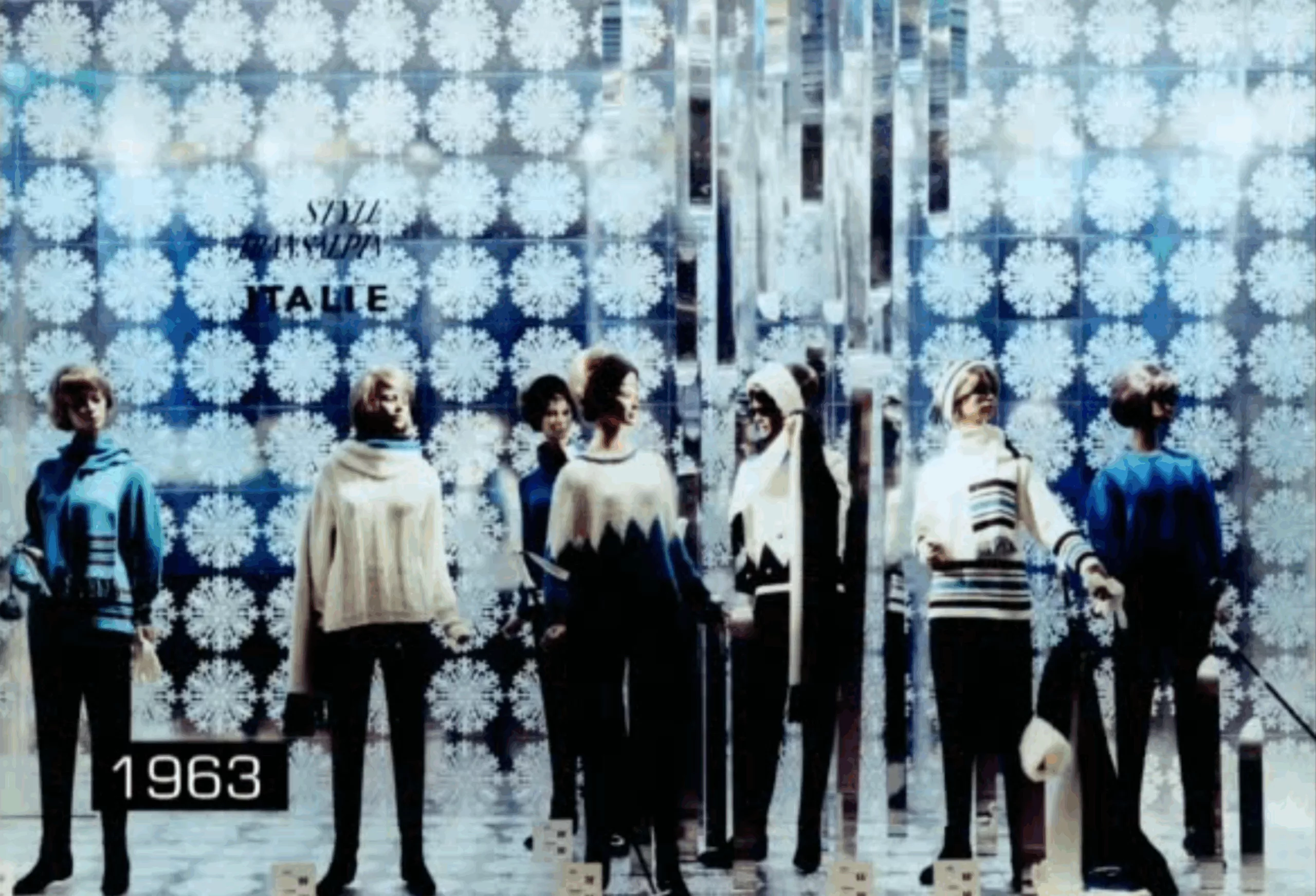
The process will be used a lot in the 60s and 70s, moving along with kinetic art, opt art, or psychedelics. Thanks to light or the movement of the printed sheet, bewitching and futuristic patterns appear. A system of hidden light bulbs flashing around the pattern gave life to it, and advertising industry was a big fan of this process. It is an ideal medium for the age of consumerism, the conquest of space and avant-garde art. Parisian department stores used it in their Christmas shop windows in the early 1960s, as shown in this photo from the film Louis Dufay, La Couleur et l’Héliophore.
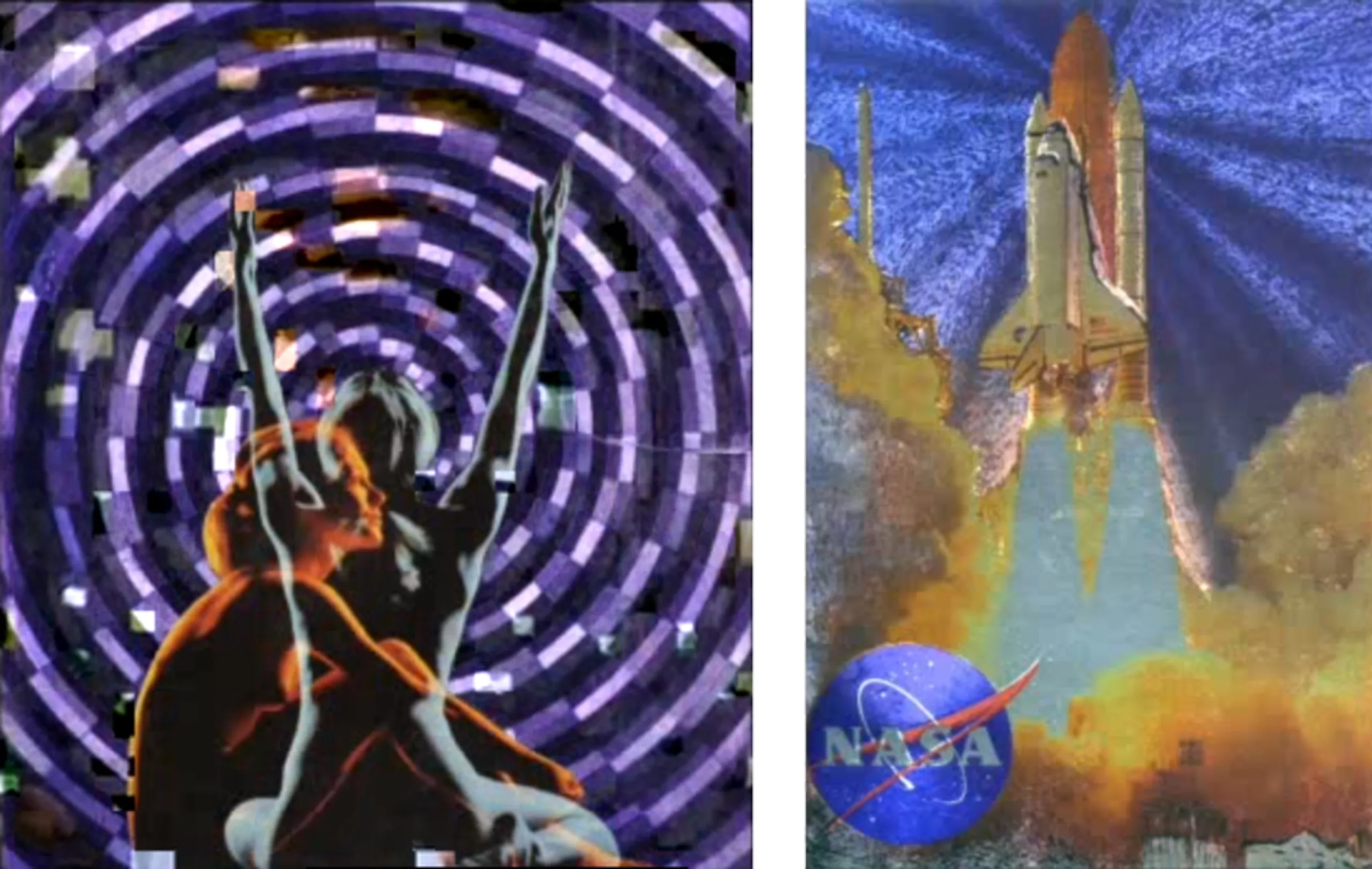
The technology was exported to the United States in the early 1970s and featured on NASA visuals, Looney Tunes cartoon cards, festivals -such as Woodstock, etc.
Visual communication
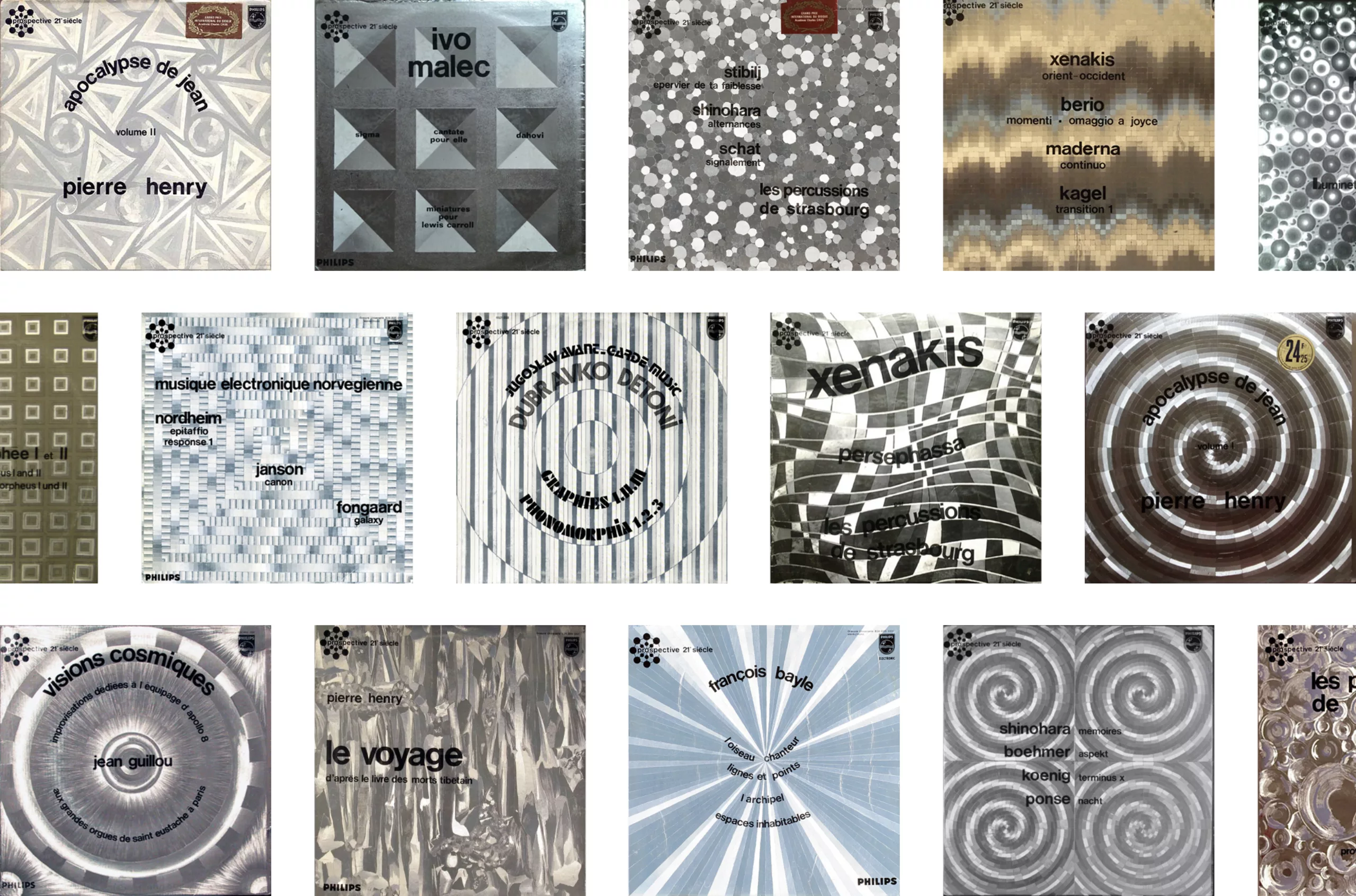
In France the Philips record company used heliophore printing to illustrate a series of records of electroacoustic and bizarre music, under the collection “Prospective 21e siècle“. The futuristic vinyl covers (which seem very retro today) set the tone and propel the listener into a fictional and hypnotic world, even before he or she has listened to the records. The heliophore thus makes it possible, by a simple graphic process, to visually communicate in a very effective way.
Elsewhere and tomorrow
It is these jackets that inspired Gérard Klein, a great author and SF specialist who launched and directed the collection “Ailleurs & Demain” (Elsewhere & Tomorrow) published by Robert Laffont in 1969. At the time, he was struggling to publish and get recognition for science fiction masterpieces. The era, at first cheerful for the conquest of space, returned to being very down-to-earth. Fiction stories were perceived as entertaining but not credible literature and few publishing houses welcomed them. The “fantasy” section no longer even existed on the shelves of bookshops! Gérard Klein had a dream: “This dream was to make a different collection, one that would demonstrate to the literary world, one of the toughest and most conservative I have ever met -from the army to the administration- that Science Fiction could be genuine literature, that at least some of its works could have the appearance and dignity of normal books. ”
Robert Laffont then trusted him and gave him carte blanche. Men were going to walk on the moon in a few months, none of them knew it yet. In addition to the requirement of the choice of titles to be presented, with as many French authors as possible, “it was necessary to have an appropriate, sober, aesthetically durable cover, avoiding the facilities of “robot-and-rockets” folk illustration”; a cover worthy of the name, which would leave a lasting impression on people’s minds. Klein explains his approach in this article (FR).

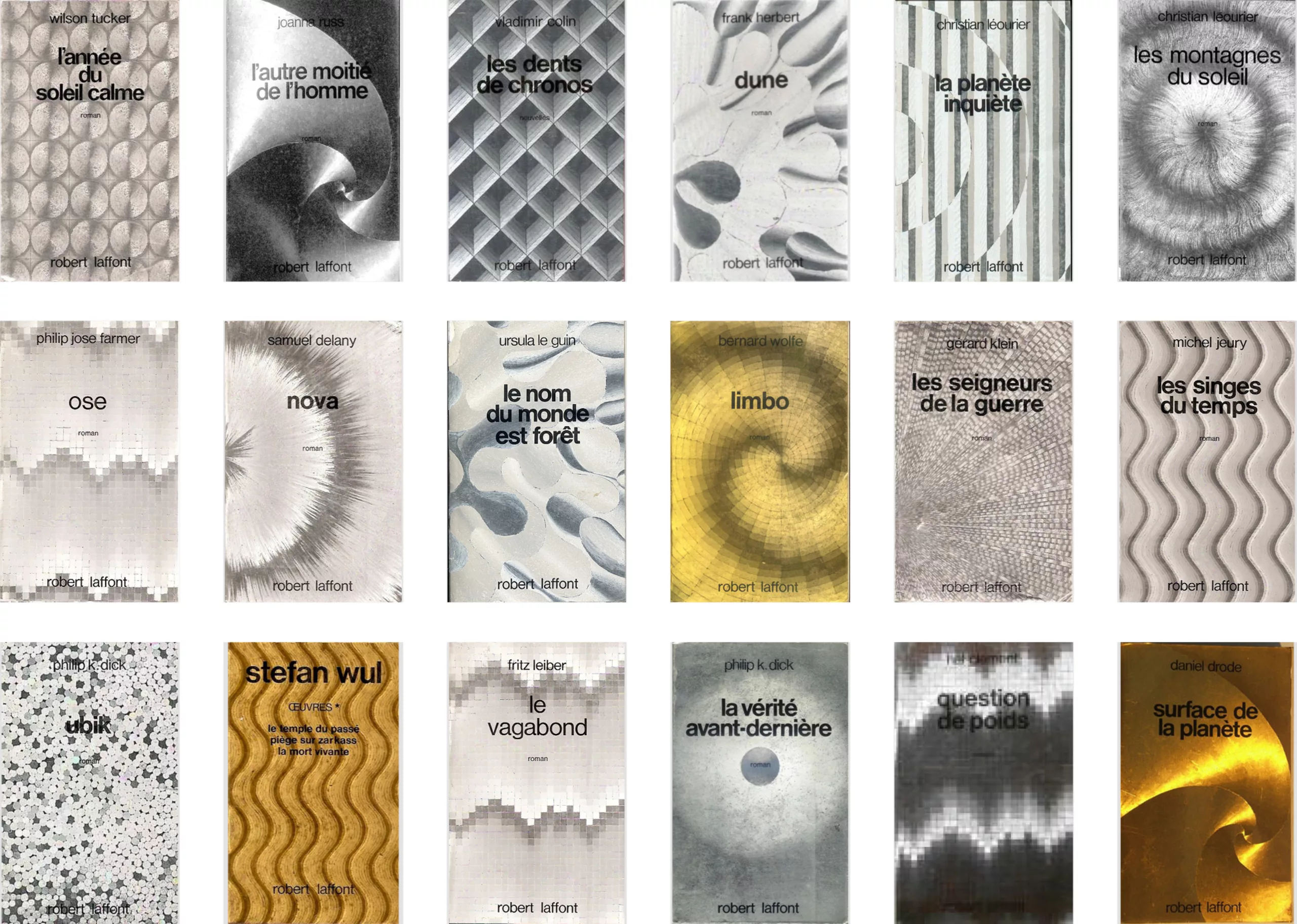
This time without calling on an illustrator, he used the variations proposed in the catalogue of the heliophore technology company. Klein, cheerful, specified that “the variant and variations result from the arrangement of the sheets, sometimes head to tail, and show that such a process, well chosen and well used, is unrivalled. (…) Héliophore had only a limited catalogue of themes corresponding to matrices, most of which looked like chocolate boxes. I therefore chose the best ones to my taste, sometimes trying to make them correspond to the general theme of the book. It’s not aluminium “to wrap fish” (…) it’s high-tech craftsmanship. “
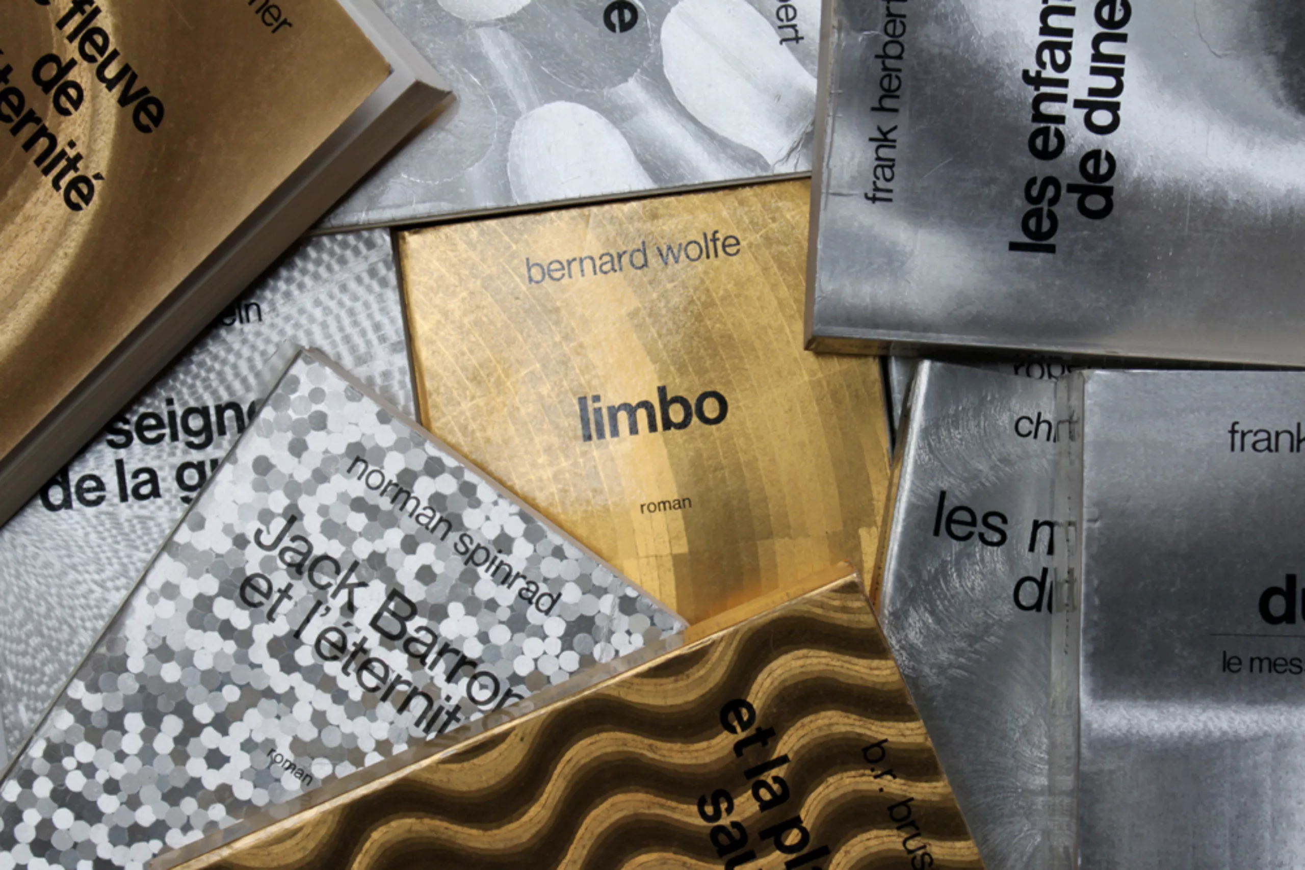
The same themes will be declined in aluminium, gold, or sometimes copper, a nod to technology and astronautics: the future. In bookstores, the kinetic covers are blindingly obvious. To such extent that one bookseller even insulted Laffont by saying that they should be ashamed, because they were systematically stolen!
If you are interested in book covers and their graphic design, we wrote a series of fascinating articles, tracing their history through the centuries.
In hell with Romy
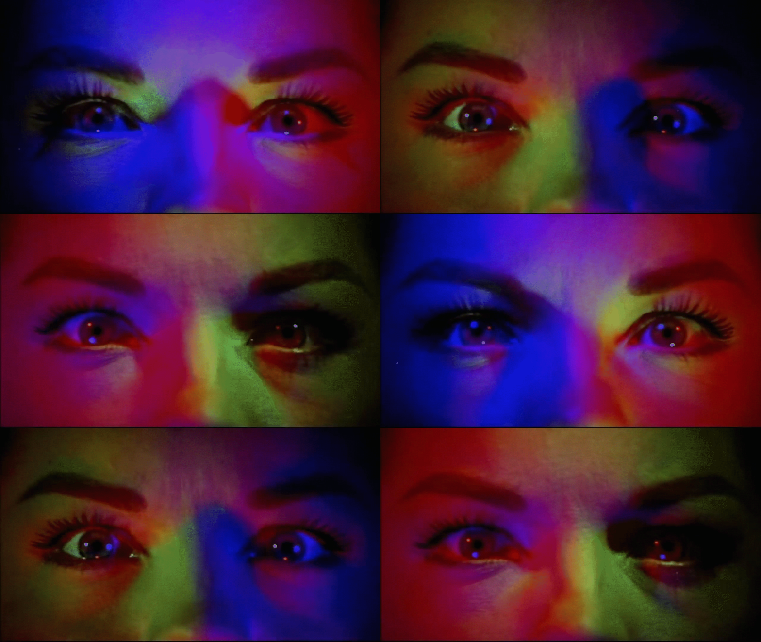
At the peak of kinetic art’s golden age, heliophore was also used in films such as Clouzot’s Inferno (1964, unfinished) in which the reality of the heroine’s husband, Romy Schneider, is distorted into hallucinogenic visions to illustrate his paranoid and devouring jealousy. The changing reflections give the actress demonic and disturbing reflections.
In 2012, producers of aluminium foil, specialising in yoghurt lids in particular, imposed minimum orders that Imprim’Hélio was unable to meet. Imprim’Hélio stopped marketing this technology. It is nevertheless found in England under the name of Dufex prints (even if the technology is not exactly the same), and it seems that it is possible today to obtain results quite close to the French heliophore, as the Fraser Muggeridge studio did in 2016.
We hope one day to see the heliophore shine in all its splendor again, and in the meantime, we can rush to these few books, vinyls and other objects now collector‘s items.
