The city of Paris revises its visual identity
A new logo for the capital
Since the beginning of January, the city and the department of Paris have merged. The opportunity for the capital city to review its visual identity.
It is a work done by the agency Carré Noir.
PS: We would like to point out a form of conflict of interest in the analysis of this logo, since we had also participated at Graphéine in this consultation (see our proposal). Despite this, we tried to remain objective in our analysis, and we obviously congratulate our colleagues for their success. 🙂
Logo analysis
First of all, let’s look at the symbol.
We obviously find the “Nave”, the ancestral symbol of Paris. Its design in a single line is rather clever. An idea of movement emerges from the sign, we feel the boat pitching (but without sinking!). The back of the ship, slightly inclined, reinforces this impression. Only the pointed ends can possibly question. In short, bravo for this idea.
Let’s note that the logo abandons the expression “Mairie de” in favor of “Ville de Paris” (in print) or simply “Paris” (in digital).
In terms of typography, the old incise typeface has been replaced by a geometric lineal. Note the very discreet reworking of the A with a slight curvature. Apart from that, not much to look at. A very neutral choice. For the rest of the chart, it will be Montserrat, a Google font. If we can appreciate the interest of this choice for the finances of the municipality, we can obviously regret its lack of singularity.
The last ingredient, the color, is the most surprising.
Gone are the blue and red, the historical colors of the city. It will be an anthracite blue, very dark. In other words, almost black! A surprising and relatively sad choice. Contrary to the saying, here Paris does not seem to celebrate!
The graphic charter
It’s not enough to have a logo, you must know how to use it.
The graphic charter is there to help you.
Here, in our case study, it is quite simple. A large white frame border, very imposing. It is obviously very practical to make the logo visible. But let’s admit that as it is, it is neither very original, nor very fair for the events put forward. Indeed, it is almost a quarter of the poster that is occupied to enhance the logo of the city! Not very economical… unless it’s a free expression space or just bread and butter for taggers in the metro?
For the rest, we are free to put what we want inside, as long as we compose the texts in Montserrat ?
In the end, we can regret a certain lack of visual ambition in this charter. Maybe this is just a first draft of the graphic charter, and let’s bet that the future will surprise us. We would have liked to see the spirit of the logo developed as a thread, why not a range of pictograms to enrich the language? In short… to be continued.
Thanks to the indispensable Geoffrey Dorne for sharing the graphic chart on his Twitter account.
On the subject
-
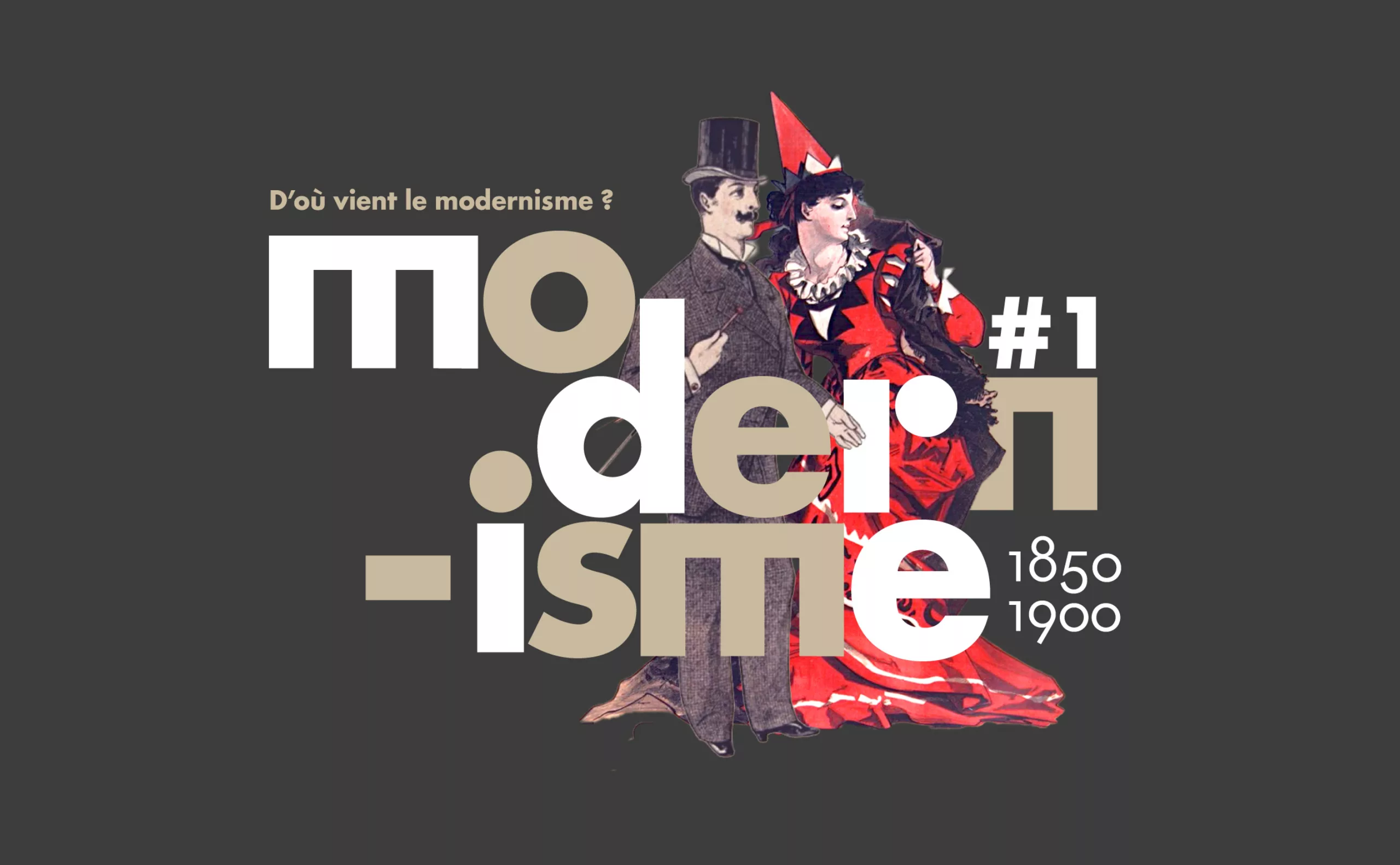
Where does modernism come from? 1 – Man propelled by Modernity
Episode #1. To understand modernism, we need to understand its relationship with modernity, and its meteoric rise at the end of the 19th century.
-
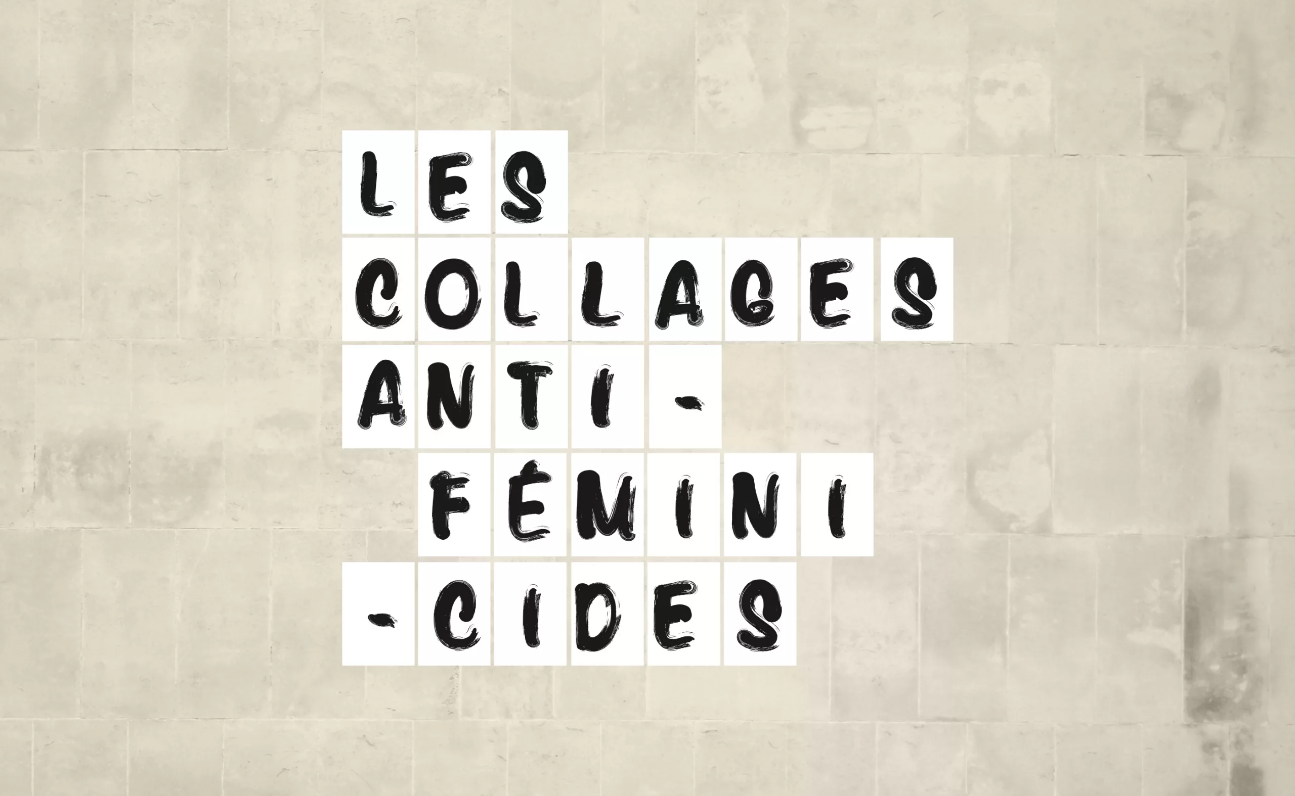
The branding of a social movement: Collages against feminicides
Why and how anti-feminicide collages, through their “graphic charter” as simple as it is powerful, have opened a wide breach in the public debate.
An opportunity to try to untangle how the “branding of a social movement” differs from the “classic branding of brands”. -
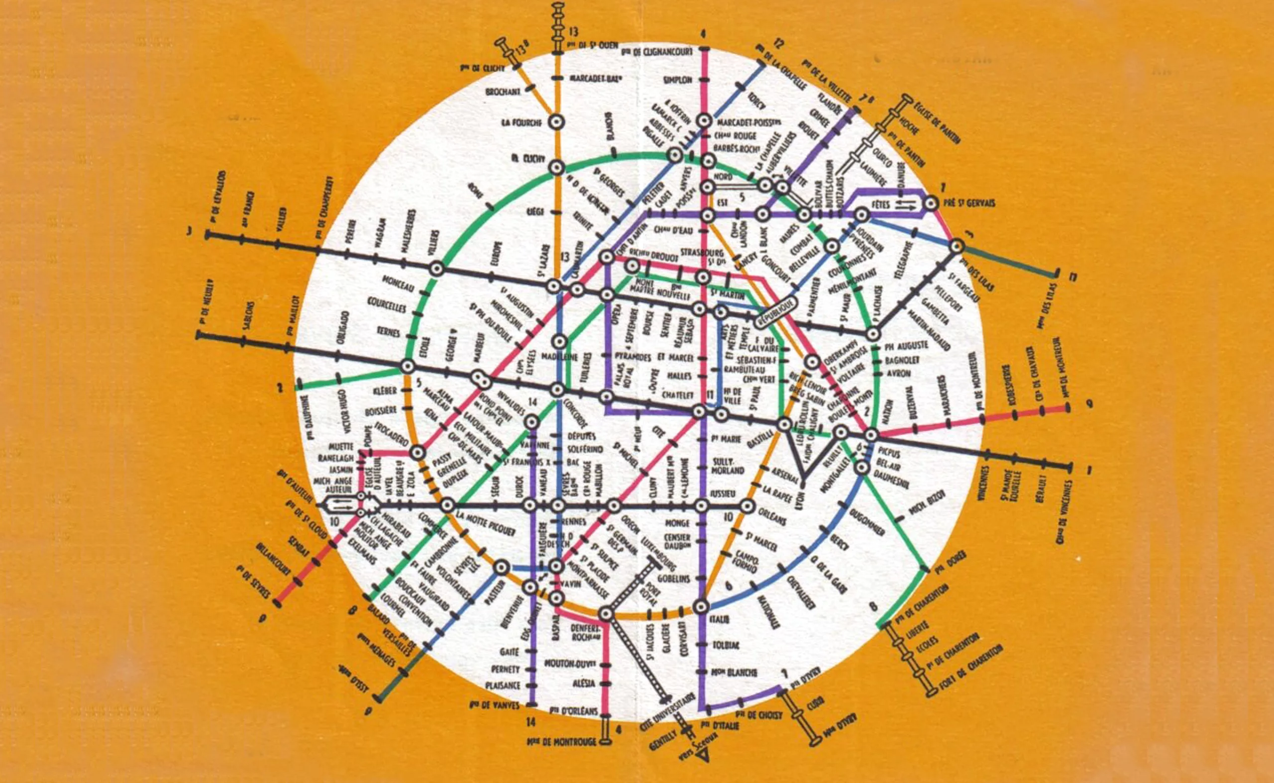
Evolution of the Paris metro map: from spaghetti dish to futuristic city
A concentrate of the evolution of the Paris metro map and beyond, in which we also talk about spaghetti, beer and futuristic cities.