The genesis of the Rio 2016 Olympic Games logo
When two agencies on two continents work hand in hand to create a visual identity!
It’s hard to imagine a more iconic subject when it comes to visual identity. What graphic designer hasn’t dreamed of designing a visual identity for the Olympic Games? At Graphéine, we obviously count ourselves among the lucky few, having written at least 5 articles on the subject since the beginning of the year. But until we have enough experience and/or have developed our network of clients between Switzerland, the IOC and Panama, we’ll just talk about it, a bit like Mc Cain’s fries (it’s the ones who talk about it the most…).
We’re going to take a look behind the scenes of the visual identity for the Rio Games, and how two agencies came to work hand in hand. A unique opportunity to decipher a collaboration between designers from different cultures.
This is a freely inspired translation of an article originally published on the 99U blog.
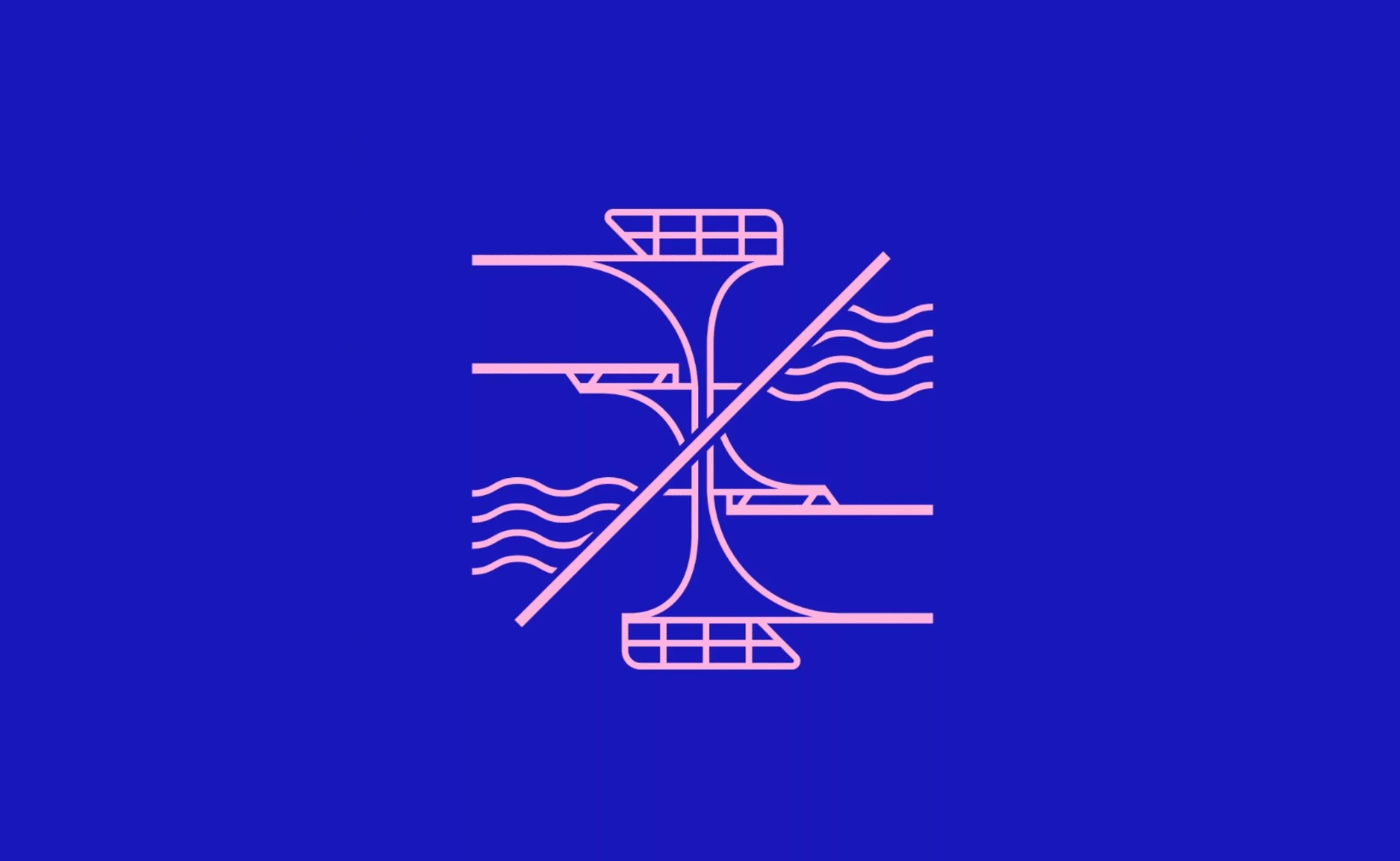
Day 1: Make a logo by walking on water.
In the beginning, there was the word. Without wishing to offend the faithful, this was simply the brief for the consultation. The first day was then devoted to designing the logotype.
The Brazilian agency “Tátil design” won the consultation with its logo of dancing figures and ribbons. This was already a miracle, as there were 138 other contenders trying to walk on water.
or two months, under the impetus of Creative Director Frederico Gelli, the entire agency was in a state of effervescence. Their ambition was to represent Brazil’s energy and sense of welcome (a sense of celebration?).
But creating the sign was not the hardest part. The hardest part was keeping the project secret from the moment God (aka the IOC) communicated their chosen status to the moment the logo was to be revealed to the public. For 4 months, 10 people were forced into secrecy, locked in a bunker hastily built in place of the old open-space area. Badges and passwords were mandatory. For the rest of the agency, it was a top-secret project for… the CIA??? …NASA ???? …Dilma’s impeachment ???
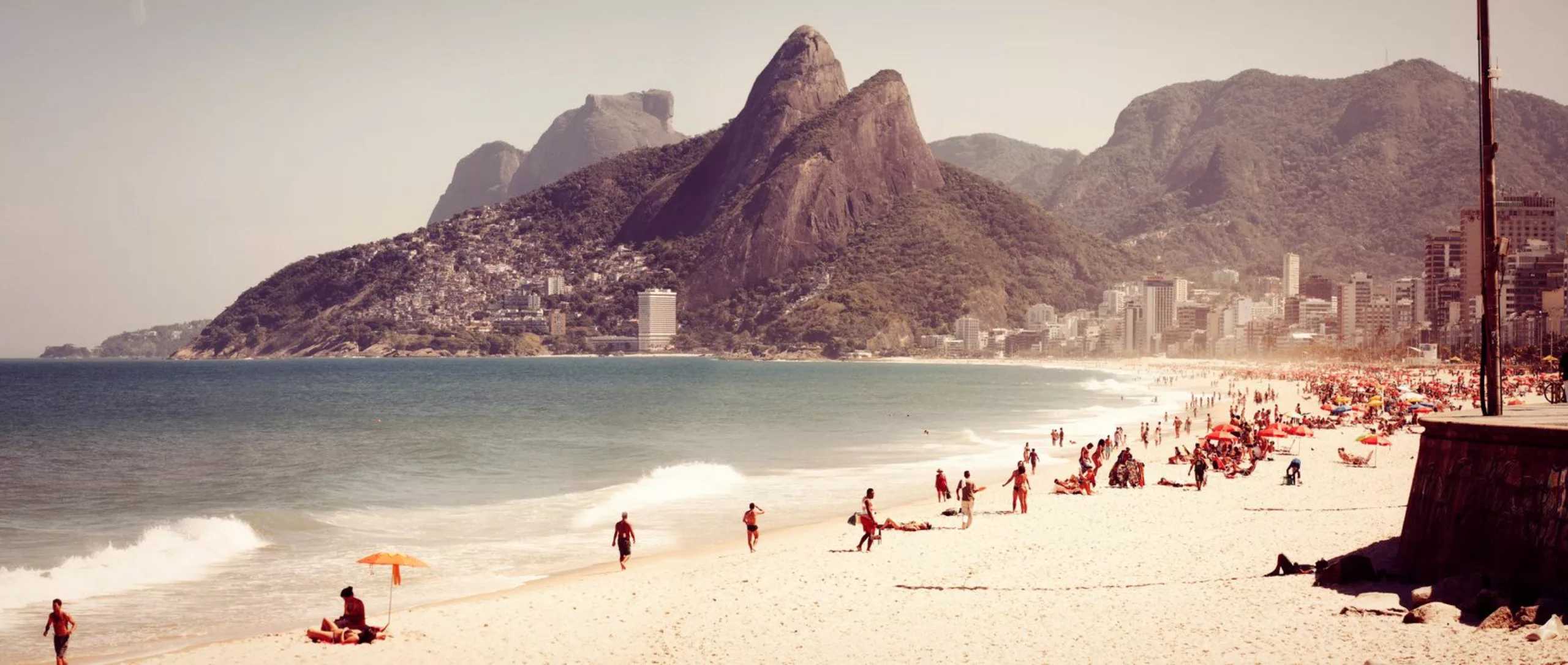
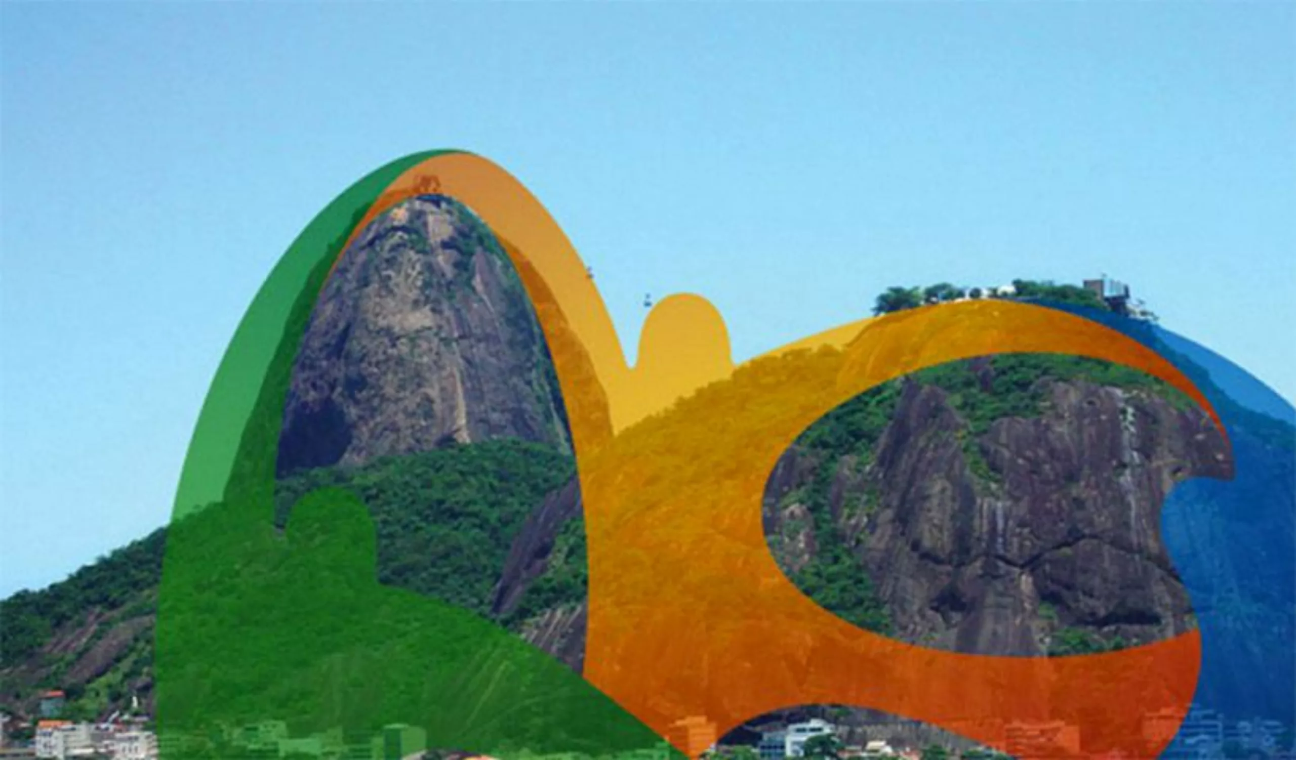
The logo from Ipanema
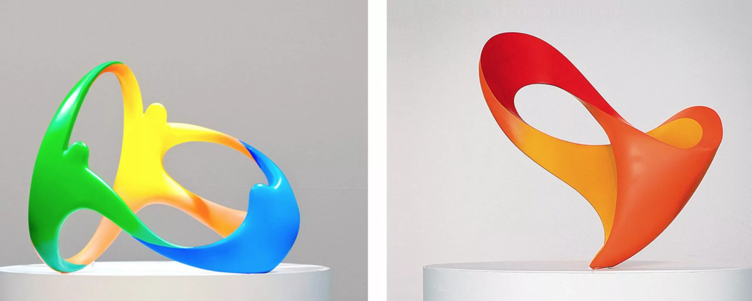
“The idea for the logo came to me when I was swimming at Ipanema beach,” says Mr. Gelli, now that the seal of secrecy has been lifted, “It was when I got my head out of the water and saw Irmãos (the hill of the two brothers) that I realized we were standing at the foot of the city’s symbol. A symbol of harmony. All the curves in the logo come from these montages.”
Okay, so it was suggested that the chosen one walked on water. For the non-believers out there, you’ll have gathered that this was just an image. What’s certain is that it looks cool to be a designer in Rio.
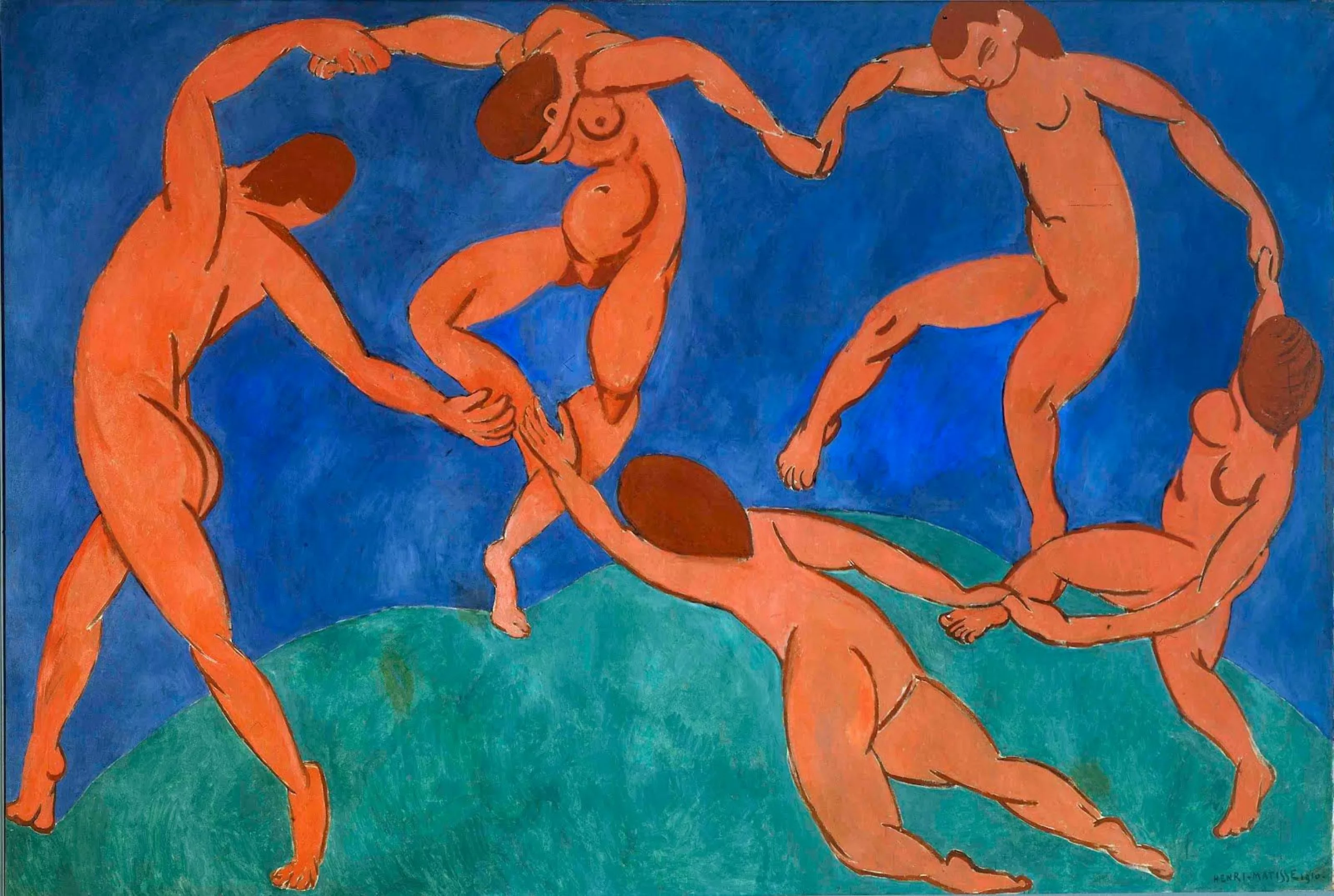
The other big idea behind this logo is the notion of infinity. A visual archetype readable by all cultures, union and collective strength. The sign is simple, plastic and universal. The mayor of Rio would have read his city’s name in it. For our part, we see it above all as a reference to Matisse’s dance.
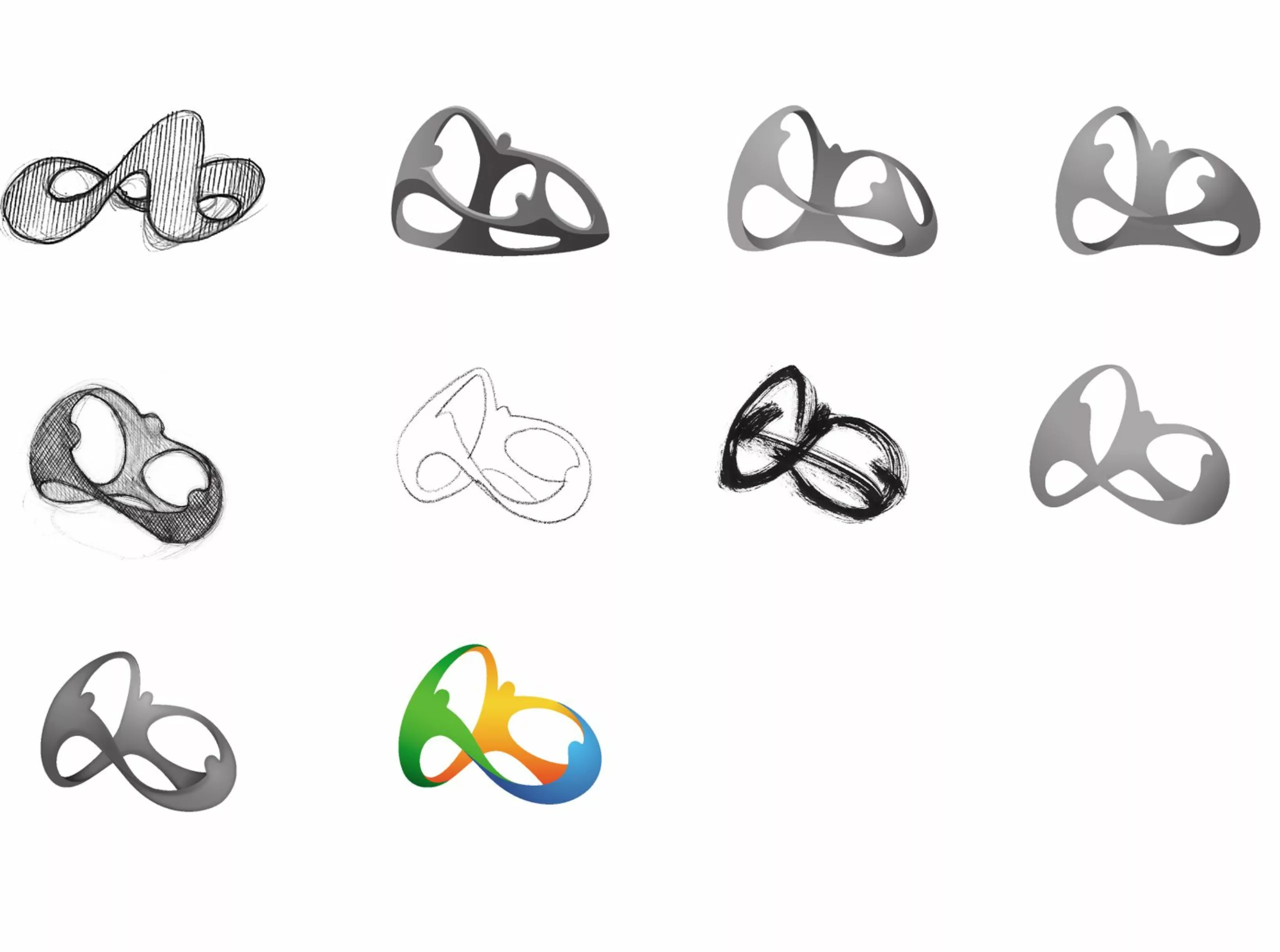
Day 2: from 2D to 3D
While the main logo use was going to be 2D, the concept was intrinsically 3D. So the Tatil team set about modeling it in 3D to test possible applications.
Day 3: Find a typography apostle
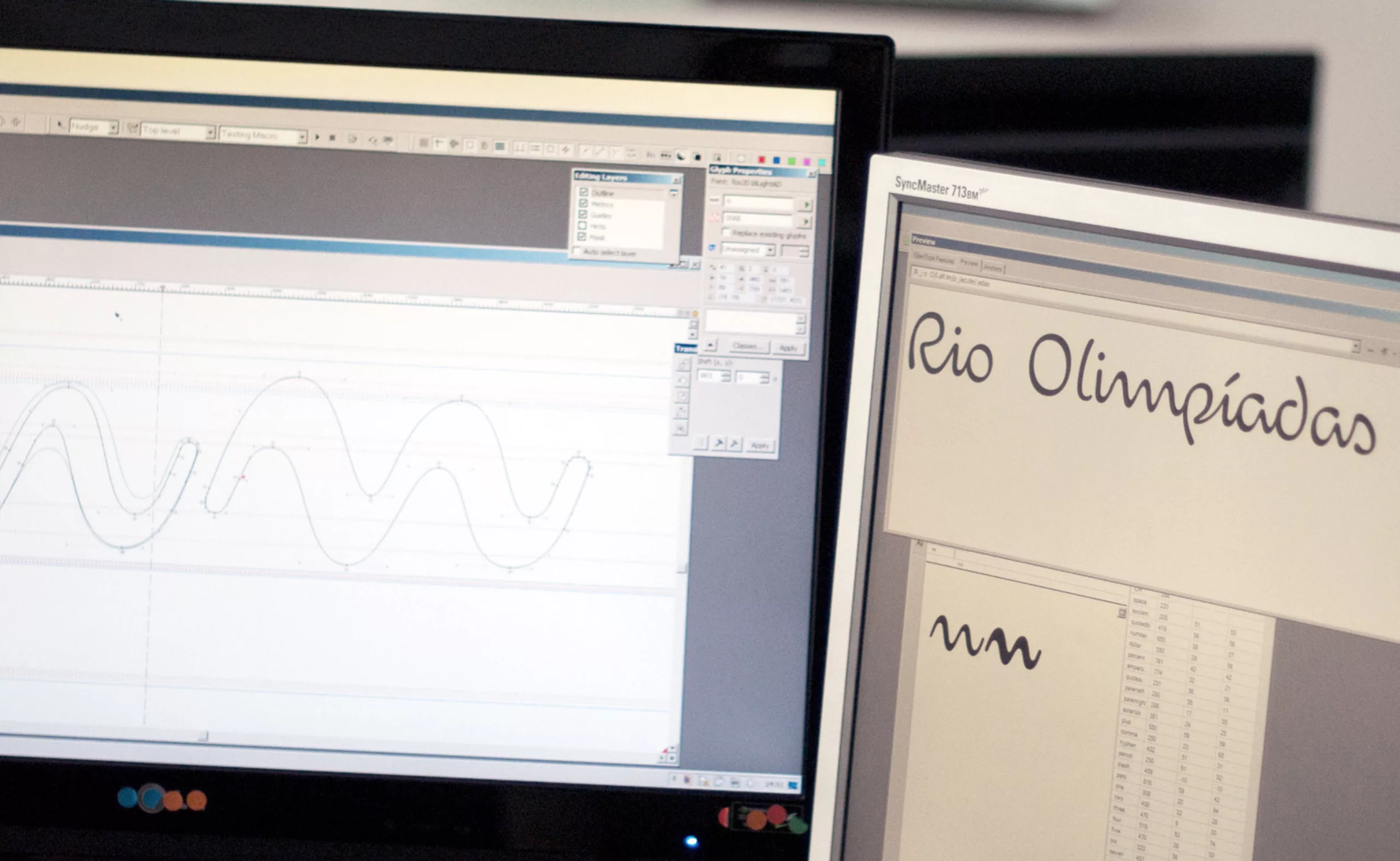
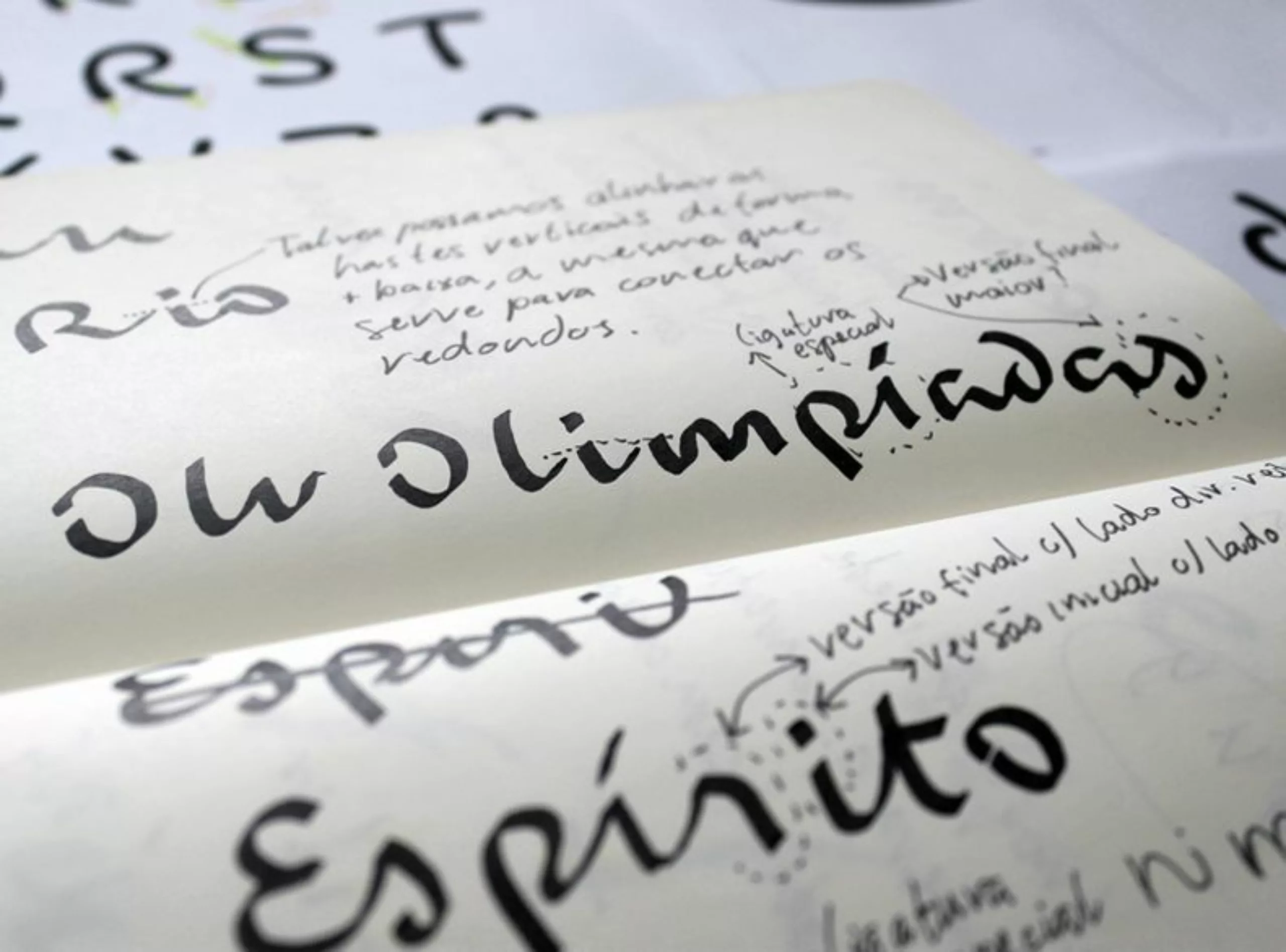
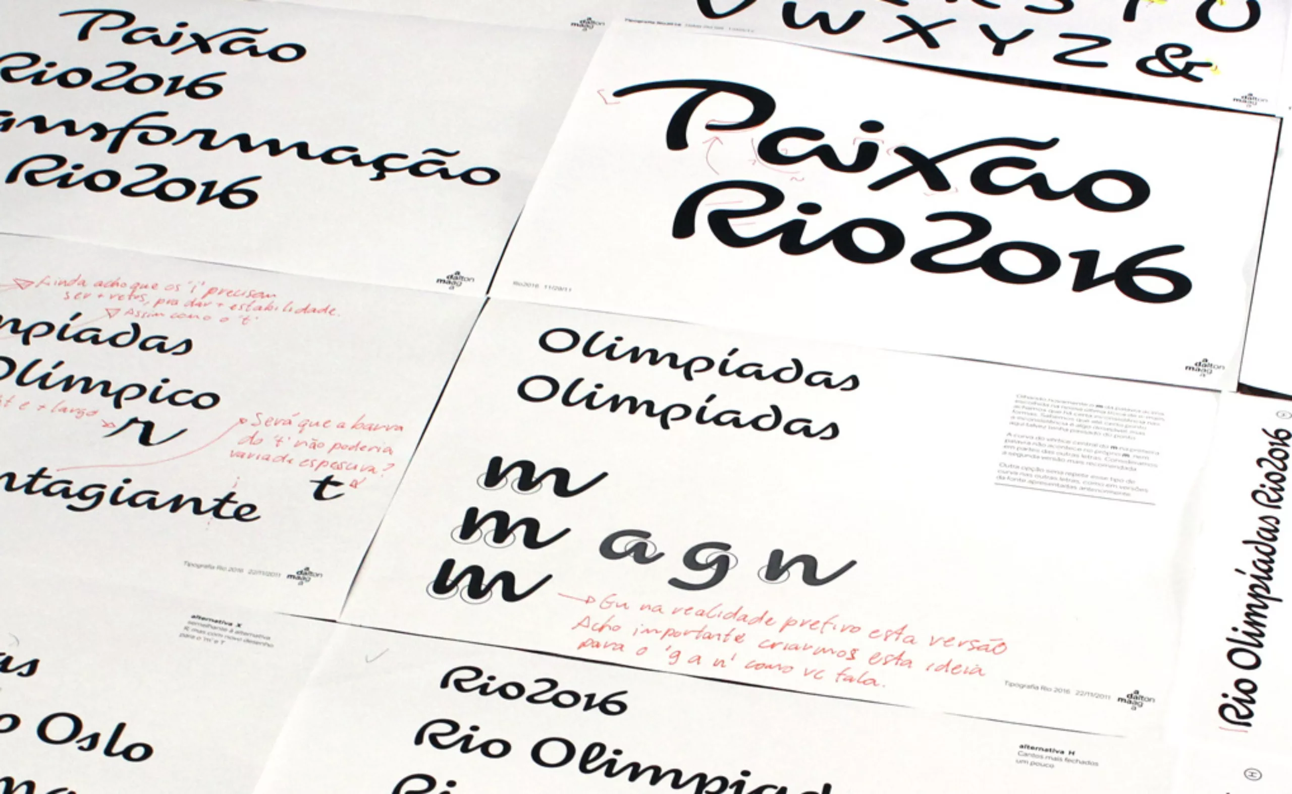
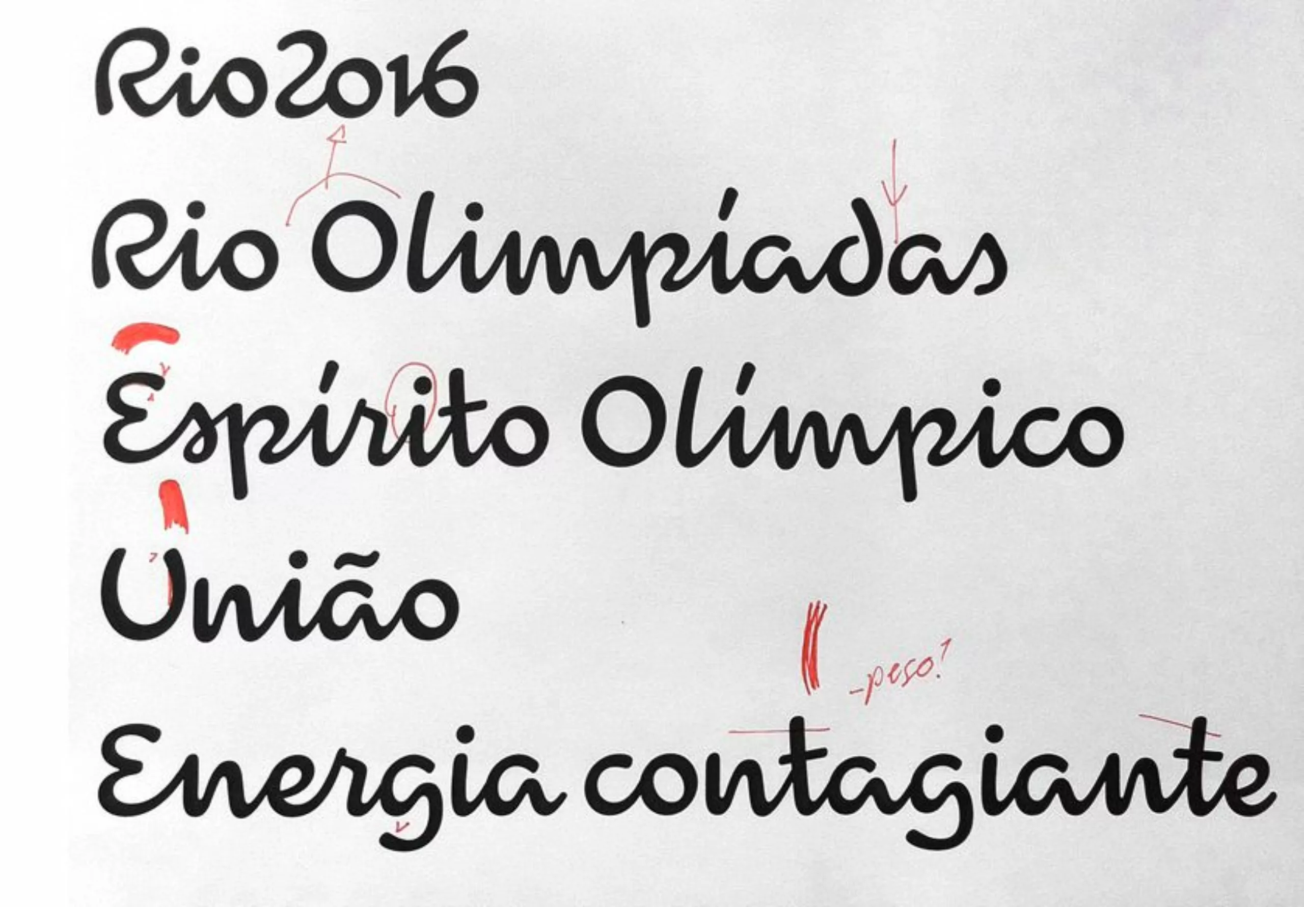
Initially, the project was presented with a relatively classic typography. Surprisingly, it was the IOC jury who invited them to reconsider the typography. The challenge was to find a typeface capable of extending the spirit of the logo in just three letters!
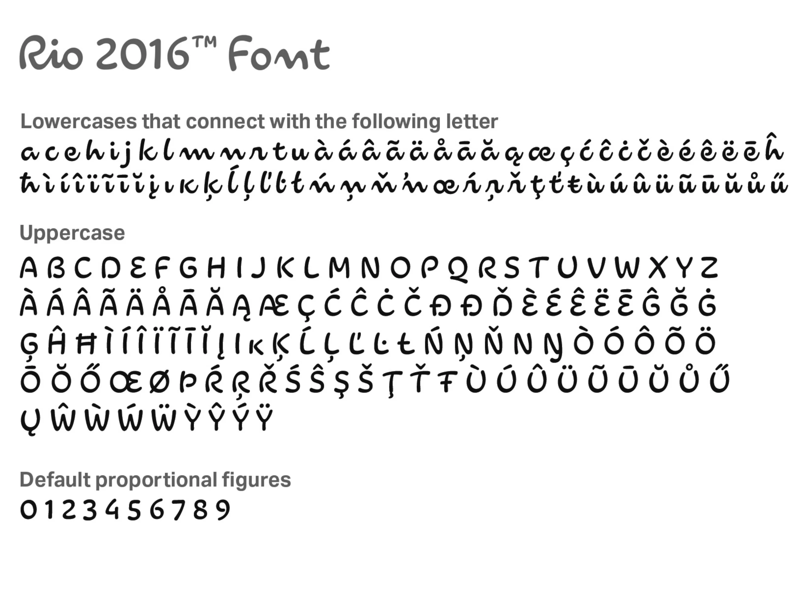
After reviewing hundreds of typefaces, the choice fell on a home-made script typeface. Although the 3 letters were designed in-house, the work had to be extended to create a complete typeface.
Gelli resumed its secret agency costume, and contacted Dalton Maag‘s English studio. Only when they were all together did he reveal the purpose of the meeting. The latter had previously thought they were starting an ordinary project. What a surprise! 🙂 I thought it was a joke.
This time the process was reversed. Usually, you design a typeface, then make the logo. But here, the brief was to perfectly respect the 3 letters of the logo (and the numbers 2-0-1-6!), and create the other 500 characters.
So they began by analyzing in detail the spirit of these three letters. The key was to understand that these letters weren’t written with a pen, but with quick brushstrokes. Take the “n “s: they’re really wave-shaped. Yet there was none of the subtlety of a brush-drawn typeface, with no pronounced full and loose strokes. Basically, it was a “brush-esque” typeface drawn with a black pen.
The next challenge was to manage ligatures. To do this, the team focused on the letters of certain words, such as “passion” or “transformation”, in order to study their conditional ligatures in detail.
Day 4: It’s Sunday.
And yes, in Brazil the week is only four days long. You have to make time for brainstorming on Copacabana beach.
On the subject
-
The 2024 Olympic Games will not get a gold medal for their pictograms
The organizers have unveiled the new Olympics pictograms of the Paris 2024 Games, which totally lose us.
-
The new graphic charter of the Olympic Games
The Olympic Games are redesigning their identity to harmonize their visibility in all countries and on all communication media.