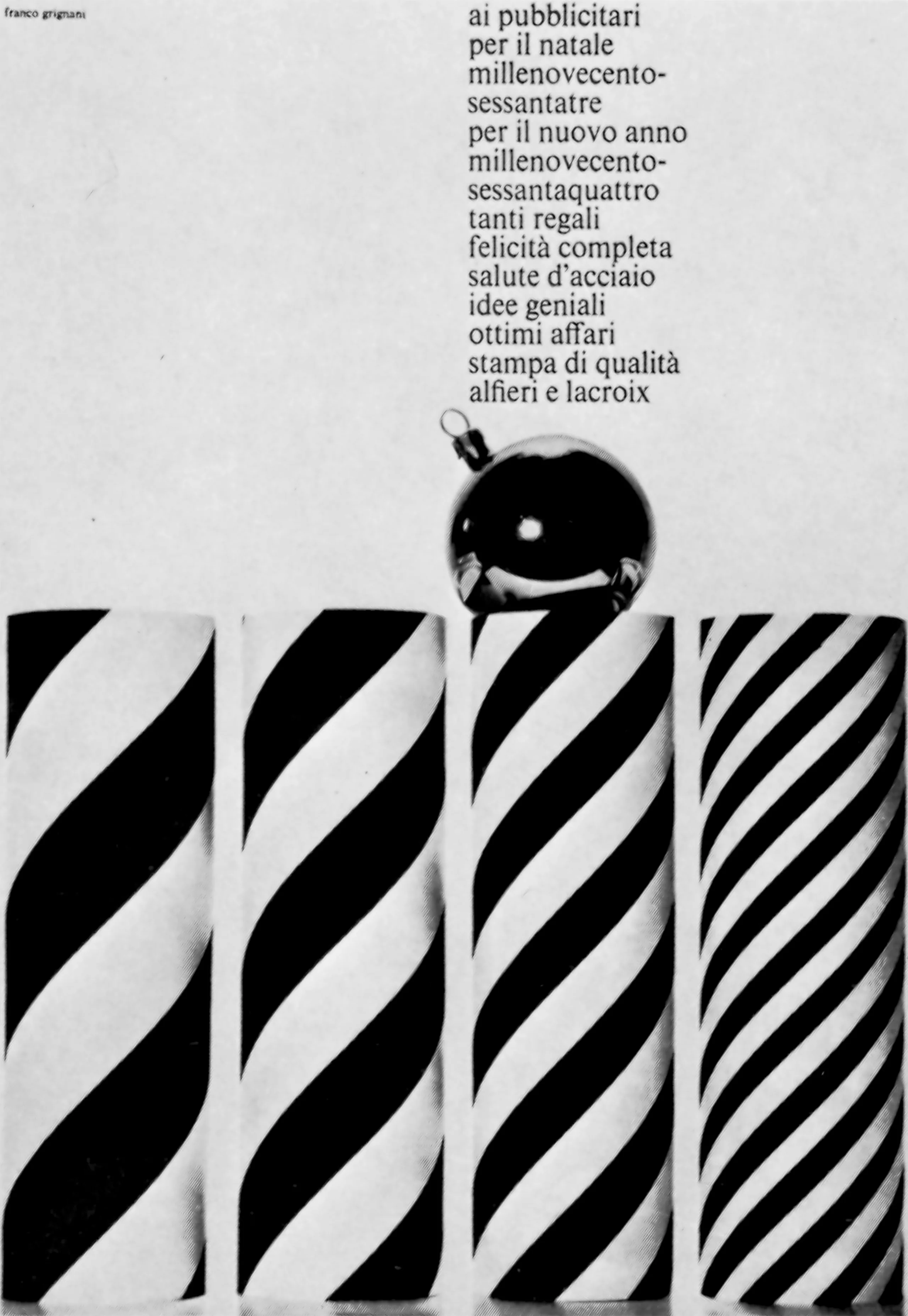
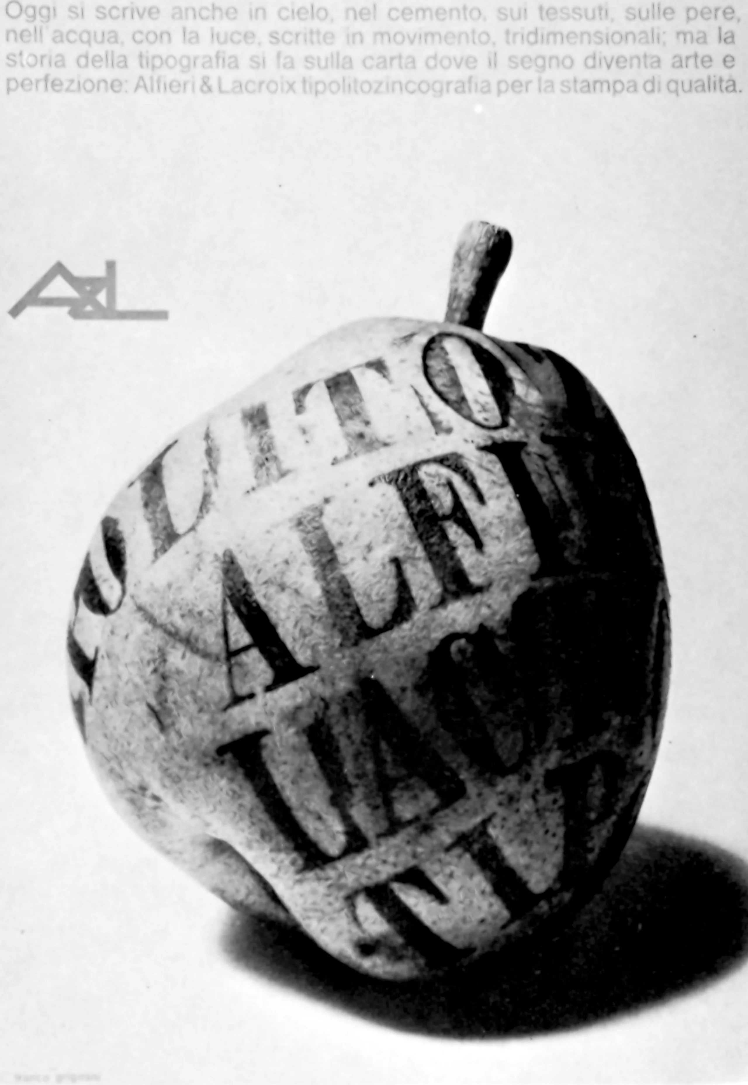
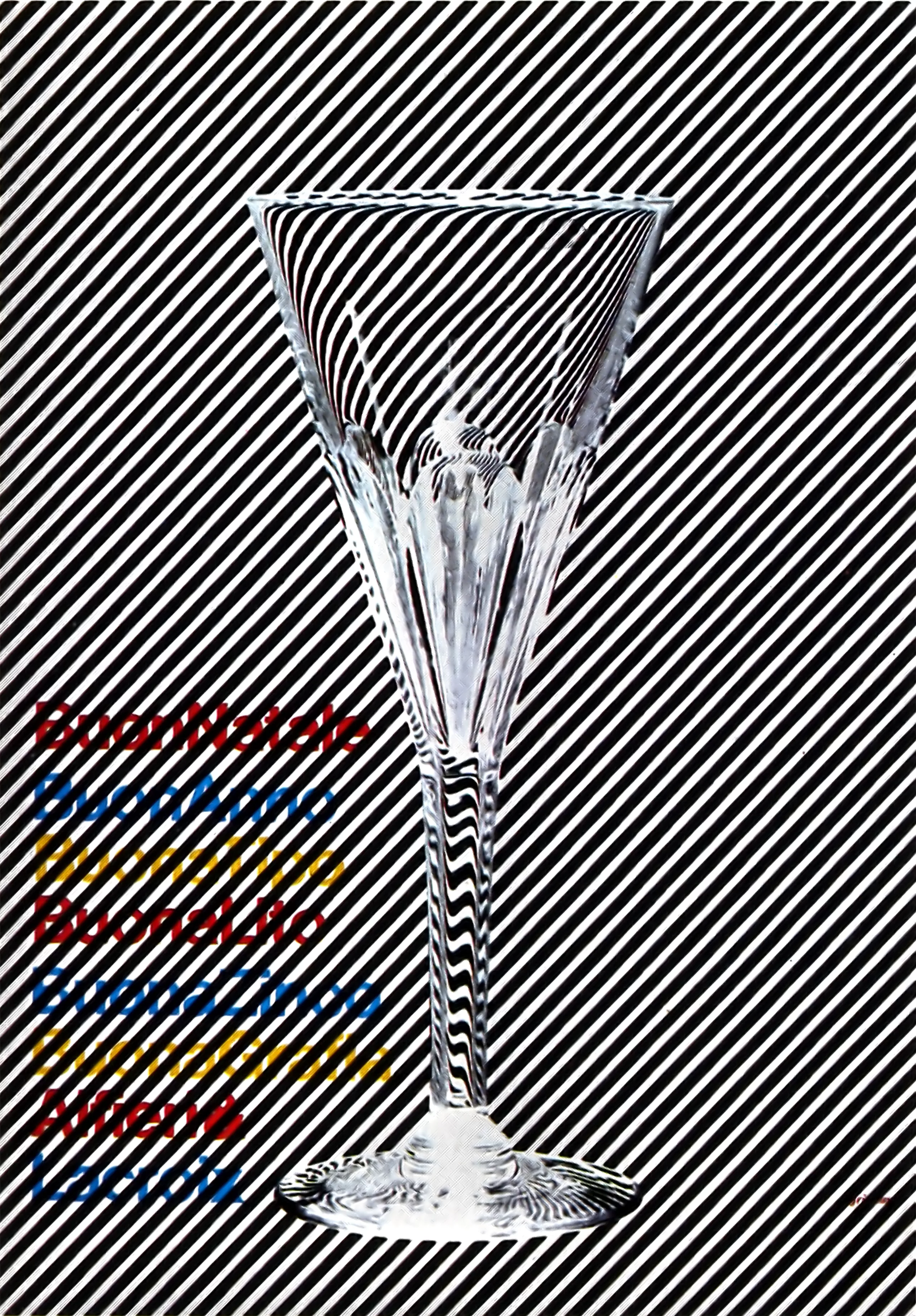
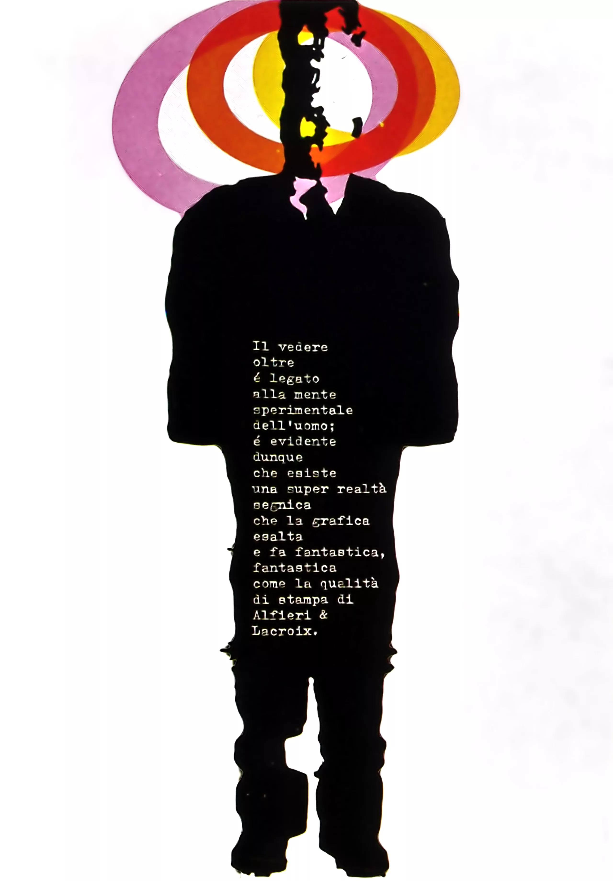
Franco Grignani: “Grafica cinetica”
We launch a new section of our blog which will be dedicated to the history of graphic design and communication. We will present the great names of graphic design and typography through excerpts from old publications which are part of our library… (and which are obviously no longer sold!).
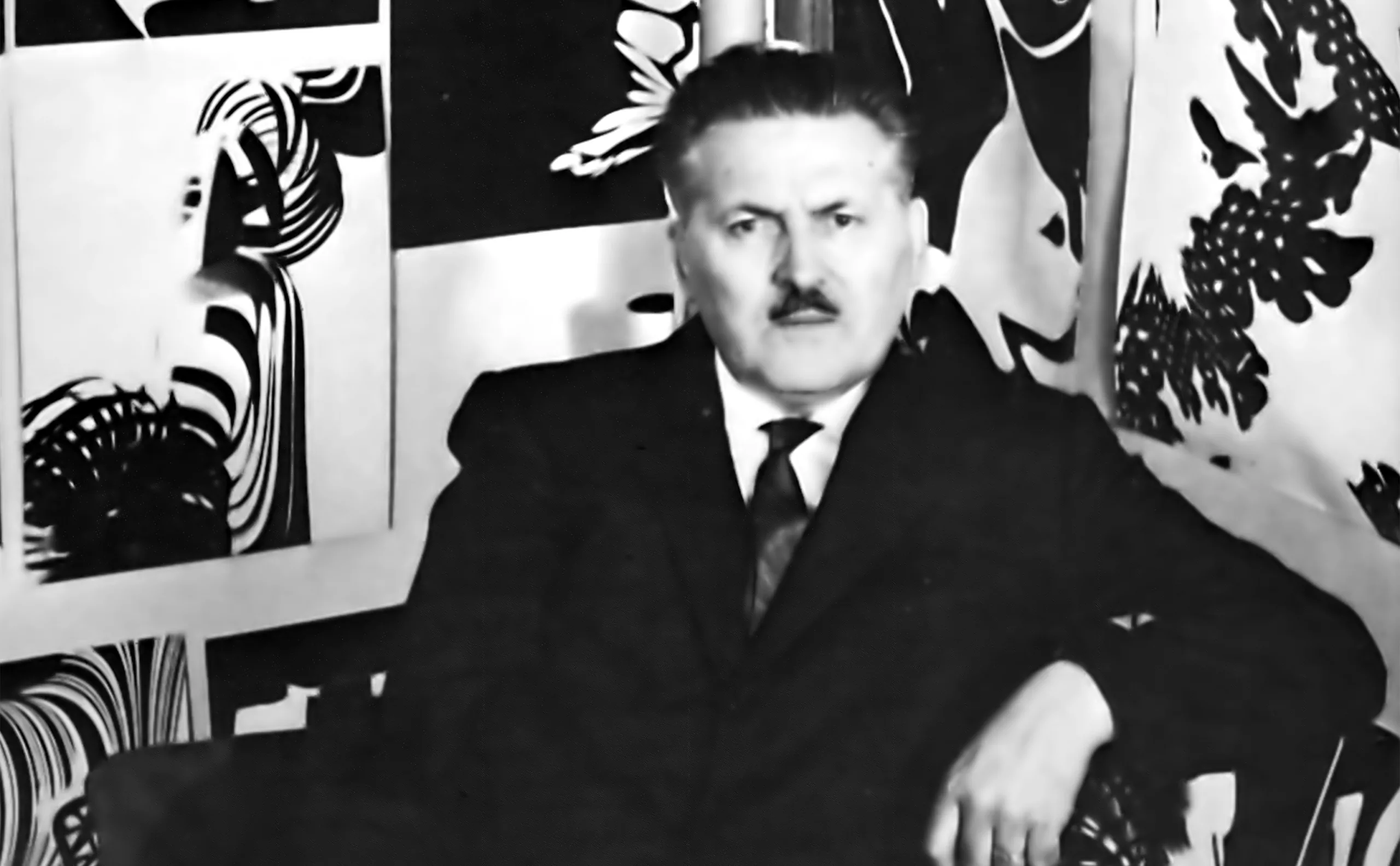
Franco Grignani, 1908/1999
We begin by presenting the work of the Italian graphic designer Franco Grignani (1908-1999). This is a text in which he himself presents his work and his vision of the profession (initially published in the “Graphic Designers in Europe” collection in 1973).
Surprisingly, many of his reflections remain very contemporary. Like the swiss graphic designer Rolf Rappaz, his graphic design practice was conducted in parallel with an intense artistic practice.
In the 70’s he produced and collected detailed documentation of his work which had a great influence on international graphic art. At that time, many publications presented his work.
His works of art and experimental works are still in the collections of the Museum of Modern Art in New York, the Stedelijk in Amsterdam, the Museum of Modern Art in Warsaw, and the Victoria and Albert Museum in London. Numerous personal exhibitions have been held in Italy and other countries. The constant evolution of his graphic work, his painting, as well as the coherence of his method, have always aroused a keen interest among young graphic designers, starting with us!
Here is Grignani’s text:
Experiment as far as possible
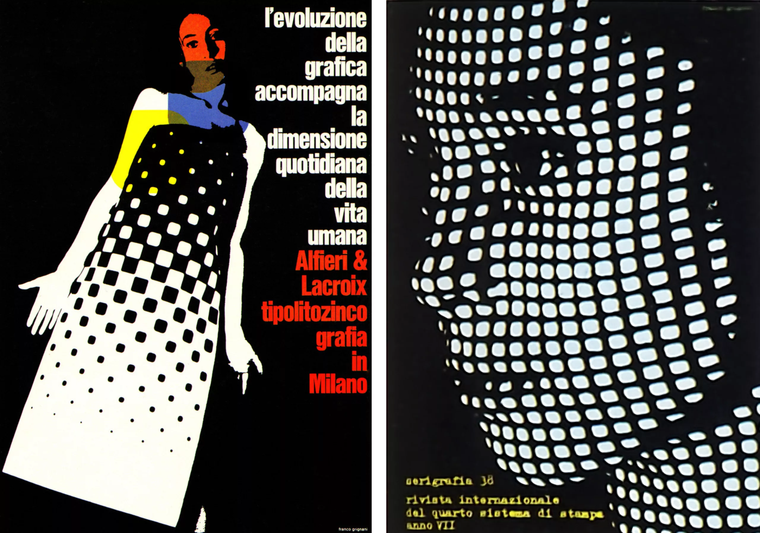
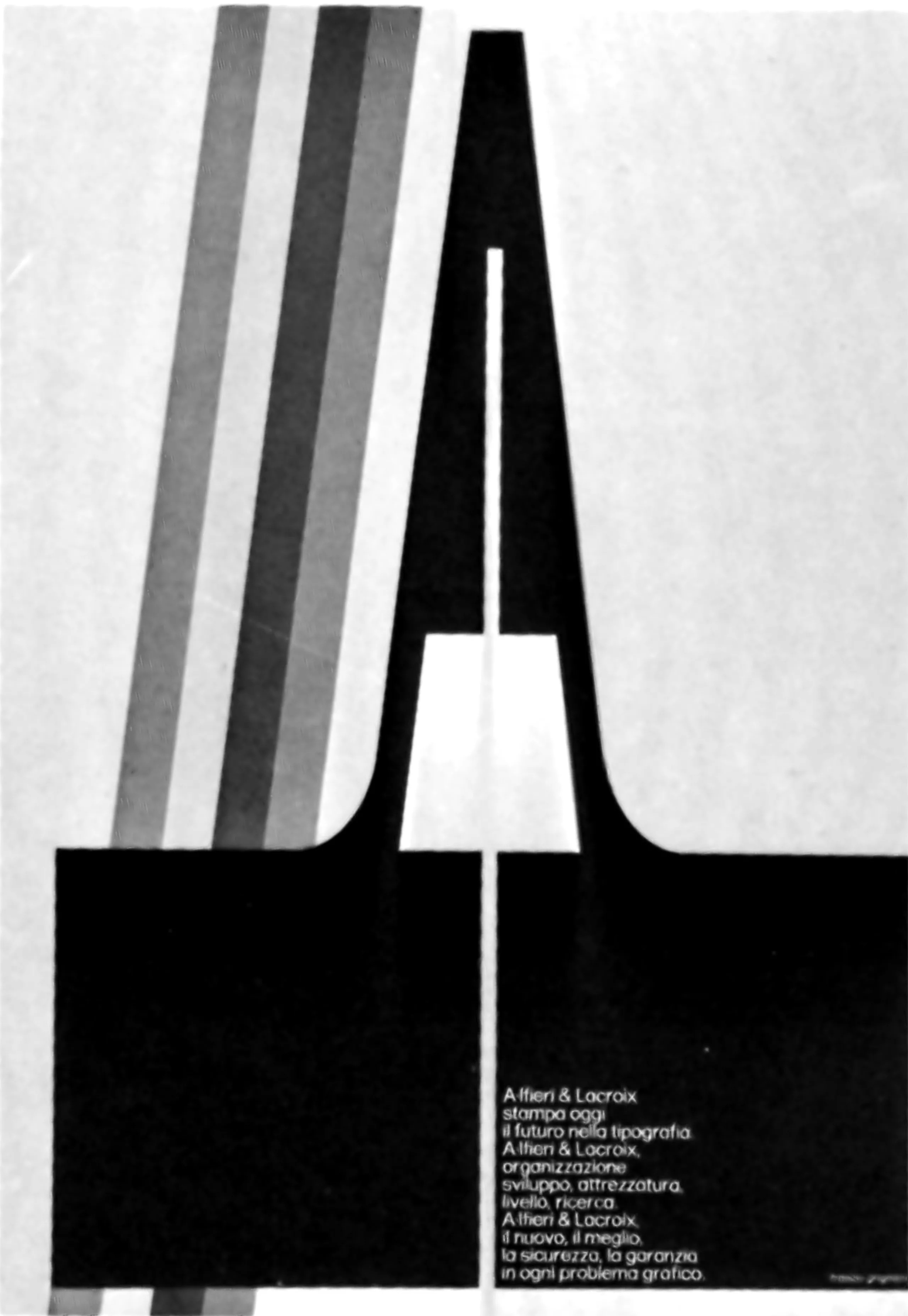
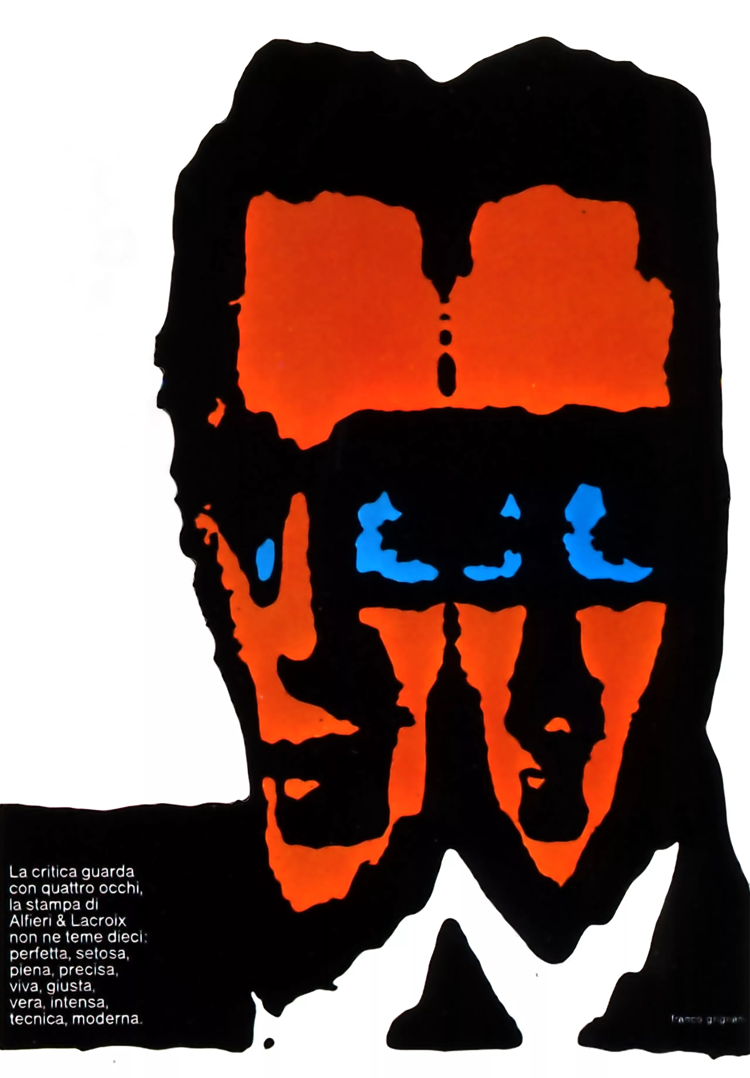
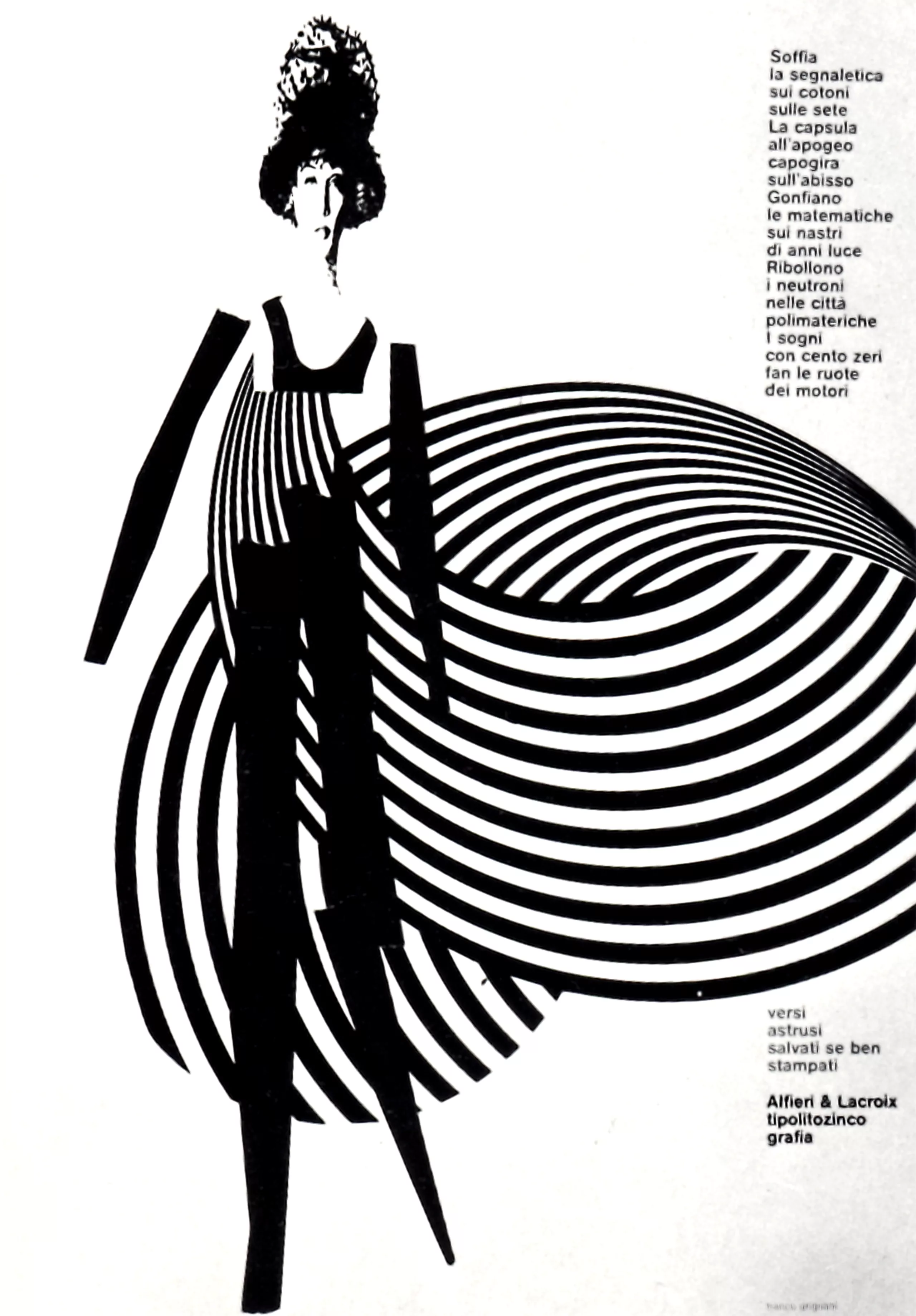
To assert its utilitarian role in the service of visual communication, graphic art must rely on a large number of experiences in order to achieve the ideal freedom from the routine of daily activities. The urgency conditions the quality, the limits imposed by the subject slow down the creative spirit, there is also the coherence of the style, all these obstacles hinder the individual character of the graphic designer. I have done my best to resist all these external factors and I have tried to broaden the scope of my own activity by compelling myself to experimental work that often encroaches on the scientific fields of philosophy and physics. It is only through the fusion of diverse elements as much as through decantation and contamination, that graphic art will complete its evolution through new ways and expressions.
The marked tendency that I feel for experiments, or better, my penchant for the imagination sciences, probably comes from my training as an architect. I did not confine my experimental activity to a rigid mathematical framework, on the contrary, I went as far as possible beyond this limit. As an example, I can cite my experiences with optical distortions and structural stresses. The human eye “sees” through emotions and suggestions, which is why flat geometry or a balanced composition are too logical to have the necessary force to trigger the eye’s reaction. Most of the time, we see advertisements next to other posters, naturally this promiscuity requires each advertising poster to have its own physical autonomy of expression, and by “autonomy”, I mean the possession of this traumatic value that instantly captures the viewer’s gaze and makes him feel a certain embarrassment of perception, an irregularity created by tensions.
The power of graphic designers
Through mechanical reproduction and dissemination, graphic art has become the most important means of communication and propagation of culture. Every day, by leafing through a newspaper or magazine, or looking at a row of posters on walls, consciously or unconsciously, we receive messages. The graphic designer represents a fundamental power in the world. He pours “culture” into the street, distributes it to the man in the street, and allows him to assimilate communication.
I would now like to classify my research experiences into various trends, under different headings.
The fluid period
First, my research was limited to creating indefinite images or very vague signs, in order to awaken observation and the creative spirit. Then, this study switched to incomplete images (completed by means of photographic cut-outs) which by their “content” of information, were intended to stimulate the thought process.

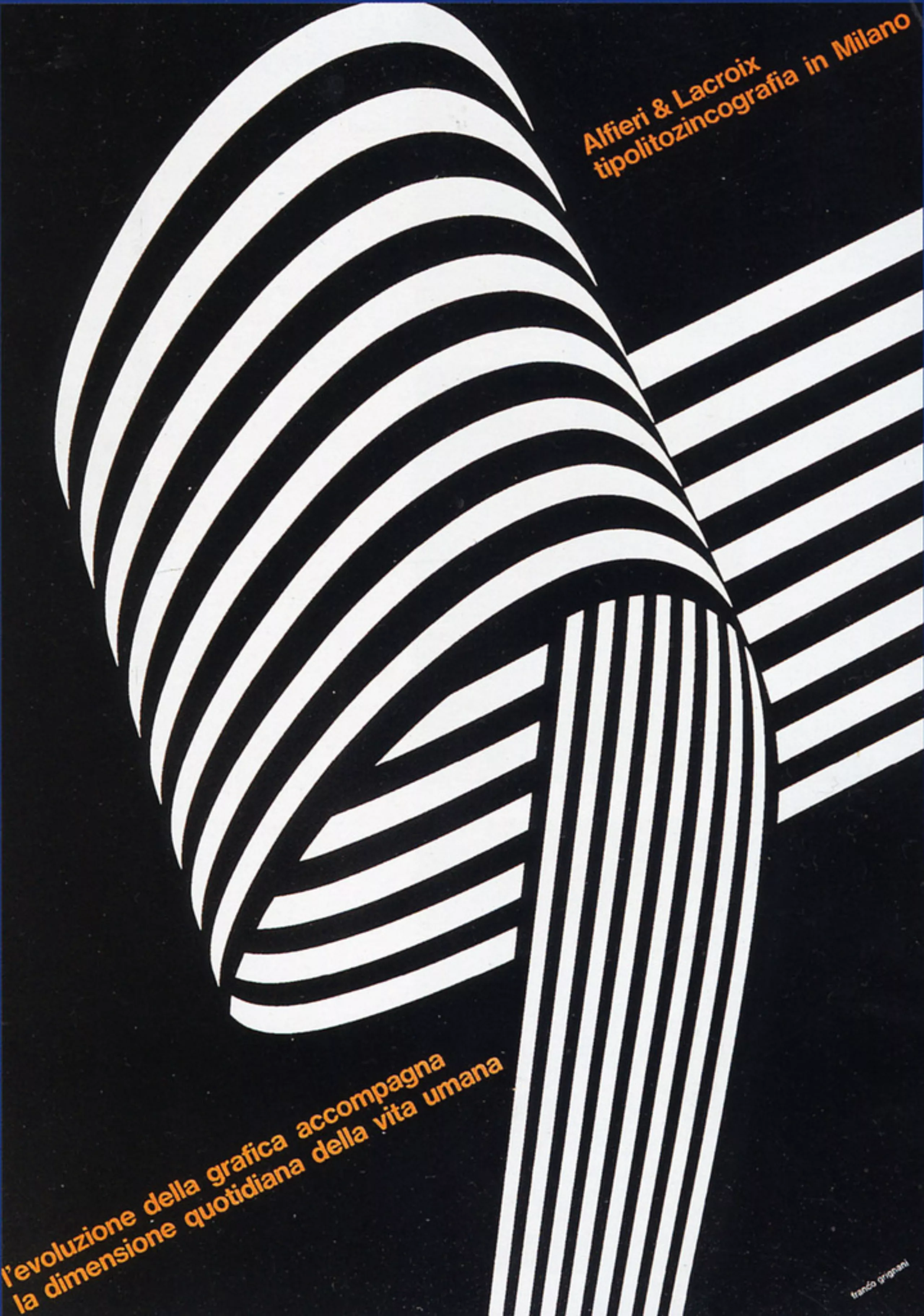
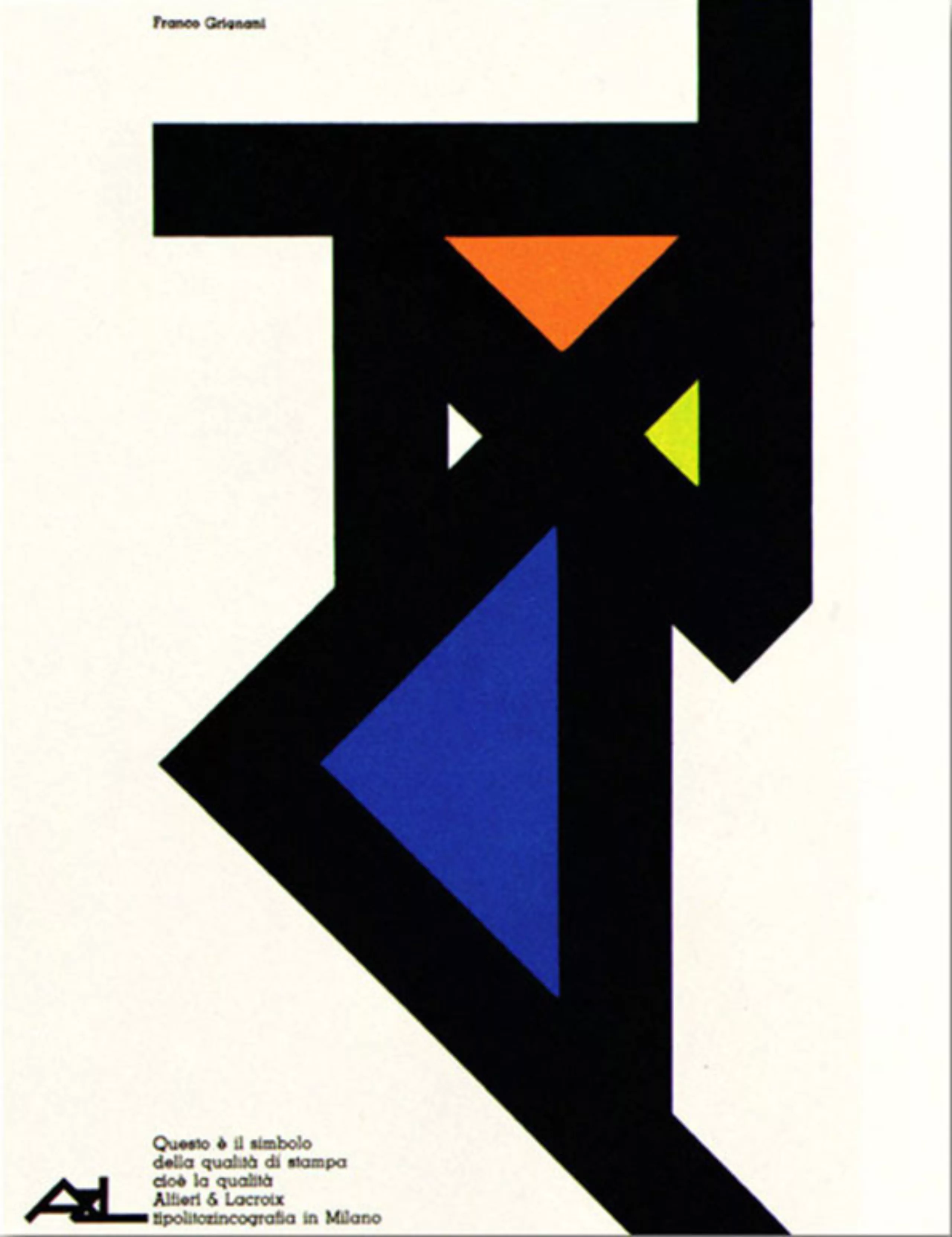
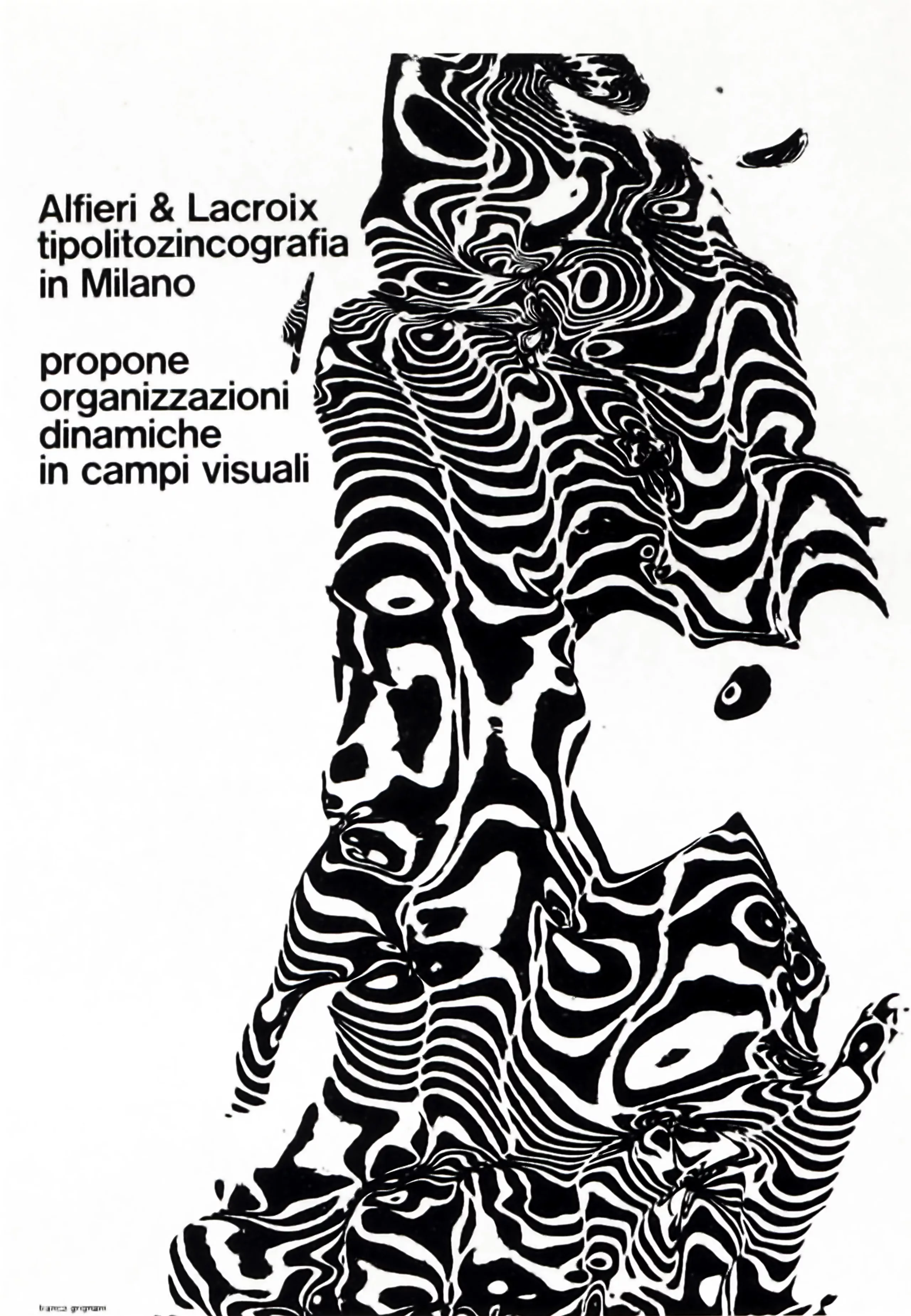
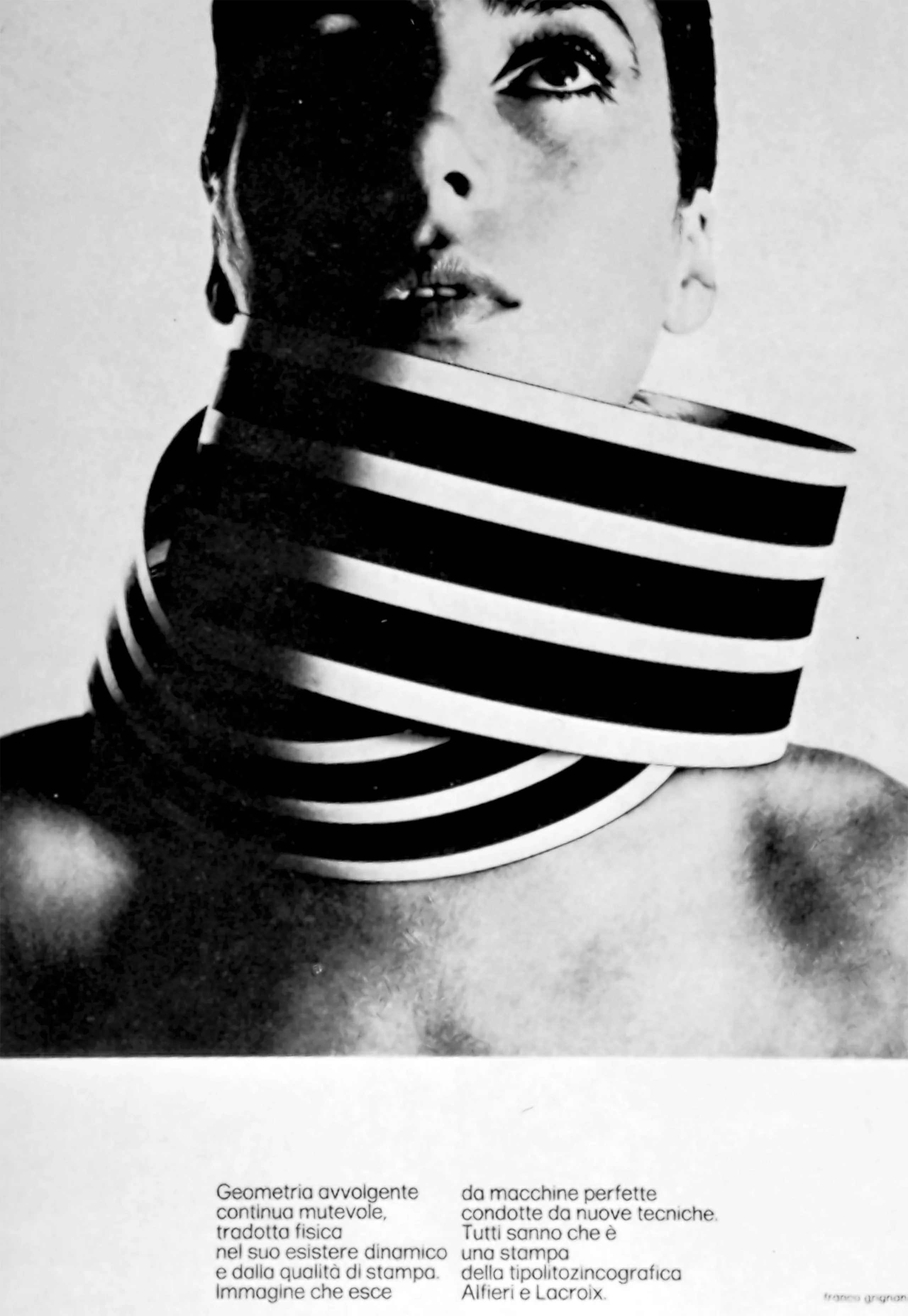
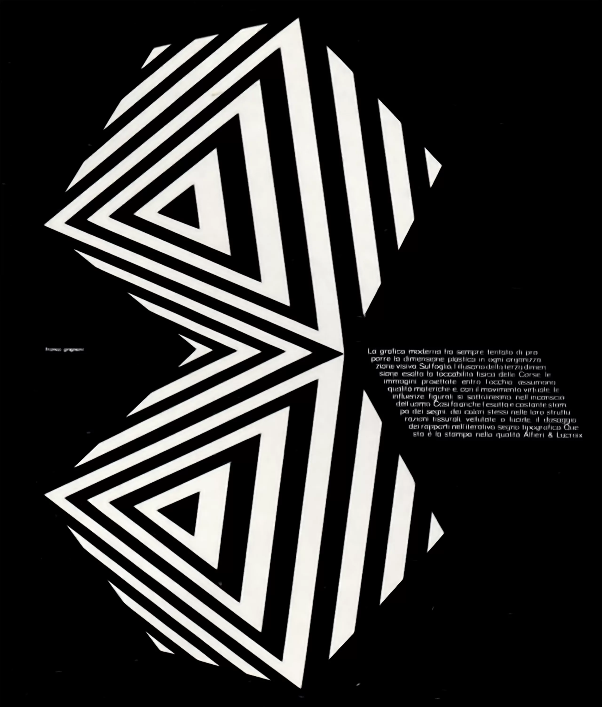
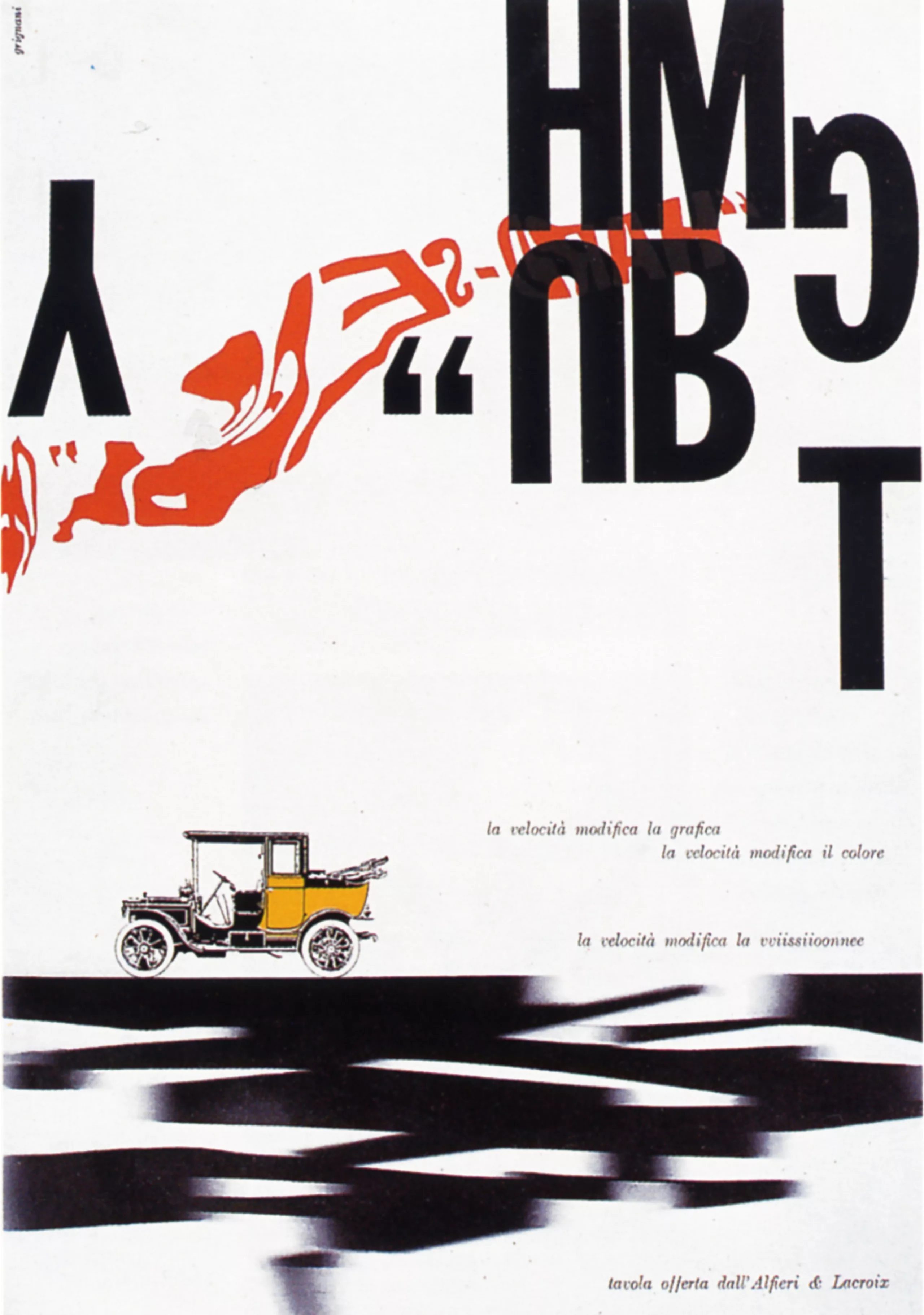
Research on distortions
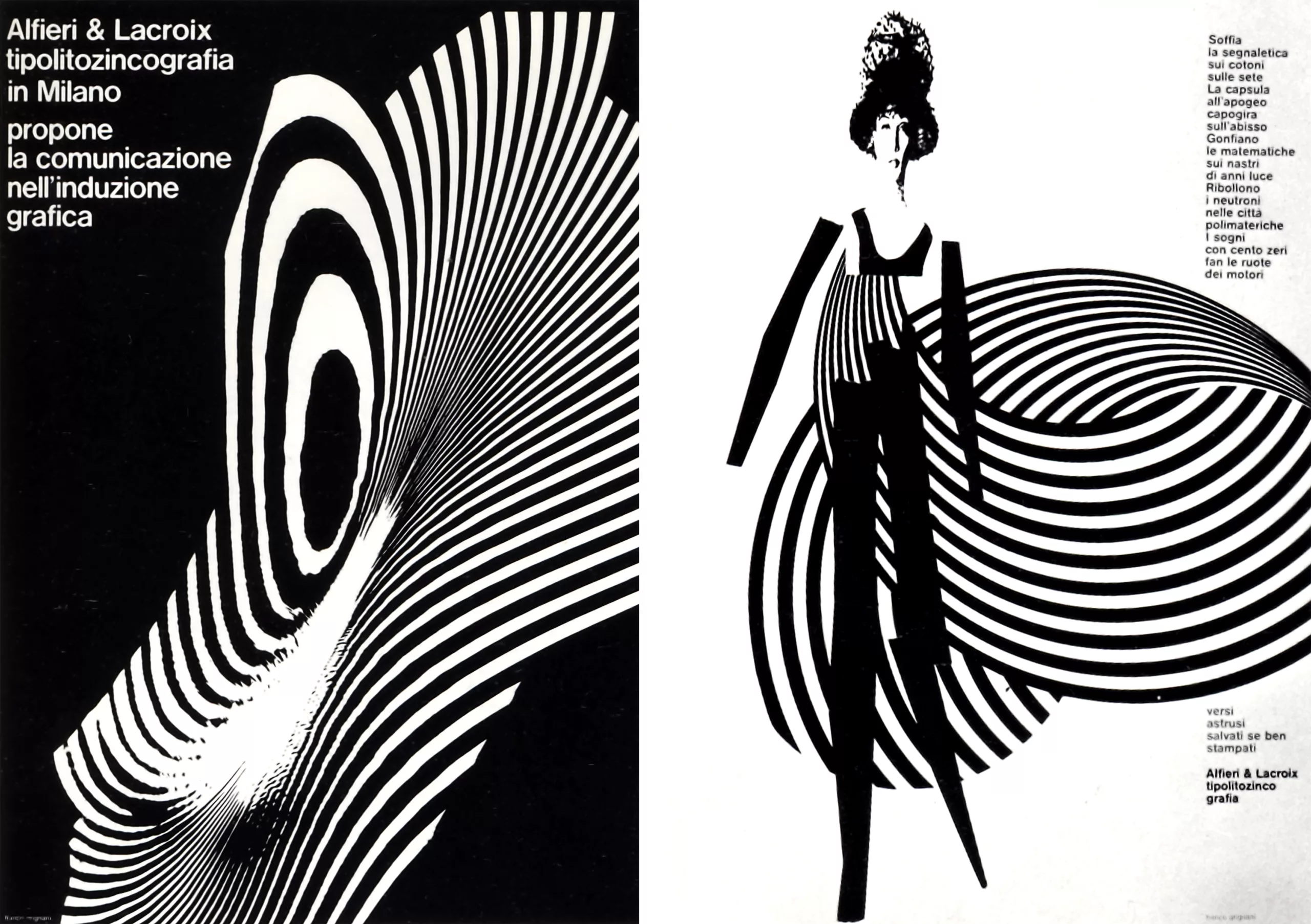
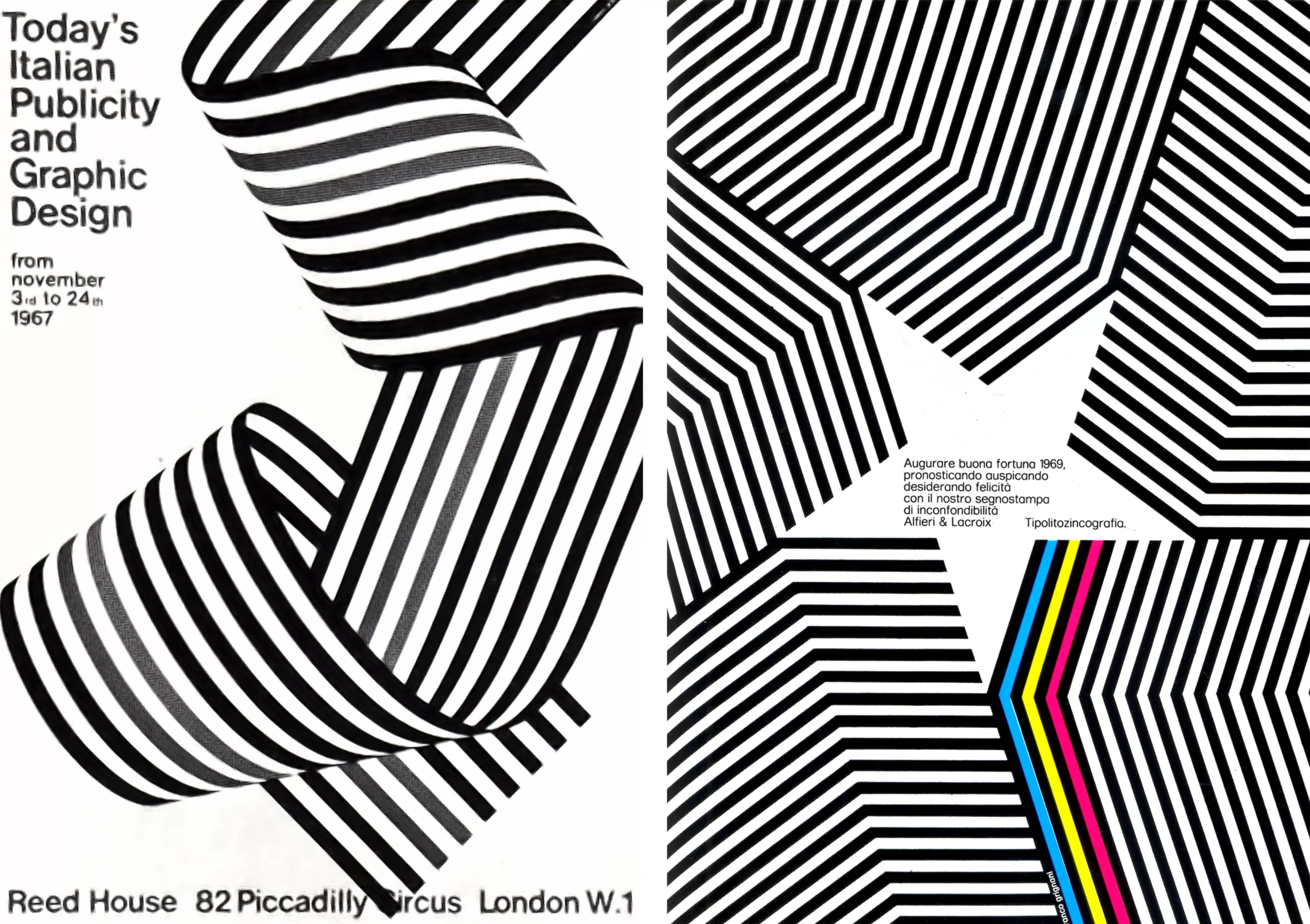
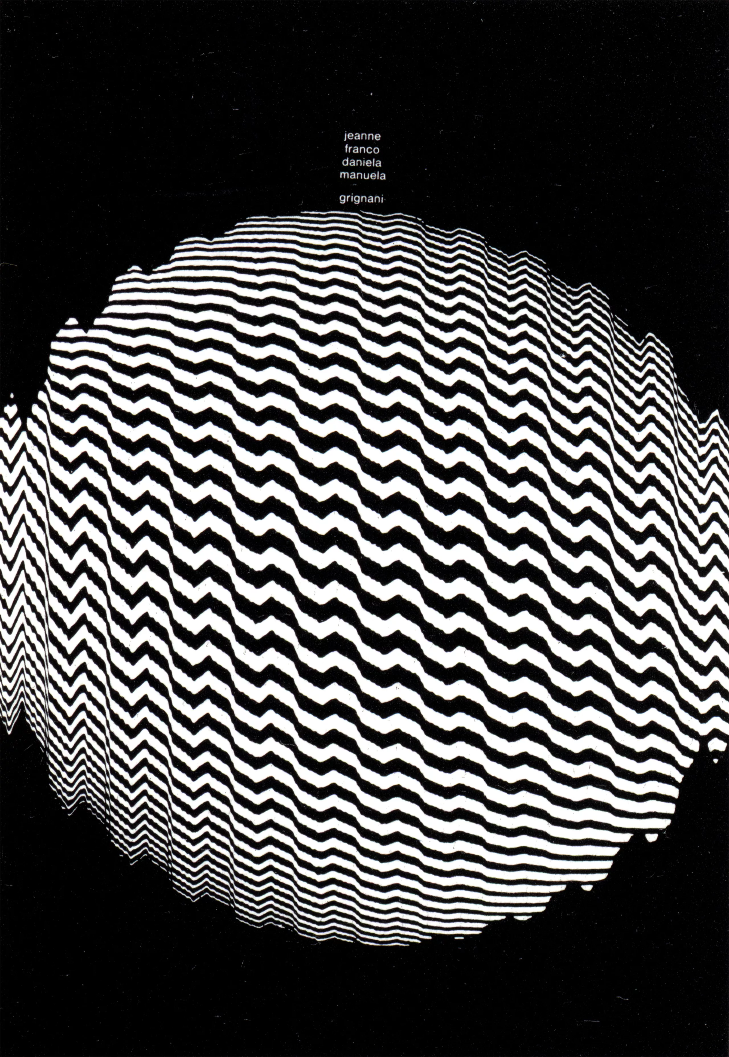
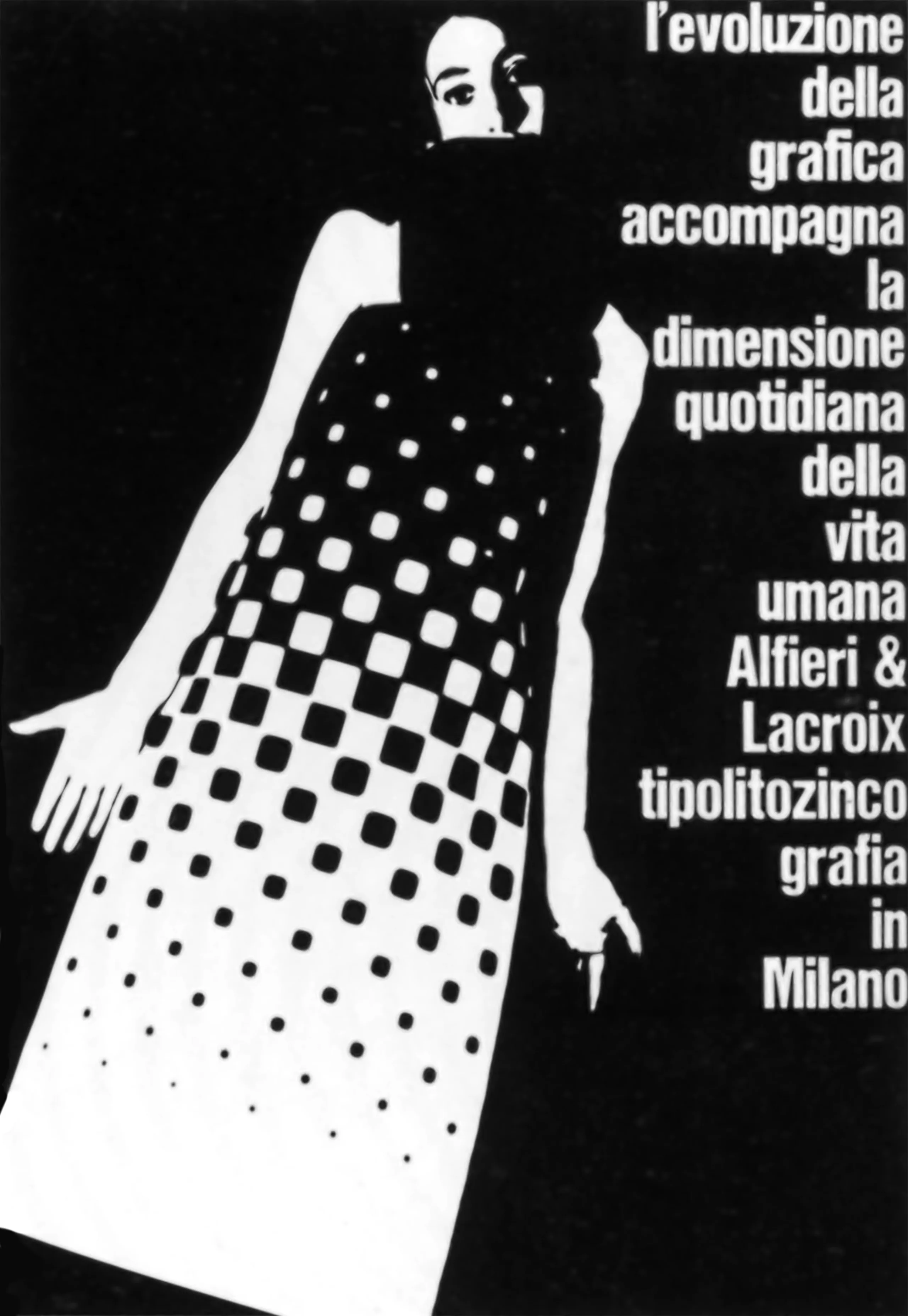
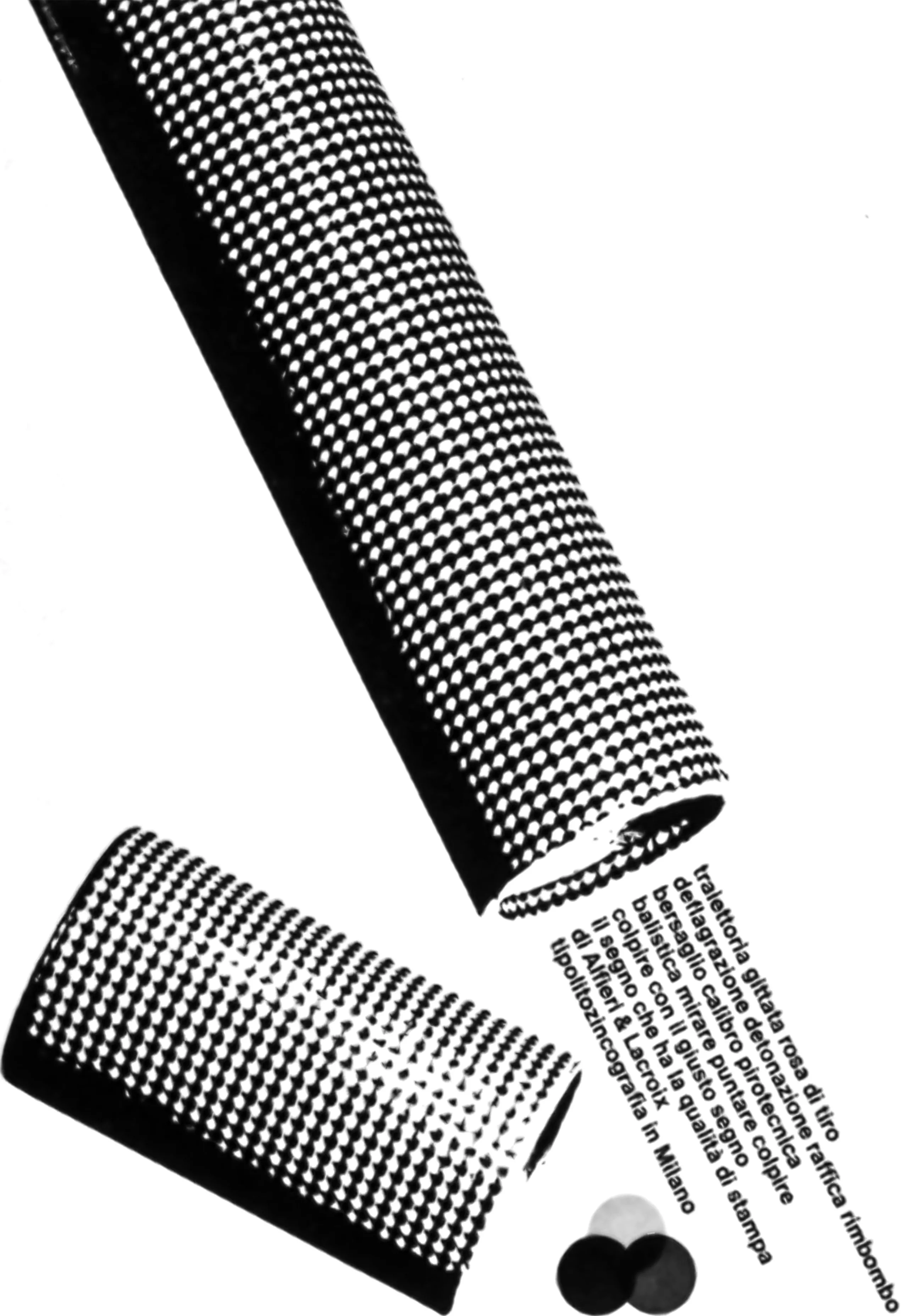
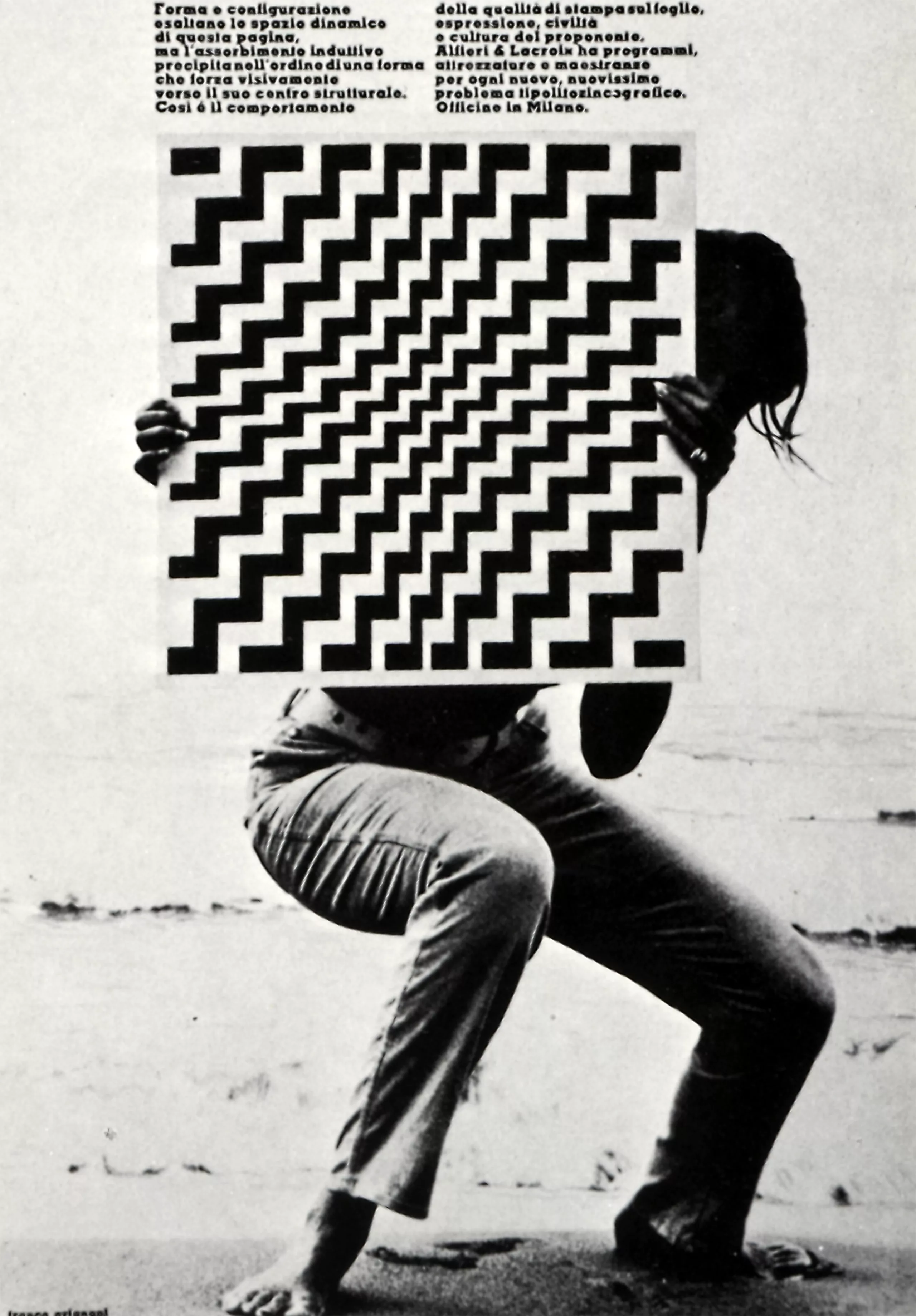
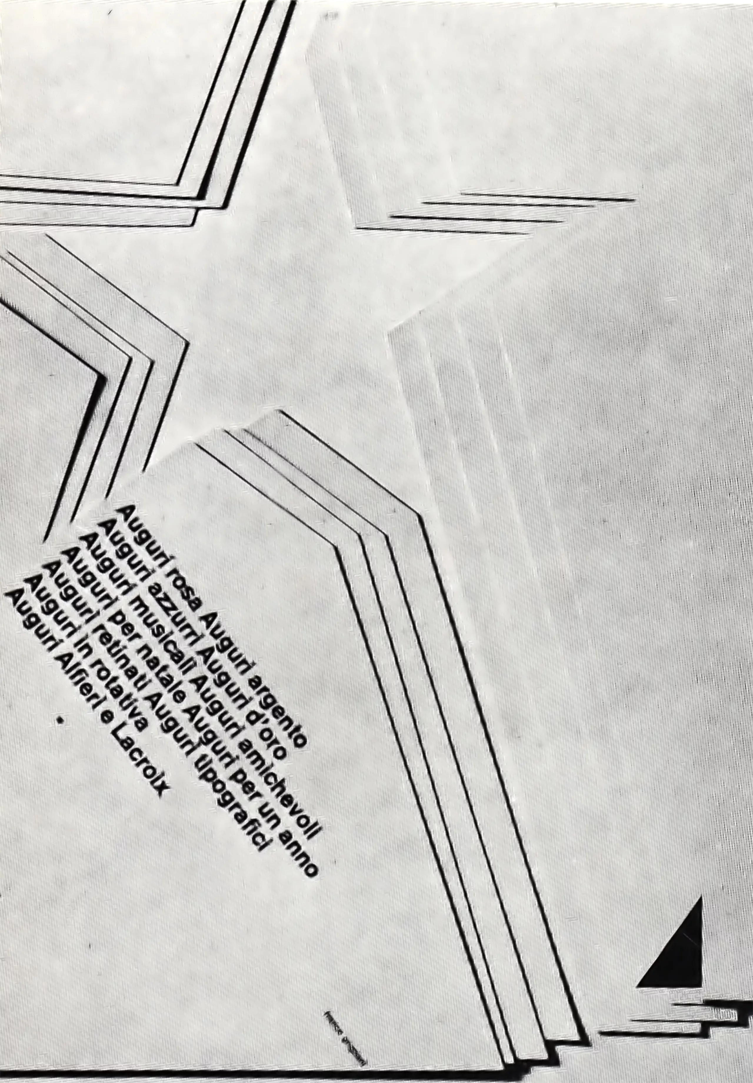
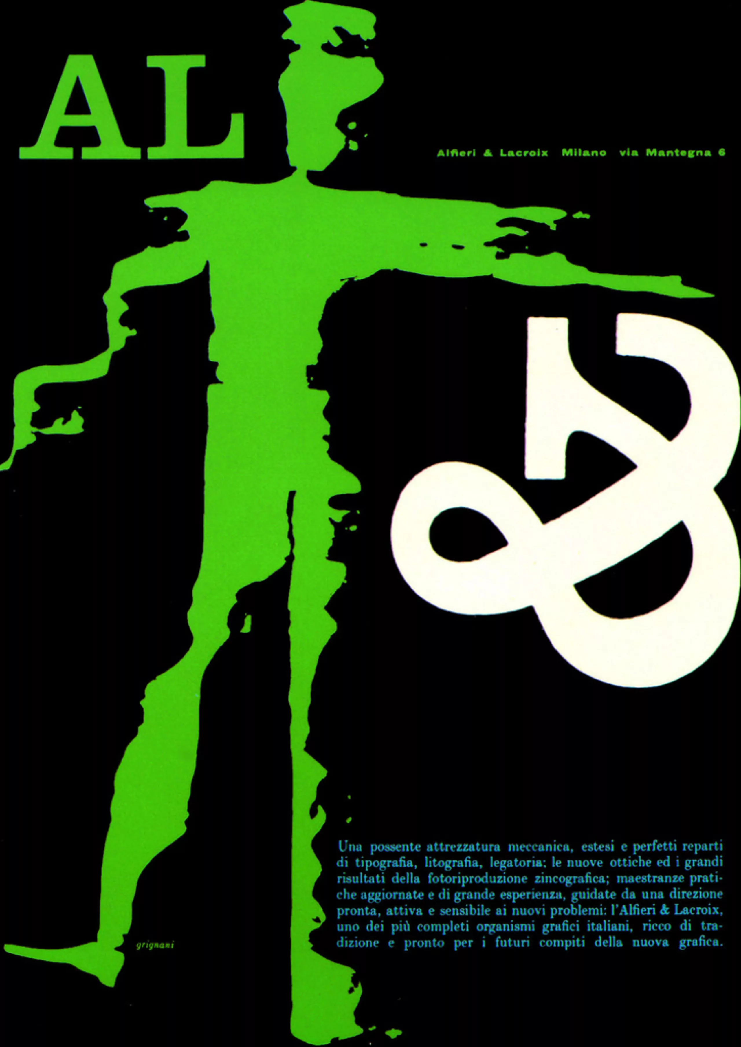
The reality of an image or sign is optically altered in order to compete with the logic imposed by the eye. A careful look will make new discoveries, beyond the rules of logic (where forms are anthropomorphic), free of geometric restrictions, free of any structure. Then, we reach the trauma due to the dynamics, to the individuality, to the “unique”, which is frequently disposed in an ordered geometric space.
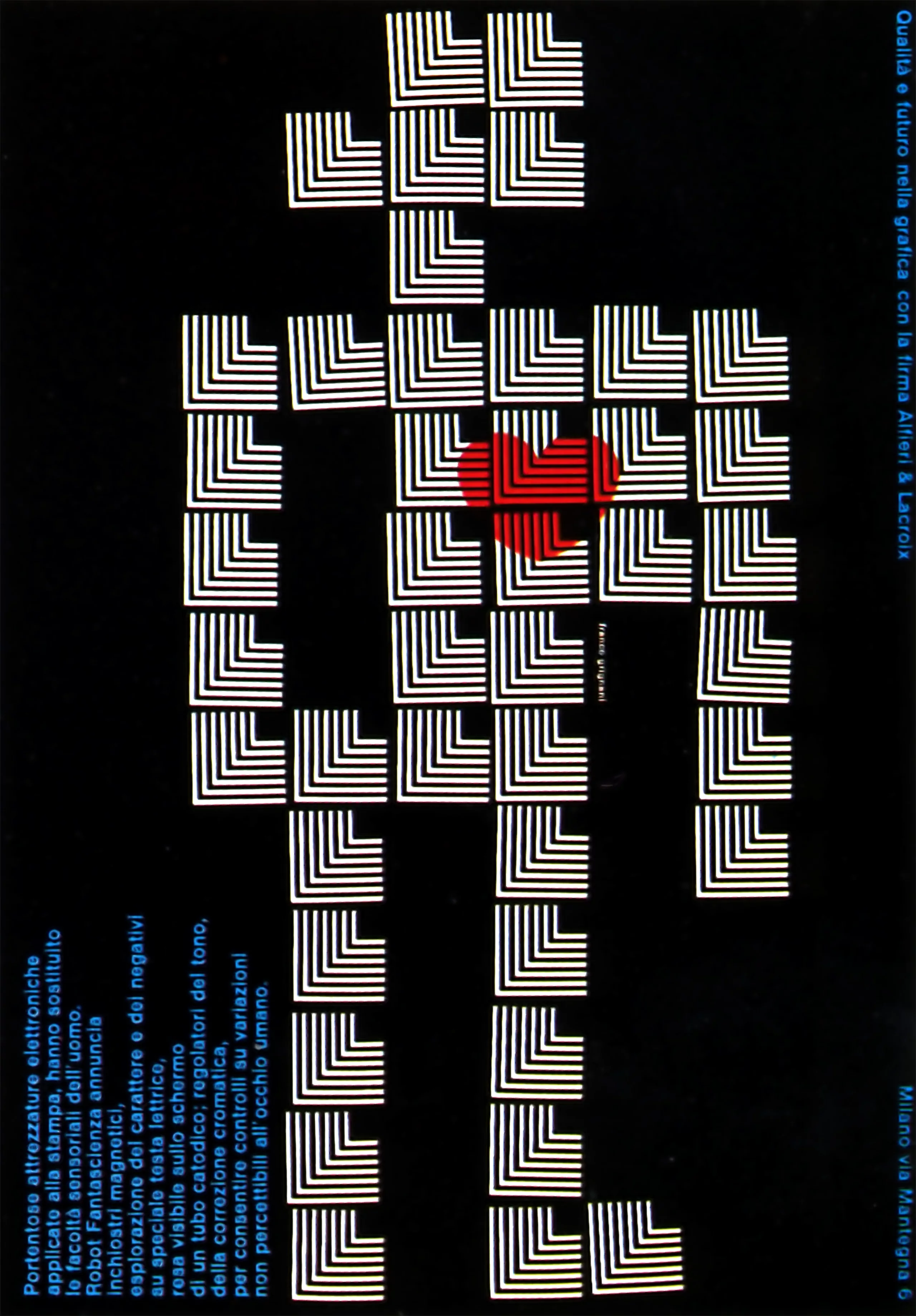
Tension in all its forms
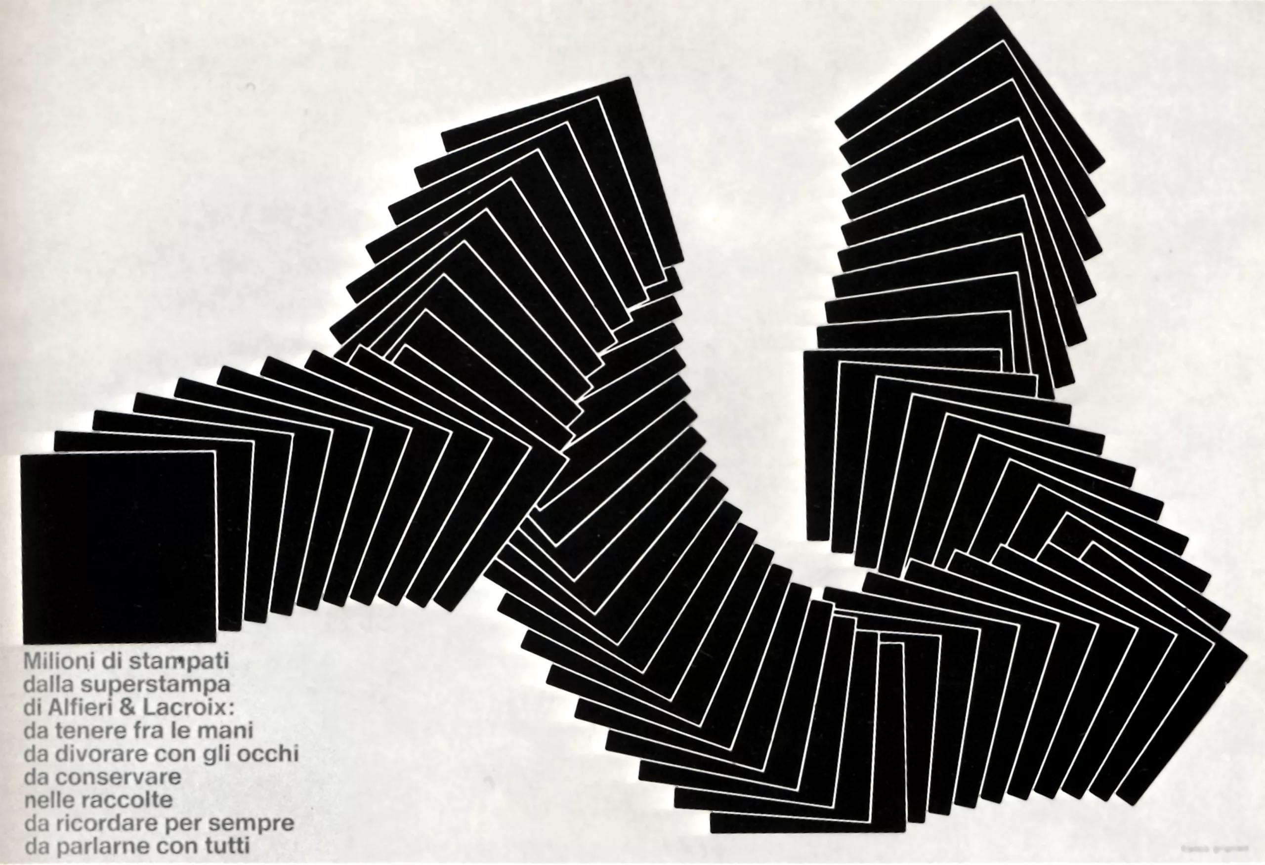
After the distortion, printing a form using tensions, I turned, as a coherent continuation of the experience, towards a period of tensions in the forms and in space. The fact of breaking the uniformity of the space produces tensions more strongly felt because of the physical unease that they cause and by the process of re-elaboration of our personality that follows, in the last place, they stimulate the completion of the proposed image. These are fundamental phenomena of visual communication. Nevertheless, we can affirm that even an expression of the human body, a movement or a simple gesture, creates tension. This force of tension is equal to the effects produced by a certain space, or by the balance of whites and blacks, or by colour, or by words expressed or not expressed.
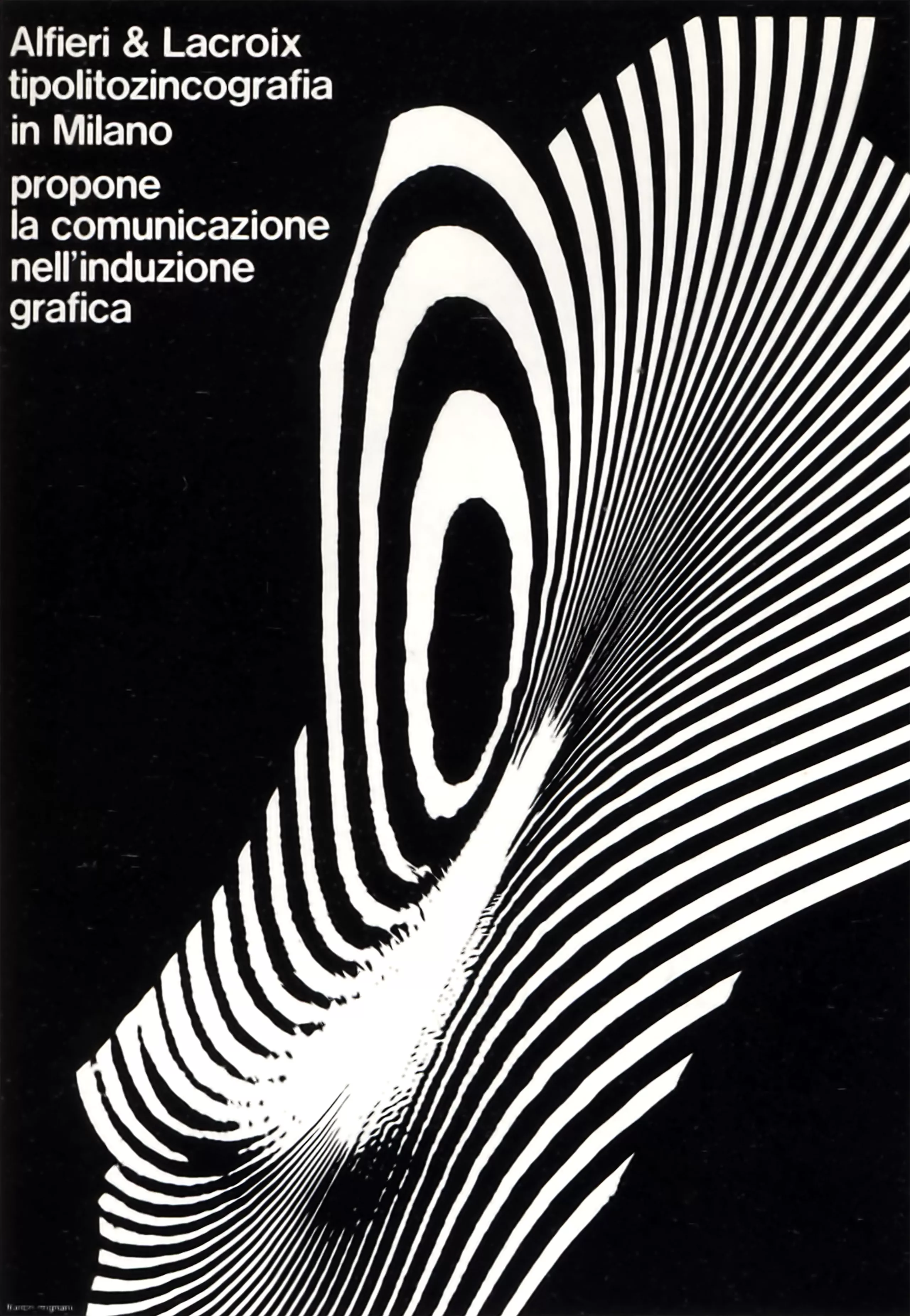
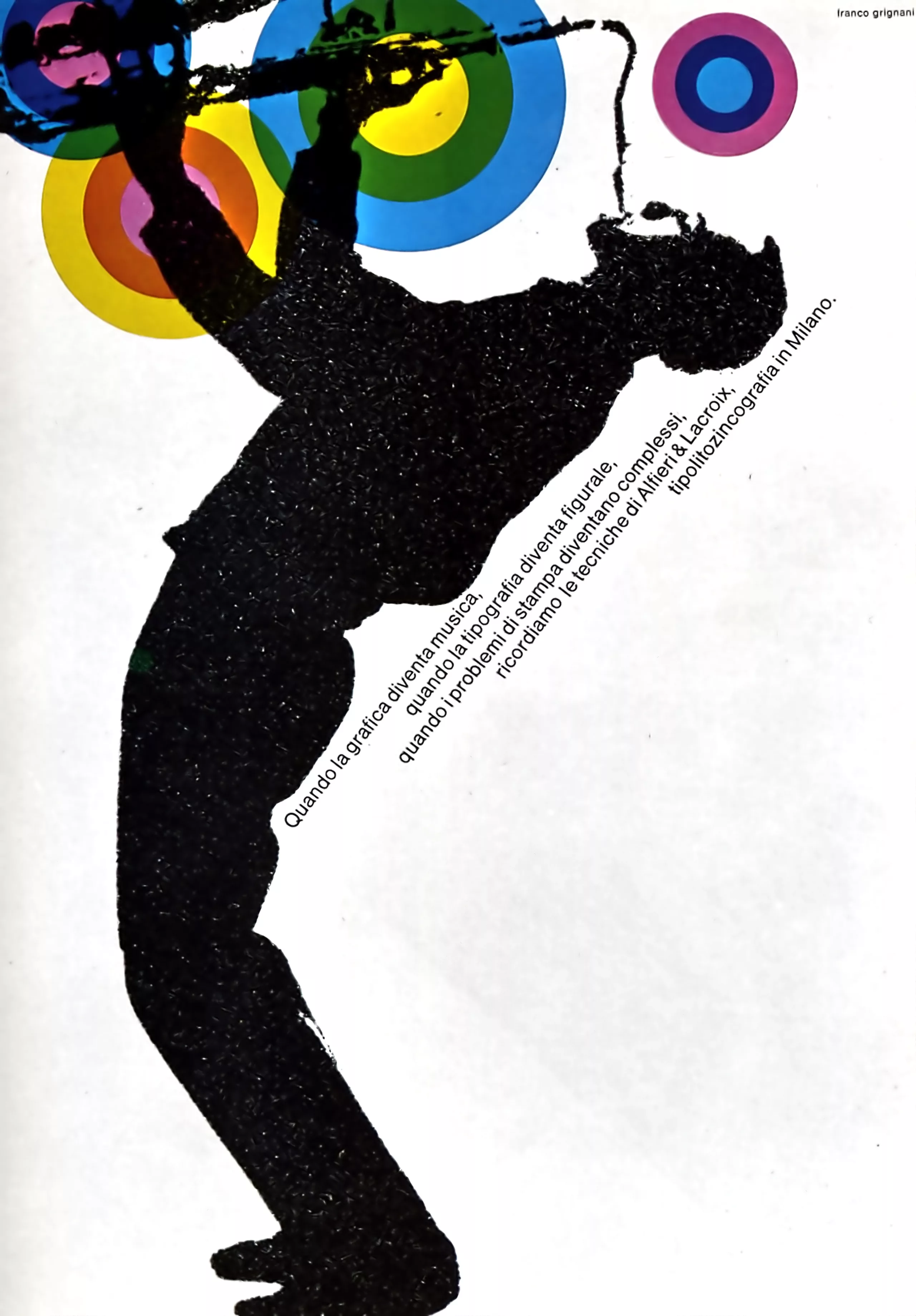
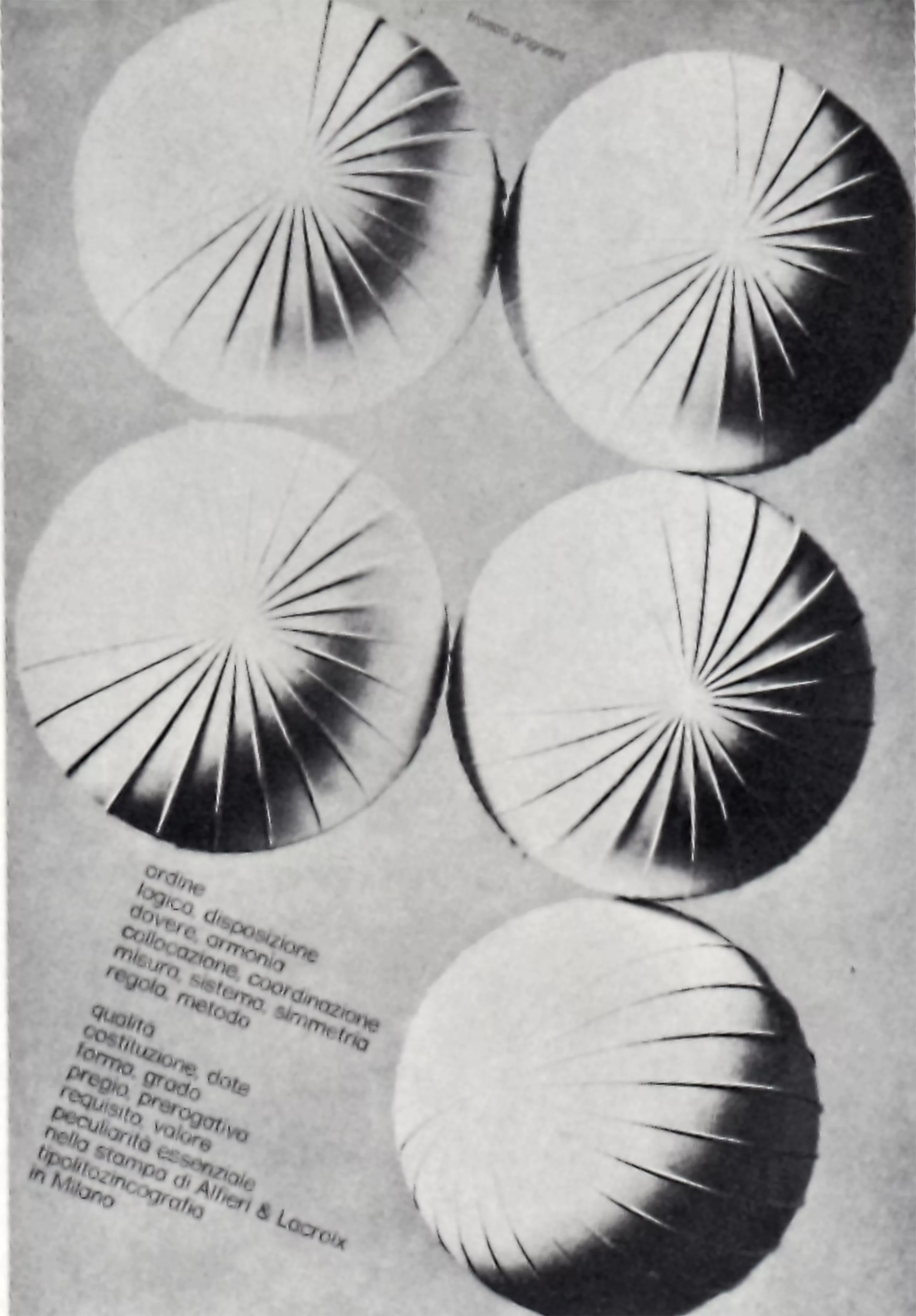
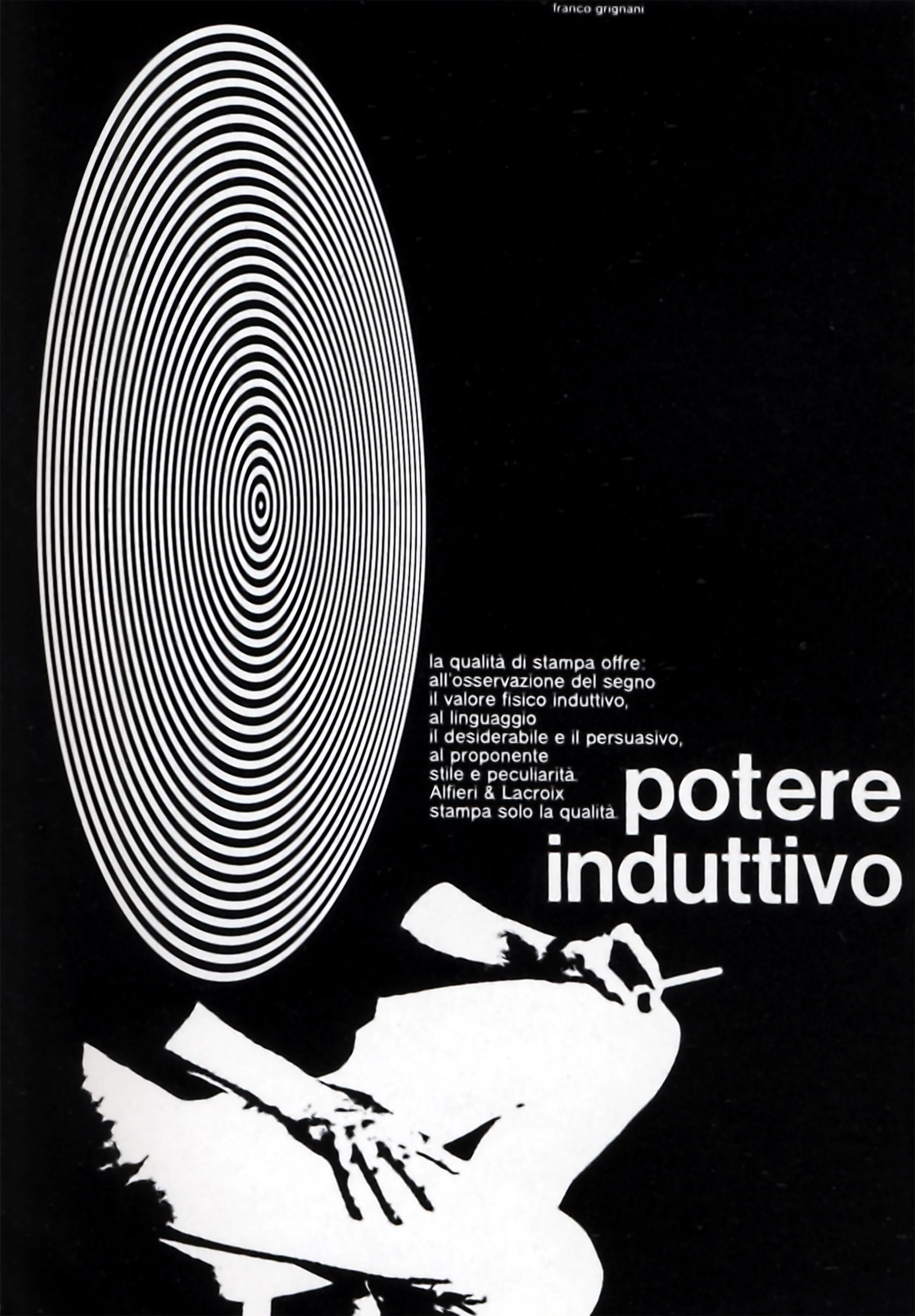
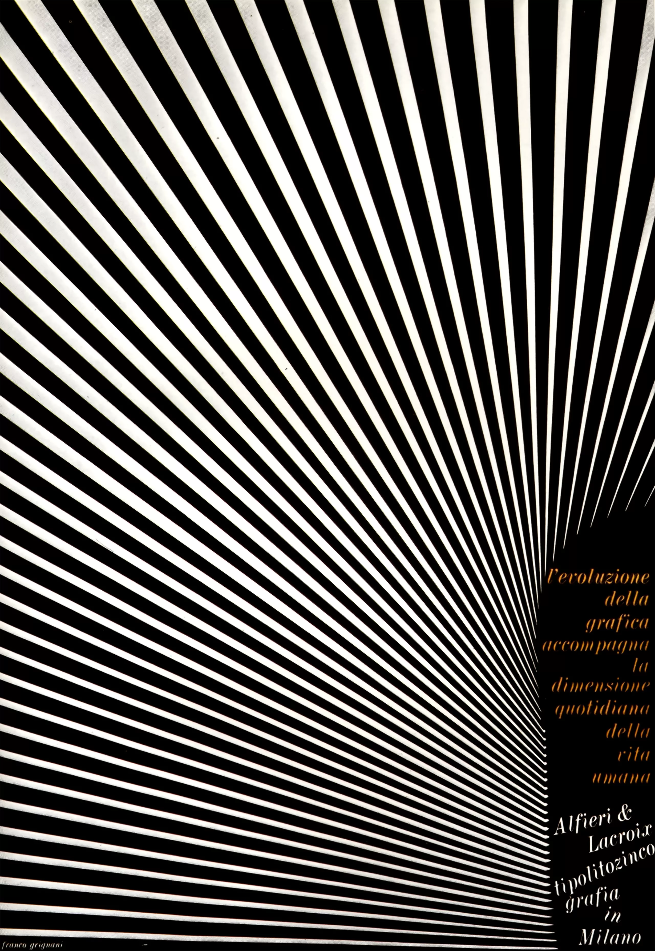
Visual induction
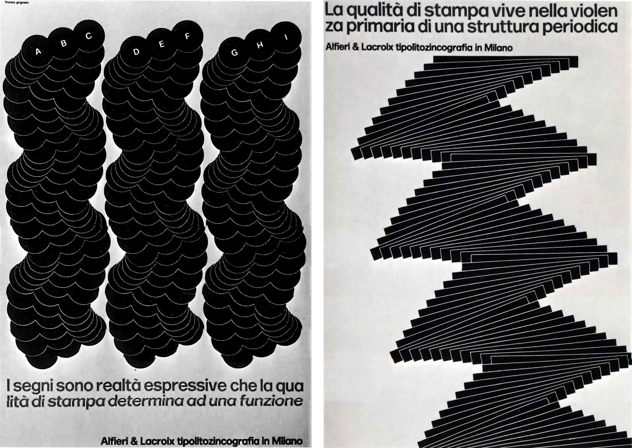
Induction acts as stimulant, concentration, absorption. Some circular shapes are good examples, shapes based on a marked radial balance, shapes have a focusing, compulsive core.
To date, I have produced over 14,000 experimental works. Obviously, such a profusion took a large part of my life, but I had decided to devote myself to two activities: one, earning a living, the other, “making my life”.
With this assumption, the solution of continuity between the two is rather confused. Recently, I have moved from graphic drawing to painting, which, by its absence of restrictions, has given me the illusion of greater freedom.
I have always been interested in photography, especially “avant-garde photography”, as an element applicable to graphic art. Photography should not only be good documentation, even poetic documentation. She must create strange images, using light and chemistry. Today, my work contains little drawing and my previous achievements have always been reworked by photographic or optical processes in order to express a different meaning.
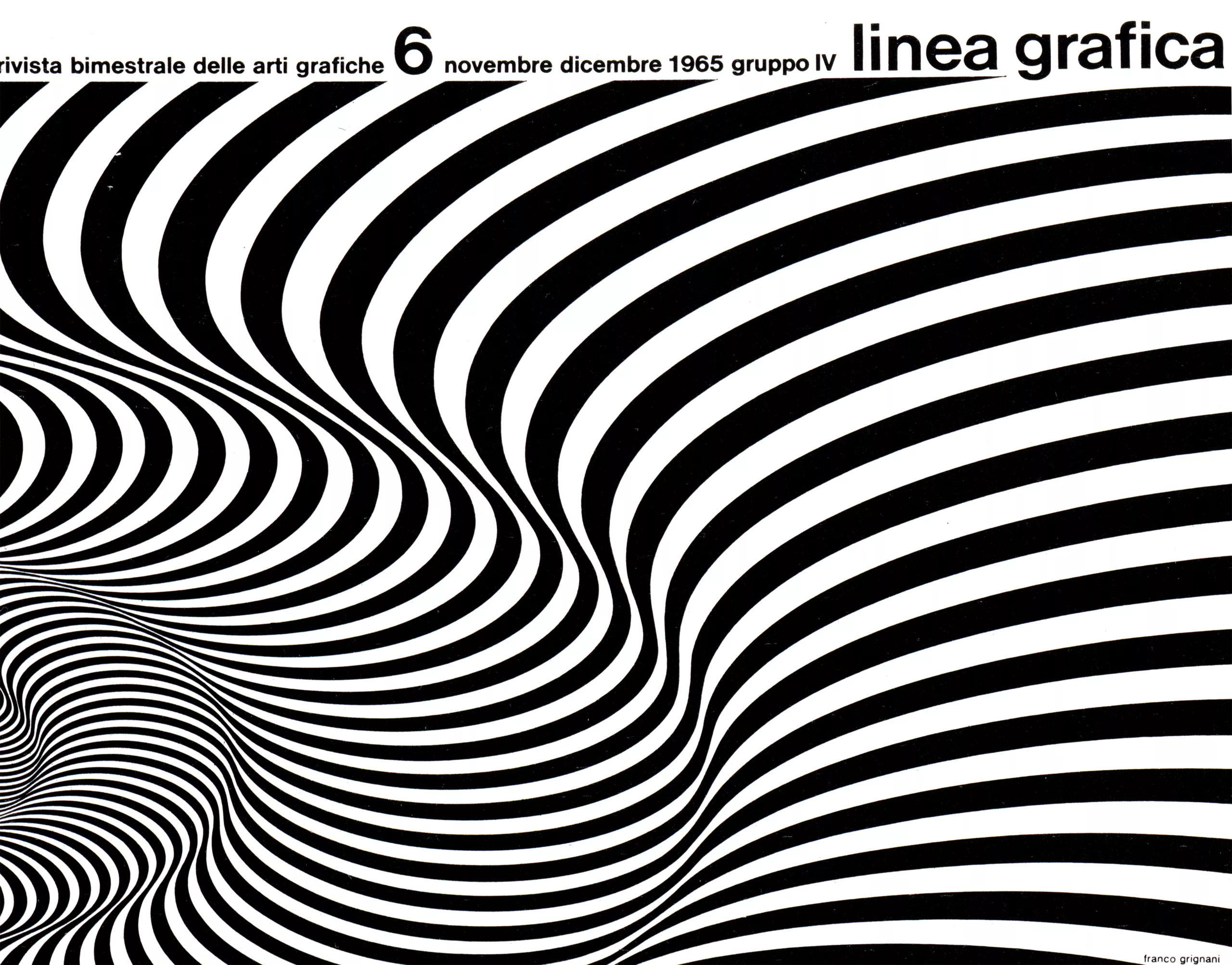
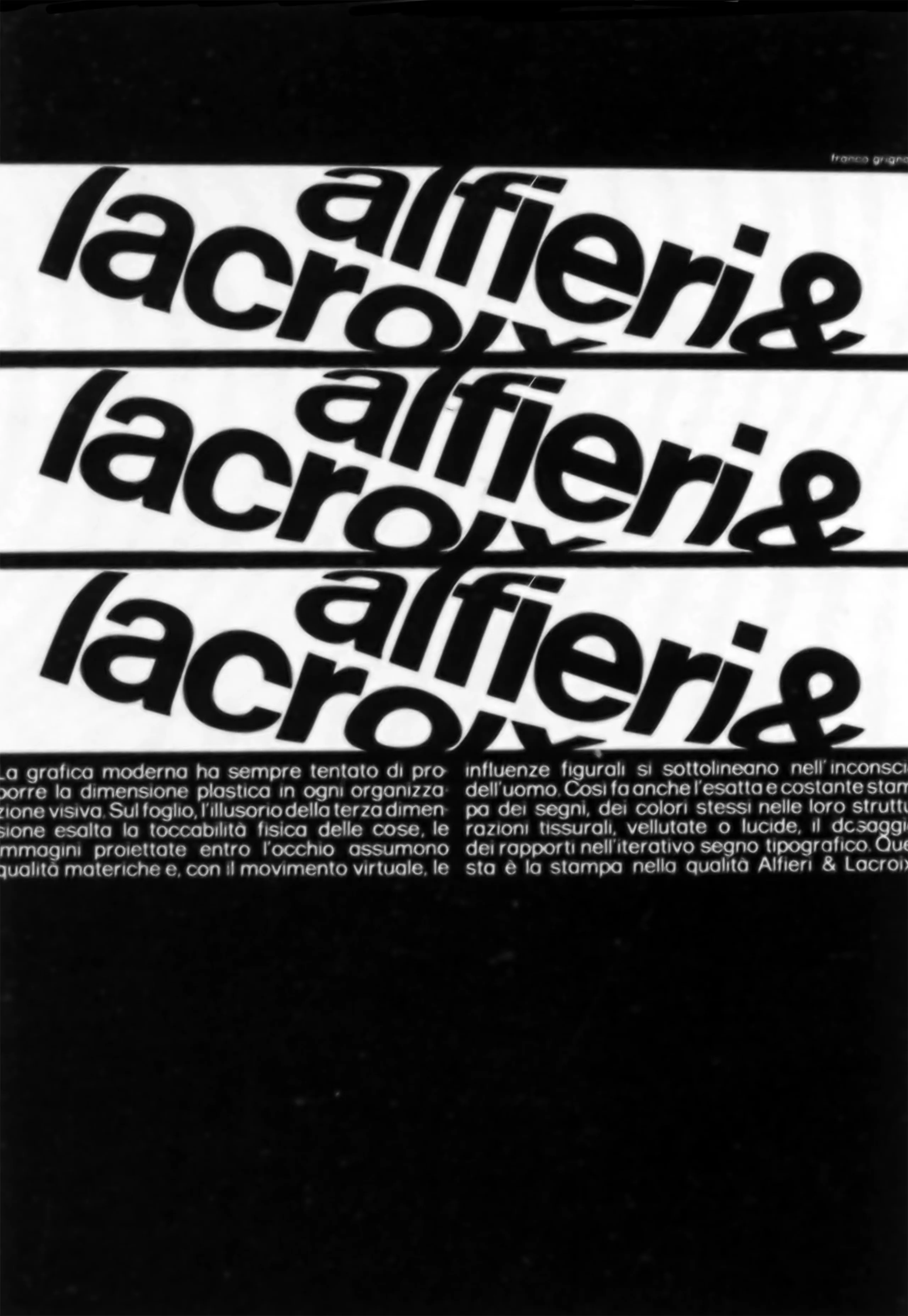
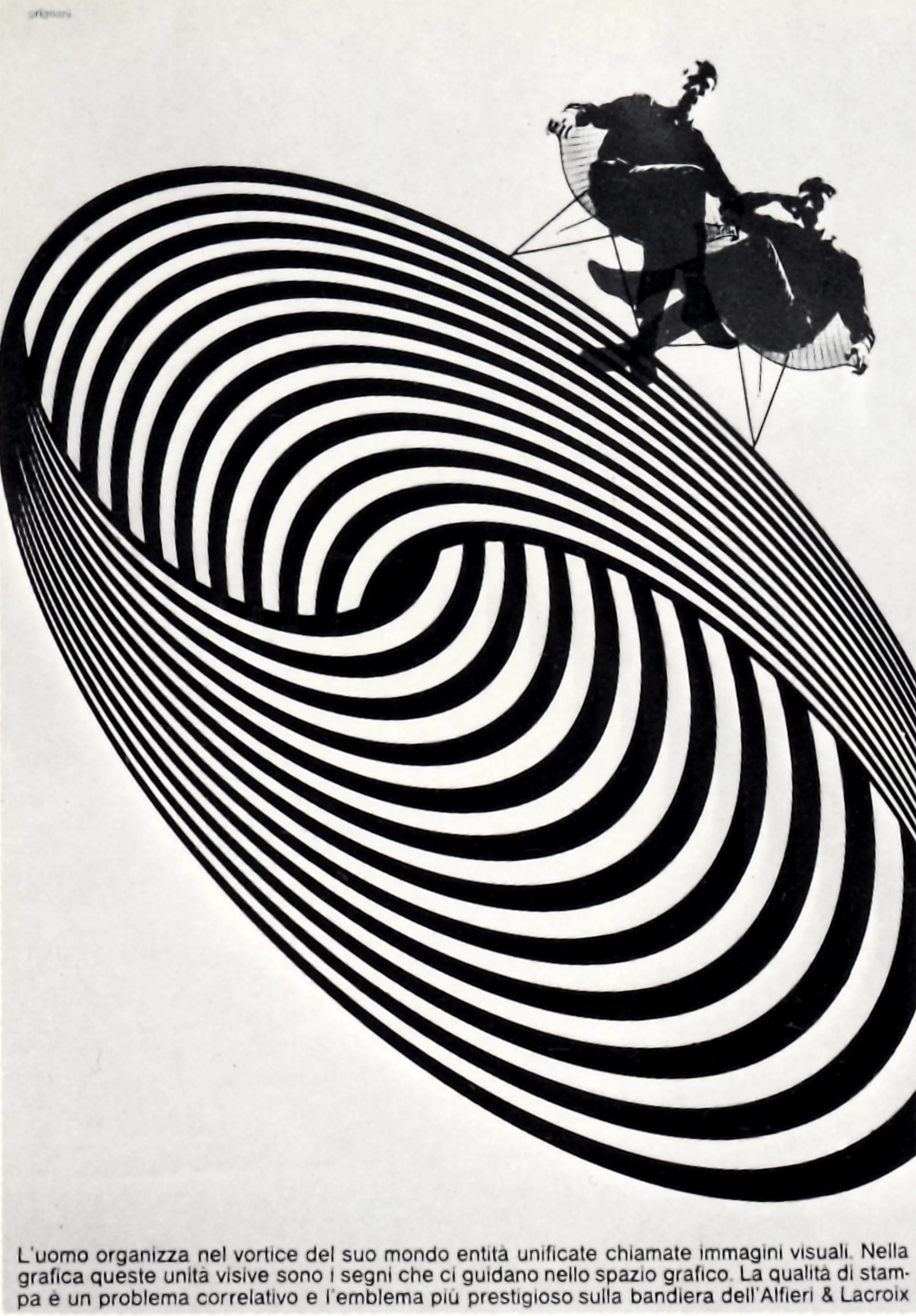
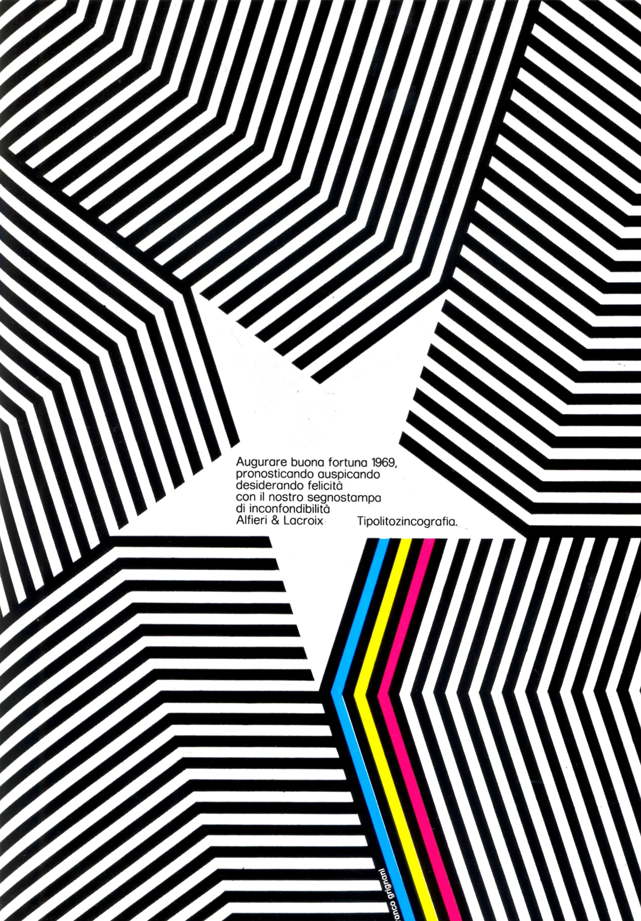
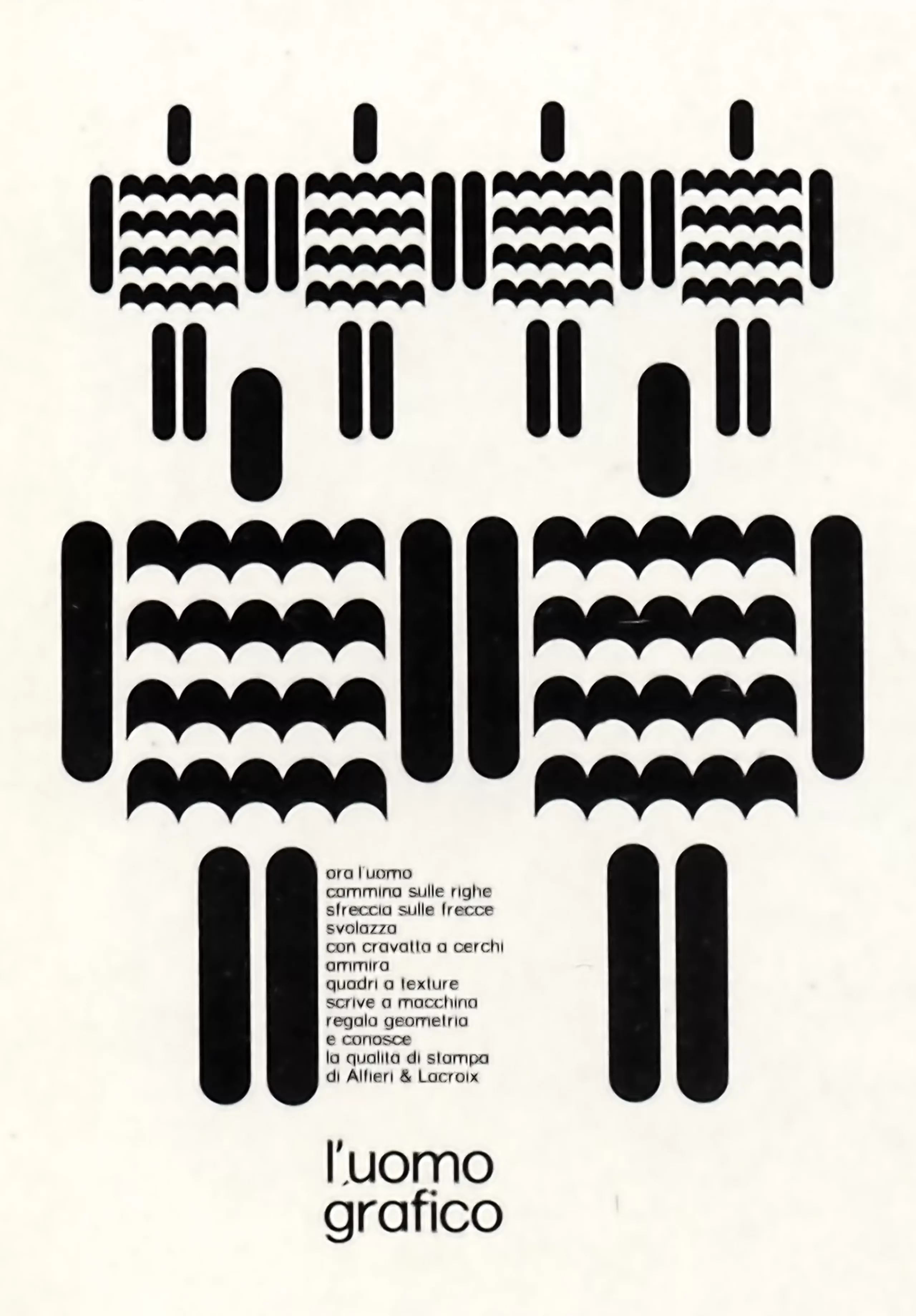
The periodic image
Currently (in 1973!), I am engaged in the search for a “periodic image”, i.e. the realization of an organized structure with repetition of a basic pattern or fundamental sign, most of the time, very simple. We thus arrive at an altered geometry, these modifications having been programmed in such a way as to flow multidirectionally. Because of this arrangement, the viewer is unconsciously invited to re-coordinate the alterations of perspective and is thus engaged in visual communication.
Vital humus
In recent years, many explanations have been formulated about visual communication, but human beings, by its nature, always want to solve the mysteries they encounter: the unknown or the deep reason for things. Thus, communication cannot be summed up simply by seeing’. Images already classified in a viewer’s vision experience no longer arouse the viewer’s interest. This is why the graphic designer’s task should not be limited to reproducing printed texts on a board, but to searching for various ways of personal experience, the “vital humus” from which elements could spring that will make his message lasting.
Text: Franco Grignani, 1973, “Graphic Designers in Europe“.
The mystery of the Woolmark Logo
In 1963, the International Wool Secretariat, now Australian Wool Innovation (AWI), announced an international competition to design a visual identity that would strengthen consumer confidence in wool and represent a new quality standard. Still in operation more than 50 years later (www.woolmark.com), it is unquestionably one of the best logos of all time!
Inspired by a woollen skein, the winning logo, known as Woolmark, was launched internationally in 1964. But who really designed it?
Officially, the Woolmark logo is signed by an Italian designer from Milan, a certain Francesco Saroglia, who at the time would have won the competition. But how could this designer have signed one of the most famous logos in the world, without there being any trace of his work anywhere else? No other known work, no publications, no exhibitions… mystery!
The answer to this mystery seems to find its answer on the website of the International Graphic Alliance (AGI) which attributes the creation of the logo to Franco Grignani.
The latter would have entered the competition under a pseudonym because he was also a member of the jury to choose the winning project. “Grignani was a member of the jury, but he couldn’t resist the temptation to take part himself,” says Dutch designer Ben Bos, who wrote a book on the history of AGI. What is certain is that Grignani was never paid for this work.
Another version was told by one of Grignani’s daughters: “I don’t know exactly how the IWS organized the contest, but at the time a certain Spiriti, owner of an advertising agency, would have contacted several graphic designers, would have made them work on several tracks in order to present them to the contest. Grignani was consulted and would therefore have proposed several sketches.
Shortly afterwards, Grignani was invited to participate in the jury to select the winning logo. “It is with great astonishment that he would have discovered the work he had submitted a few months earlier to Spiriti, but not signed under his name. He was embarrassed – he thought his work had been stolen by this “Saroglia”. He also wanted to hide that the logo was actually submitted by him. When all the jurors agreed to retain this logo, he tried to fight against this choice, in vain. At first, he said nothing, but after a few years, regretting not being recognized as the author, he would have started to reveal to people that he is the author.”
An image from Grignani’s diary with several sketches, including a sketch very close to the final logo, appears to be the murder weapon. The only thing certain, the real creator of this “Woolmark” will have left behind him a great graphic mystery!
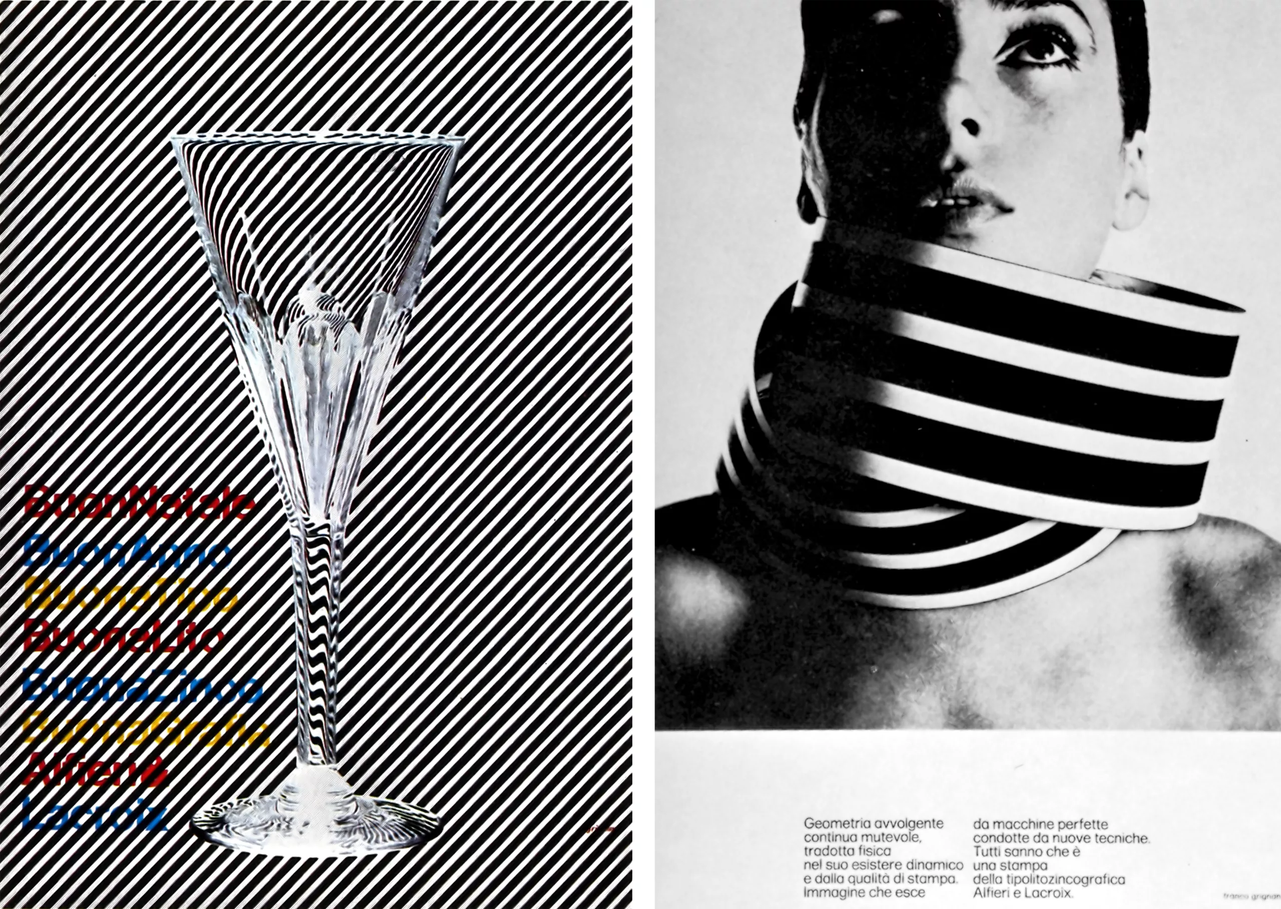
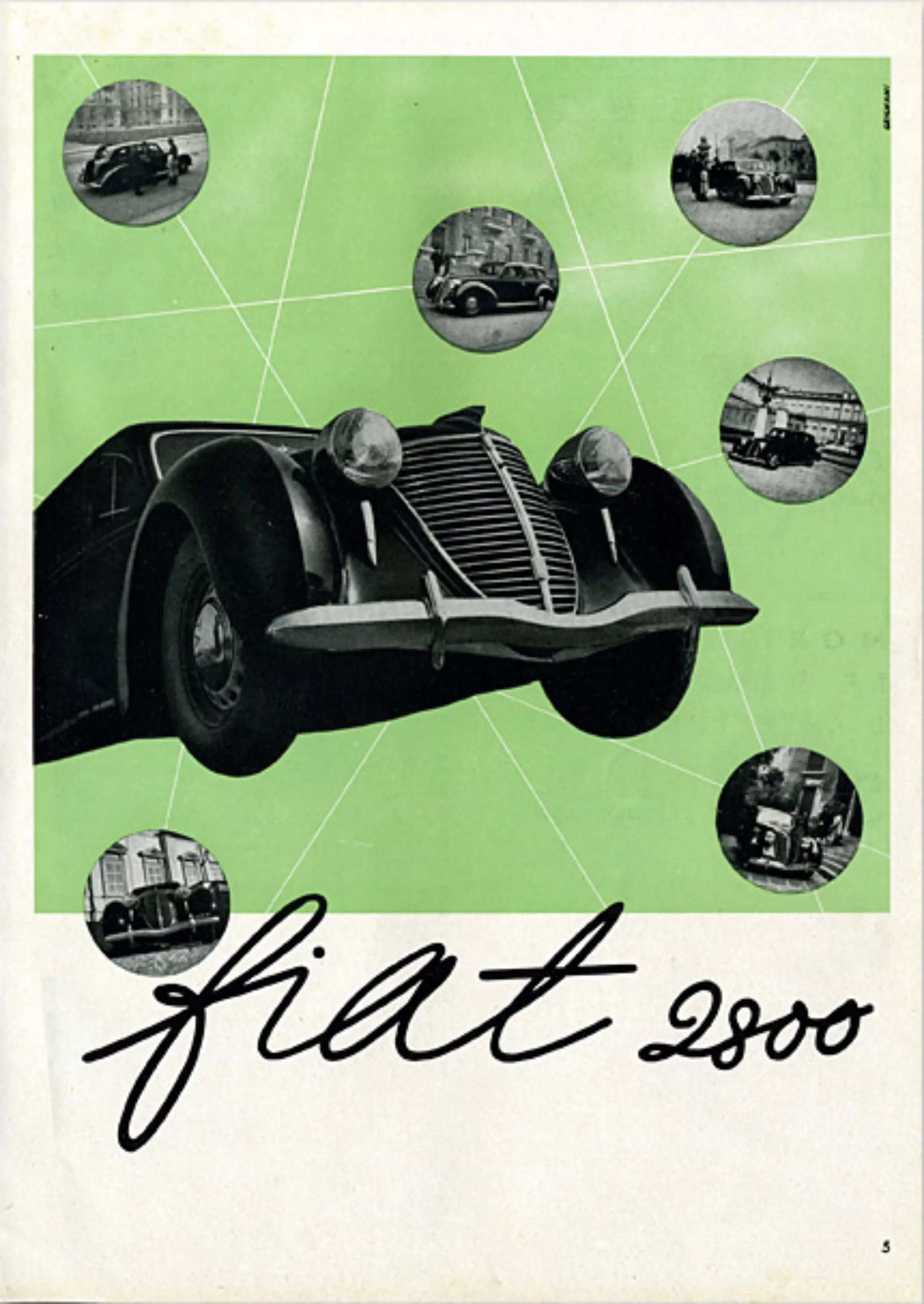
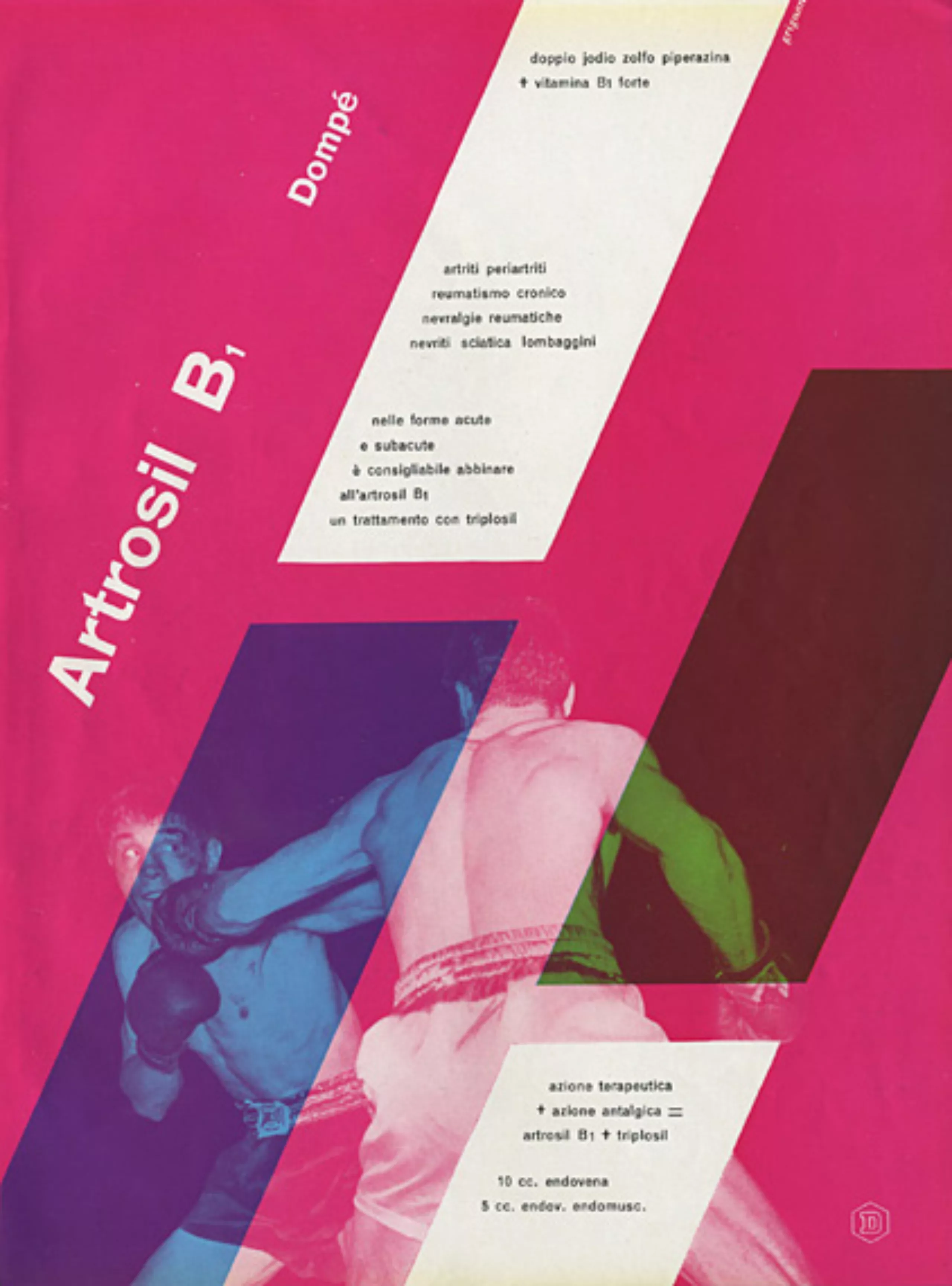
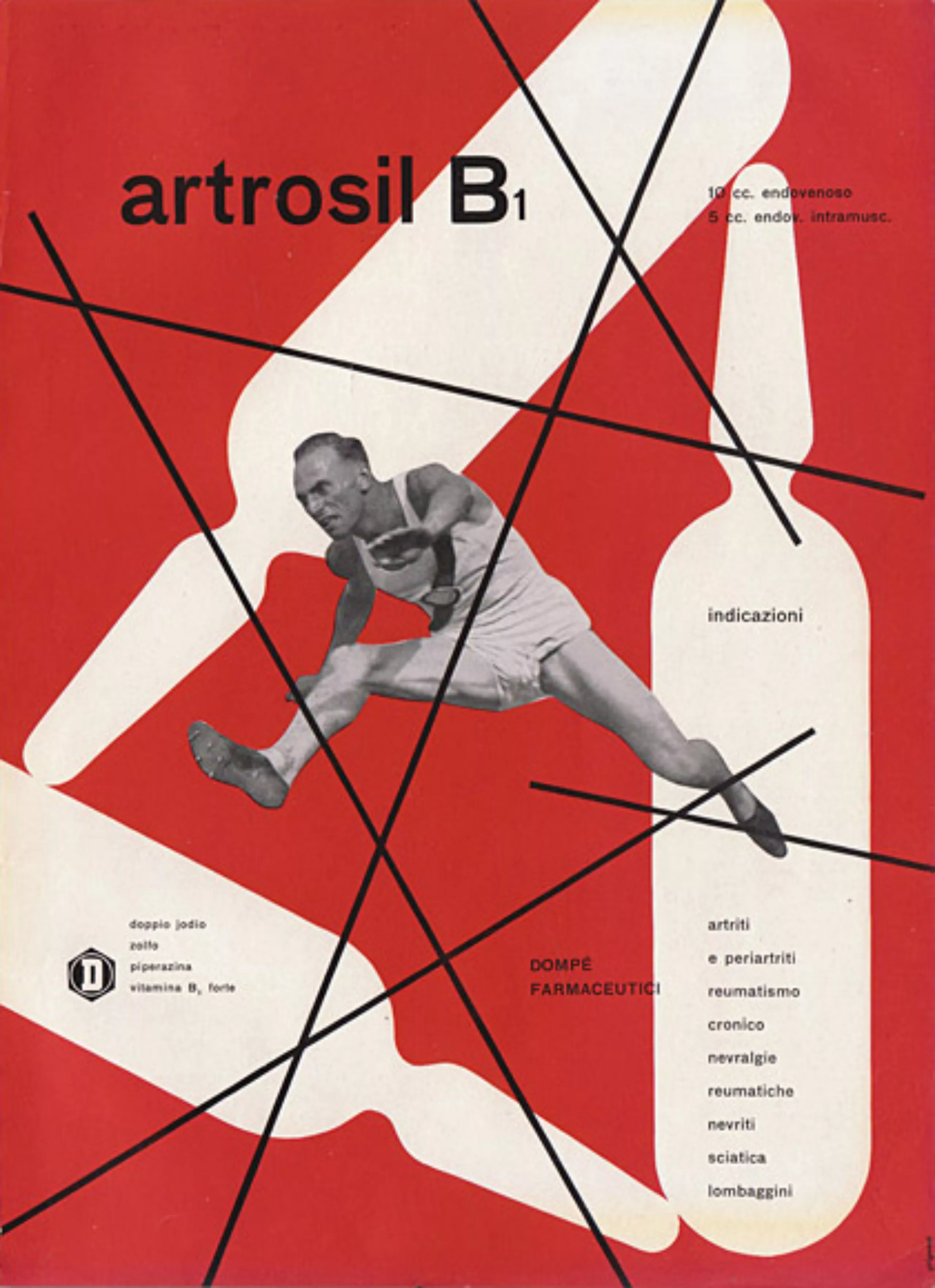
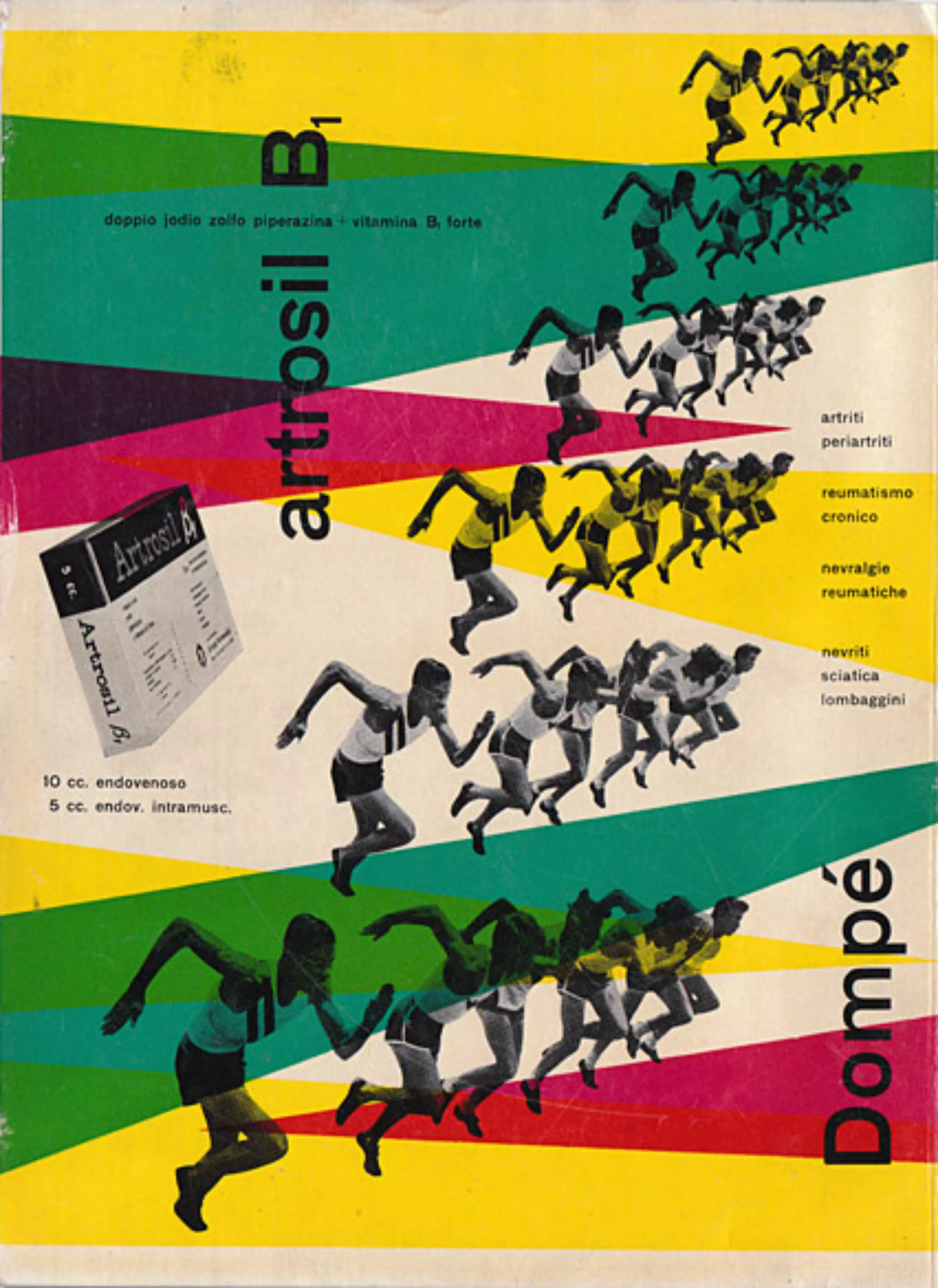
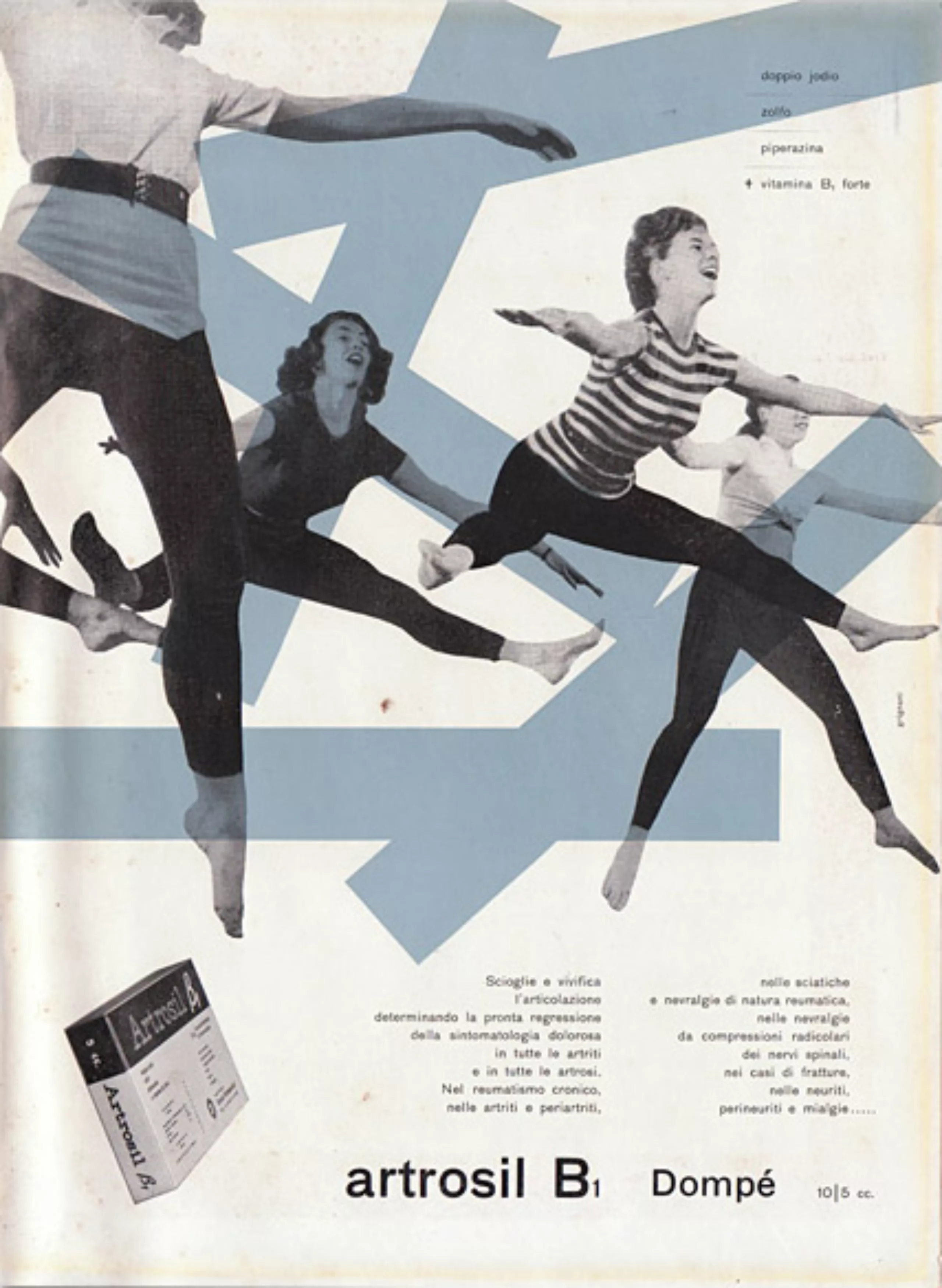
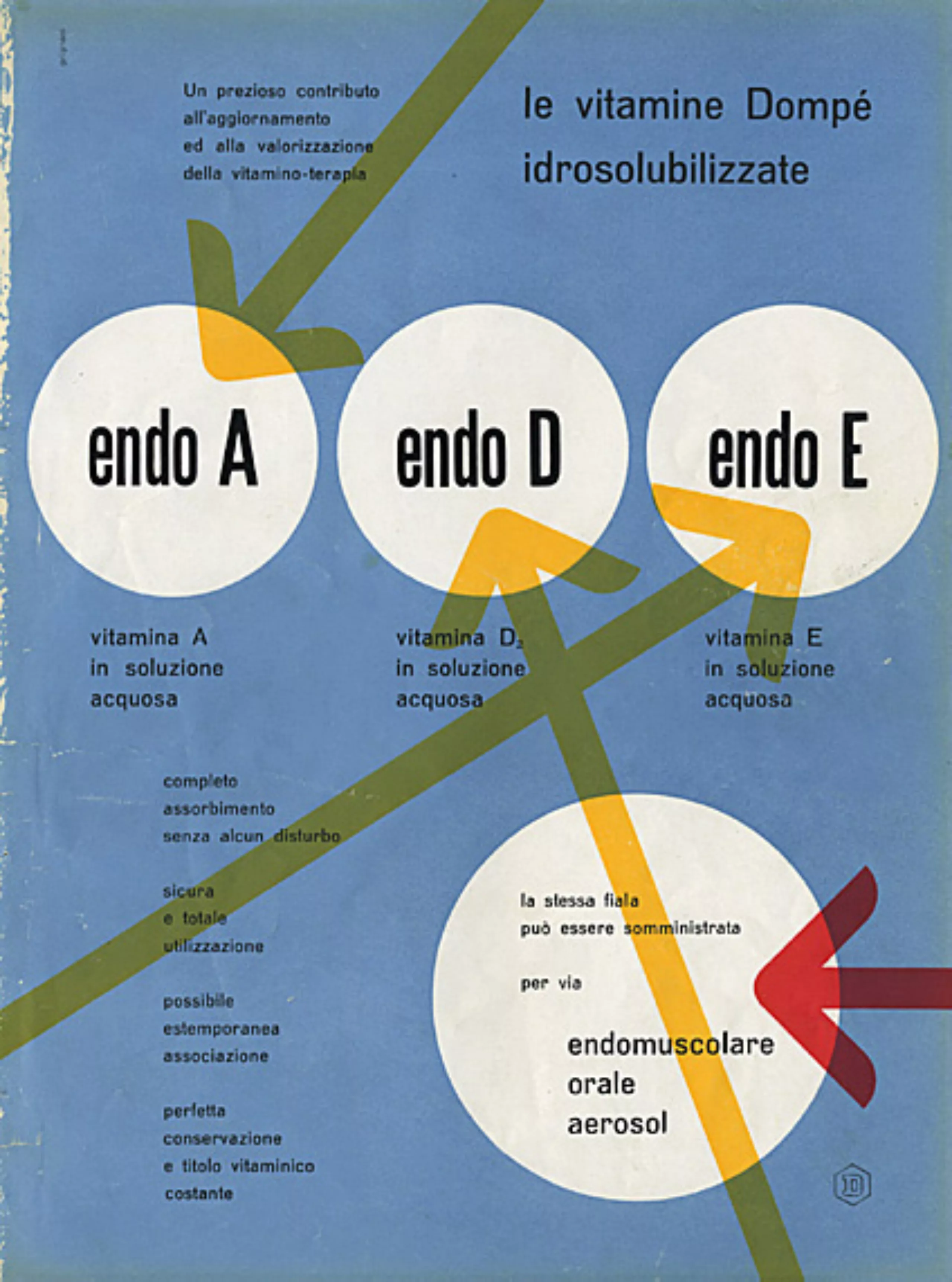
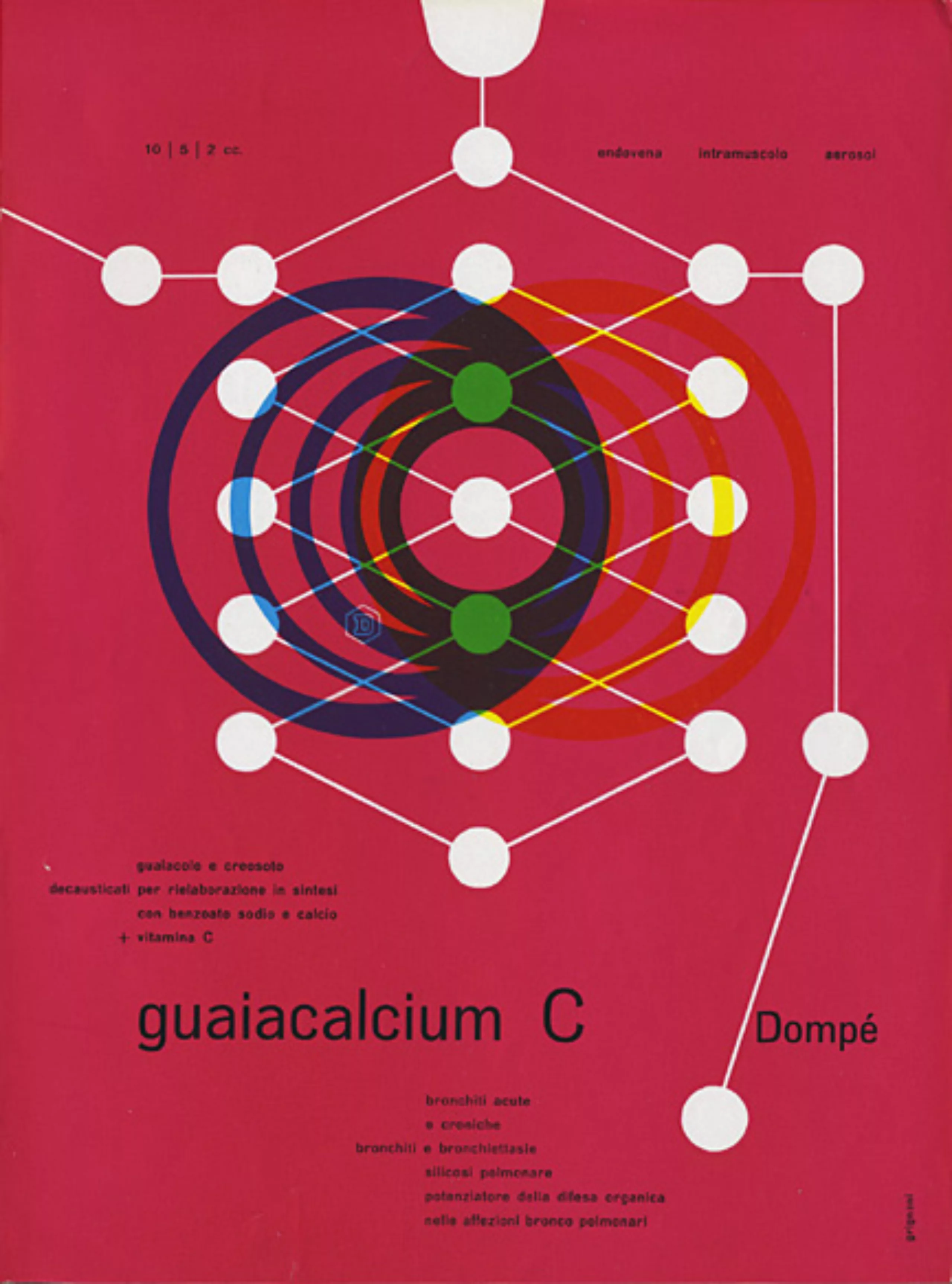
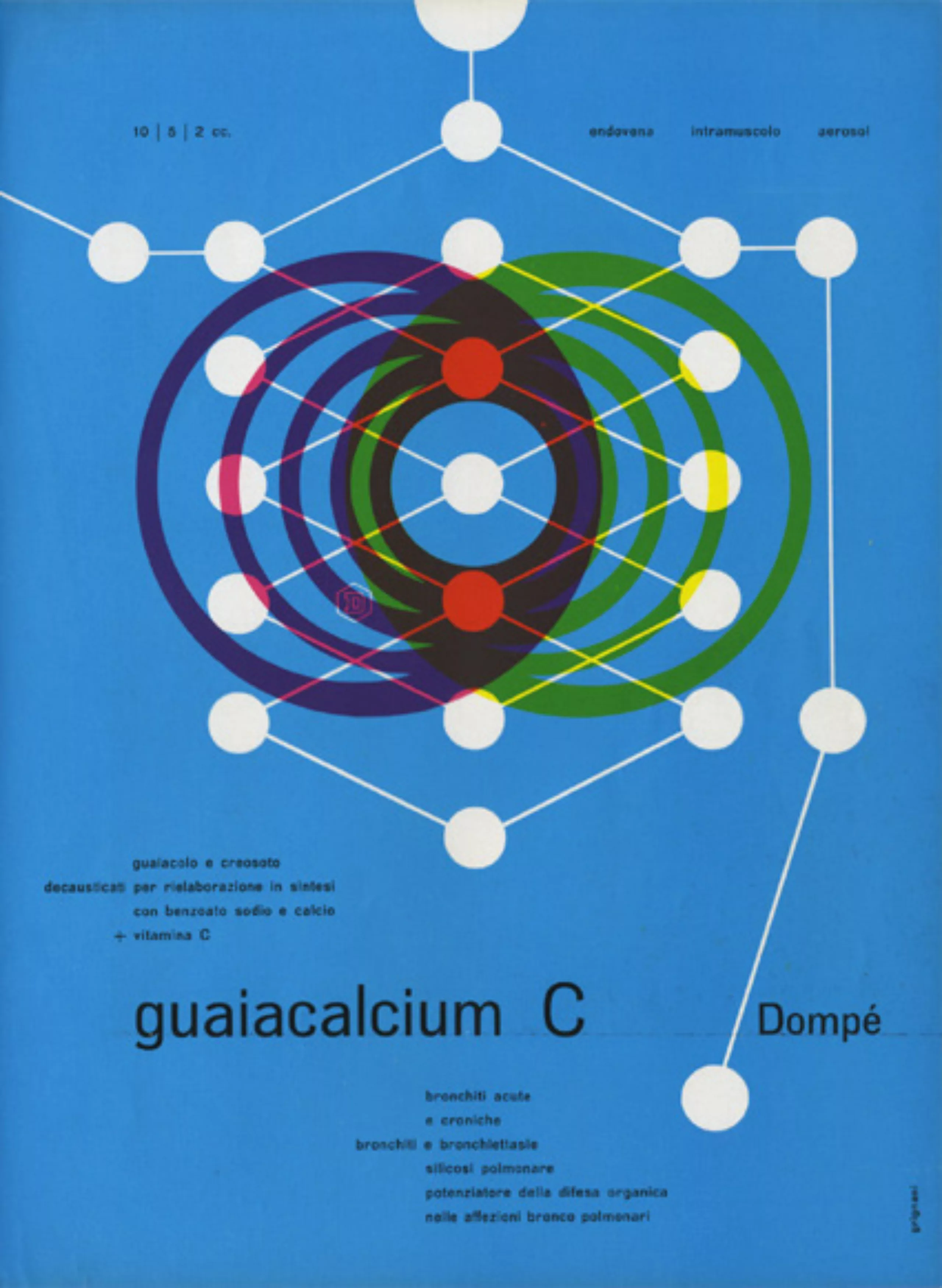
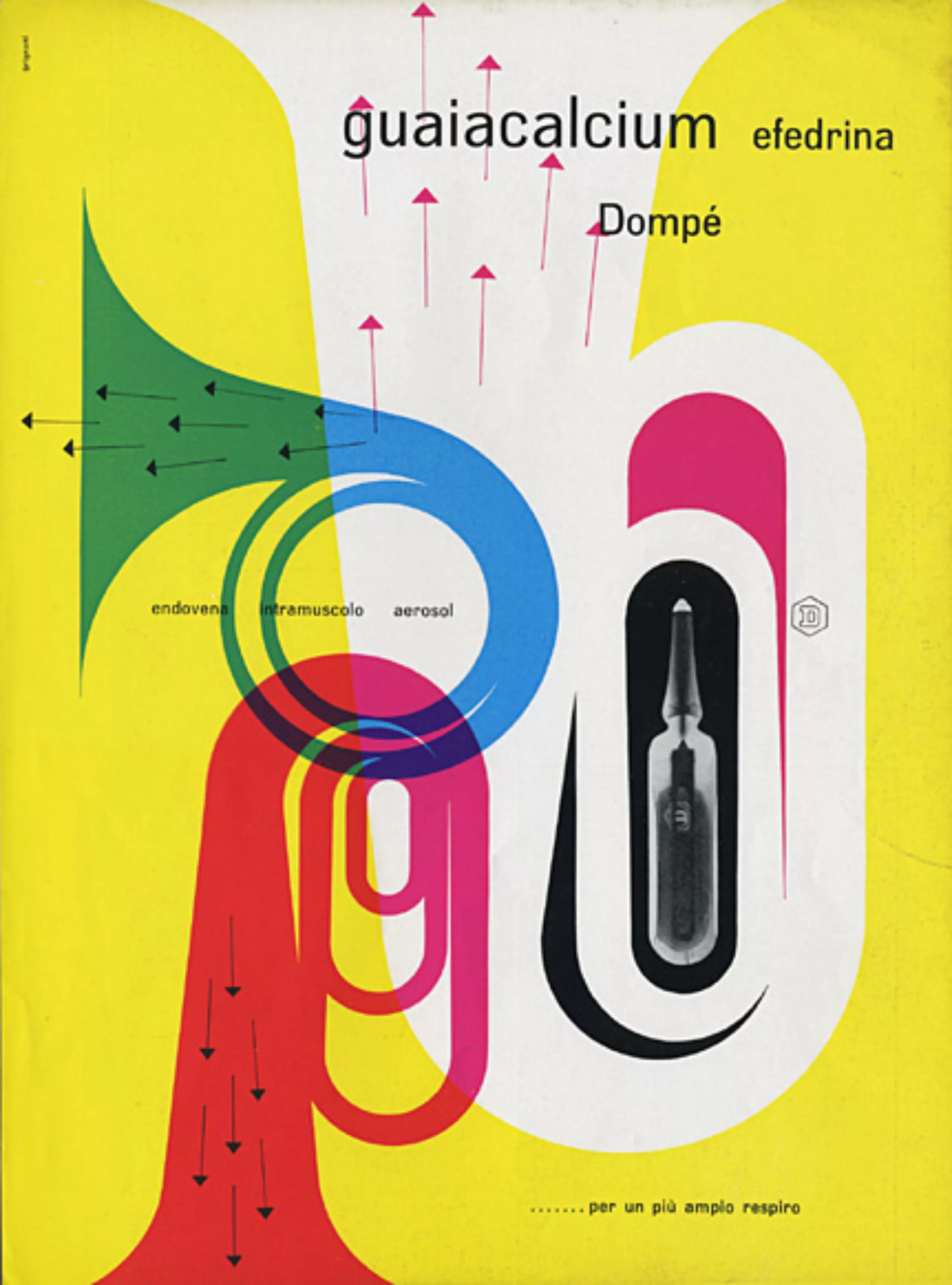
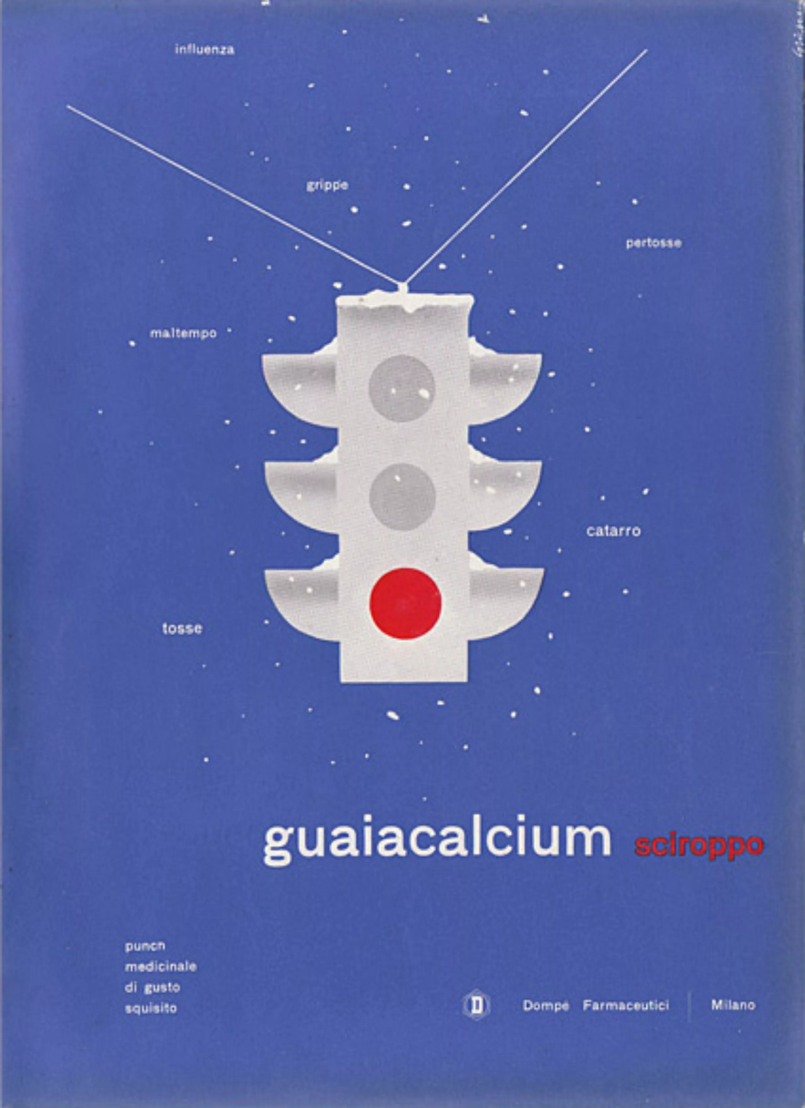
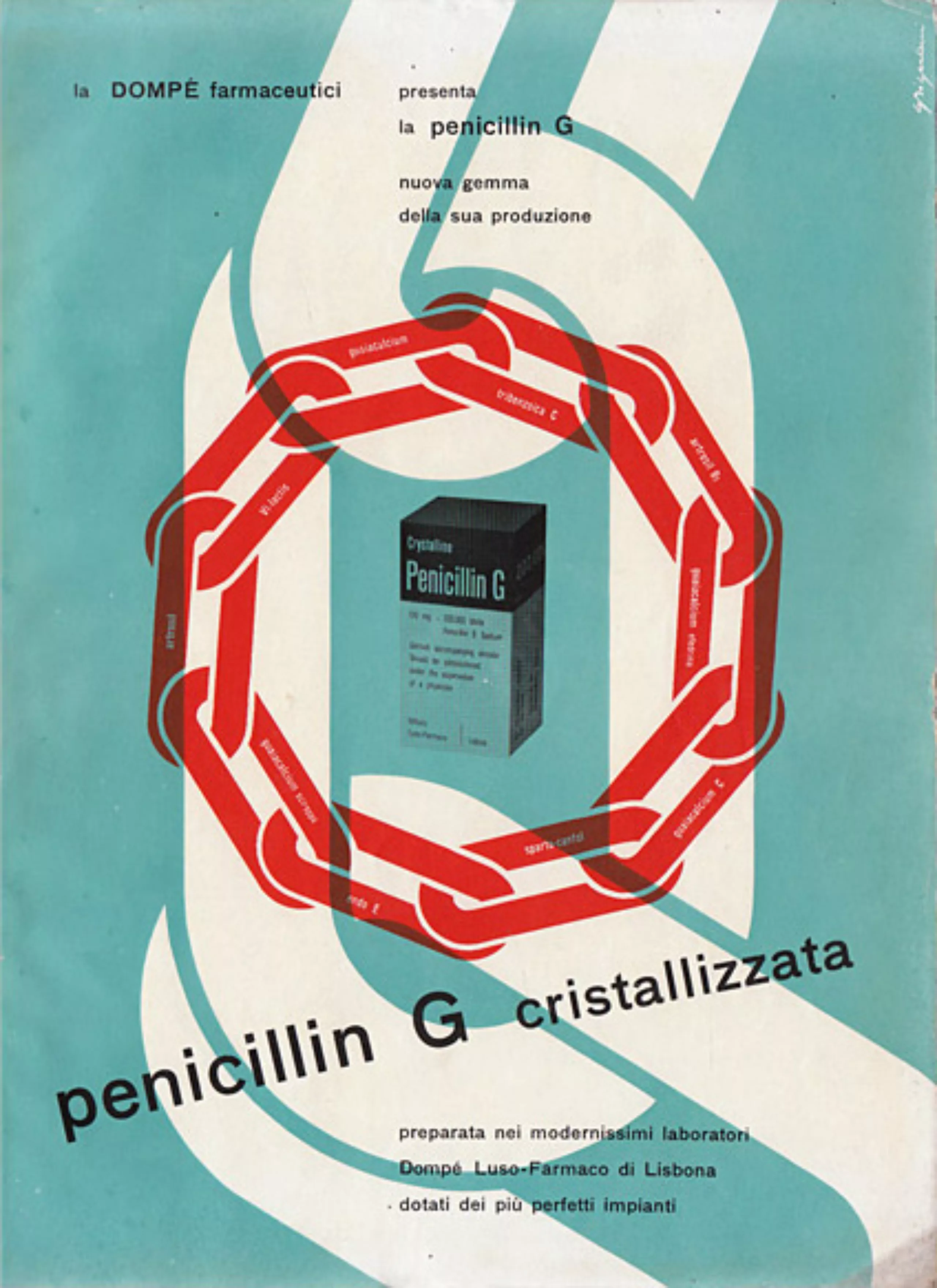
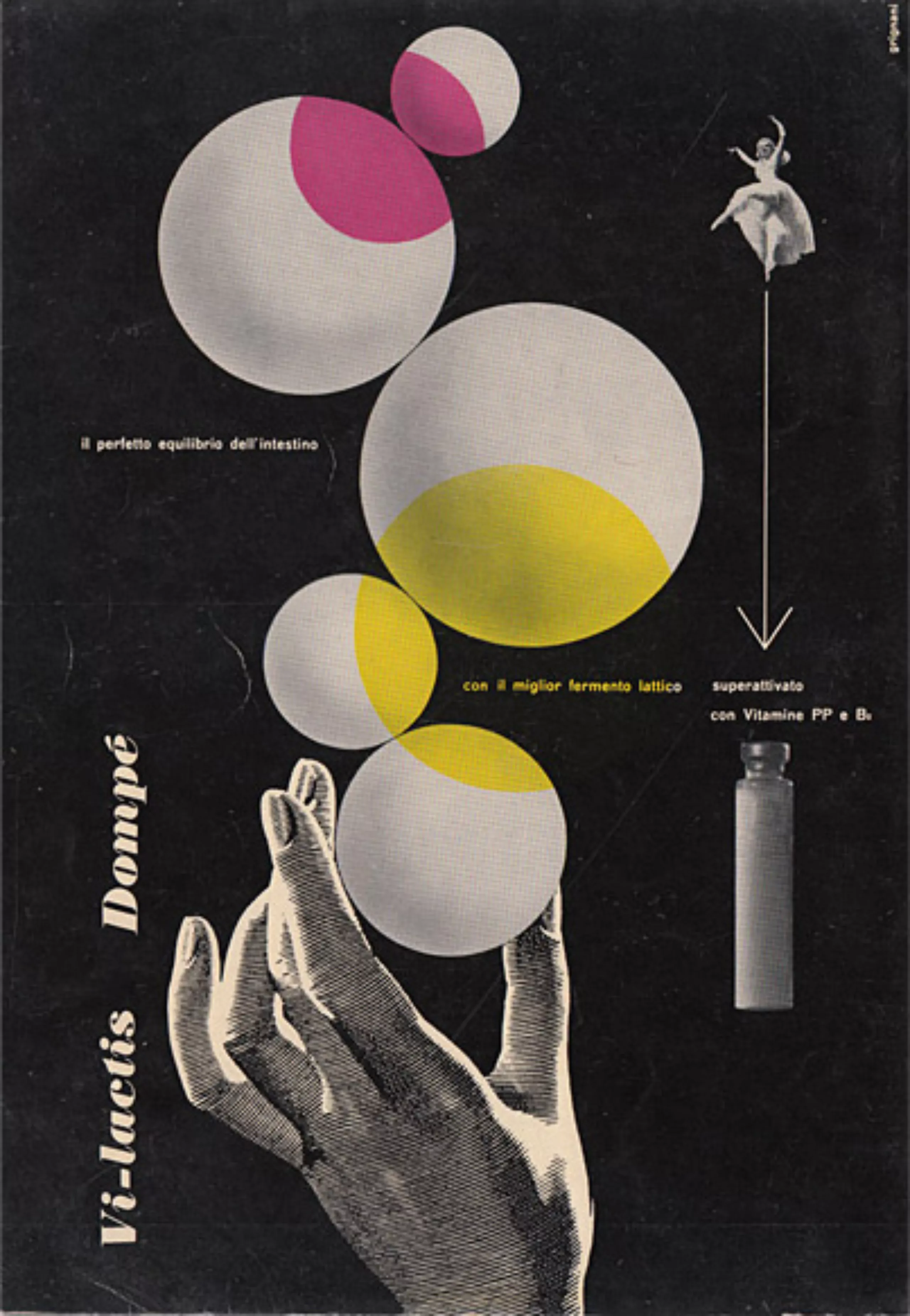
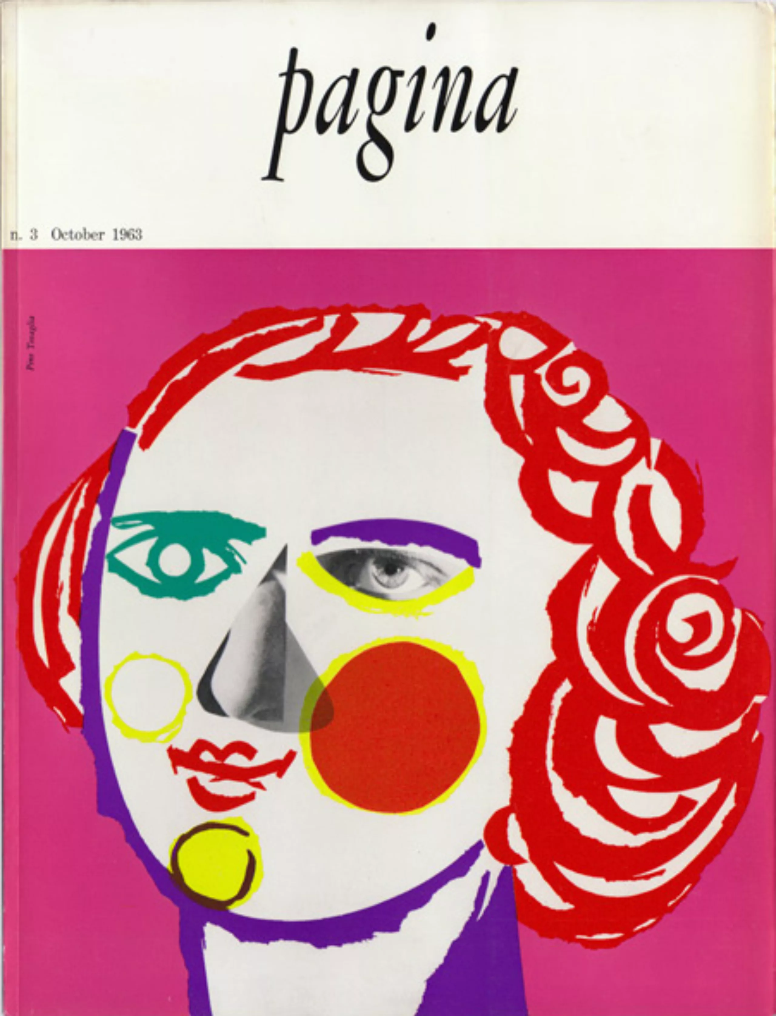
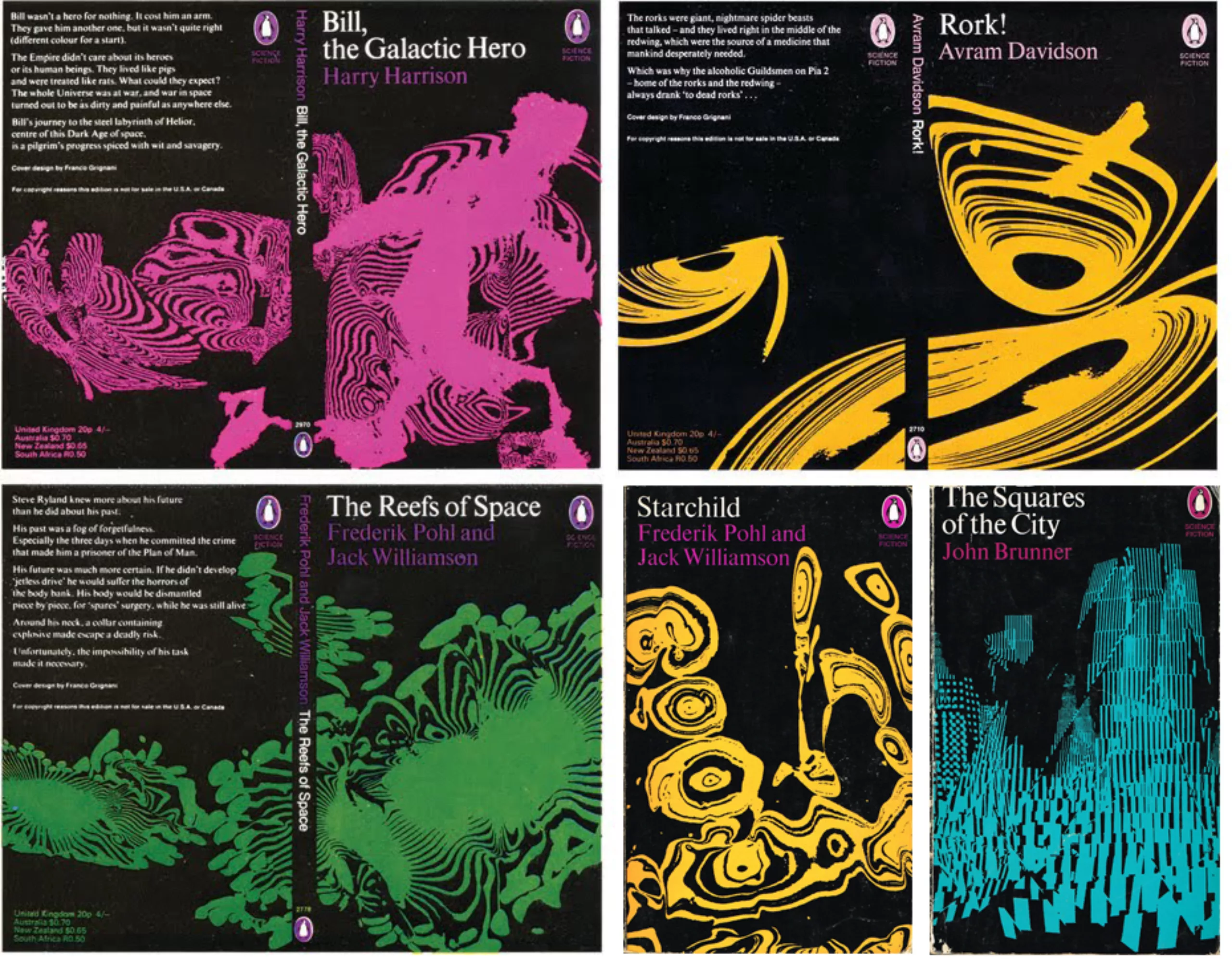
Here is a gallery presenting more fully the work Franco Grignani:
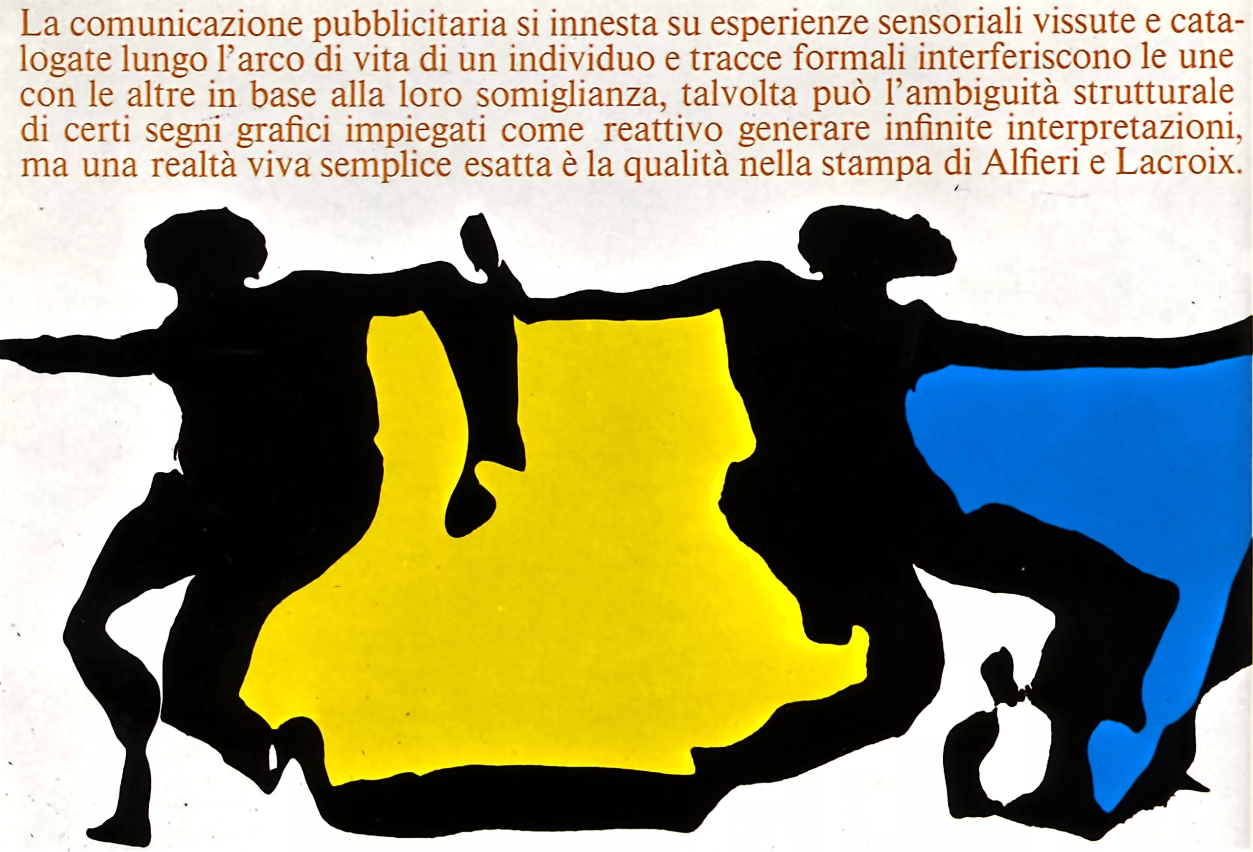
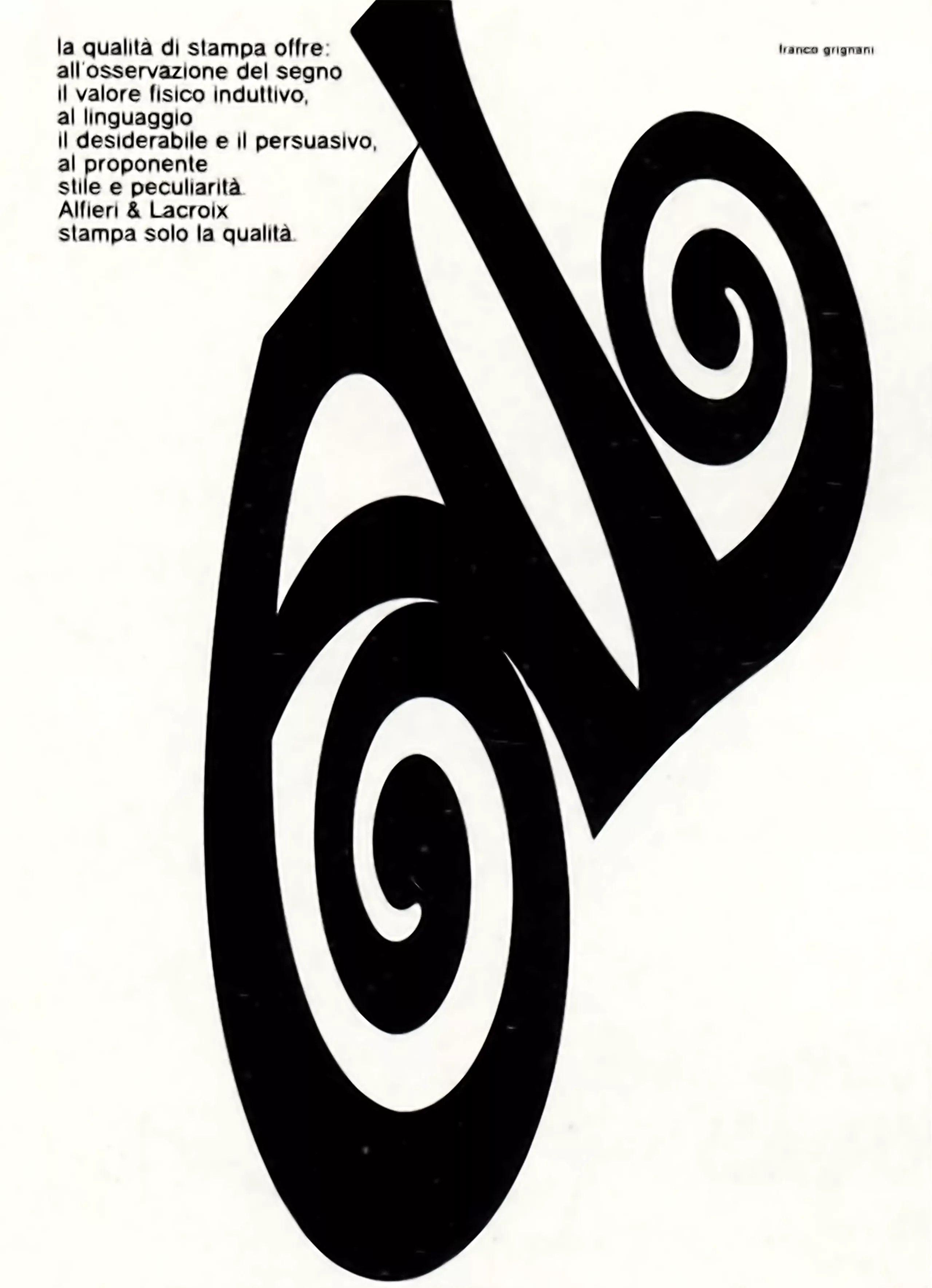
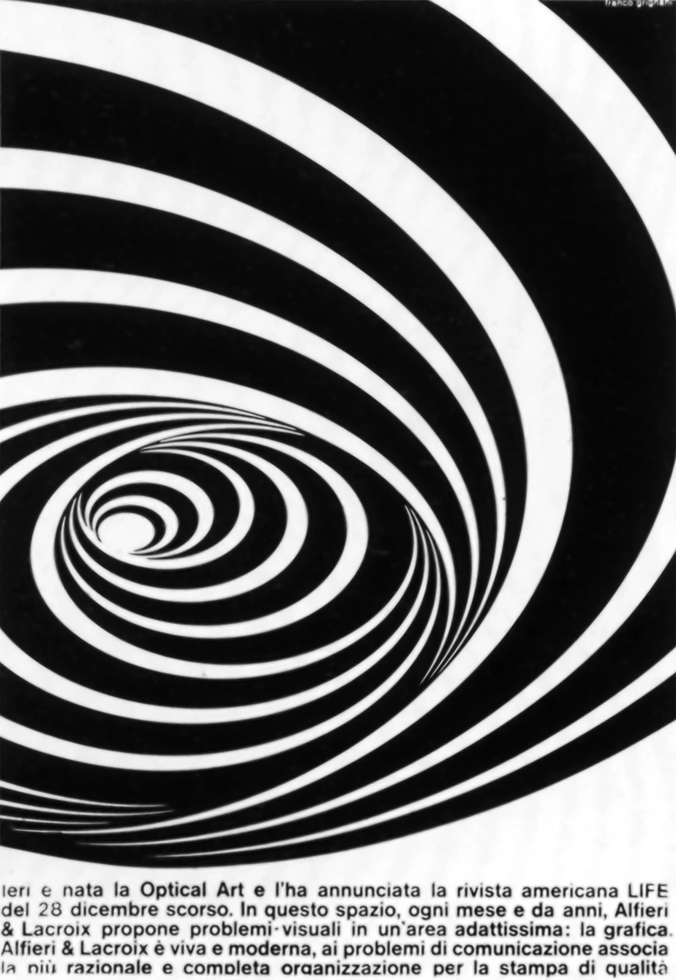
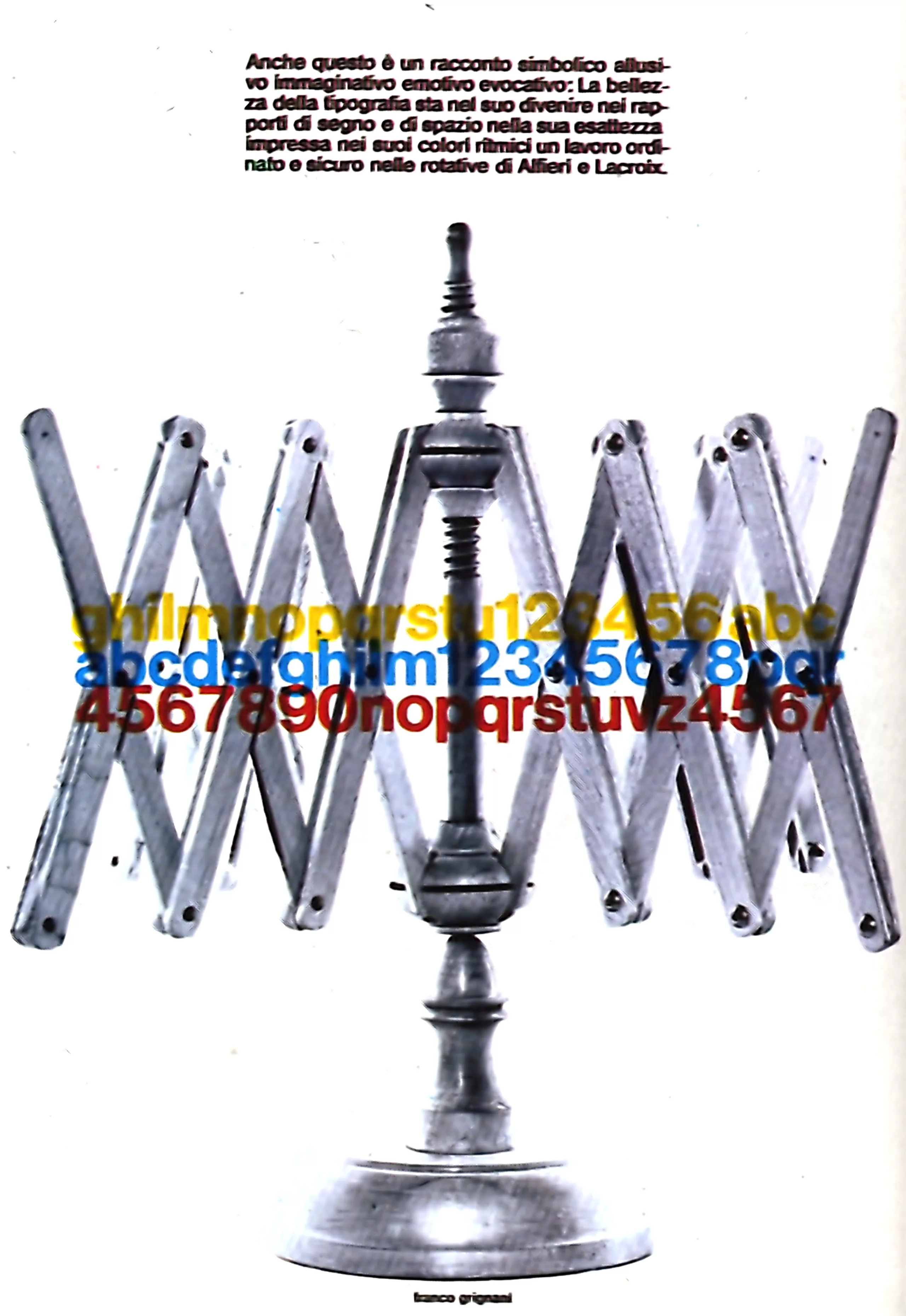
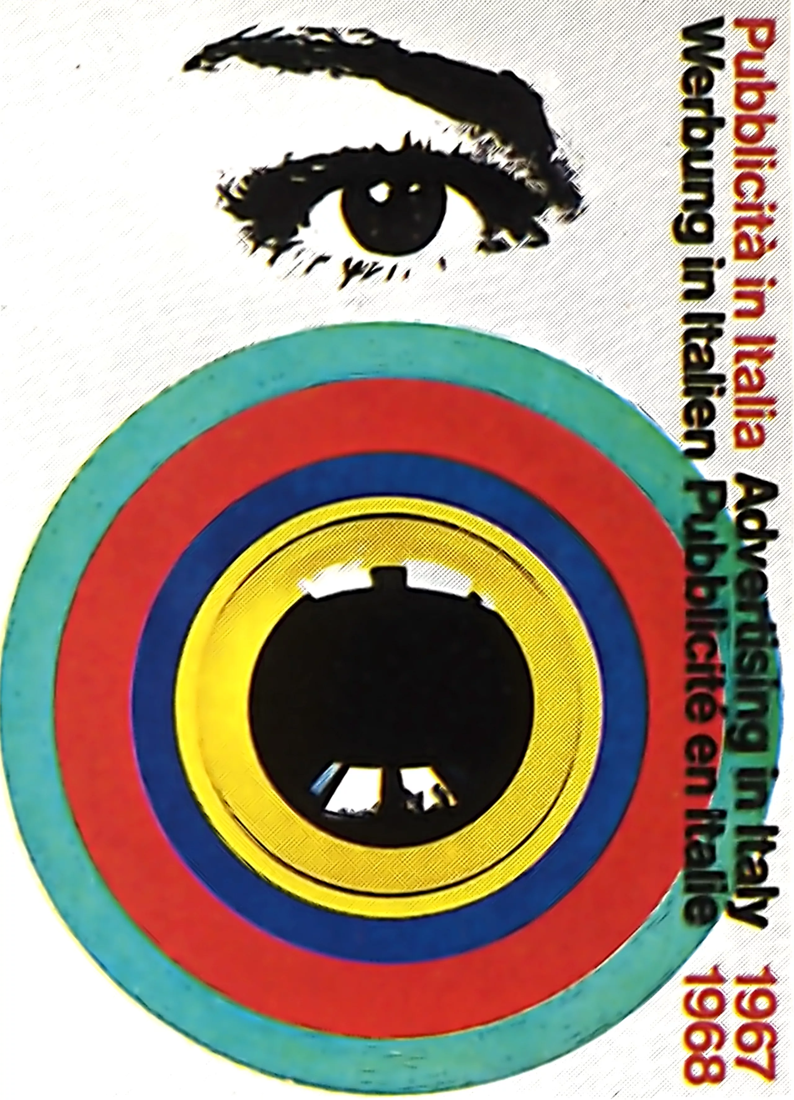
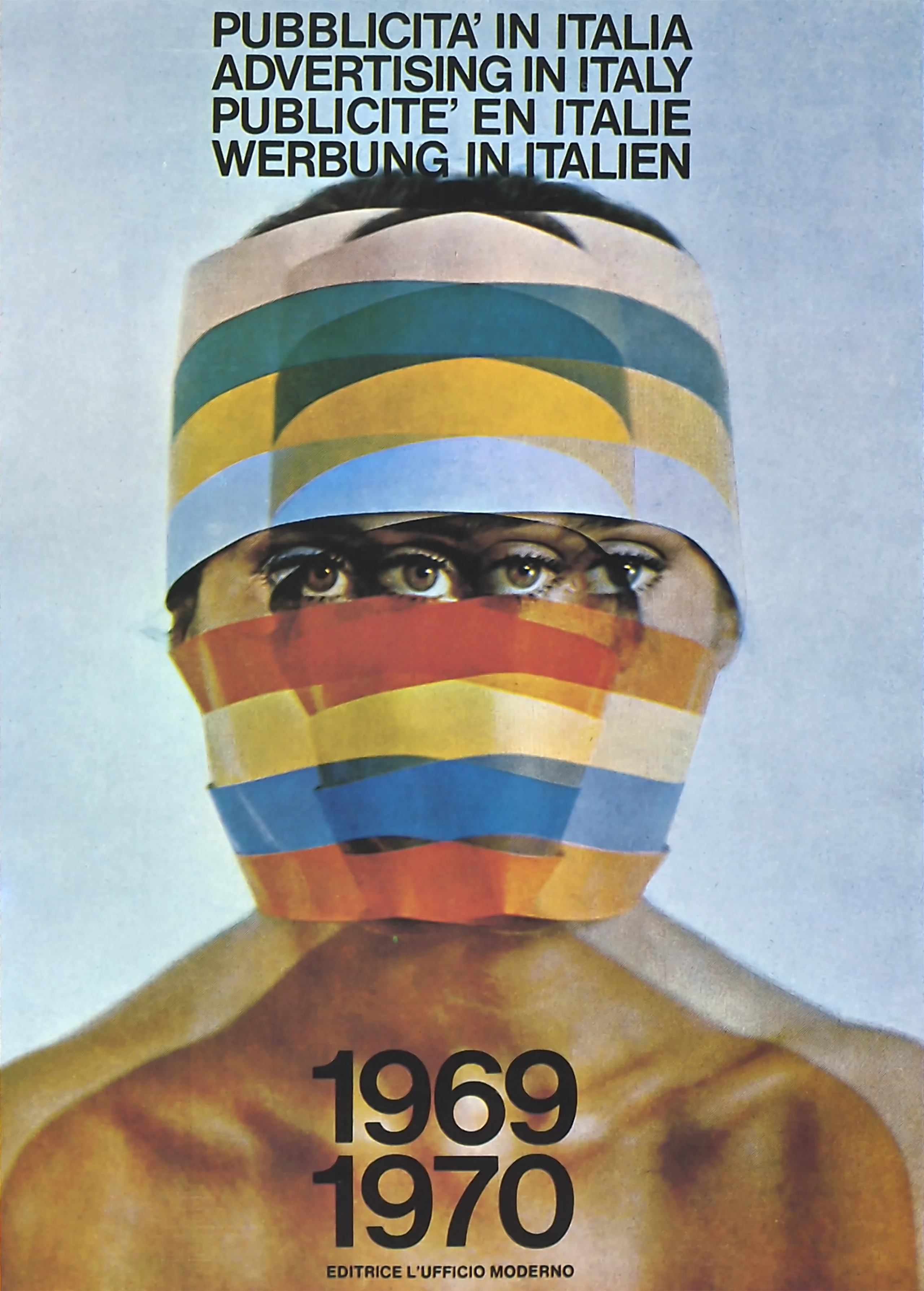
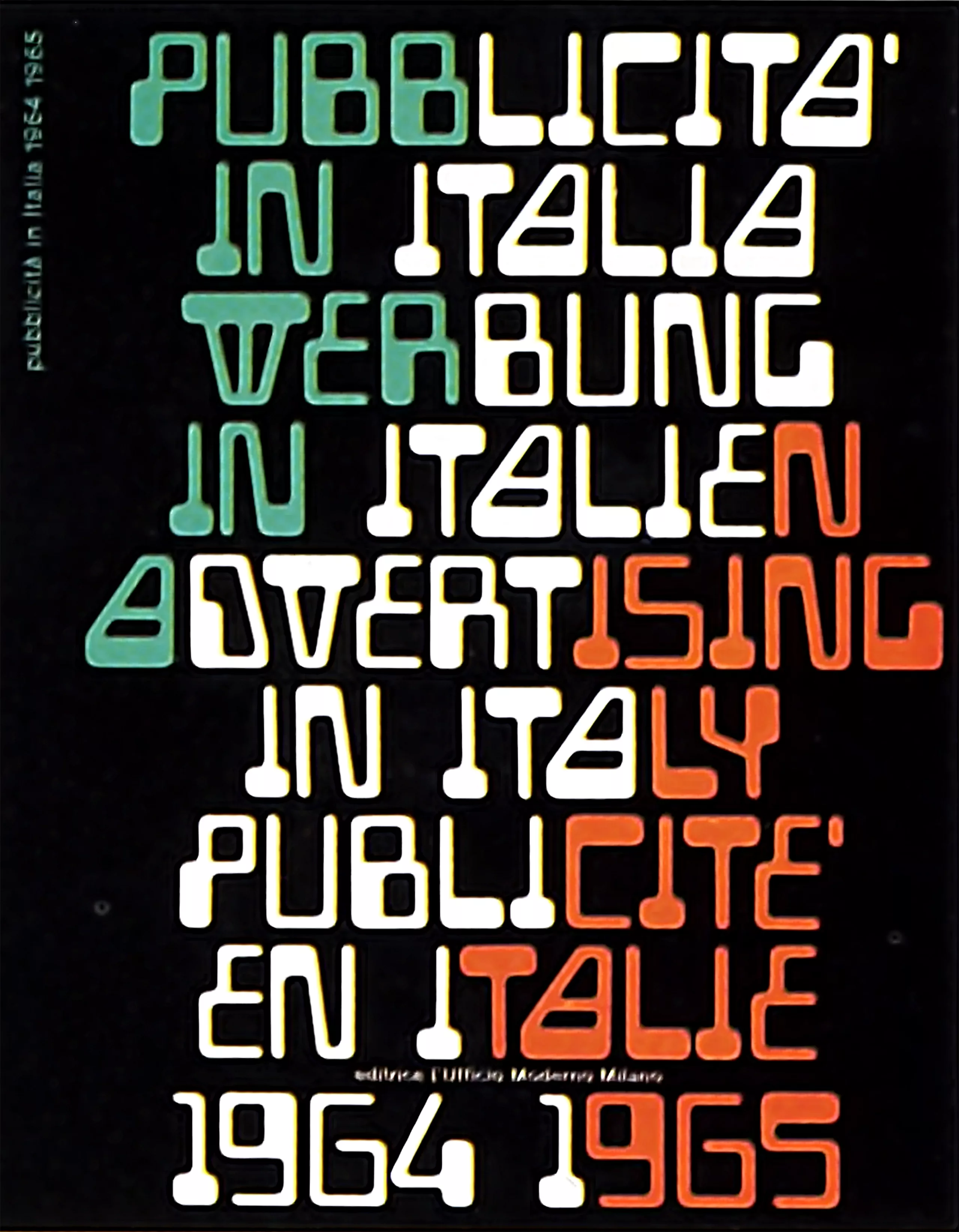
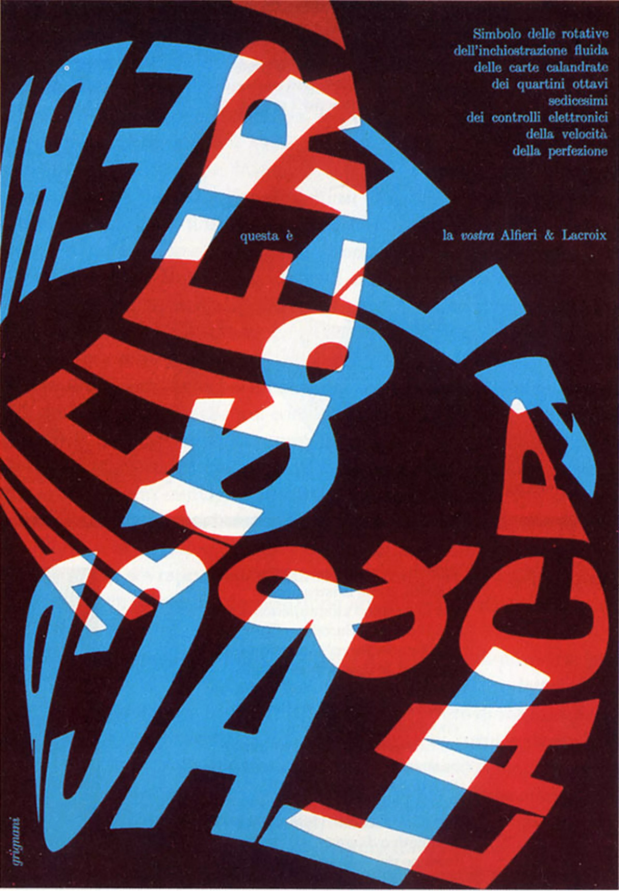
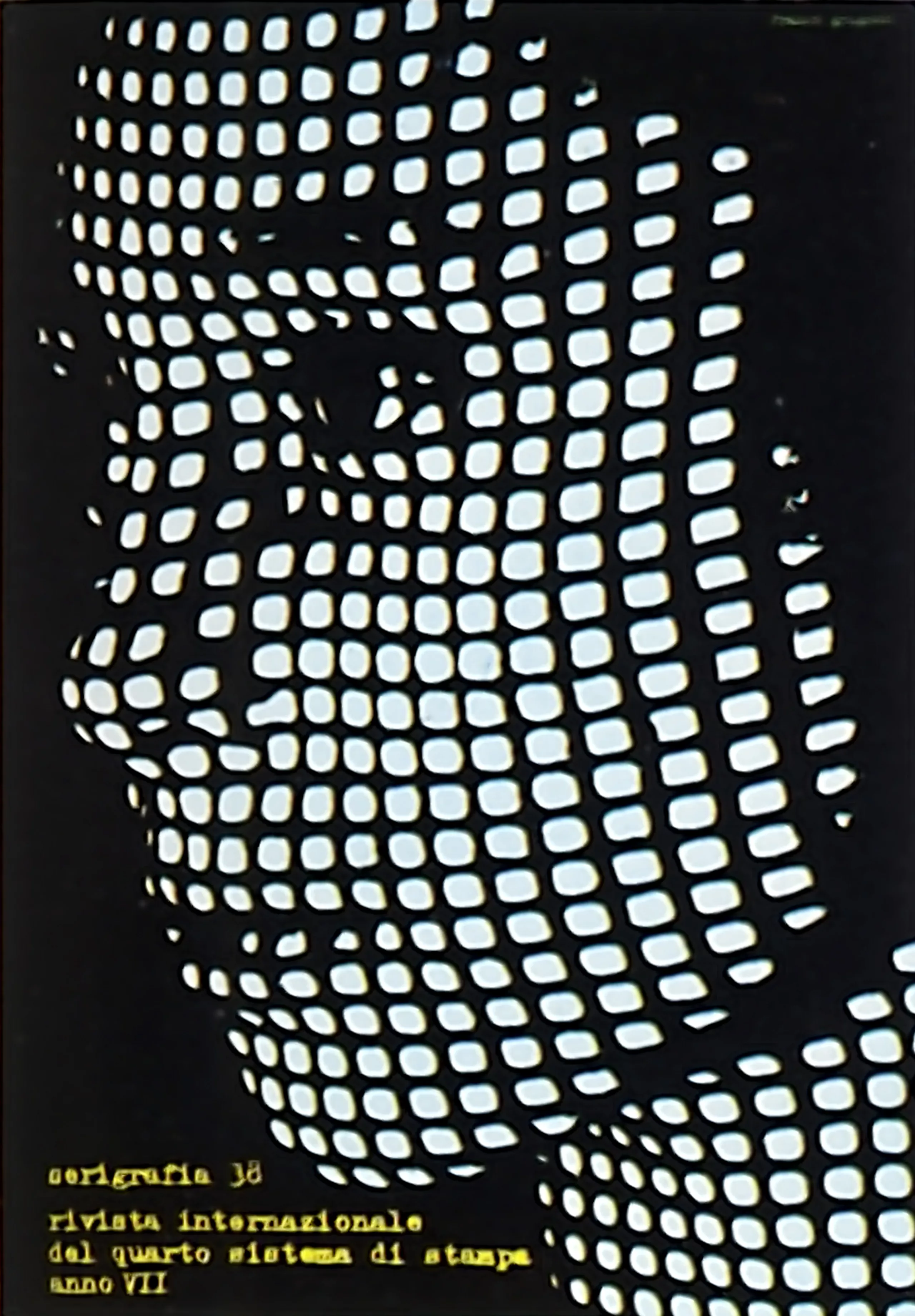
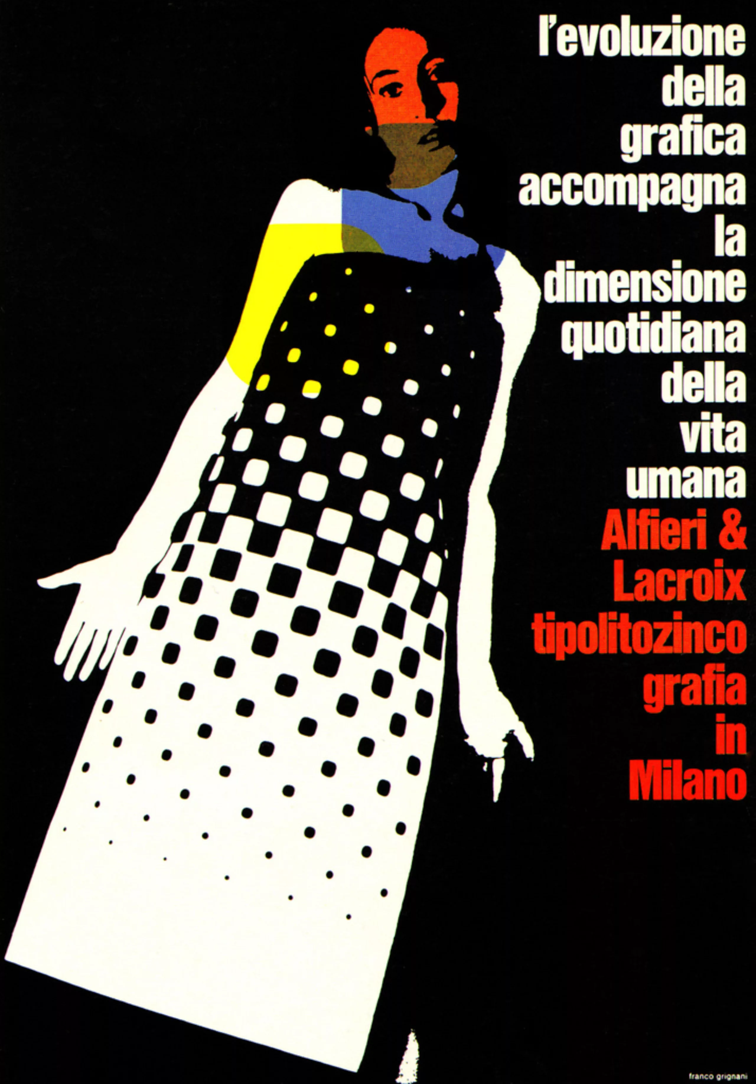
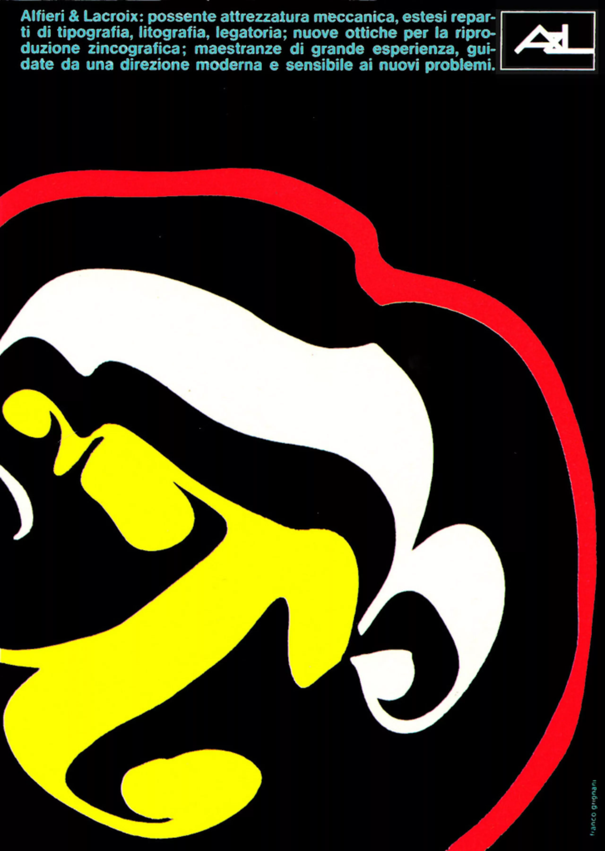
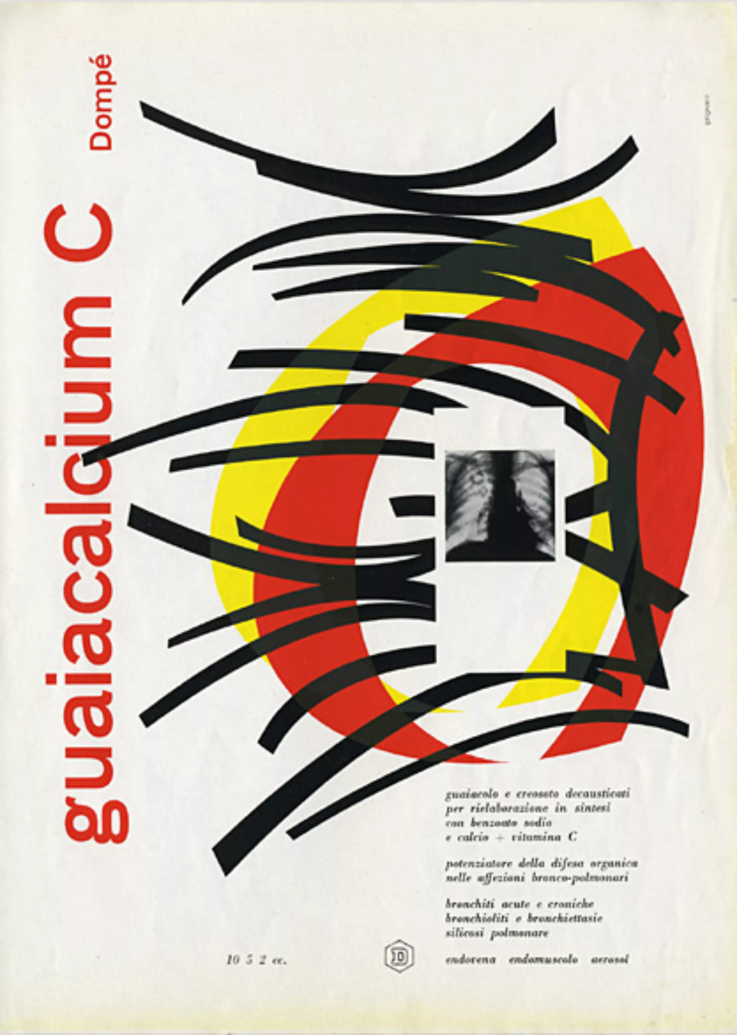
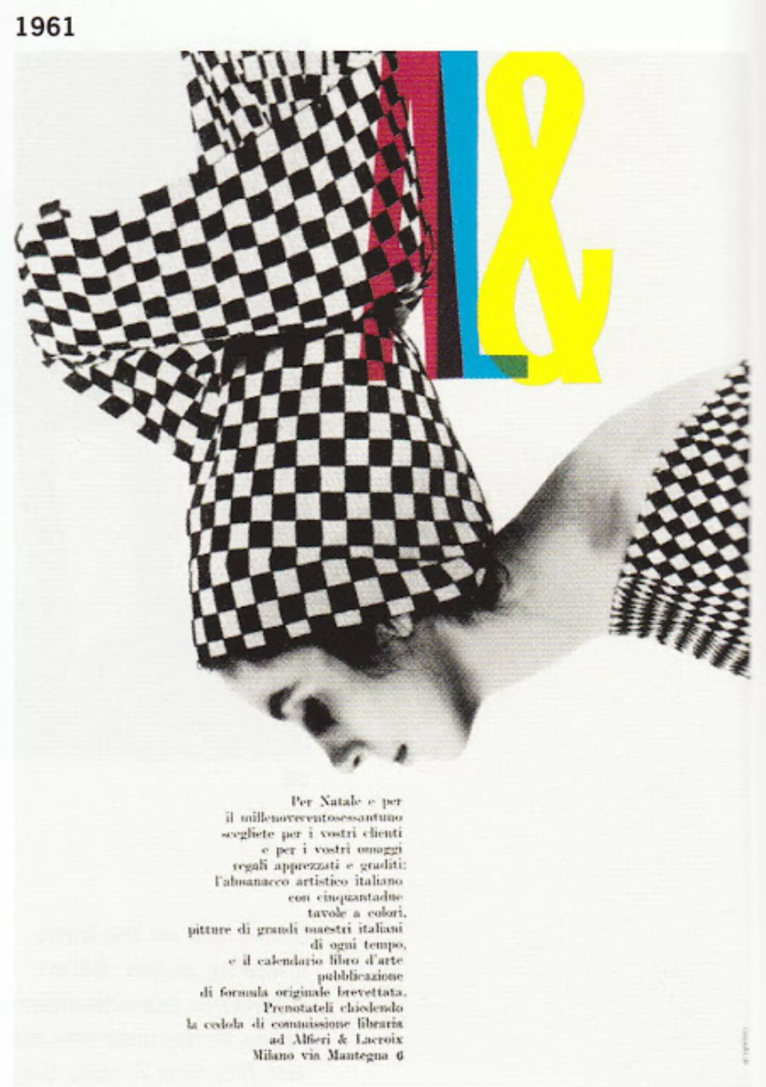
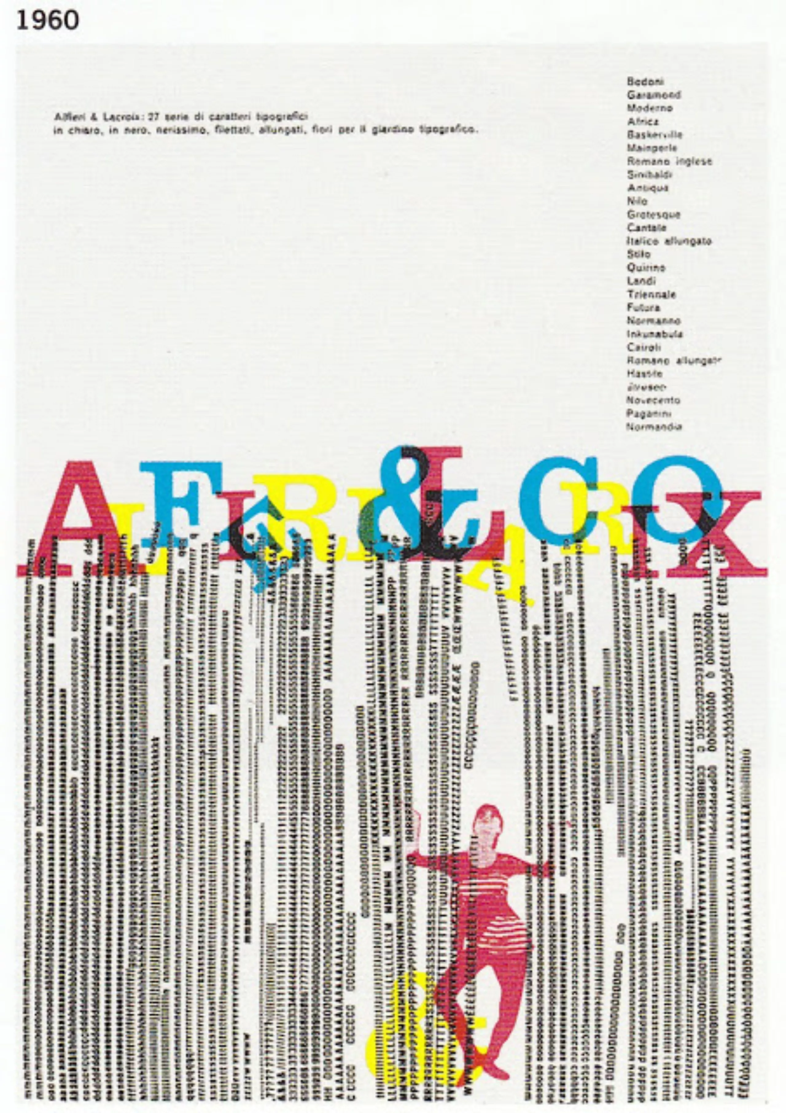
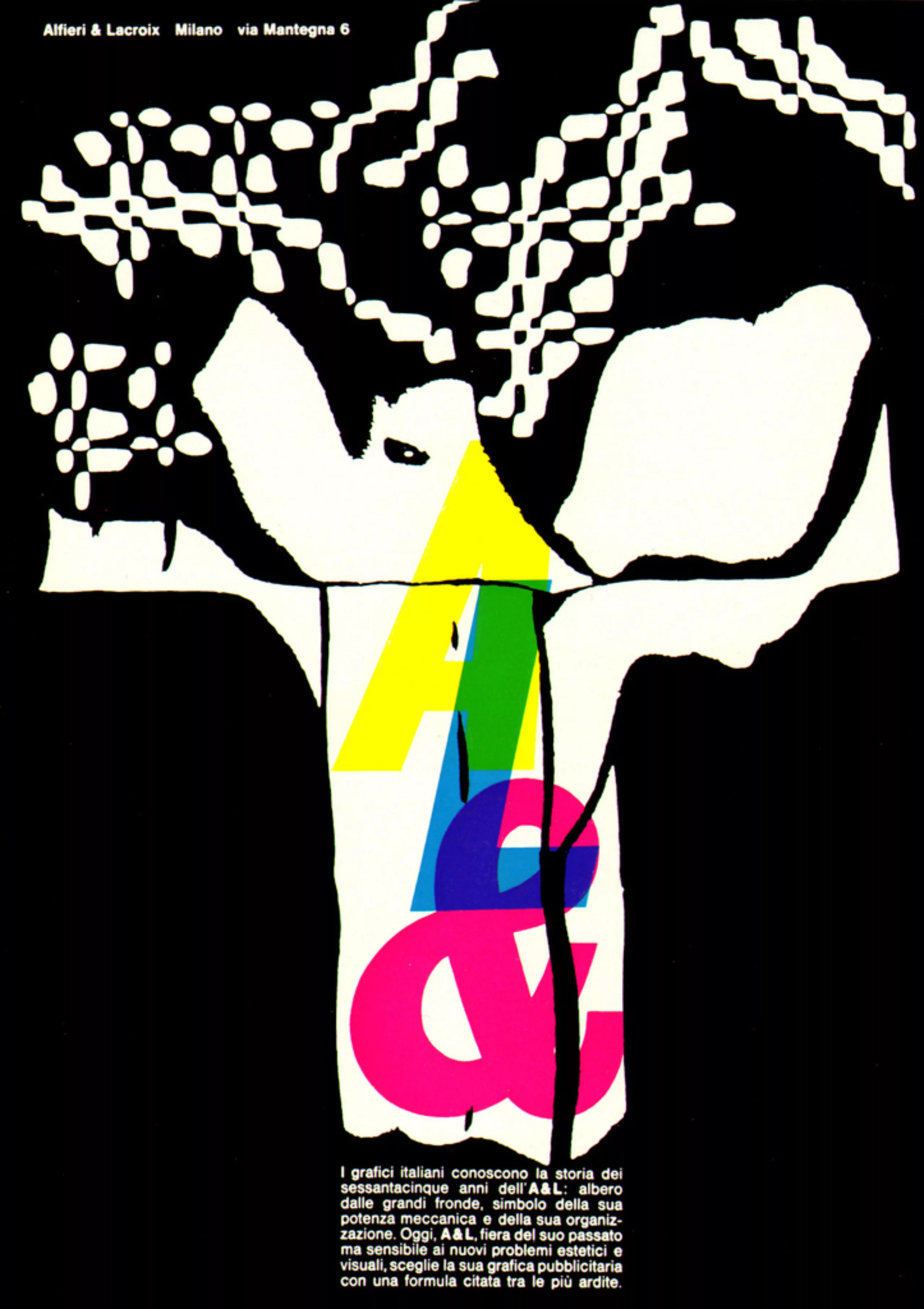
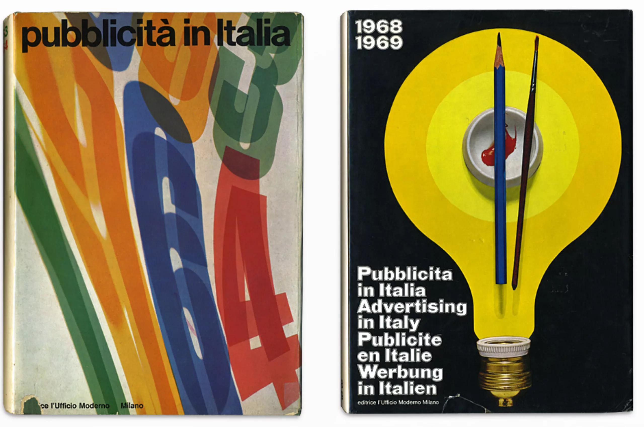
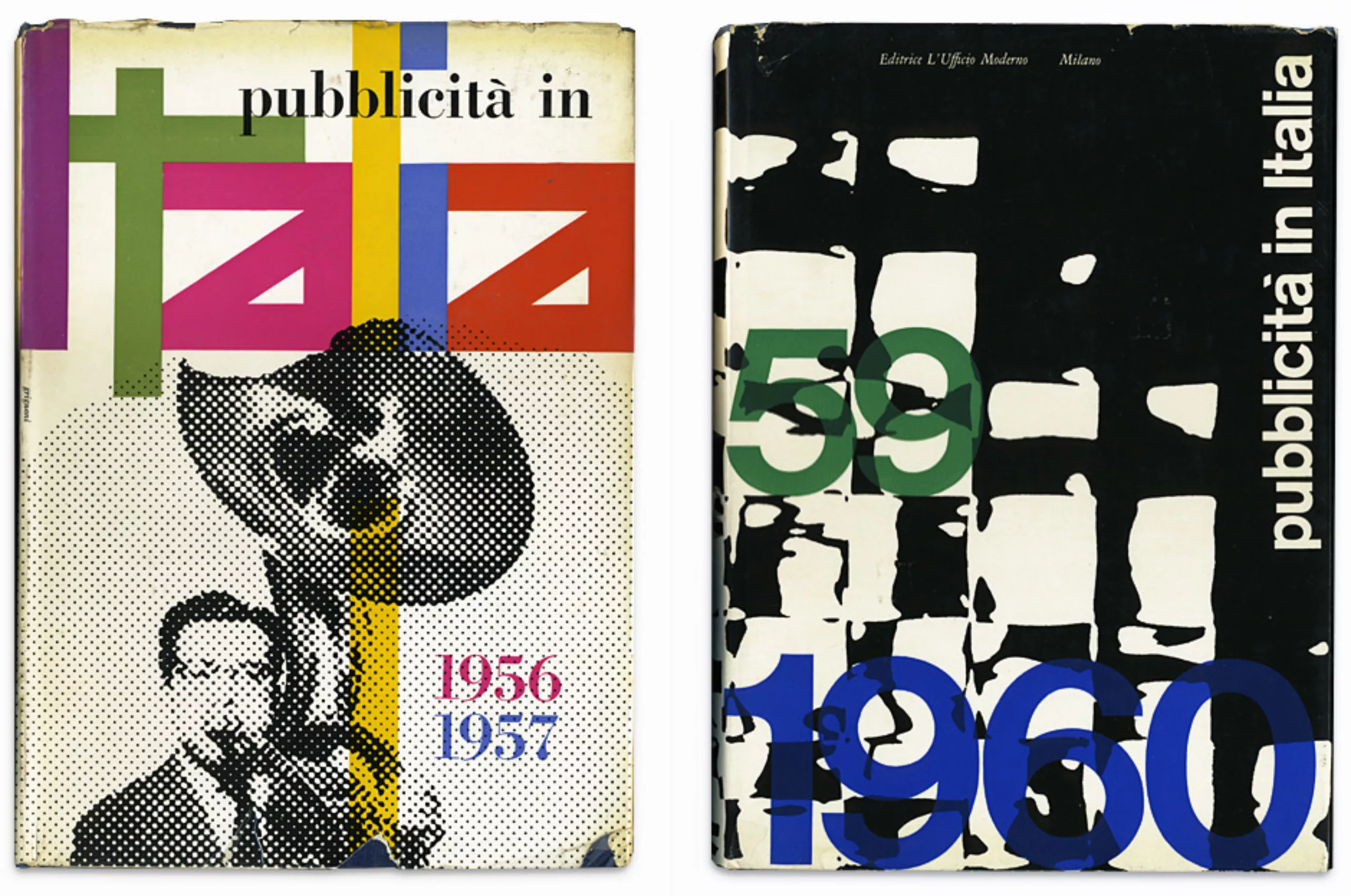
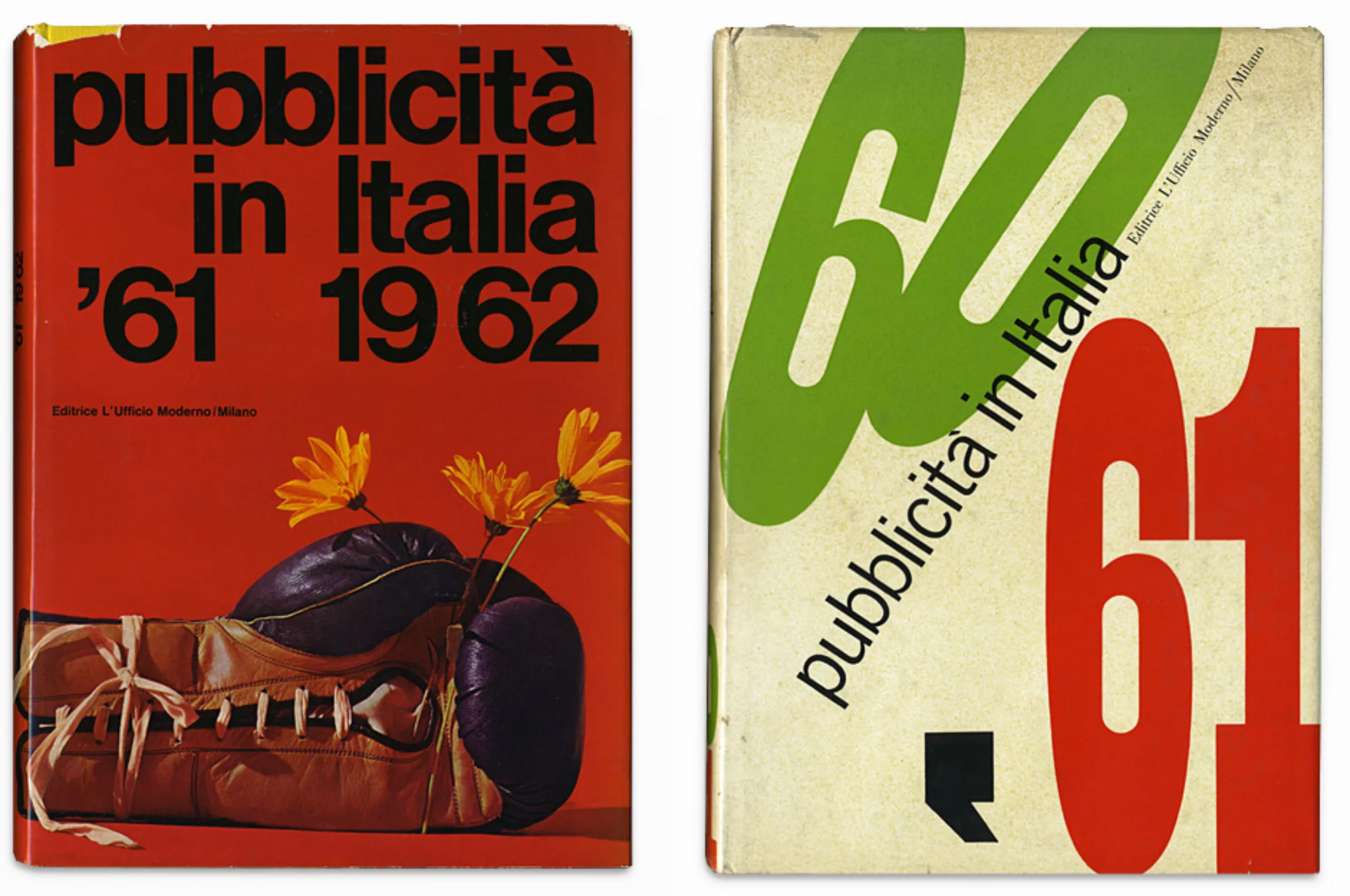
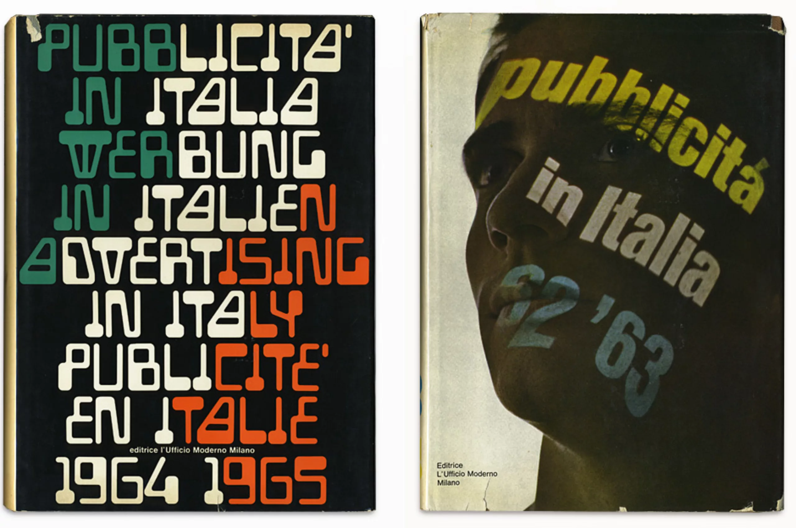
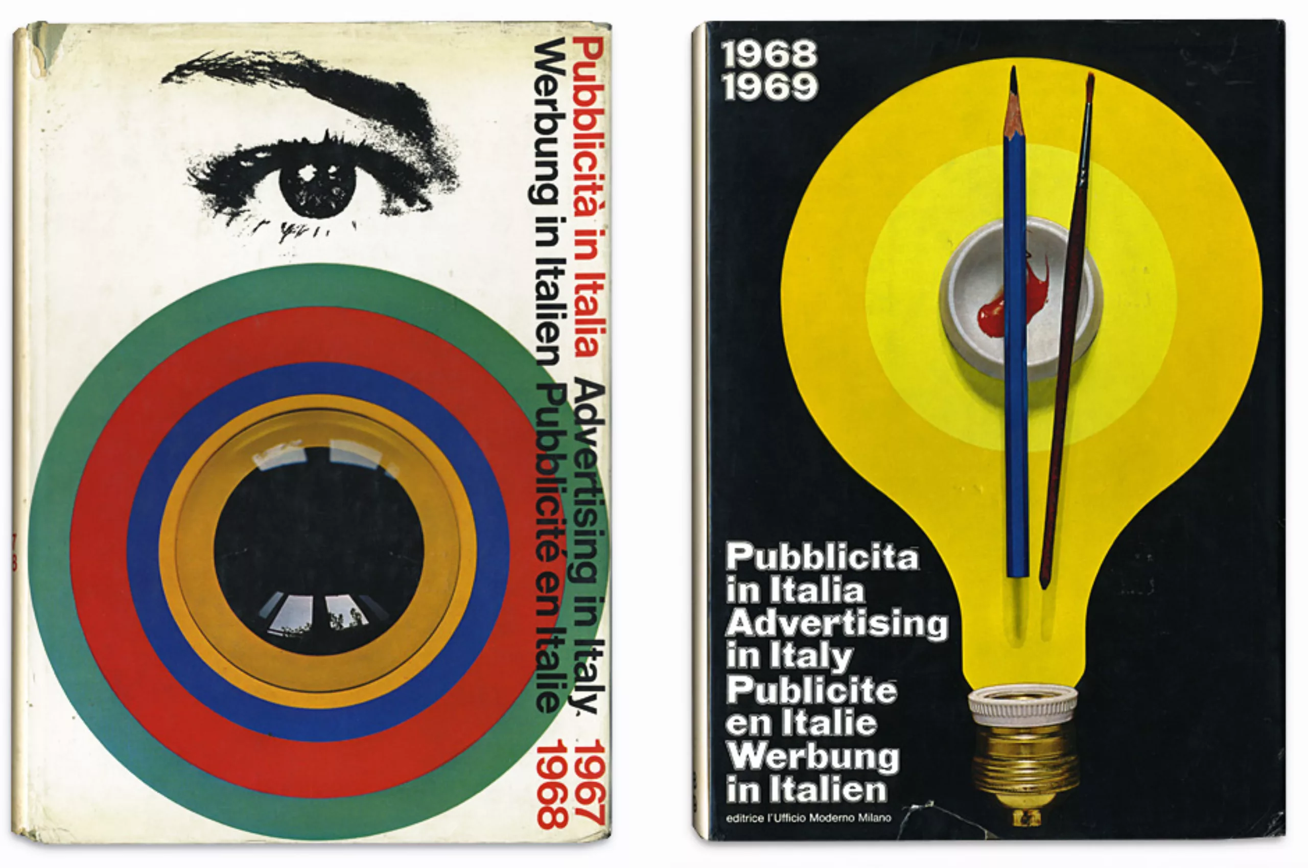
His work still influences today!
On the subject
-
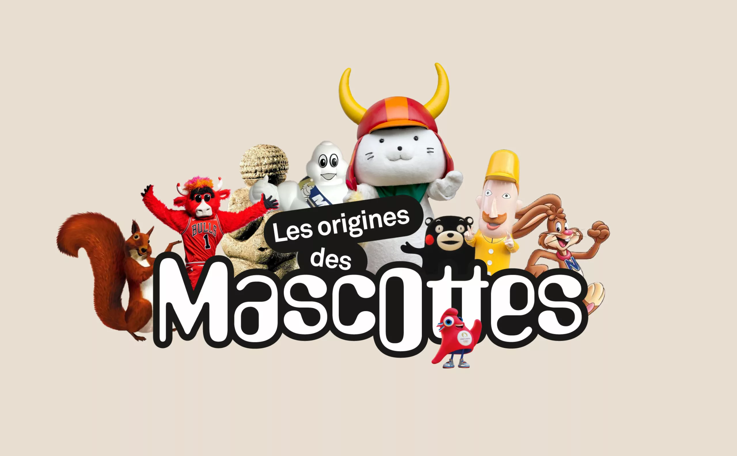
A history of mascots
Mascots, those soft, slightly silly characters, are nothing new. Here’s a look at their origins, from Antiquity to Japan.
-
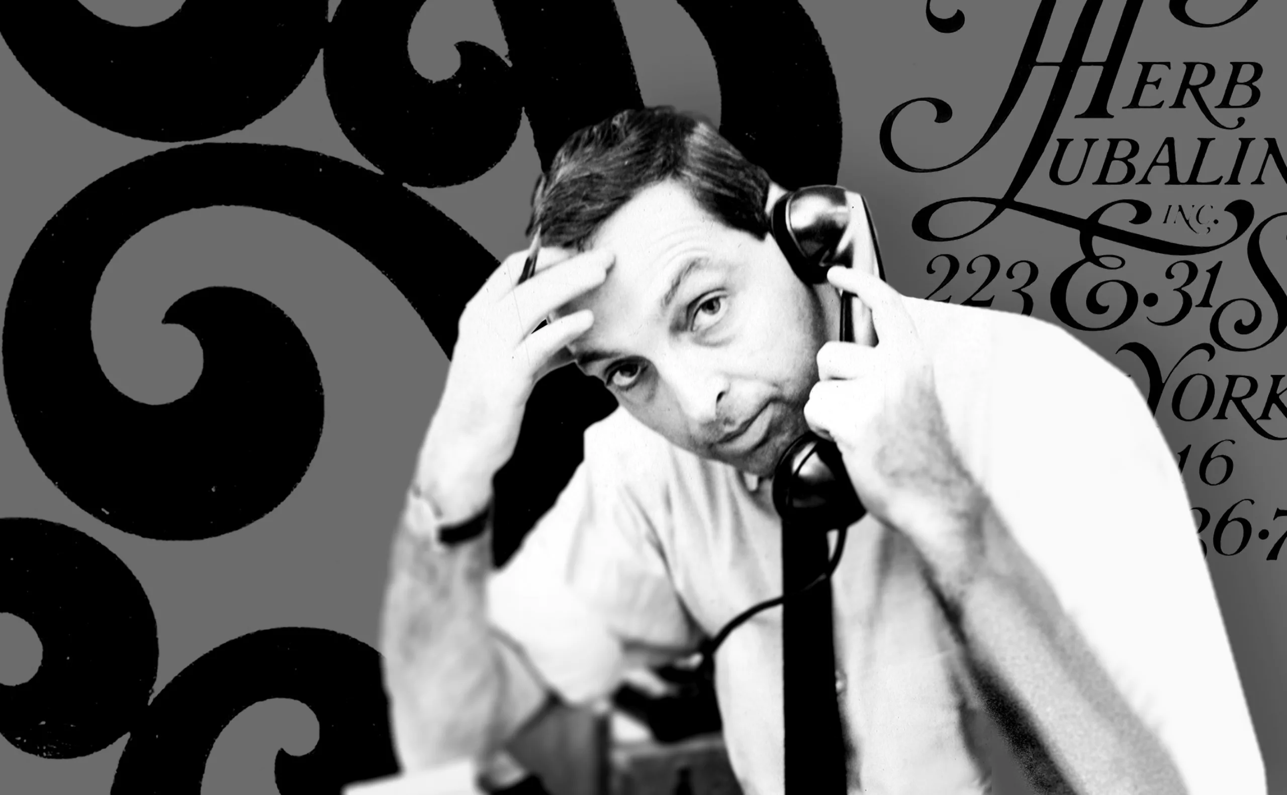
Herb Lubalin, the letter as an image
Herb Lubalin’s biography in pictures. In his 40-year career, Lubalin has revolutionized the landscape of American graphic design by composing images with text.
-
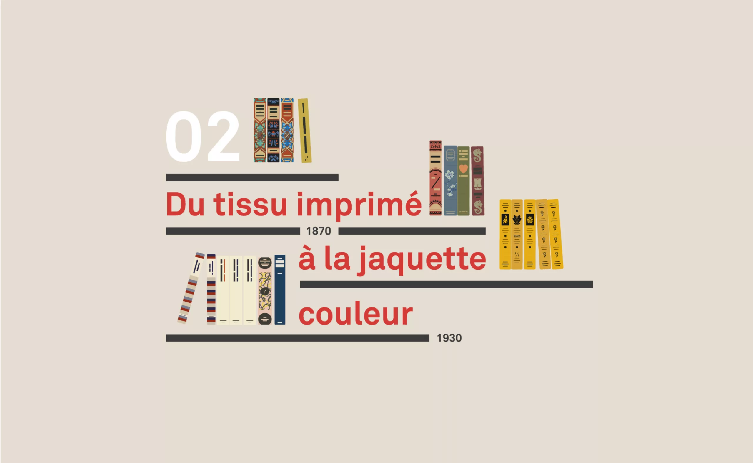
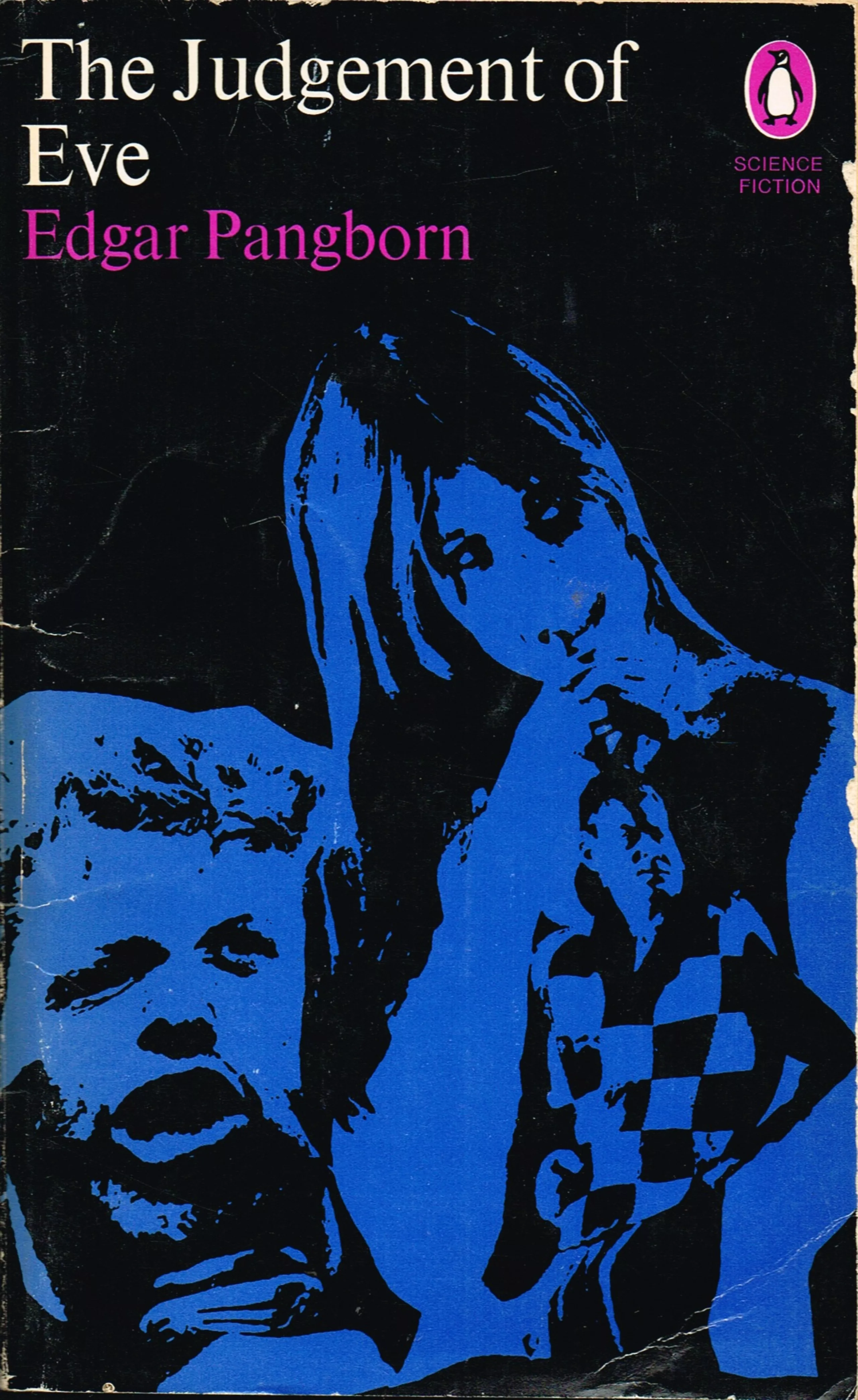
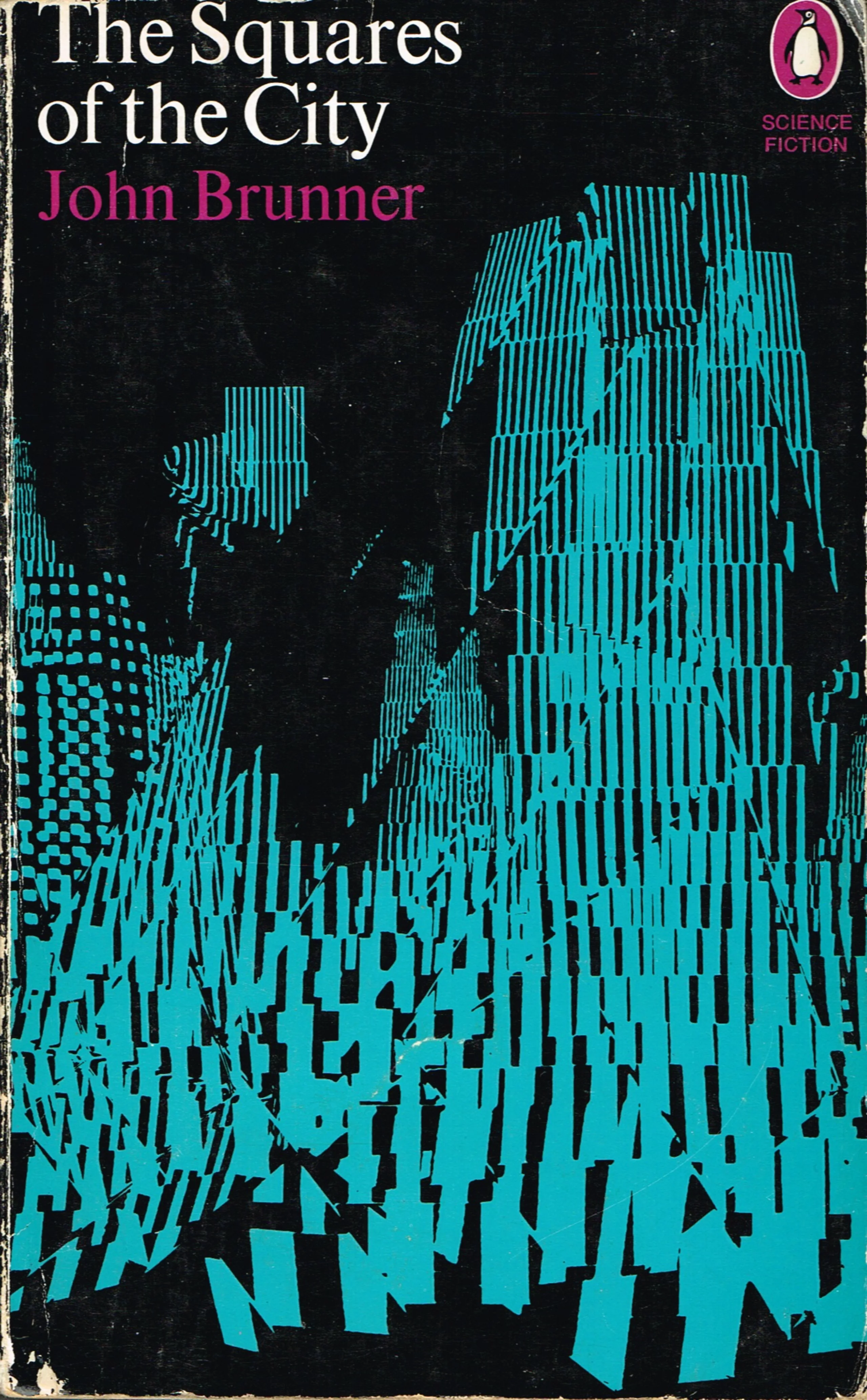
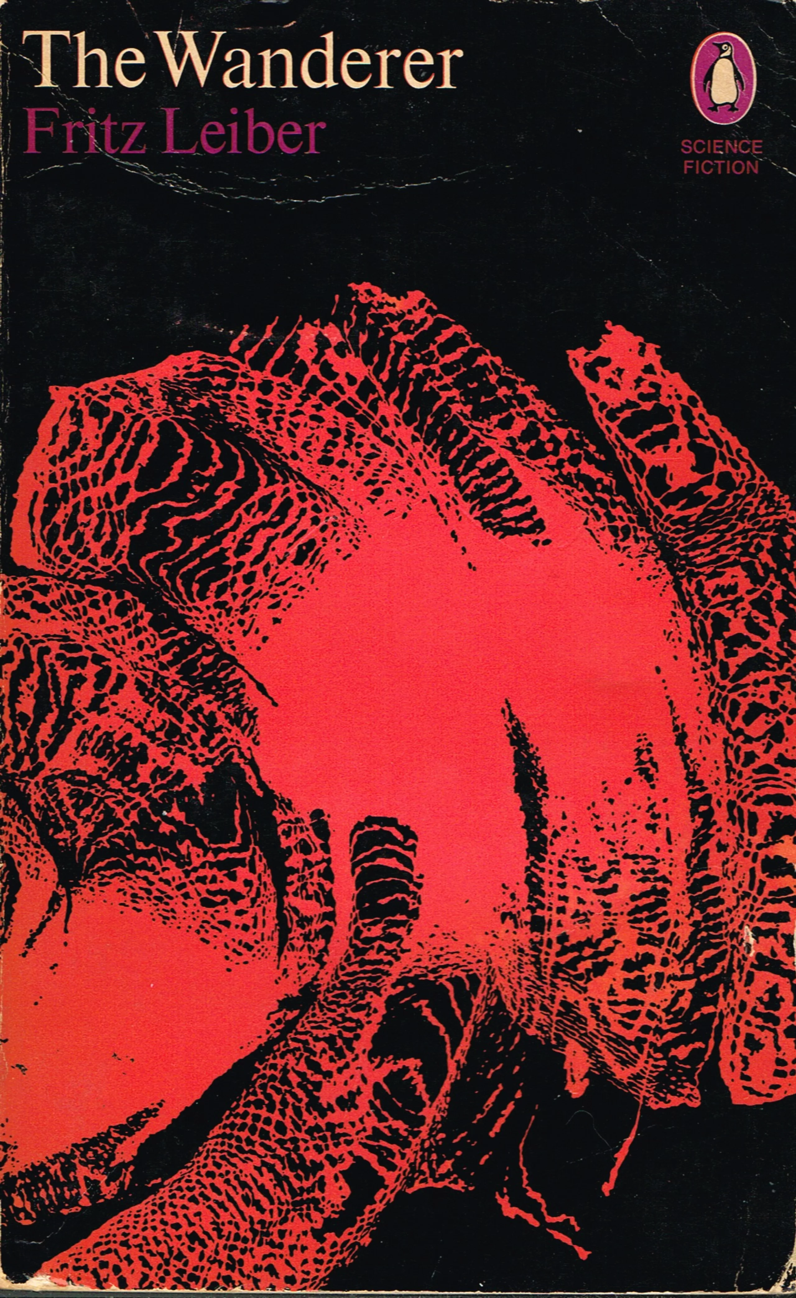
A short history of book cover design – 2/4
Under the influence of Japan, France or Russia, book covers are constantly evolving with technical progress and crises.