How Pantone colors the world !
As we all know, color is an eminently cultural notion. It only exists if there’s light, an object on which it’s going to fall, and an eye that’s looking. But this gaze is rarely objective, and our cultural codes invite us to perceive colors through different filters. Religion, for example, has long guided our chromatic choices. Today, cathedrals have been replaced by Apple stores, and multinationals dictate their chromatic choices to us twice a year. And if we had to find an apostle, it would be Saint Pantone.
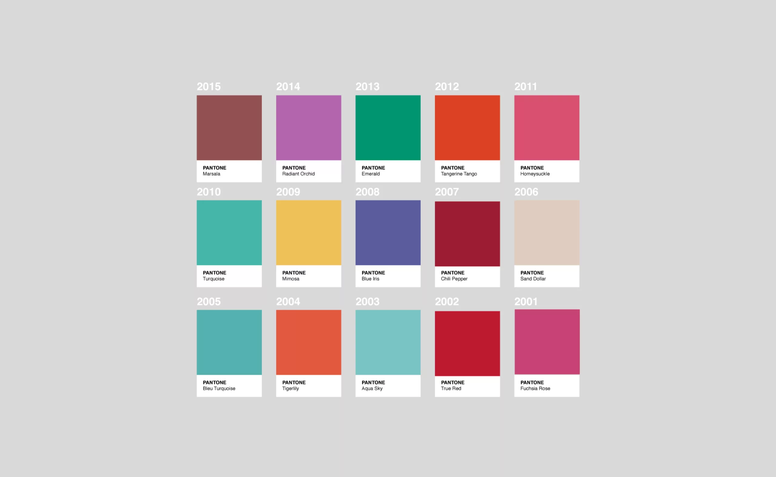
Twice a year (and for the modest sum of $750), Pantone, the grand master of colors, proposes ten seasonal colors with two flagship colors that will mark the current year. Now ready-made, color is decided at a very high level, and sets the tone for today’s society.
Color of the year: influences past and present
A simple printing company in 1950, Pantone is now THE reference in terms of color, both in the world of graphics and fashion.
Today, the highly secretive Pantone committee meets twice a year to determine the color of the year to come, and its variations of ten undertones. Under the watchful eye of color guru Leatrice Eiseman (the group’s executive director, declared by the Wall Street Journal to be a “major influencer in the world of color”), a handful of people from the four corners of the globe decide on the next color trends to be adopted by the fashion industry. These trends are then compiled, by season and genre, in the $750 Pantone View Annual.
When Kate and Nathalie influence the world of colours
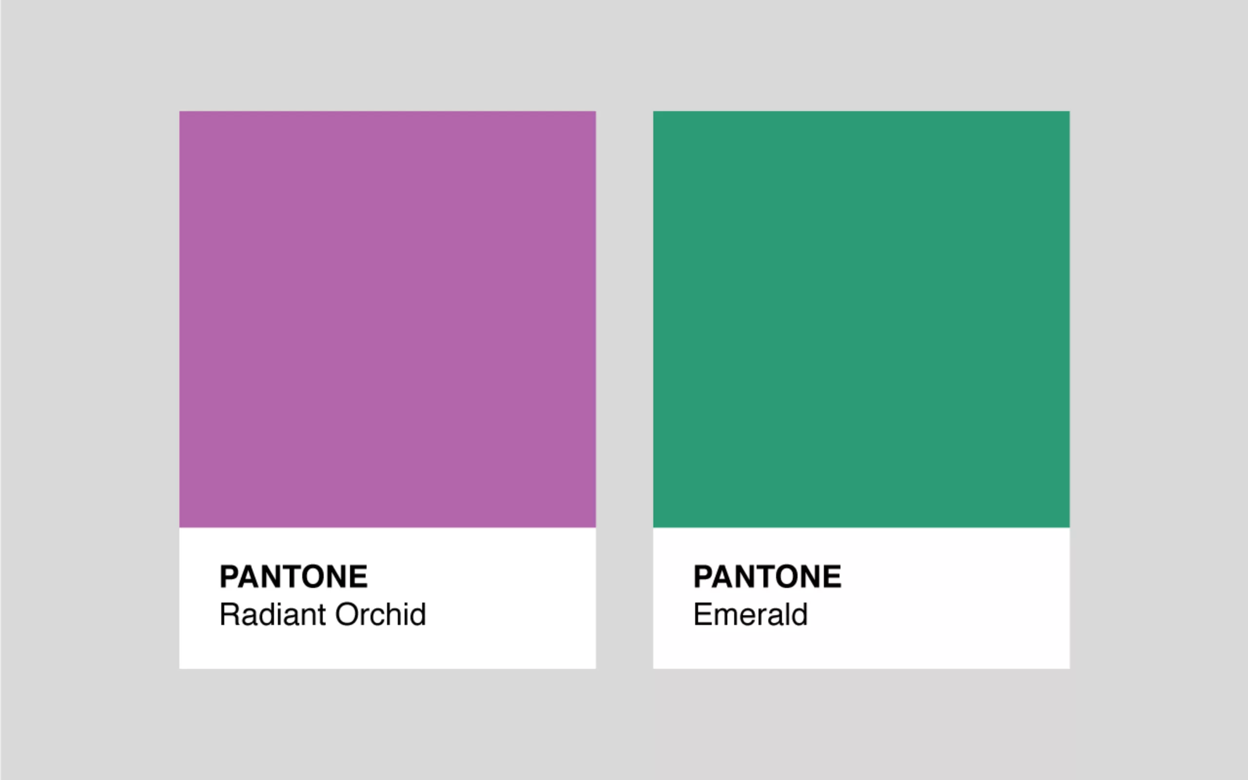
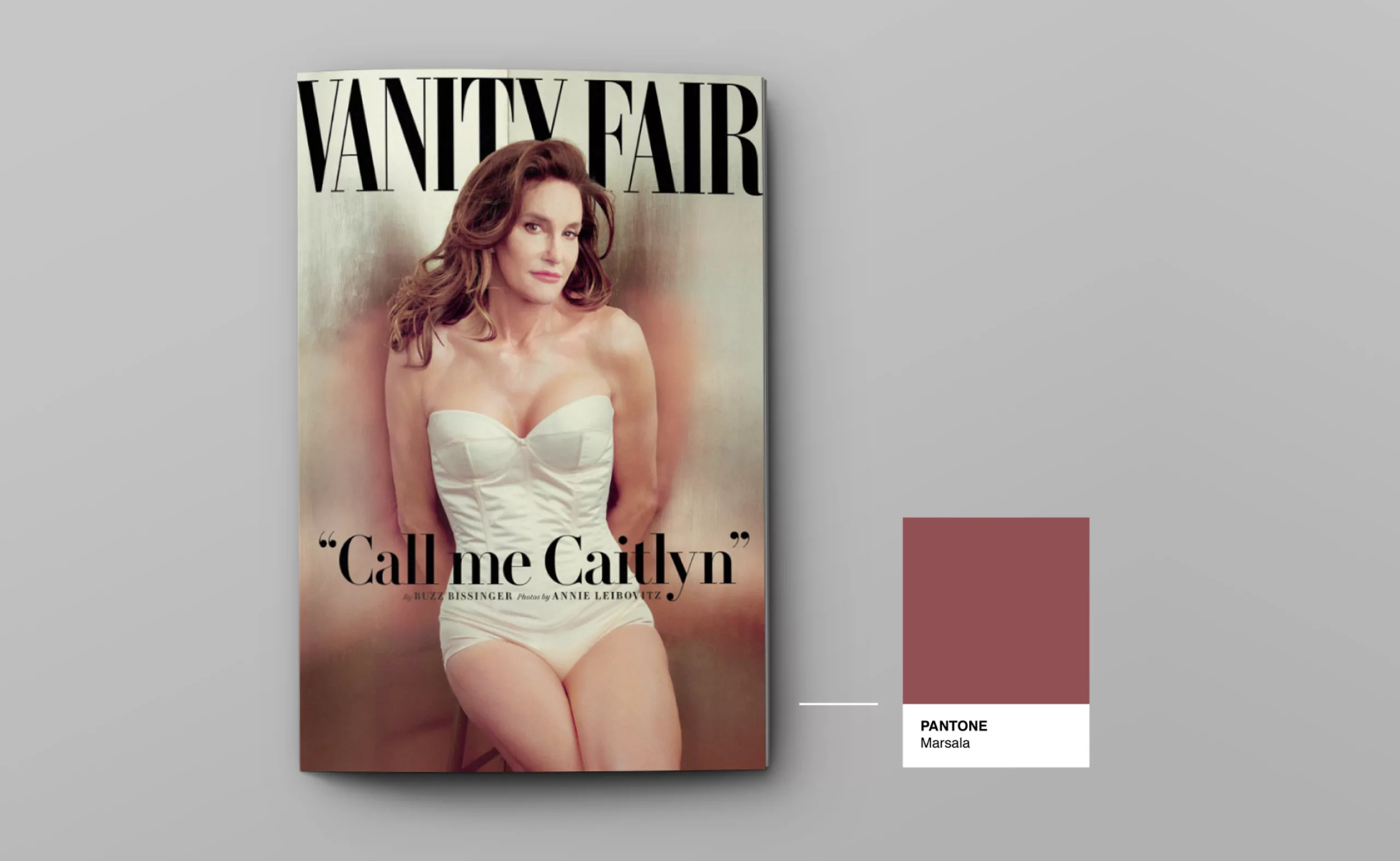
We can imagine them sitting round a table, putting together their visual favourites of the year: those shades of green from the tea plantations of Sri Lanka, that red on Nathalie Portman’s feet, that purple on the Oscar carpet. Regardless of the in-depth analyses carried out to legitimise the choice of colours for the year, advocating the reassuring and necessary side of an emerald in times of crisis or a sunny yellow during a dreadful winter, it always seems that the stars – the real market leaders and therefore the originators of mass consumption – have their say. Influences intersect, between stars, travel, the Super Bowl and princesses, and it makes you wonder if it isn’t, in the end, the celebrities’ clothes that are behind the Pantone committee’s choice, rather than the other way round. Kate Middleton and her “Radiant Orchid” dress worn for Prince George’s first official portrait was such a hit that this mauve became the official Pantone colour for 2014.
Natural colours and dyes vs. divine influences
While the tones of fashion and graphic design in general are now influenced by stars, in the past they were influenced by raw materials or religion.
We are a long way from the time when the colour of the year was not suggested by the happy few, but restricted by the raw materials used in dyeing. From pre-Roman antiquity to the early Middle Ages, over several centuries, the only dye used was red. Of course, there was white (synonymous with purity) and black (or any darker shade), but white was undyed or bleached, while black was simply the sign of a dirty garment. Blue – on the other hand – was non-existent or very rare because it was very expensive. Indigo was imported from India and its colour was unstable. But in the age of the all-powerful red, blue was especially depreciated: it was the colour of barbarians, eccentrics and mourners. Women with blue eyes were synonymous with little virtue. Blue was the least worn colour at the time, whereas today it is the favourite colour of the French…
Later, in the mid-14th century, blue finally came out of the closet, dethroning red: the Marian blue worn by the Virgin Mary as a guest star caused a fashion sensation in society, rather like Kate in her mauve dress. The introduction of blue and other shades in churches – the place to be at the time – sparked off profound debates about whether colour was light, and therefore a divine emanation, or simply a material envelope that should be discarded. Today, that would be like asking whether green is still in fashion, because Beyoncé hasn’t been seen in a fir-tree dress for several seasons.
Colour of the year: a ready-made?
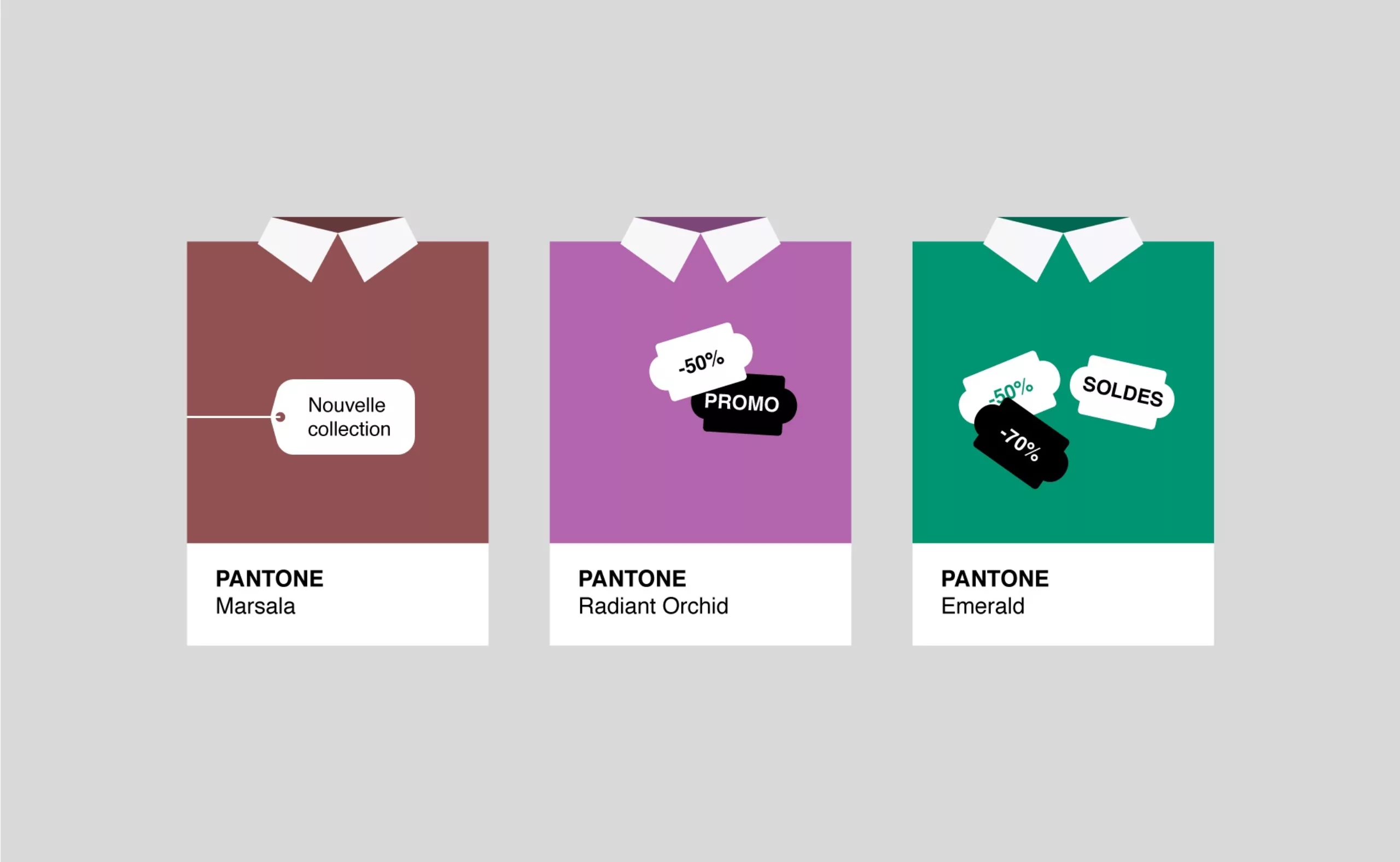
Kate may have replaced the Blessed Virgin, but the Pantone View Annual is now the Bible. This compendium, which is sold to the industries we mentioned at the beginning of this article, is the source of all the colours you need to adopt if you want to make a splash, and therefore sell. Colour is the most important criterion, after price, when choosing a garment. If Kate wore mauve, we’ll need mauve. As the driving force of the industry, our desires are driven by this chromatic seasonality, which means that we buy the same jumper over and over again every winter, but in a different colour, because emerald green is soooo 2014.
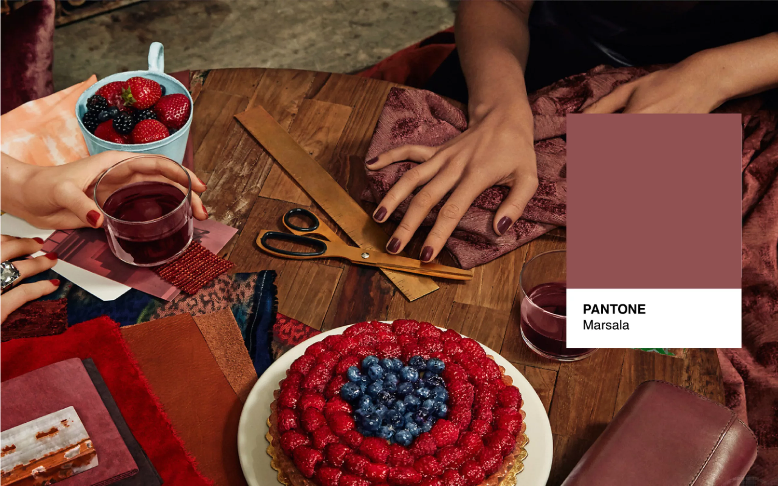
This autumn, Marsala – the colour of the year 2015 – will be found on coats, bags and watches. The reason for this homogenisation of the colour is that the chromatic mix used to produce this shade is registered and you have to buy Pantone 18-1438 to be resolutely Marsala. The advantage of standardising colours is that the key tones of the year can be used on an infinite number of media, without fear of variations in tone from one country or object to another.
The Pantone Matching System (PMS), with its multiple colours, enables industries to ensure standardised production based on a universal colour language. We no longer say fushia, but PMS 213. The cotton or wool yarns rigorously respect the colour to the letter, or rather to the PMS number. We’ve come a long way from the variations in shades that were once natural, where red came from raw materials such as kermes (a type of cochineal) or madder (a plant with yellowish flowers), giving shades ranging from purple to pink that varied in tone according to the dyeing techniques used. More than just influencers, Pantone alone governs the world of colour, fashion and, indirectly, our society, since our tastes and desires are actually shaped by their initial decision.
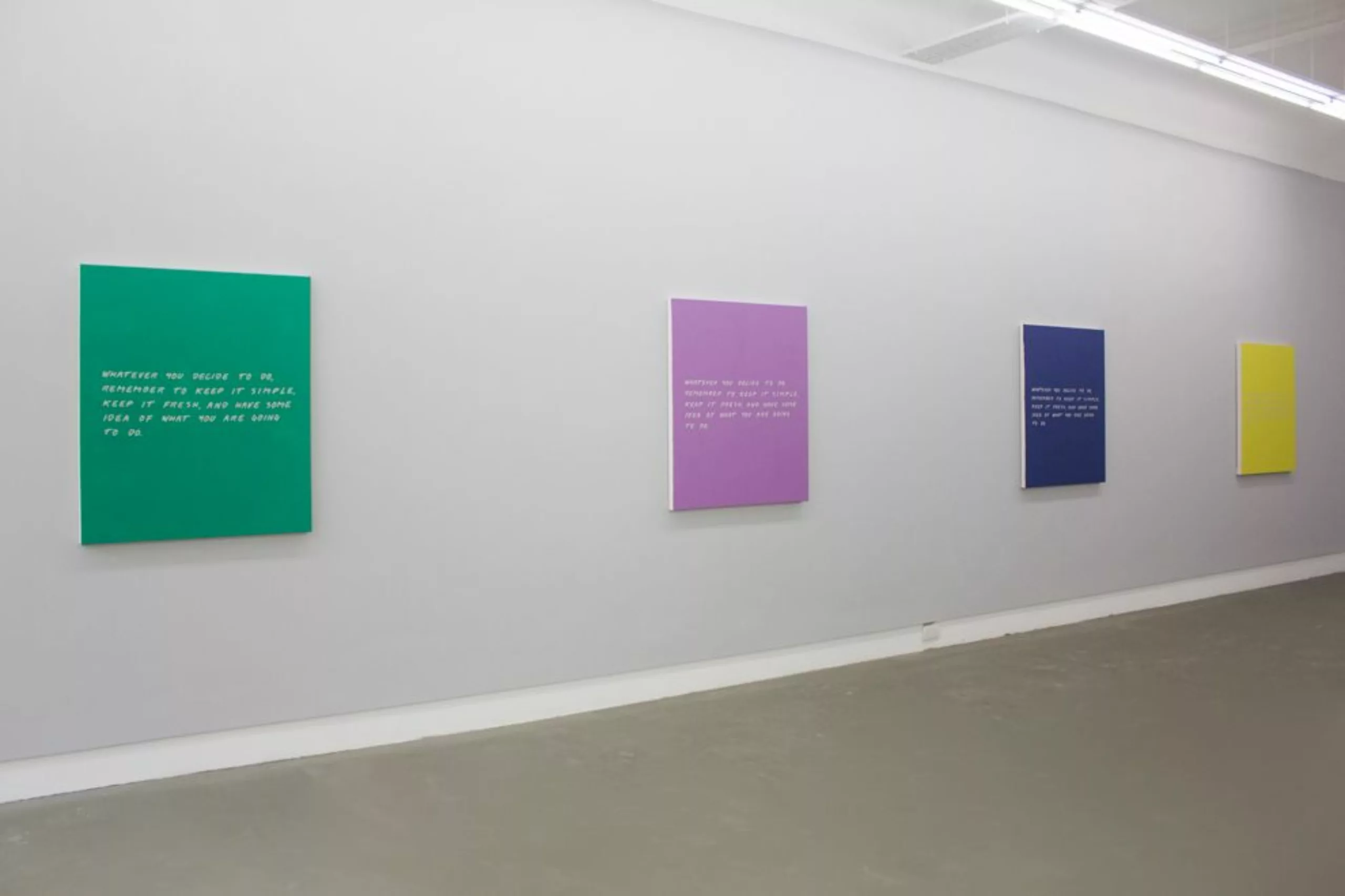
Standardised and then adulated as a work of art, brought to the fore by Leatrice Eiseman, colour takes on the aspect of the ready-made. It can even be substituted for the word ‘object’ in Duchamp’s definition: ‘an ordinary colour raised to the rank of art by the sole choice of the artist’. This is what John Baldessari (a key figure in contemporary art, known for putting coloured polka dots on the faces of his paintings) and Meg Cranston have chosen to do by using the same phrase on the 10 Pantone colours of the Spring/Summer 2013 season. Their aim? To create a Ready-Made product in the image of our industry, at a single price, where only rigorously controlled shades allow a variation of tones like a voice, from shouting to whispering.
The message, “whatever you decide to do, try to remember to keep it simple, to do something new, and to know roughly where you want to go”, stands in direct opposition to the very medium of the artists’ work, like a cry to ‘do something new’ despite the standardisation.
Marsala – colour of the year 2015
Does this mean that Lee – Leatrice Eiseman’s – has decided to do something new with Marsala? Pantone says it sees in this reddish-brown and the other 9 colours of the year the presence of “neutral, natural and earthy tones; hope, fun, dreams, the reassuring warmth of a good big meal, a link to nature, protection, endurance, sophistication”. We can’t help thinking that it’s easy to make any colour say anything. On the other hand, by looking at the origins of red and brown, we can understand in a more relevant way why, in the end, Marsala is not such a bad choice to illustrate today’s society.
Marsala, a direct descendant of red
Marsala, the earthy colour that takes its name from an Italian wine, is the worthy heir to the top 1 trend of antiquity: red. At once humble with its raw, clay-like colour, yet distinguished and rich with its vivid tones, it encompasses an entire history of the origin of the colour red and its use in society. The colour of the rich par excellence before the Middle Ages, red is a dye, as we saw above, and dyeing means high costs. Red is therefore naturally synonymous with wealth, strength, prestige, beauty and love, and still is today.
Later, in the 14th century, bright colours were banned for dignified and humble people. Widows, clerics, magistrates and the gowned professions were forbidden to wear red. Brown, a humbler derivative of red, became synonymous with simplicity, especially as its colour was reminiscent of earth, the origin of human life par excellence. Indeed, Adam’s name means “made of red earth”. This is where Marsala creates ambivalence, with its dual status as a wine that is both rich and prestigious, because it draws from red, but also humble and earthy because of its brown tones. Added to these historical origins is the great innovation of 2015: the colour Marsala is transgender, and applies to both men and women. As in previous years, there are no specifically feminine or masculine tones. With a little hindsight, we can see in Marsala the desire to find a colour that unites the worthy and the humble, men and women, Nature and Man.
But here again, instead of a real revolution led by Pantone, which decided to choose a colour for both sexes, we can simply see a parallel with the evolution of our society and the advent of Marriage for All (especially in the United States). More united in the human gender and without gender distinctions, it would be reassuring to imagine that society would be the real influencer of this colour bias and that Pantone would only be the attentive observer, and not the other way round. So it’s up to us to become active players in this company, to take our turn in creating something new, and to position ourselves as decision-makers rather than followers.
Fashion-programmed obsolescence
Programmed obsolescence is an industrial model that consists of designing and marketing products that will cease to function after a certain time or a certain number of uses… to the great displeasure of users, who are forced to replace them. Programmed obsolescence, along with advertising (the world’s 2nd largest budget just after arms) and credit, are the three pillars of capitalism. “Advertising creates the desire to consume, credit provides the means, and programmed obsolescence renews the need. Remove one of these three elements and everything collapses.
When we think of programmed obsolescence, we usually think of the iPhone’s irremovable battery, but we shouldn’t forget that ‘fashion’ is the most widespread and oldest form of programmed obsolescence. More precisely, it’s a symbolic obsolescence that prematurely declassifies an object. My ‘Radiant Orchid’ jumper no longer has the same symbolic value in 2015, even though its value in use remains perfectly identical. Thank you Pantone !
How to find the Pantone equivalent of a CMYK or RGB colour
After the historical sequence, here’s the technical minute. Who hasn’t had to look up the Pantone equivalent of a CMYK or RGB colour?
Here’s today’s tip !
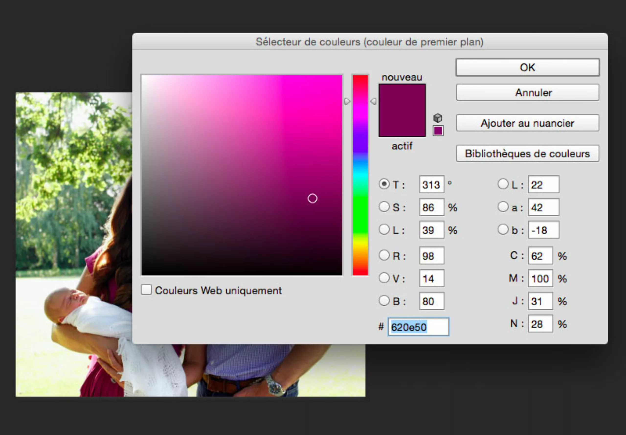
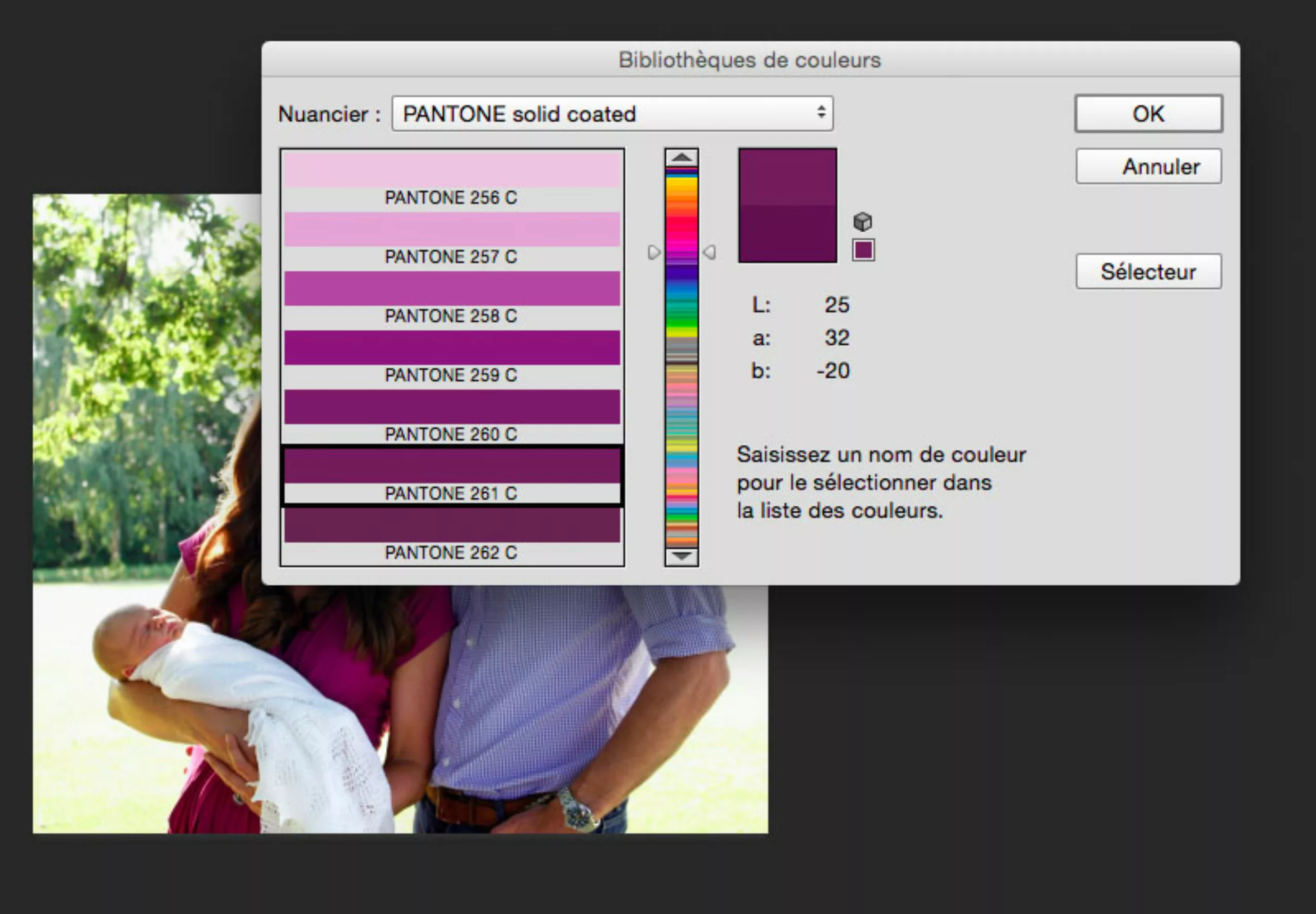
In Photoshop, use the eyedropper to select the colour you’re interested in, then click on the “Colour library” menu to magically obtain the closest pantone equivalent.
Pantone drive us mad !
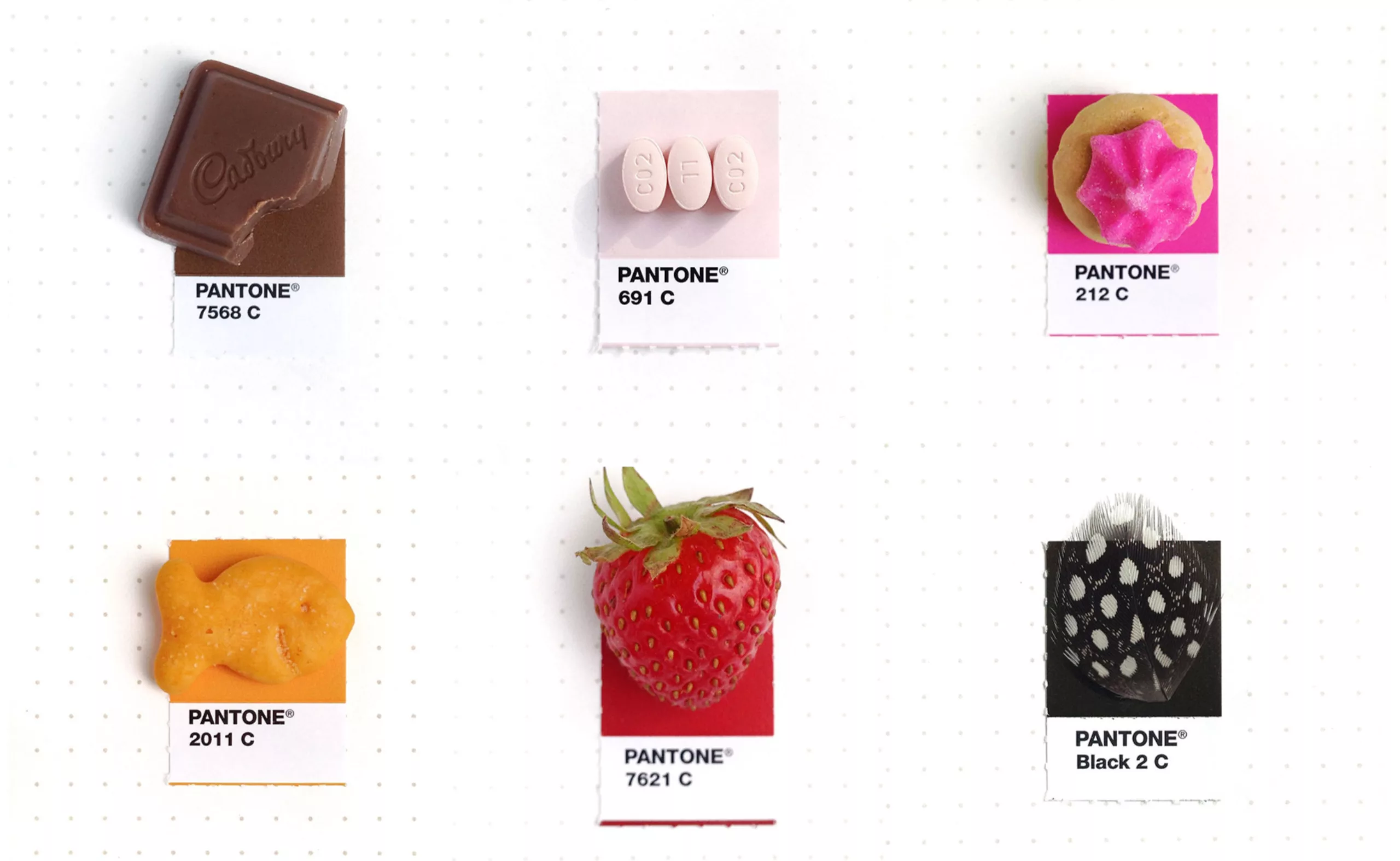
For 2 years, graphic designer Inka Mathew has been matching objects to Pantone colours. It was a titanic task that began as a joke, with Inka trying to work out what the Pantone colour of a little blue flower might be! Then it was gears…
Cheating was out of the question. Inka takes real photos without retouching the colours.
Check out the full colour chart on her tumblr: tinypmsmatch.tumblr.com
On the subject
-
Branding and colorimetry: The “RGB First” strategy
The strategy of “RGB-First”: Reflection on the colorimetric chain RGB / CMYK in print and digital communication.
-
Karel Martens: the impression that matters
Portrait of Karel Martens, the man with multiple motifs and lovers of constraints, reference in the world of graphic design and plastic research.
-
A visit to Basel’s printing museum
A short visit to the Basel ( Switzerland ) printing museum.
A unique opportunity to discover a little treasure: the Helvetica protocol !