A king-size stamp for Charles III
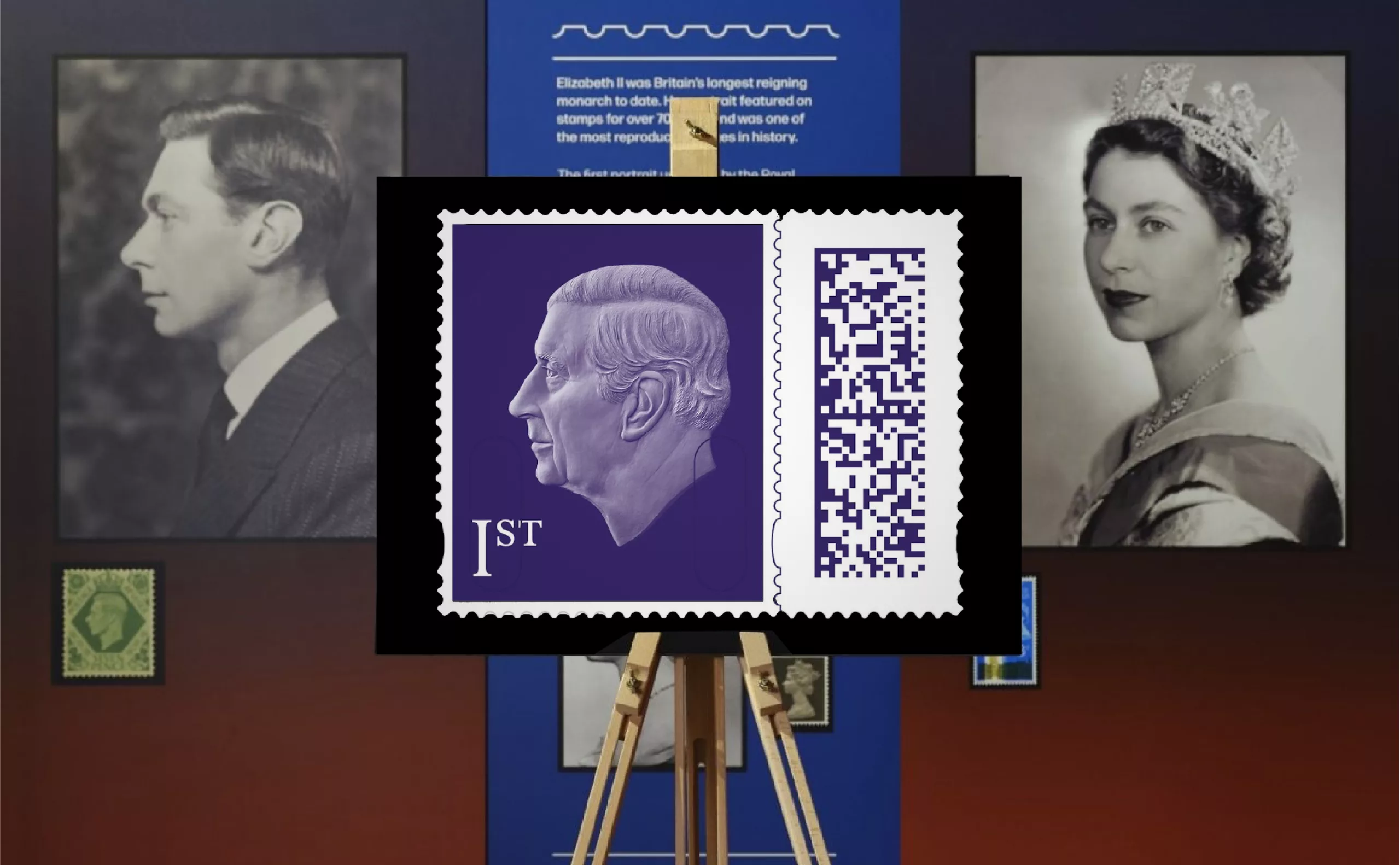
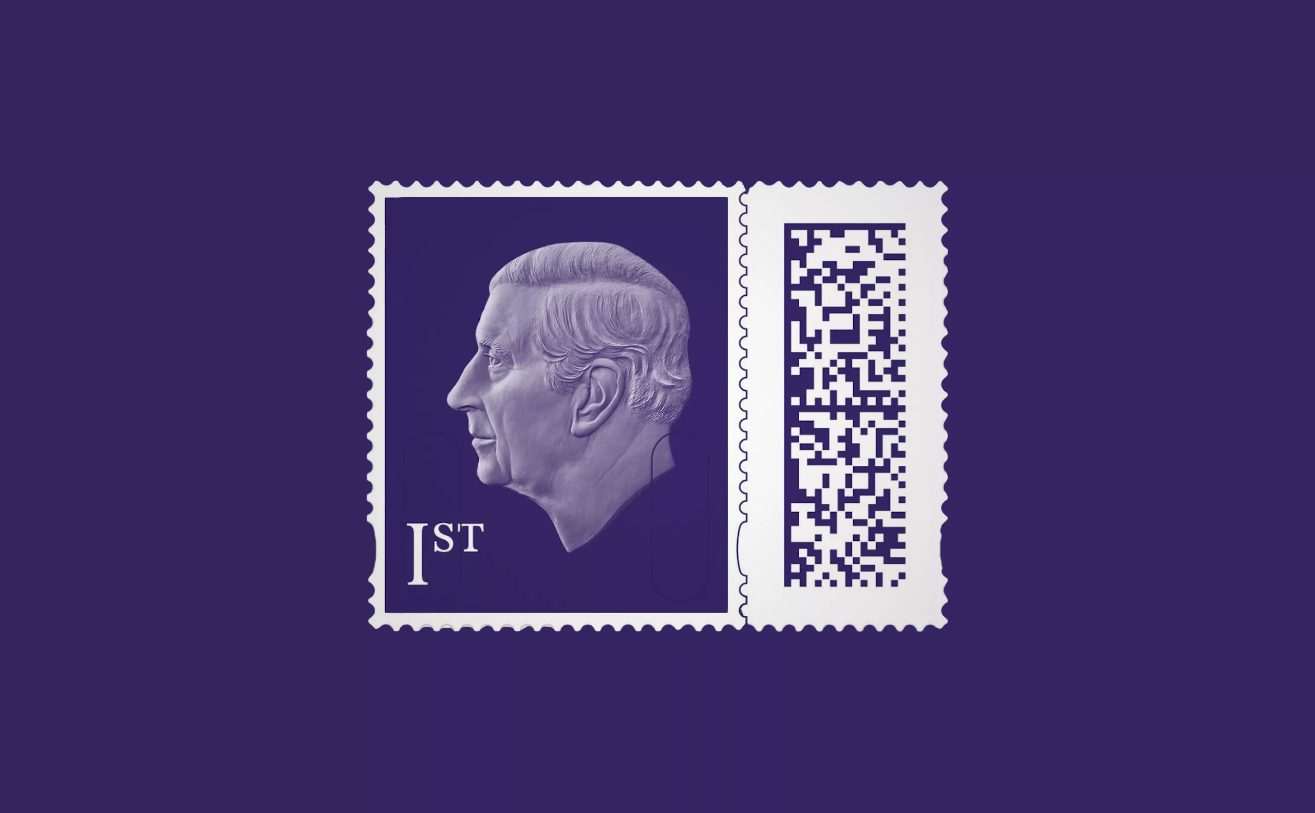
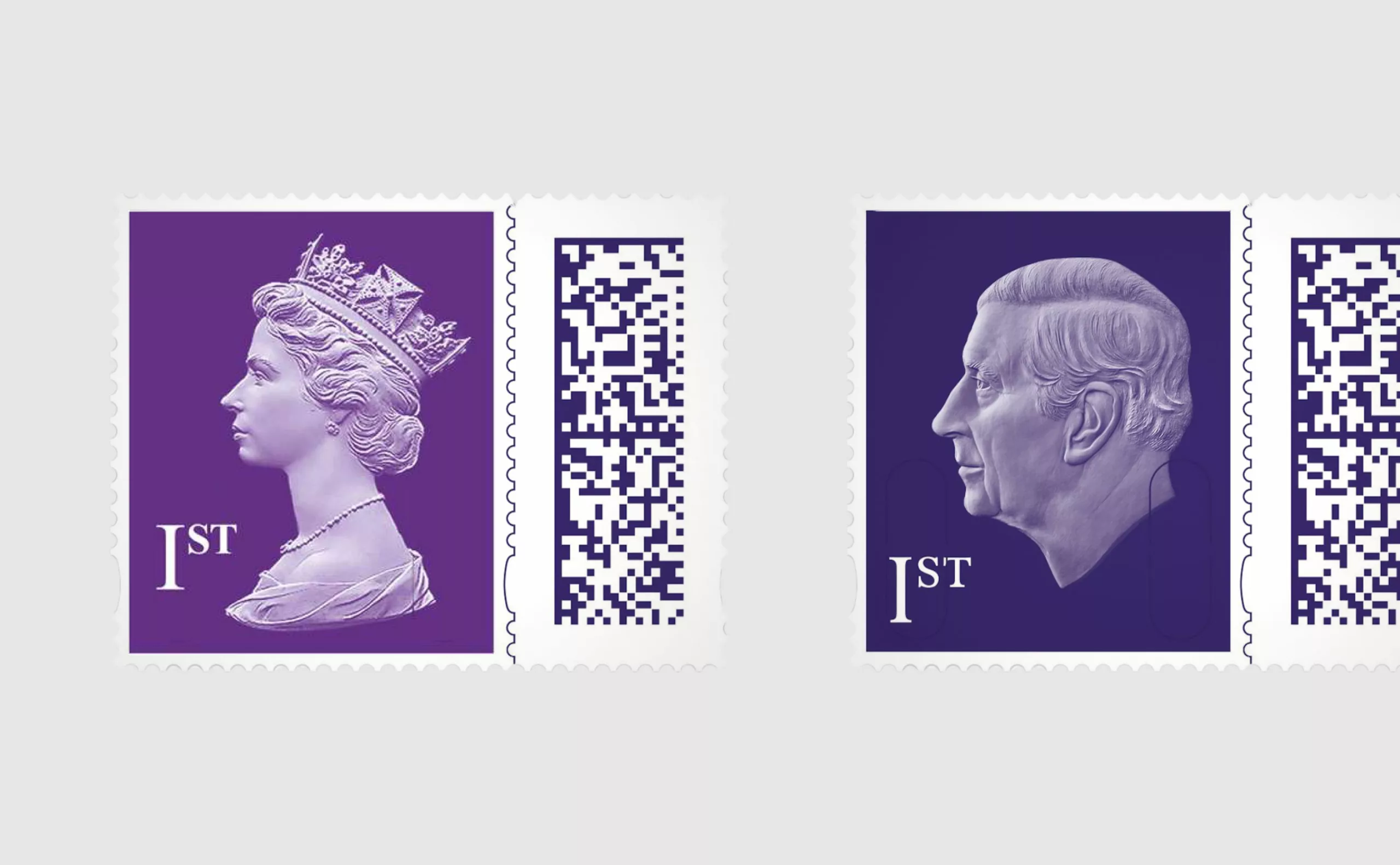
The UK postal services have just presented the image of King Charles III that will appear on stamps from April 4th. It is a very sober portrait without a crown, a very symbolic first for the British crown! The time is not really for ostentation anymore.
“We wanted it to be simple, a very human image without embellishment” says David Gold, communications director of the Royal Mail. The portrait is based on a sculpture made by artist Martin Jennings for the new King Charles coins – the image was then adapted for the stamps. While the realism of the portrait is indeed striking, with the fatness of the neck and the large ears of Prince Charles clearly recognisable, the result is a certain austerity, not to say coldness.
And why look to the left when we learn from the first course in semiology that in an image, the future is always located on the right? The monarchy always looks to the past… in the end it seems logical.
Finally, we note the arrival of a QR code associated with the stamp, an innovation presented to ensure the security and traceability of mail. The result is a “King-size” stamp that is much larger than the classic stamps.
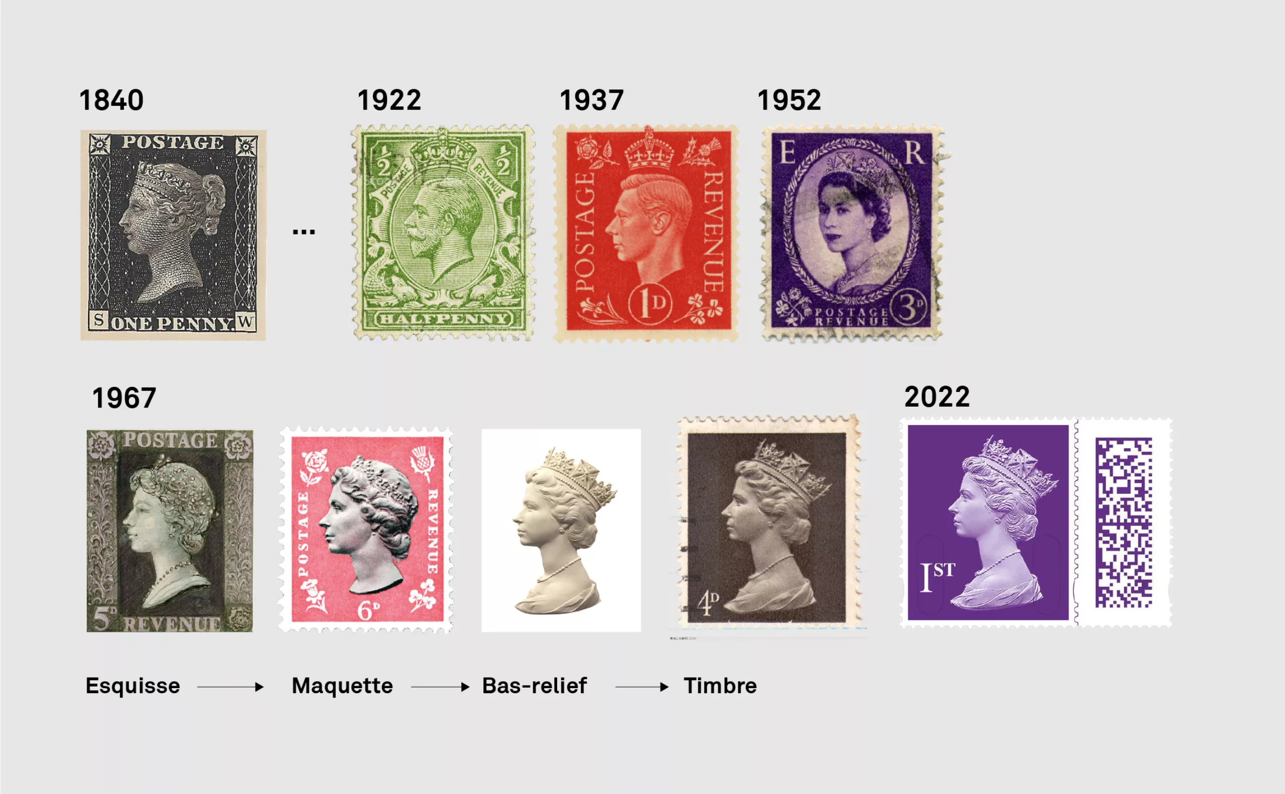
The design of this stamp is a continuation of the previous royal stamp with the profile of Queen Elizabeth II created by the artist Arnold Machin in 1967. A timeless minimalism without any mention of the issuer or the country of origin. A bold design. It couldn’t be simpler or more effective.
The history of the 1967 stamp
A few years after the end of the Second World War, in 1952, a first stamp with Elizabeth was produced with a photograph by Dorothy Wilding Studios. It is in the imagery of the time, 3/4 portrait and peach skin.
In 1966, a competition was launched for the creation of a new official stamp. Artists were invited to submit a sketch (history does not say whether these sketches were compensated or not!) Arnold Machin was selected. He was asked to develop his project in the form of an advanced model, and was then entrusted with the sculpture of the portrait in bas-relief. It was this bas-relief that was photographed and used on stamps and coins.
Because of Elizabeth’s longevity, 220 billion copies of this stamp were issued in 55 years! This makes it one of the most widely distributed graphic creations in the world!
Charles is the 7th monarch to appear on stamps, Queen Victoria being the first, in 1840, when her profile was used on a “Penny Black”. A mythical stamp.
“Notes on postage stamps” by Eric Gill
Eric Gill (1882-1940), a famous English graphic artist and character designer, worked on the subject of postage stamps on numerous occasions. He worked on the Edward VII and George VI stamps in 1937. Gill had strong opinions on the subject of postage stamps and his theories were not always heard. In his essay “Notes on Postage Stamps” Gill succinctly sets out his philatelic ideas and offers some still contemporary thinking. Here are some excerpts:
“It is a principle of design that the greater the number of repeats or reproductions, the simpler the form of the repeated object should be. Therefore, strictly speaking, it is desirable to avoid portraits, landscapes and all naturalistic scenes. It is most unfortunate that our government and other governments pay so much attention to the entirely sentimental views of philatelists and the general public. It is equally unfortunate that stamp production has become, in many countries, an opportunity to find new sources of income, making increasingly elaborate and naturalistic designs seem desirable. We are all familiar with many examples of this sort of thing, for example views of remote mountains in New Zealand or a view of a new dam in Connaught.
There is no need to assume that, reduced to simple elements, a postage stamp is anything other than a very beautiful object. Good lettering, a good image and the simplest possible heraldic symbol are enough to make it beautiful and identifiable. There is no need to refer to early stamps, such as the Victorian Penny Black, because the production conditions of a hundred years ago and the number of stamps required were entirely different and the quantity printed today is considerably higher.
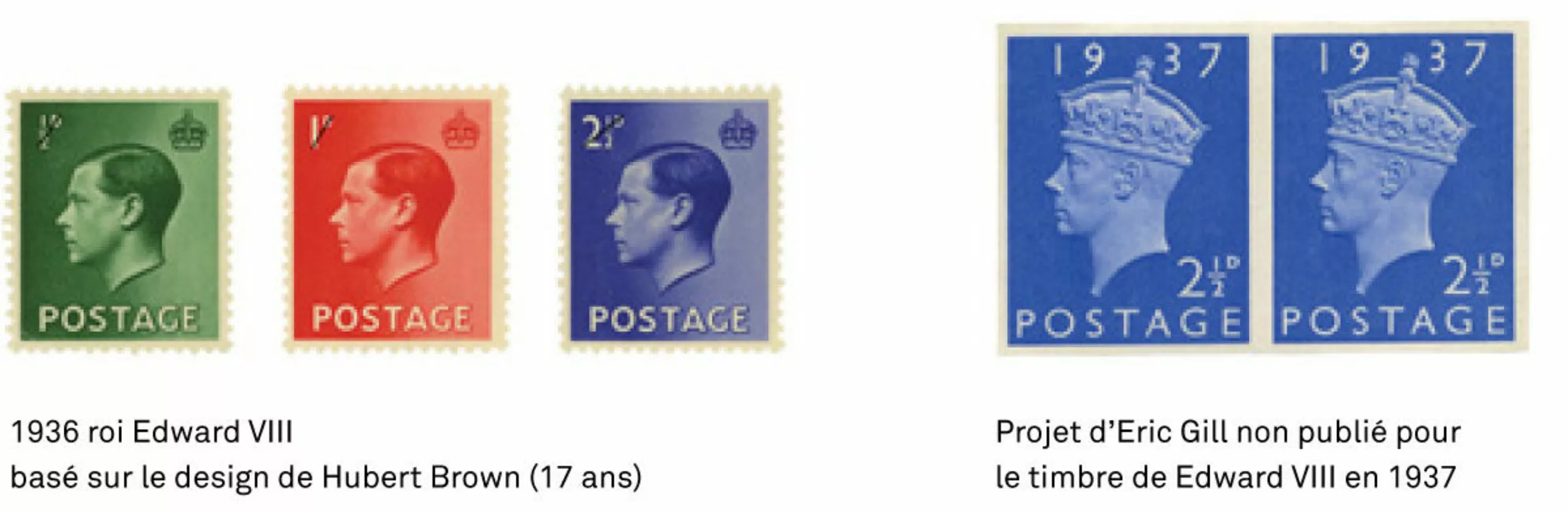
We have to take into account today’s conditions. That is why I would like to see a postage stamp designed without a portrait or other fancy decoration. But if one insists on having a portrait, I am convinced that a simple photograph should be used. Finally, in my opinion, the only good stamp that has been produced in any country in the world in recent years is that of Edward VIll, issued in 1936, although admittedly it could have been greatly improved by better lettering and a plain, unbleached background [image above left]. And I can say that a stamp such as I have suggested (i.e. an improved version of the Edward VIII stamp) was in fact produced by the UK Post Office, but was not issued due to the abdication of that king [image above right].”
Eric Gill’s straight talk with his royal backers
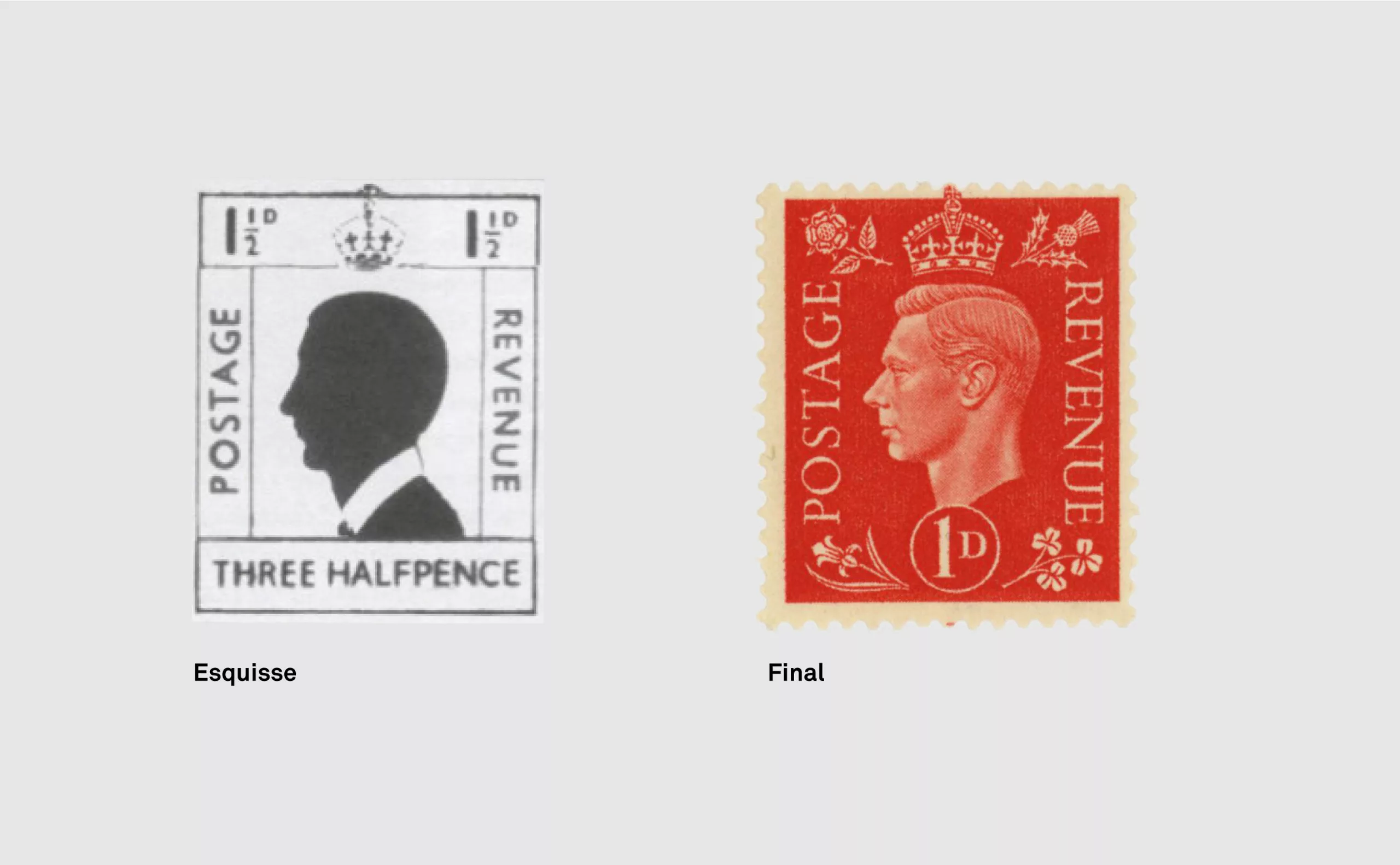
In December 1936, he was convalescing in Italy when he received a consultation from the General Post Office for the new George VI stamp. The letter was accompanied by a model showing the royal instructions: effigy cut at the neck, laurel wreath, imperial crown, small sculpted frames. To which should be added the words “Postage” and “Revenue”. The specifications are precise.
If Gill responds by protesting against any frivolous decoration: “If you say: add curls or dolphins, roses, dandelions, or Corinthian columns or something ornamental, please; I can only reply: but why?”
Nevertheless, since he was paid for his services, he agreed to lower his artistic ambitions. He submitted his first designs in February 1937, only four months after calling stamps a “slave product” in the Manchester Guardian. The simplicity of the first sketches gave way to more traditional ornamentation. Despite his initial reluctance to accept the commission, Gill finally published his stamp in May 1937. However, he did not seem to be very excited about the project. In a letter to his brother Evan Gill, he wrote: “The responsibility for this design lies more with the Post Office than with me. I only drew as instructed“. And to his friend, the writer and sculptor Arthur Graham Carey, he wrote: “They are of course only a compromise between my wishes and those of the authorities.”
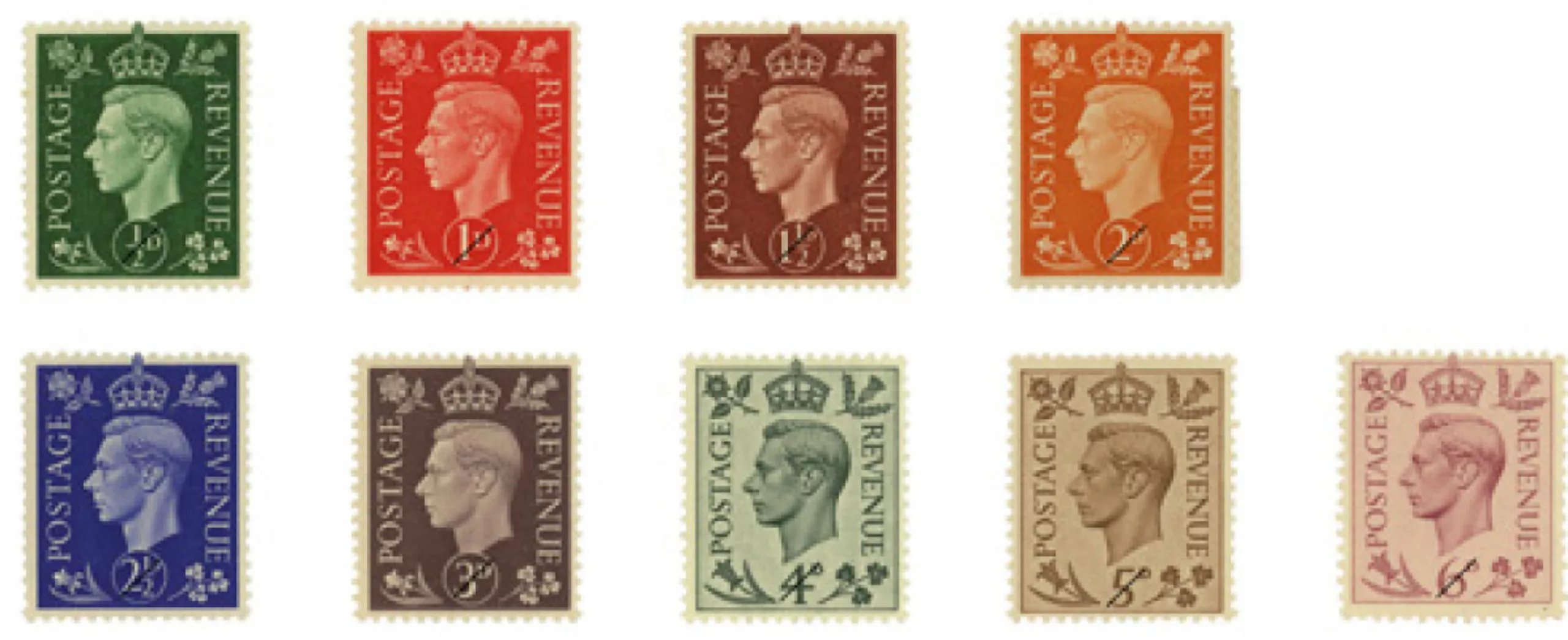
Despite Gill’s lack of enthusiasm for the design, the stamps were well received and remained in circulation for the fifteen years of George VI’s reign.
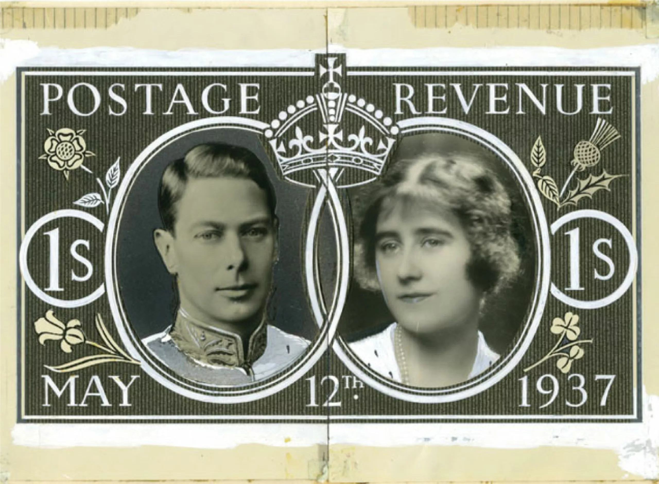
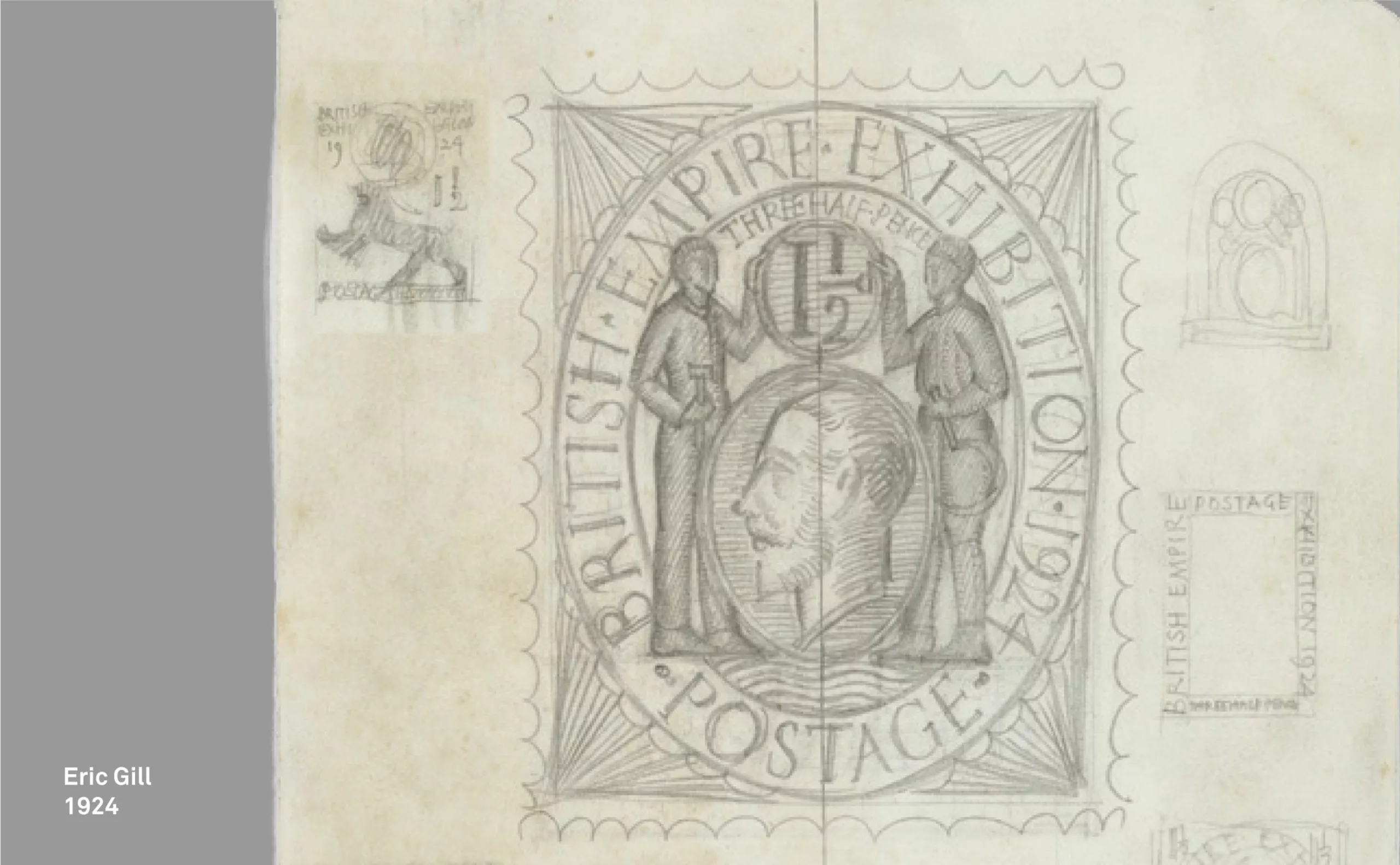
The story of the sketches for the Coronation of George VI and Elizabeth (below) reports that here again Gill is not very enthusiastic about his patron’s expectations: “From my point of view the idea of an illustrated stamp is essentially unreasonable… It seems to me that the use of an illustrated subject merely satisfies the sentimentality and appetite of collectors for anything curious. It is hard to imagine anything worse than the combination of an ornamental border, a view of Windsor and a photograph of the King… Is there any reason why England should not set the pace in this area? Why shouldn’t there be one rational post office in the world? Why must we all sheepishly follow each other in these outrageous sentimentalities?”
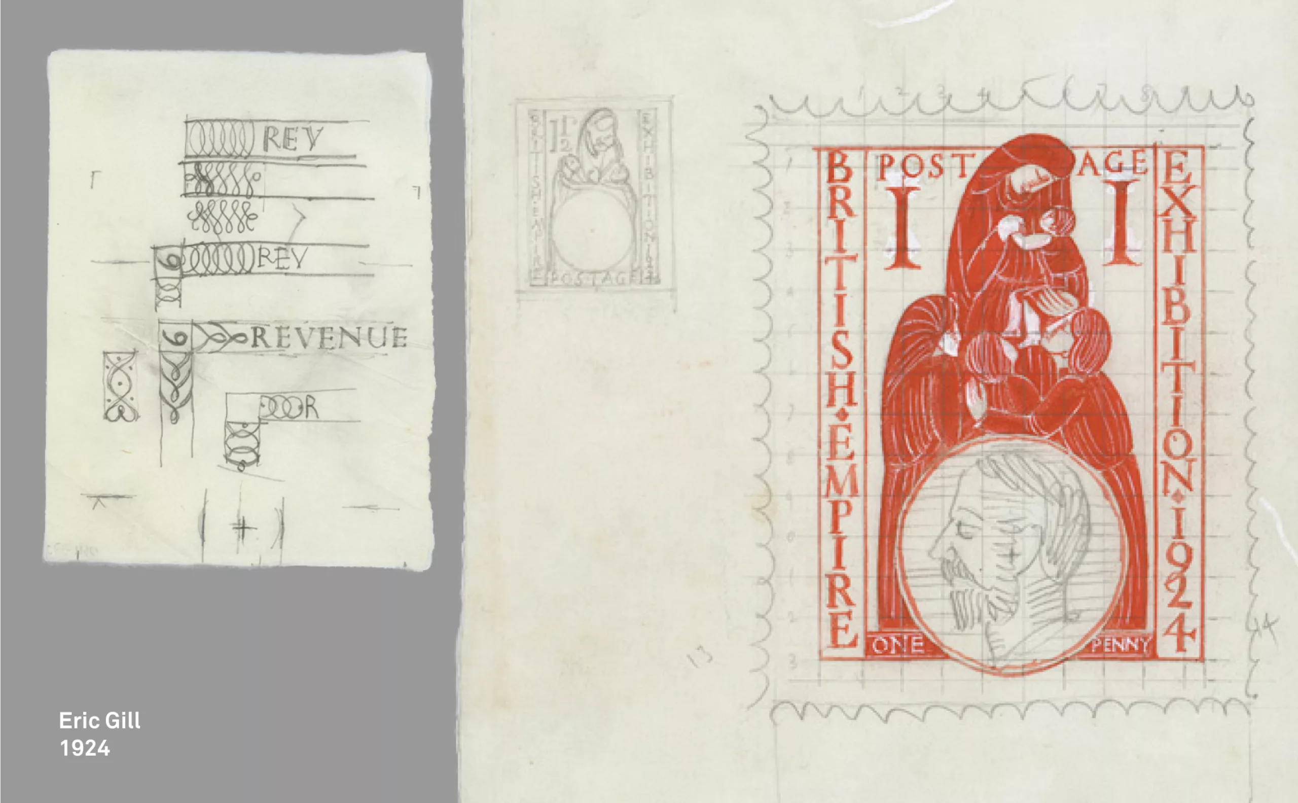
Four of Eric Gill’s drawings will be presented to the King. These essays, held in the British Postal Museum, are simply marked “Seen and rejected.”
Despite his limited success in stamp design, Eric Gill went on to design other stamps for the Royal Mail. Below is some research and stamp designs from the British Postal Museum archives.
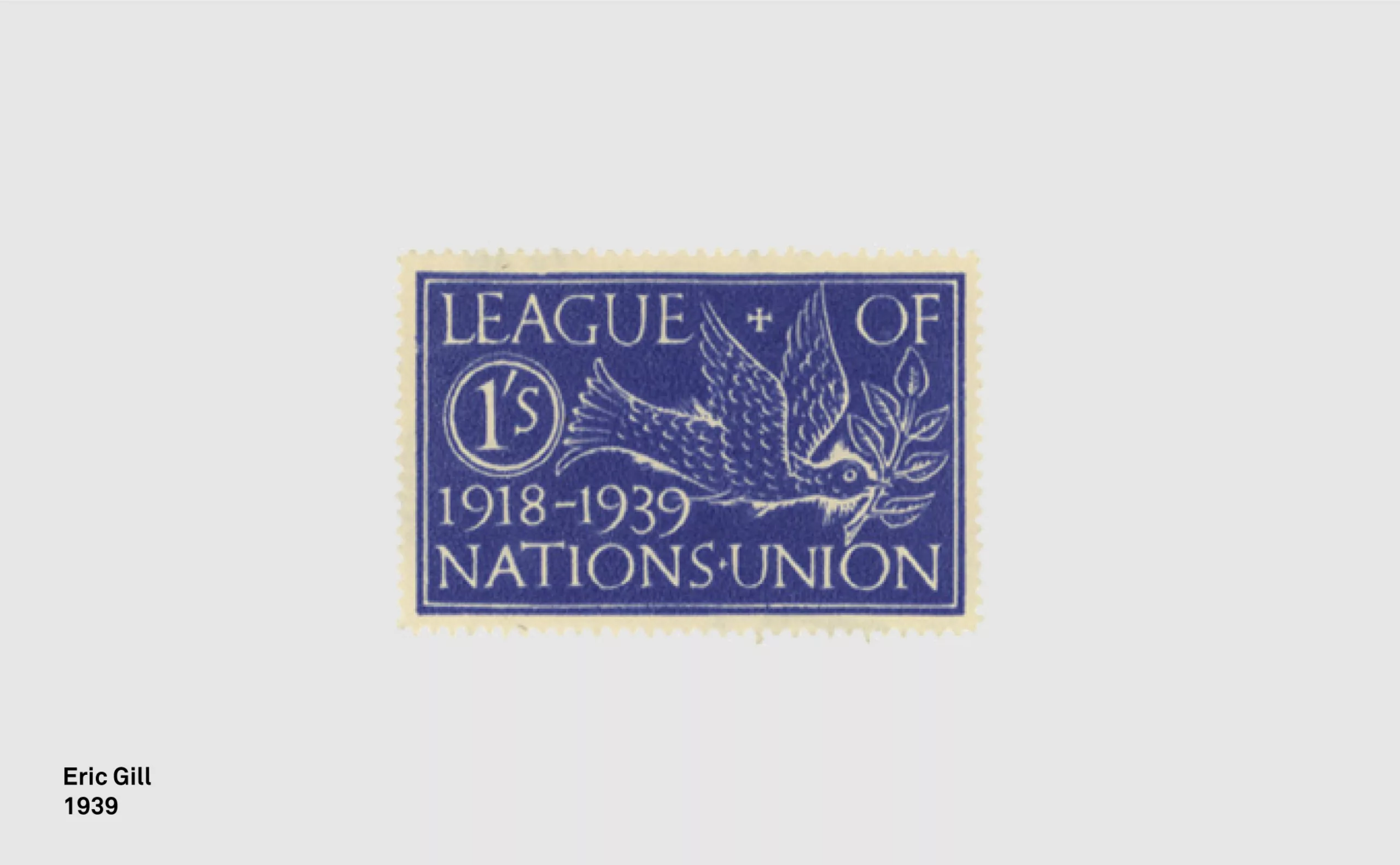
Gill probably only achieved his philatelic ideal in his design of what most philatelists would not dare to consider a real stamp: a 1939 poster stamp issued to commemorate the twenty-first anniversary of the League of Nations.
On the subject
-
Donald Trump, the martyr who makes history
Donald Trump, his face bloodied, raises his fist and seems to proclaim “I’m alive, fight!”.
Let’s decipher an image that has gone down in history at the speed of a shotgun blast. -

A “female” PRM pictogram?
The PRM pictogram was created in the 1960s as part of the international movement to defend the rights of people with disabilities.