A few months ago, we were asked to design a visual identity for Tours Métropole. Here is the project we’ve designed, and that wasn’t selected by the client.
Tours Métropole
Branding for Tours Métropole
Project not selected
A generative visual identity
We know that there are many issues involved in designing a visual identity. The visual identity must simultaneously identify and mark a difference, be recognized by as many people as possible and establish a singularity. From then on, the question of its visibility and uniqueness in a public space filled with thousands of logos arise.
Traditionally, a visual identity, whether of a product, brand or organization, is designed on the basis of a certain number of parameters, generally linked to the constraints of its context of use, but above all of production. Since then, the arrival of screens has considerably widened the scope of possibilities.
Today, we are witnessing a transformation, both in terms of substance and form, of the monolithic archetype of the logo that we all know.
Times and needs have therefore changed. No more endlessly repeated single discourse, and no more evolution to take into account the singularity of individuals, projects, epochs and events. In this way, the logos can be continuously adapted, while maintaining the consistency and recognition necessary for a brand. Generative identities can therefore be seen as a response to the times and new individual and collective needs. It is on the basis of this analysis that we initiated our research.
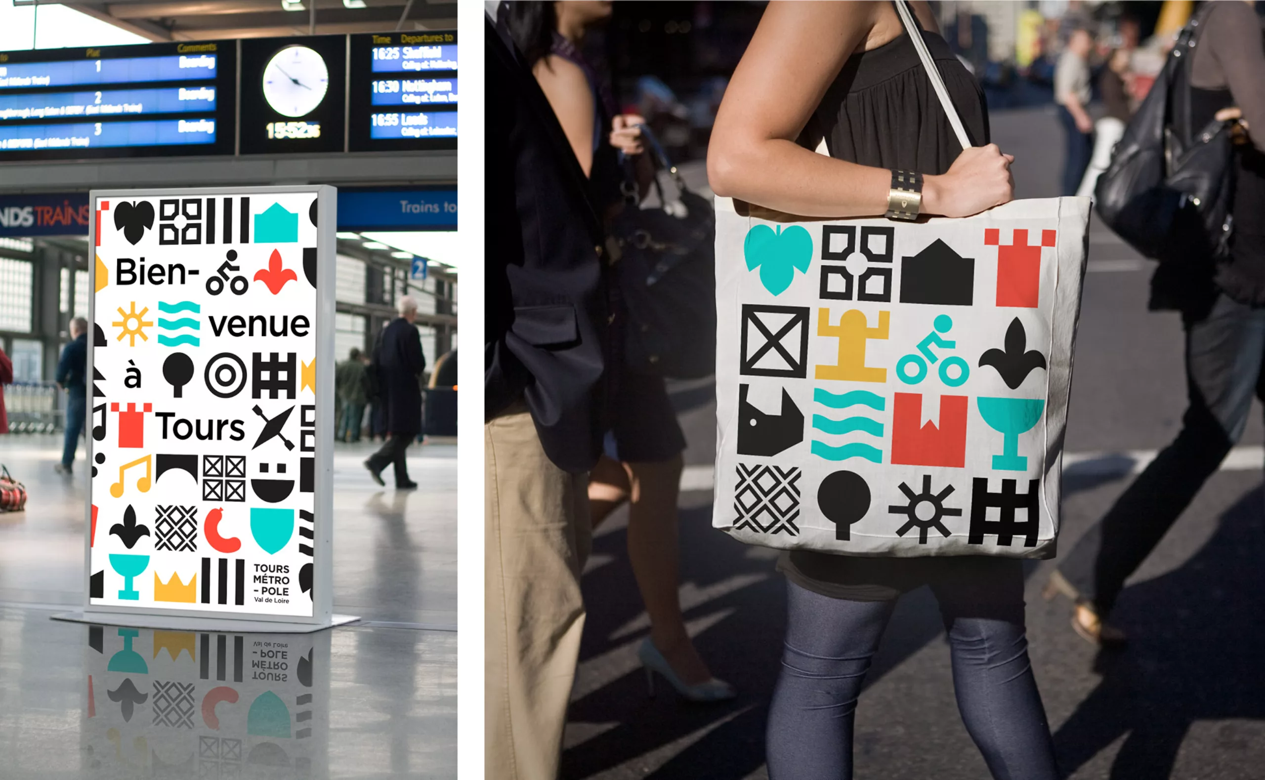
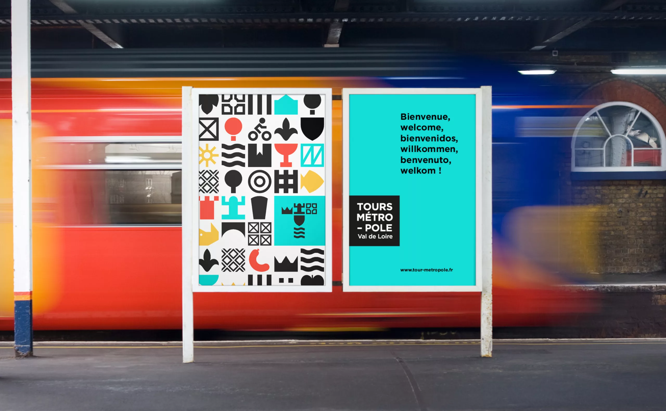
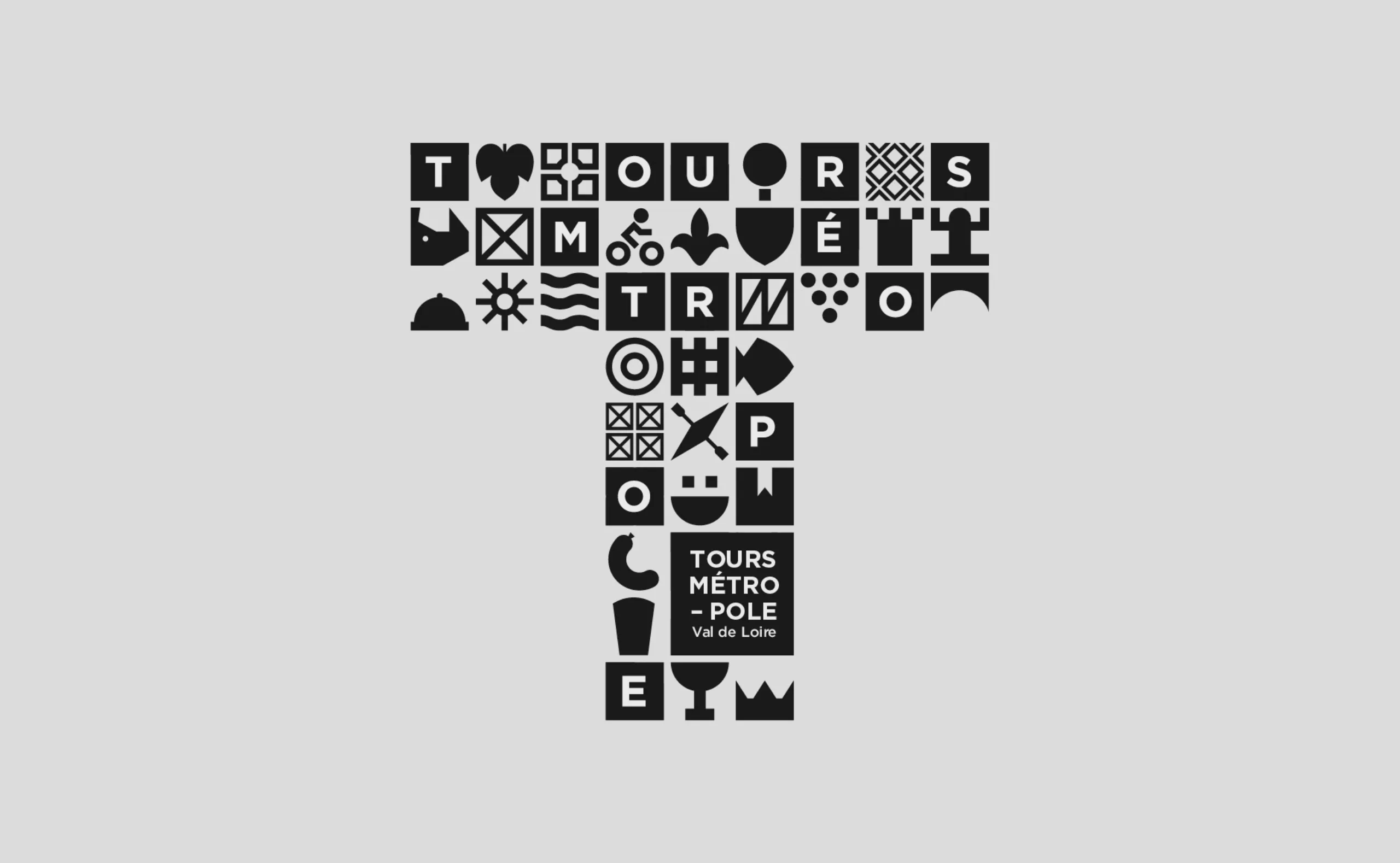
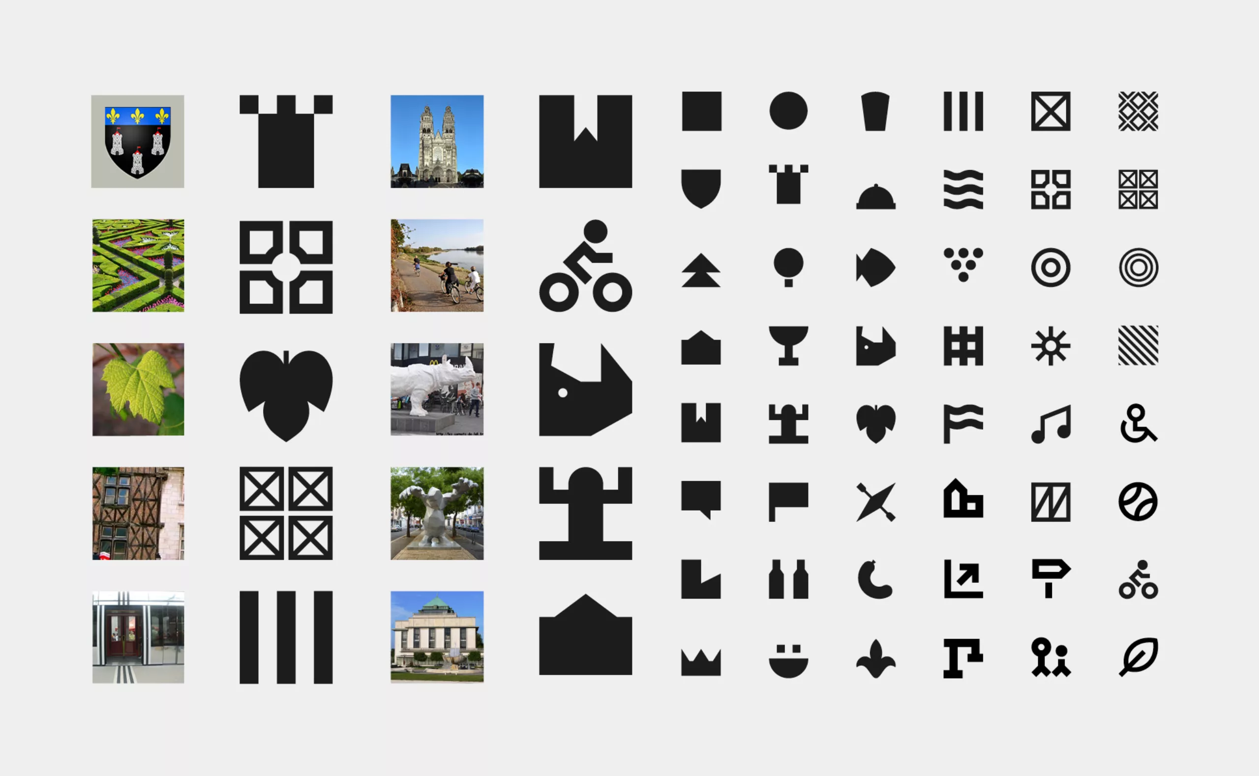
Step 1: Pictograph the territory
How can we synthesize the identity of such a rich territory, such diverse missions, without being simplistic?
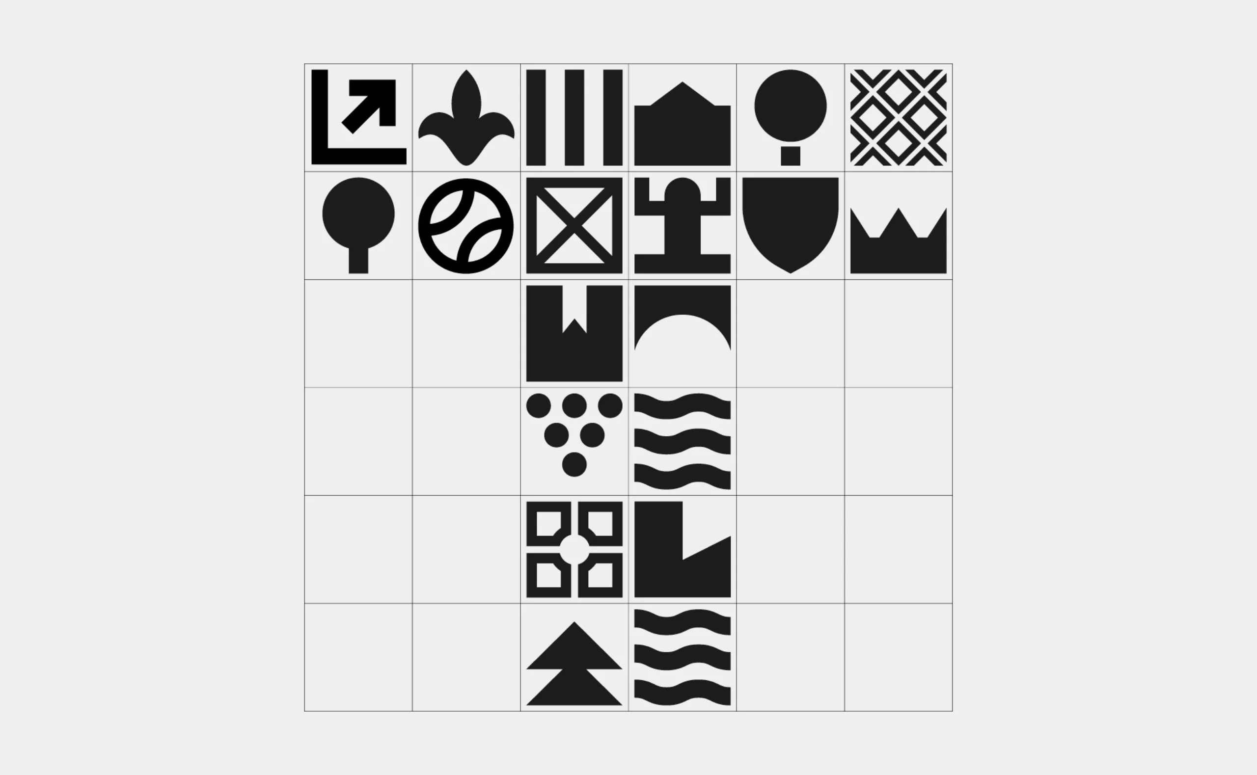
We propose to create a visual language resulting from a formal analysis of the metropolis and its missions in order to constitute a repertoire of signs. This bookstore is meant to be exhaustive, plural and modular. It is organized according to different rules, from the darkest to the brightest, from the most abstract to the most concrete.
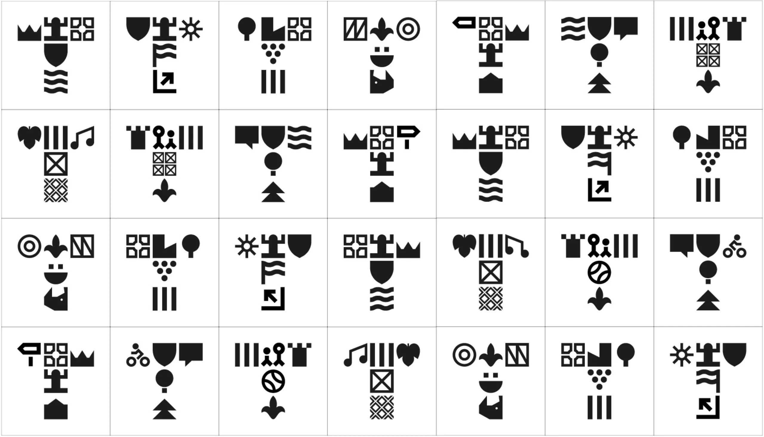
Setp 2: Tou(r)s pour un, un pour Tou(r)s!
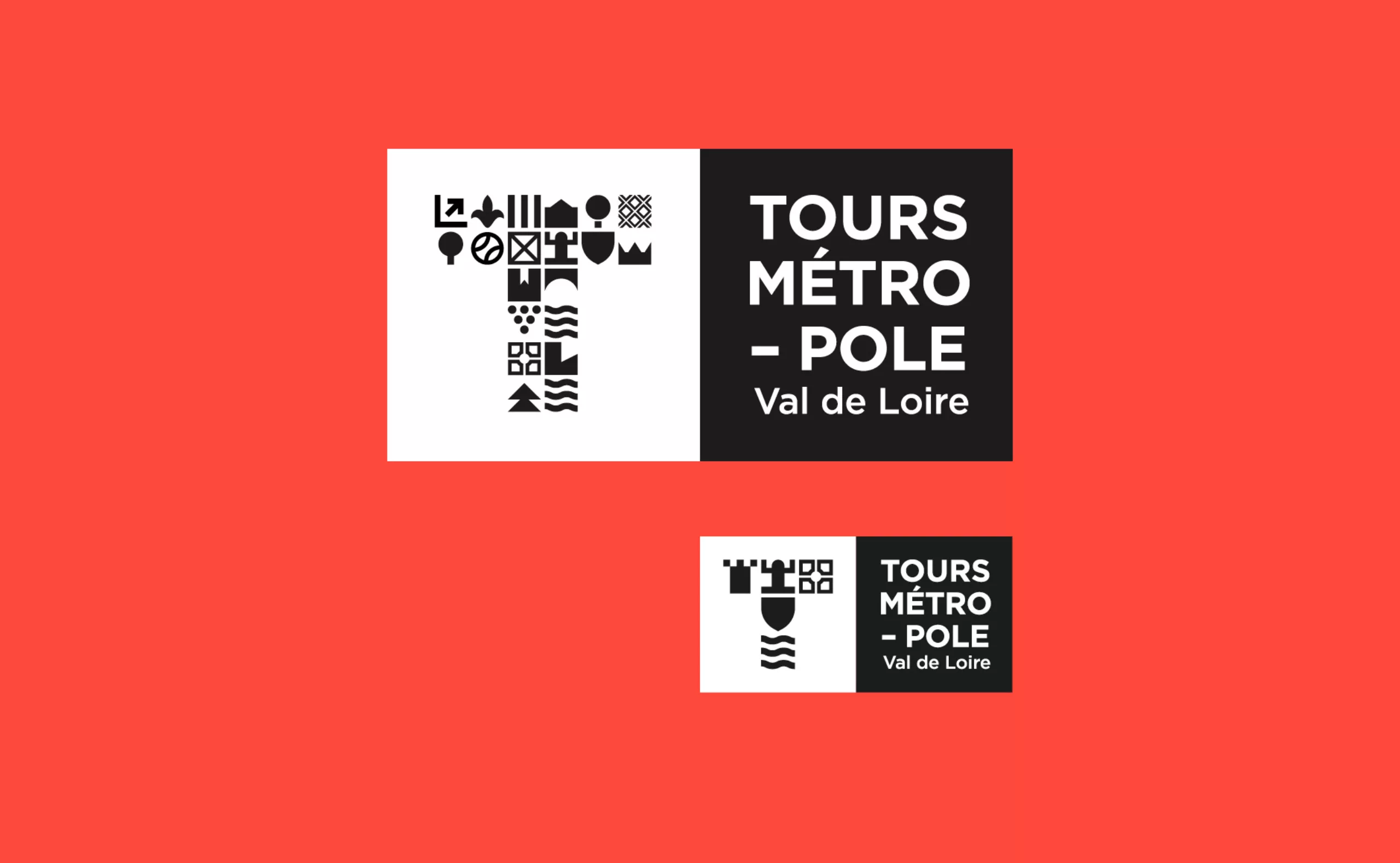
From the library of signs, we propose to compose a “T” letterline (like Tours). Single letter, composed of the diversity of the territory. By enlarging and embellishing the first letter of a text, the monks of the Middle Ages brought character and animation to the manuscripts. Suddenly the text becomes an image, the letter becomes a sign. Today, contemporary studies have confirmed what we know empirically, these lettrins significantly increase the desire to read a text! An important argument when designing a logo.
Step 3: A plural and singular visual identity
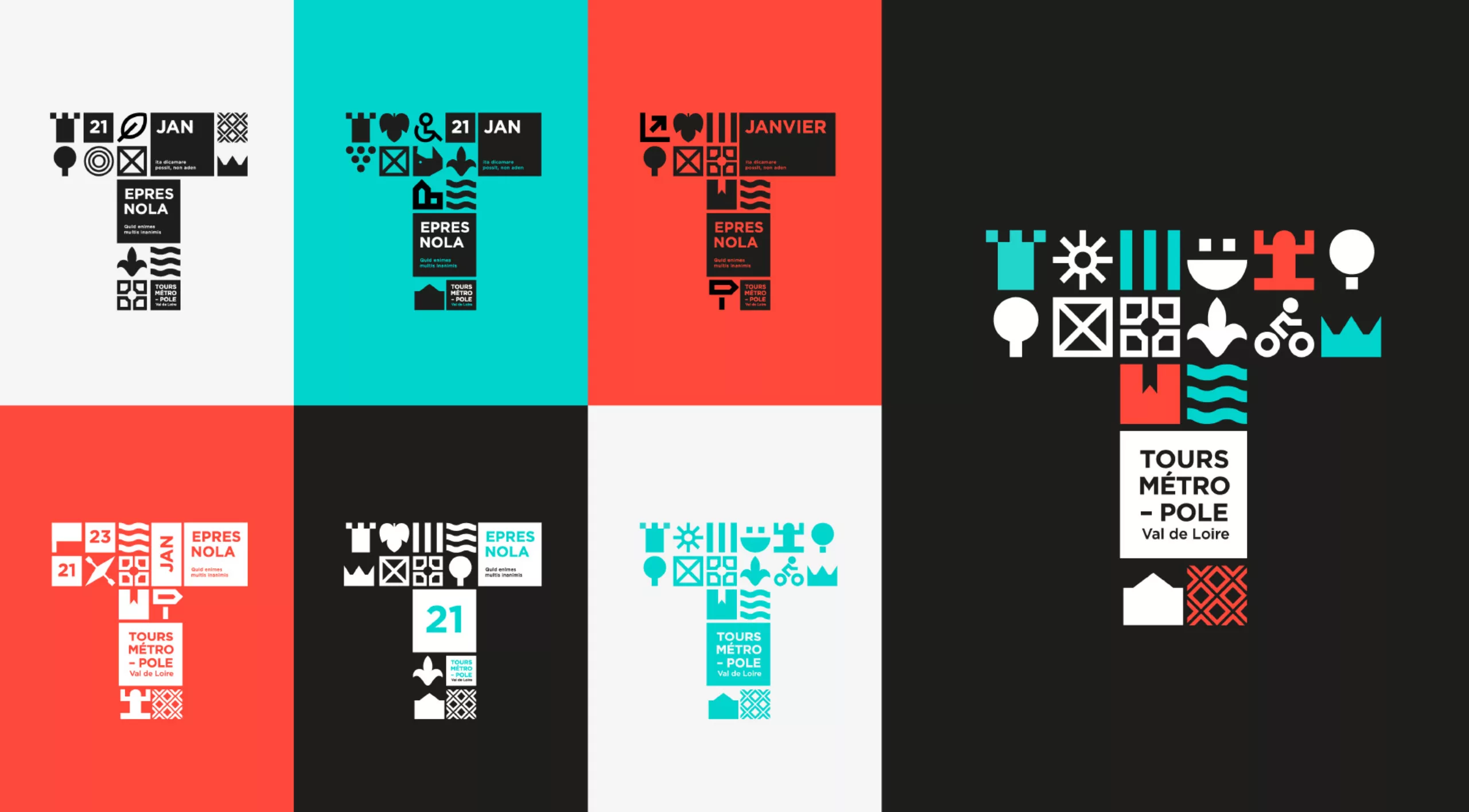
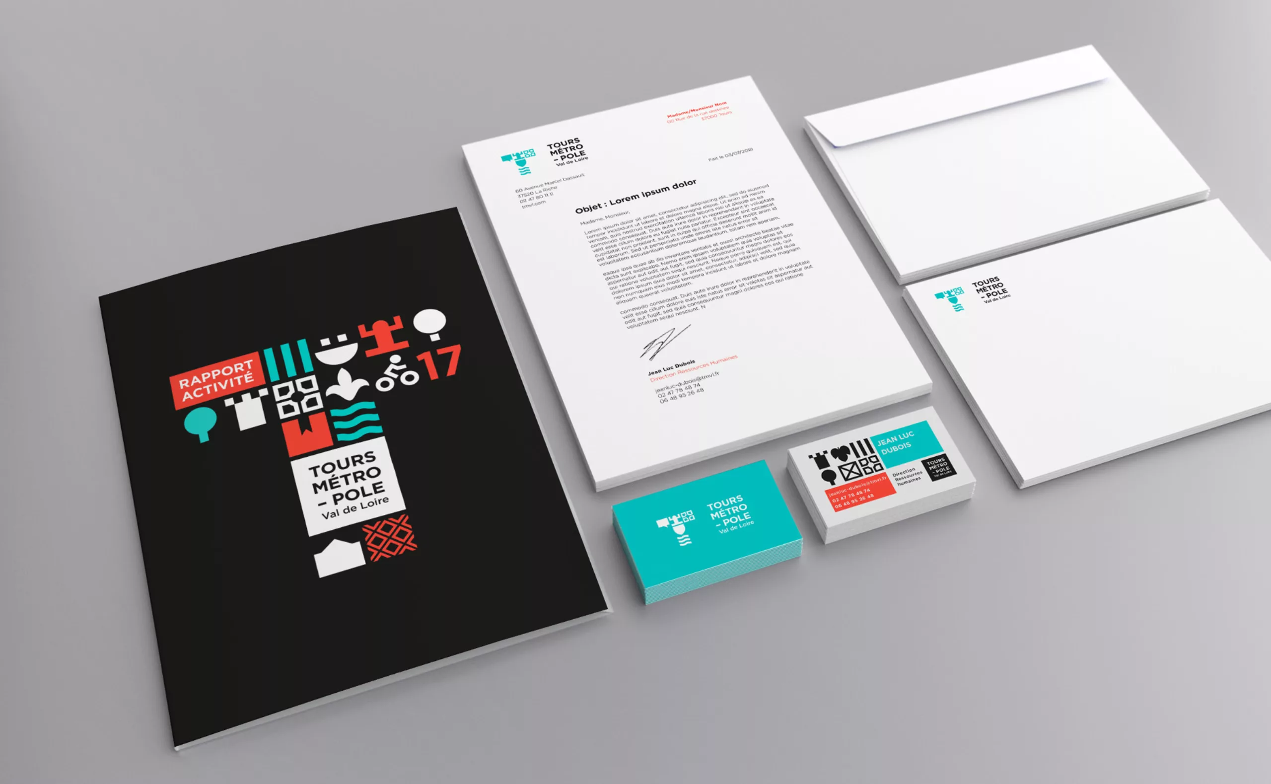
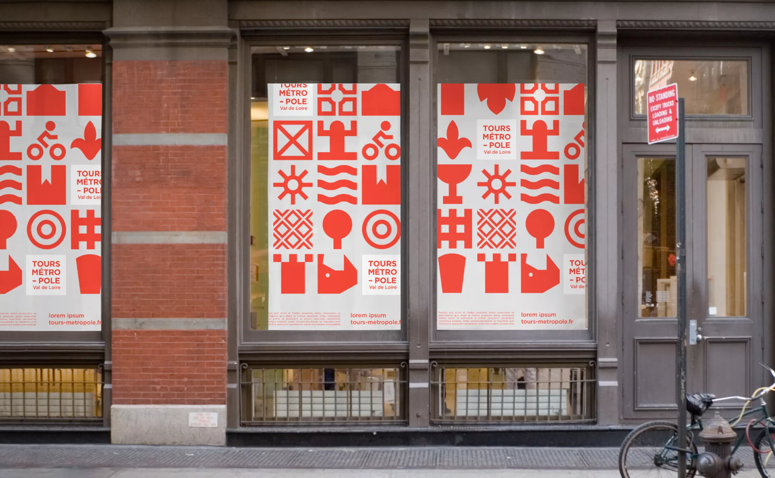
This visual identity is constantly in motion and is intended to be generative. A logo generator could be imagined.
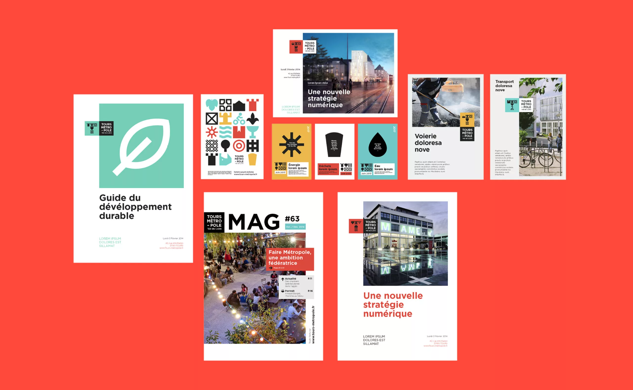
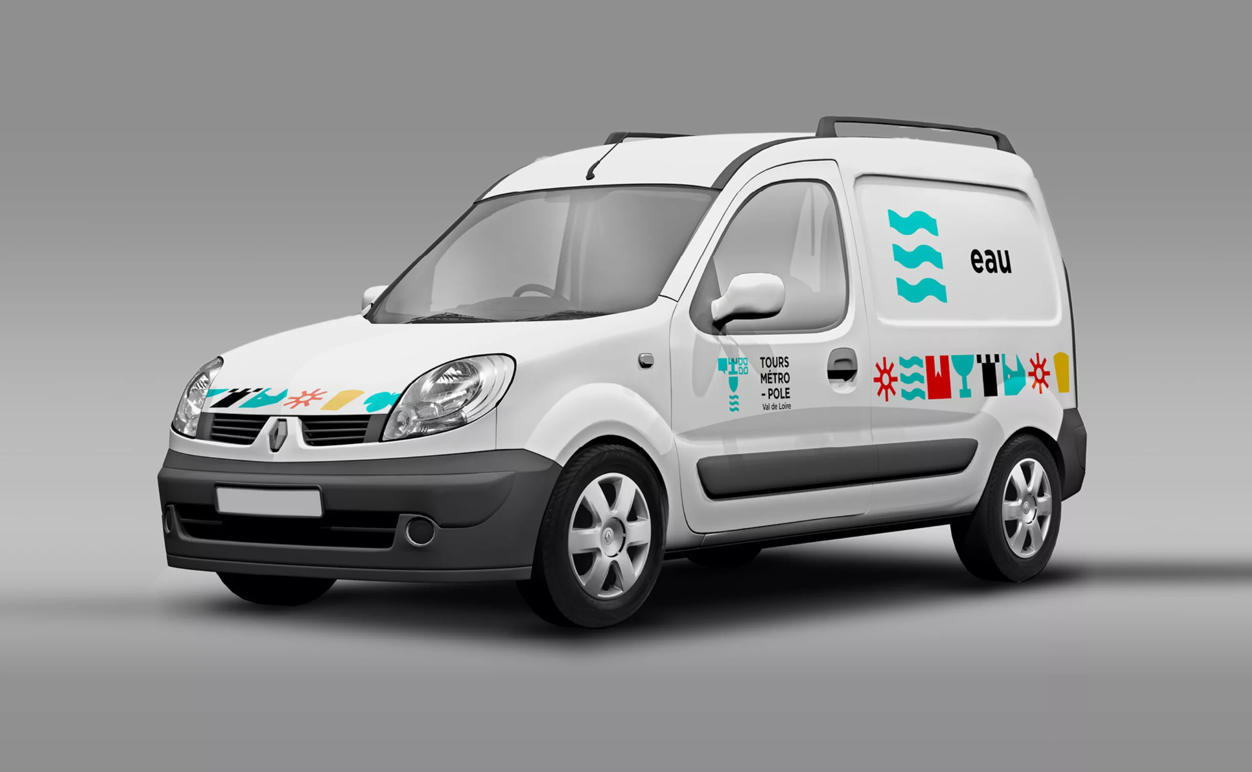
Available on the Métropole website, it would allow everyone to generate a logo on demand. The generative variables would be adapted to the communication context. For example, in the context of a communication of a project bringing together “economy”,”gastronomy” and “heritage”, the logo would include the pictograms associated with these 3 themes.
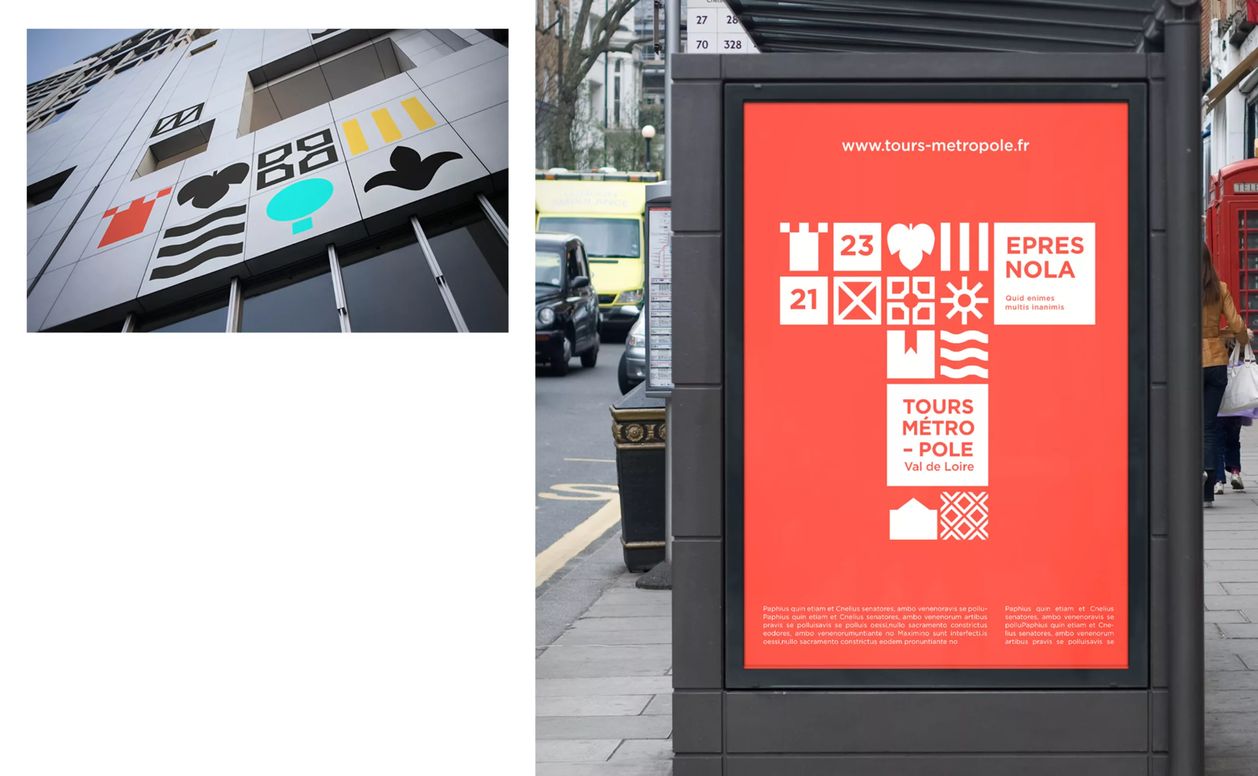
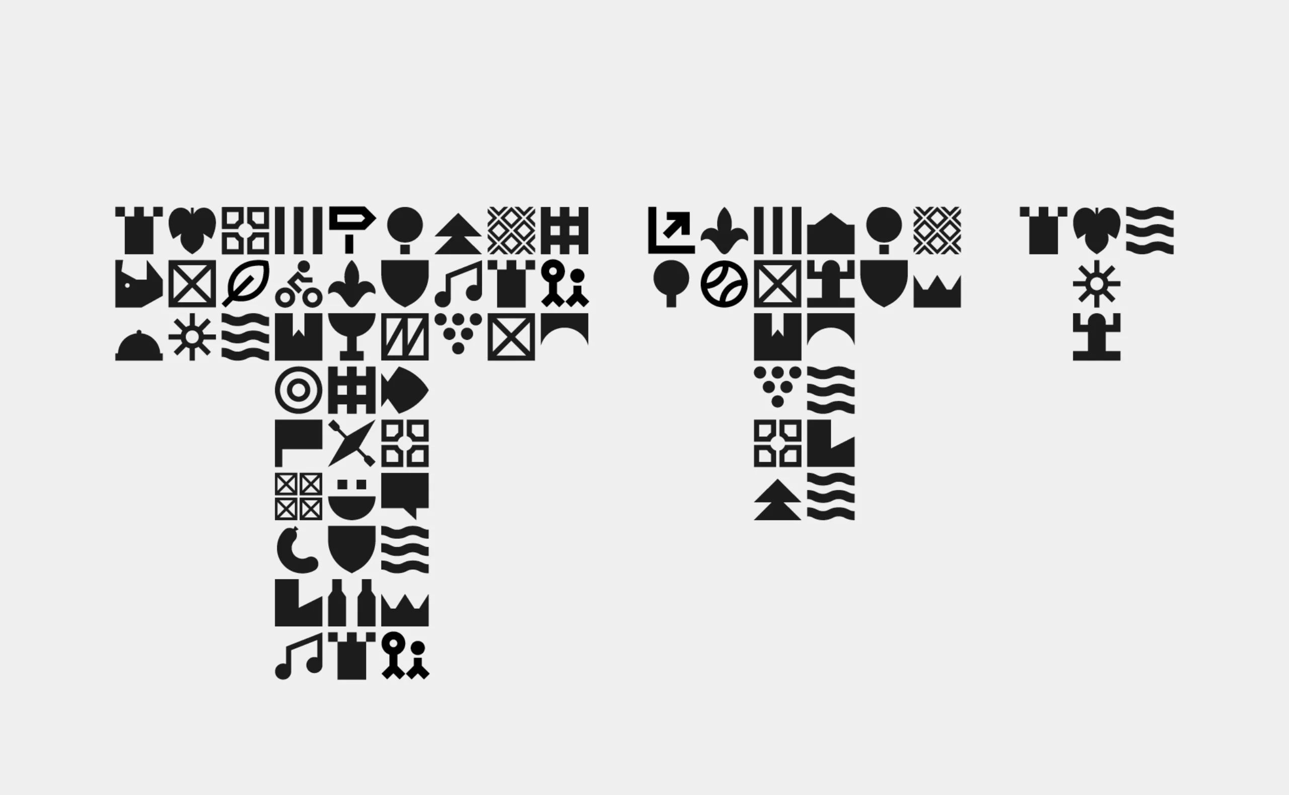
Step 4: The right resolution
Modularly designed, each pictogram represents one pixel of the logo. Therefore, depending on the context of use, the resolution of the lettrin can be adapted.
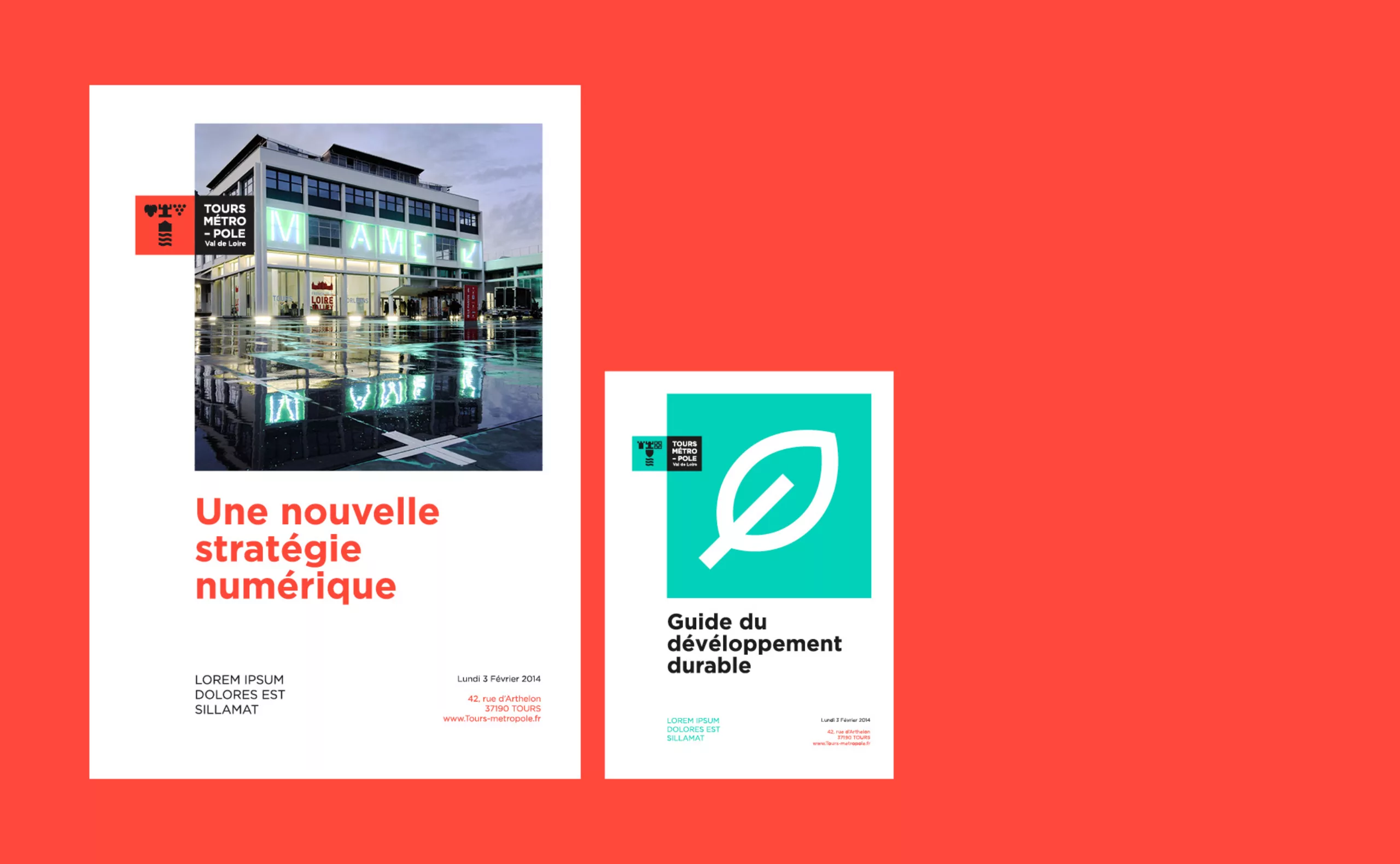
The logo
The lettrine is associated with a typographic block to constitute the logotype. The composition takes up the square structure in order to meet the functional challenges.