COMEPA-Identité-Visuelle

2025

COMEPA - Visual identity
Enterprising solutions for the space, medical and rail sectors

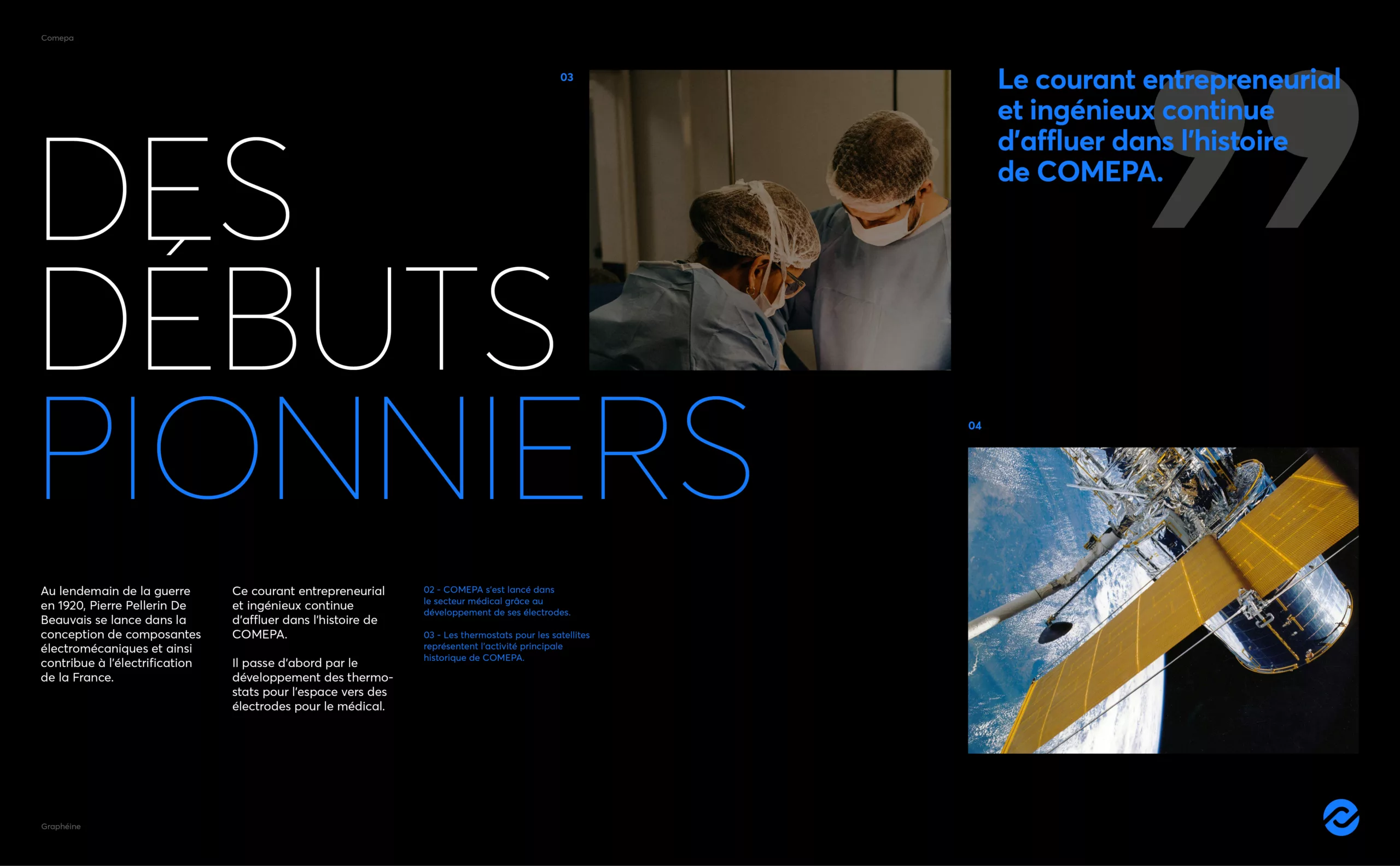
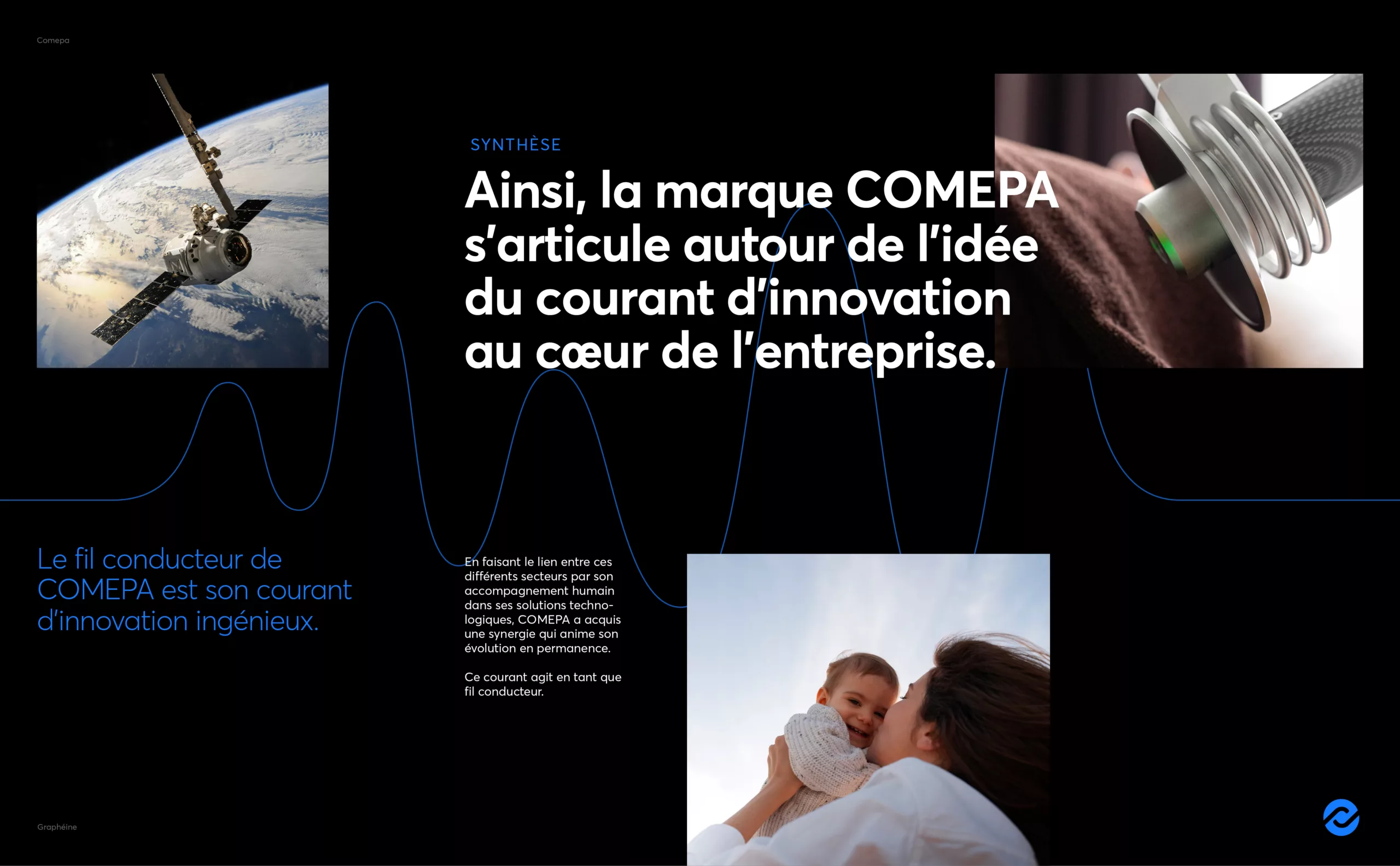
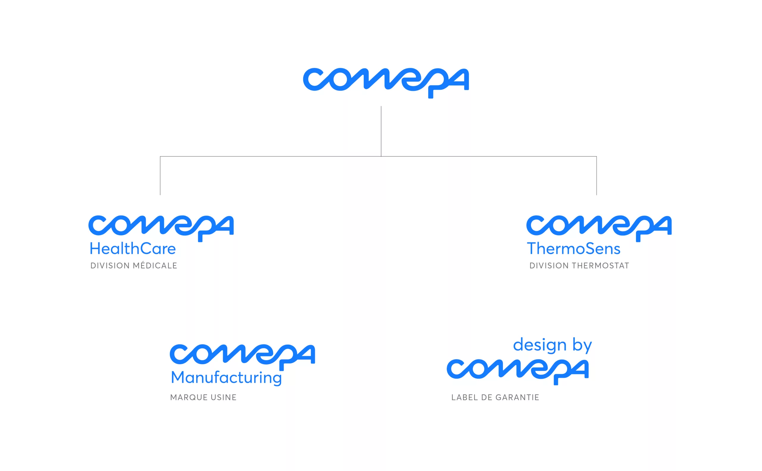
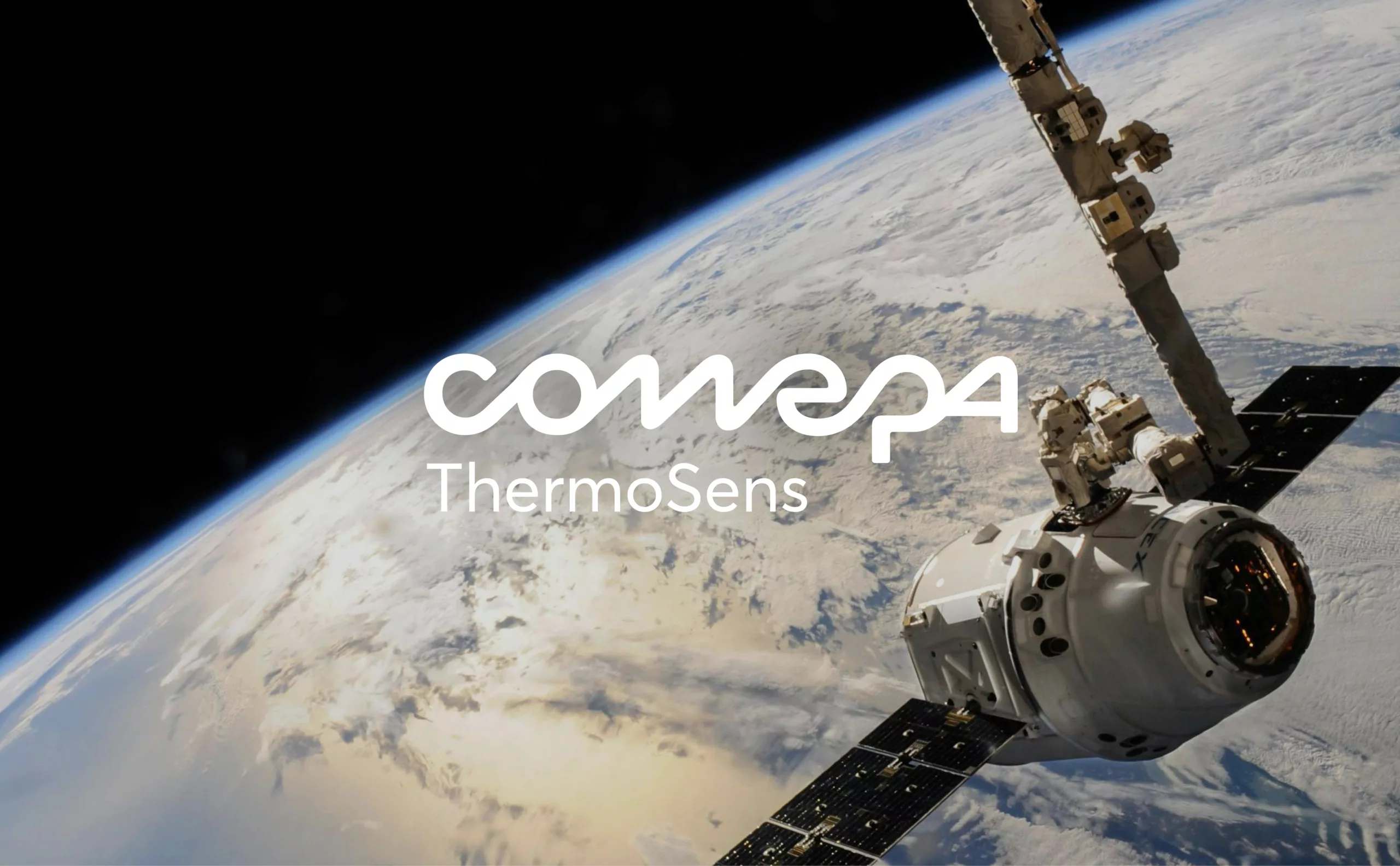
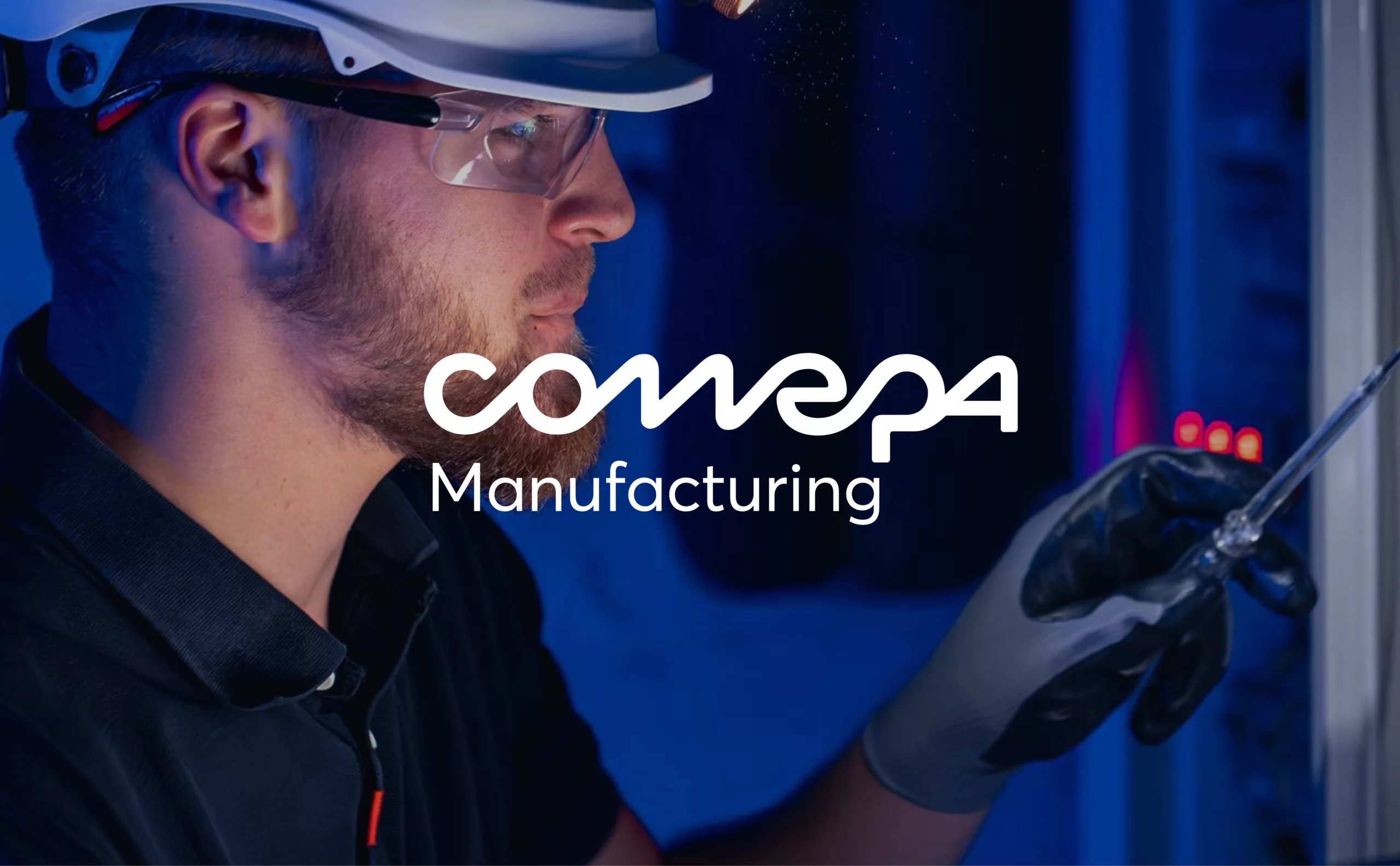
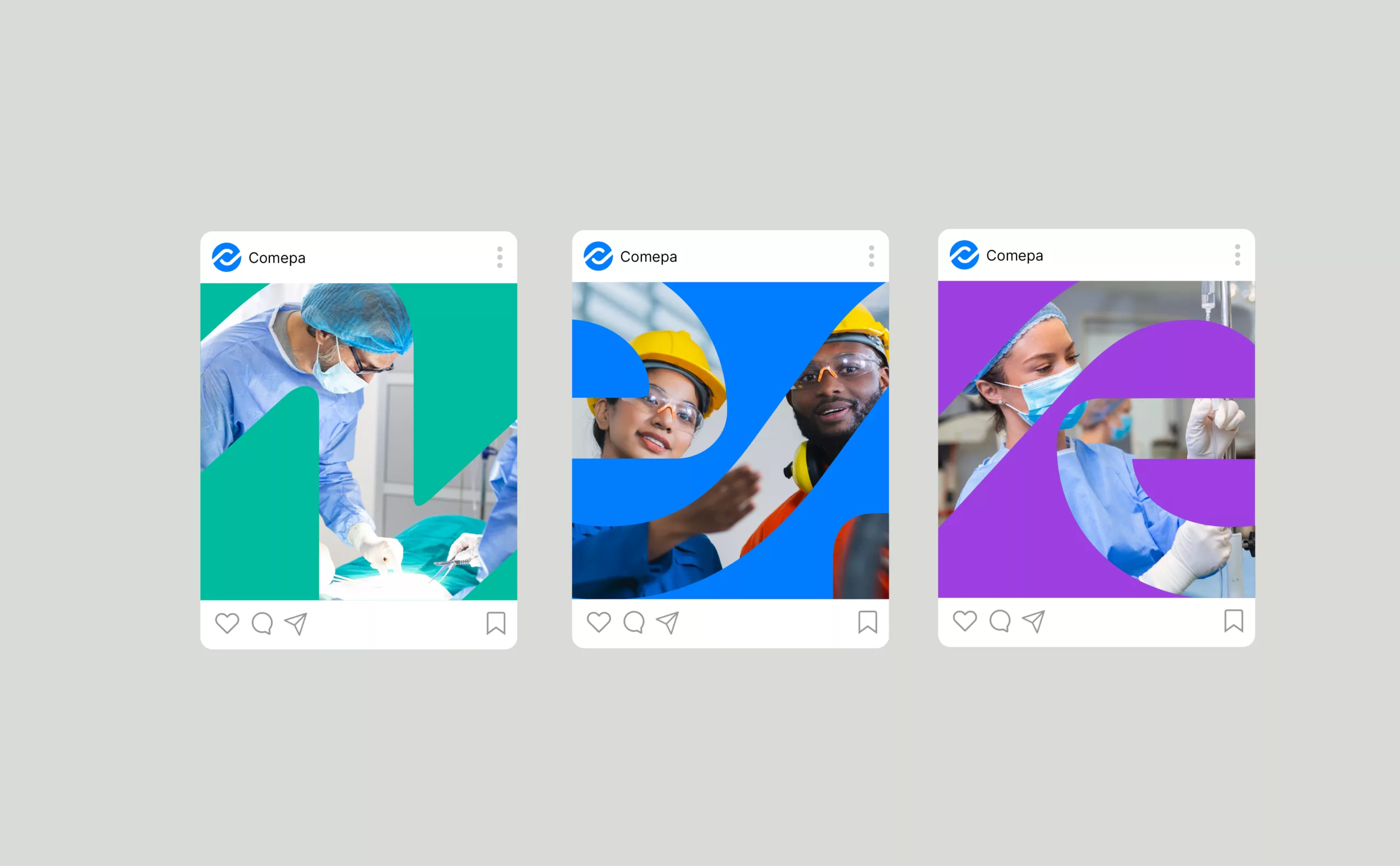
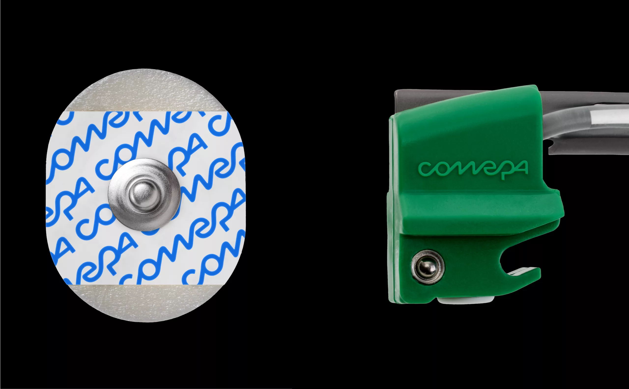
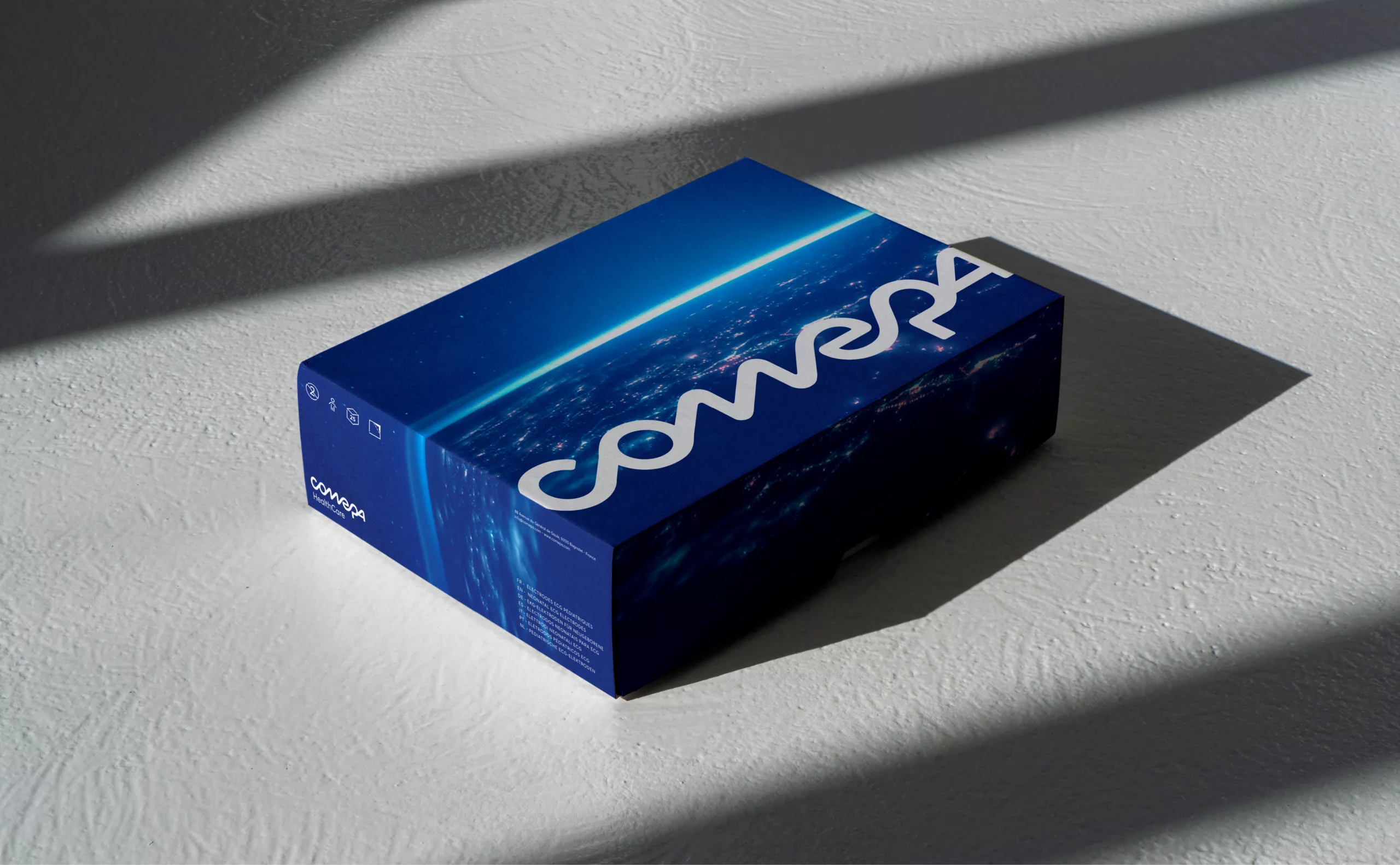
COMEPA specialises in the development, customisation and distribution of technological instruments for highly demanding sectors such as the medical, space and rail industries. Our expertise ranges from surgical instruments such as scissors, scalpel handles and electrodes, to satellite thermostats.

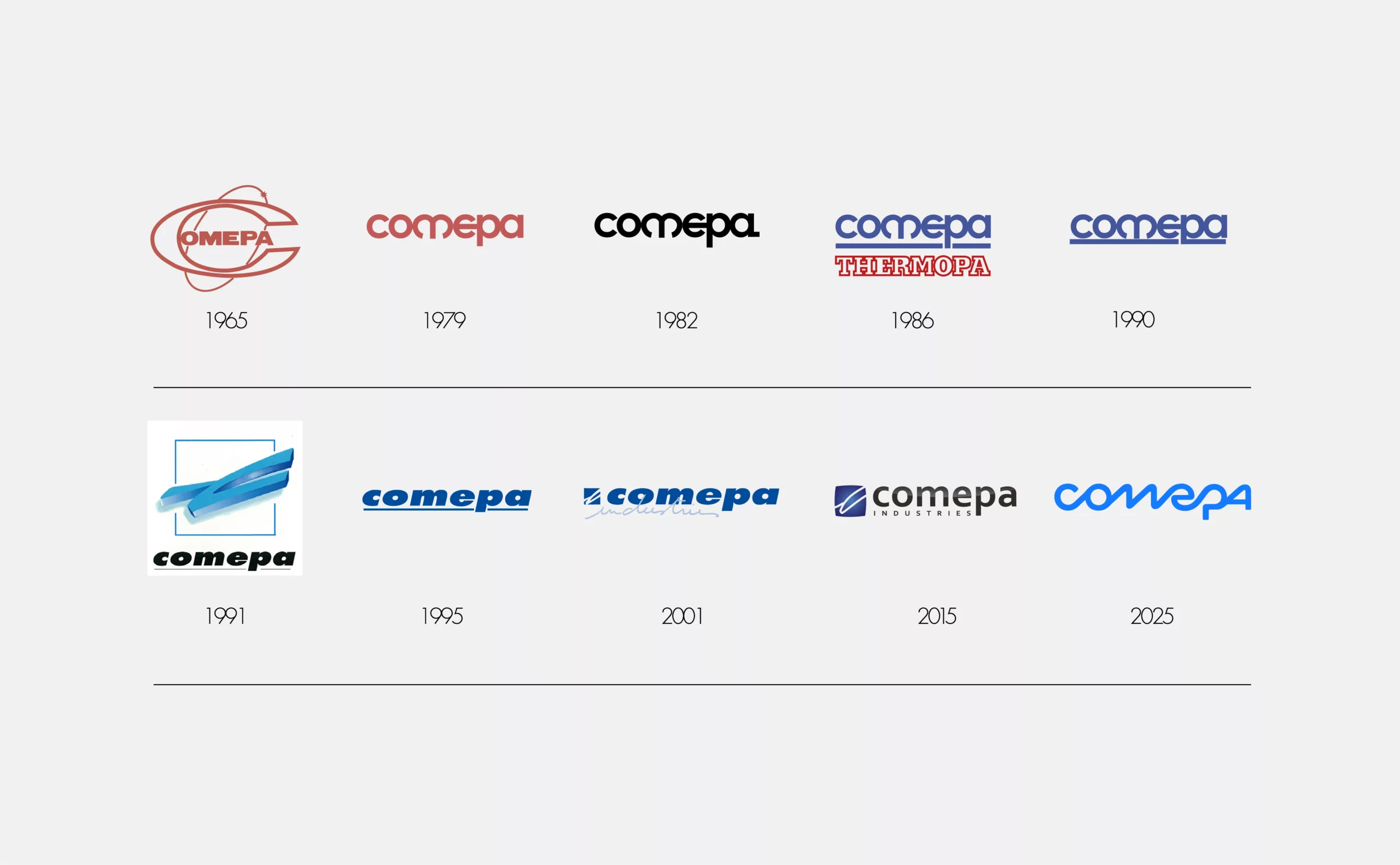
With a wealth of experience built up over the course of the 20th century's technological development, today COMEPA is the partner of choice for hospitals and companies in the space and rail industries in France and across the world.

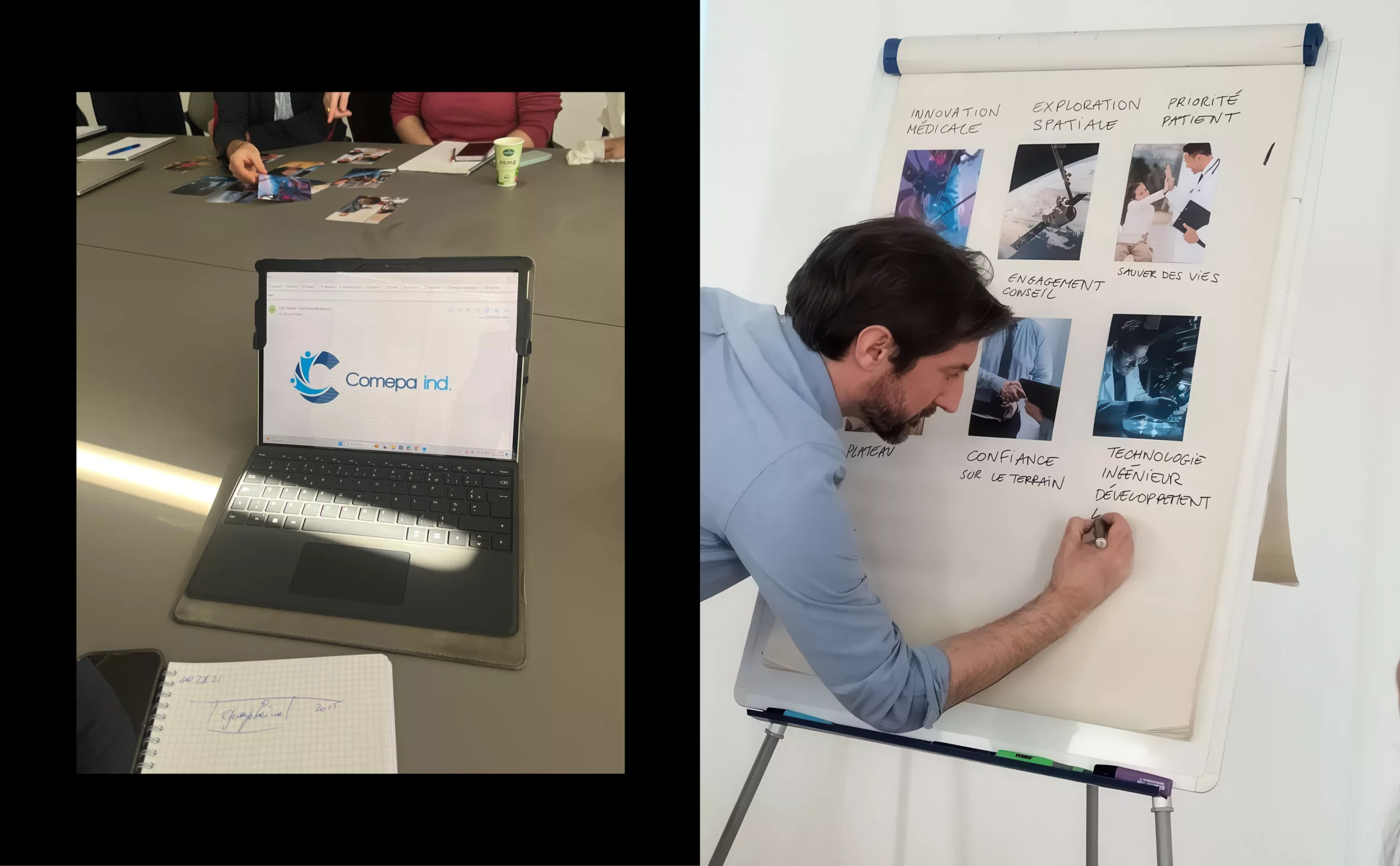
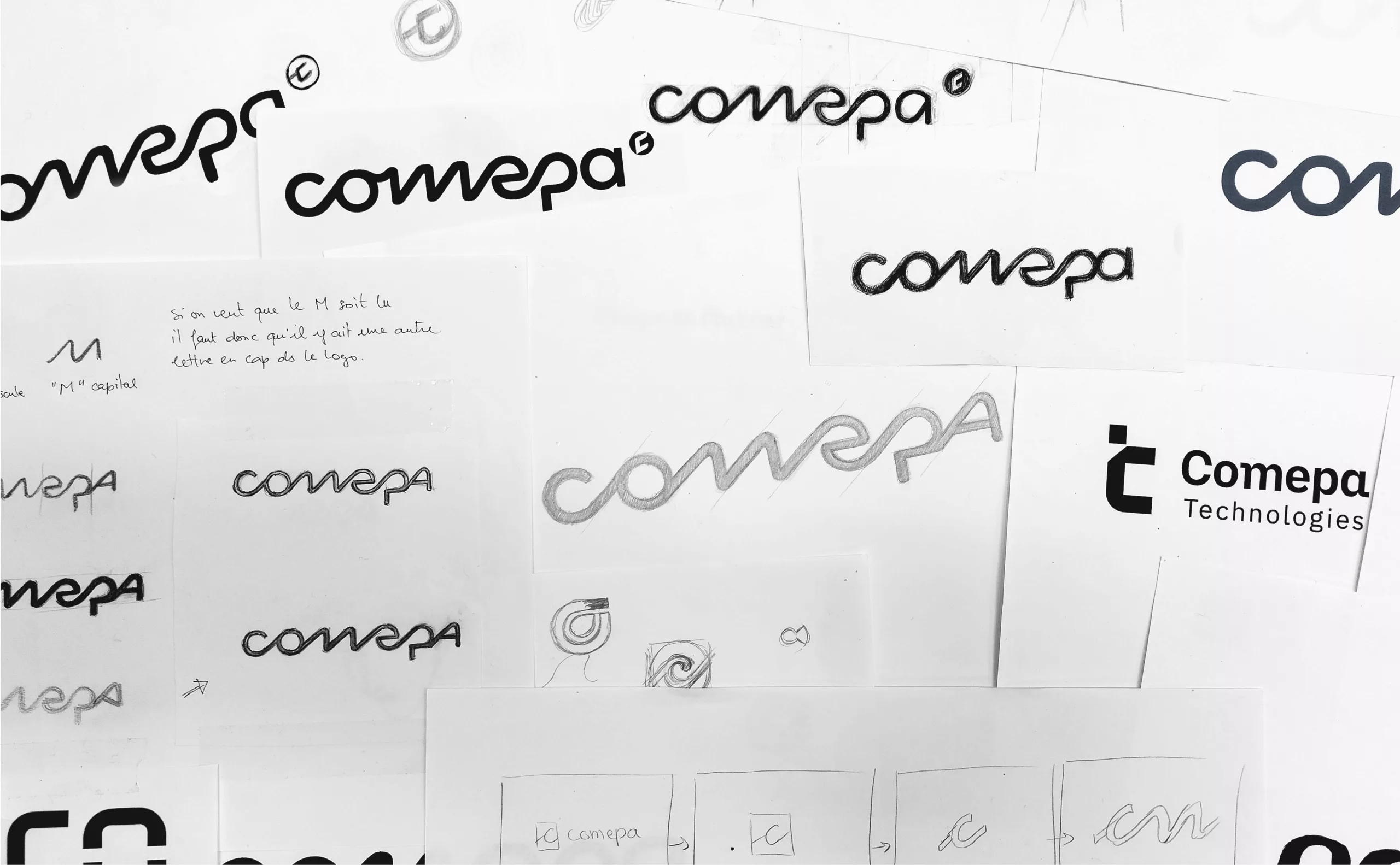
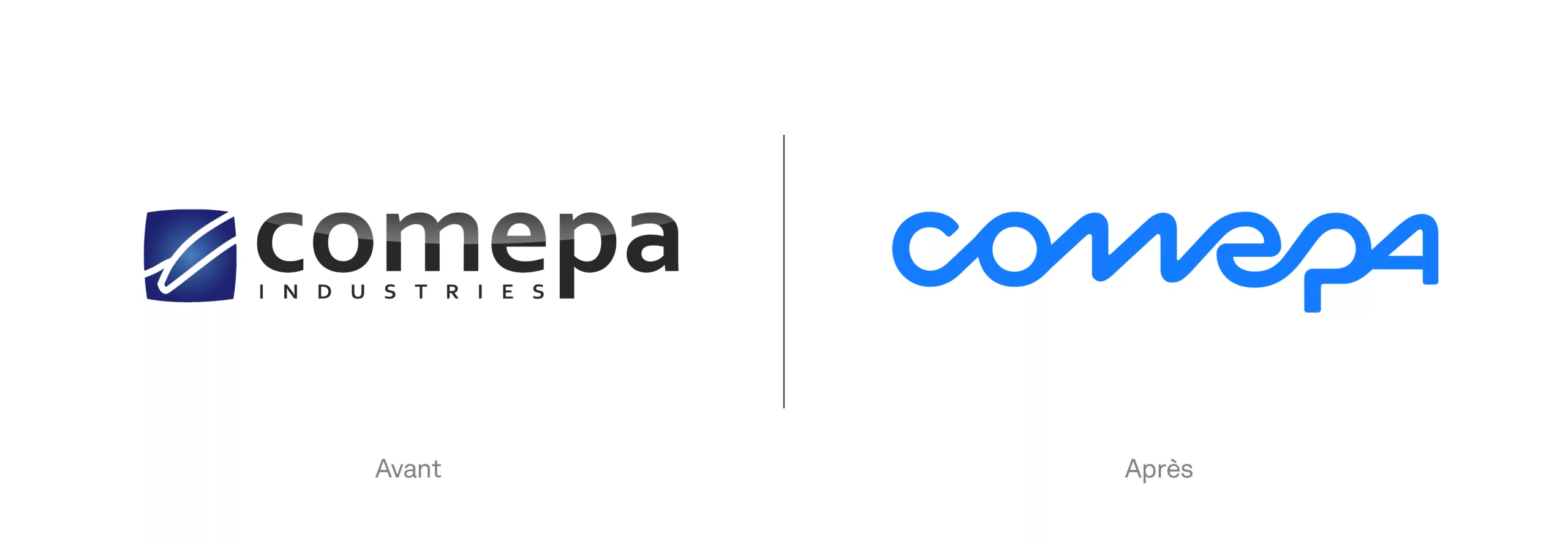
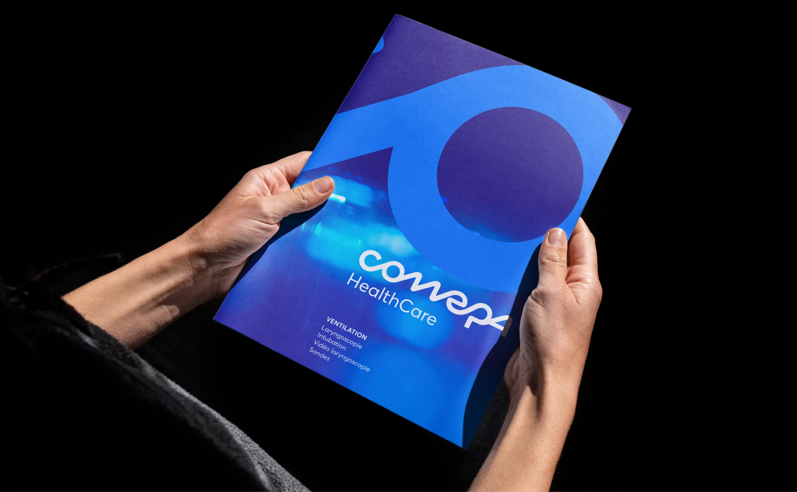
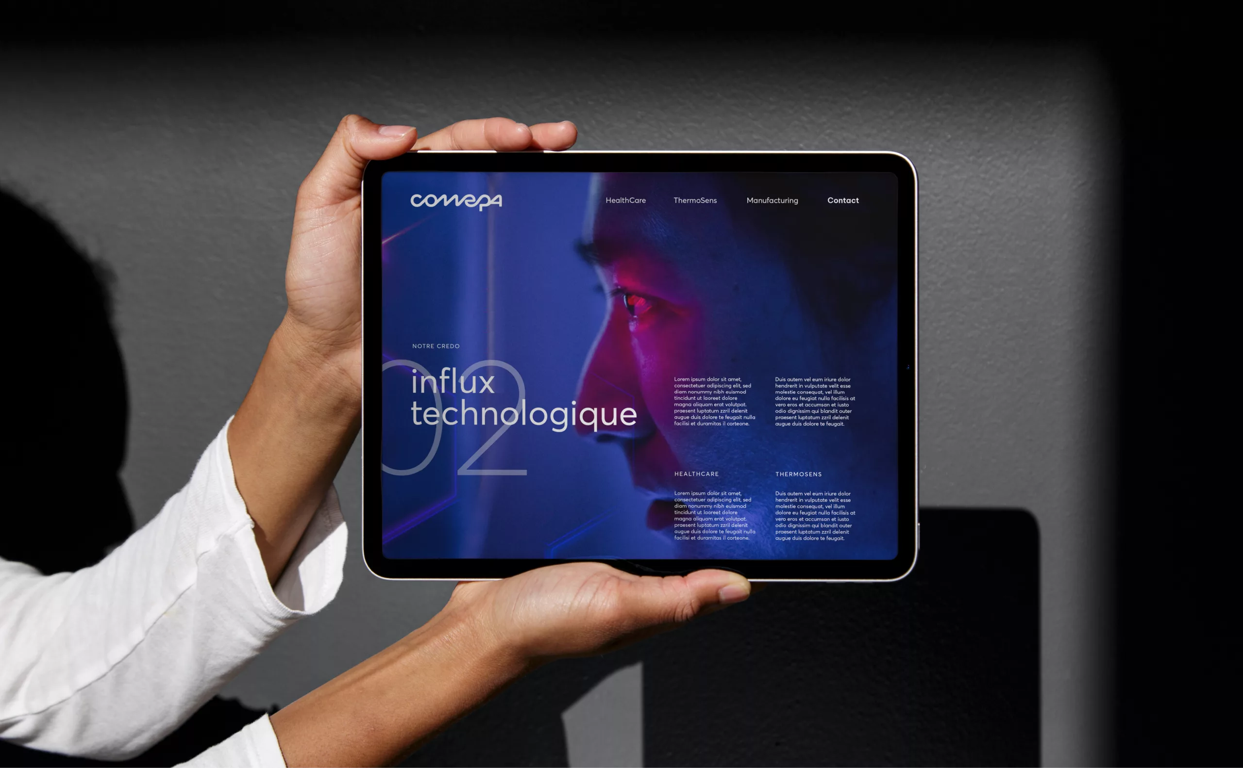
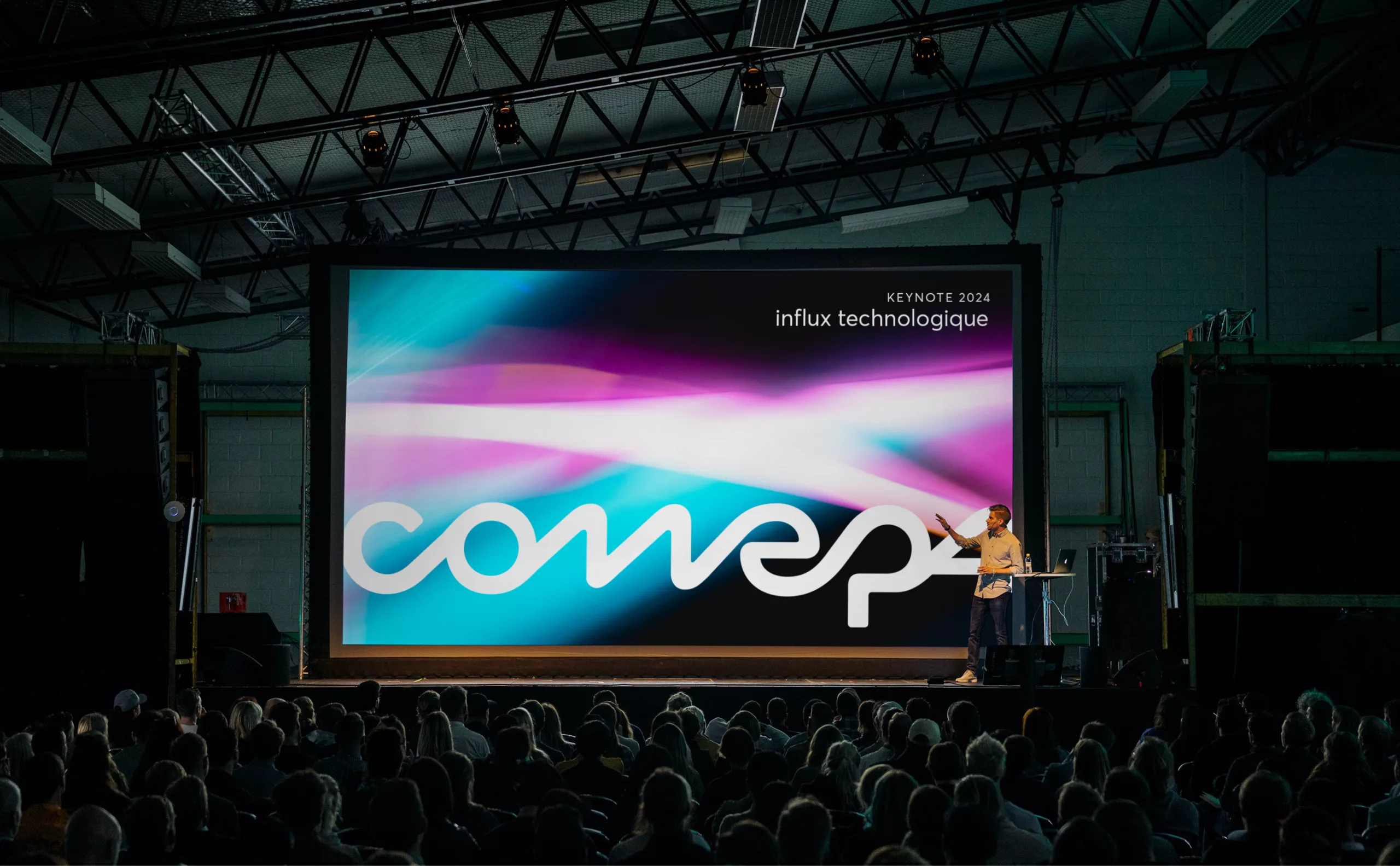
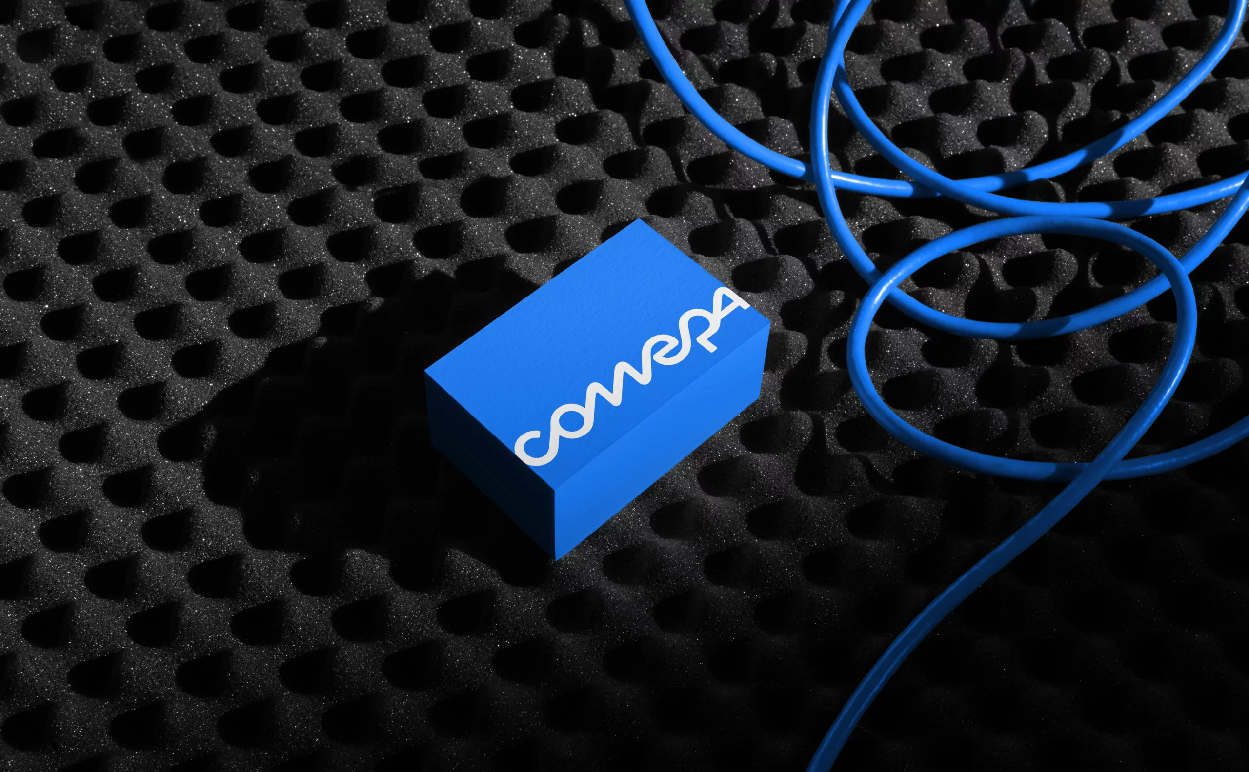
Keen to modernise its brand image and consolidate its business units, COMEPA reached out to Graphéine to carry out a strategic audit leading to the creation of a brand platform and the overhaul of its visual identity.

Brand Audit - Developing your brand strategy

Our audit was based on a range of tools tailored to COMEPA's needs - group workshops, individual interviews, analysis of existing communications media, and a brand image co-construction workshop.

We condensed this audit work into a report summarising the new brand strategy recommendations for COMEPA. This report served as a preliminary foundation for the design of the brand platform.

Brand platform
Based on the information gathered during the workshops, we designed COMEPA's brand platform to tell their story using precise, coherent and ambitious language. The brand platform is built around key values: ingenuity, rigour, support and commitment to multi-sector technological innovation.


Storytelling - Creating the brand narrative

The brand narrative summarises the brand platform in a succinct, easily narratable story.

It is built around the notion of ‘technological influx’. This technological influx refers to COMEPA's origins in the manufacturing of electronic components. The metaphor of the influx is rethought and serves as a common thread running through COMEPA's history, from its creation to the present day.

This influx is also a central graphic element in the construction of the logotype and the identity programme.

Logo

The custom-designed typographic logo uses its ligatures to embody COMEPA's technological influx. This treatment is also a nod to the historic 1979 logo with its distinctive visual style.

Emblem

The emblem is an additional element of the visual identity, allowing it to be adapted to restrictive formats. The roundel is directly inspired by the roundness of the thermostat. The two arms are a reference to laryngoscope blades, the flagship product of the COMEPA Healthcare BU. The whole forms the initial ‘C’ of COMEPA.

Brand architecture

The repositioning of the brand, which is evolving its image from that of a simple distributor to an innovative and pioneering company, has led us to review its brand architecture.

The Business Units (BUs) correspond to the key business verticals. We have chosen to rename them for greater clarity in terms of the areas in which they operate. The use of English for the names illustrates the international scope of the company.

The ‘Design by COMEPA’ label marks the products and guarantees their compliance with COMEPA's quality criteria.

Typography

The Averta typeface was chosen for the sub-brands and to serve as a companion typeface for the graphic guidelines. Precise in its geometry and reassuring through its open counter-forms, Averta both matches the design of the COMEPA logotype and adds a contemporary spirit.

Pictogram libraries

To complement the brand's graphic assets, we have created a range of pictograms. The idea of a technological influx finds its graphic expression in the style of the pictograms, with their continuous monolinear design.

This new visual identity fully embodies COMEPA's ambitions in the competitive international market, while affirming its expertise and spirit of innovation.

Context

A long-standing player in the development, customisation and distribution of technological instruments for the medical and space sectors, COMEPA wanted to modernise its image and assert its positioning as an innovative, pioneering company. To support this change, it asked Graphéine to rethink its brand strategy and visual identity.

Objectives

Carrying out an in-depth brand audit to identify the strategic areas for repositioning. This work led to the overhaul of COMEPA's visual identity and the restructuring of its brand architecture.


Share this project:
Project expertise:
Logo creation, visual identity and graphic guidelines. Motion design and video creation.
Type of client:
Communication agency in the start-up, digital and technology sector. High tech & IT, IT BtoB, IT BtoC: software publishers, digital services companies. Communication in the industry, construction and public works sector.

Related projects: