Hans Hillman, “poster art without fuss”!
Always sad to begin the portrait of a graphic design great figure, long planned, and to publish it after his death.
This forces a little to review our copy, to change the chords of the times and to find the right words. It is therefore posthumously that we salute Hans Hillman for his unique work, and too discreet in France!
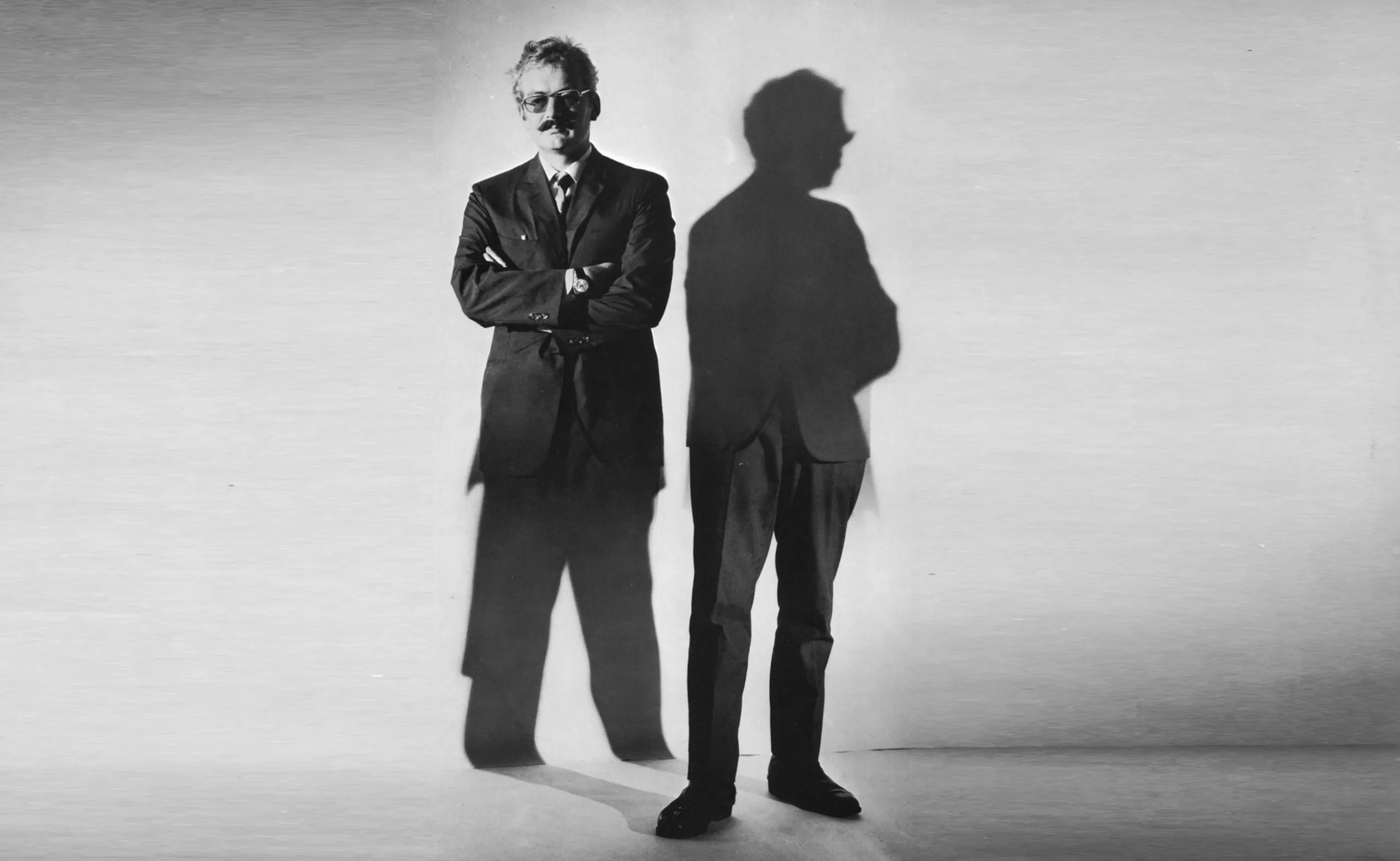
Hans Hillman, 1925 – 2014
Hans Hillman, german graphic designer, illustrator and designer born in 1925 and died last May in Frankfurt.
As early as the 1950s, he was a pioneer in re-inventing the art of film posters in Germany, and was the artistic director of the cult magazine “twen”, the cultural magazine “Transatlantik” and the daily newspaper “Frankfurter Allgemeine Zeitung”. He also had a 30-year career teaching graphic design.
Born in Lower Silesia in 1925, already very young during his school years, his passion for drawing had stung him. It was not until the end of the war that he entered the Kassel State Academy. At the time, between 1948 and 1953, Hillman learned his scales under the guidance of Hans Leistikov, one of the pioneers of German graphic design in the first half of the 20th century.
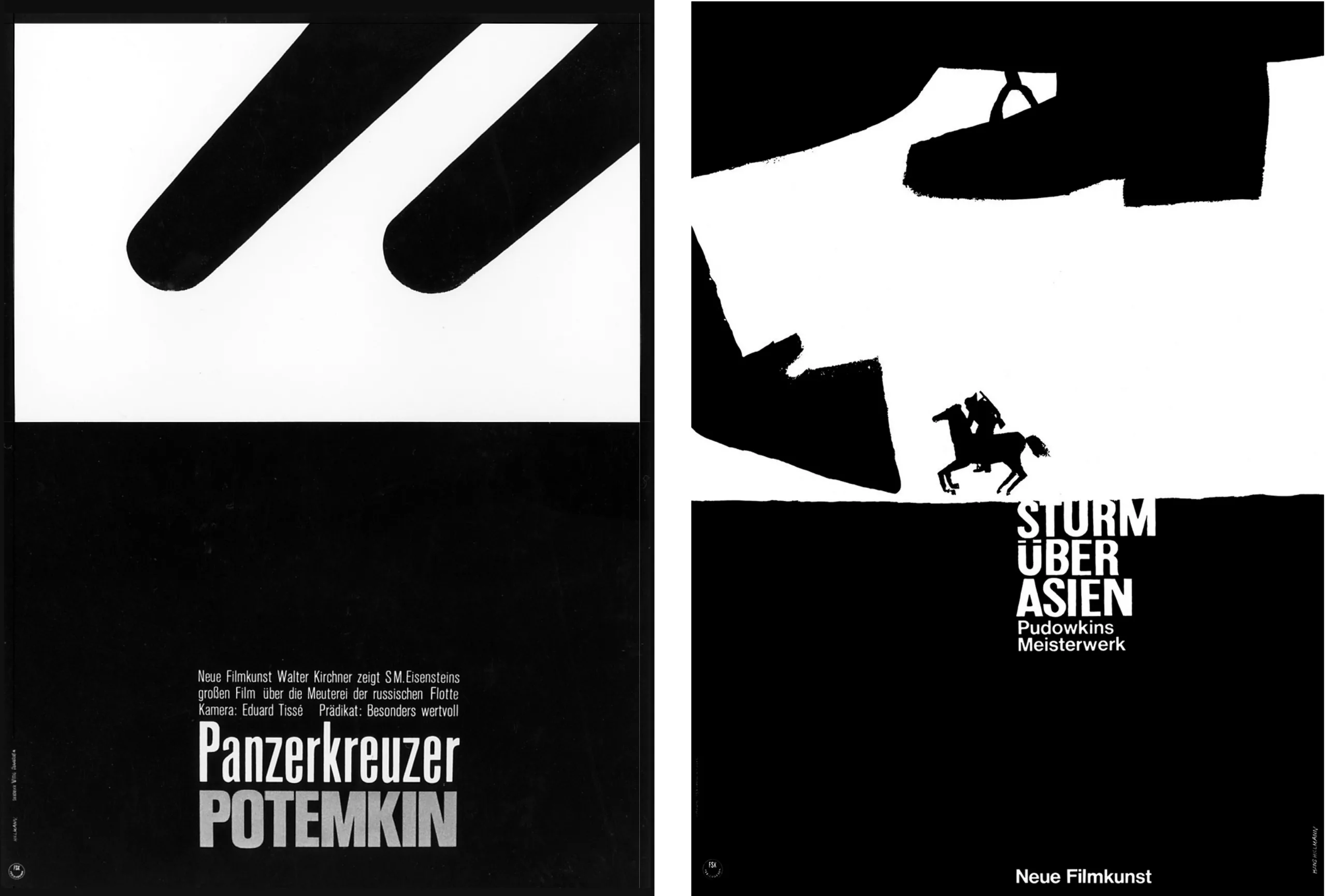
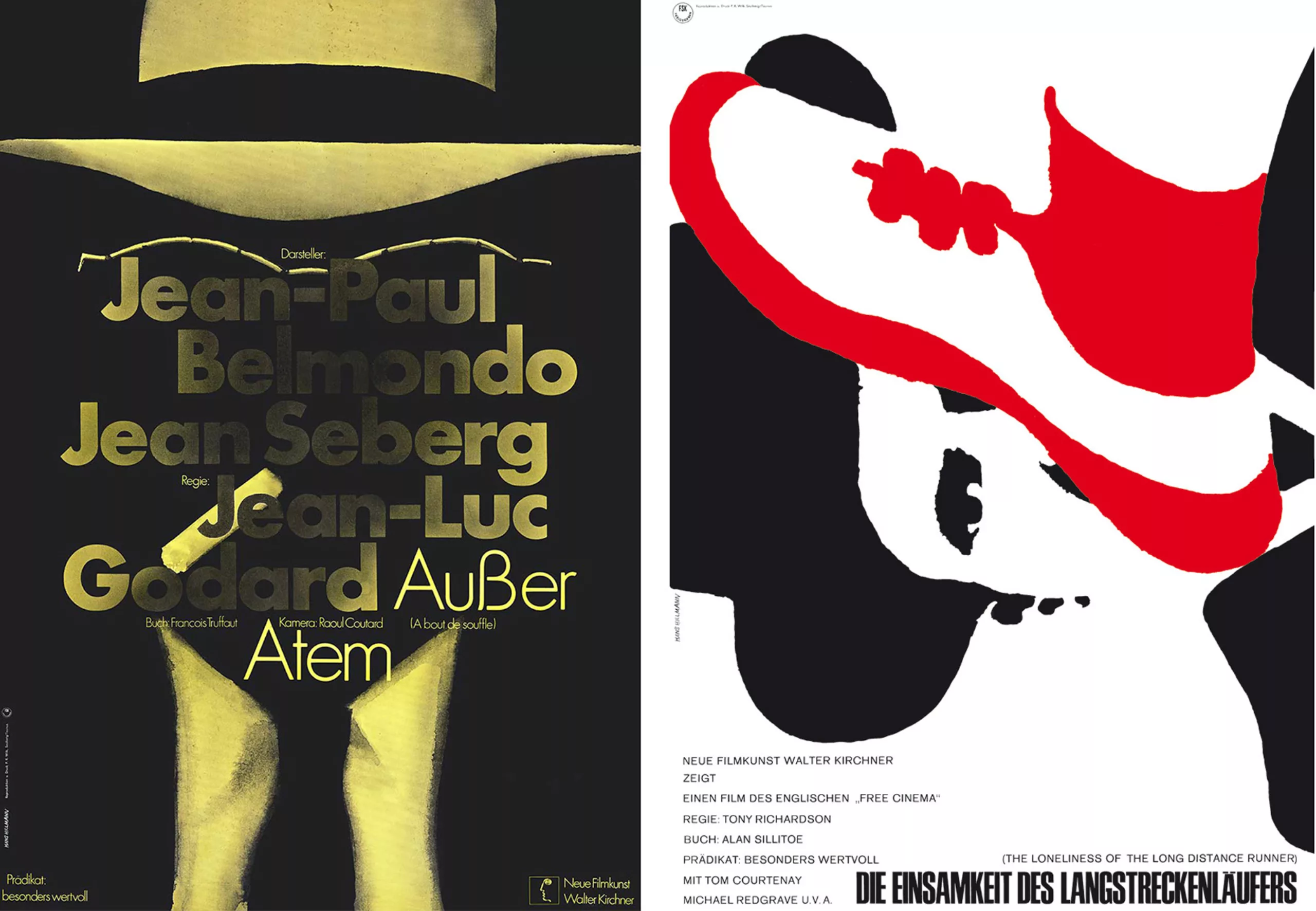
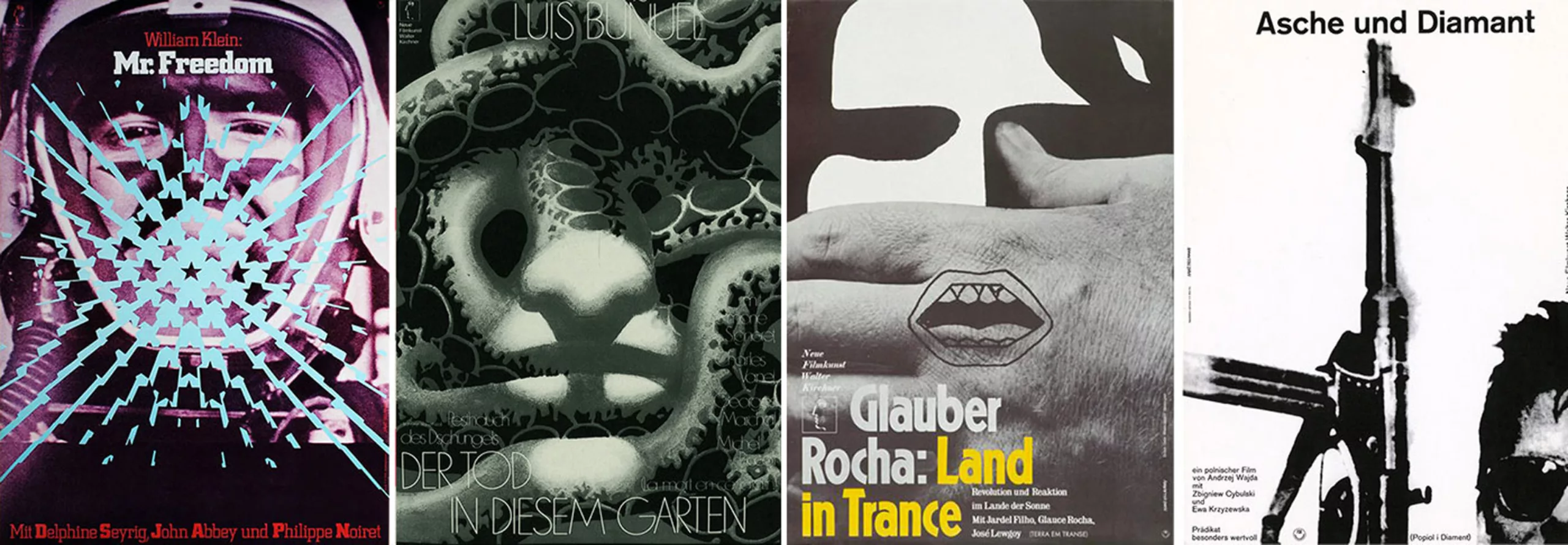
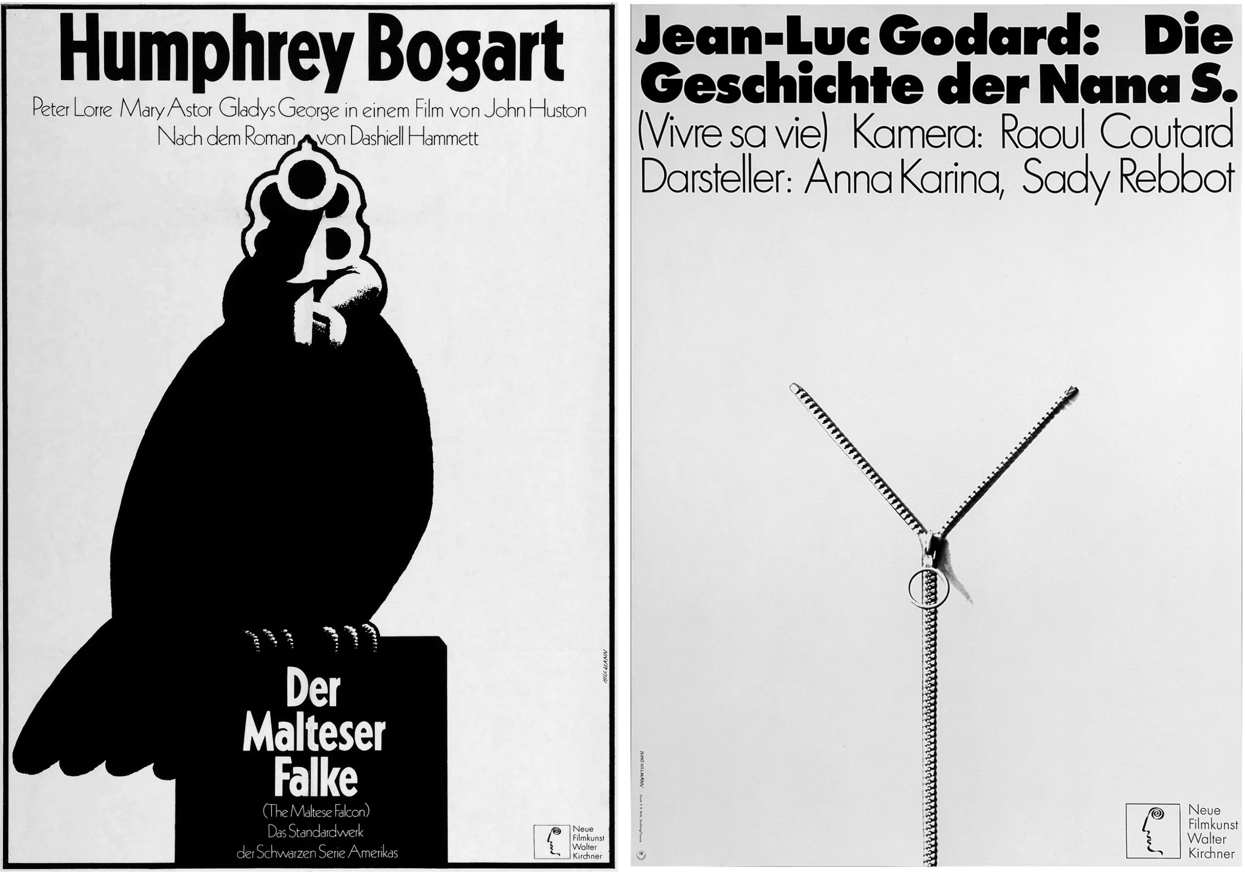
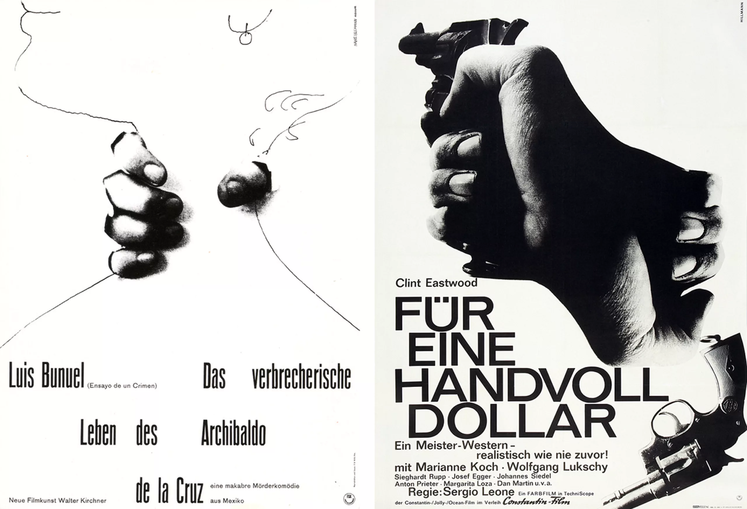
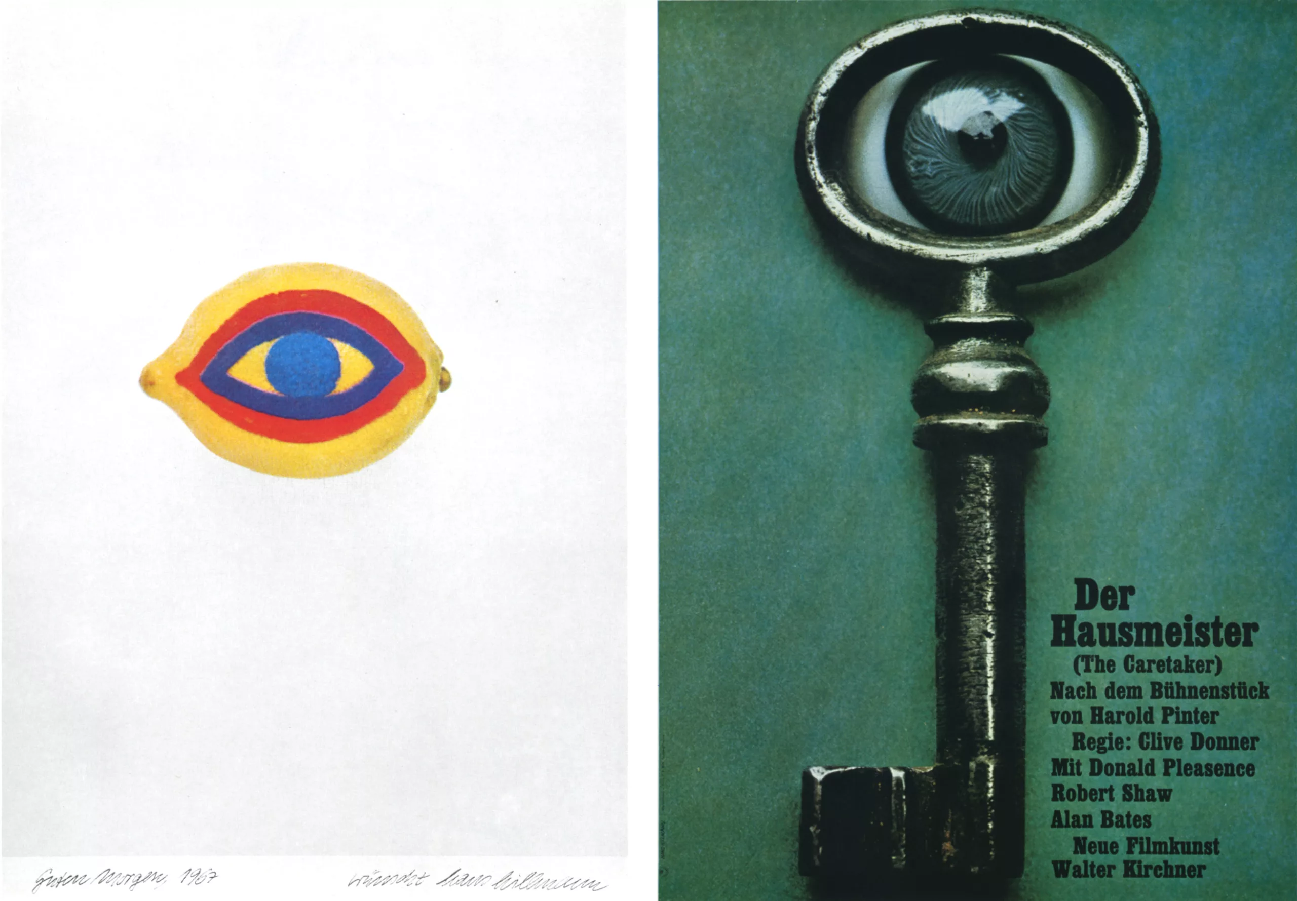
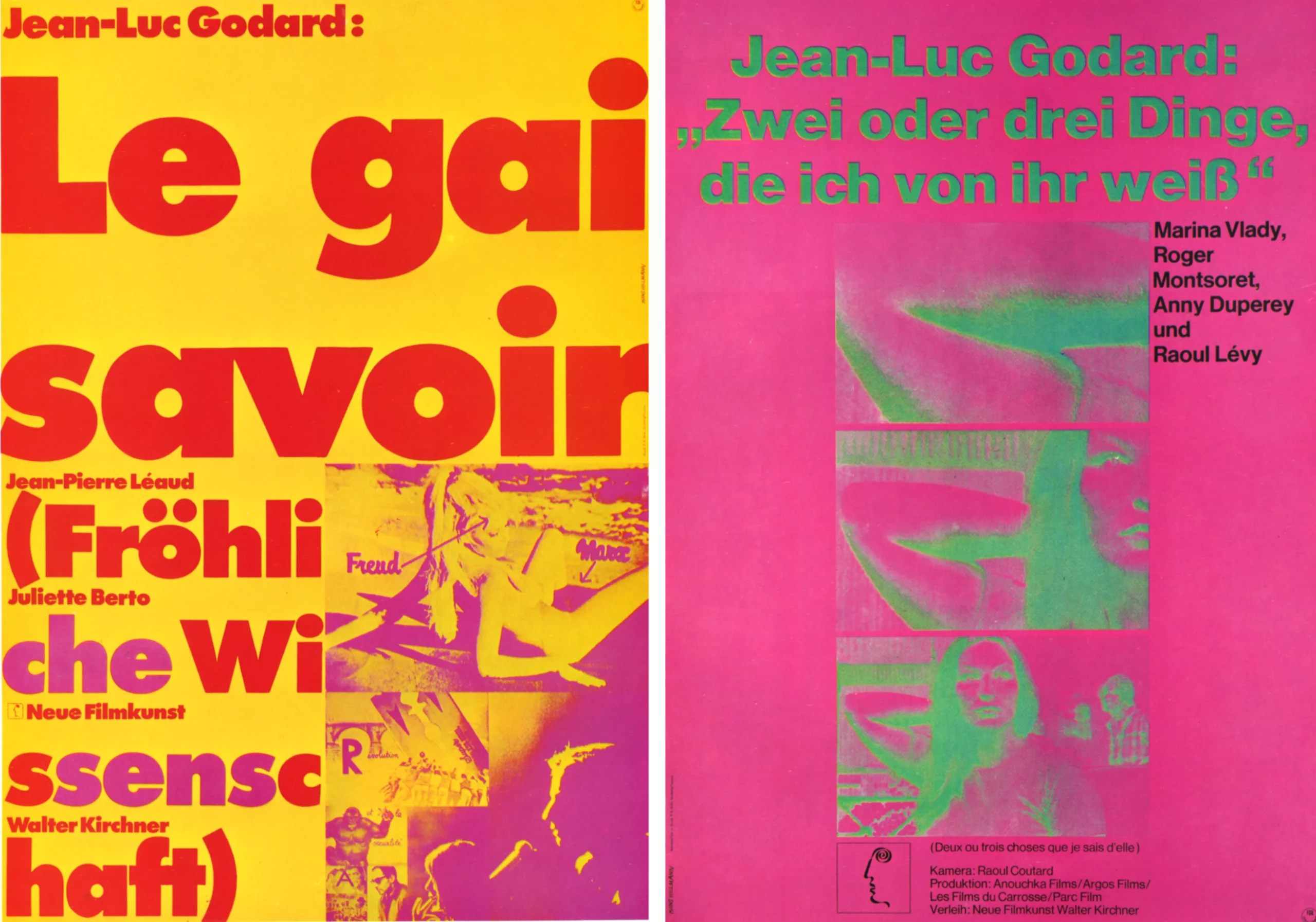
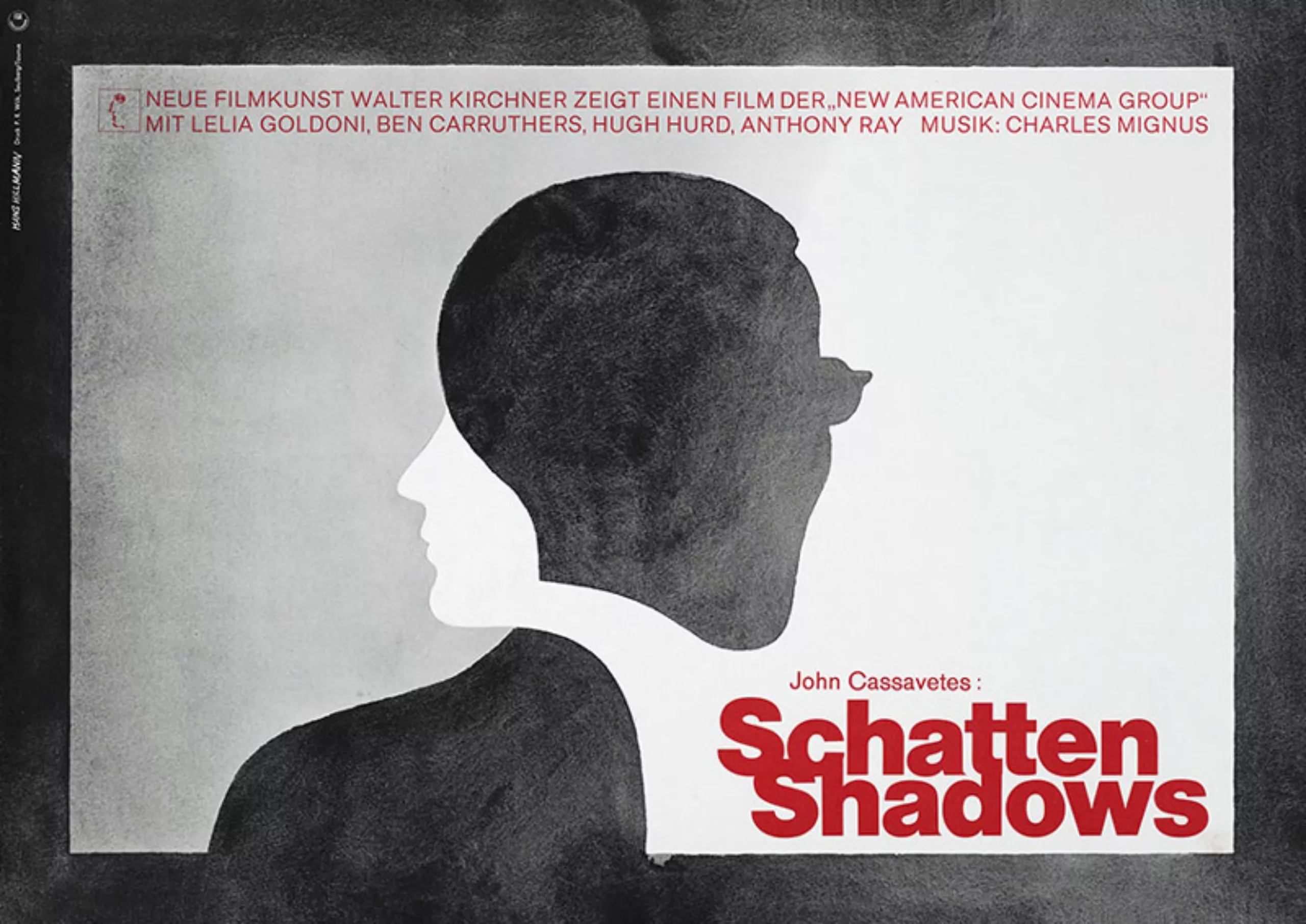
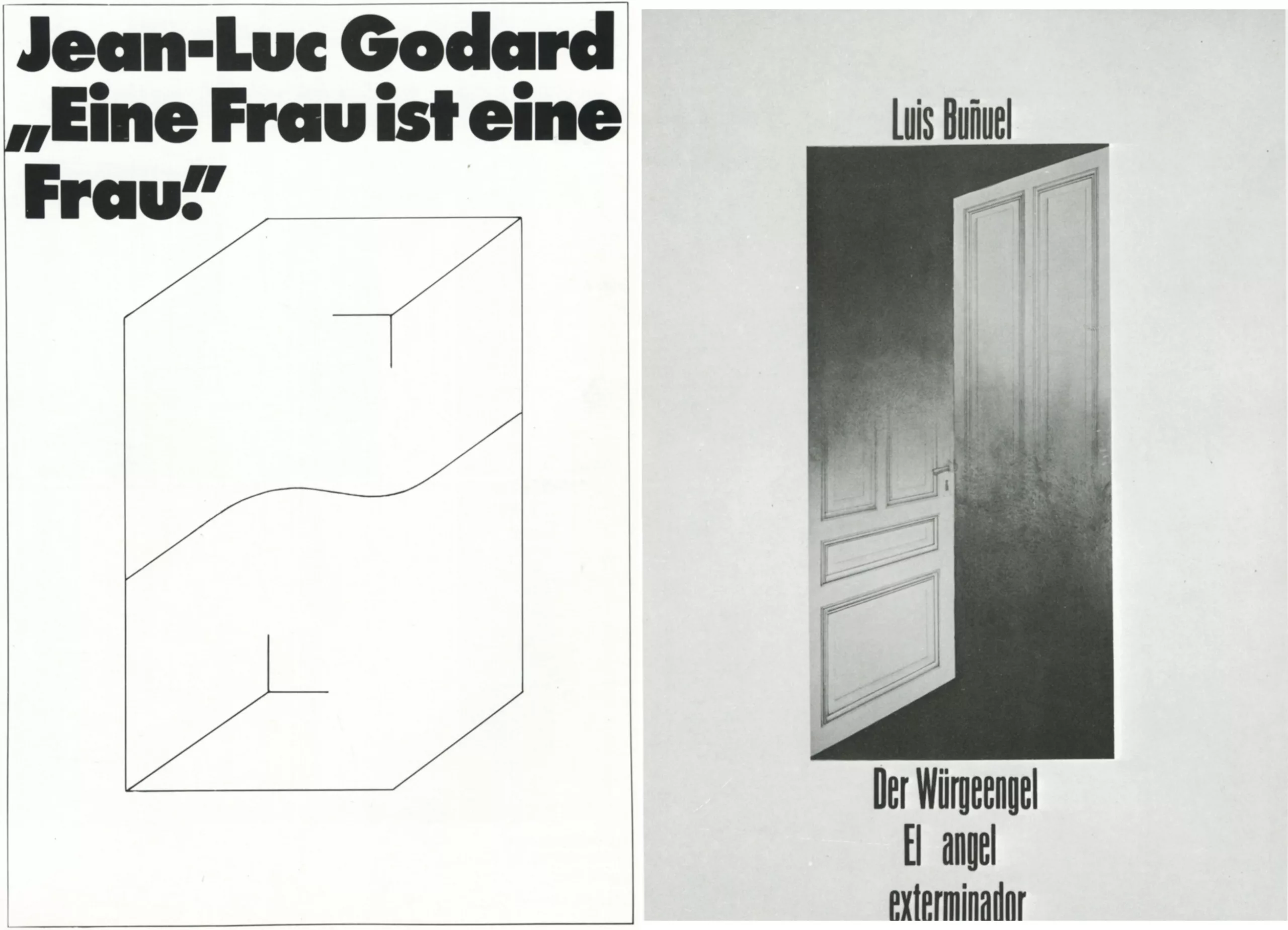
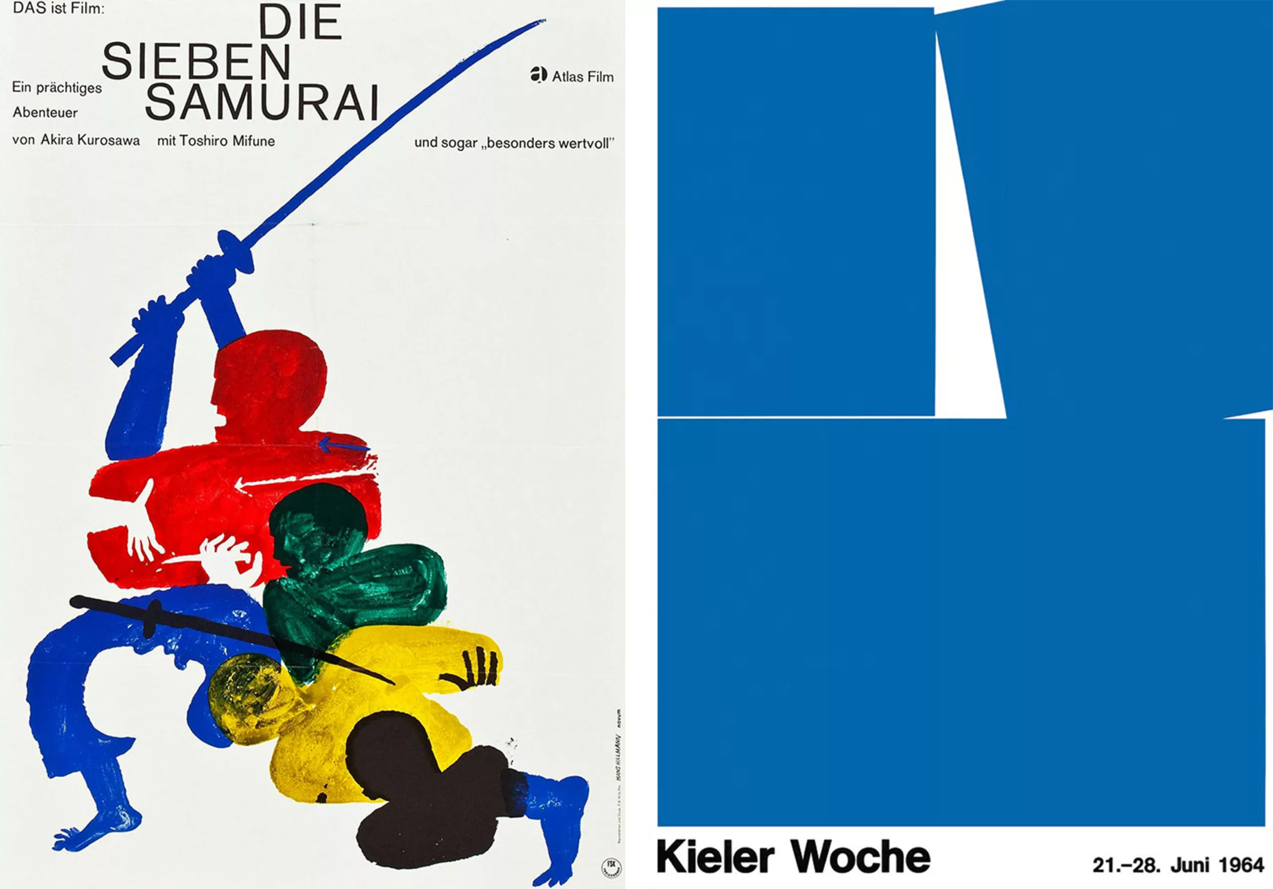
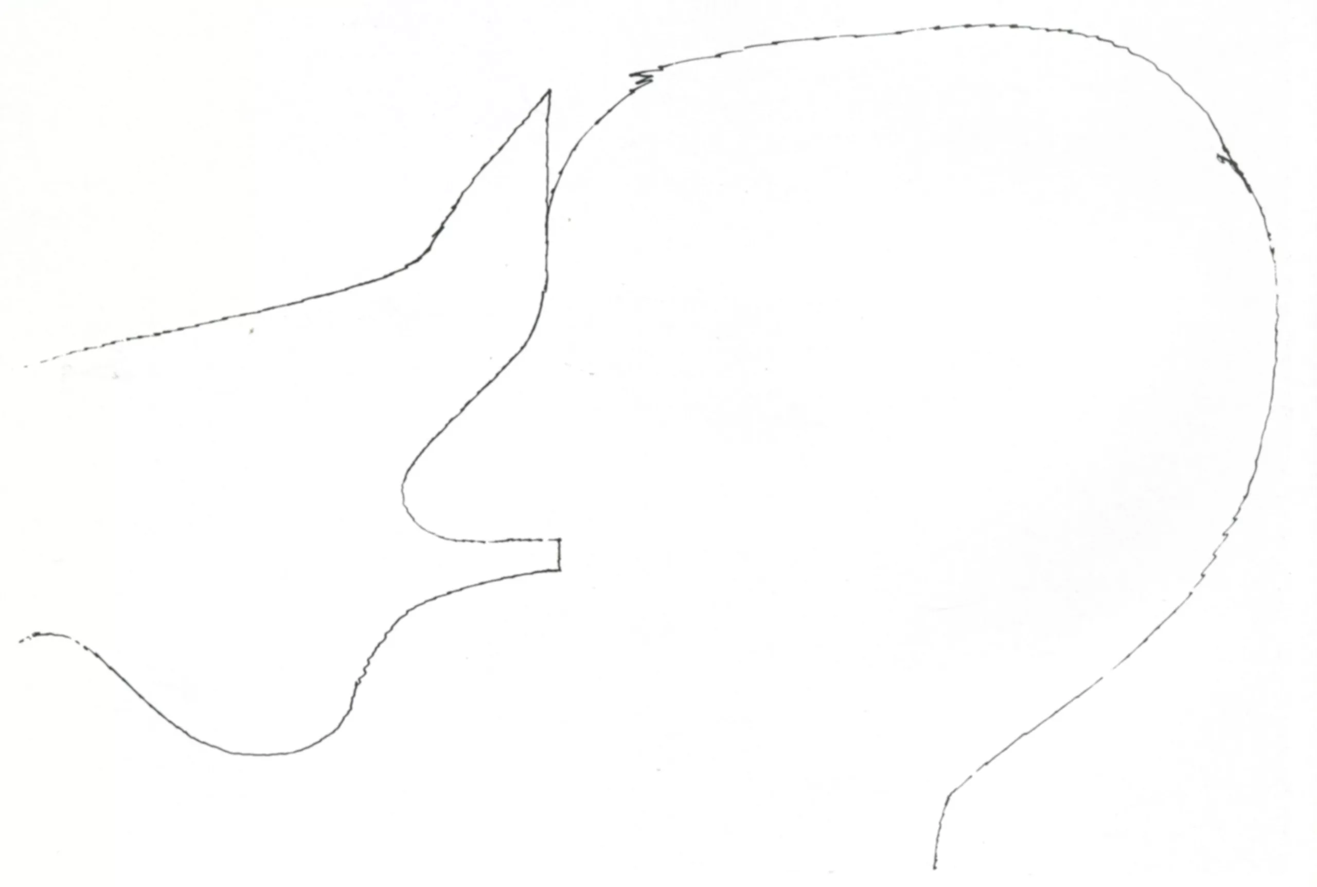
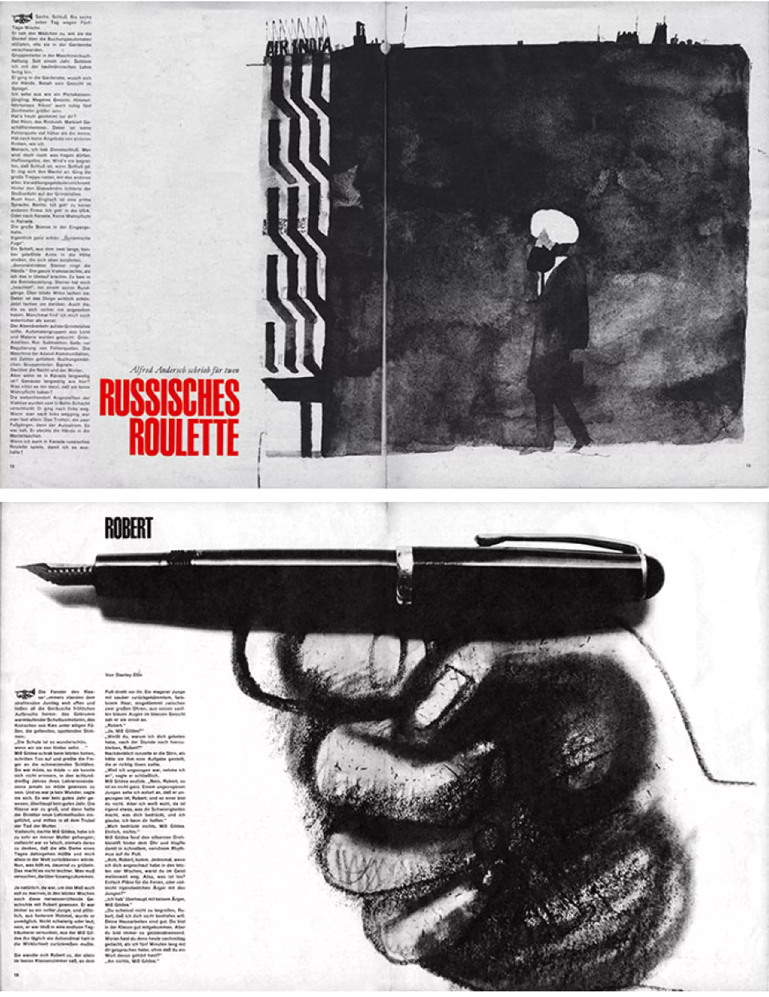
It was during her studies that Hillmann met the world of cinema. He quickly received orders for posters for German versions of films by Buñuel, Godard, Eisenstein, Kurosawa, and Bergman. During this period, he developed a new visual language that broke with the traditional conventions of the genre. Until the 1970s Hillmann worked for the cinema and designed several hundred posters in his name. His best works, such as the poster of the “Battleship Potemkin” are now part of the canon of international design history and have since entered the most prestigious collections, for example that of the Museum of Modern Art in New York.
In the late 1950s, he took over the post of his former professor Hans Leistikov at the Kassel Academy.
There he taught the art of poster advertising until his retirement in 1989, influencing generations of designers.
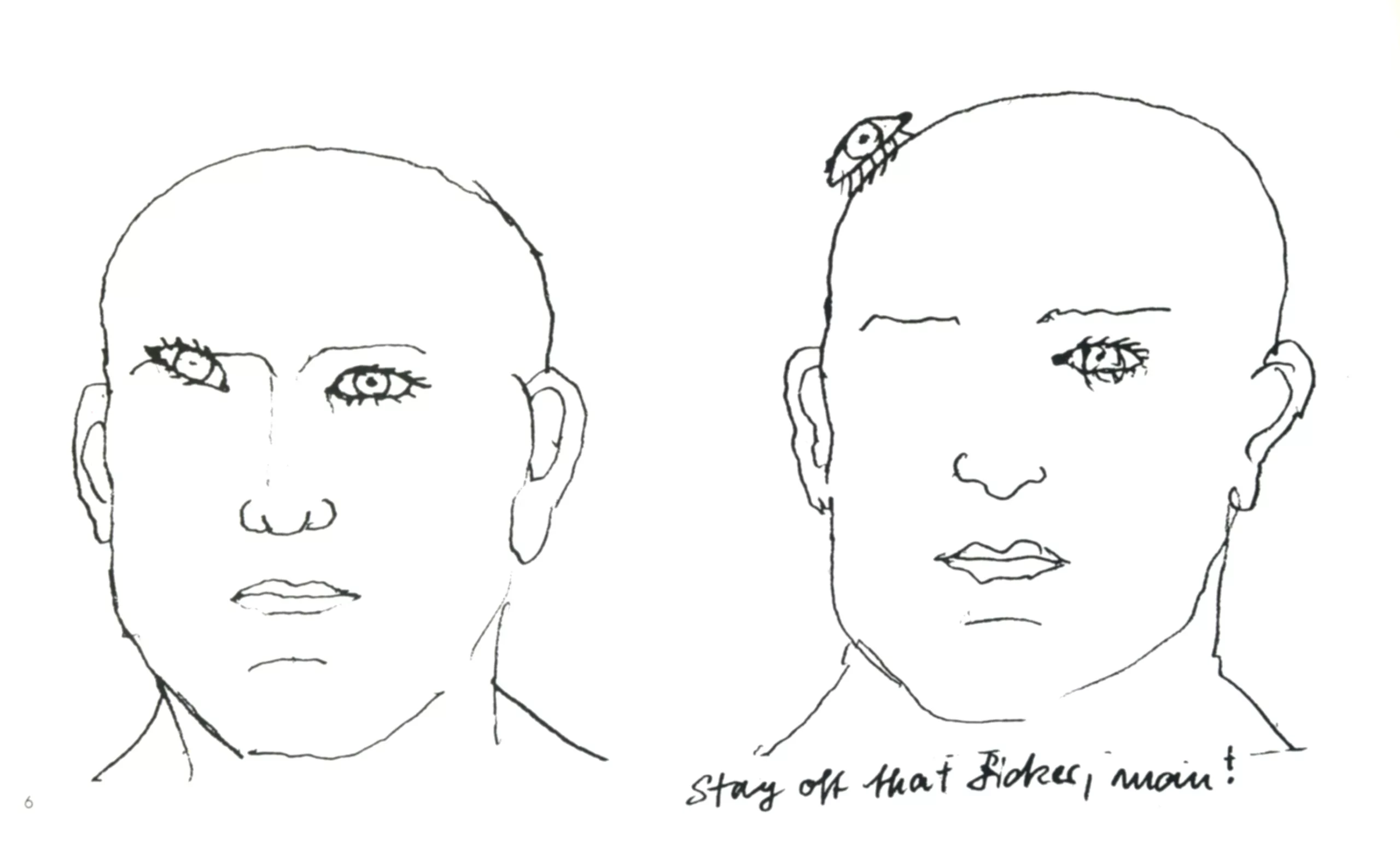
By the mid-1960s Hans Hillman’s graphic design work was well known, but at the same time he had another passion: illustration. Between 1959 and 1971 he was a regular contributor to the German teenage magazine “twen”, the “Vingt-ans”. Around 1980 he collaborated with the magazine “Transatlantik”.
Between 1968 and 2003 Hillman was a permanent member of the jury on the Advisory Board of the German Federal Post Office, thus participating in the selection of German stamps. In 1994, he was made an honorary member of the German Art Directors Club. Since 1961, he was a member of the International Graphic Alliance, the most prestigious graphic designer association in the world.
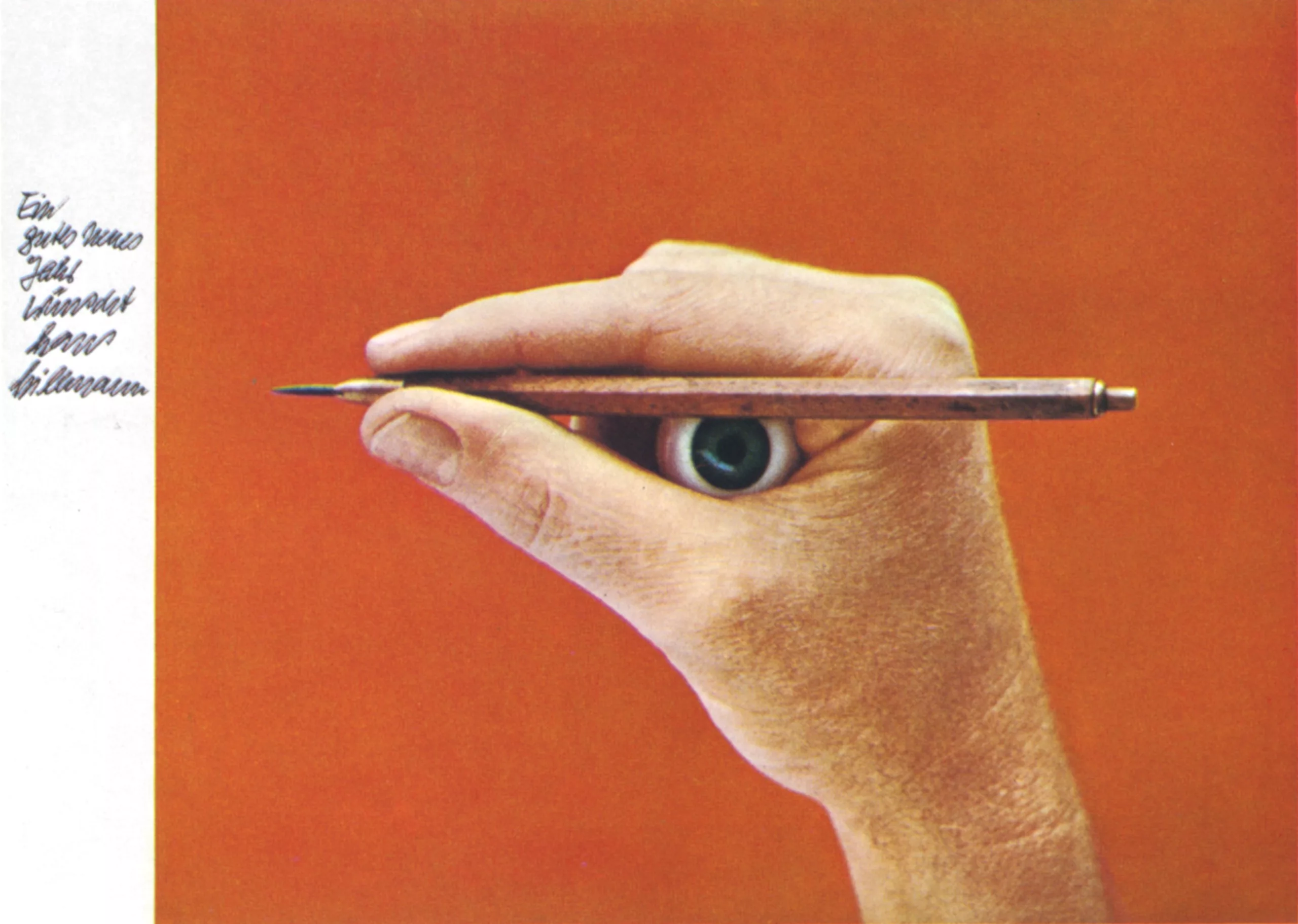
In recent years, his work has been recognized and exhibited. Many personal exhibitions were organized for him, mainly in Germany unfortunately! Until recently, Hans Hillmann did not spend a day without a pencil in his hand. Now that he has passed the “graphite” on the left, we can comment without making him blush, that he “charcoal” of the greatest graphic designers and illustrators of the last 70 years.
Here is an auto-interview published in the magazine “Graphic-designers Europe” in 1972.
Self-interview of Hans Hillman, 1972
When I am asked to speak about myself, as a graphic designer, I am sometimes tempted to reduce everything to two words borrowed from the English language “just work”, and while I note, I see these two words unfolding on paper, growing to about 1 50 points in a beautiful and bold arrangement.
Will this pattern have to be very small with a lot of white space, framed with a thin line like any drawing? Be handwritten or projected on myself (and photographed)?
In this case, I should take a double page and represent myself, not standing, but lying down, perhaps in bed.
“Just work”, I work now, I imagine all the possibilities I have retained, finished, printed, trying to predict the reactions of various groups of readers (including yours). What the public (you) hope to find, under what circumstances will my book be read and what effect will the difference between my article and those of my colleagues have?
I want to talk about my work or more exactly about the course of my work. In my opinion, this offers more interest than the finished work, probably because nothing is decided yet. Sometimes you express something that comes out of the blue. There is a saying that the more you know someone, the harder it becomes to surprise them. If it’s true
for me, I have to wish my friends would stay at a certain distance.
My contribution to this work consists essentially in advertising films, it would perhaps be useful to recall the facts which conditioned my work and which cannot be captured through the images represented here.
The films
The films for which I have made posters (nearly 150 so far) range from the first buffoon comedies to the latest productions by Godard or Truffaut.
This list includes most of the major directors from all film-producing countries.
These tapes belong to the category of art cinema, many are screened in their original version and consulted by professionals, they are not qrands films.
The public
A tiny part of the crowd of cinemas, are not the regulars of the dark room, but those who
are going to see a particular movie.
The customer (film distributor)
A former cinema club host who started by showing films that delighted him personally,
then realized there was a gap in the entertainment market and he could fill it.
Advertising
Either by posters that launch the films, sometimes displayed on billboards, but always
displayed at the entrance of cinemas, either in the form of leaflets, loose sheets, catalogues or programmes.
My studio
A big room and a small room. A darkroom to develop part of my production. I usually work there alone, sometimes someone comes to help me for a limited time. The illustrations in this book have been made for various publishing houses and mostly for short stories.
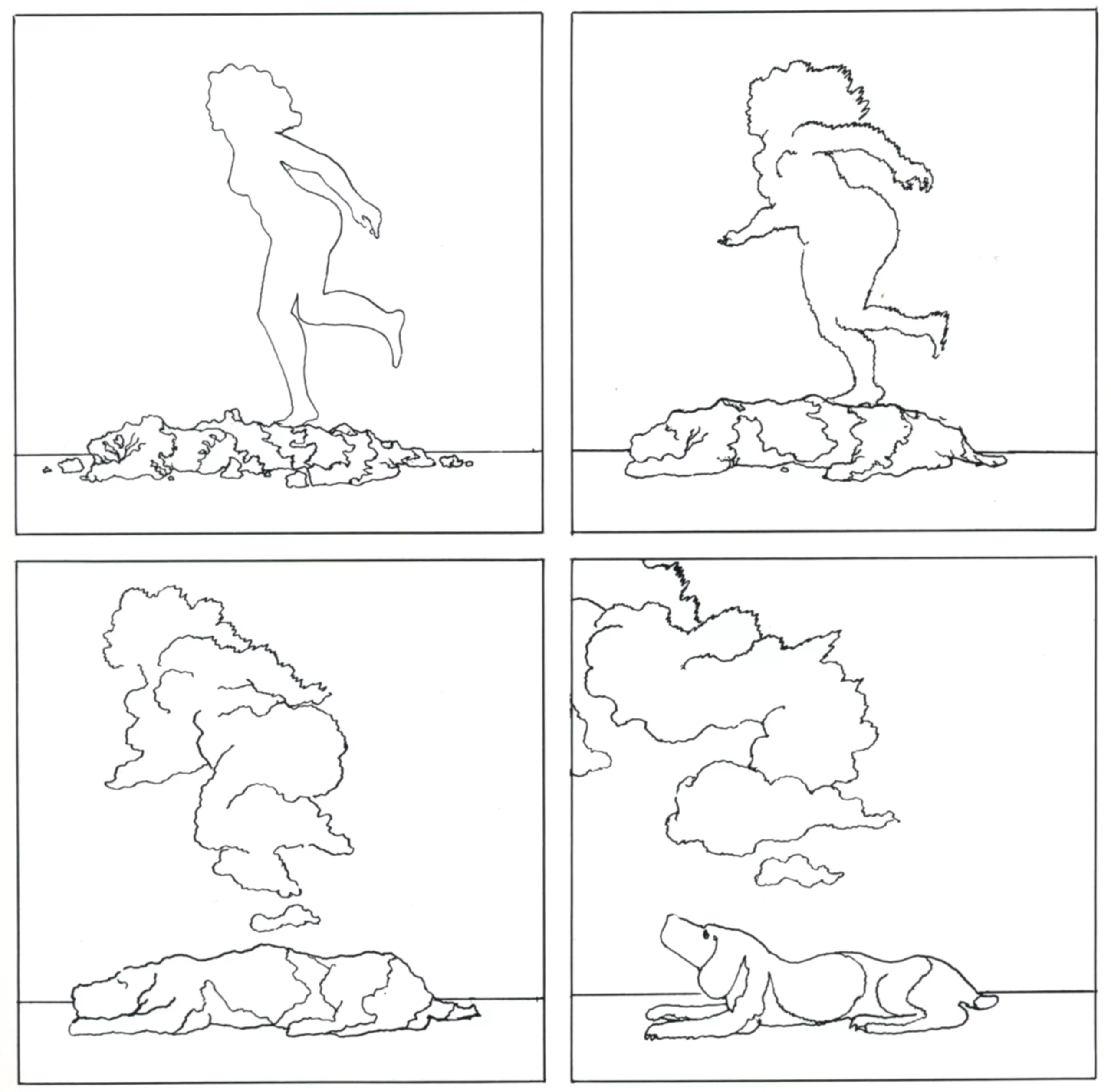
No. 4 on the list, “I dreamed of being a dreaming dog”, is one of a series of pictures from a series of stories without words that will be published again this year as a collection: my first book.
Here is a short video tour of the exhibition “The Title is continued in the Picture”:
Der Titel wird im Bild fortgesetzt – Filmplakate von Hans Hillmann: Ausstellung im Museum Folkwang (movie posters) from Kunst+Film on Vimeo.
Sources: The images and texts in this article are presented for educational purposes. All rights reserved
On the subject
-
A history of mascots
Mascots, those soft, slightly silly characters, are nothing new. Here’s a look at their origins, from Antiquity to Japan.
-
Herb Lubalin, the letter as an image
Herb Lubalin’s biography in pictures. In his 40-year career, Lubalin has revolutionized the landscape of American graphic design by composing images with text.
-
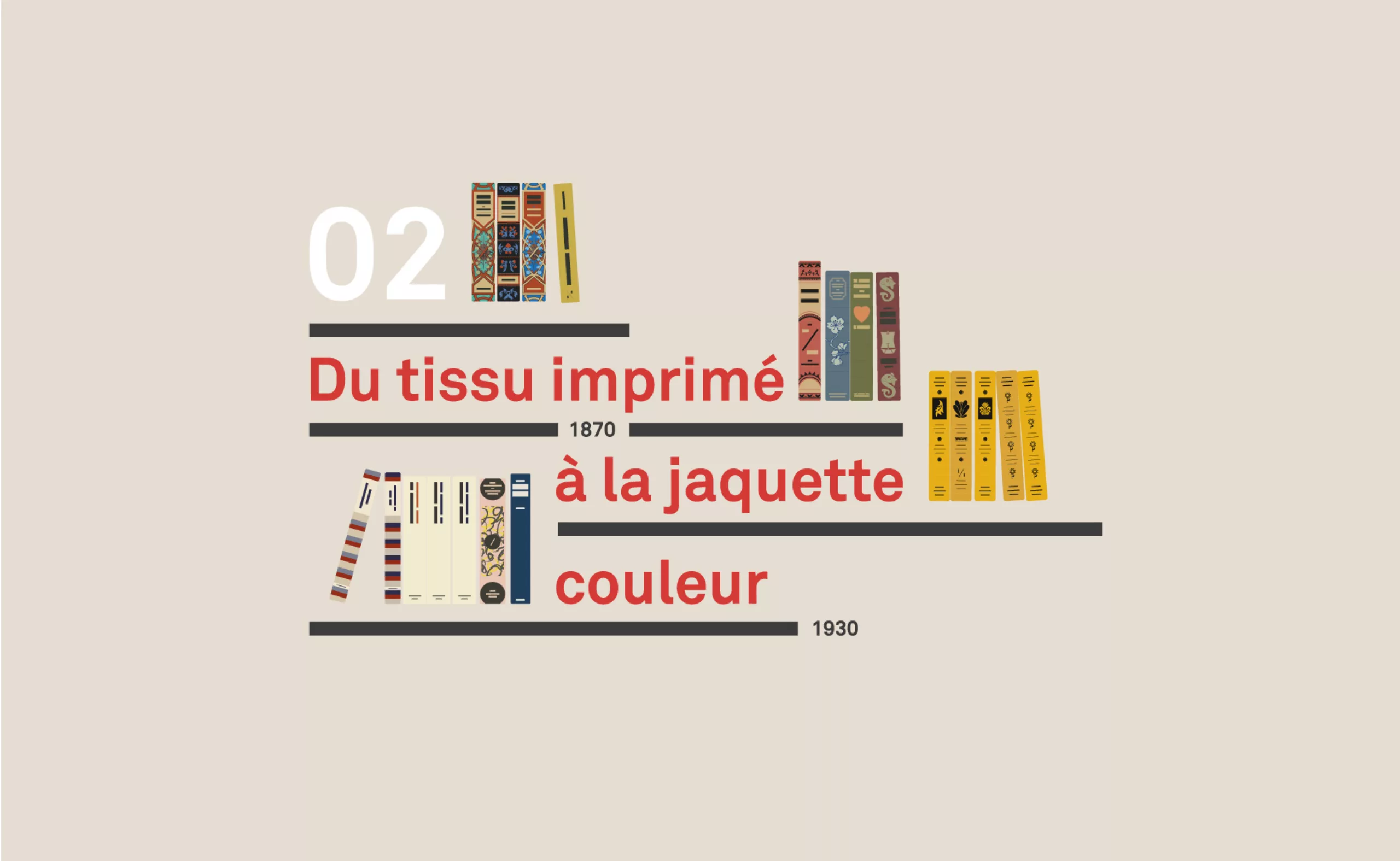
A short history of book cover design – 2/4
Under the influence of Japan, France or Russia, book covers are constantly evolving with technical progress and crises.