
ebay’s new identity ebayit nobody!
ebay gets a new look
ebay reveals its new visual identity. It's clean. It's corporate. But what the hell it's boring.
![]()
We owe this redesign to the agency Form& (that deleted the project from its site, who knows why?).
Presentation of this new "revolutionary graphics system that redefines a new era of connection", as the agency imagines.
The ebay site is apparently being updated, since the logo still appears in color at the time this article was written.

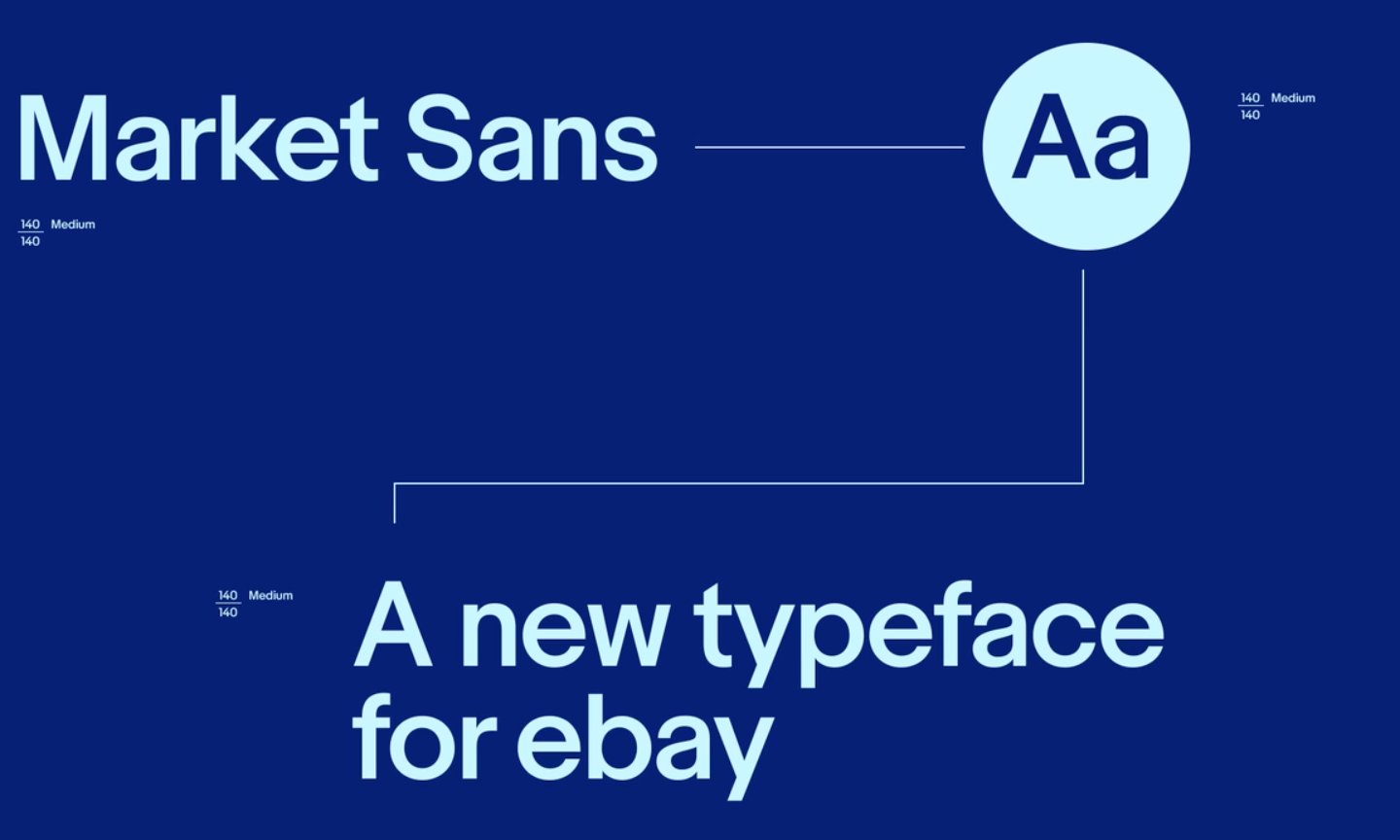
A swiss font
On the side of the new ebay logo, no great revolution. The swiss typeface Market Sans has been adopted, for its "modern, attractive and optimistic side" the agency explains.
![]()
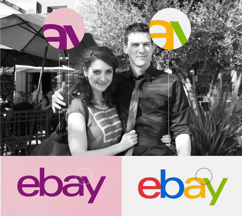
So close, and already so far away...
The letters are now separated by a pixel (unless it is an error on the presentation images) and one wonders a little why!
According to us, they are not far enough apart to breathe, but close enough for us to think that the result would have been better if they had touched like before. Anyway, it's not very frank! A bit like those couple pictures that seem so close... but already so far away!
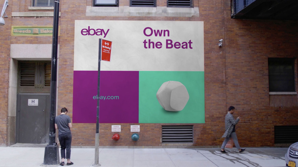
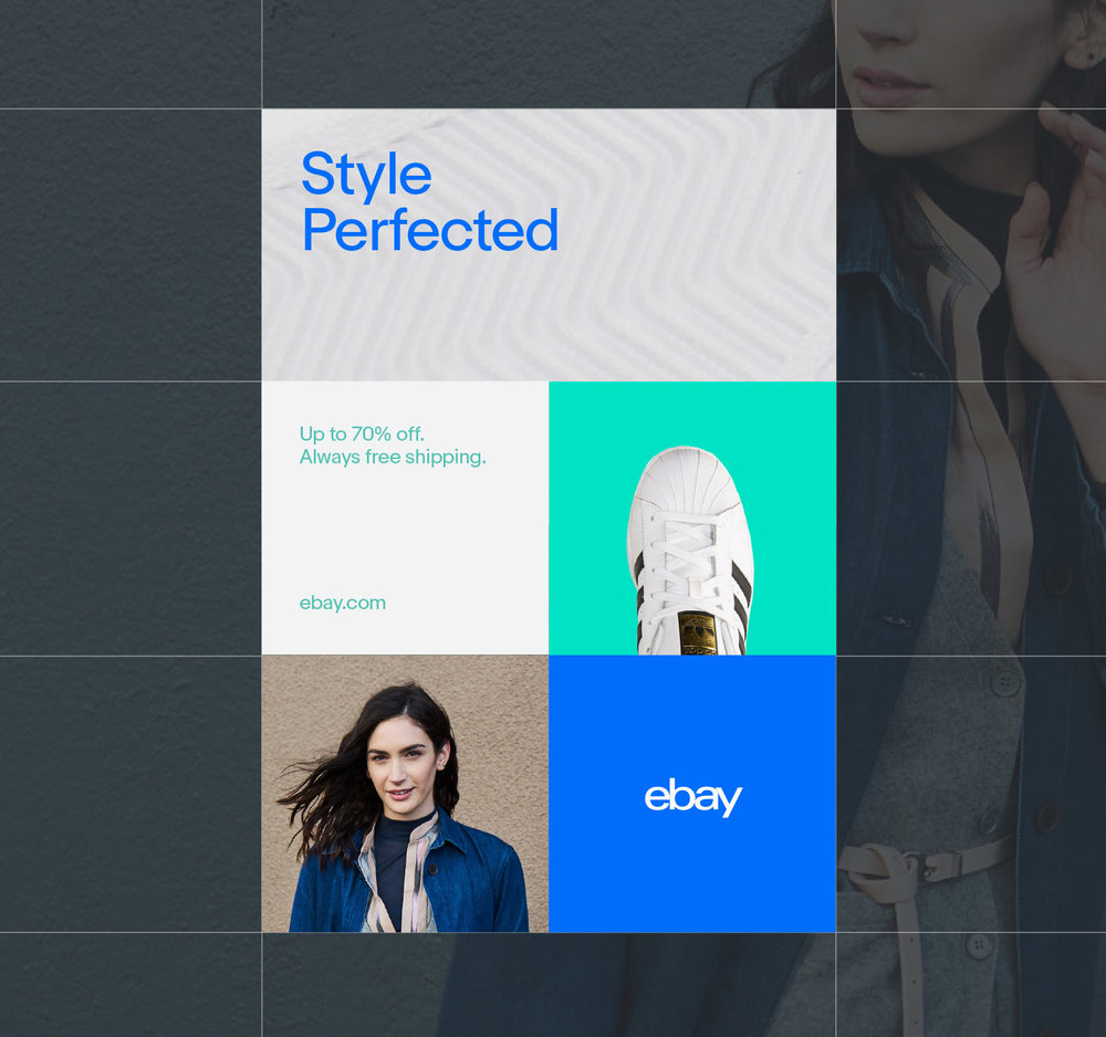
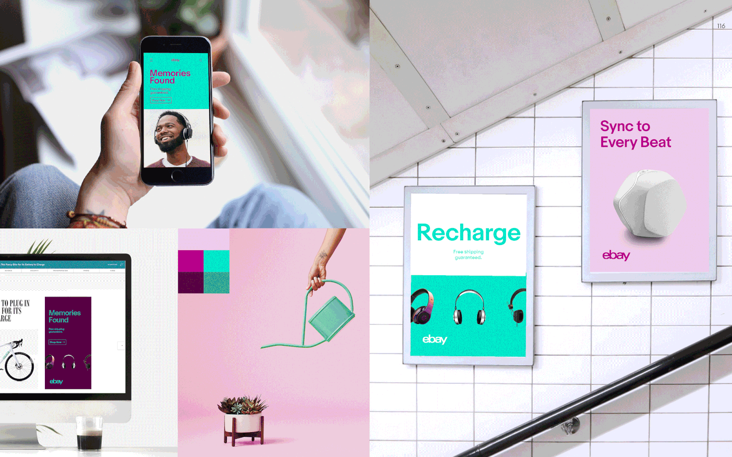
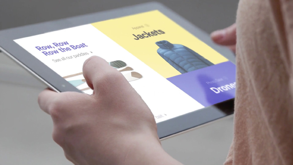
The biggest change comes from the appearance of a multicoloured palette. We move from the old coloured ebay logo to a graphic system with complementary tones, arranged on a grid that recalls the shape of a shelf or stacked packages. According to Form&, it is "a system where the logo becomes the symbol of ebay's diversity".
This graphic system allows to create a graphic block-Mondrian 3.0 schema very adapted for the web, and all in all rather tendency today #instalife. As for the choice of colours, it reminds us of Deliveroo, or Dropbox in its bold style. Still, this choice echoes their latest campaign "Fill your cart with color".

https://www.youtube.com/watch?v=ZBcl7oqKtvE
One world, one brand!
In 2012, ebay had already removed much of its identity (the letters that "danced").
This time, it's the diversity of colors that disappears! Finally, what is the uniqueness of ebay compared to Spotify, Deliveroo, or Dropbox?
One can (it is necessary!) regret the lack of roughness, these accidents which make the singularity of the signs and which preserve the trace of a singular history. With its unlimited means, ebay could probably have told us a story with a little more thickness... a little more unexpected or simply poetry...
By addressing millions of customers around the world, we can understand their desire to seek common sense more than singularity. But how sad this globalized world will be when all brands are composed in "Helevetica-like"!

Share this post:

 San Serriffe typographic Island
 Design, creativity and oblique strategies!
 Tote bag, a new social totem?
 Sister Corita Kent, the Pop Art nun
 Donald Trump, the martyr who makes history
 Heyraud – Visual identity
 Malecare, men fighting cancer, together – New brand identity
 Anacours – soutien scolaire
 Spring Festival of Pérouges 2017 – Poster design
 Vasarely, the father of optical art
 Time and creation #02 : how does time impact our creative brain?
 There is no smoke without brands!
 A short history of book covers – 4/4
Leave a Reply