The UN logo takes on water during COP28
Almost seventy-seven years after the creation of the UN, and in the context of COP28, two Norwegian designers spontaneously proposed a new UN logo, taking into account the rising sea levels on the world map and the future disappearance of many lands and coasts.
We wanted to take a closer look at this impactful graphic project, which not only moves the lines, but also aims to visually “show that these scenarios are not distant hypotheses, but the reality of the near future“.
The UN logo, a flag for peace
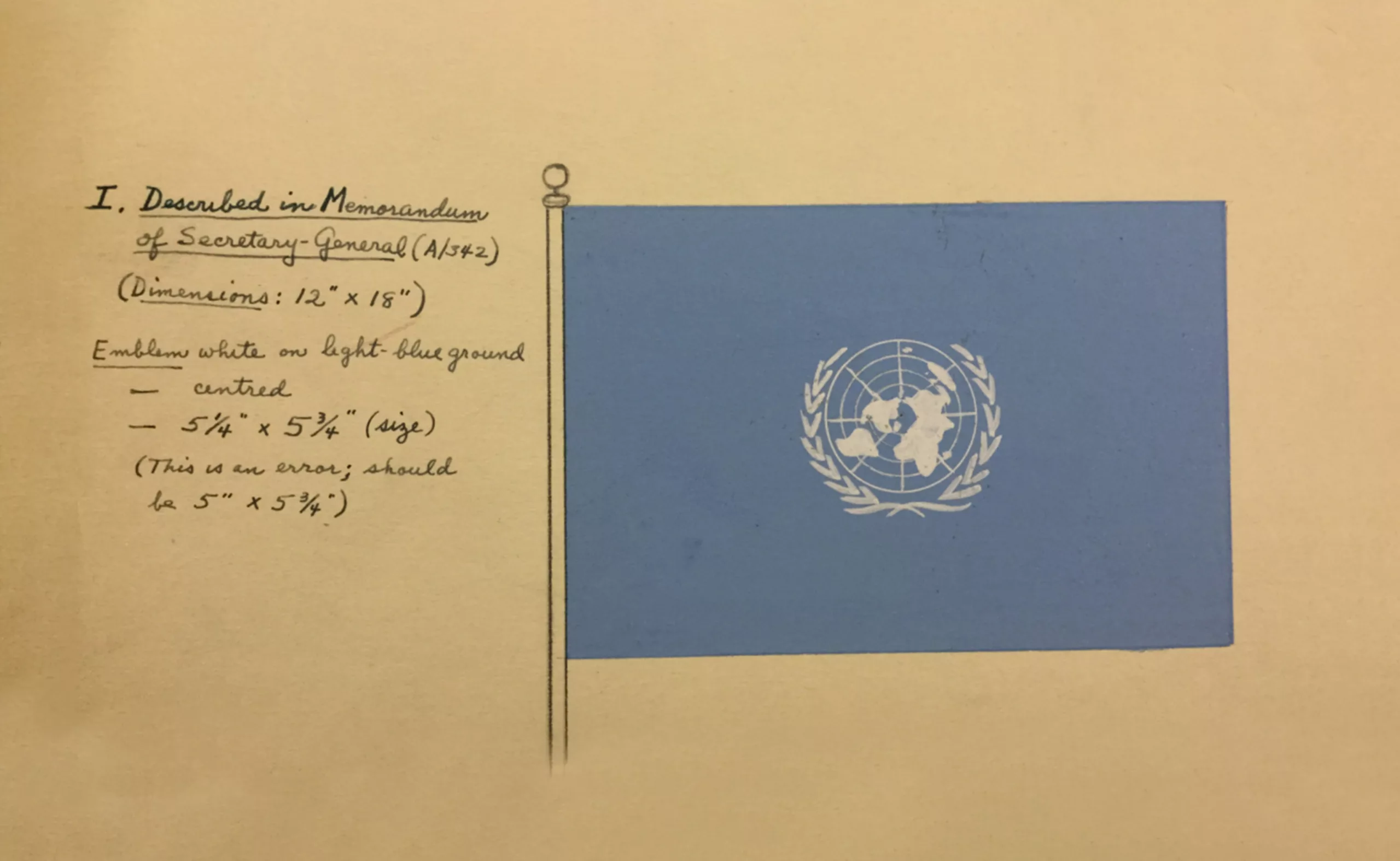
At the end of the Second World War, several states joined forces to create the UN, an international institution aimed at resolving international conflicts and promoting peace. After several unofficial versions, the UN logo was approved in 1947: a map of the world visible from the North Pole, surrounded by two olive branches, a symbol of peace. The background colour was “Stettinius Blue” (in honour of Edward Stettinius, Jr., head of the American delegation), a blue never before used by member countries. This pale blue soon became known as “UN blue”.
A new logo for a new world
The UN logo may have remained unchanged since its creation, but the map of the world is destined to undergo profound changes. Almost 77 years on, and to coincide with COP28 (which focuses on the need to move away from fossil fuels), two Norwegian designers from the Publicis agency, Ole Andreas Finseth and Thale Riiser, wanted to redesign a new UN logo to raise awareness of the phenomenon of rising sea levels linked to climate change. The Climate Changed logo, a fictitious graphic scenario that is spontaneous and has no direct client, aims to get the political opinion of those involved in COP28 to react by redrawing the coasts as they could be submerged by 2100, according to UN scientific data.
NASA satellite data reveals that sea levels have risen by 10 cm since 1993, coupled with a 150% increase in CO2 levels linked to human activity since the first industrial revolution in 1750. While 10 cm may not seem like much, NASA estimates that sea levels could rise by up to 65 cm by 2100, or by the same number in metres if the ice at the poles were also to melt – although this is less likely.
Even with a few centimetres or degrees more, scientific experts estimate that by 2050 17% of the coastline of Bangladesh will have disappeared, leading to the migration of 20 million people and a huge social, human and economic upheaval worldwide.
“Minor changes, major impact”
Using a simple film that ‘mechanically’ modifies the Bézier curves on the map, the two graphic designers move or even erase land that is destined to be swallowed up by 2100. Dubai, where the climate summit took place, Thailand, the Maldives (the world’s flattest country), Egypt, the coast of the Netherlands and many other regions, some of which are home to capital cities, are redrawn or simply removed from the map (we have translated the red annotations into French here)… with just one click. The speed of the click to delete seems to echo the drastic increase in CO2 emissions in just 200 years, of which humans are responsible for 50% – barely a quarter of a blink on the scale of our planet’s lifetime.
From a graphic point of view, the changes to the logo are minimal and almost invisible. Because the map is small, the few modified curves or deleted points are barely visible in the final result, if at all, if you compare the current UN logo (left) and the fictitious logo (right). The new world map looks as if it has been ‘cleaned up’ in the same way as a photograph, by removing dust, flying hairs or other parasitic elements, or a typeface that has been reworked. Except that here, these dots represent precious living spaces. The strength of this awareness campaign lies in the fact that everything hinges on these lines, fragile but very real boundaries between the blue of the ocean and the white of the land, so easily altered by human hands.
We are more used to approaching the subject of rising waters from a vertical point of view, talking about elevation and levels. Here, the map is treated horizontally, and it is mankind itself, as the great architect of its near future, that is planing its own living space by modifying its curves.
What might appear to be a banal graphic execution, something we designers do every day, has far-reaching consequences. As the graphic designer behind the project, Thale Riiser, explains, “although graphics is our way of highlighting this problem, it goes beyond vector lines; these reshaped and removed areas are home to millions and millions of people. Knowing that, this simple graphic hurts to see.” The parallel is drawn between the everyday actions of the human race and the impact we all have on our planet.
It should be noted that during COP28, which ended on 12 December, an agreement was signed between the member countries to create a fund to cover part of the “loss and damage” linked to the irreversible damage caused by climate change, including rising sea levels. These needs are already estimated at between 290 and 580 billion dollars per year between now and 2030. As a reminder, poor countries are the ones most affected by these disasters (cyclones, floods, drought, rising sea levels, etc.) and over the past 30 years they have been sending out a series of appeals to the most privileged and responsible countries, to no avail.
By signing this agreement – and this is an historic first – the rich countries (which are not obliged to pay and are not all committed) are acknowledging that they do indeed bear a large share of the responsibility for the increase in greenhouse gas emissions. Designers, for their part, can continue to raise awareness by drawing the curves of our future, in the hope of having to modify them as little as possible.
More info on The Climate Changed Logo
On the subject
-

Groupama’s new visual identity, a logo in the open countryside
Groupama has just unveiled a new logo that updates its graphic design by abandoning its campaign in favor of a “startup” aesthetic.
-
From surnames to acronyms: creating a brand name from letters
From founders’ surnames to initials and acronyms, brand names have always oscillated between abstraction and familiarity.
-
The graphic codes of post-modernism in brand logos
We are entering the “time of the tribes”. Let’s discover the impact of this post-modernity for the logos and visual identities of brands and companies.