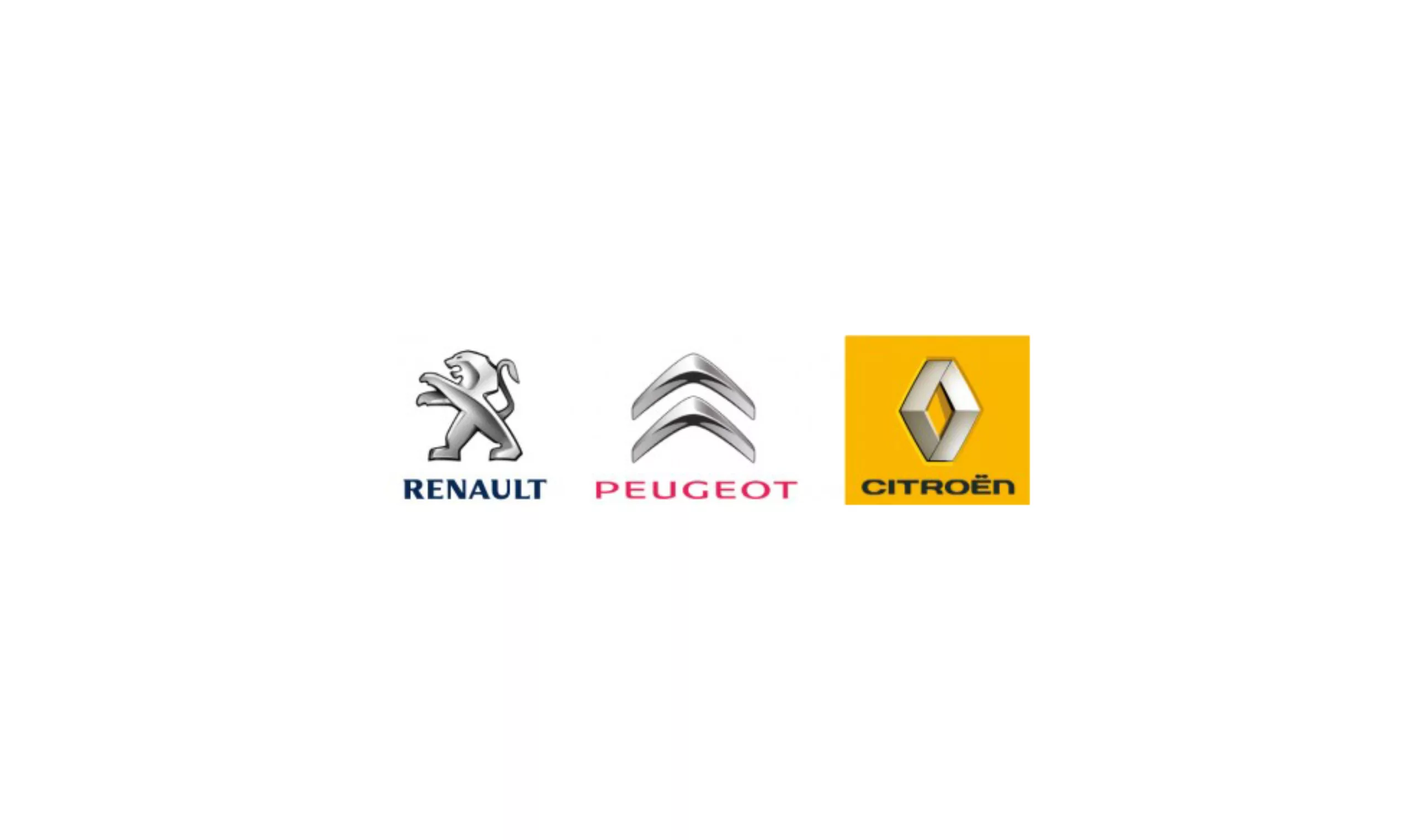
Logos: Peugeot vs Citroën vs Renault
You’d think this blog was all about car logos…
You’ll think we’re obsessed with the Peugeot logo…
But never mind, I’ll have a go…
In the space of three years, all three French manufacturers have revised their visual identities: Renault in 2007, Citroën in 2008, and Peugeot in 2009.
What a strange impression it all makes: chrome, chrome and chrome…
When I think that some agencies had to sell them a guarantee of a new logo that was dynamic, futuristic, reassuring and, above all, “original” and “innovative” compared to its two other competitors, for a lot of “kopeks”… I’m… er… kidding… For example, Citroën’s new chevrons were designed by an agency called “Landor”. It must be a metaphor for the effect they have on their customers… 3 photoshop effects, a lot of bleuf and then you put the customer to sleep…
To convince ourselves that they share the same genome, let’s mix a few things together…
However, to put things into perspective, it’s important to remember that Citroën and Peugeot are part of the same PSA group, which could explain why the “T1000 in Terminator 3” effect is the same. And I’m not even talking about typographic choices…

And as we’re likely to be called unpatriotic, here’s a list of chromed car logos. Can you find the few brands that haven’t used this trick?
… And that’s without mentioning the car logos with a circle (protective circle or metaphor for the wheel?). In short, without wishing to launch into a full-scale criticism of this or that logo, what I find regrettable is this standardisation, which is sadly leading to the impoverishment of the signs that make up our graphic landscape.
On the subject
-

Groupama’s new visual identity, a logo in the open countryside
Groupama has just unveiled a new logo that updates its graphic design by abandoning its campaign in favor of a “startup” aesthetic.
-
From surnames to acronyms: creating a brand name from letters
From founders’ surnames to initials and acronyms, brand names have always oscillated between abstraction and familiarity.
-

The UN logo takes on water during COP28
For COP28, two designers have come up with a new UN logo showing the rising sea levels and the future disappearance of much land and coastline.