Y2K trend, the 2000’s style is back
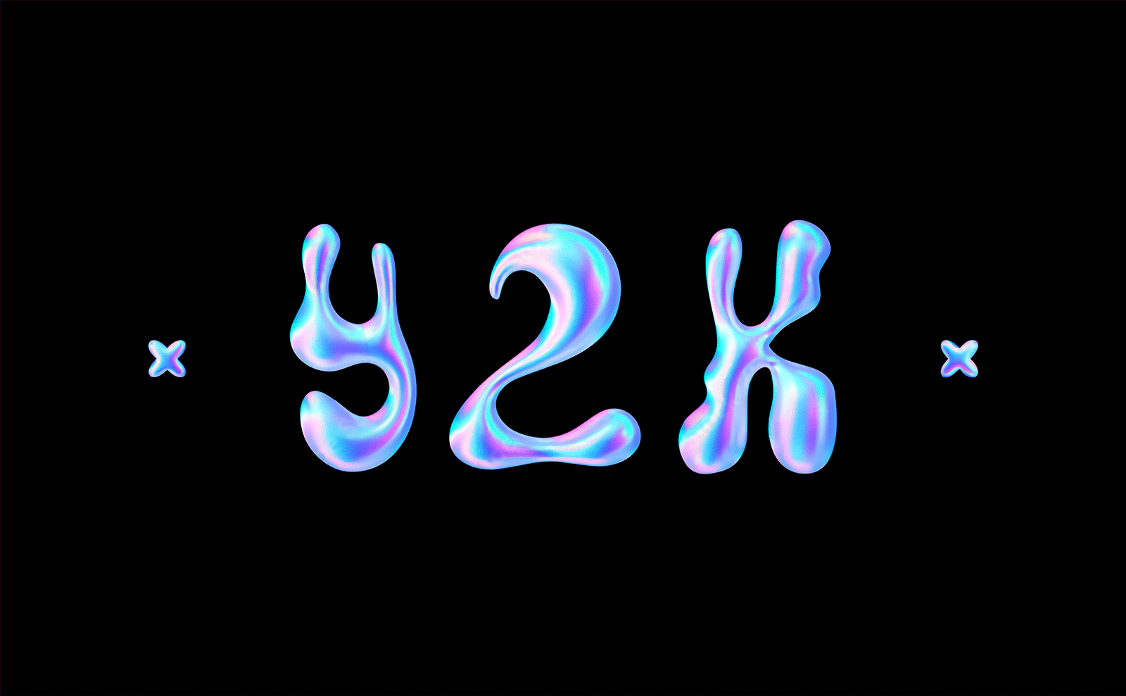
The Y2K soap bubble
The 2000s had the fragility, lightness, and iridescent reflections of a soap bubble… Also known as the “noughties,” and now “Y2K” (for Year 2k, year 2000) already represented a time of frantic consumption, carefreeness, embodied by the peak of limitless marketing. In that golden age, we created for the sake of creating, to always offer more, in size or beauty… just because it was cool. Most of the time, it didn’t matter how or by whom it was made, if it was truly useful, if the advertisements offended a certain audience, or were misleading. Some were already offended by this apparent devouring frivolity, pointing out the excesses of consumerism and its impact on society, such as Canadian author Naomi Klein in her book “No Logo,” or with the character Tyler Durden, from Chuck Palahniuk’s novel and portrayed by Edward Norton in the film “Fight Club.” In 2000, we were just beginning to talk about “sustainable development” and “fair trade,” often in the form of crude greenwashing.
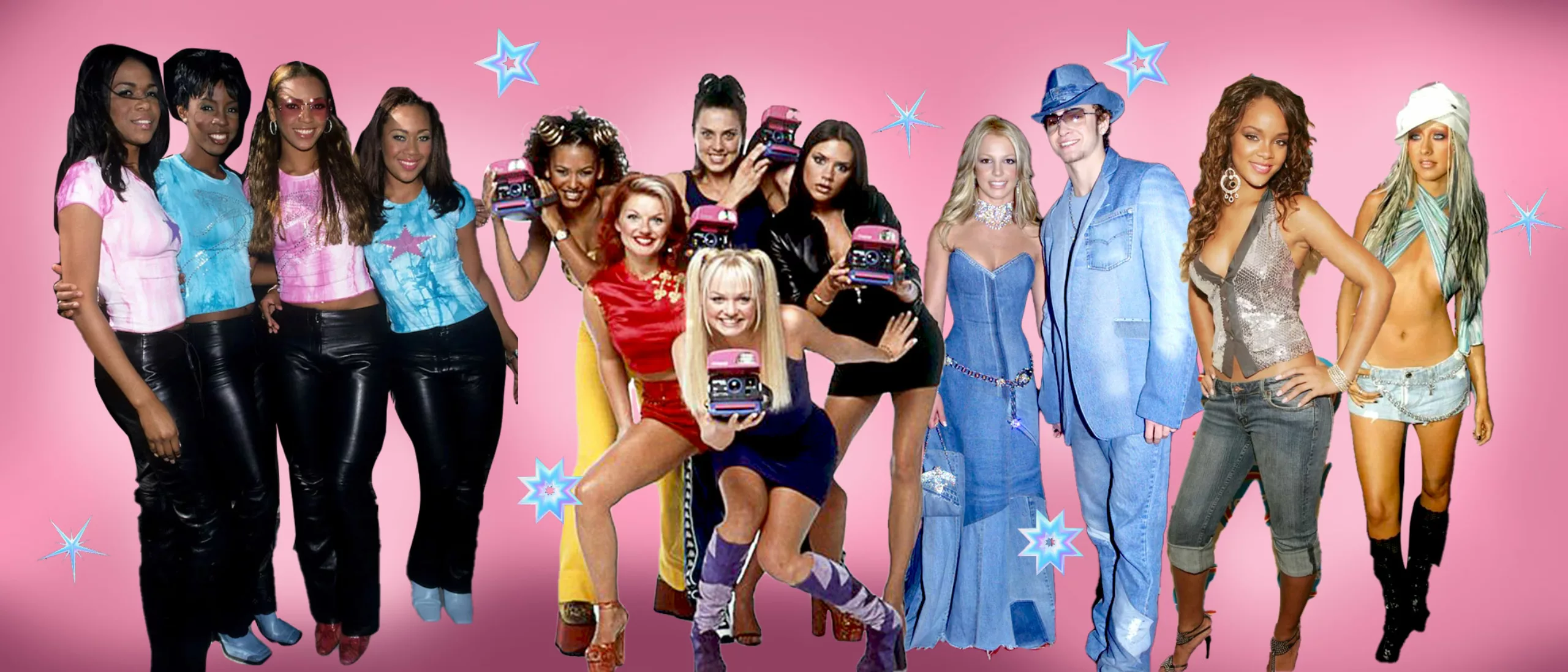
Far from being better than how it used to be, this market was nonetheless glistening with worry-free holographic plastics and bubble gum-colored skin-tights, pearlescent eyeshadow with a thousand reflections, rhinestones, at ease in baggys and skin-tight tank tops. The 90s-2000s deliberately abandoned the bourgeois or distinguished style and gave prominence to subcultures, whether they were military, streetwear, RnB, hippie, or tribal. The style of the 2000s favored individuality and custom style to stand out from others, in the image of the iconic Spice Girls, or conversely, to show belonging to one’s tribe. Marketing rode these trends, pushing individuals to stand out while belonging to clans.
A future with a Y2K bug
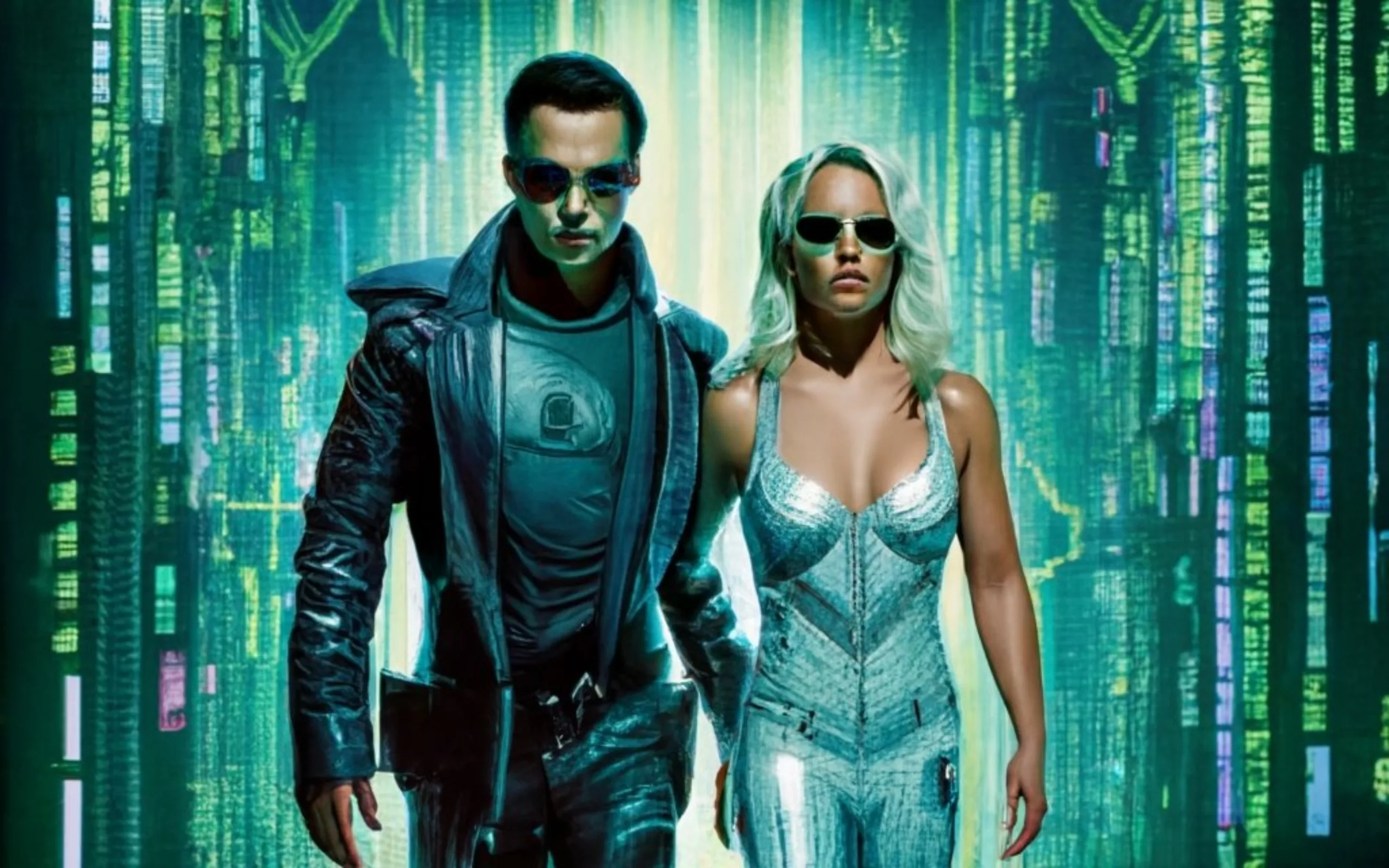
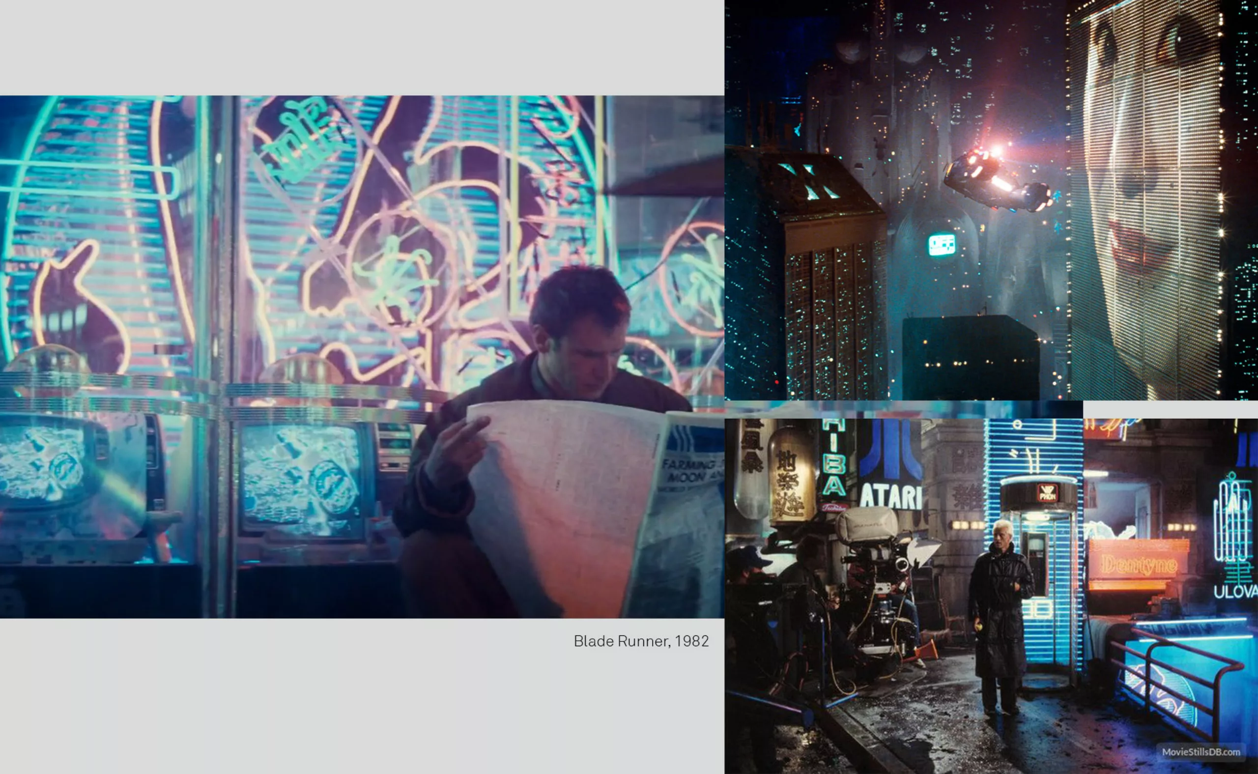
However, the 2000s began rather poorly… Between the anticipated fear of the Y2K bug and the 2001 World Trade Center attacks, digital and terrorist threats worried and weighed on the West. The future was portrayed as resolutely digital, with flying machines, avatars, and sophisticated technology: the flip phone. It had the colors and ambiance of the 1982 “Blade Runner” (the story takes place in 2019): a cold, metallic, and humid dystopian world with blue and pink neon lights. Neo and Britney waved their arms in their latex suits, projected into a slightly unsettling parallel universe where numbers coexist with letters. The iridescent silver materials, which were in vogue, were inspired by the 60s, the era of the heliophore and the first steps on the moon. The future was (already?) so retro…
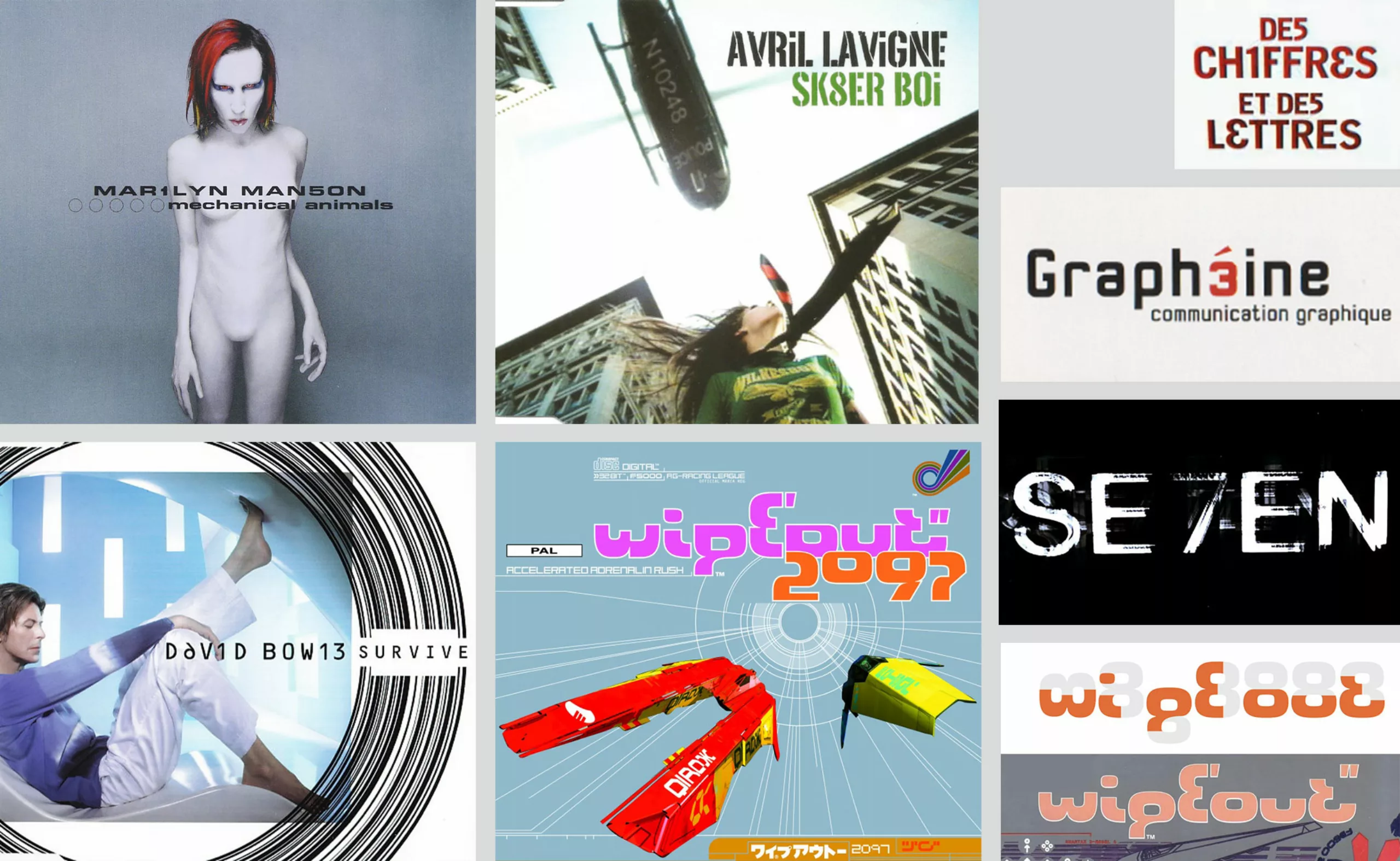
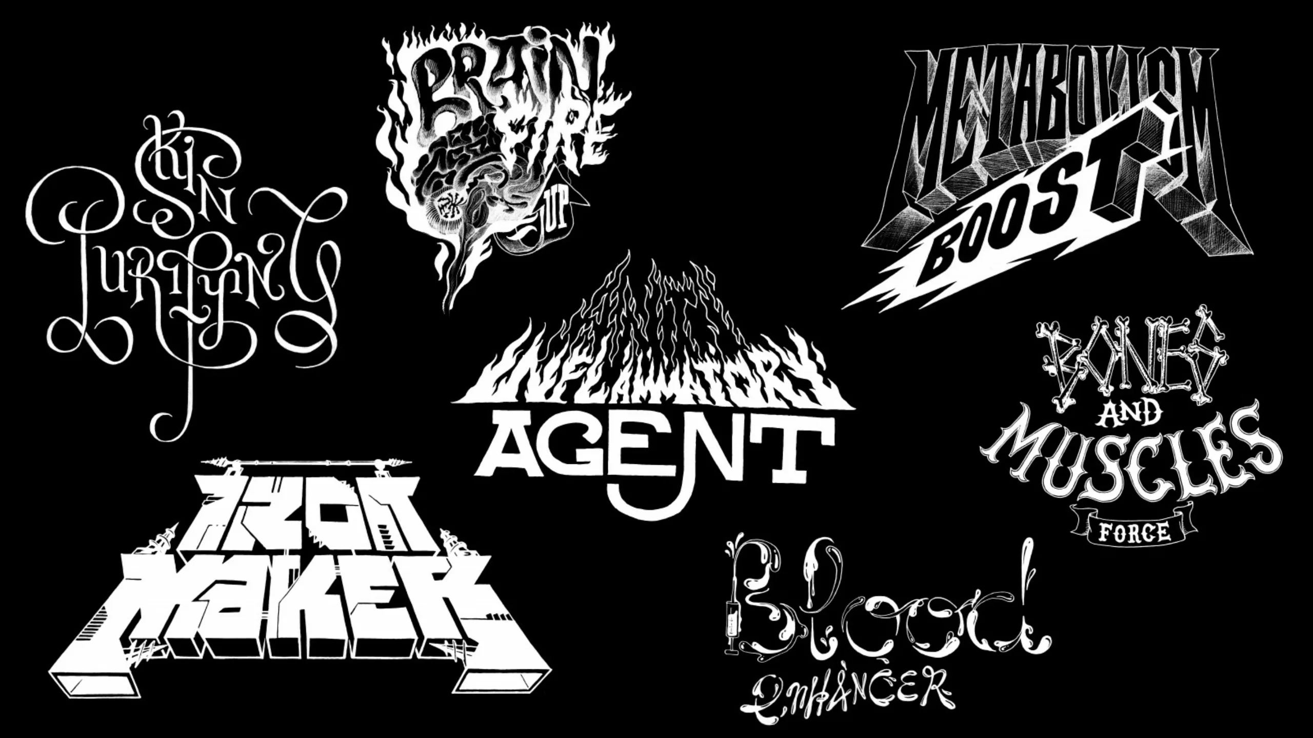
Digital language of numbers and letters
Like a virus, the coded language of programmers infiltrates the world of letters until it comes to replace them. From Mar1lyn Man5on to D6v1d Bow13, passing through Se7en and graph3ine (us too), the digital world colonizes the existing, like a (meta)verse, transforming the roots of language. Record covers are adorned with strange graphic universes, between liquid typography and eccentric visuals of Björk, or the surrealism of Storm Thorgerson. The innovative and experimental styles of Neville Brody and David Carson still influence the graphic scene since the 90s: they play with typography, break the traditional rules, and distort characters to deconstruct the existing and visually mark the transition into a new era.
Lightness and joy
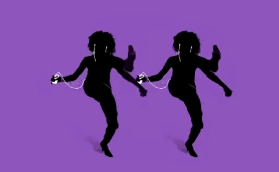
To counter these threats and worries, the 2000s deliberately became a joyful and practical decade, where heavy and bulky accessories were discarded. The Nokia 3310 replaced landline phones (before being knocked out by the iPhone), the CD player replaced ghetto blasters, USB drives replaced floppy disks, and DVDs replaced cassettes… Halfway between digital and resourcefulness, we still talked to our neighbors in person or with a webcam, while playing with Tamagotchis on a pixelated black and white screen.
The initially timid but colorful and joyful birth of the iPod revolutionized the music world. The first iPhone followed 6 years later with its rounded edges and slippery like soap, with apps with ultra-realistic and rounded visuals as well. The digital world was still very “tangible” at that time: its roundness was meant to be reassuring and soft. By the end of the 2000s, limited phone subscriptions that required sending coded text messages were a thing of the past, as was slow and expensive internet. Facebook, Twitter, Google, YouTube, or Airbnb arrived from Silicon Valley: they promised better connections with others, and we believed it.
Evolution of brand identities, from monolith to arabesque
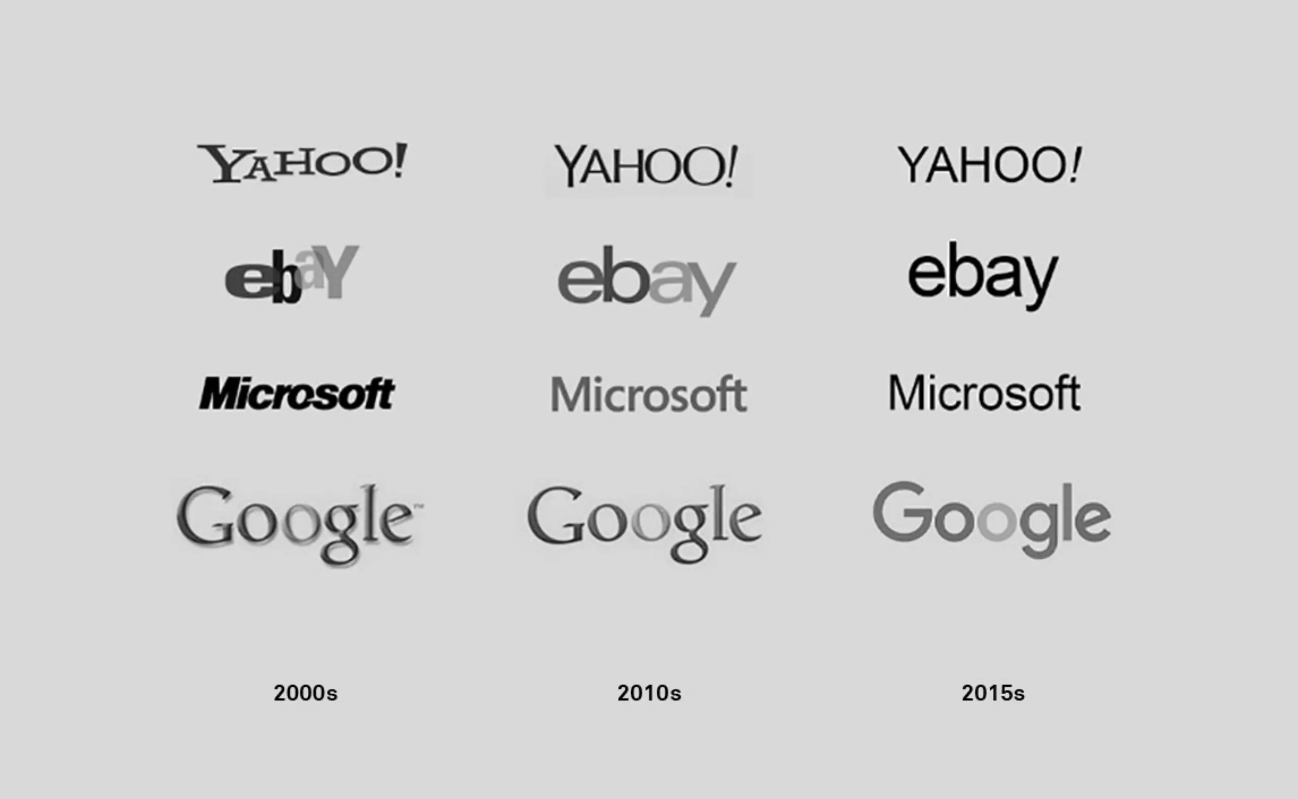
A jump back in time before arriving at the Y2K trend revival. From around 2010 to 2020, the majority of brands were characterized by “flat” codes inherited from modernism by constantly repeating the same recipe with variable ingredients, stemming from Silicon Valley startups: sans-serif typefaces with stick linework, strict grids (due to the web), and a few complementary and vector colors. It was necessary to stand out in a messy and noisy world, to establish a frame, to assert oneself as a straight and solid monolith in the midst of chaos. The minimalist and geometric aspect of these brands infused society to the point of being taken up in almost all areas of visual identities, from fashion to mass distribution, reinterpreting the same recipe with some variations, resulting in timeless identities, but sometimes perceived as “cold” or “inhuman,” losing their singularity. Think of Uber or Saint Laurent, for example. See how Google or Yahoo! lost the bounce of their letters, for example, or their volume, to align neatly as they became immense institutions.
Eternal repetition: organic or technical, singular or standardized?
The shift from flat to exuberance, or from standardized to singular, is nothing new. We can find the same shift in the exuberant era of Art Nouveau in the early 20th century. Art Nouveau (= singularity) exists in response to the austere advent of machines from the industrialization of the late 19th century (= standardization), which had given rise to the absence of ornamentation and modernism in the 1920s. This absence of ornamentation (= standardization) was set aside by the visual exuberance of the psychedelic and hippie years of the 60s-70s (= singularity), then taken up again by mass consumption which added another layer (= standardization of singularity). Minimalism, born in the 1960s, only exists in opposition to an excess, and reciprocally: an optimistic and spontaneous explosion of colors and arabesques always ends up shaking up a world that is too structured and serious, as if one were suddenly surfacing after a long apnea. It seems that we are constantly oscillating between what could be called “organic” (handmade, singular, colorful, in motion, unique…) and “technical” (straight, standardized, rigorous, monochrome, in series…), perhaps unable to find any semblance of stability at any tipping point. The Arts & Crafts and the Bauhaus had nonetheless found a balance before tipping back into the organic for the former, and into the technical for the latter. The 2000s and the Y2K revival are a way to tip back into singularity, the organic, after having long bathed in a certain standardization.
I want some fun in Y2K
In a visual universe that has become too serious due to graphic simplifications, the trend is now towards fun, noise, roundness, and enormity, in contrast to the 2010s. The 2020s mark the explosion of this almost visually standardized bubble, and since COVID, things have slowly shifted. More or less forced to work for the community or stay at home during global lockdown, the more privileged have been able to reconnect with others, their loved ones, their neighbors, their desires… others have been excluded from all social contact. More intimate, festive moments are now experienced in smaller numbers, at home or with others, or even online. This results in a need to live again, to have fun with lightness, to weave social ties, to be closer to nature or others (but also from a distance, which is good), as if to mend social cracks and global anxiety. Fun is back, but is it really serious, and sustainable?
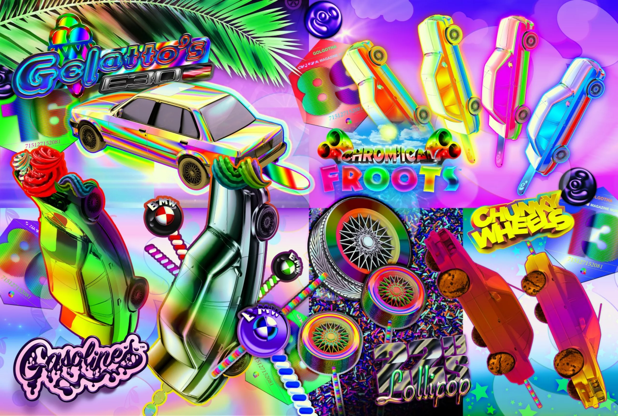
New graphic and visual trends have emerged, and gradually brands are turning either towards a distant past, their heritage – for reassurance’s sake – or towards a promising future, space-age electric. Sometimes even both at the same time. Failing to invent something new, we recycle! And this recycling now has the look of the 2000s… French studio Golgotha embodies this Y2K retro-futuristic graphic design, in a profusion of free forms, flashy colors, gradated reflections, and an emphasis on subcultures.
In 2023, in the wake of global post-lockdown, the youth wants to have fun, to breathe, to feel light, and still dances to “L’aventurier” or “Freed from Desire,” retro hits from the millennial era that are now cherished by the Y2K generation. The Spice Girls and their style are back in vogue, and Britney has finally been liberated! In the year 2000, we moved from reality to the virtual, today we integrate the virtual into reality. Networks like Snapchat, Instagram, or TikTok incorporate futuristic filters that stick to our skin and immerse us in other dimensions.
As always in the world of fashion and imagery, we take the same things and start over… obviously keeping only the good from that time, and forgetting that society has evolved in the meantime. We find again this atmosphere of a bubble ready to burst, offbeat, futuristic, digital, but with the advent (and burial?) of the metaverse, AI, and Elon Musk’s long-term projects, this time. Our future looks like even more extravagant science fiction and much less tangible, and seems both so far from the present and integrated into reality.

Capitalism seems to digest trends or movements only to regurgitate a watered-down version, for purely mercantile purposes. We mentioned the standardization of singularity earlier. We want to do just as much as in the 2000s, but without making people anxious, and it shows on our screens. Failing to live in a world characterized by lightness; we create it, we escape into a parallel world, bright, immaterial, and futuristic, iridescent thanks to ultra-high definition in 4K. Neo is no longer there, too dark, but Barbie has made her big comeback, taking three generations with her in a breath of pink and glittery fresh air that advocates consent and gender equality.
Back to the future, today’s Y2K trend is iridescent
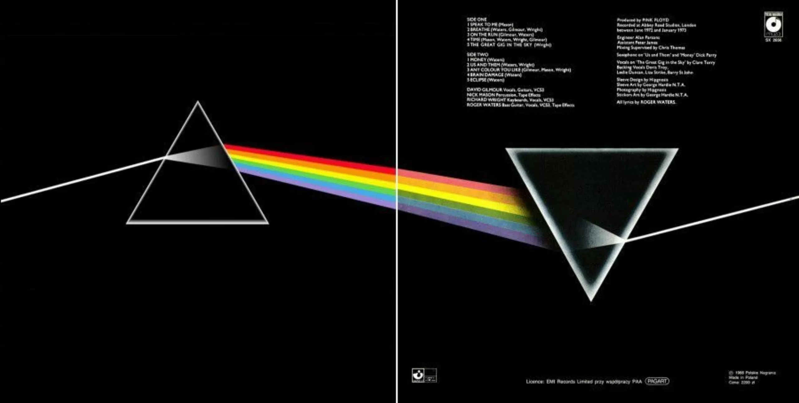
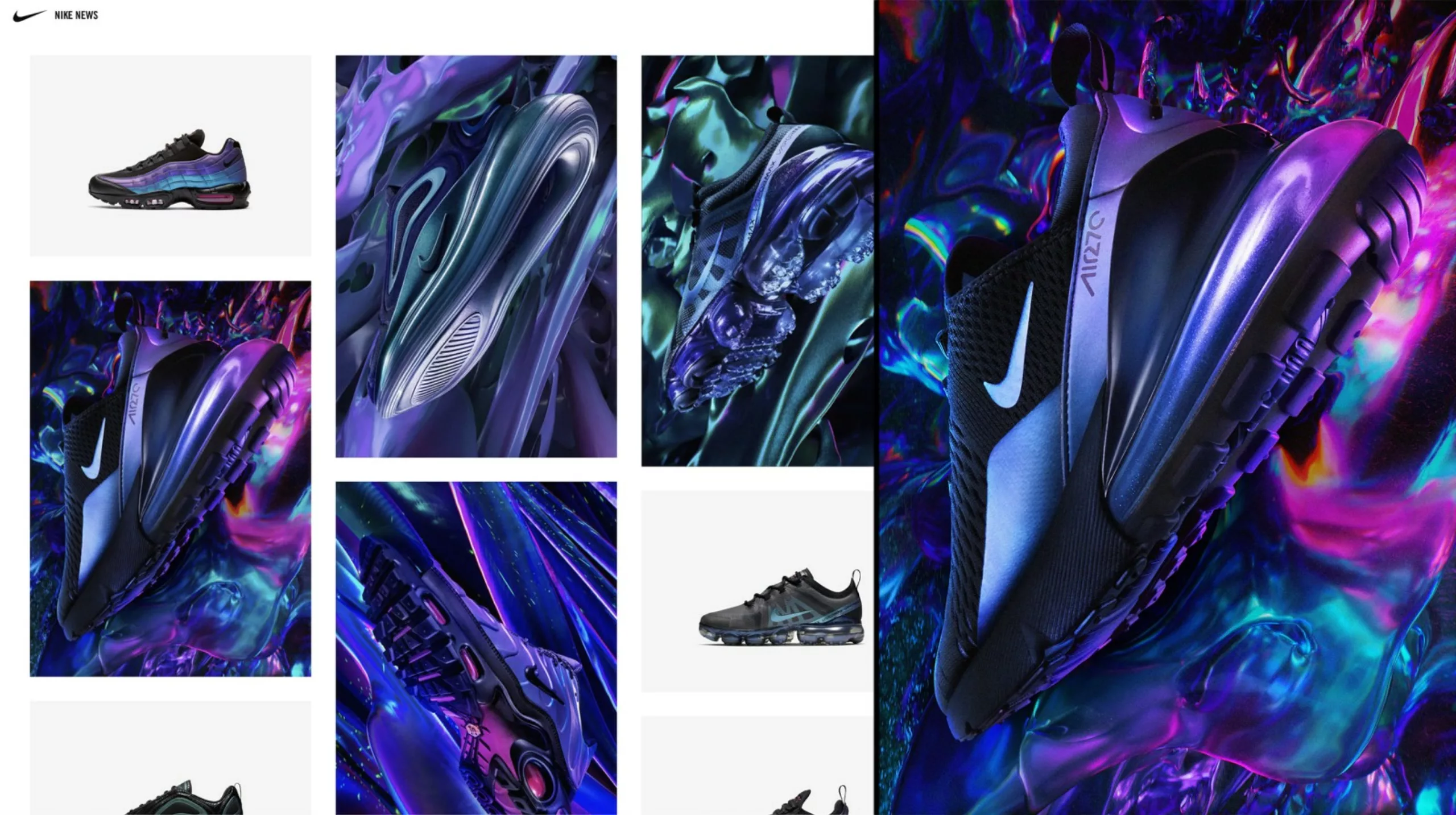
In 2020, WGSN (the leader in consumer trends) declared “milky white” as the trend color until 2025. The organization recommends accompanying this milky white with iridescent reflections, which envelop everything while letting it be seen in a tactile translucency. Milky white is a non-gendered and neutral color, the origin of life (think of body fluids or milk…), and iridescent carries within it the prism of all possibilities (like the LGBTQIA+ rainbow flag)… Iridescent embodies our time so well: it is the ultimate magic, the intangible rainbow, the wings of fairies or insects that we can now imitate, it is the color generated by a prism like that of Pink Floyd… an ever-changing and elusive alchemical mixture.
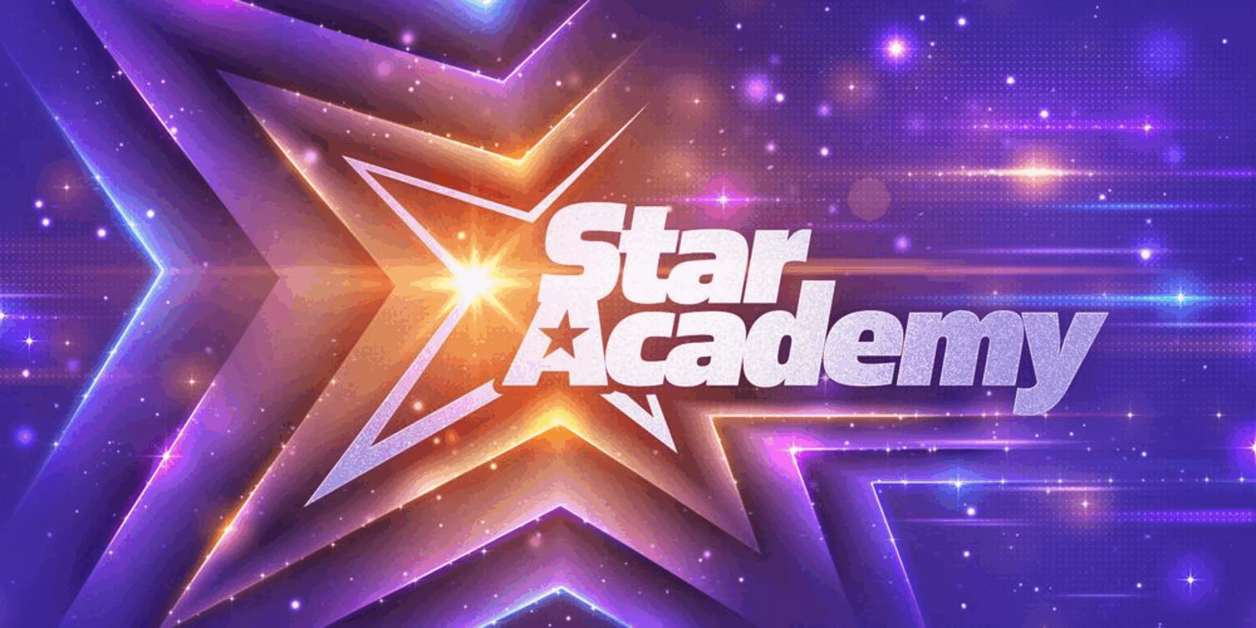
Iridescent carries within it the all-powerful creative, almost divine, which allows both to exist from nothing, to change constantly, and to be lighter than air, almost transparent. It is digital by essence. A major revolution, the Y2K color version of 2023 is now no longer fixed but transformable, with changing reflections obtained with 3D or virtual animations, and even embedded directly in our world through technological advances like augmented reality or bioscience; the latter revolutionizes the pigment industry with bacteria that reflect light. The real future! The Star Academy has understood this well and surfs on this mystical violet rainbow to celebrate its big comeback. We have gone from a Blade Runner universe to a warm and enveloping orange-pink-violet, more mystical, extraterrestrial.
Roundness, volume, bold, too much
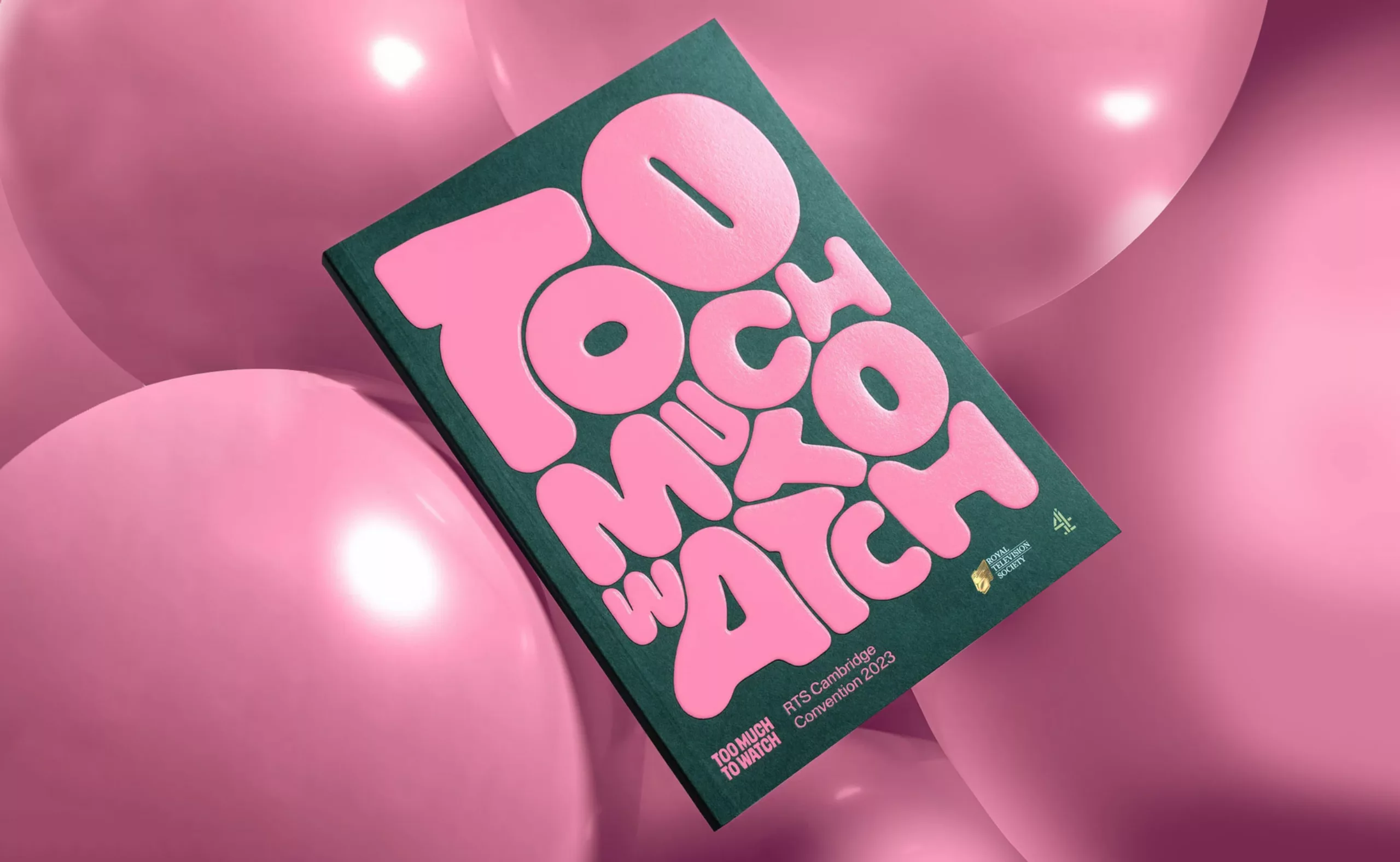
Obsessed with the past but turned towards the future, today’s fashion, visuals, and imagery are adorned with these reflections, mirrors, shiny silver, 3D and inflated materials that take up space – even all the space, spirals and colored pixels… as in the “too much to watch” identity created by Studio Kiln. It symbolized this enthusiasm for tech in the noughties, and that for AI and web 3.0 today. Optimism has rubbed off a bit, and we are entering the metaverse with more caution.
Graphically, we now want to break free from constraints and turn towards handmade, “too much,” roundness… to rediscover the reassuring, light, and fun codes of the Y2K or even the 60s or 80s. We are gradually moving from an era of rigor to an era of excess, from straight lines to arabesques, from the static of paper to the morphism of digital 3D, from duotone to holographic iridescence… The new Patreon logo embodies this change.

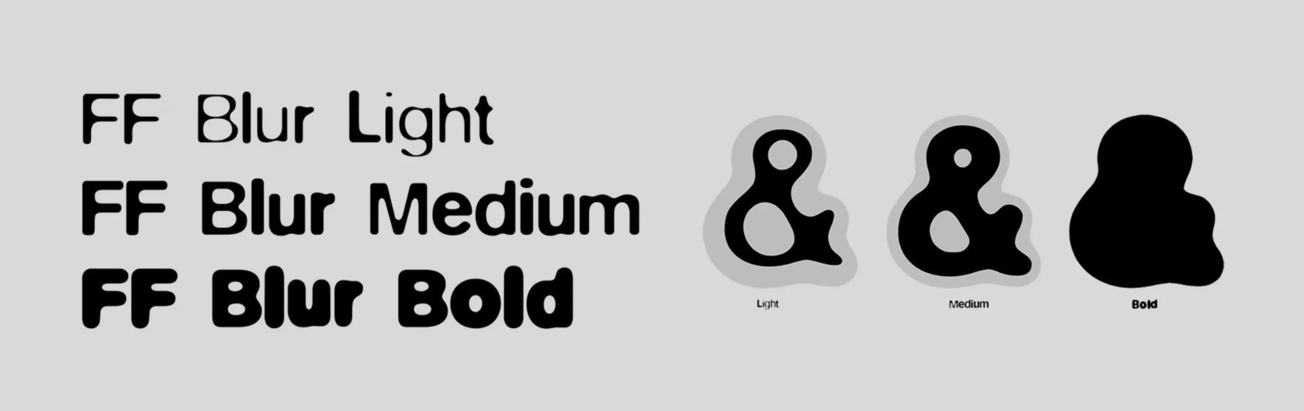
The community platform that supports content creators has abandoned its identity in geometric stickers (a rectangle and a circle, to form a P) to now offer an evolving and overflowing logo. The typography takes up the codes of Neville Brody’s Blur, from 1994 (first image below), proposing, like it, a boldness that gradually takes up all the space to make the letter disappear and transform it into a shape.
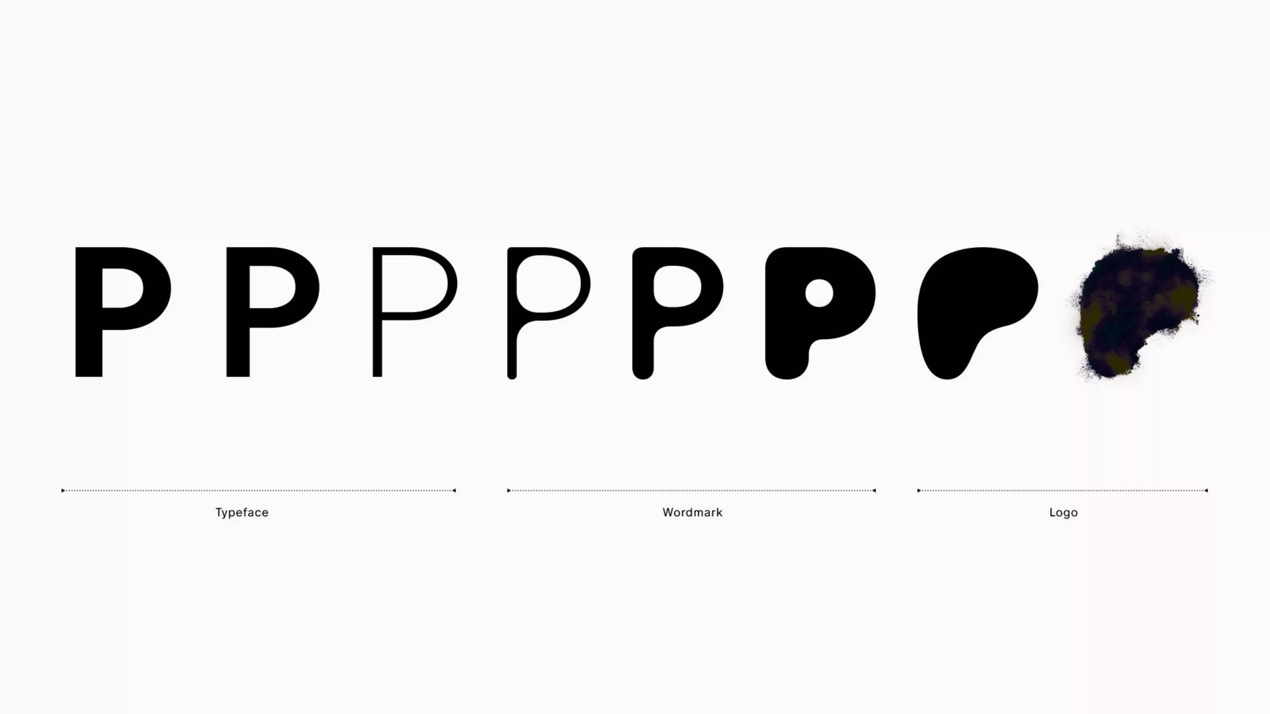
Now a form, it is a receptacle for creativity, symbolizing individualism and multiple possible means of expression.
Will the Y2K trend last? Probably not. What is more certain is that graphic identities are no longer thought of only in 2D but in volume, constantly in motion. More rounded, they are a graphic way to show themselves as more intimate, human, with a soft and bouncy design that makes you want to touch it or interact with the user behind the screen. The new Y2K creations draw inspiration from the retro world of the 2000s while being hyper-realistic and connected to reality, with avatars and filters that merge the two worlds. Generative AI also disrupts our acquired knowledge today, by offering “new” visuals based solely on existing ones, asking the eternal question of the source of creation and the origin of our inspirations.
Perhaps the oscillation from one extreme to the other is not really a balance problem after all, but the engine that drives us forward. And if everything was nothing but a variation of an eternal recurrence?
On the subject
-

Flat design vs Skeumorphism : The game !
Flat design versus Skeumorphism, a brief analysis of the latest trends in web design and communication. Google, Apple and Microsoft, 3 case studies under the microscope!