Typography and ecology
Over the past few days, the news has been all over the media : a 14-year-old boy has recommended the use of the “Garamond” typeface to save the American government up to $136,000 million.
It has to be said that the announcement has all the makings of a dream : a little “prodigy”, a typeface that’s over 450 years old, and a few thousand trunks of dollars in savings.
a quick reminder of the facts
The story begins with a simple school assignment to save money at his secondary school. The 14-year-old (Suvir Mirchandani) decides to look into the problem of ink consumption when printing documents.
“Even if printing costs have been reduced in recent years, they are still high, and a small reduction in this type of expenditure, thanks in particular to a change of font, could lead to considerable savings”, explain the student and his teacher. The student points out that, for the same quantity, ink is twice as expensive as perfume.
What would be the ideal typeface to save the most ink ?
According to the schoolboy, it would be Garamond. He obtained this result using APFill® Ink Coverage Software, which measures the amount of ink used for each letter during printing. He deduced that a saving of 24% could be achieved, which would represent $21,000 a year for his establishment, and as much as $136 million for the entire American administration.
Incidentally, the US government spends a staggering $467 million on printer ink, a staggering figure !
Why it’s a good question, but a bad answer…
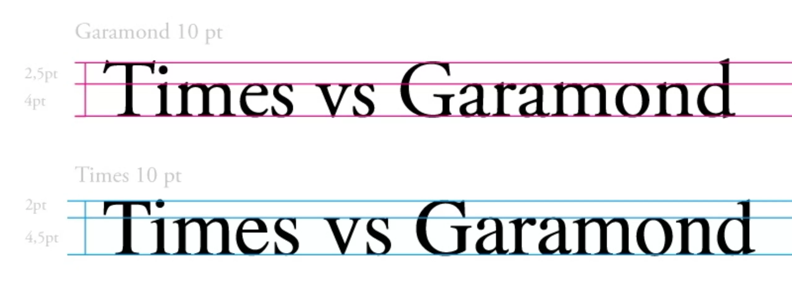
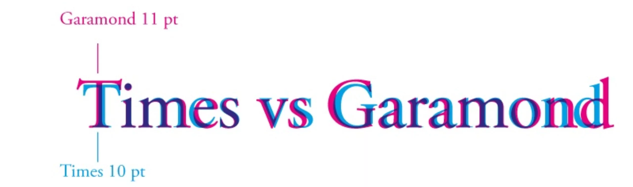
To compare the “inking” rate of two typefaces, it’s not simply a question of comparing the ink used for two texts printed in 10 pt. type. Indeed, the size of a typeface is quite relative, with the x-height (the name given to the height of the stroke of a lowercase typeface, without the lowercase staff or jamb) being relatively variable according to the typographic design. In the case of Garamond, for example, this x-height is very low, making it necessary to increase the size of the typeface to obtain a size equivalent to that of another typeface (and thus maintain an equivalent level of legibility).
Here’s a demonstration.
However, we can only praise the media coverage of this news. It has the immense merit of placing typography at the heart of the major issues of our time. Although typography is by nature a discreet discipline, it nevertheless remains the most useful expression of graphic design in the world, that of visually representing thought, of being a “conduit” for information and ideas. In this respect, the type designer has an immense responsibility to ensure that each of his “fly-legs” has a “positive butterfly effect” on human thought.
So alerting the general public to the value of paying attention to these tiny typographic variations is already a big step !
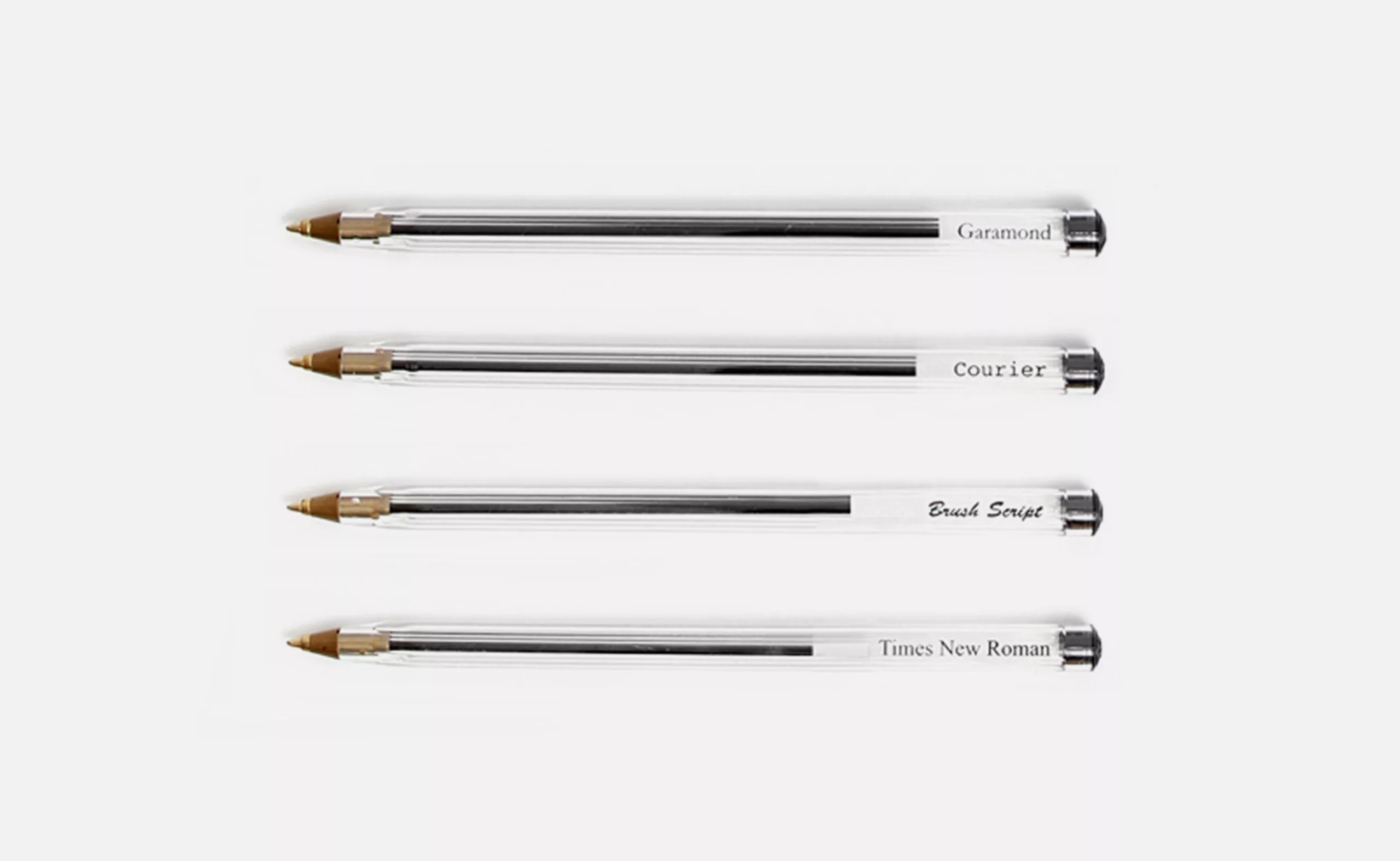
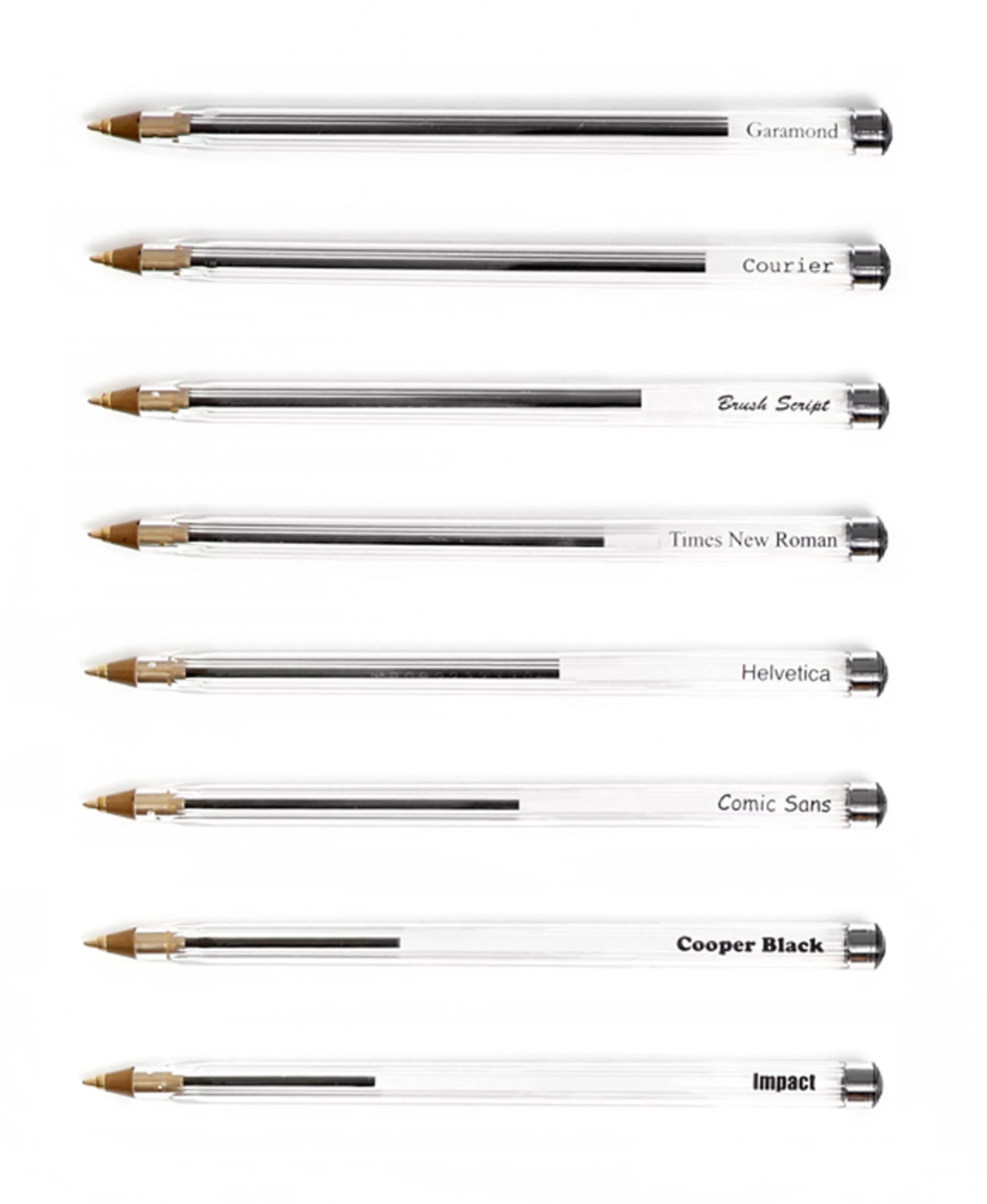
Ballpoint pen technique
Returning to the question of ink savings, two students had fun “coloring” different typographies with BIC pens. One pen per typeface is used to “visually” measure the amount of ink used…
An effective, if unscientific, demonstration…
Which Garamond are we talking about ?
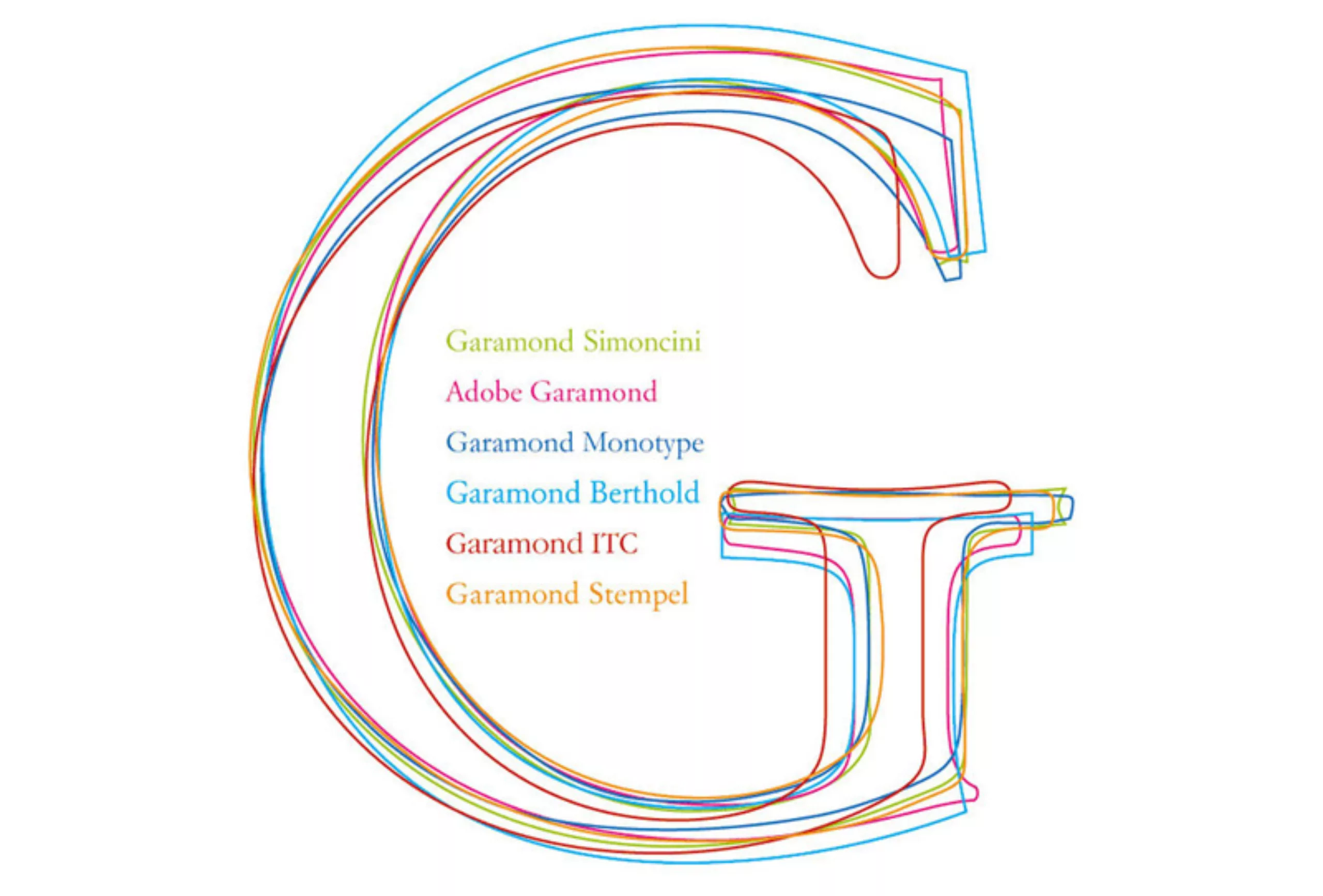
Obviously in the public domain, anyone can create their own version of Garamond. Today, there are at least 6 versions, some of which, it has to be said, have very little in common. We can start by mentioning Francesco Simoncini’s version (Simoncini foundry, Bologna, 1958), then that of the Stempel foundry (later Linotype) in 1924, Fritz Max Steltzer’s Garamond for the Monotype foundry in 1922, Tony Stan’s Garamond in 1970 designed for International Typeface Corp, and more recently Adobe’s, designed by Robert Slimbach in 1988.
An article by Peter Gabor discusses the different versions of Garamond in detail.
In short, given the differences between these versions, we can agree that they probably don’t all have the same inking ratio !
A little detour : It’s worth noting that the original Garamond punches were carefully preserved in the famous cabinet des poinçons de l’Imprimerie Nationale. Since 2005, when the Imprimerie Nationale left the Paris buildings, the Cabinet des Poinçons has been stored in an industrial zone on the outskirts of Paris, and then, for lack of a project, moved to the Imprimerie Nationale site in the “Flers-en-Escrebieux” industrial zone (near Douai). So I’m not the only one to think that they don’t really belong there, and that they would be much better off in a museum accessible to the public, students and researchers !
You are also invited to visit the superb “http://www.garamond.culture.fr” site
The question of legibility
One of the most important factors in typography is of course the measurement of legibility, i.e. the eye effort required to identify letters. Eye fatigue is the true measure of legibility.
Type designer Ladislas Mandel (1912-2006) made this his life’s work. He analyzed how a reader apprehends a typographic page, reads the words (physiological aspect) and deciphers the information through his cultural filters. He developed a veritable “science” of typeface legibility, experimenting with very small sizes, down to size 3 (1.05 mm) for directory use. It was obviously a question of saving paper (and ink).
To the question “How can so much information and feeling be conveyed in so little space ? Mandel replies : “We think that in small bodies we can’t see the letter, but yet we “read” it, in the overall reading we make of words. It is the “formal constants”, the alternations and rhythms, that condition the first cultural view we take of typographed words – just as we do of any other object. It’s this first “cultural” glance, a sympathetic agreement, that should encourage us to go further. This sensitivity to formal language allows Ladislas Mandel to express a certain, recognizable sensibility in his forms, so that the reader finds himself there, “vibrating” in resonance. It’s like a familiar “typographic landscape”, where we feel at ease, where we are not afraid to get lost. In which you can find the information you are looking for with complete peace of mind : a single, unique telephone number.
( Excerpt from an article published in Etapes magazine in 1999 )
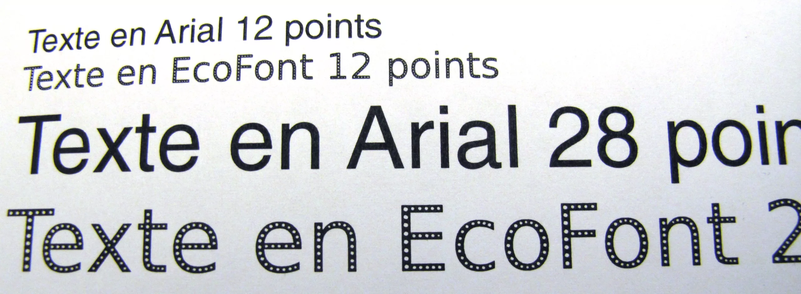
“eco-font” software
One of the most effective ways of saving ink is with Eco-Font. software.
Basically, it’s a simple idea : make holes in typography to save ink without affecting legibility. From a simple typography with holes, the concept has evolved into a printing software that allows you to print with any typeface that will be “perforated” at the time of printing. This means you can keep your favorite typeface (e.g. “Comic sans”) while doing something for your company’s wallet (and the planet…).
Common sense is economics !
In addition to using an “ecodesigned” font, there are many other ways of reducing the environmental impact of printing. Most of them are simply “common sense”.
- Dematerialize your documents.
An e-mail addressed to the right person will be more economical than a letter sent by post.
It should be noted that the practice of copying an email to 10 people is still 10 times more polluting. According to ADEME, “reducing the number of e-mails systematically sent to your manager and one of your colleagues by 10% in a company of 100 people saves around 1 tonne of CO2 equivalent over the year”. - Print on multiple pages and on both sides of the page.
- Optimize page layout and eliminate unnecessary text: pages with one line of text, colors, ads, etc.
- Use high-performance printers with separate inks and cartridges without integrated read heads.
- Set printers to economy mode by default, and use draft mode whenever possible.
- Recycle ink cartridges and use reconditioned cartridges, which are up to 50% cheaper than conventional cartridges.
- Reuse paper (reverse side) for drafts.
- Use 100% recycled paper, now equivalent in quality to normal paper, or eco-certified (PEFC, FSC, etc.).