
Miles Newlyn, cool design
Today in our series of interviews with the stylus gods, I'm pleased to bring you an interview with a highly regarded logo designer from around the globe, Mr Miles Newlyn...

Miles Newlyn
Once again, if you don't know his name, his work will certainly be very familiar to you. Unilever, Suez, Honda, Société Générale and Skittles are just some of the logos this Londoner, also renowned for his typographic work via the X&Y foundry he created, is capable of. A freelance designer, Miles Newlyn has never worked for an agency, a rare fact for a graphic designer of his stature.
Taking a fresh, unconventional look at logotype design, Miles Newlyn agreed to answer ActuLogo's questions.

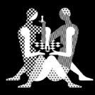
Tate Gallery logos
ActuLogo : What do logos represent for you today ?
Miles Newlyn : The role of a logo today is simply to be recognizable, memorable and distinct from others. It's an organization's identifier.
AL :You've designed many world-famous logos, including those for Unilever, Suez and the Tate Gallery. What is your creative process for a logo?
M. N. : I'm often asked to describe my process. I don't have one. What surprises me is that when I see what I've done, many people claim that there's a certain process that led to the result. But creativity isn't a process, it's a state. The best I can say is that I listen, I give my full attention to the client. I don't let anything get in the way of that attention. There's no agenda, nothing I don't want to complete, there's no need as long as I enjoy doing it. If the work is done with joy, awareness and confidence, it will be the best you can do.

Works by Miles Newlyn
I try to ask as few questions as possible, knowing that questions will always include hidden answers. It's best to let someone talk and listen. Do this face to face in a peaceful, neutral situation. I admire enthusiasm, and people's enthusiasm, whether they're clients or colleagues, will lead me to better work.
AL : What do you think makes one logo better than another?
M. L. : Its freshness.
AL : If you had to choose just one logo in the history of design, which would it be?

The Smiley by H. Ball
M. L. : The Harvey Ross Ball Smiley, because it makes me happy!
(This smiley, an icon of the 80s and 90s, was originally a logo created in 1963 for an American insurance company, for the modest sum of 45 dollars - Editor's note).
AL : How do you explain the evolution of many logos towards this "glossy", "Web 2.0" style?
M. L. : Apple's "gel" buttons have had a huge impact on logo style. It's also because the combination of logo and button offers an action, an interaction to the consumer, just as icons on a computer desktop offer computer actions.
AL : How do you see logos evolving in the future?
M. L. : The future evolution of logos will depend on the evolution of names. I don't know why, but people think that logo and name are somehow independent, maybe it's because most designers rarely do naming.
I see a lot of "flexible" or "moving" logos, but they're all failures. The sooner designers stop using this crutch, the better.
AL : Was there a recent logo change that marked you?
M. L. : I confess I don't pay much attention to what other designers are doing, but I'm very interested in what Renault might be doing soon...
AL : a tip for novice graphic designers ?
M. L. : Be extremely cool, never look at other people's design work unless you're trying to copy it, understand that specialists can help you, seek the truth and laugh at trends.

Modena Condensed, one of the typefaces created by Mr. Newlyn
Share this post:
 San Serriffe typographic Island
 Design, creativity and oblique strategies!
 Tote bag, a new social totem?
 Sister Corita Kent, the Pop Art nun
 Donald Trump, the martyr who makes history
 Science Forum communication
 Heyraud – Visual identity
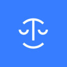 Mon-avocat.fr
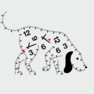 Time and creation #03 : in search of creative time
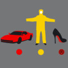 Color and brands are all about identity !
 A short history of book cover design – 2/4
 Hobo signs, the secret language of America’s wanderers
 Évry University open day: reveal your professional future!
Leave a Reply