
Saint-Malo and the new wave
Ah, Saint-Malo, its ramparts, its castle, its beach... and its new logo...
Subtly unveiled at the beginning of the month, the new Saint-Malo logo clearly marks a change in the city's image, a desire to be closer to the inhabitants than to tourists.
I have to tell you, I was skeptical at first. Not living in Saint-Malo but having frequented its streets and ramparts in my youth as many tourists, I had kept a memory much richer than a simple wave. Surcouf (no, it's not just an old computer shop), Chateaubriand, the fort, the cannons, the cathedral, the beach... all this showed a city with a very strong history and an omnipresent past, which we could have hoped to see in this new logo.
Saint-Malo is also Saint-Servan, on the Aleth Peninsula, Paramé, Saint-Ideuc and Rothéneuf, four communes that merged with the old town just 50 years ago.
And it is to mark this fiftieth anniversary that the city wished to modernize its logo, with the fierce intention of gathering all the districts under one and the same banner, even if it meant abandoning the representation of the arrow of the Cathedral Saint-Vincent, too "intra-murienne" to federate.
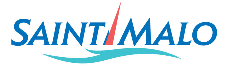
The old logo of Saint-Malo
In order to model this facelift, the city called upon a freelance graphic designer from the region, Katell Le Guillerm.
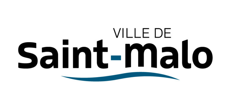
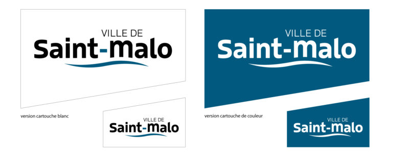
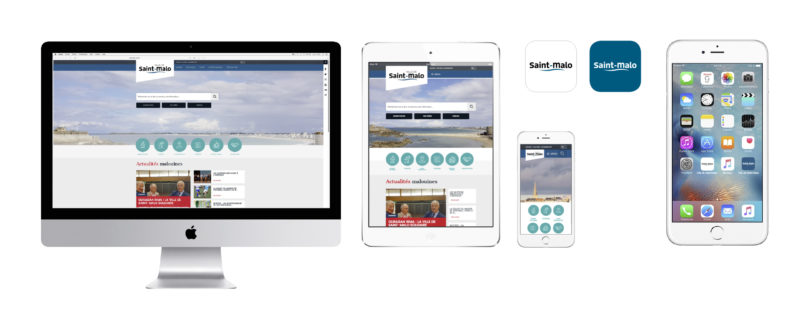
Visually, it's relatively simple (too simple?). The name Saint-Malo writes in lower case for the proximity, licked by a wave for the maritime side of the city. This wave, which eats the legs of the m, is finally the only vestige of the old logo, the only "historical" allusion. No architectural or symbolic allusion linked to the Corsair City, no jealousy.
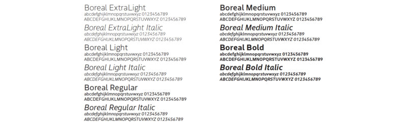
As for typography, it is the Boreal, by Jean-Baptiste Levée (Production Type) initially designed for Air Inuit.
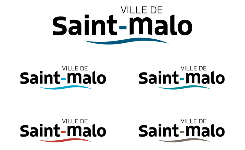
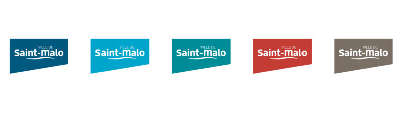
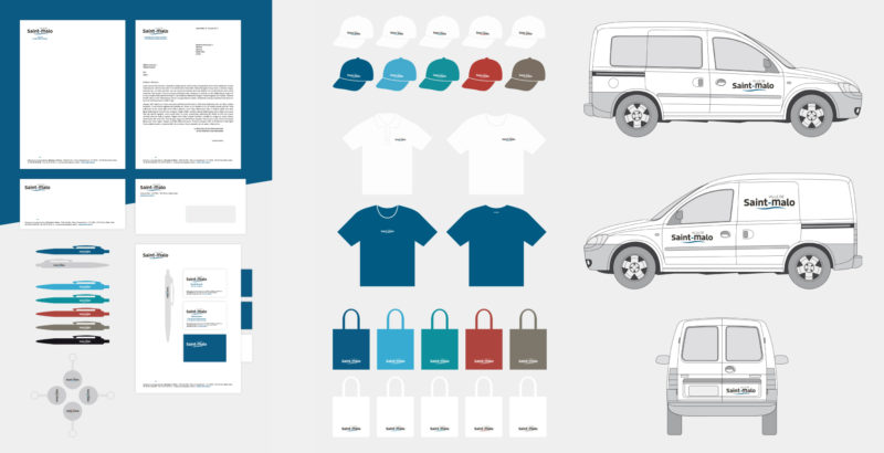
 As for the colours, it is obviously a blue that has been chosen, a deep shade in relation to the coastal situation of the city. But 5 different colours will be used: navy blue for the institutional, cyan for the economy and the marine environment, green for ecology, orange red for culture and communication, and brown for history and heritage.
We must not lose sight of the fact that this is an institutional logo, not a tourist one, because the Tourist Office of Saint-Malo has its own logo in relation with the Bay of Mont-Saint-Michel (which stirs the spirits as to the membership of the Mont which is, let us remember, Norman), released at the beginning of this year.
In short, this new logo and this new identity are simple, perhaps too impersonal, however, one could even speak of déjà-vu, so much this wave could have been used in many communes or logos relating to water sports, for example. We even saw this wave in the logo of a Pixar animation film...
The simplicity of this new logo can also be a strength and achieve its primary goal: rejuvenating the image of the city and bringing together the almost 50,000 inhabitants of Malouin, whether they are in front of or behind the ramparts, under the same symbol.
Share this post:

 San Serriffe typographic Island
 Design, creativity and oblique strategies!
 Tote bag, a new social totem?
 Sister Corita Kent, the Pop Art nun
 Donald Trump, the martyr who makes history
 Heyraud – Visual identity
 Auvergne-Rhône-Alpes Region – Brand architecture
 Villefontaine Design School – Brand identity
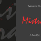 Typorama #04 : Mistral, a typography in the wind !
 Turkish graphics
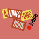 Visual identity project for the theater of Nîmes
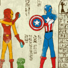 Superhero-glyphs are coming!
Leave a Reply