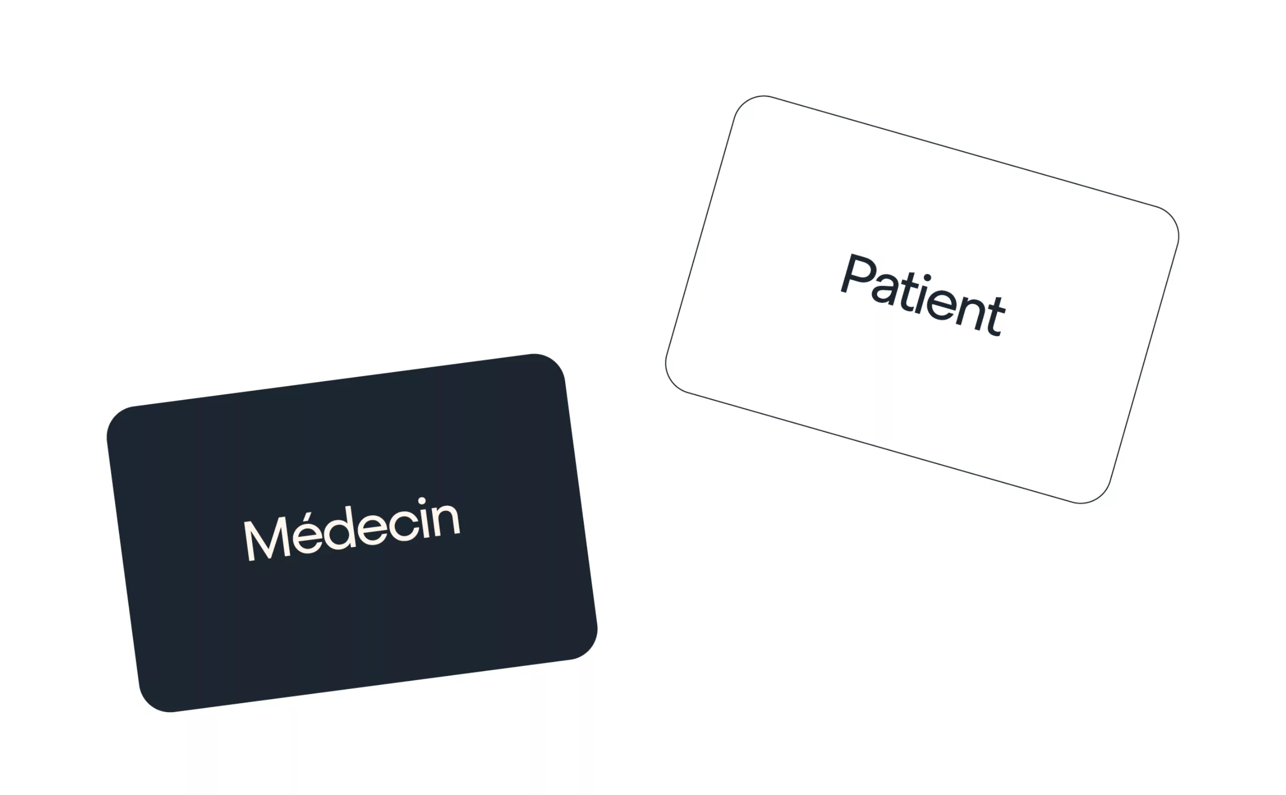
MadeForMed_Portfolio_Header-relation-medecin-patient

2023

MadeForMed
Sustaining family doctors in the digital age

MadeForMed is a medical communication interface created in 2014 by a general practitioner and two associates. At a time when more and more "GPs" say they're increasingly overworked, MadeForMed helps them manage the organization of their practices more efficiently, while being more present for each of their patients without sacrificing their life balance. The company currently employs around twenty people and supports over 1,600 GPs throughout France.

In 2023, MadeForMed became a mission-driven company, i.e. a more committed form of enterprise, which, beyond the economic aspect, decided to act for a societal cause. Their cause? Family medicine! They want to modernize it so that the patient/doctor relationship is at the heart of the healthcare system. This mission is the compass that has guided the entire strategy and the creation of this new visual identity.

Strategic challenges

For MadeForMed, family medicine is something precious. A family doctor is a doctor who is close to his patients, in whom they can confide, who knows their personal environment and takes it into account in diagnosis and treatment. It's a doctor the patient trusts, thanks to long-term follow-up over several years, and sometimes even several generations.


Unfortunately, with practice management, overcrowded waiting rooms, telephone calls and paperwork, many GPs are sounding the alarm and denouncing a deterioration in working conditions over the years. What's more, in the age of teleconsultation and online appointment-booking platforms, general practice is tending to become a consumer good like any other, turning the practice into a supermarket and the doctor into a mere prescription dispenser. In a society of immediacy, patients are less and less "everything, right away". They are also increasingly volatile, ready to flit from one practitioner to another. The doctor-patient relationship is gradually deteriorating, and ultimately the very profession of family doctor is under threat, as evidenced by the vocational crisis among young graduates.


MadeForMed's aim is to keep family medicine alive, while modernizing it so that doctors can remain close to their patients without sacrificing their lifestyle.


généraliste qui travaille

Strategy

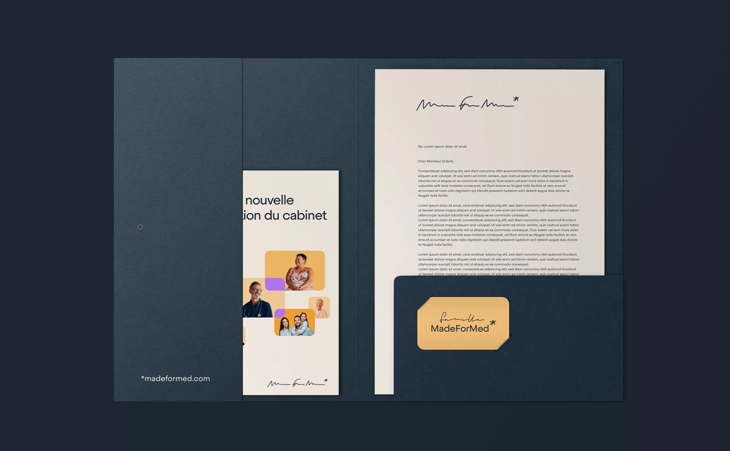
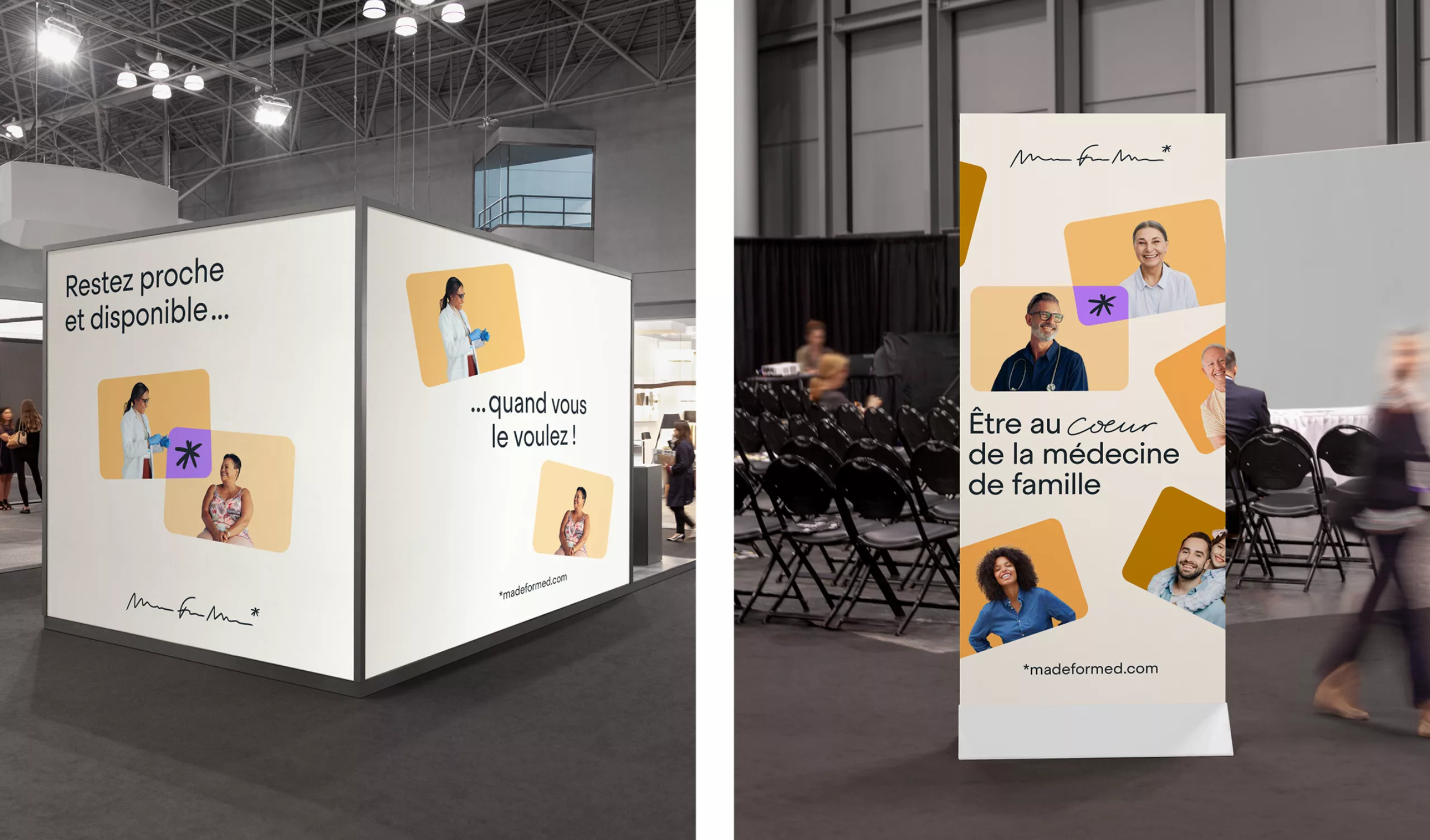
MadeForMed is committed to preserving a human approach to medicine and putting a smile back on doctors' faces. The company wanted to take a contrarian approach to the online appointment platforms with which everyone is familiar today, most of which are much more patient-oriented.

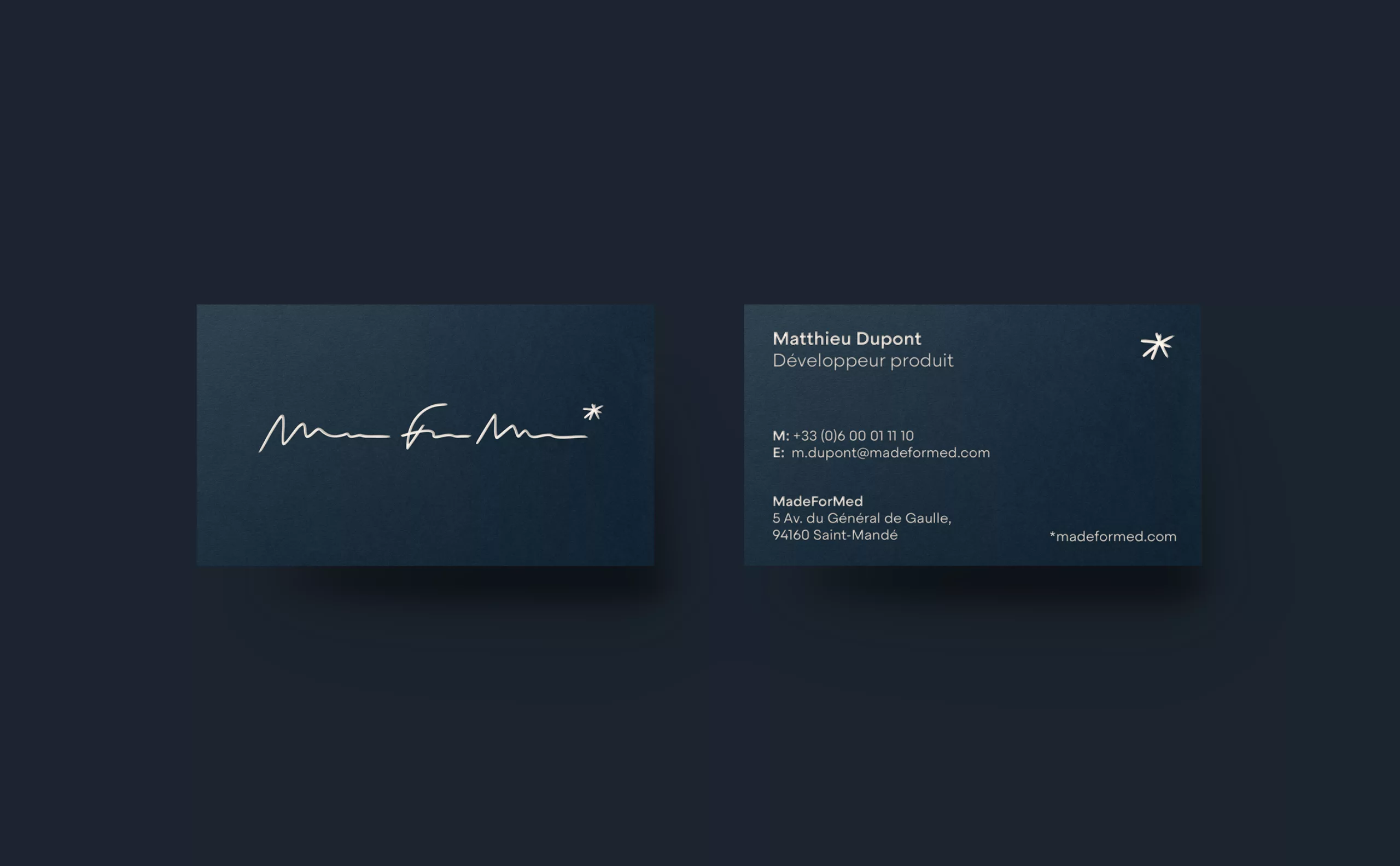
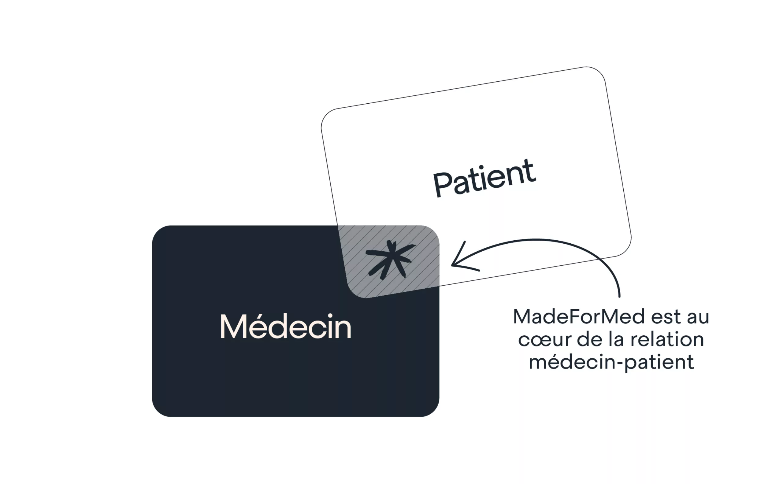
The company felt that its brand did not sufficiently differentiate itself from these different players, nor did it sufficiently embody its values and commitment to society. In fact, for a time, the company considered changing its name. And while we may regret the Anglicism - which could be perceived as a lack of authenticity and sincerity for a french brand- the name "MadeForMed" had for us the merit of being easy to remember and easily understood. Even if you're not bilingual, you can understand what it means: it's "made for doctors".

And not only is it made for and by doctors! After all, the founder of MadeForMed is a doctor himself, but the company also offers its customers the opportunity to become members of the company. As well as taking part in the financing and decision-making process, member doctors can also contribute to the development and improvement of the company's services. In this way, MadeForMed intends to cultivate a genuine community of family doctors, sharing the same interests and values.

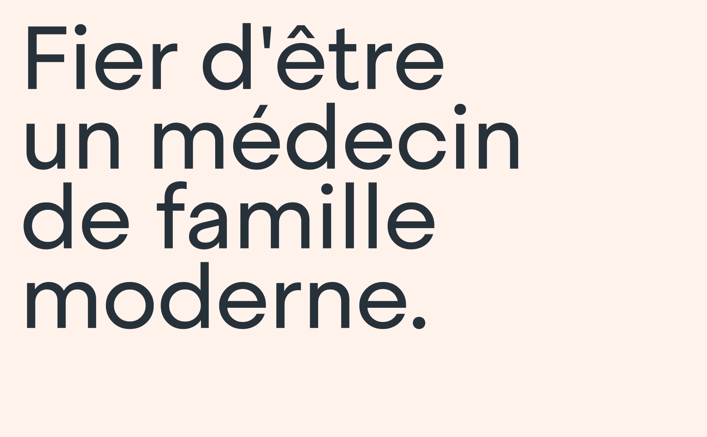
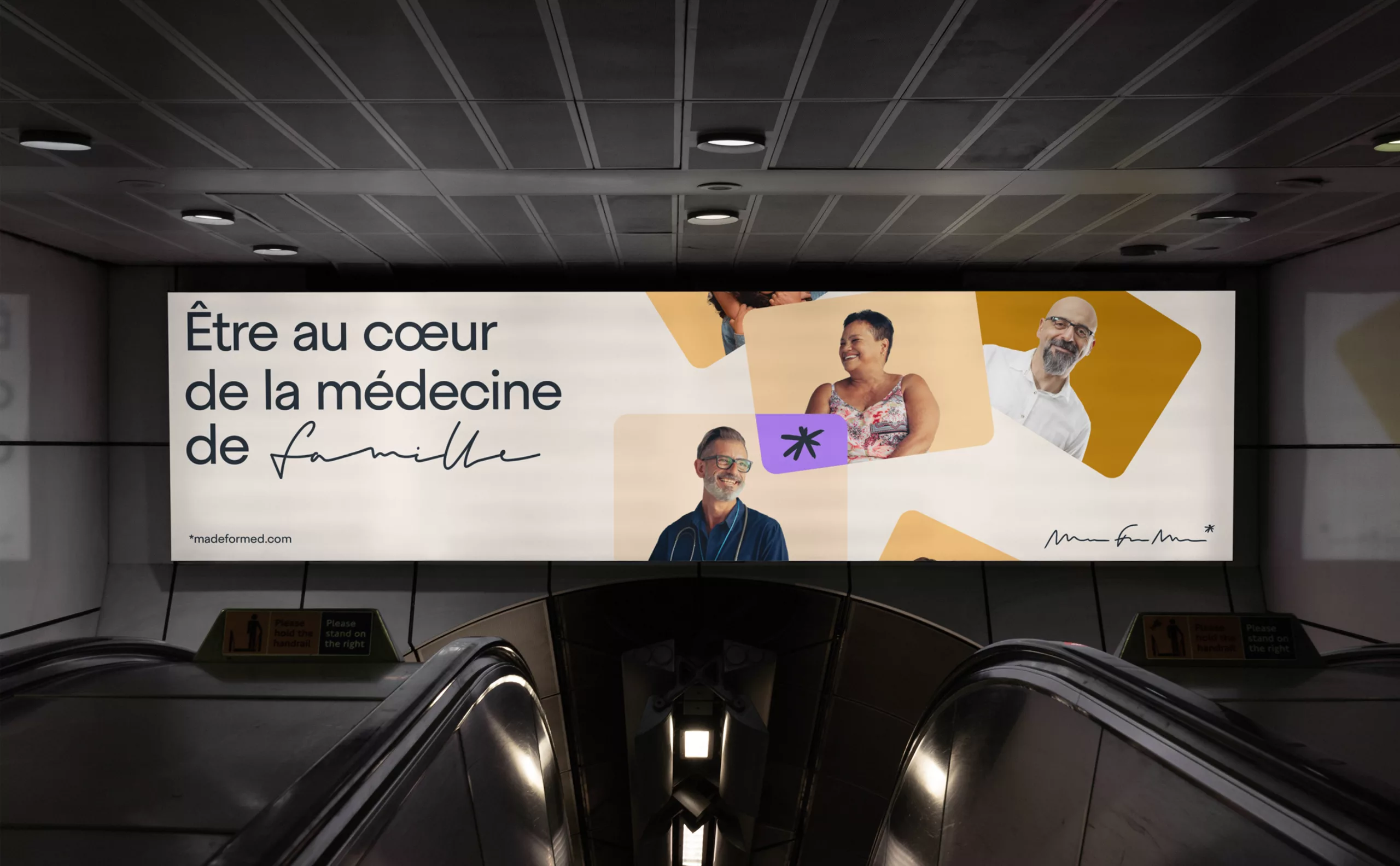
The future brand was to send out a message: "Between doctors, we understand each other. We speak the same language, we know what you're going through! That's why we're the kindest to support you and provide the best answers to your day-to-day problems.

Creative concept

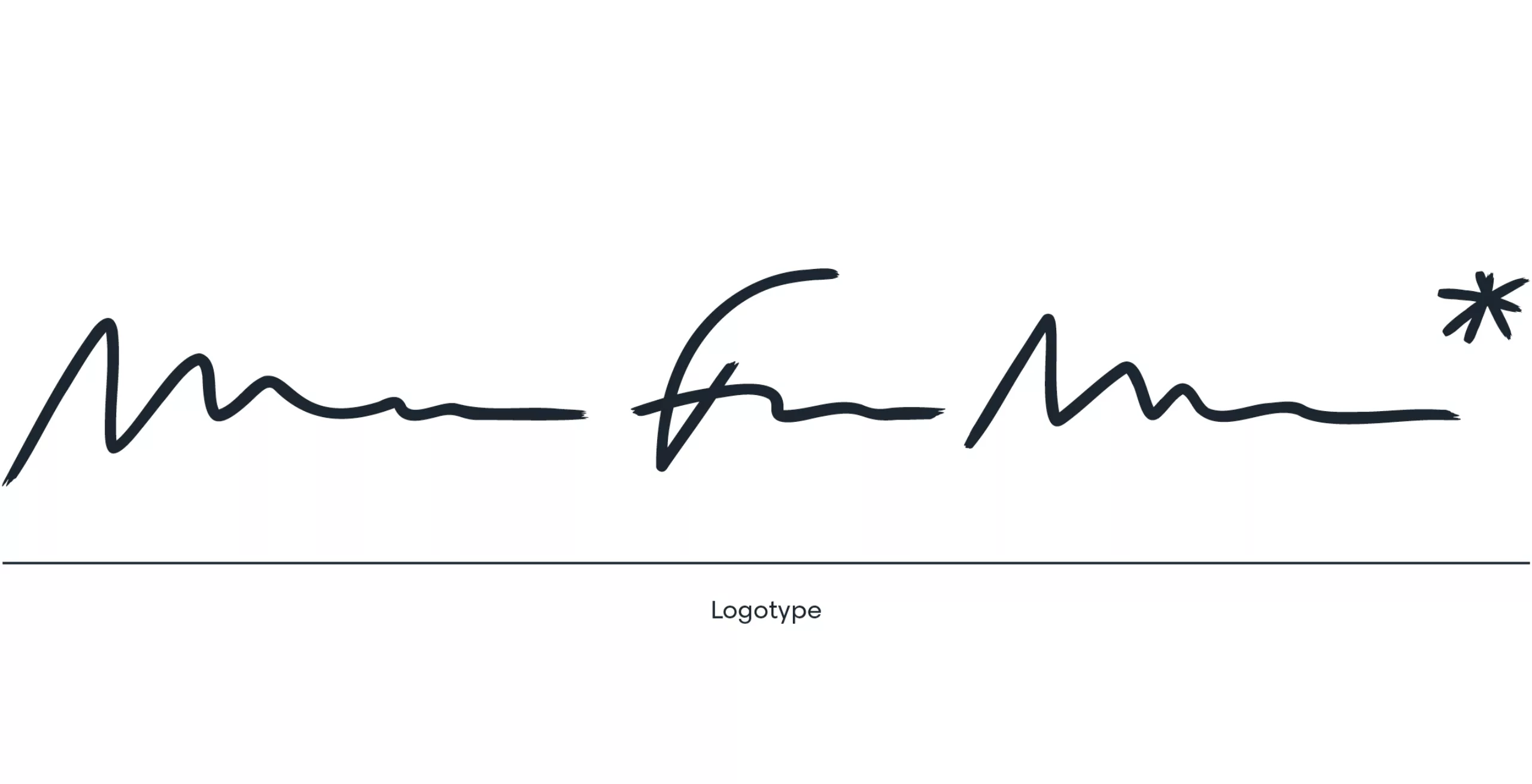
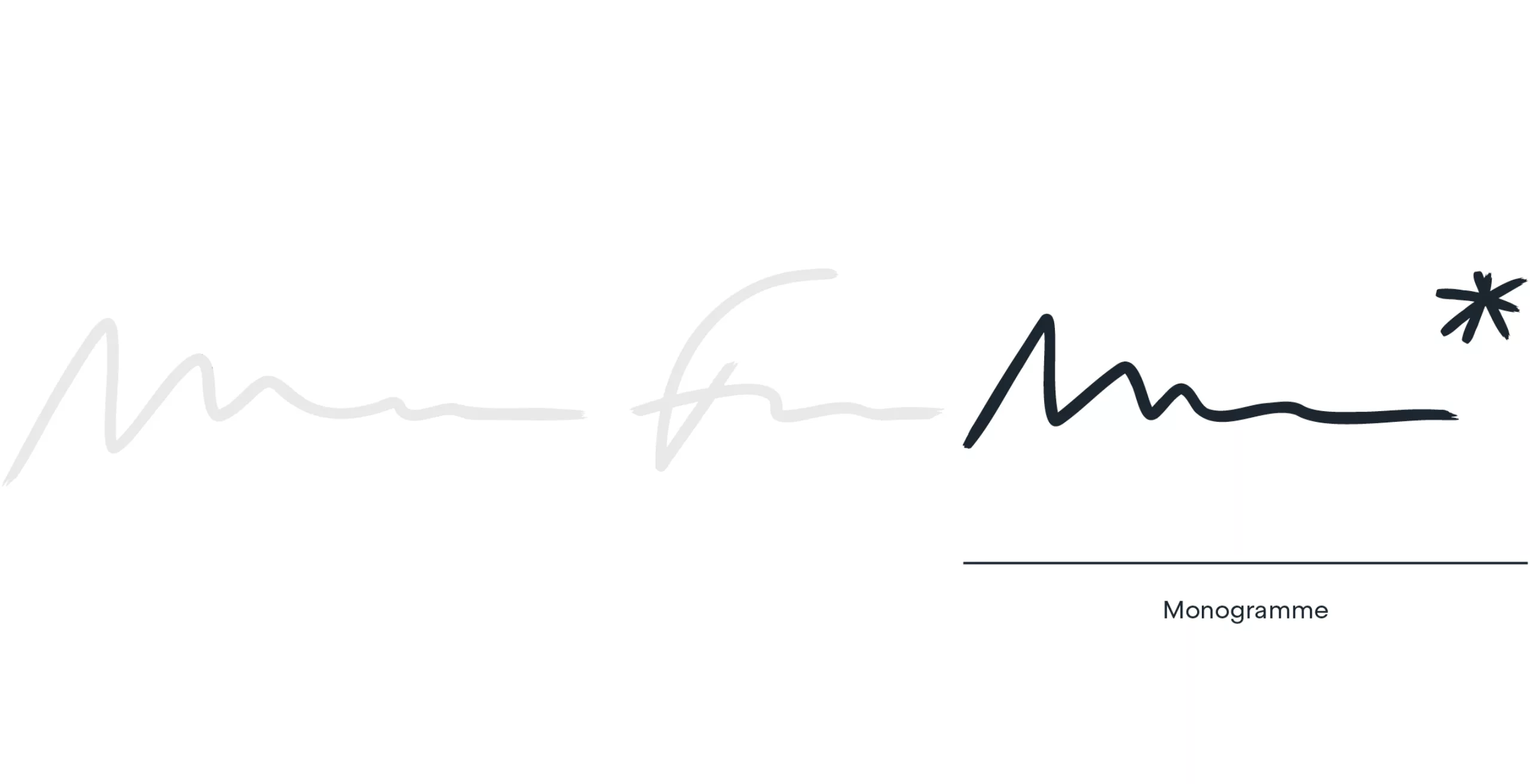
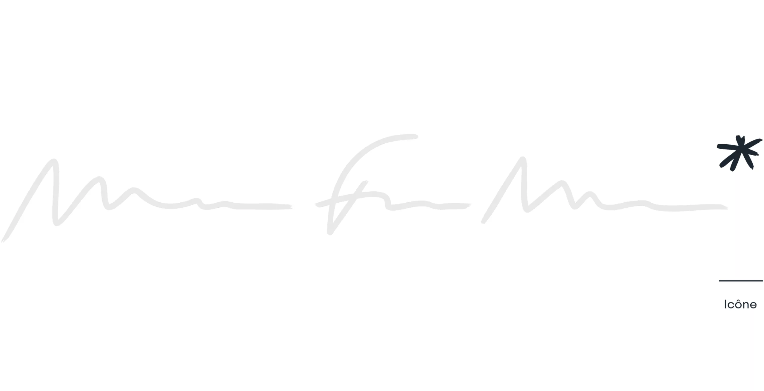
We therefore asked ourselves how we could assimilate MadeForMed's image with that of the family doctor. But this image is already well defined. We all share more or less the same mental image of the family doctor. The image of a character permanently wearing a stethoscope around his neck, sometimes in a white coat, an overcrowded office, an old leather briefcase, the caduceus affixed to the windscreen of his car, and so on. Yet all these symbols remain relatively cold and impersonal, and ultimately exude as much joie de vivre as a waiting room with its piles of old magazines and posters of prevention campaigns hanging on the walls.
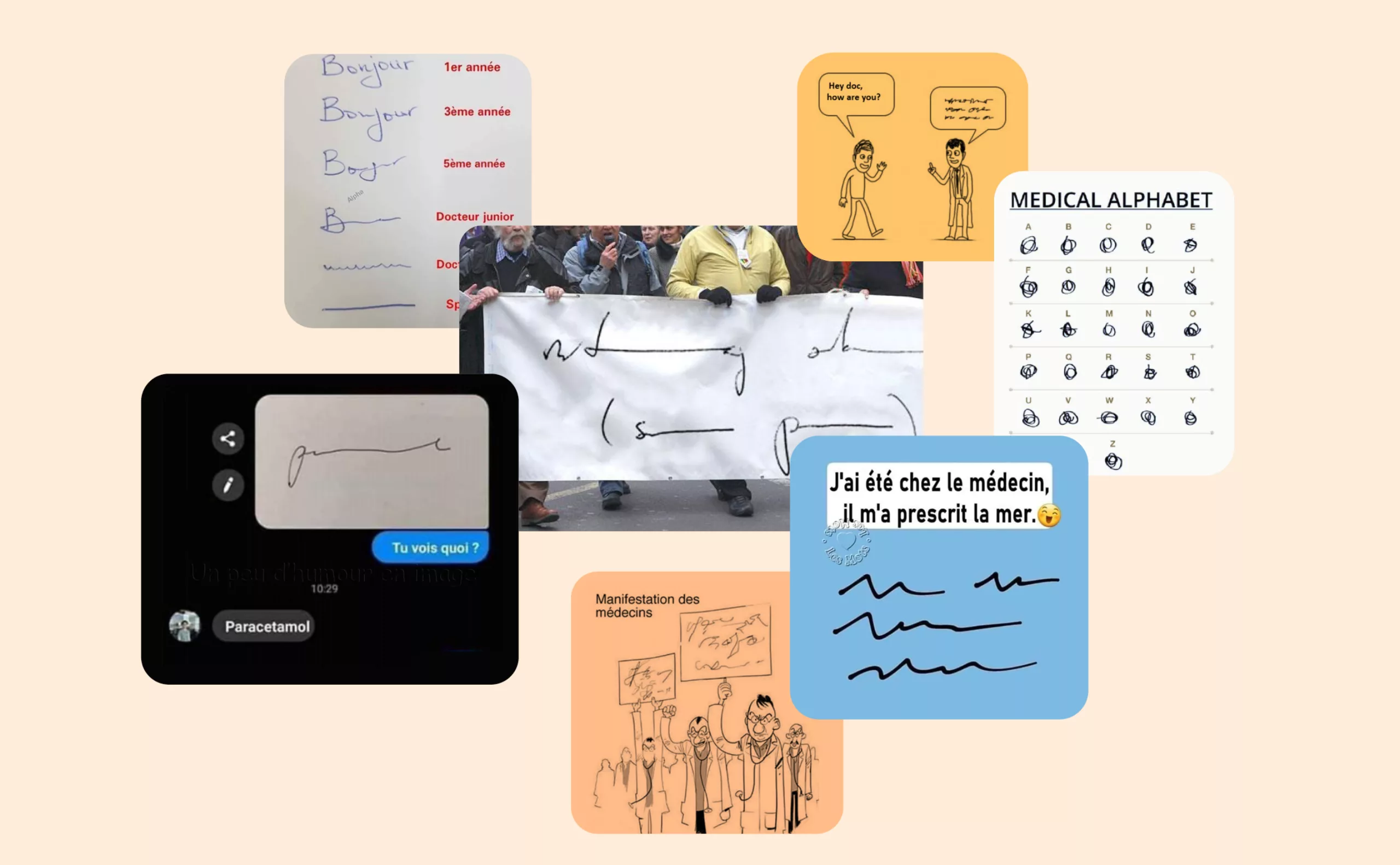
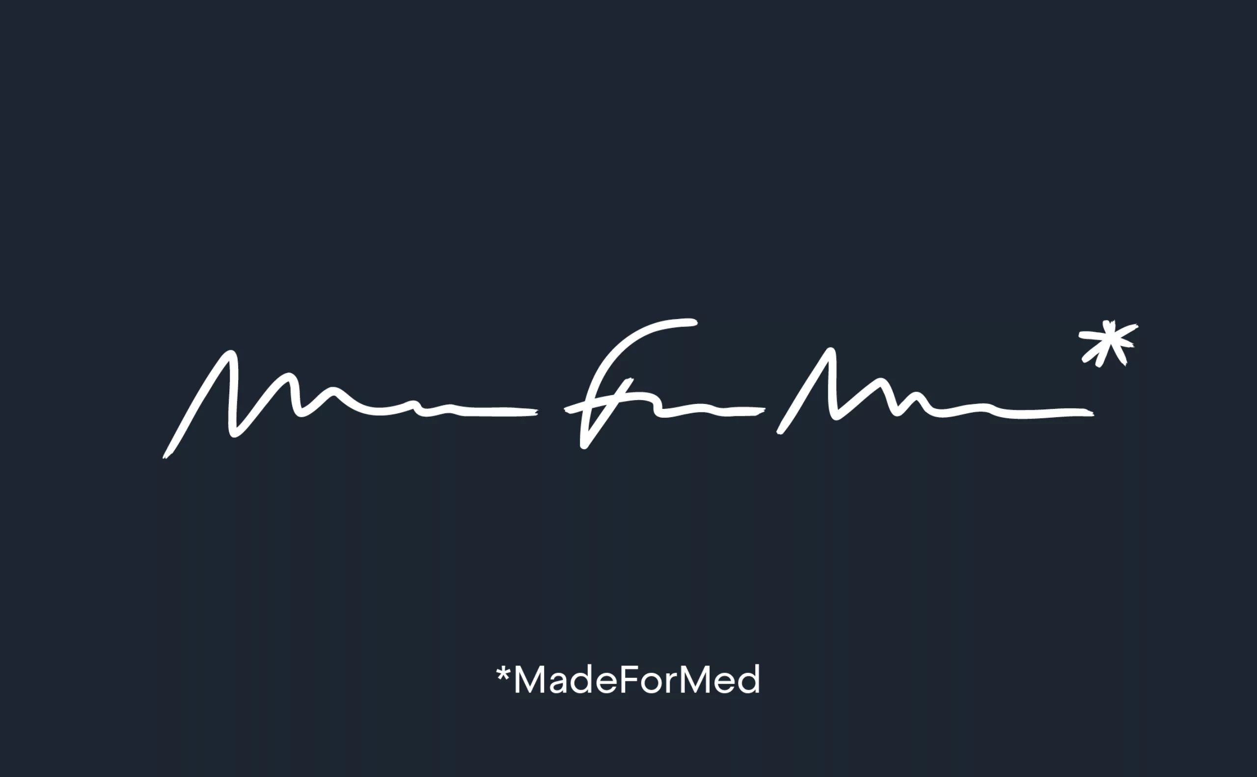
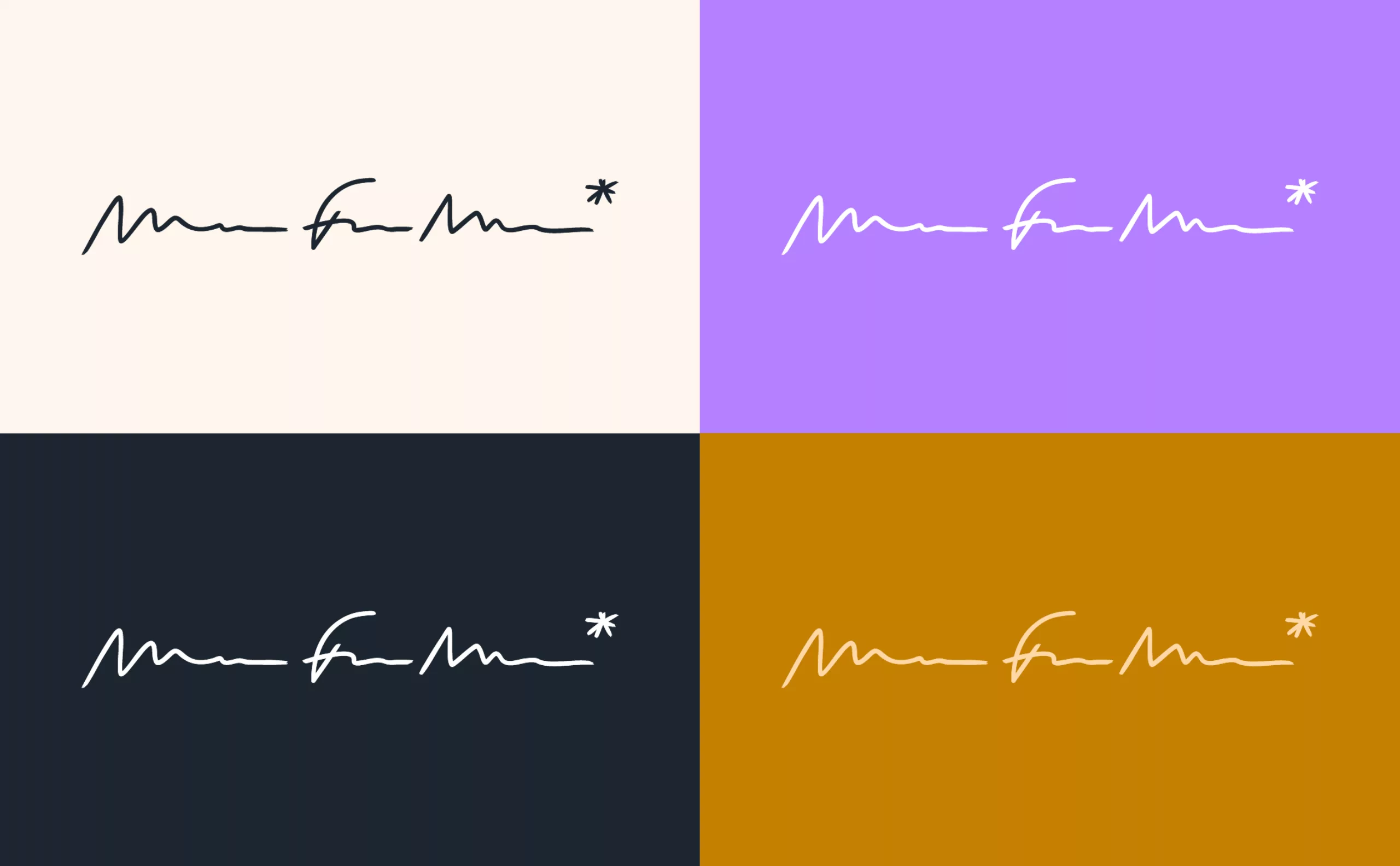
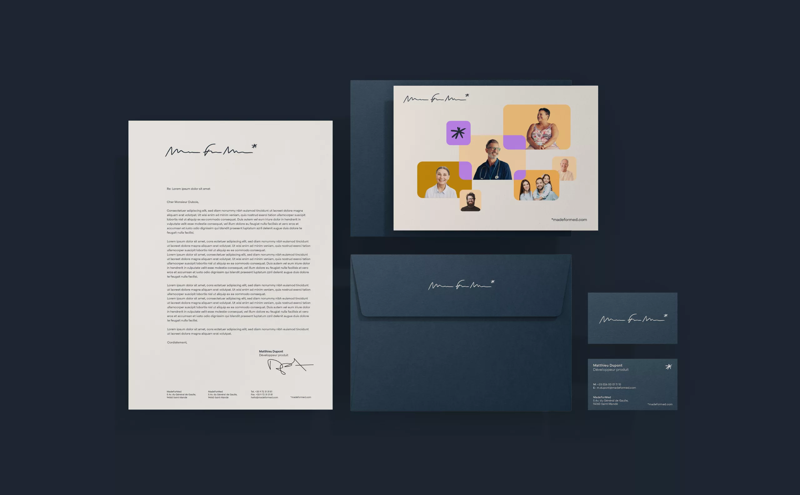
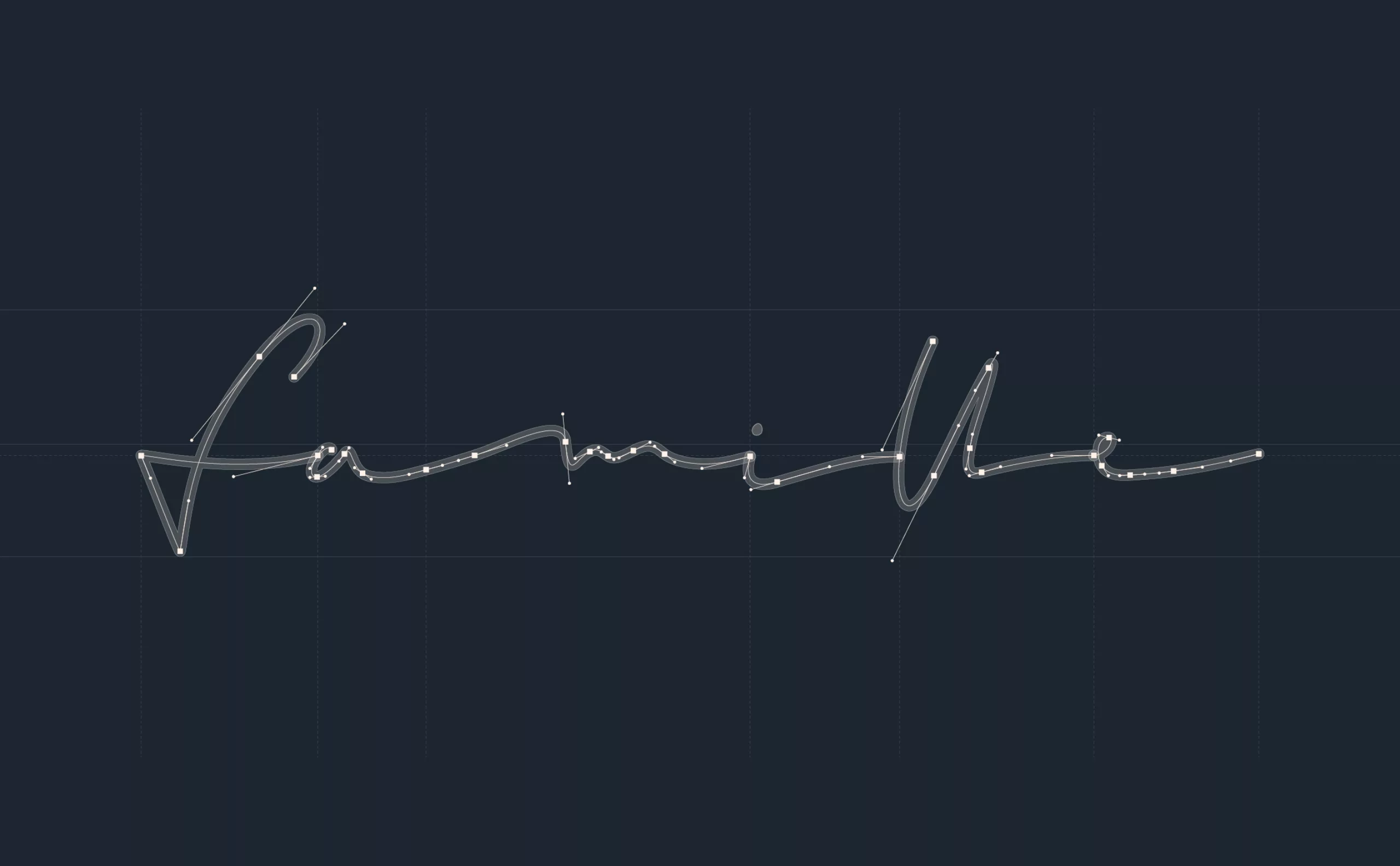
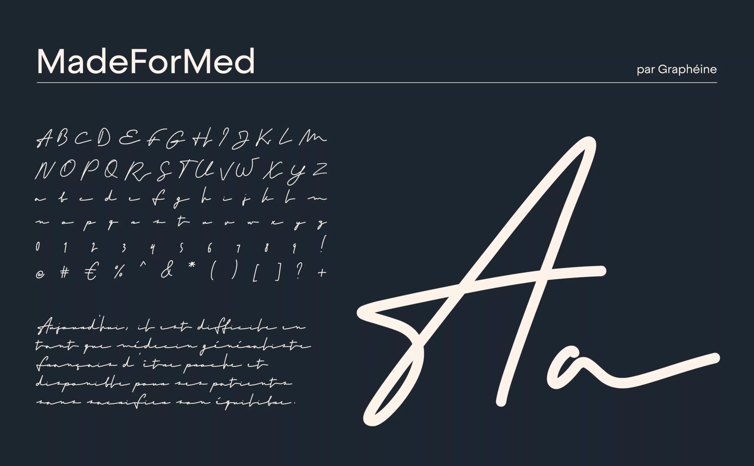
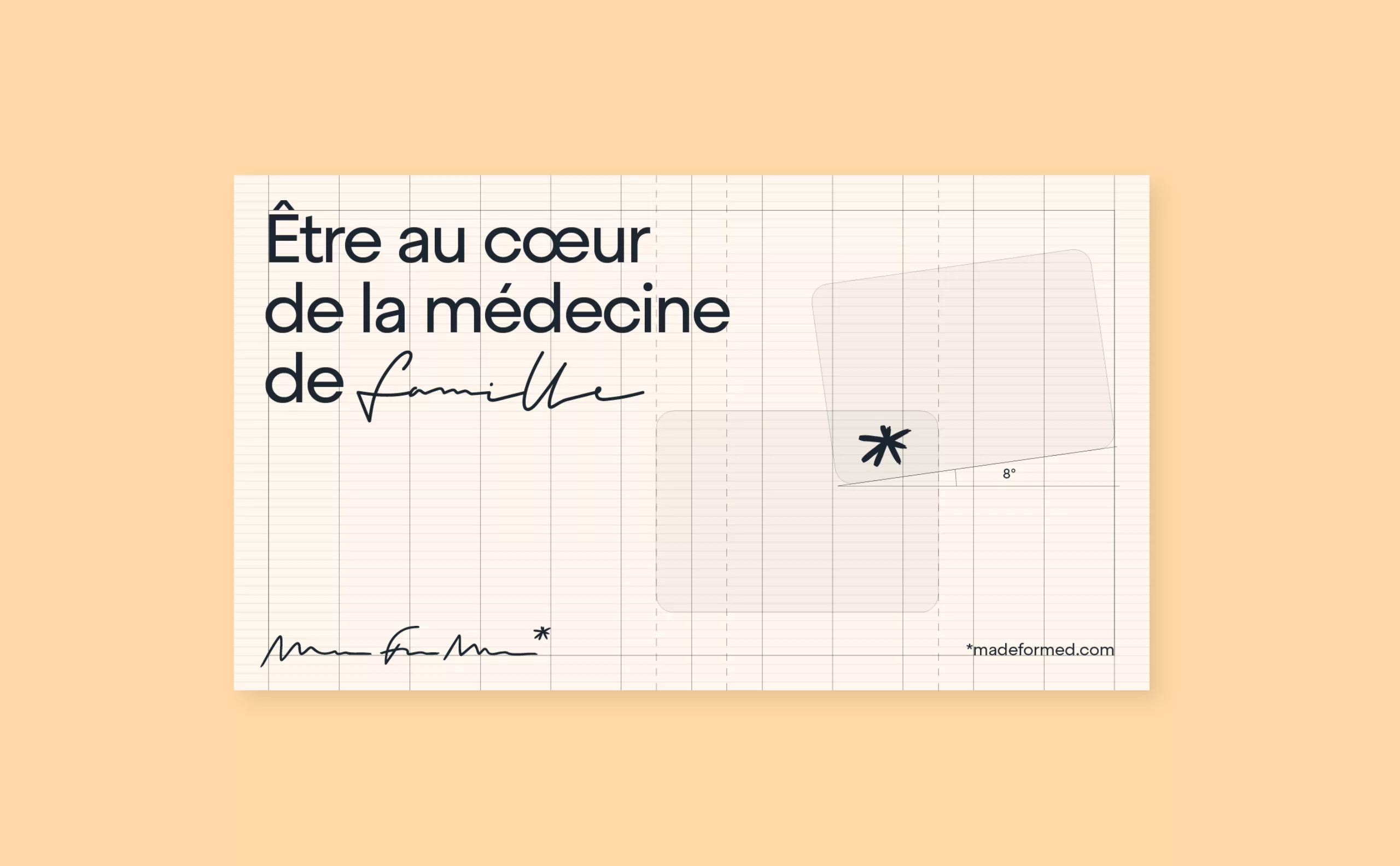
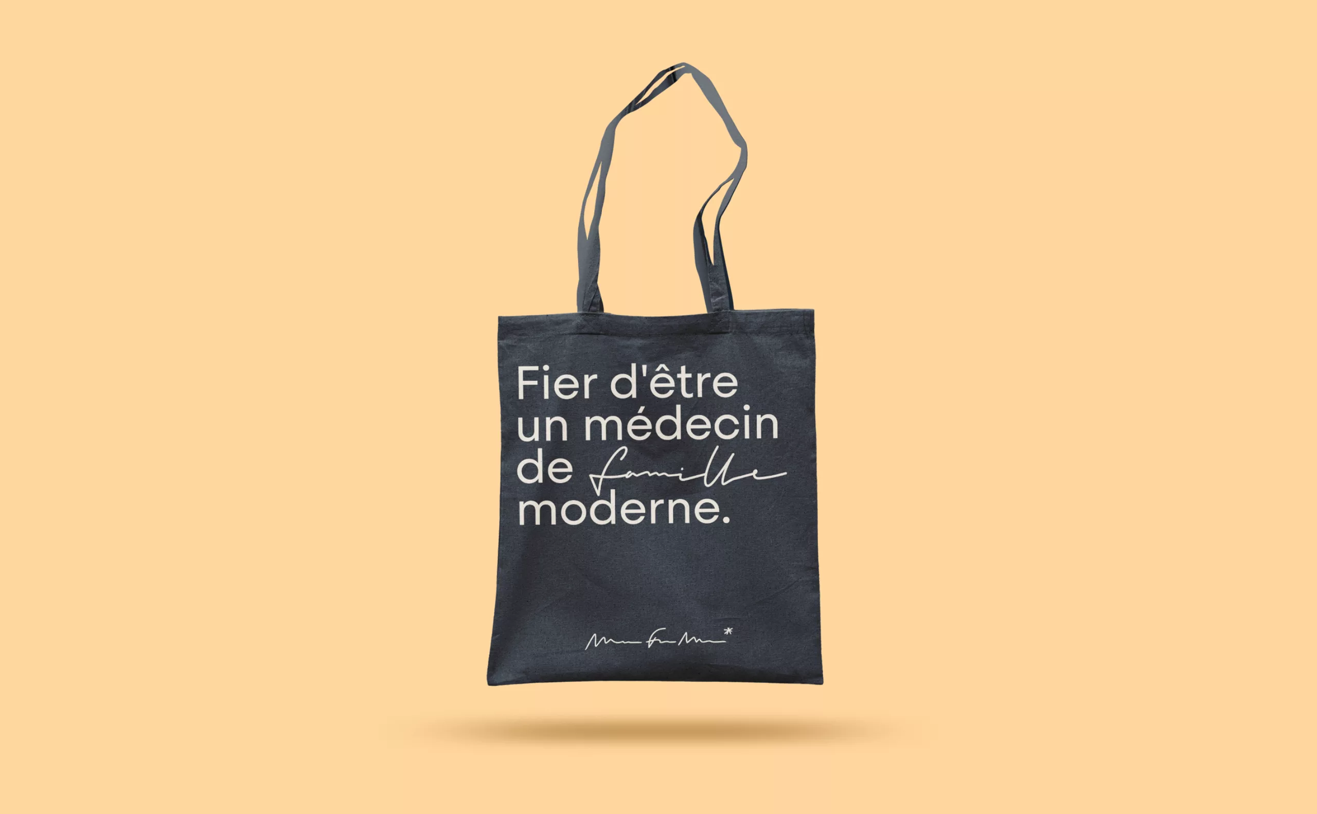
What is it that embodies everyone's identity, especially that of doctors? Handwriting is a kind of signature, and that of doctors is legendary! In fact, it's generally accepted that a doctor can be recognized by his or her handwriting, which is often indecipherable and illegible.

In fact, it's not uninteresting to note that this sloppy handwriting can, in a way, be interpreted as a symptom of the doctor's malaise, as he or she is forced to write prescriptions in a hurry under the pressure of an ever-increasing number of patients.

humour  médecins

Even though many doctors have long since abandoned handwritten prescriptions for those typed on a computer, the clichés still die hard! It's a representation that's particularly deeply rooted in the popular imagination, and has even become an expression: "having a doctor's handwriting". It's a characteristic that's often mocked, as evidenced by the many memes on the Internet.

Logotype

As MadeForMed is made by and for doctors, it was obvious to us that MadeForMed's new visual identity should borrow this recognizable writing style... and so illegible! So we suggested that they adopt a "spidery scraw" logo, in which MadeForMed is spelled out, and only the initials "MFM" remain remotely legible.

While the adoption of an almost incomprehensible logo may at first seem counter-intuitive to current marketing codes, in reality it reveals all the boldness, derision, optimism and self-assurance of the brand, while at the same time demonstrating its simplicity and authenticity. It should also be remembered that MadeForMed is a B2B brand, not aimed at the general public, but at a very specific target group: general practitioners.

To ensure that the logo remains intelligible, an asterisk is integrated into the logo, allowing the brand name and URL to be spelled out like a footnote. The asterisk also acts as an icon on a variety of media.

Typography

This "spidery writing" or "chicken scratch"  is deployed in a barely legible typography in the same style. It allows the company to express its views in an original way, but also serves to highlight certain key words, reminiscent of the doctor's notes on the prescription.

Principles of composition

The rest of the visual universe is playful and digital, thanks to UI elements that contrast with the handwritten look and feel of the site, while reminding us of the applicative aspect of their services. The human element remains particularly present, thanks to a stack of photo blocks representing the doctor and his patients, like a family album.

We then developed a system based on the interplay, superimposition and intertwining of the various blocks. The blocks are like bubbles: the doctor has his own, and the patients have theirs. The blocks can be connected, even merged, or otherwise completely separated from each other. For us, it's a way of symbolizing the doctor-patient relationship and illustrating the degree of proximity. Of course, MadeForMed is not far away - in fact, it's at the heart of the relationship: when two blocks overlap, MadForMed appears at the junction, acting as an interface between the two.

Concept de la rencontre

Share this project:
Project expertise:
Website and social media design. Logo creation, visual identity and graphic guidelines. Motion design and video creation. Typographic design.
Type of client:
Communication agency in the start-up, digital and technology sector. High tech & IT, IT BtoB, IT BtoC: software publishers, digital services companies.

Related projects: