
New identity for the Gaîté Lyrique, a nice logo to start 2017
![]()
A gay new logo for the gaité
Yorgo Tloupas, our french madmen has struck again! His studio Yorgo&Co has just signed the brand new visual identity of the Gaité Lyrique, a parisian creative and cultural centre that promotes culture under the prism of digital innovation. The strange logo called "Gérobase" was unveiled last December, after a tender phase judged without follow-up by the establishment. Three studios had then worked on the subject, including the Chevalvert studio and Brest Brest Brest (and thus a last mysterious candidate). Yorgo has agreed to meet to discuss this creation. This article is therefore an opportunity to share some information from him to better understand the creative bias and its process, as well as add our point of view on the subject. And yes, there will be matter for a few digressions ;)
A gerontobase logo?
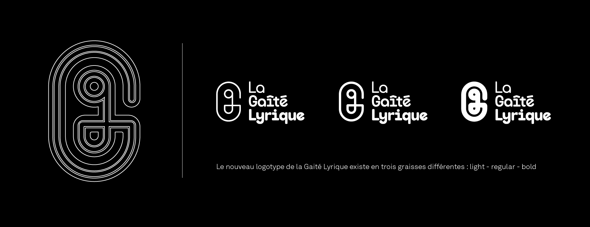
The "Gérobase" - strange symbol - which is the equivalent of an arobase or the letter G replaces the A. With this intriguing neologism but "catchy", one feels the experience and the trick of the communicator able to coat his graphic concept with a catchy formula to titillate the customer. And the result is a nice identity that will please from 7 to 77 years ! (so a bit gerontophile anyway) The emblem is accompanied by a typo block composed with a rounded typo. This was then used as the basis for the development of a proprietary typography extended to three variations of grease. This new visual identity replaces the previous one created in 2010 by Michel Mallard for the reopening of the site. The logo was then composed with a "dot" style lettering referring to the pixel of the digital images.
![]()
History of a graphic passage of torch
Yorgo Tloupas and Michel Mallard have both worked as DAs in the fashion press. Michel Mallard is renowned for his experience in the artistic direction of major international magazines such as Vogue Homme International, Jalouse, L'Officiel and Marie-Claire Japan. He is also responsible for advertising campaigns for luxury brands such as Kenzo Parfums, Jean Paul Gaultier and Inès de la Fressange. Yorgo Tloupas started his career as a designer with the launch of the first lifestyle car magazine "Intersection". He then worked on the AD of Crash magazine, before signing the redesign of the GQ magazine and launching the French formula of the magazine Vanity Fair. The redesign of the identity of Gaité Lyrique comes at a time when Yorgo&Co wishes to diversify its field of sponsors, particularly towards the general public, to continue preaching "good design" in France outside the elitist spheres. I recommend readingBack Cover N°7 where Yorgo mentions his desire to redesign the logo of the french republic.
![]()
The point as a bridge between the old and the new logotype.
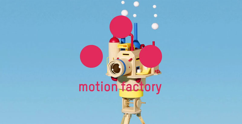
Visual of the Motion Factory exhibition using the graphic principle of the "three points" of the previous visual identity.
Yorgo is passionate about logos. He was one of the first in France to speak about the current events of logos in an acerbic and offbeat way in his column of the magazine "Magazine" created by Angelo Cirimele. His texts were "fictional logotypes" where he imagined for example the story of the AD who had the idea of the new facelift of the LU logo one evening while watching the Blade vampire movie, thanks to a scene where a character lifts the corner of a rug... Back to seriousness and hop a date..:
In 2013, the Yorgo&Co studio took over Gaité's graphic communication and reinvented Michel Mallard's charter by implementing the "three big points" system. (which are a zoom on the circumflex accent of Gaité's "island"). This visual system will remain in effect until the current redesign.
Yorgo's new proposal takes the round shape as a starting point to create the Rounded style of the new logo. The thick line with rounded ends of the Gerobase and the typeface are therefore direct evolutions of the previous visual system. Smart guy!
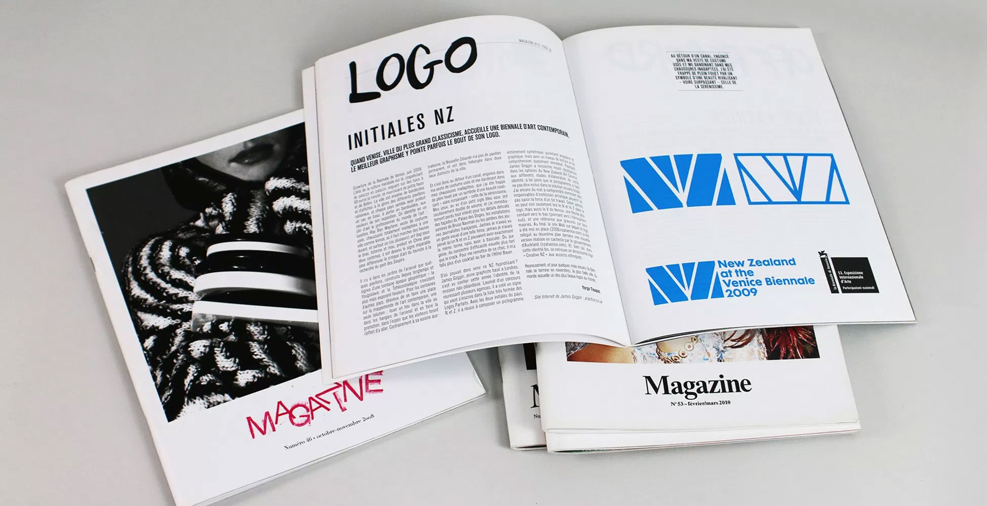
Yorgo Tloupas logo chronicle in the magazine "Magazine" created by Angelo Cirimele
Hardcore Hipster vs Casual Normcore
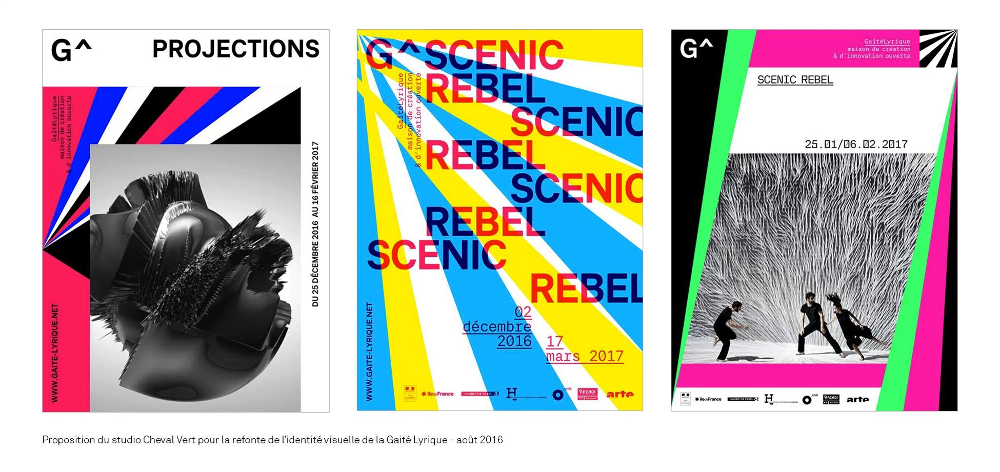
This choice leads to a very "pop" and even childish aesthetic. Surely in agreement with the will to open Gaité to a wider public and less essentially hipster, to democratize even more the access to the digital creation. Glitch, stroboscopic graphics and a grid that flies in pieces, makes you wonder if Yorgo&Co received the same brief as the participants of the initial call for tenders, both the proposal made by the Chevalvert studio, and revealed on their facebook account, plays on the codes of a perfect communication for a VJing festival. Where Chevalvert offers a graphic design demanding and sharp enthusiasts, Yorgo&Co tries the identity of digital culture for all.
Reaction of an Internet user on Chevalvert's Facebook account: "It's so much better than the one they chose in the end! Seriously these three fats for a g in analog cassette form, I don't know what took them. There at least you kept the circumflex signature accent by leaving the point/touch aspect a little "morse" of the previous identity!"
![]()
Logotype typically "Chevalverrien" where the arrow is both the trace of the circumflex accent and the symbol of the programming language - proposal not selected.
Principle of radiant patterns and typography developed by Chevalvert for the graphic language of Gaité Lyrique - proposal not selected.
It's all about that font
Note that unlike his previous large-scale visual identity projects where Yorgo used to surround himself with the best type designers, (Jean-François Porchez - Commercial type - Production type) this time the creation of the proprietary typeface was entirely done in-house. Available in 3 weights, light - regular - bold, the character will allow you to compose the content of all the Gaité's com media, from posters to programming leaflets.

Proprietary typography created by Yorgo&Co for the Gaité lyrique.
It's the story of a small letter in a big one.
A small g in a large G, it necessarily recalls the small p in the large P of the logo of the small Palace by Apeloig. But in a version so round and soft that it looks like the result of a mating with a logo of the duo M/M. The round and baroque treatment of the emblem is very reminiscent of the M/M style, notably the very convoluted CNAP logo created in 2005. Designed in a spiral, this logo also seems to have been inspired by the concentric graphics of an arobase.
Even if one can reproach it for its round finishes which give it an aspect a little too regressive, the main reservation remains on the choice of the diversion of the symbol arobase. This sign has been worn to the core to symbolize the new web economy for over fifteen years. Today it seems a bit old-fashioned to represent a place at the forefront of digital creation like lyrical joy.
![]()
Sketches made by Yorgo Tloupas during the interview to demonstrate the simplicity and effectiveness of the gerobase symbol. The gerobase is compared to the graphics of the Petit Palais logo and that of the Philharmonie de Paris, which as you can see, is much more difficult to draw from memory!
![]()
Finally the understanding of the concept behind the symbol is rather difficult for the uninformed quidam. Is it a safety pin or an audio tape? Anyway, Yorgo assumes the unexpected interpretations of his logo and it would seem that this humorous bias is completely part of the new Gaité com strategy because I learned during our discussion that at one point it was envisaged to have gerobase pretzels for the press conference of the new visual identity...
One of Yorgo's objectives for the new visual system was to create a sign adapted to the problems of location in urban space to allow the public to better locate the Gaité Lyrique in Paris. The proposal is therefore accompanied by a totem sketch at the end of which is perched the emblem in a luminous version.

The Gaité Lyrique with a G for a « gay » (joyful) place?
In a very "branding" approach (initially, a practice which consisted in marking herds with a red iron), the gerobase emblem will be used as a stamp and will come to mark more or less discreetly each com object. Diverted, the gerobase can also be the heart of the visual. Designed using an alignment of fruits, the new visual identity takes seriously the risk of sinking into kitsch so much the proposal ready to smile...
Cultural graphic identity vs. commercial graphic identity
I take this opportunity to question Yorgo on his position regarding the opposition between commercial graphics and cultural graphics. According to him, this antagonism is not justified and would be above all a French specificity which pushes graphic design students to overvalue the creation of theatre posters rather than to create a good visual identity for the local SME, leaving an entire part of the "commercial" graphic design in the hands of the big advertising agencies...
Commercial brands impose their notoriety by repeating their logo. This omnipresence of advertising in everyday life is often described as "visual pollution". By repeating a symbol "gerobase" ad infinitum, is there not a risk of applying the codes of an aggressive commercial branding for a place in the mission is above all cultural?
Not at all, defends Yorgo, citing the example of the logo created by Jean Widmer for the Centre Pompidou, whose graphics would be very close to those created by Paul Rand for IBM. I let you judge the possible similarities with the illustration below. I add the Montebourg logo as a bonus, but Adidas' would also have done very well:
Beyond Yorgo's point of view on what a good visual identity is (but it's a long way from Ruedi Baur's), this very marketing and branding orientation simply seems to be the designer's response to the brief from the sponsor who would have expressed his vision in this way "we need our G ! ».
And if there is one point in common between Chevalvert and Yorgo&Co's proposals, it is in the creation of a stylized lettertrine G that is damn practical for declining the brand on social networks, places symbolizing democratized digital ! It is interesting to note that we also owe the creation of the emblem of the Centre Pompidou to the expectations of the management at the time and not to the original will of Jean Widmer who would have preferred to do without. In the meantime, the emblem has become a monument of graphic design and the graphic community even lobbied for its preservation in the Centre's visual system when Ruedi Baur almost made it disappear in 2000 in favour of a system based on a typogram...
![]()
Doodles of the airbnb graphic charter to encourage users to create their own version of the "belo" symbol.
Is the Gerobase a good logo? Attempting to answer this question in the affirmative or negative would be reductive. One thing is certain: the Gerobase is a logo of the digital age, just as the "belo" symbol of airbnb can be. (we reported how airbnb humorously assumed the "badbuzz" at the release of the new logo in this article about the BrandNew 2015 conference in NY).
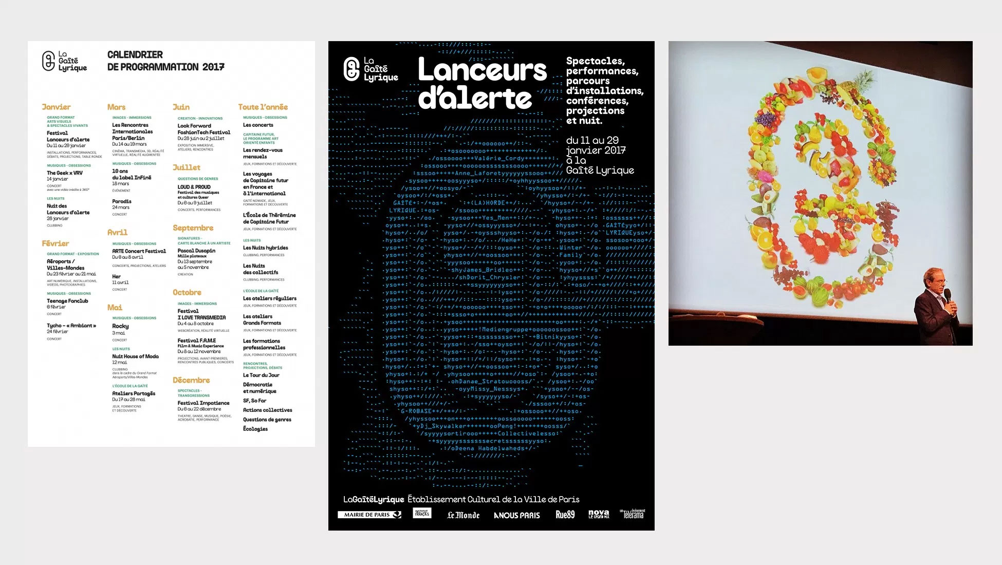
It is both a "tribal" sign and a "doodle" whose vocation is to create a very strong emotional bond with the public. The more appropriate and diverted it will be, the more it will become a meme and the more it will reach its objective. In this, it is an answer perfectly adapted to the expectations of the customer. For the moment only the logo and the visual of the exhibition "Lanceurs d'alerte" have been revealed. All that remains to be done is to hope that the visual system accompanying this symbol will be as Anglo-Saxon as Yorgo's graphic work, where content is always as privileged as form.
Only the test of time will allow us to judge the relevance of the logo. Unless the speed of digital evolution forces the Gaité Lyrique to review its cultural mission sooner than expected! I'll see you in 40 years or tomorrow to see if the gerobase has made old bones!
Share this post:
 San Serriffe typographic Island
 Design, creativity and oblique strategies!
 Tote bag, a new social totem?
 Sister Corita Kent, the Pop Art nun
 Donald Trump, the martyr who makes history
 Citéco Economy museum – Visual identity
 Mon-avocat.fr
 Auvergne-Rhône-Alpes Region – Brand architecture
 The utopia of representing futuristic cities
 The genesis with pictograms
 Tutorial: Poster Festival of Lights (part2)

Leave a Reply