MaleCare_case study2

2019

Malecare new brand image
a stronger visual identity for America's largest support organization for male cancer survivors

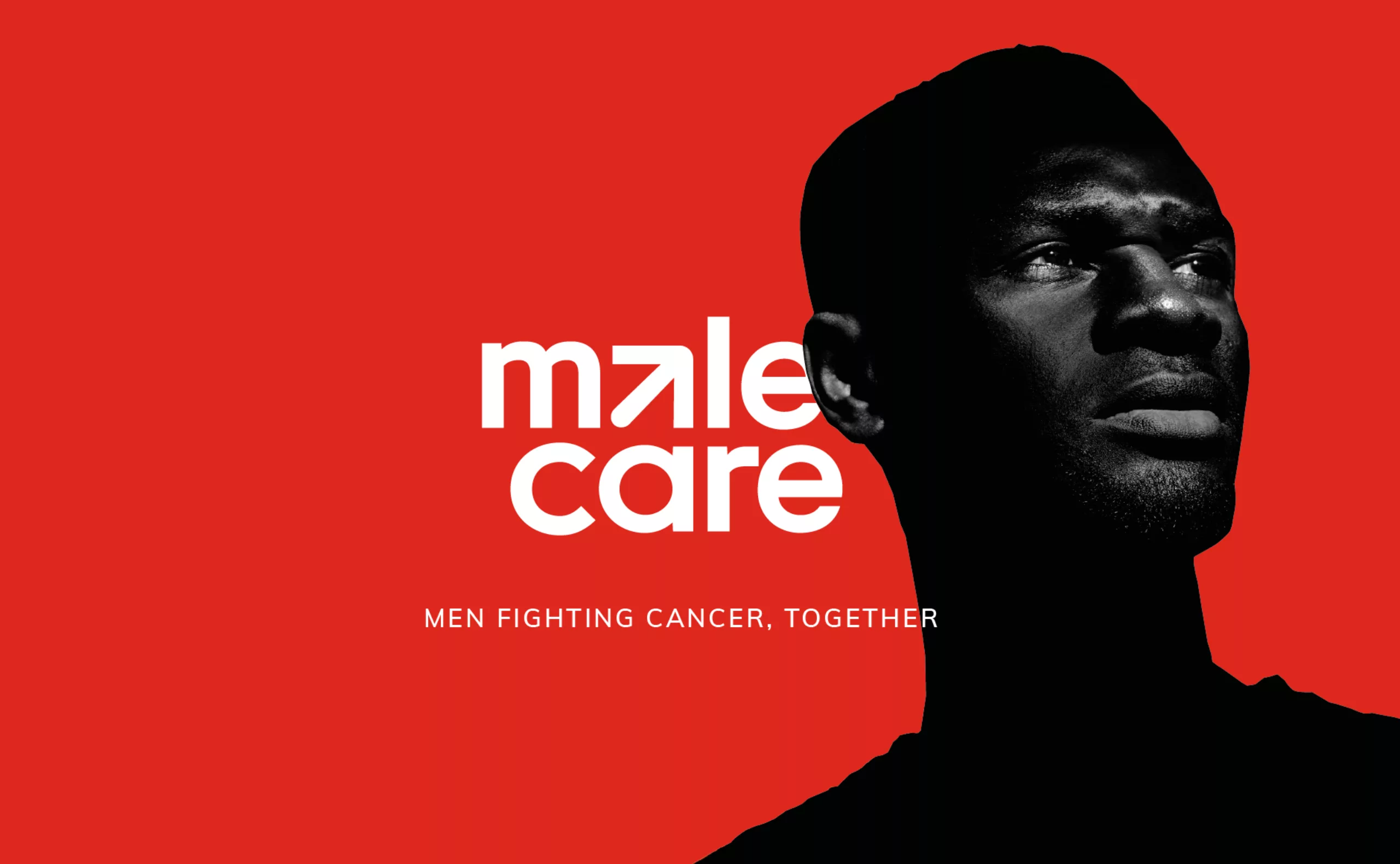
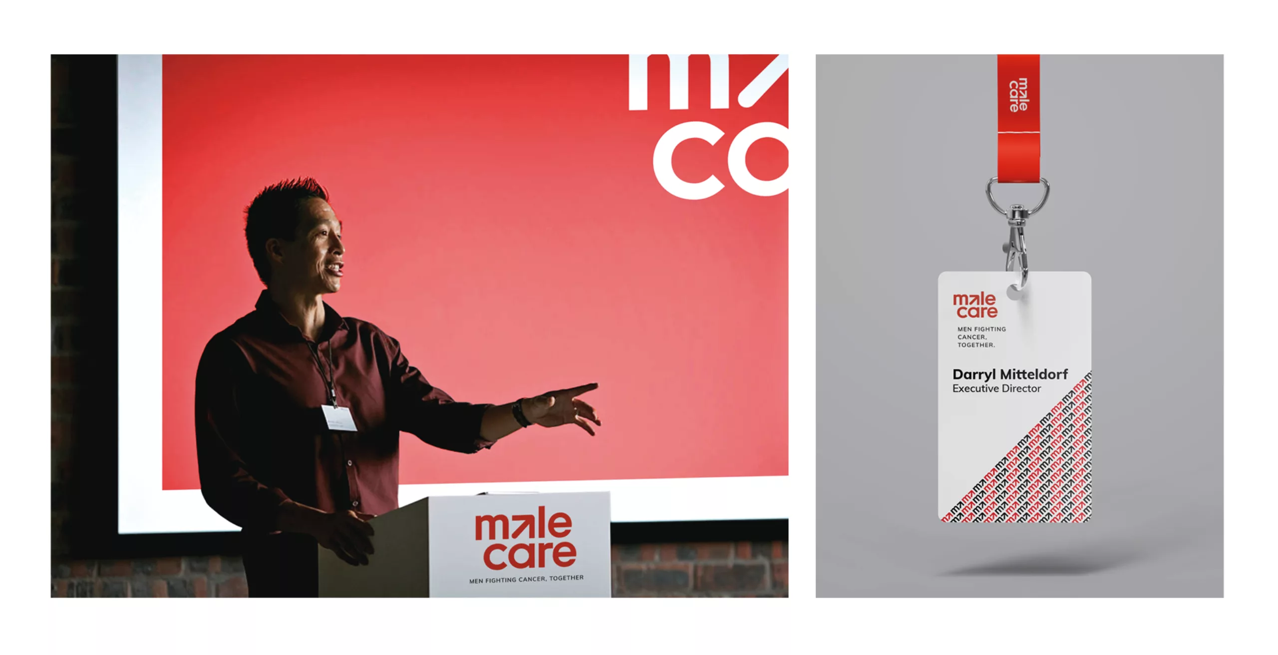
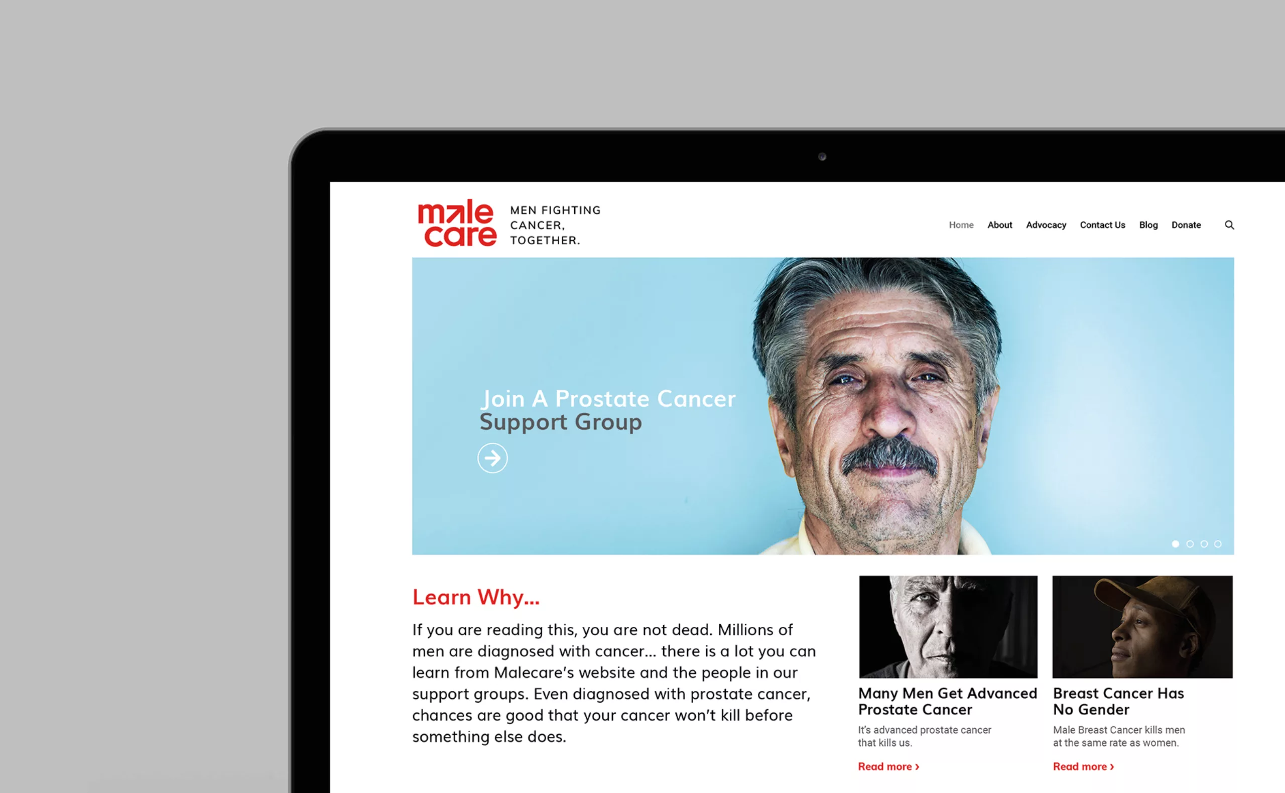
Malecare is a non-profit organization founded in 1997 by Darryl Mitteldorf in New York, USA. The association develops support programs for men with prostate cancer.
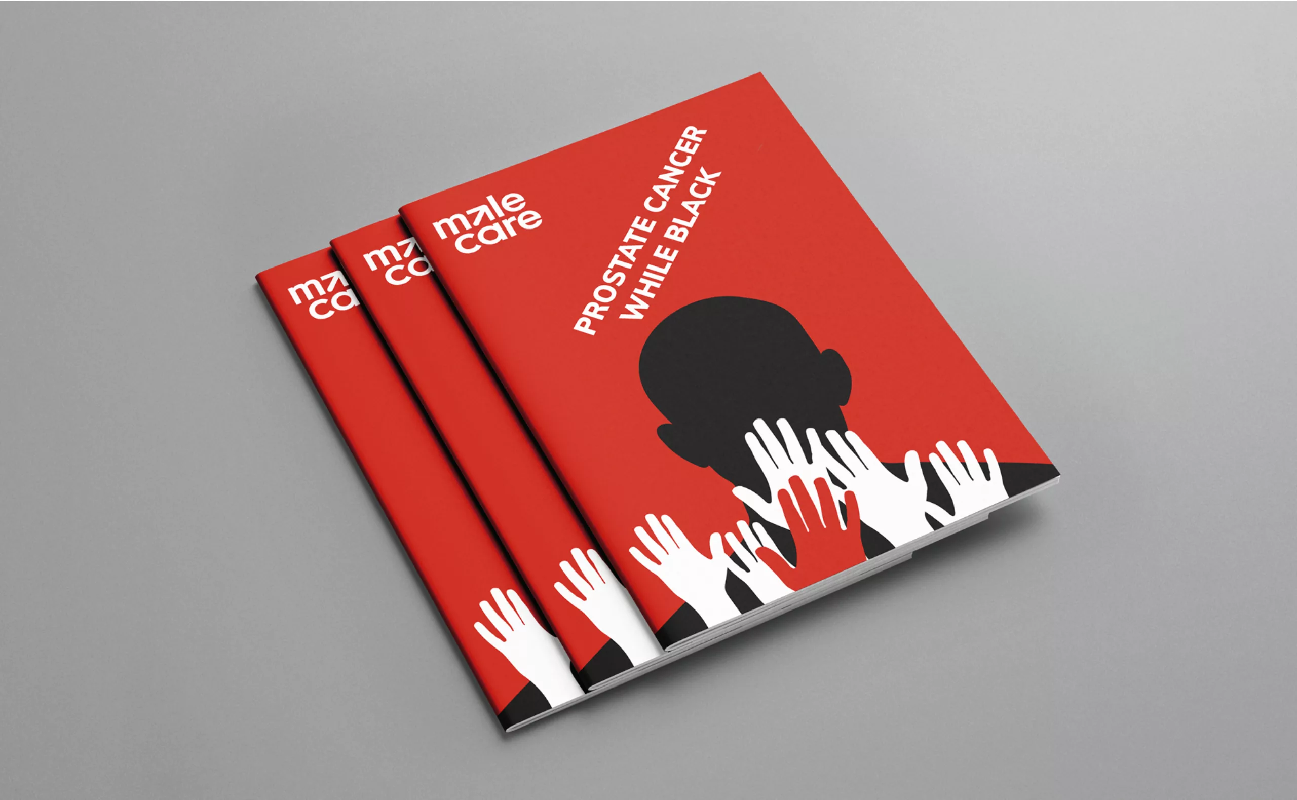
Malecare is America's largest support and advocacy organization for male cancer survivors. Being dynamic, the association strives to be the first to understand and implement new technologies for the benefit of patients. Malecare is run by oncologists, psychologists and social workers and is particularly recognized for its health programs for under-represented populations such as African Americans, LGBT and Native Americans. All services provided by Malecare are free of charge to the patient and their families.
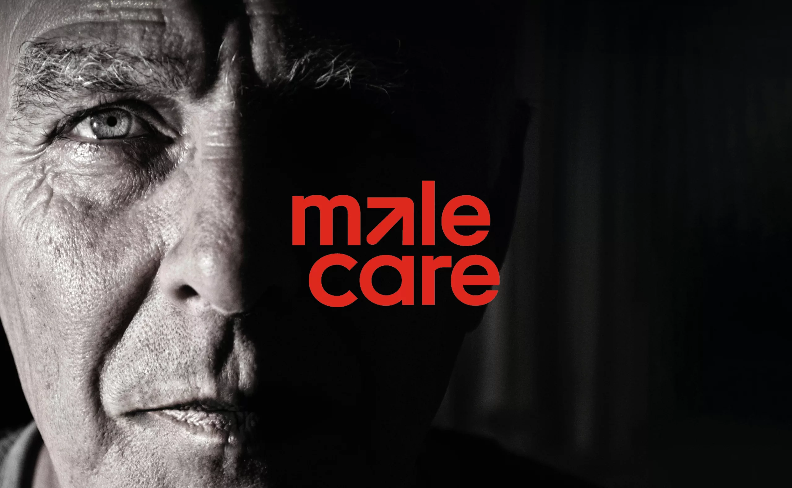
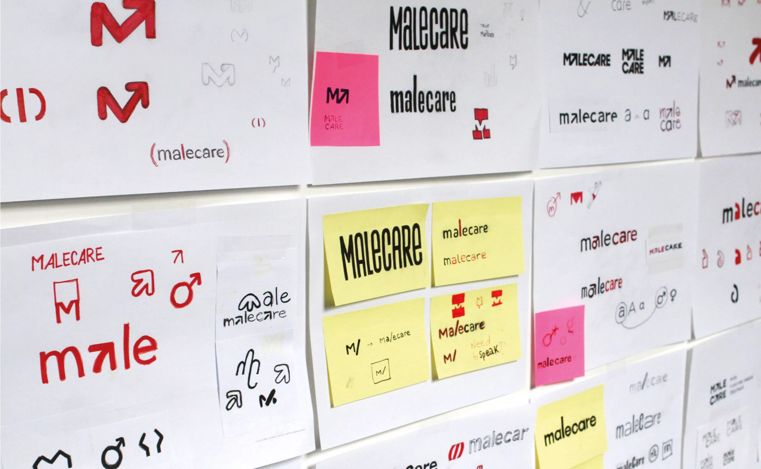
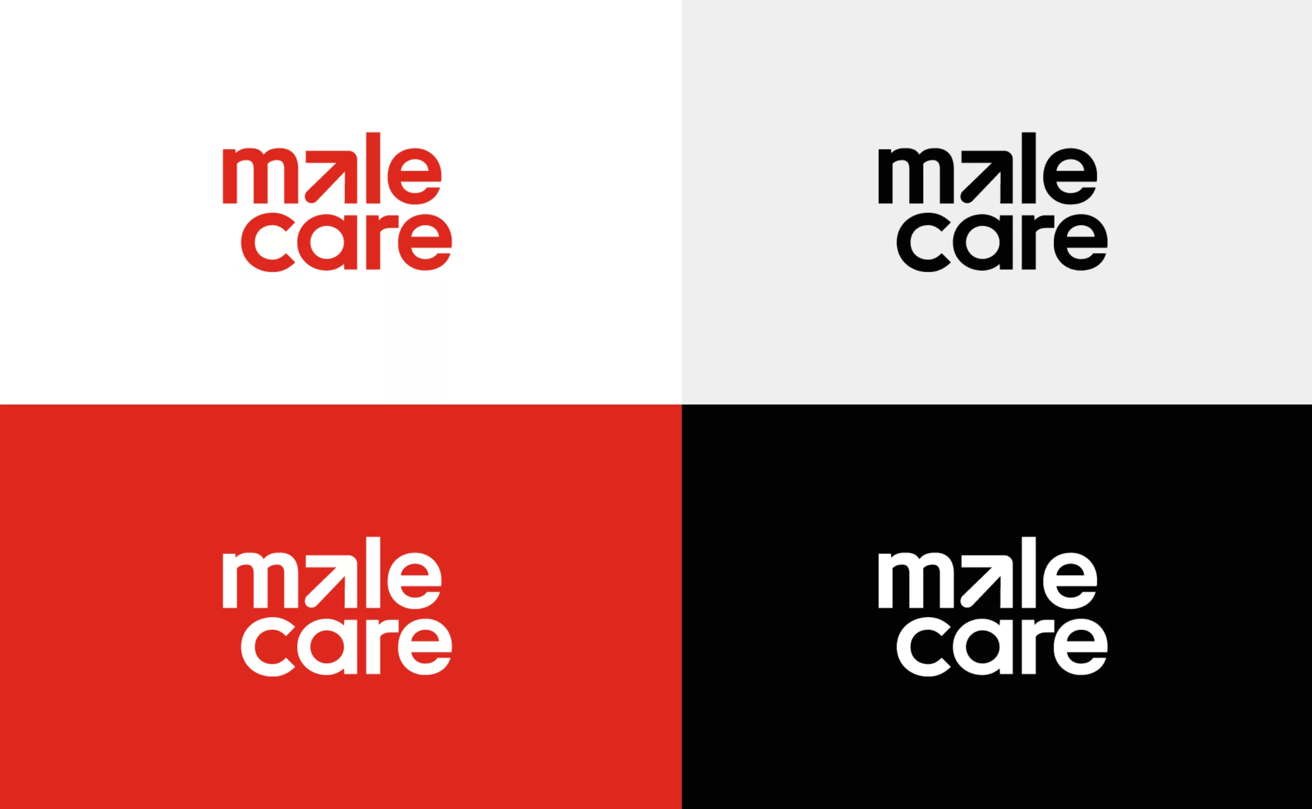
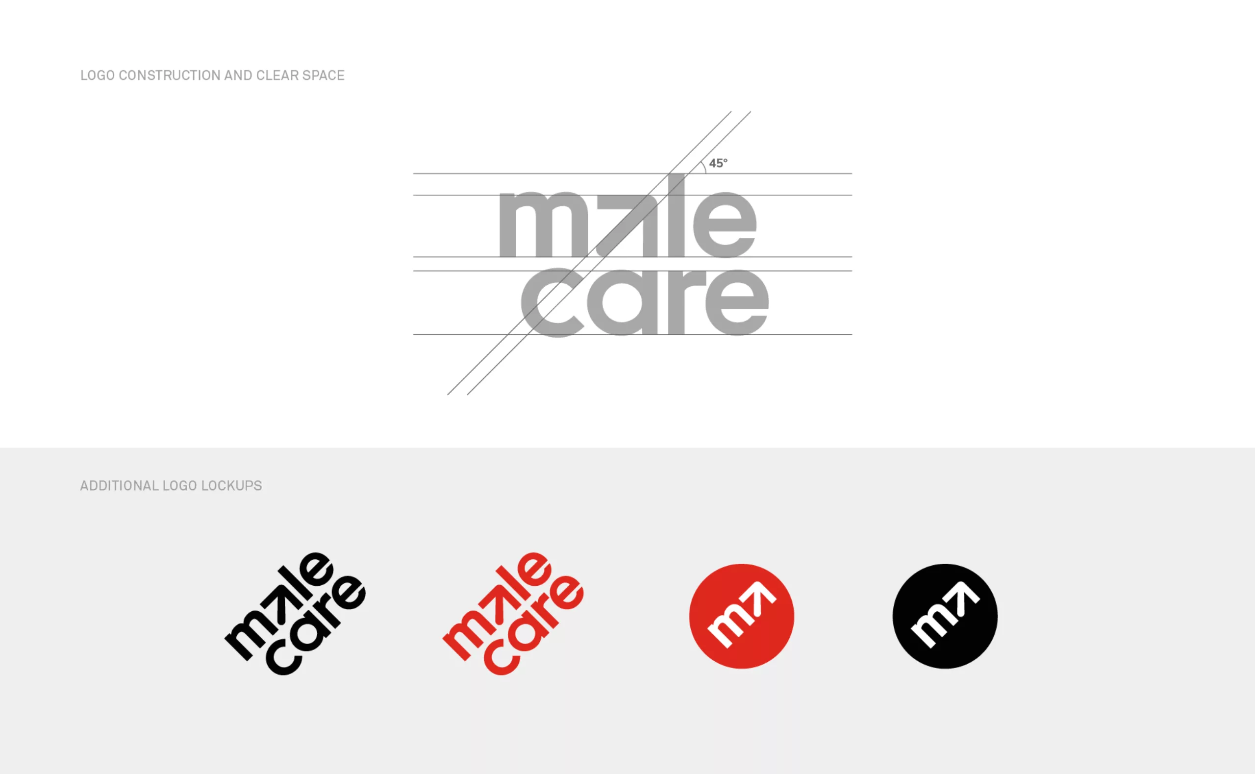
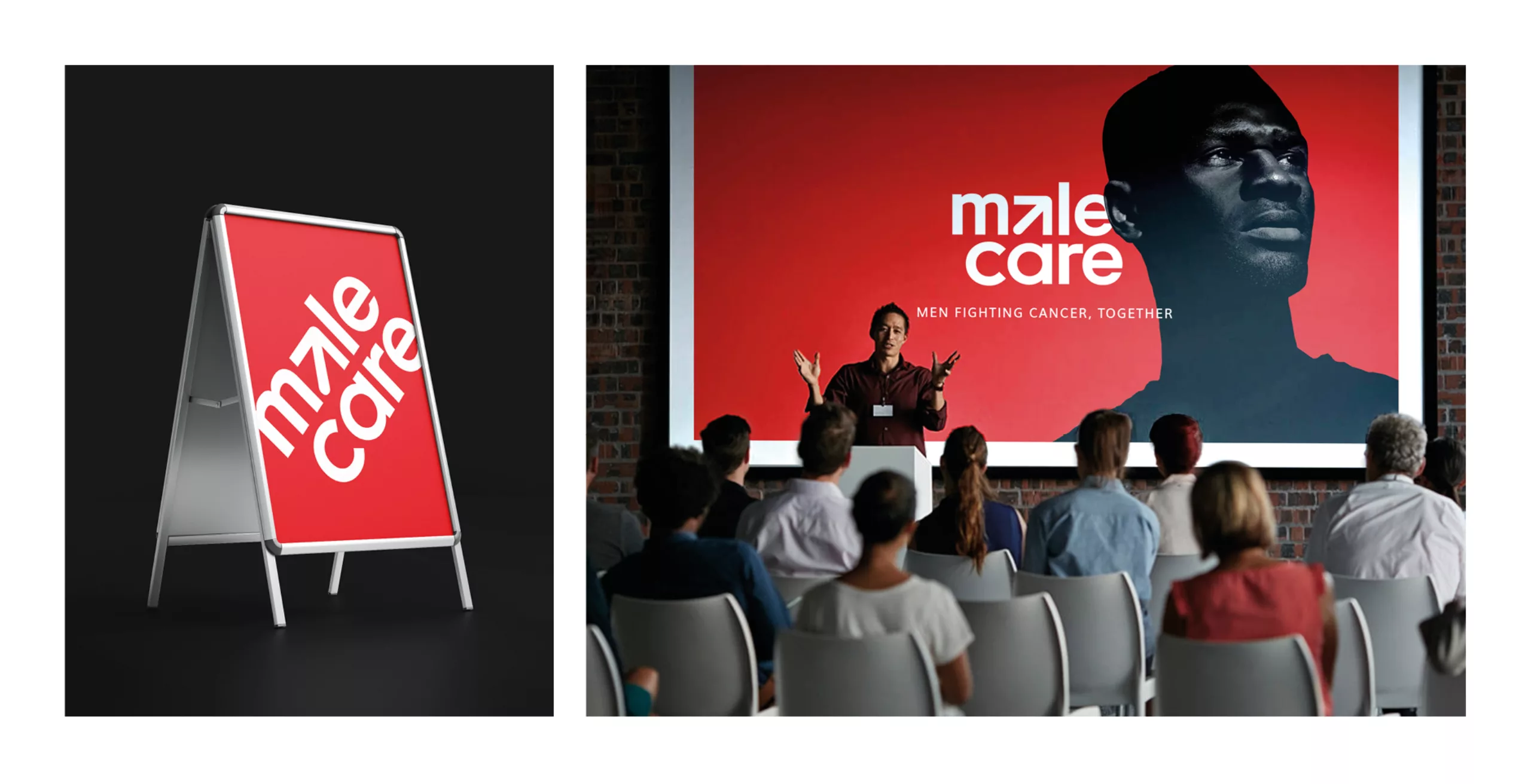
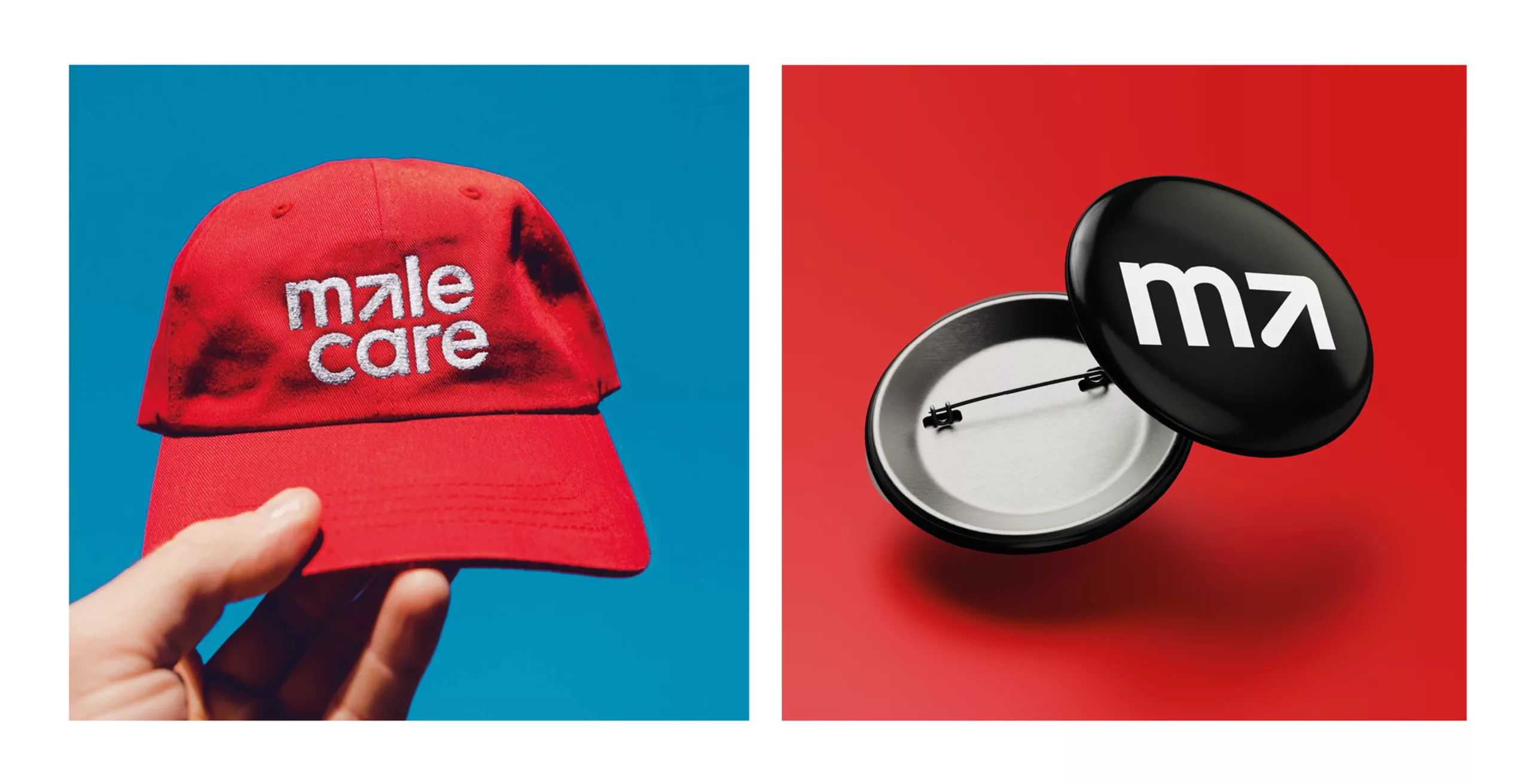
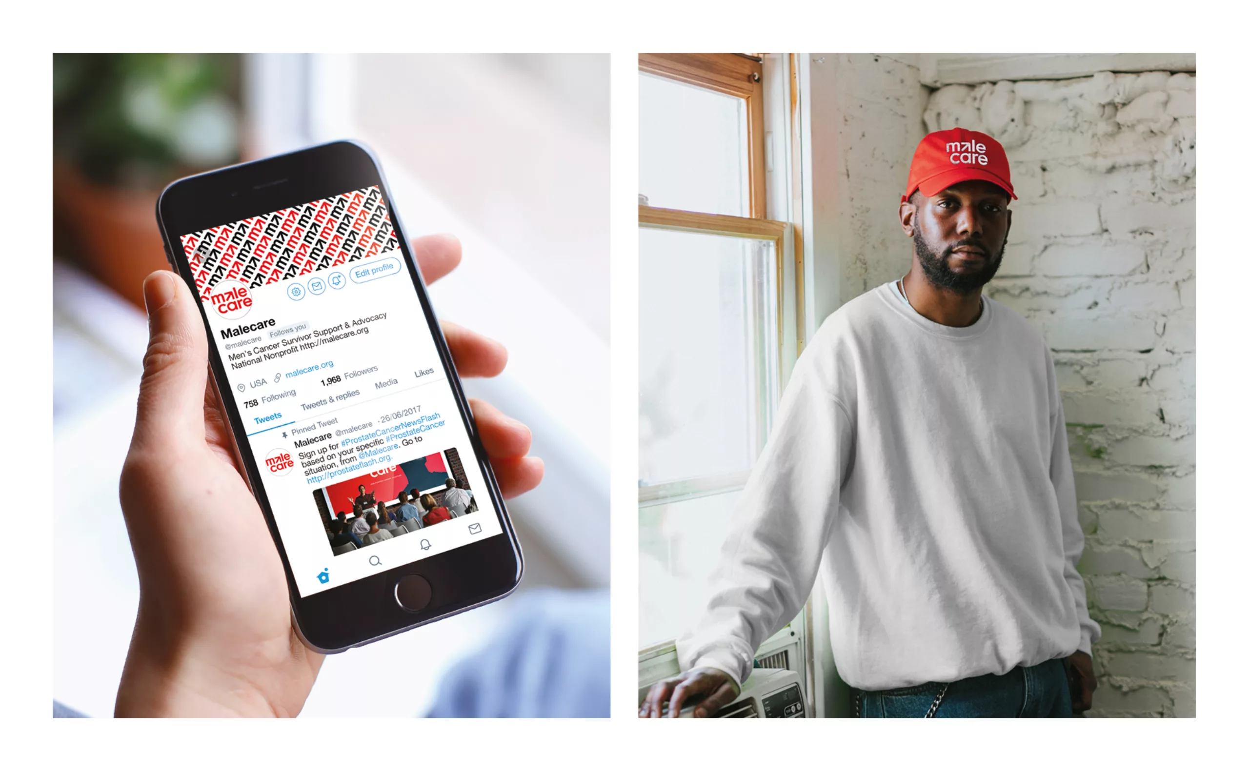
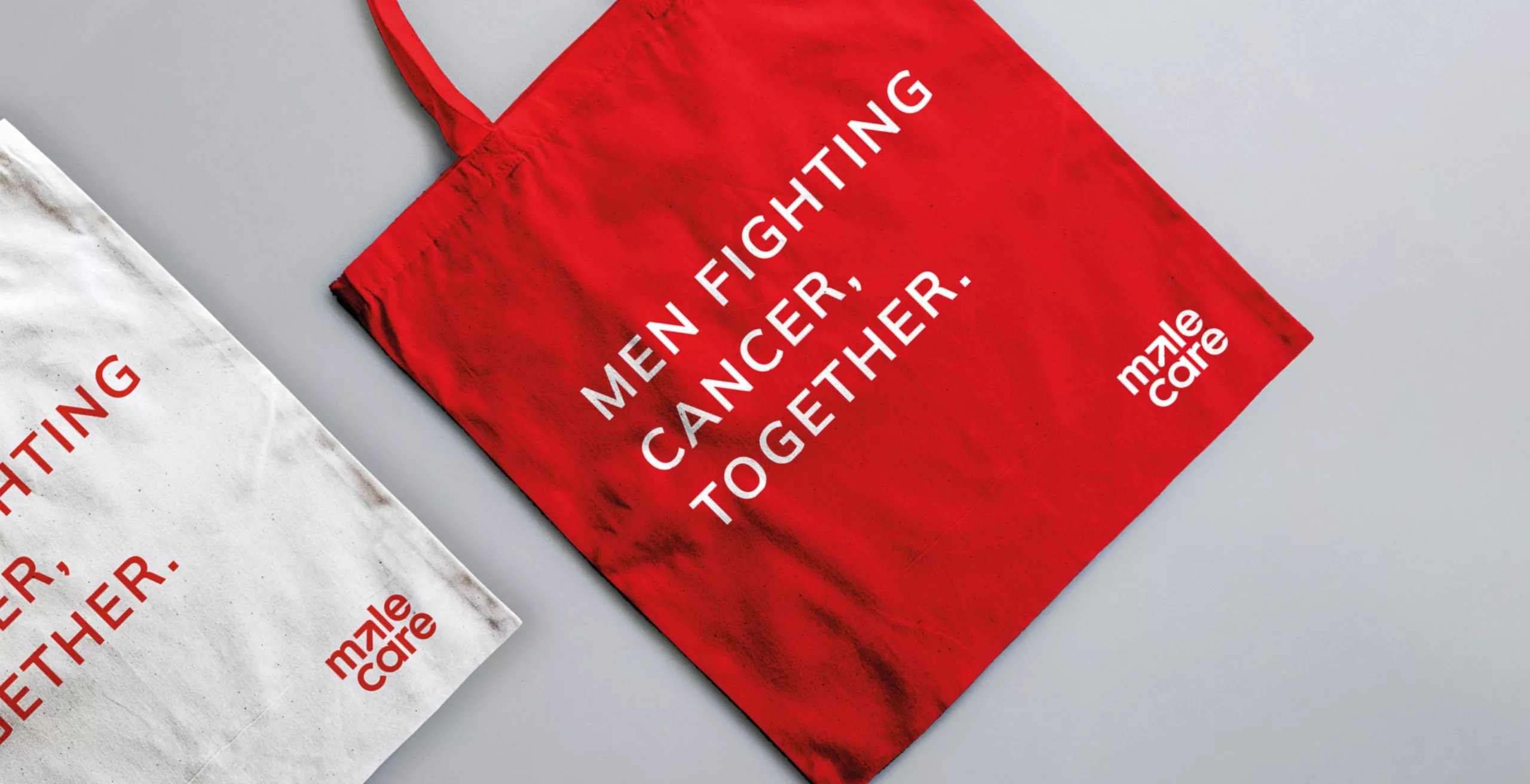
Graphéine accompanied the association for the revamp of its visual identity.

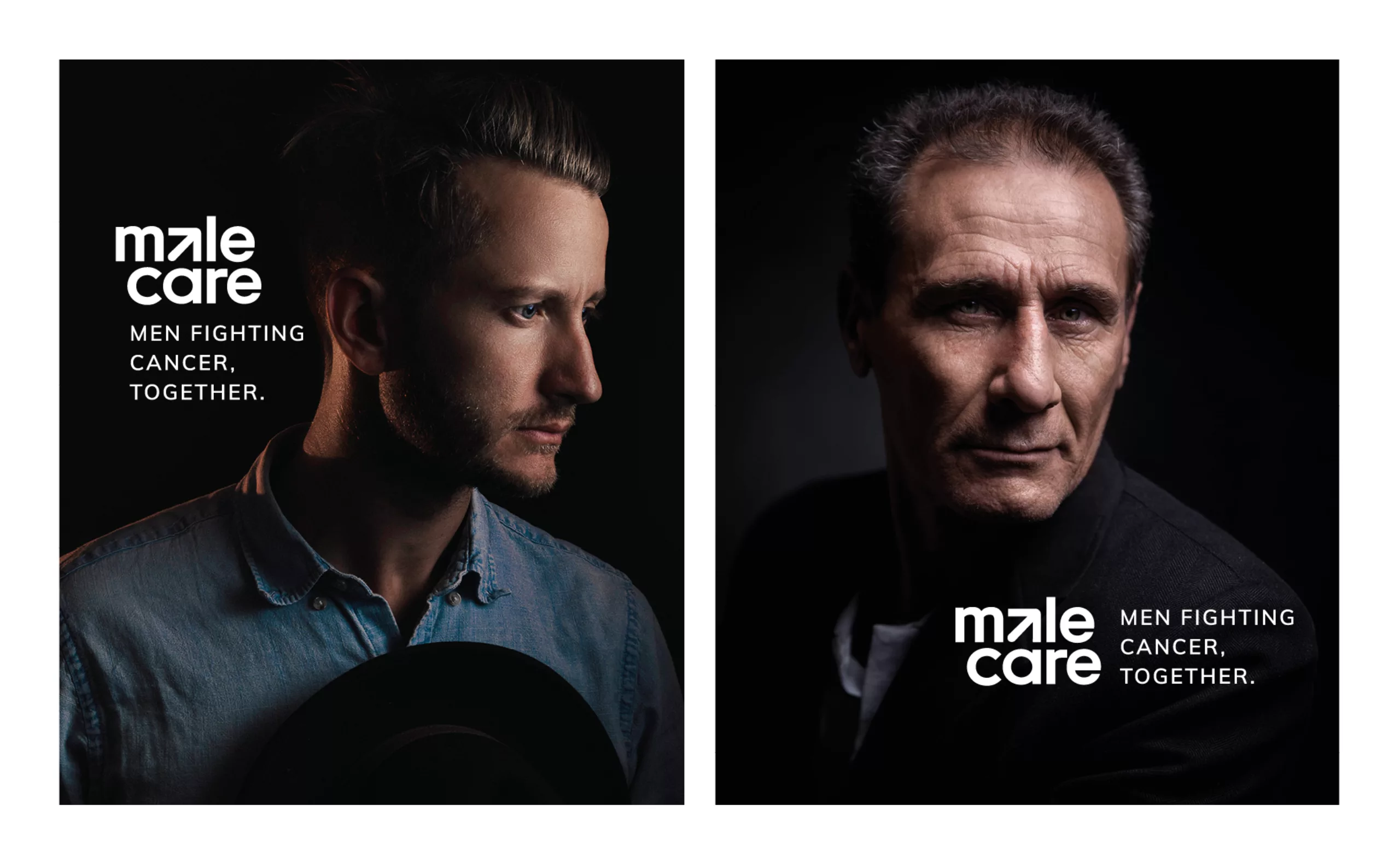
The objective was to provide Malecare with a strong brand and a logo that could be identified during its public speaking engagements.

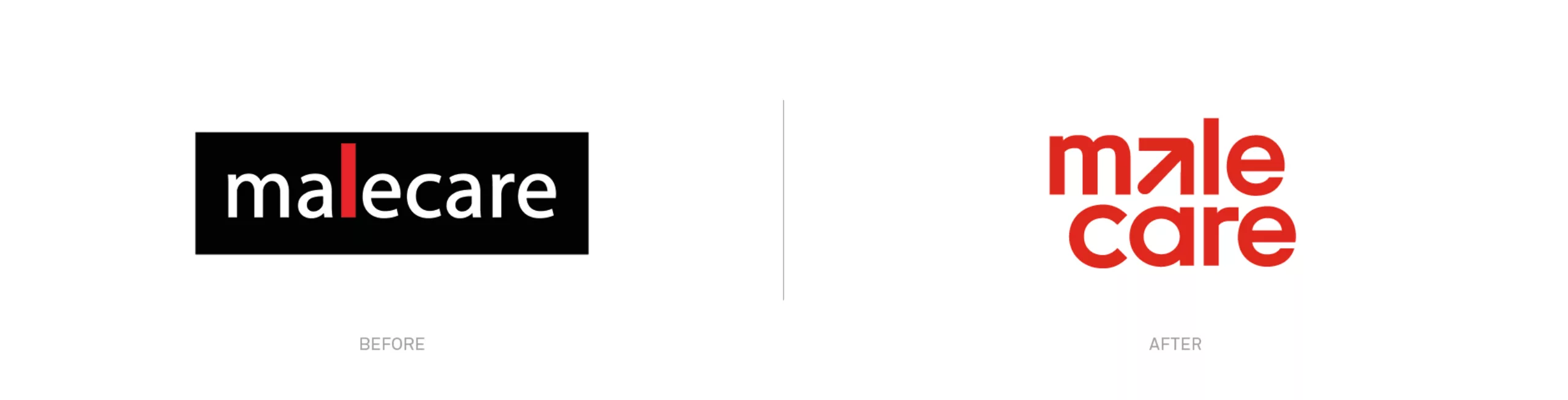
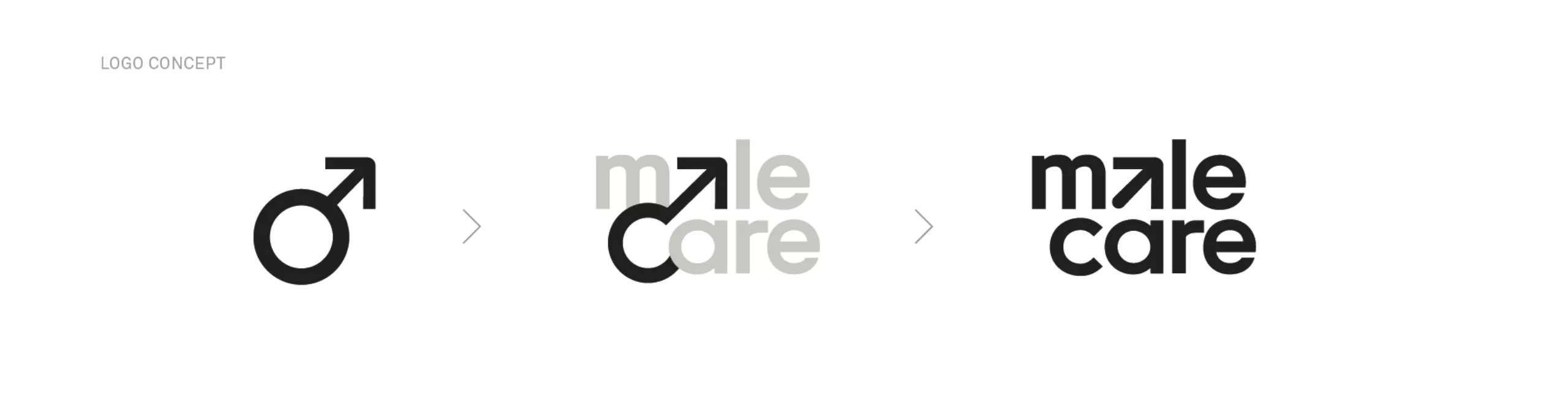
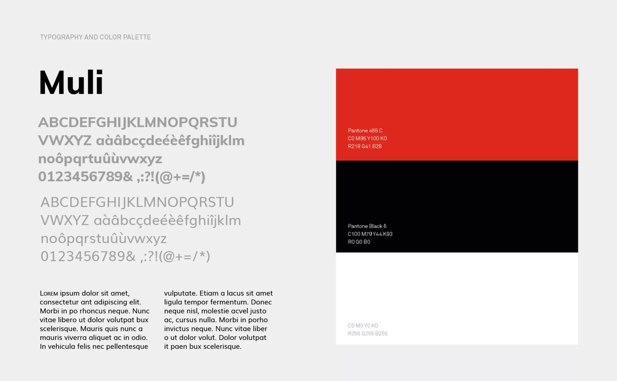
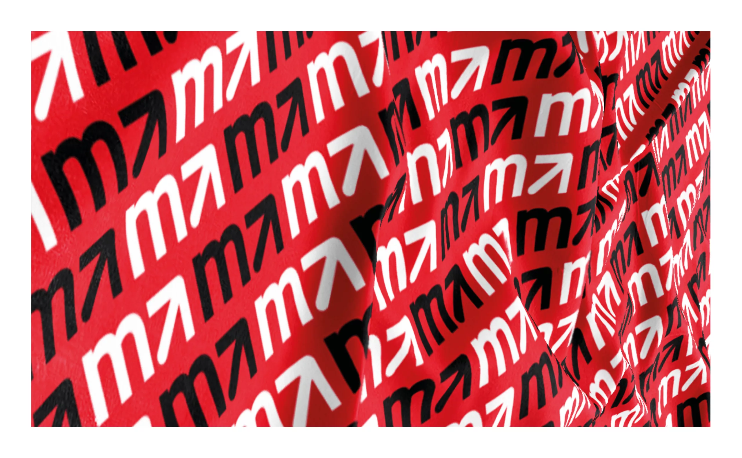
The logotype previously designed for the association consisted of a typographic wordmark that combined the words "male" and "care" with the letter "L" highlighted in red. The letter subtly hinted at the erectile dysfunction suffered by men with prostate cancer.

A new logo to stand against male cancer

The aim was to build a brand that was both strong and discreet. Prostate cancer is a painful subject associated with great suffering for patients and their families. Since men with this cancer can often perceive the disease as an attack on their virility, we wanted to create a logo that would allow members to carry the Malecare identity with dignity and without embarrassment about the subject.
The first step of the redesign was to split the name Malecare into two lines. This caesura allows a better reading of the wordmark.
The final logotype consists of a geometric wordmark that conveys the idea of care.
The rendering is both completely appropriate to the subject and timeless in this treatment. The arrow of the male symbol becomes the letter "a" in "male" as an evocation of a penis and to express the strength and commitment of the fight against cancer, while the circle becomes the "C" from "Care". In the end, the masculine symbol is entirely hidden inside the new "MaleCare" logo, creating a smart graphic asset while maintaining the brand's readability.

Men fighting cancer, together.

The association's slogan is "Men fighting cancer, together". The red of the logo is an emergency, an alert ; the importance of the care given to all men fighting cancer. The full logotype can be reduce to an "M + arrow" monogram, giving extra flexibility to play with the identity on digital media and various signage materials.
With a new visual identity that is both impactful and dignified, Malecare has a robust visual language to communicate and make its voice heard on a subject as important as the fight against cancer and support for people suffering from the disease.

Founded by Darryl Mitteldorf, oncology social worker and author or co-author of numerous peer-reviewed articles and book chapters, Malecare is America's leading men's cancer patient support and advocacy national nonprofit organization. We helped Malecare to stand out by designing a stronger brand identity with a new logo and visual guidelines. The objectif was to create new graphic assets with a smart concept at its core, keeping in mind the importance to give the new brand an humble touch to respect the patients' dignity.


Share this project:
Project expertise:
Logo creation, visual identity and graphic guidelines.
Type of client:
Communication in the education, higher education and health sector. An indispensable partner in the transformation of the health and wellness industry through the alchemy of creativity and technology.

Related projects: