

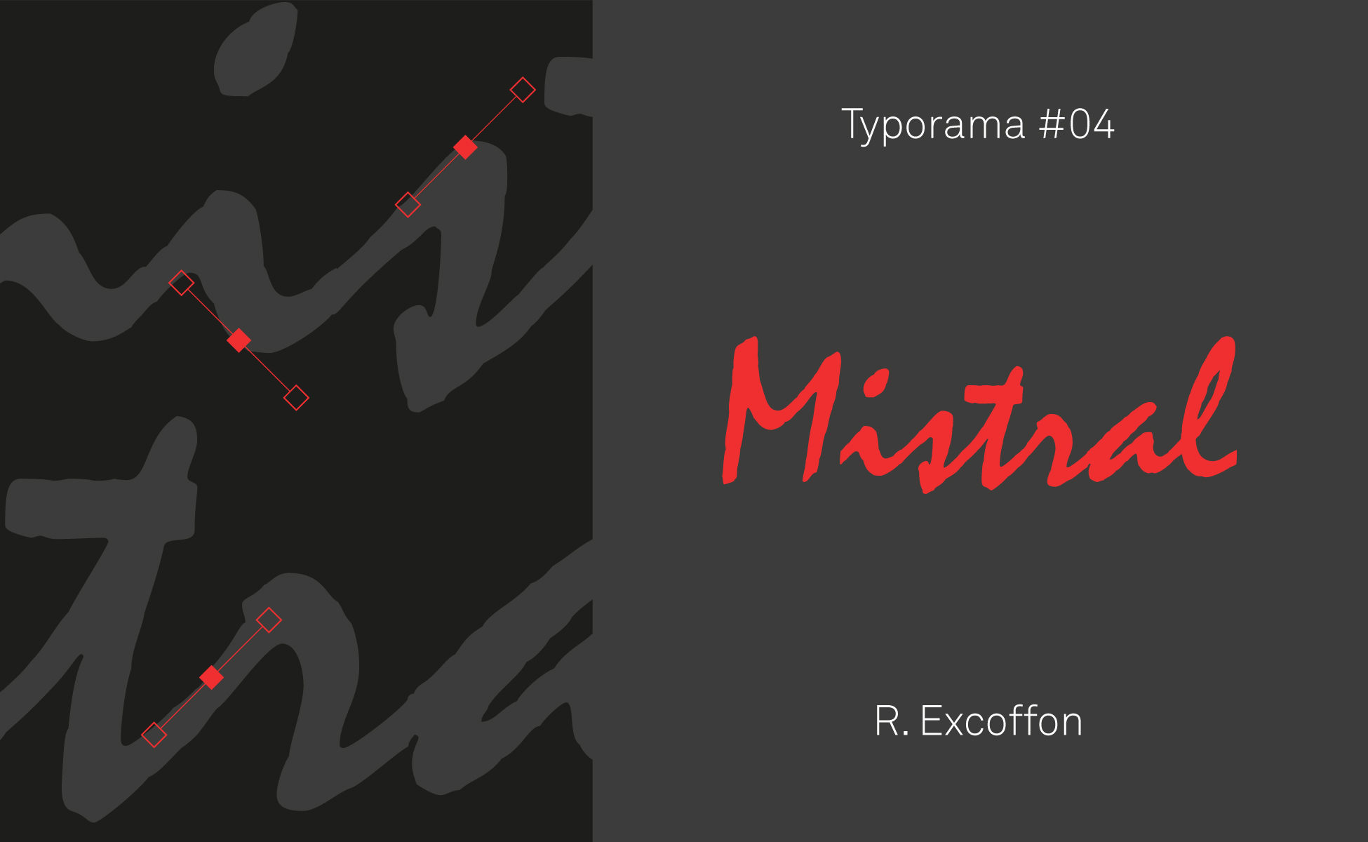


Like the portraits of great designers, we continue our series on the typographies that have marked the world of graphic design. Here is Typorama #04, about Mistral!
This typeface may share its name with a cold wind coming from the north, but it breathes Provence! It has become the favorite typeface of bakers, butchers, tobacconists and other small rural artisans. Its name alone is enough to awaken a whole universe as old-fashioned as it is modern: Mistral.
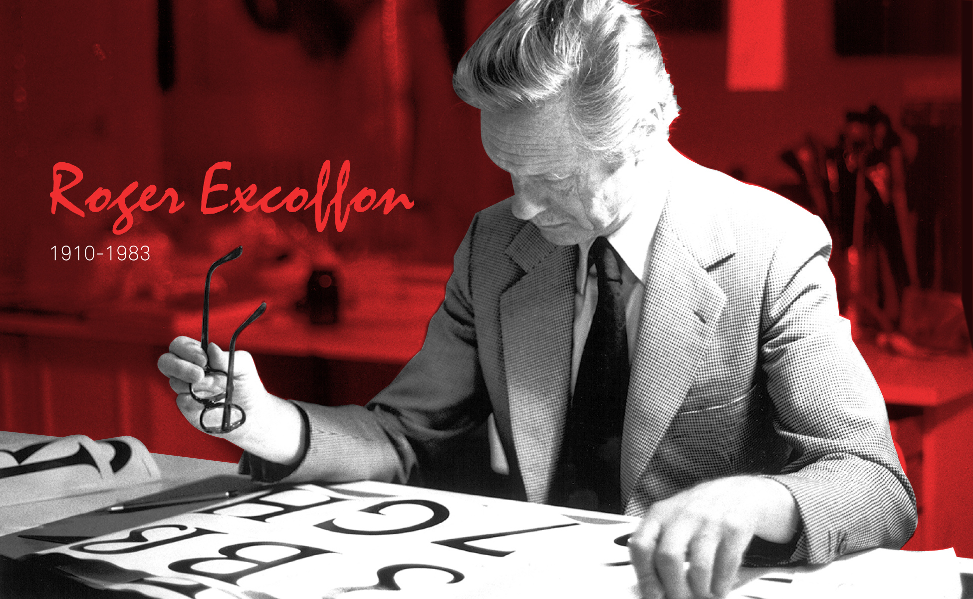
My name is Roger...
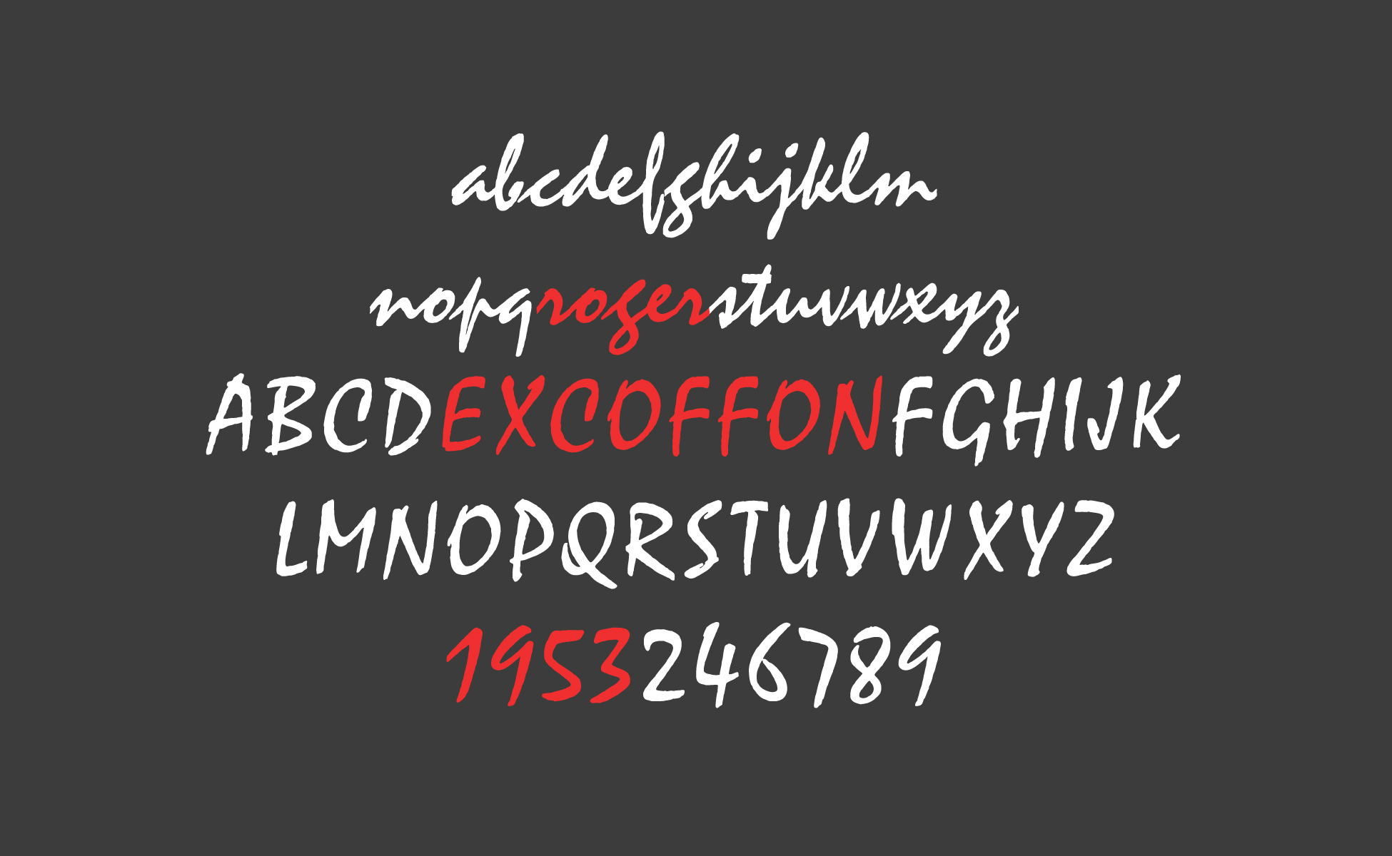
Roger Excoffon !
Roger Excoffon is a French graphic designer, typographer and advertising executive who designed some of the most daring typefaces of the 1950's and 60's. He is one of the most influential figures in French graphic design and typography. And yet if his name remains little known to the general public, his work is certainly known to most people.
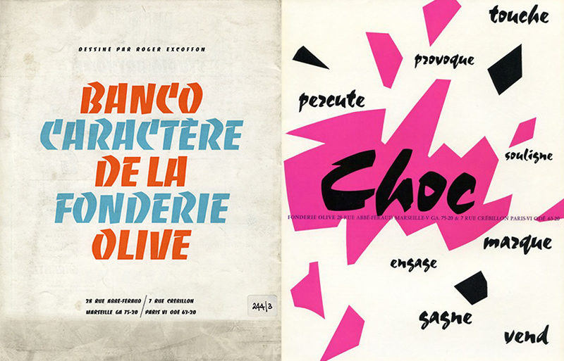
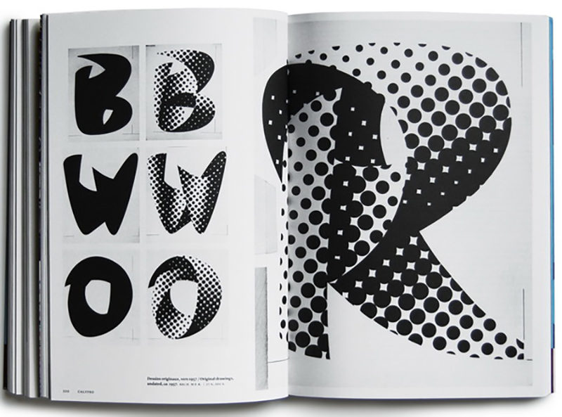
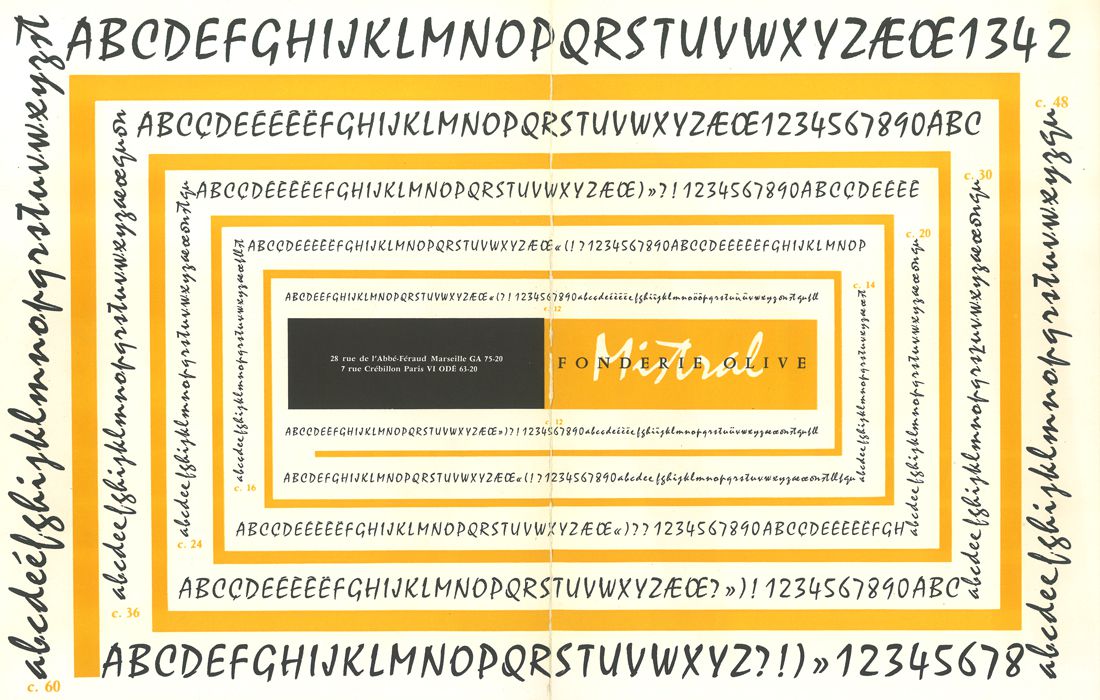
Beyond the typographic world, it is the entire French graphic landscape that he has durably marked through his work. It is with the Marseille foundry named Olive, of which his brother-in-law Marcel Olive was the director, that he exercised his activity as a type designer. Among his most emblematic creations are the Banco (1951), the Choc (1955) and the Calypso (1958). The Banco has also been very popular on the signs of bakers and tobacconists.


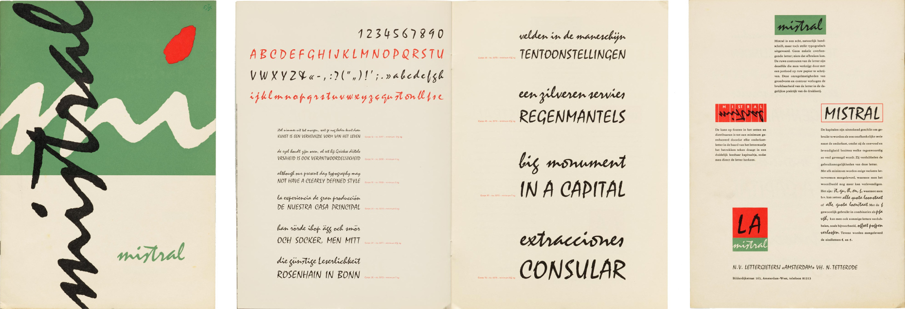
Mistral, a typeface with a Marseille accent!
But let's get back to Mistral which was designed by Excoffon in 1953. The Marseille-based typographer wanted to capture the impulsive, dynamic and rugged side of handwriting in his typeface. And it was after working on the handwriting of well-known characters that he decided to use his own as a model.
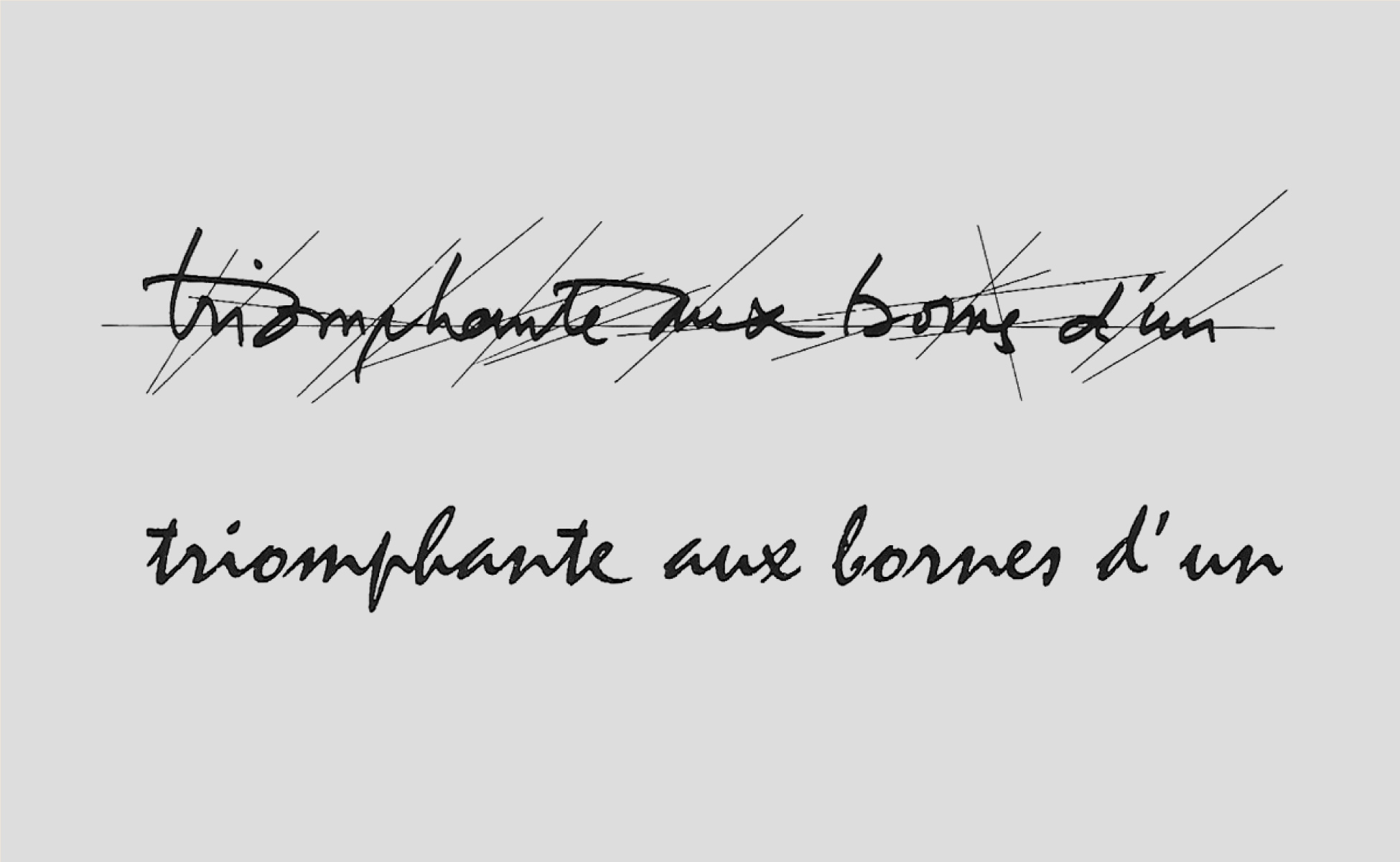
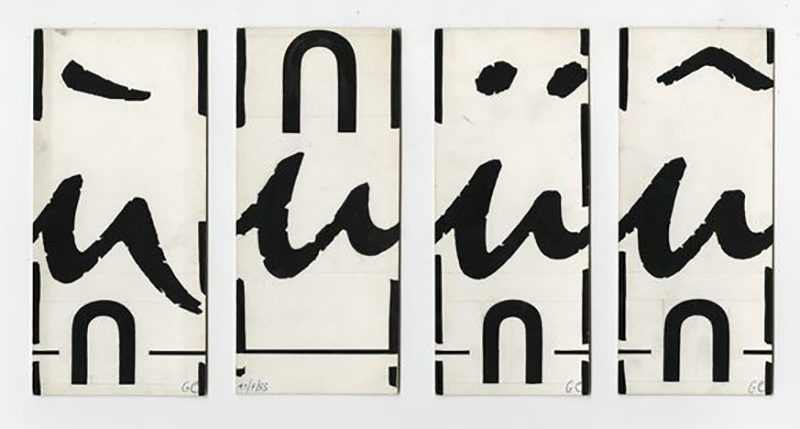
The steep and irregular stroke of this typeface gives it a spontaneous, playful and warm aspect. When it is laid down on paper, its letters seem to dance and respond to each other on the page. Roger Excoffon will push his search for spontaneity to the point of designing alternative characters for the accented a and u, the final e and s, as well as certain bigrams like qu, ll, st and on.
Usually fonts are characterized by the redundancy of certain shapes. Notice how often the "d" and "b" are simple symmetries, as between a "p" or a "q". But Mistral is full of irregularities. Its "g" looks like a kind of "s", its "q" looks like a "9"... all the flavor of this character comes from this delicate Provencal cuisine. In fact, you can almost hear the cicadas singing!

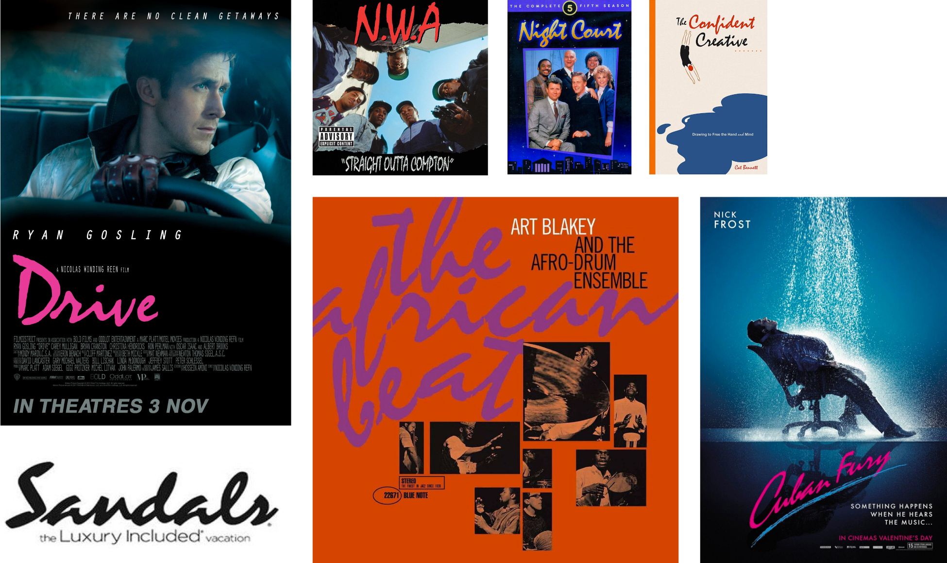
It seems to be full of freedom and gives off something sincere, familiar and wild. This is what the rappers of the American group N.W.A felt when they first used it for their logo and the title of their 1988 album Straight Outta Compton. To achieve this result, Roger Excoffon had to face the technical constraints of the typographic composition of the time. Indeed, the rigidity of the mobile lead characters obliged the typographer to redouble his rigor to keep this feeling of fluidity in the sequence of letters and thus give the reader the impression of a handwritten script.

The ideal typography for sushi restaurants?
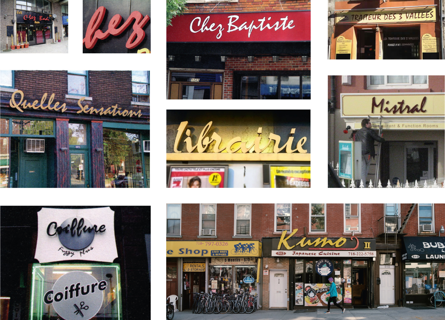
Most of the typefaces sold by the Olive Foundry were very successful shortly after their release and Mistral is no exception. Very popular in the 1960s, it was overused by everyone and for everything until it became obsolete and synonymous with bad taste and old-fashioned. It's hard not to come across a bakery, a butcher's shop or a sushi restaurant that doesn't use the Mistral!

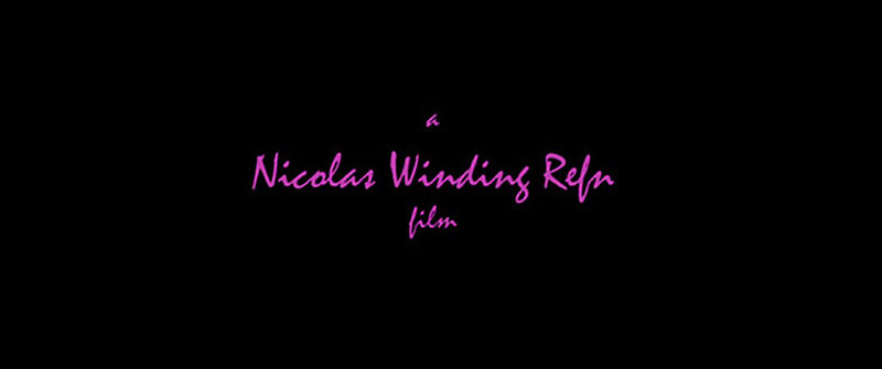
owever, the Mistral recently regained its letters of nobility thanks to a renewed interest from graphic designers. For example, it returned to the forefront in 2011, when it was chosen to embody the title and credits of the American film Drive, giving it a second youth. You didn't know what Hollywood had in common with a bakery in Marseille? Here it is.


Et pour ceux qui veulent se plonger dans la vie de Roger Excoffon, (re)découvrez l'article complet de notre série Les grands noms du design graphique.
And for those who want to dive into the life of Roger Excoffon, (re)discover the complete article of our series The Great Names of Graphic Design.
Mistral Island
To finish, we propose you the episode on the Mistral from the podcast "l'Océan des Cent Typos". A podcast where you can follow the adventures of the intrepid Malo Malo ! ...that we thank, by the way, for the writing of this article ! :-)