
![]()
Last December we were commissioned to work on the new visual identity of the Saint-Étienne Opera House. After nearly six months of work, we are tremendously proud to unveil this project today.
With more than 150 curtain lifts for around 60 performances throughout the 2014-2015 season, the Saint-Étienne Opera House is a landmark of great cultural importance, a predominant player in the cultural life of the city.
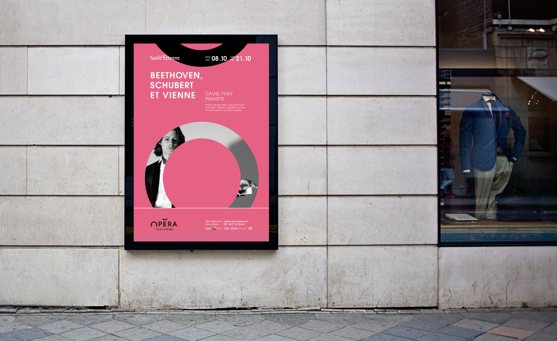
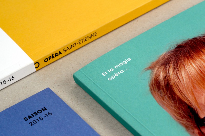
The objective laid out in this commission was to re-establish a sense of closeness with the people of Saint-Étienne through simple and down-to-earth communication. The main change was forgoing the “Opera-Theatre” name in favour of “Saint-Étienne Opera” to reflect an image of a traditional Opera House for its aficionados, but also to draw in potential opera-goers. As for the theatre programme, it has been put in the hands of the recently reopened “Comédie de Saint-Étienne”.

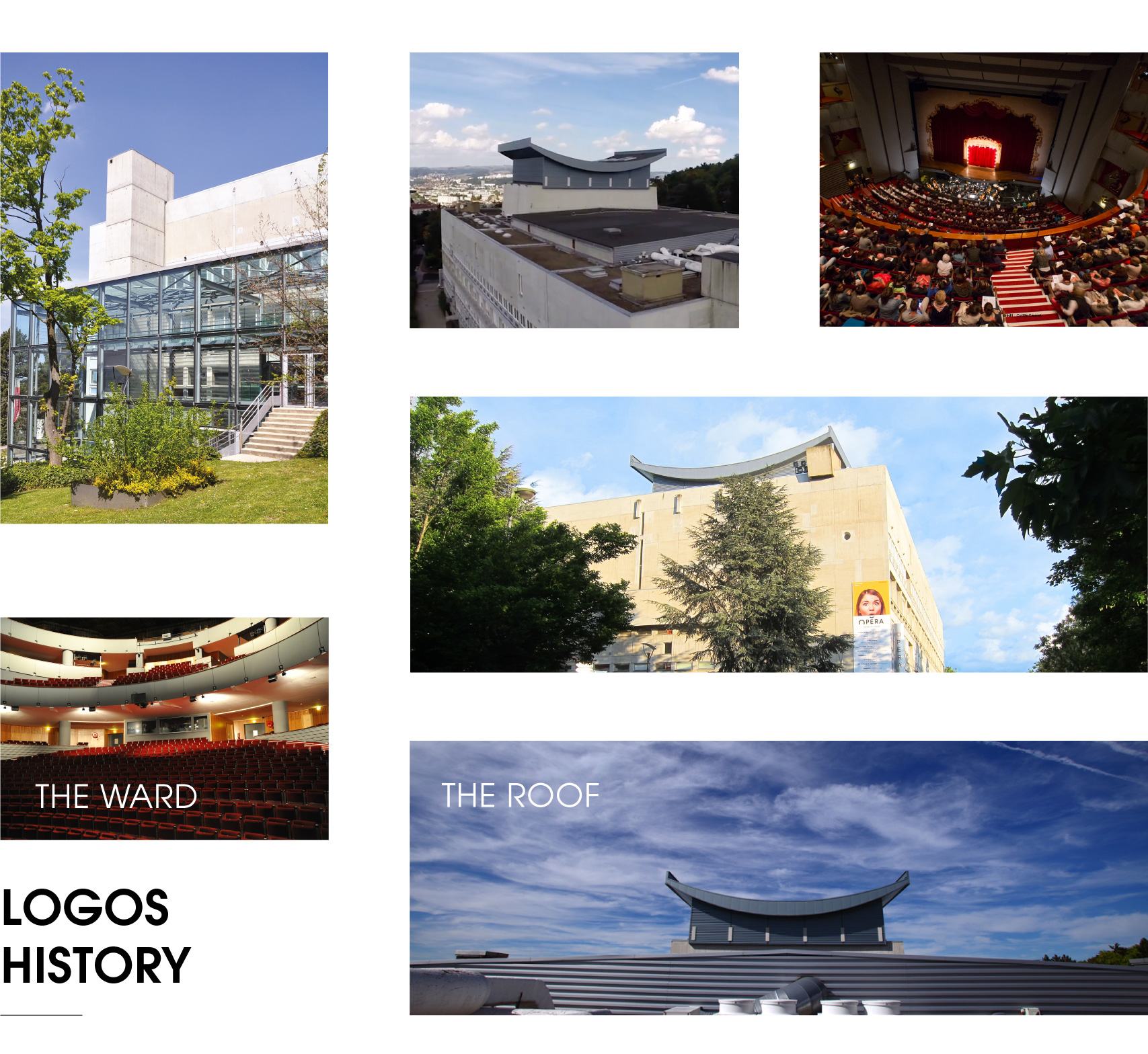
1969
Inauguration of the Maison de la Culture et des Loisirs cultural centre by André Malraux. It is named L’Esplanade.
1998
An arson attack destroys the Massenet Theatre. An open-air programme is organised over two seasons. In 2001, the Massenet Theatre re-opens to the public. In 2006, L’Esplanade becomes the Opera-Theatre of Saint-Étienne.
2015
A new chapter is written: the Opera-Theatre of Saint-Étienne becomes the Saint-Étienne Opera House, offering a programme with a clear operatic note, in which the Symphonic Orchestra of Saint-Étienne Loire and the Opera Choir of Saint-Étienne Loire are at the forefront.
![]()

![]()
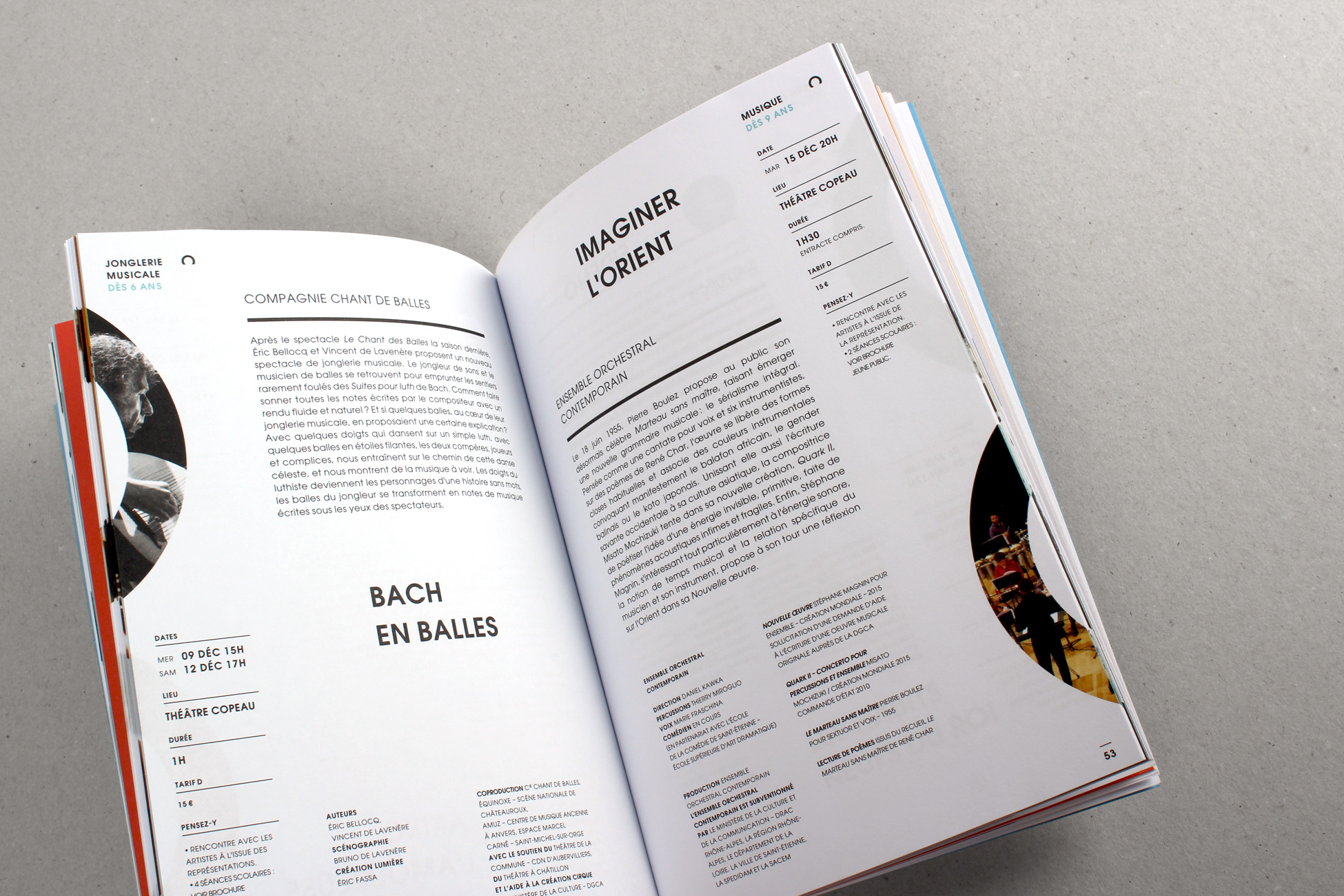
THE ROOFTOP
An unmissable architectural feature, the roof of the building looks as if it is giving a sign. With its location from the heights of the Jardin des Plantes park, the sign looks over the city. For Saint-Étienne’s inhabitants it has become part of their landscape.
THE HALL
Perfectly circular, the hall offers exceptional comfort and acoustics.
![]()
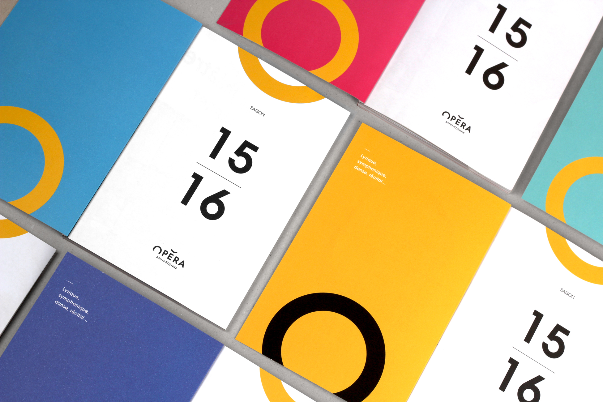
AN ACCENT ON THE TOP
On the top of the “E”, the accent stresses the syllable by increasing the intensity of the voice. It decks the word “opéra” with the image of the building’s pagoda.
THE OPERA WITH
A CAPITAL "O"
The shape of the “O” brings to mind an open mouth singing an operatic aria. The “O” is used to show a strong emotion such as surprise, admiration, joy, etc.
![]()
Rhythm is life
In opera, music and dance are intimately linked through “movement”. This could be the movement of a body, of musical notes or simply the emotions* triggered by these two art forms. (*The word “emotions” literally means “to make movement” of feelings). The emotion behind this logo comes from the optical framing trick between an “O” and the “accent”. The “O” looks as if it’s disappearing at the same time as the accent appears. That’s Opera’s magic!
![]()
![]()


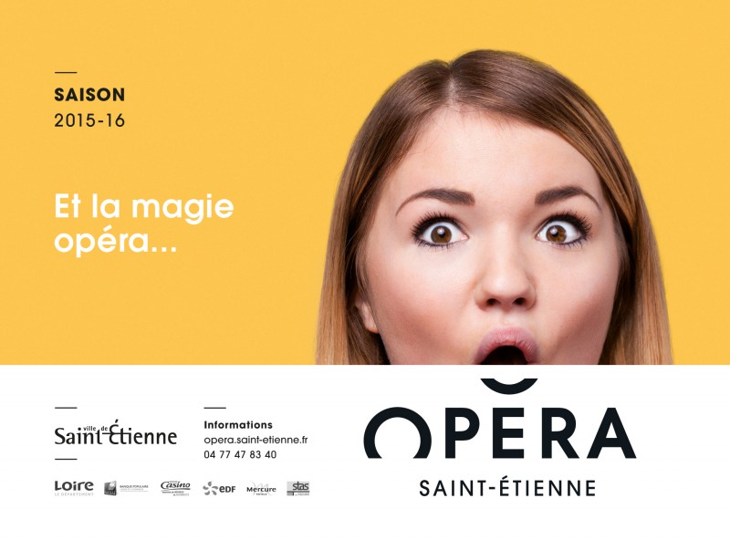

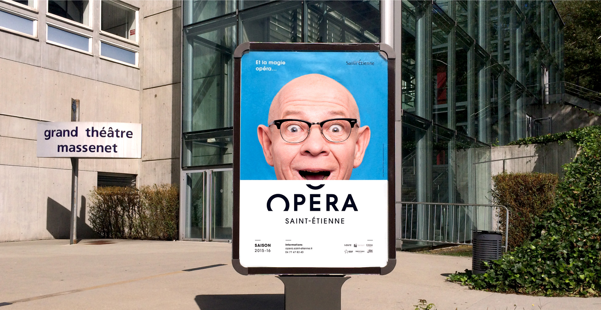
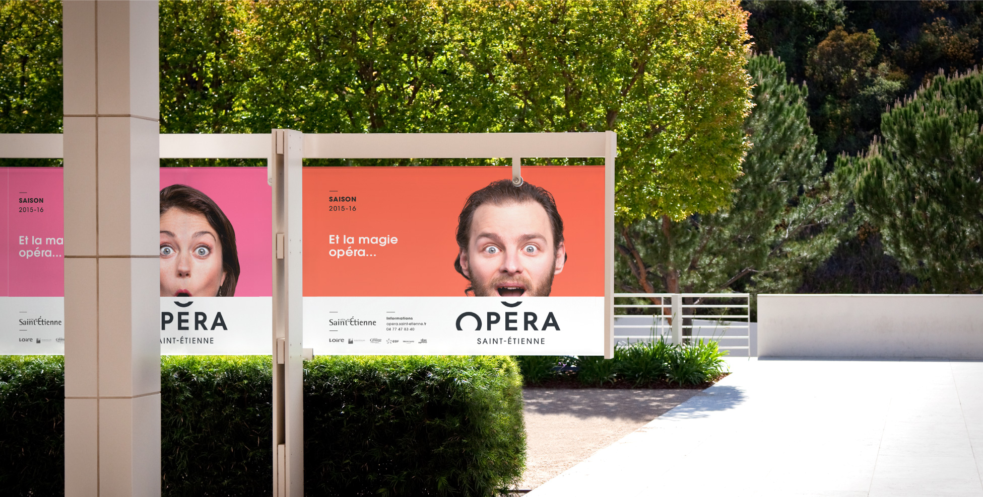
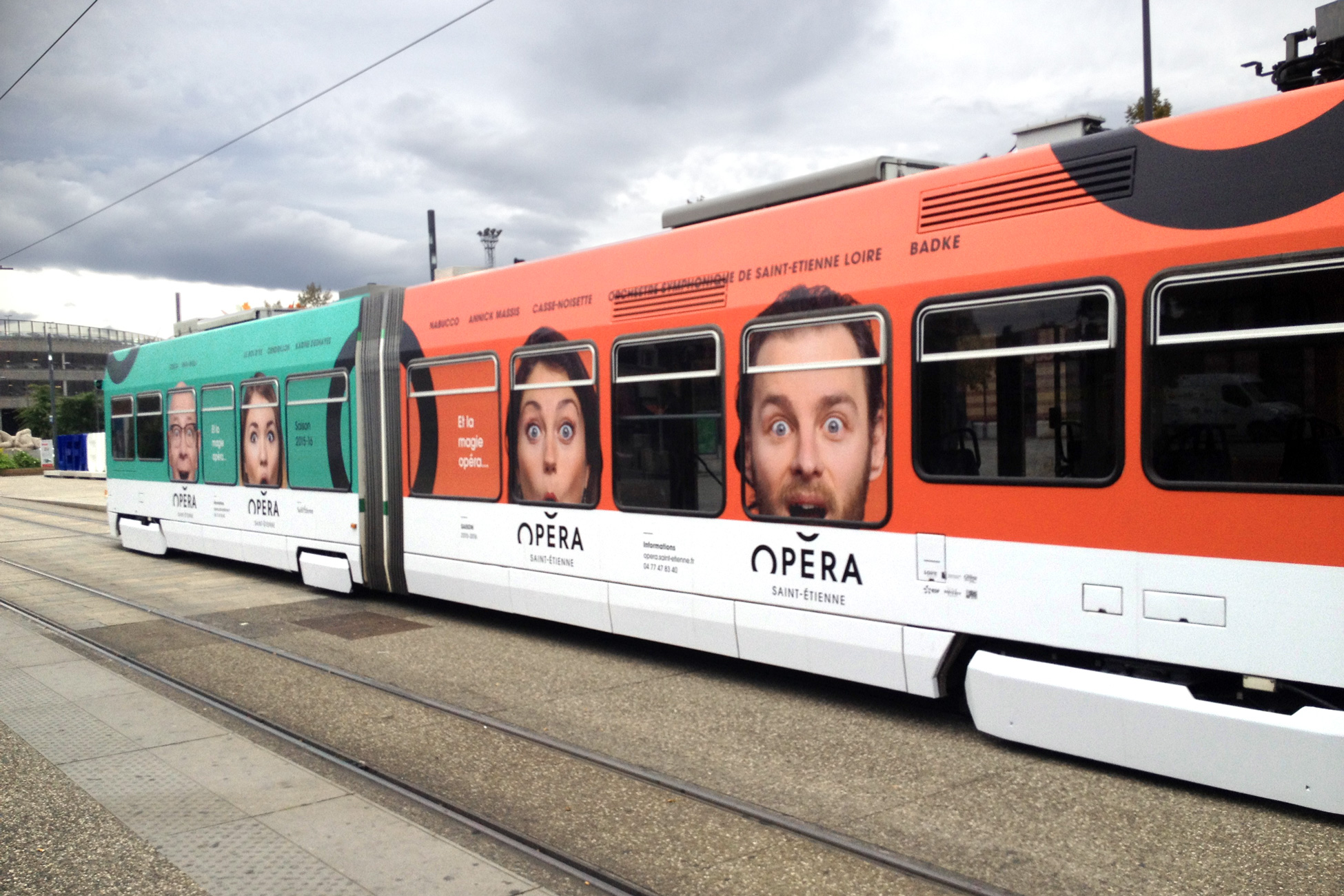
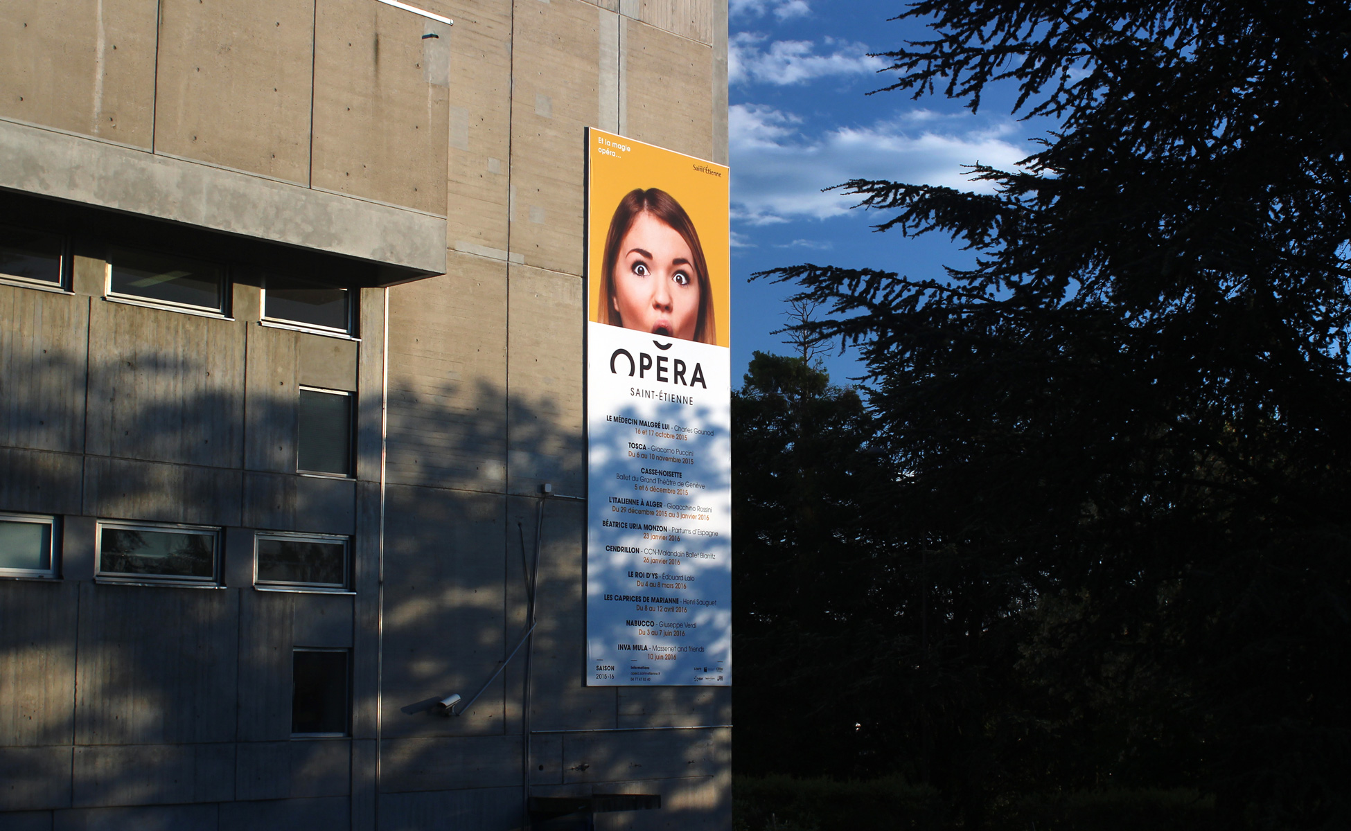

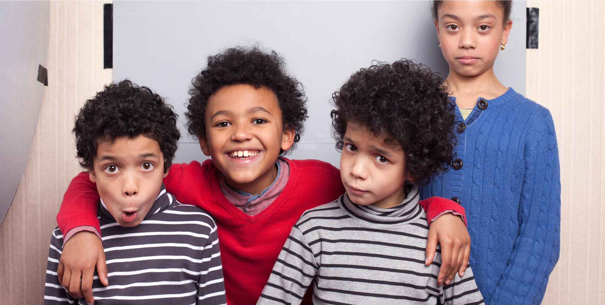
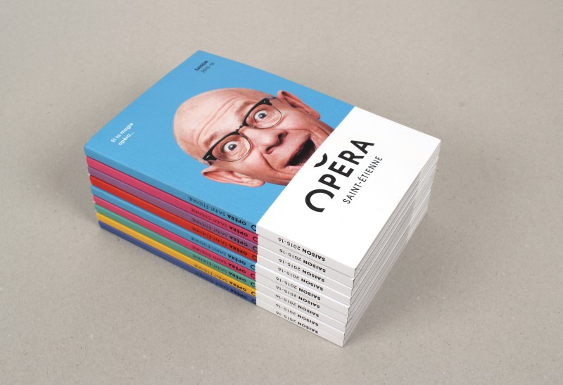
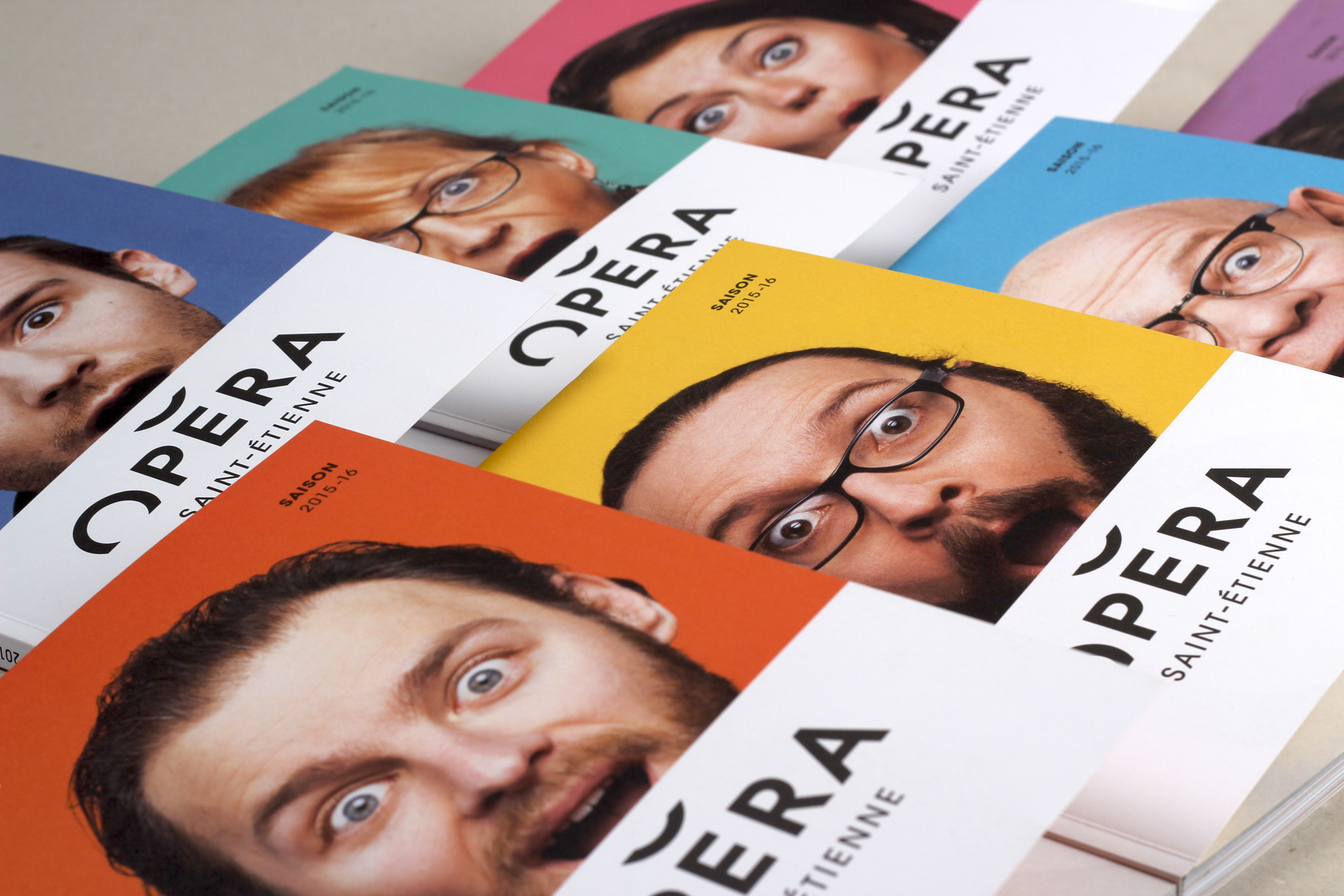
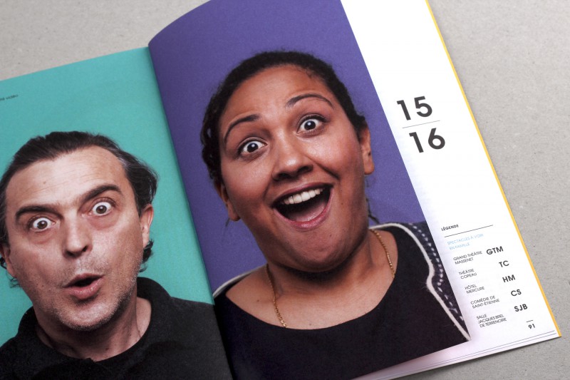
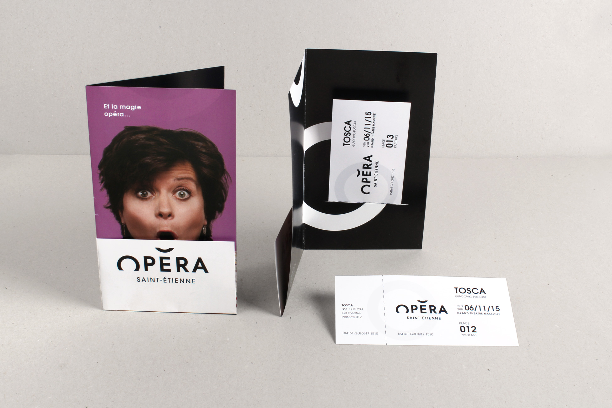
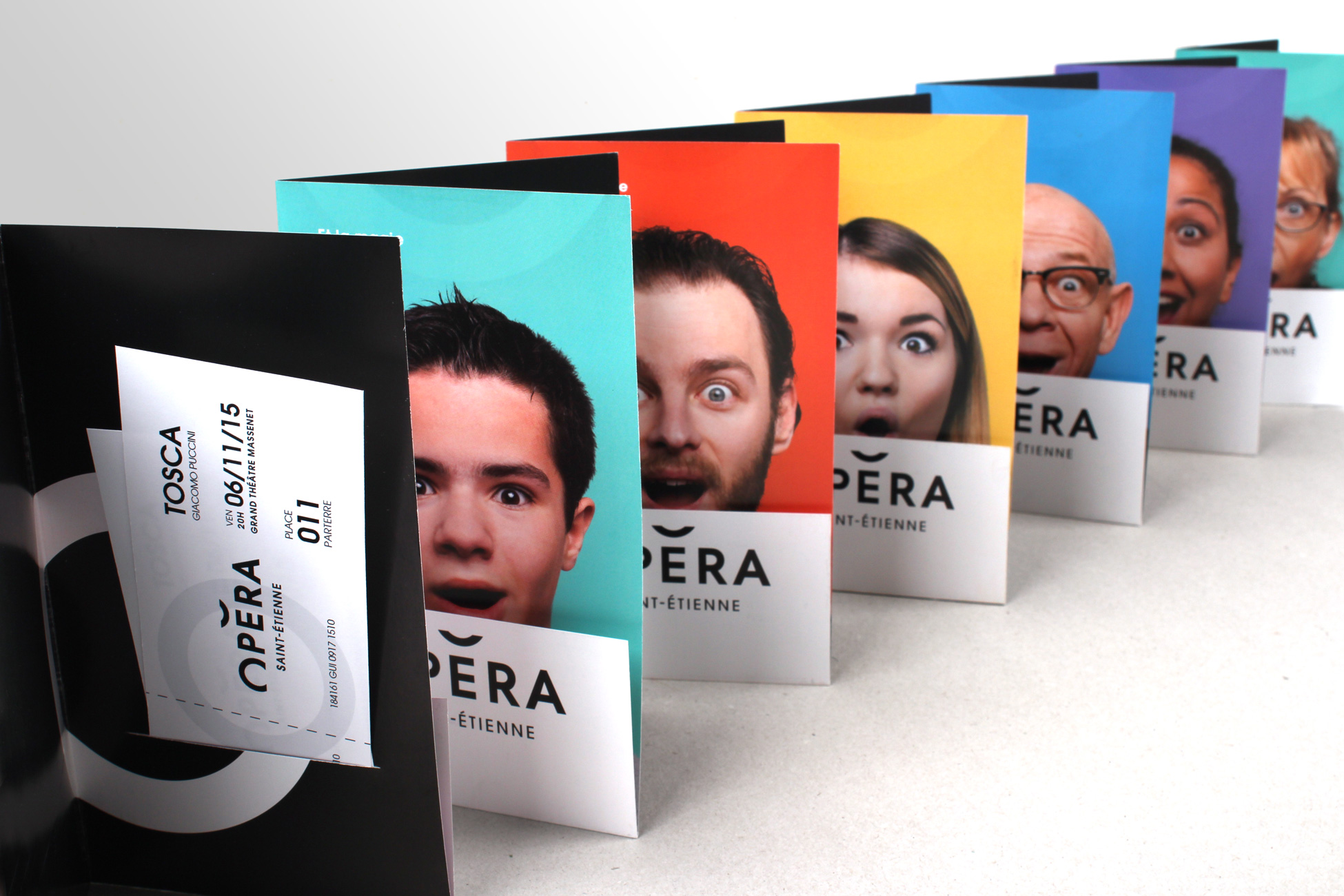
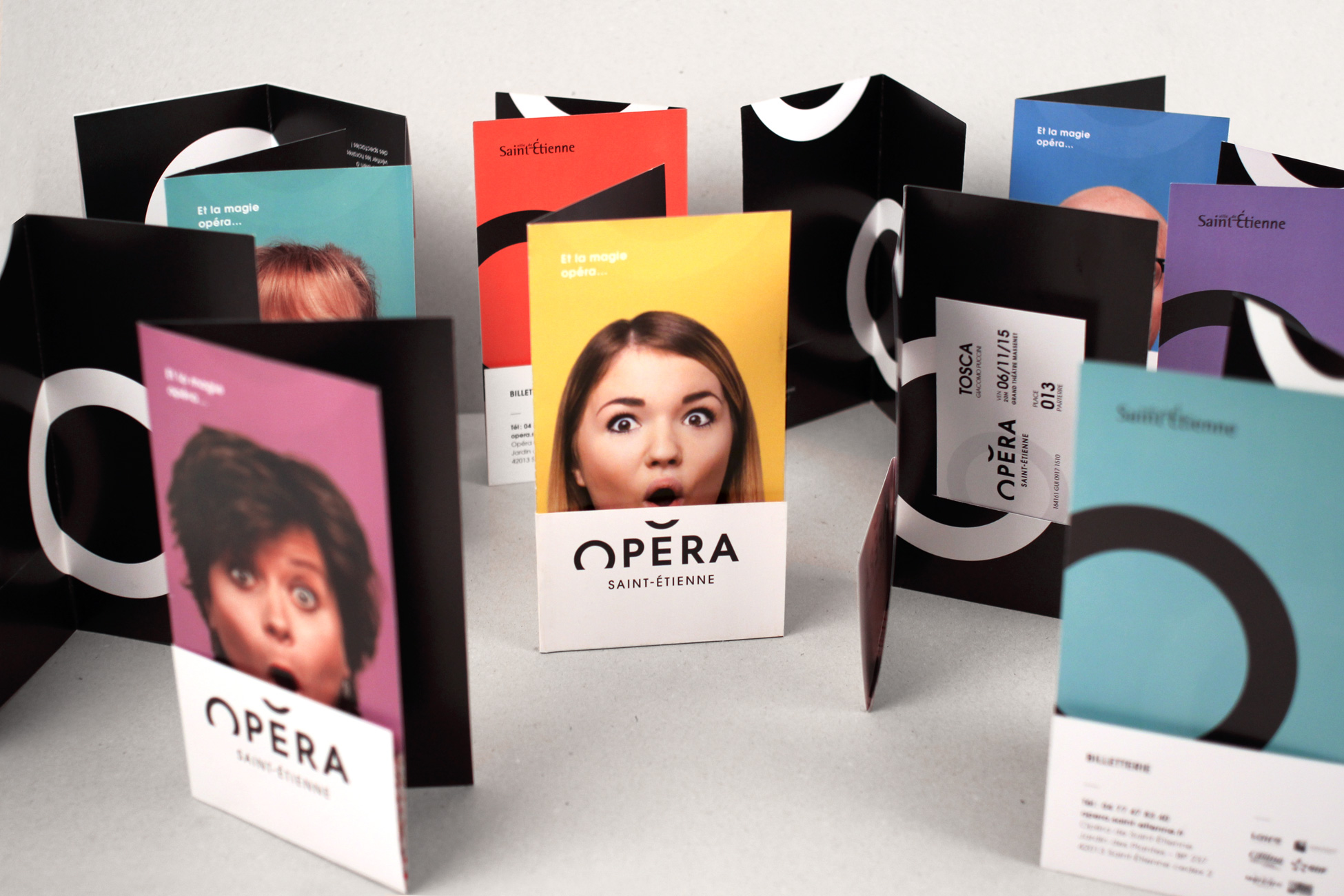
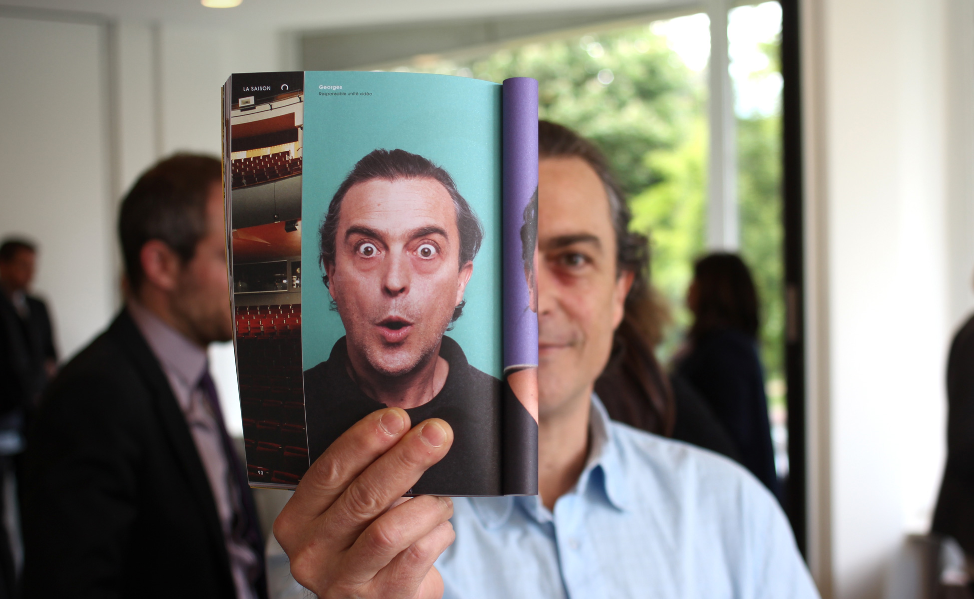
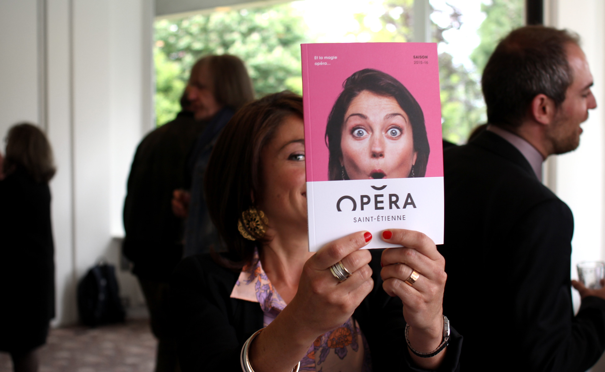
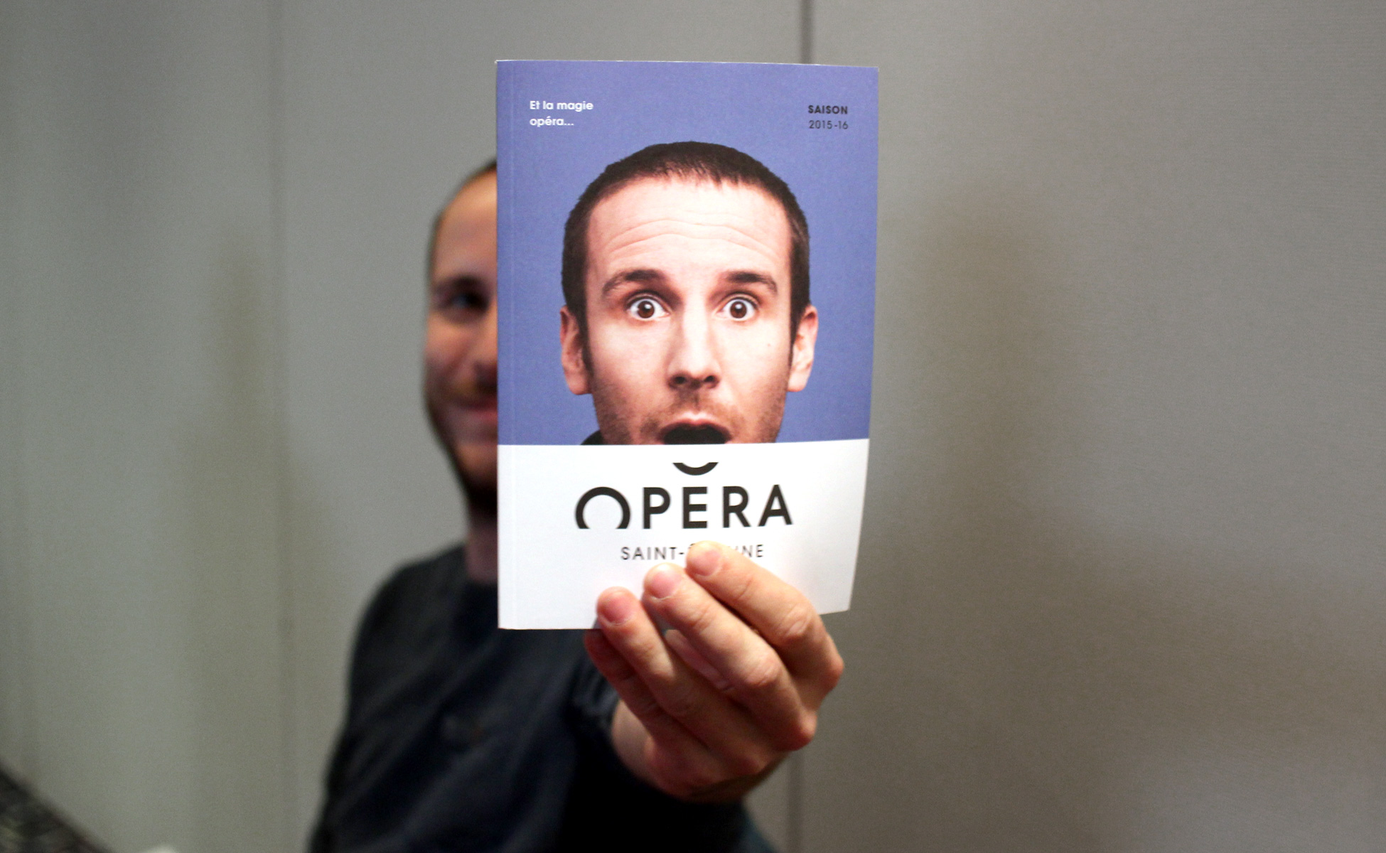
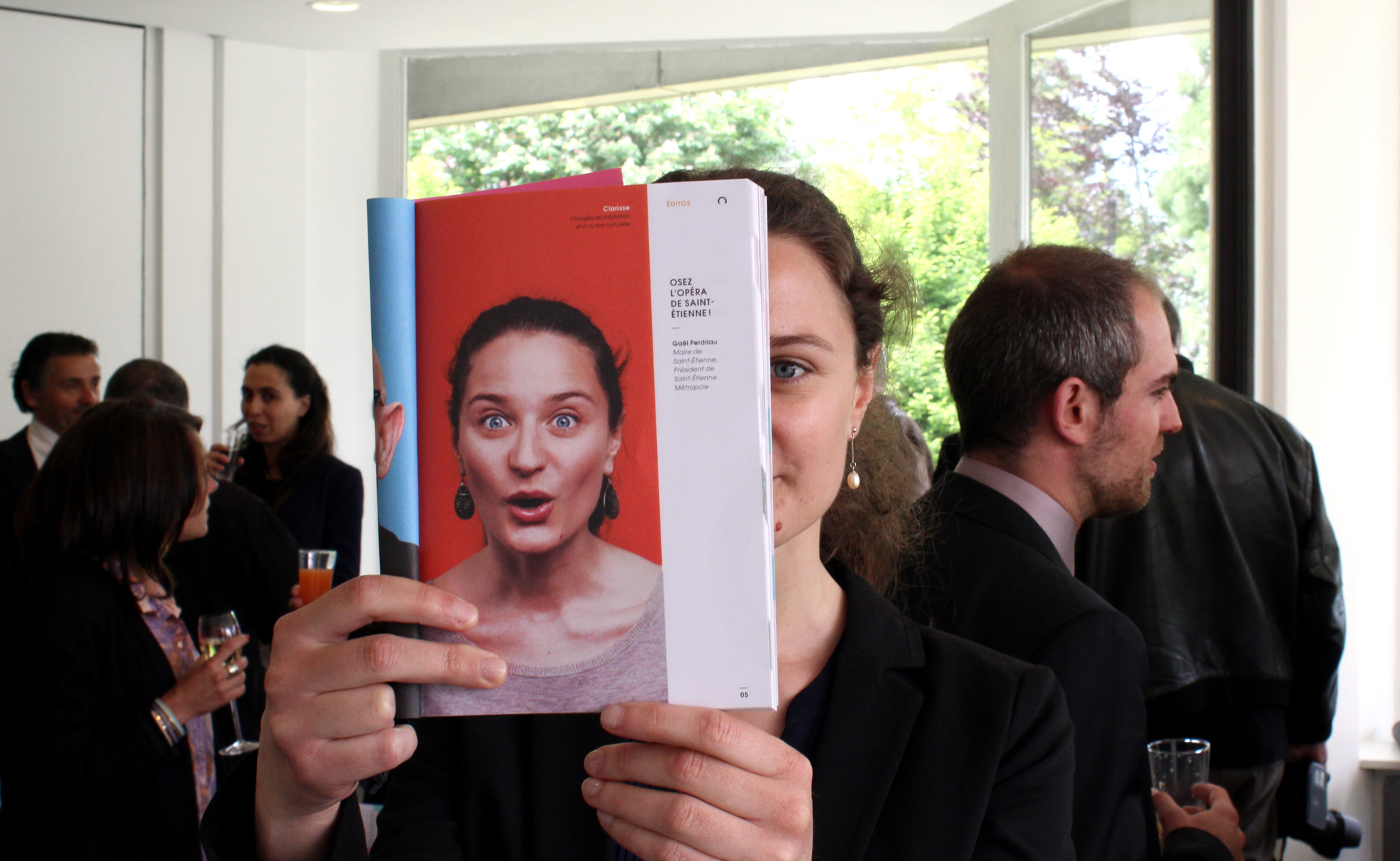
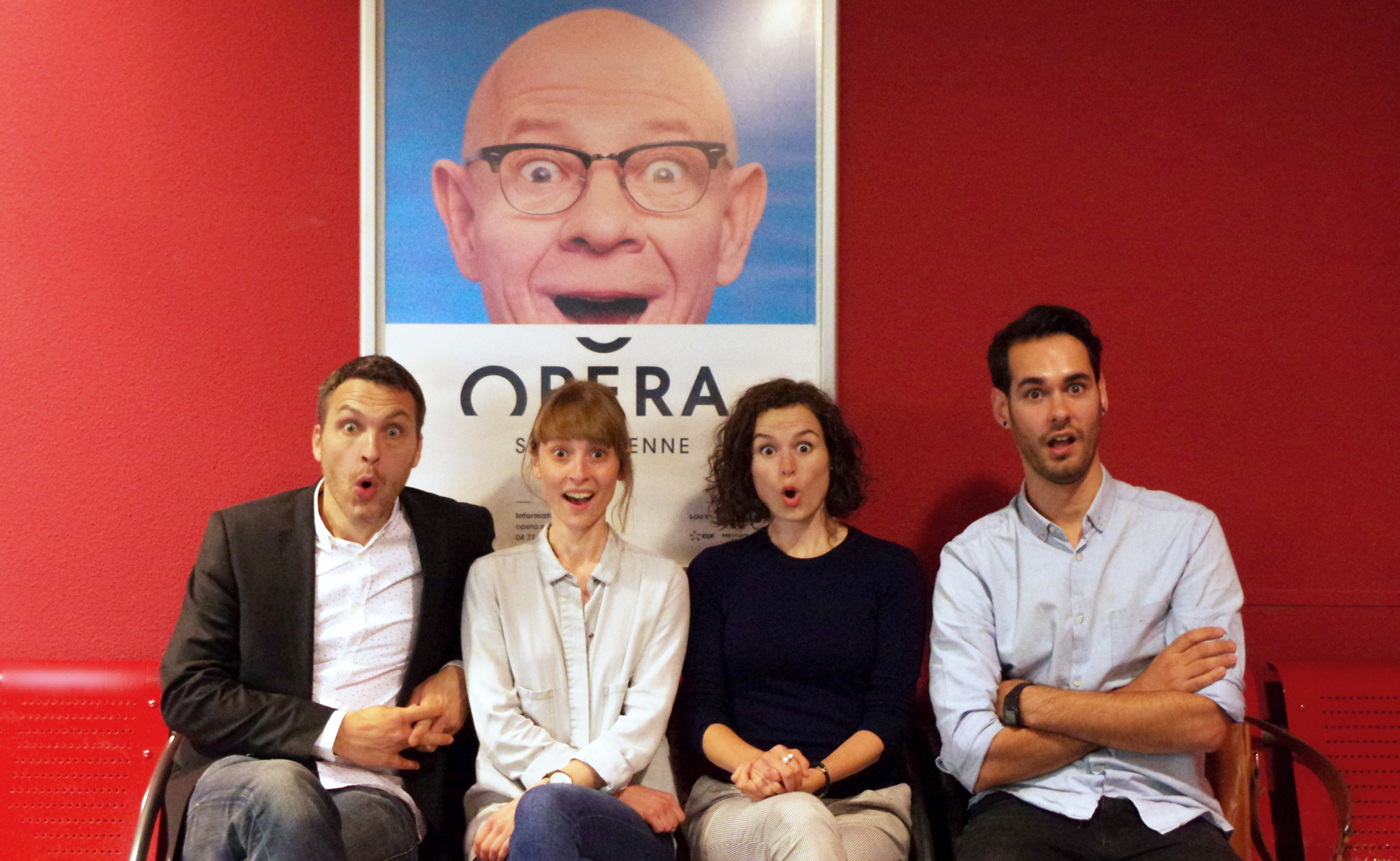
To inaugurate the new logo’s first season, we have come up with a simple and accessible communication campaign which features, in photos, all the staff members who work at the Opera. The logo is there to finish off the smile of the person being photographed, as if a curious spectator had come to peek through the Opera doors, wide-eyed at what they saw. So it’s about re-establishing a feeling of closeness between the people of Saint-Etienne and a popular cultural venue. The campaign comes with the slogan "And the magic opera(te)...", is a pun in France between the word "operate" and the word "opera".
And the...
Expressions "deictic" letting appear a narrator "At this time the magic operate...". This puts us in a story, a story that is unfolding before our astonished eyes.
...magic...
Figuratively: power exercised on the senses and the soul on the fine arts, poetry, eloquence, passion, bright conditions. (Eg the magic of music). The fantastic sense: Art claimed to whom is attributed the power to operate, by occult means, surprising and wonderful effects.
Opérate...
The verb "operate" meaning perform an action, perform a series of actions to obtain, to accomplish something: (Ex: Operate a calculation).
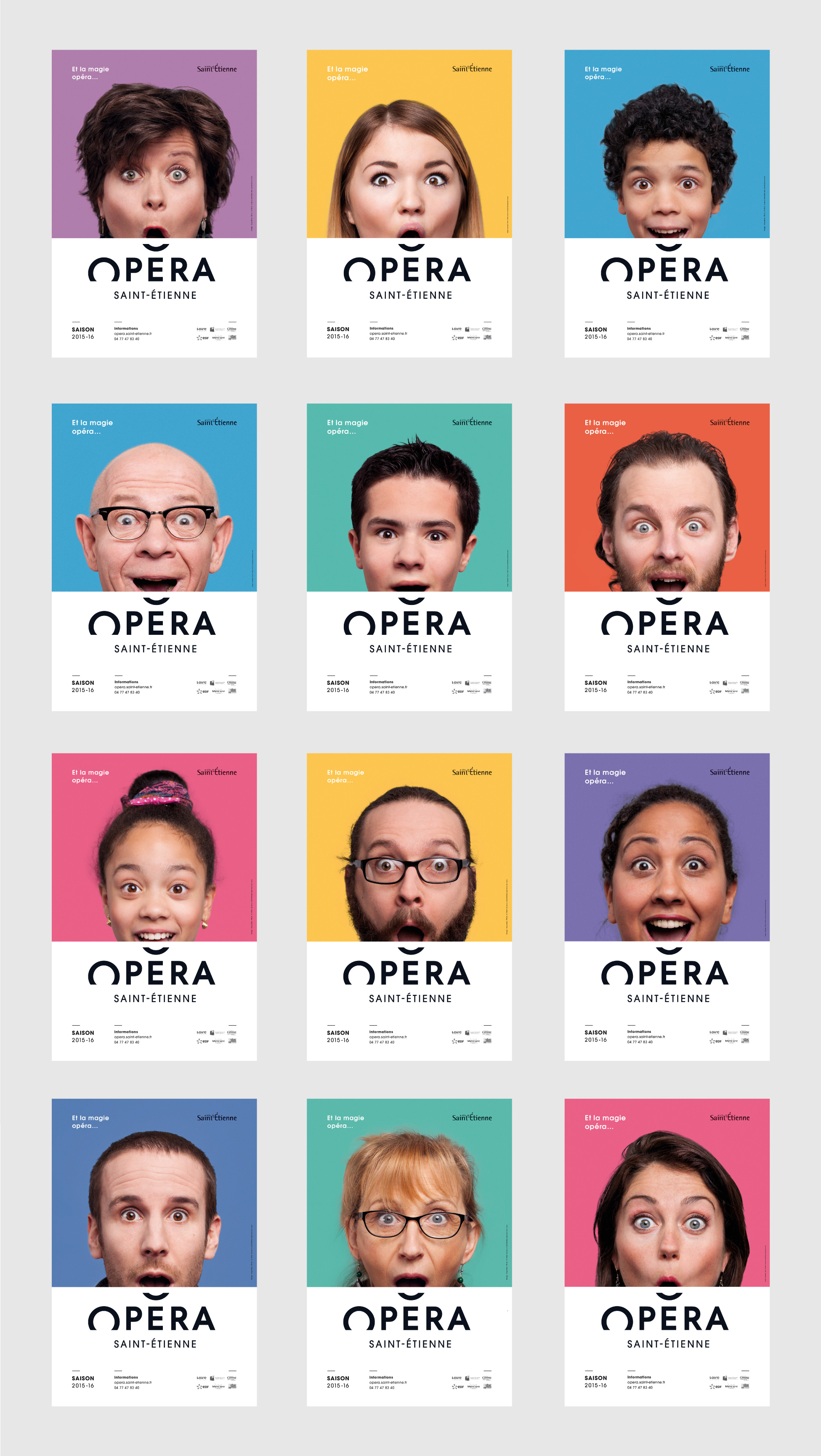

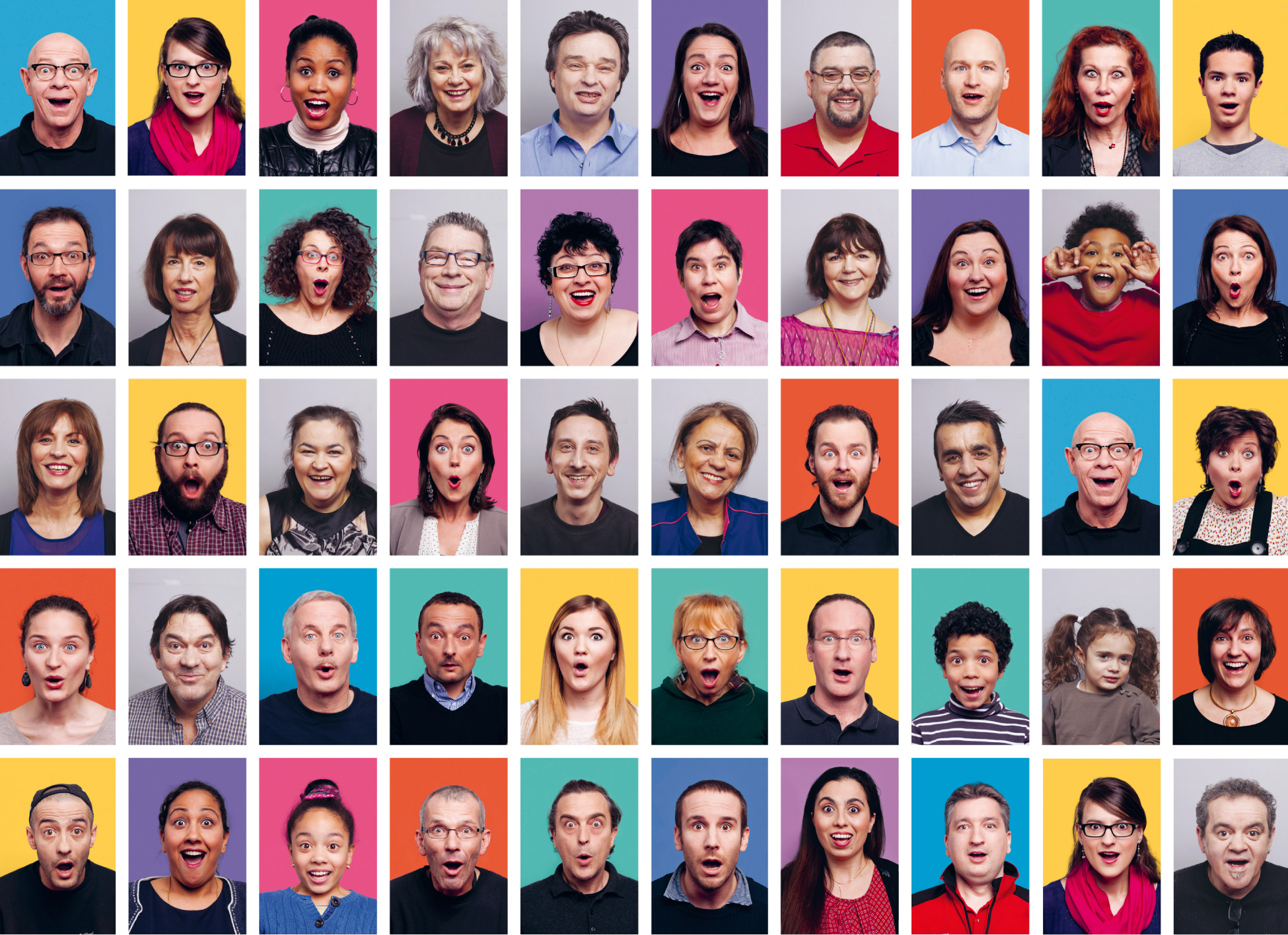
Right from the bid-for-tender phase, we put forward the idea of photographing real people from Saint-Étienne (the “Stéphanois” as they are known) for the new season’s communication campaign. We wanted to avoid the bank of images effect – the kind of stereotyped portraits of people with fake smiles. Alongside the opera’s communications team and our favourite photographer from Lyon, Ghislain Mirat. we organised a photo shoot inside the Opera. On a voluntary basis, all staff members were invited to have their portrait taken. The day was highly rewarding and motivating. Three quarters of staff members entered into the spirit, from the people who work at reception to the Director, not forgetting the faces hidden behind the curtain, the smiles of the dressmakers, happy children and a few drifters walking by!
They had no idea at that point what the project was going to look like. So they were both surprised and proud to discover they had become icons of their own Opera House. It might need to be reminded that the Opera had been through some tricky months of political and administrative upheaval and team morale was pretty low. We hope this very unique campaign put a smile back on people’s faces when they went to work. That was our objective in any case!
To illustrate the "young audience", that are obviously the children of staff who are loaned to the game! And what a game for them, it was a real gang of "scoundrels smiling" and a treat for the photographer!

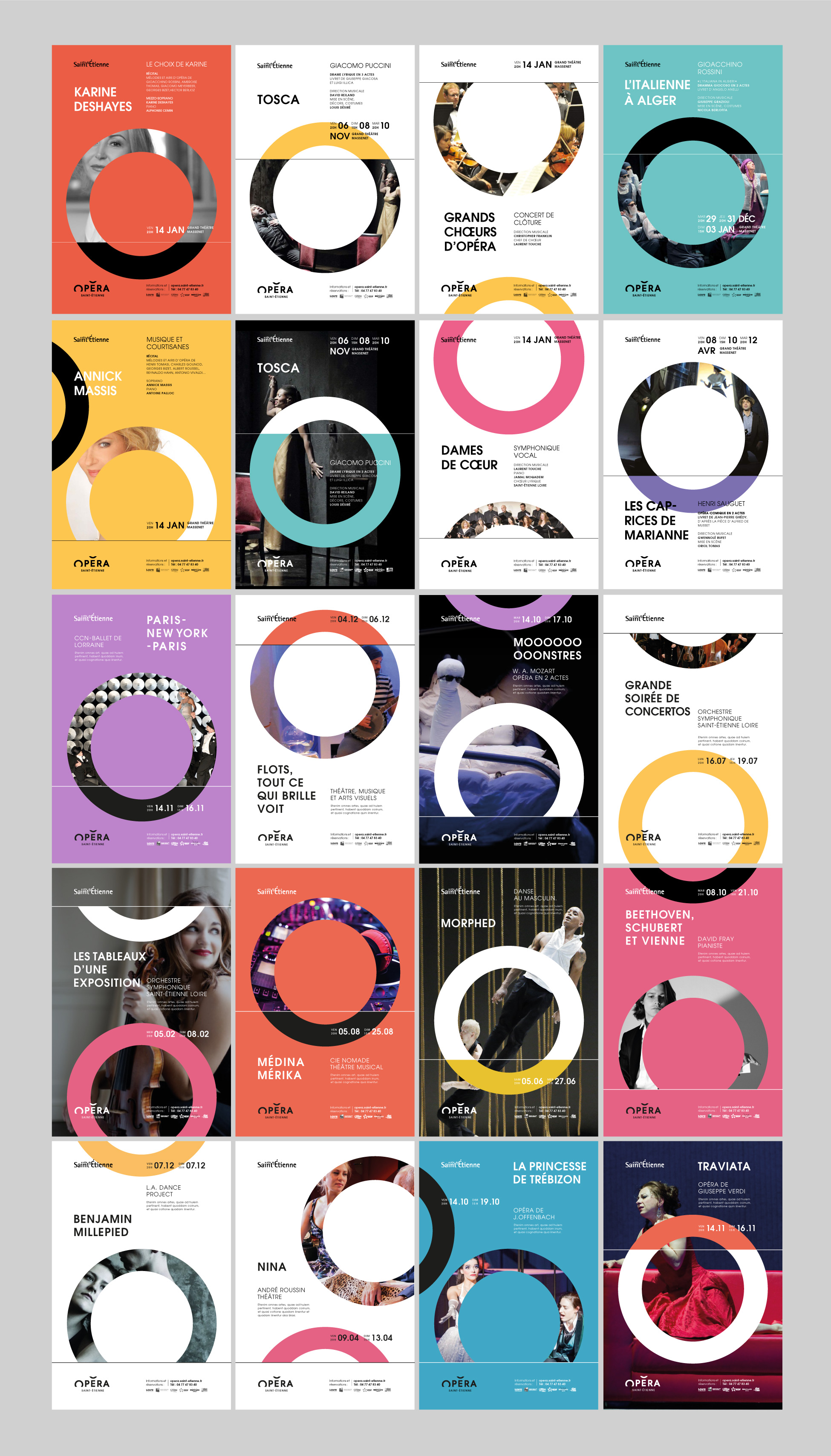
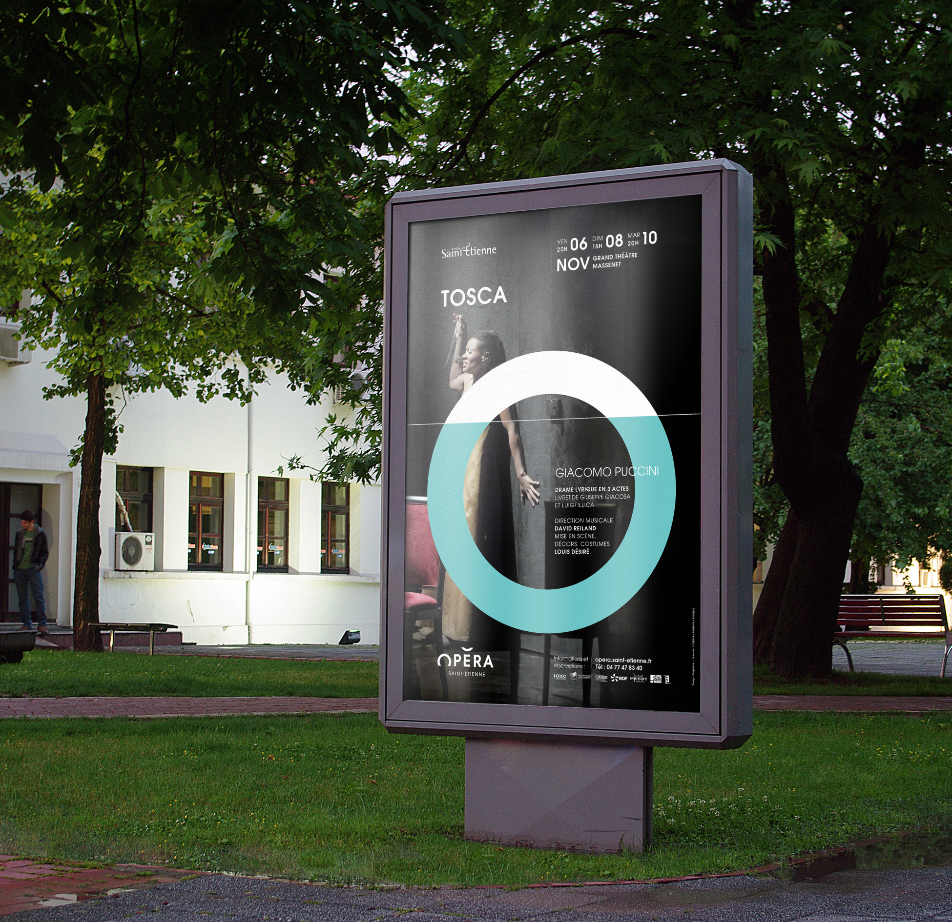

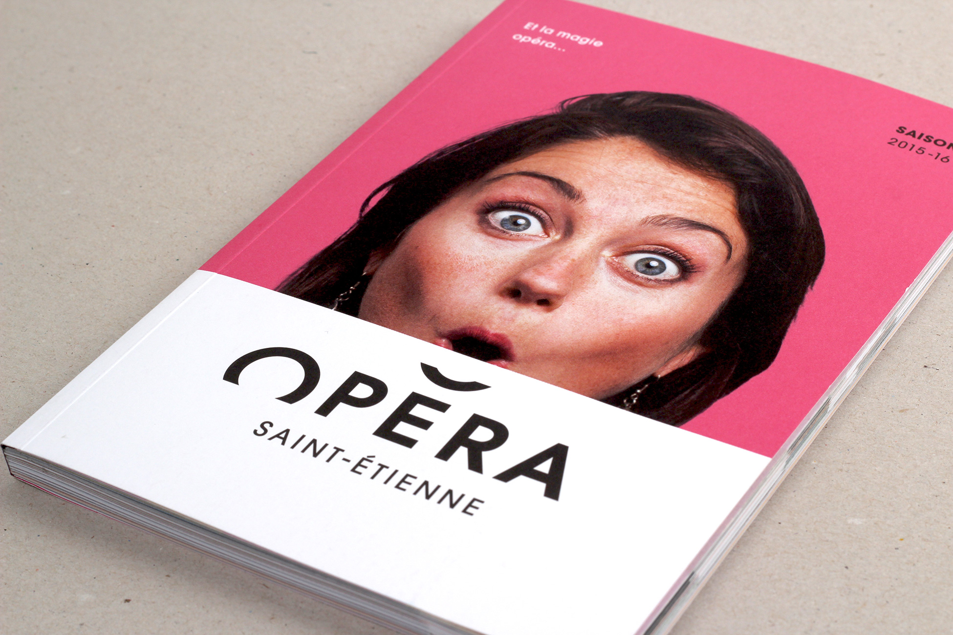
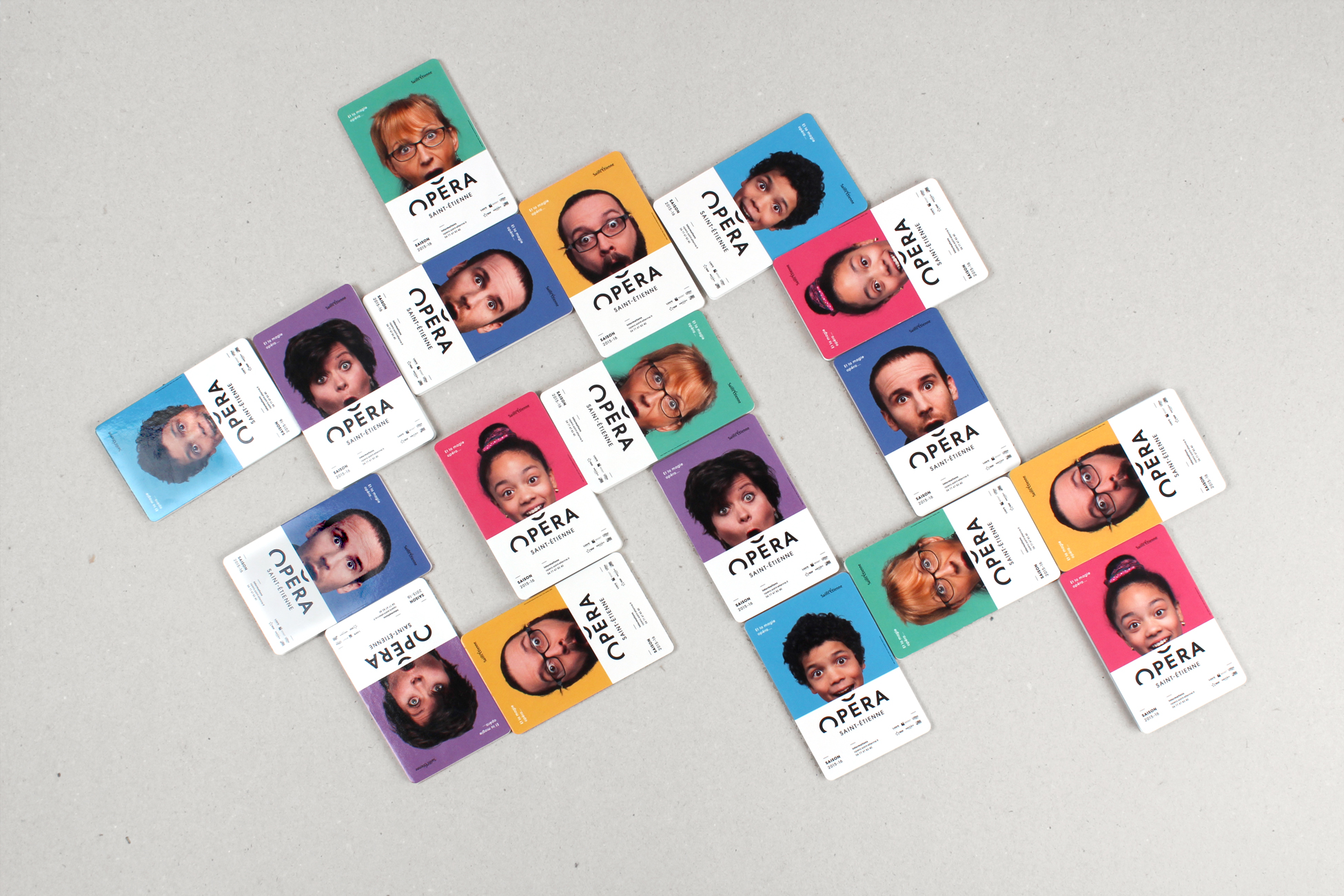
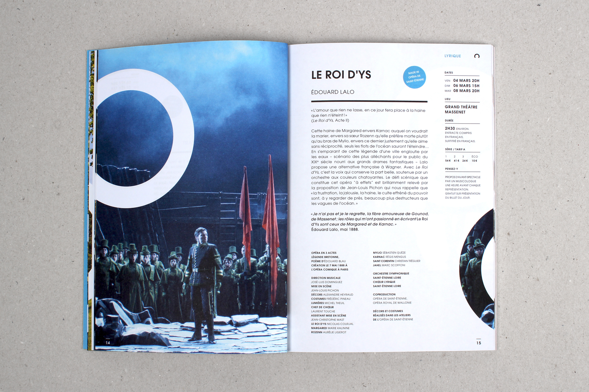
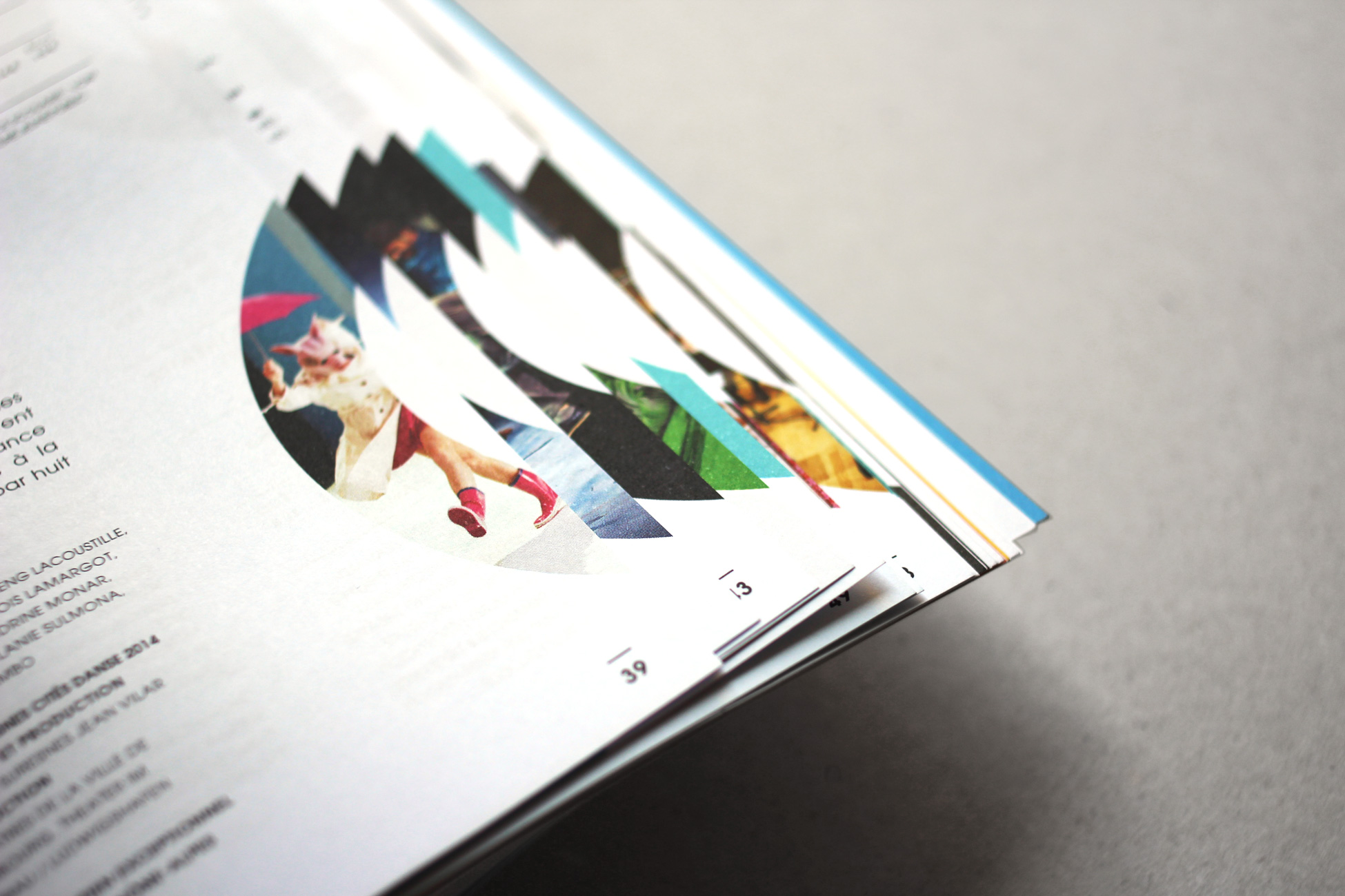
With 8 different covers, the seasonal programme also puts the portraits in pride of place. A definite collector’s item… the 15,000 printed issues have almost all gone!


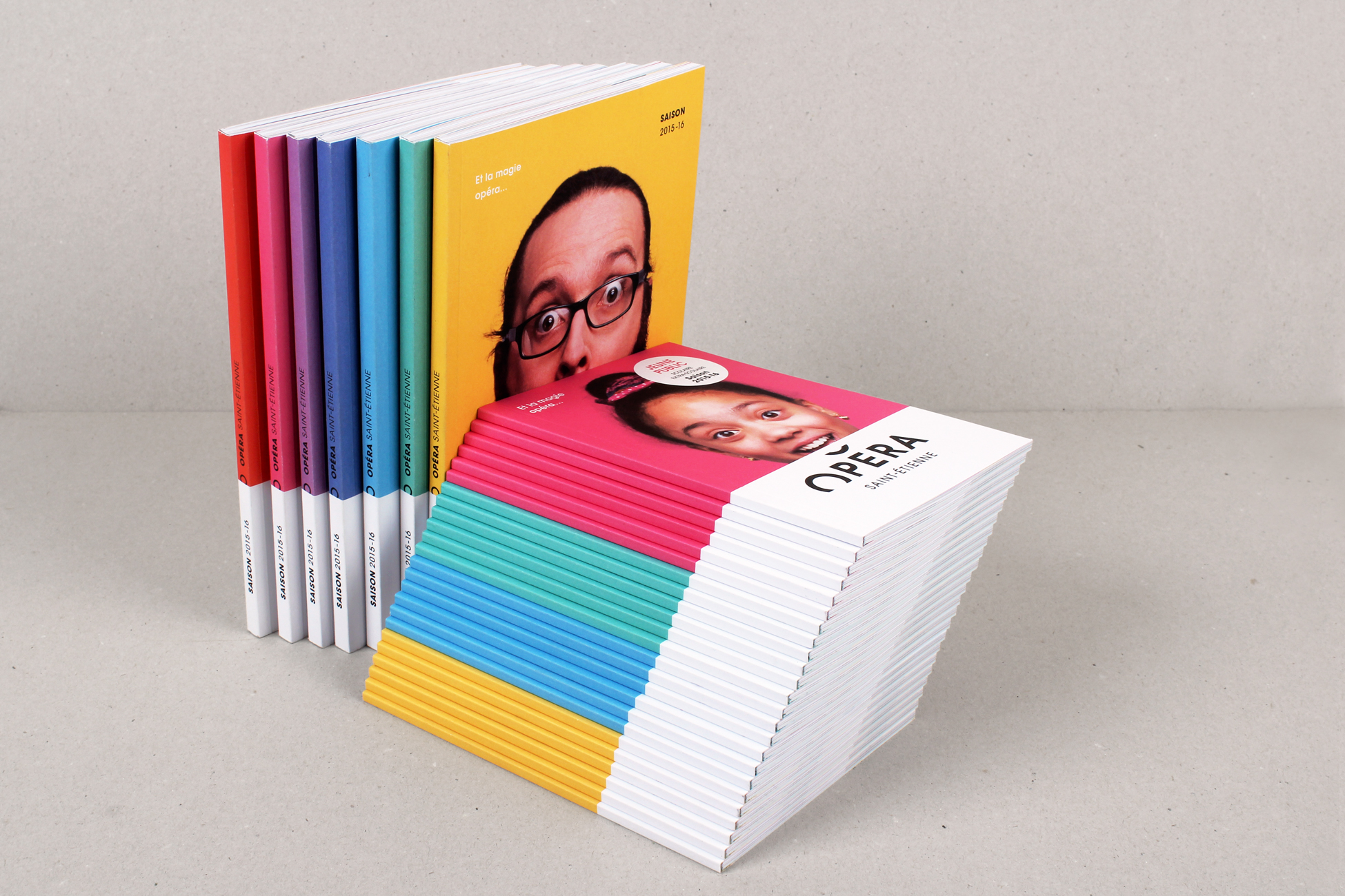
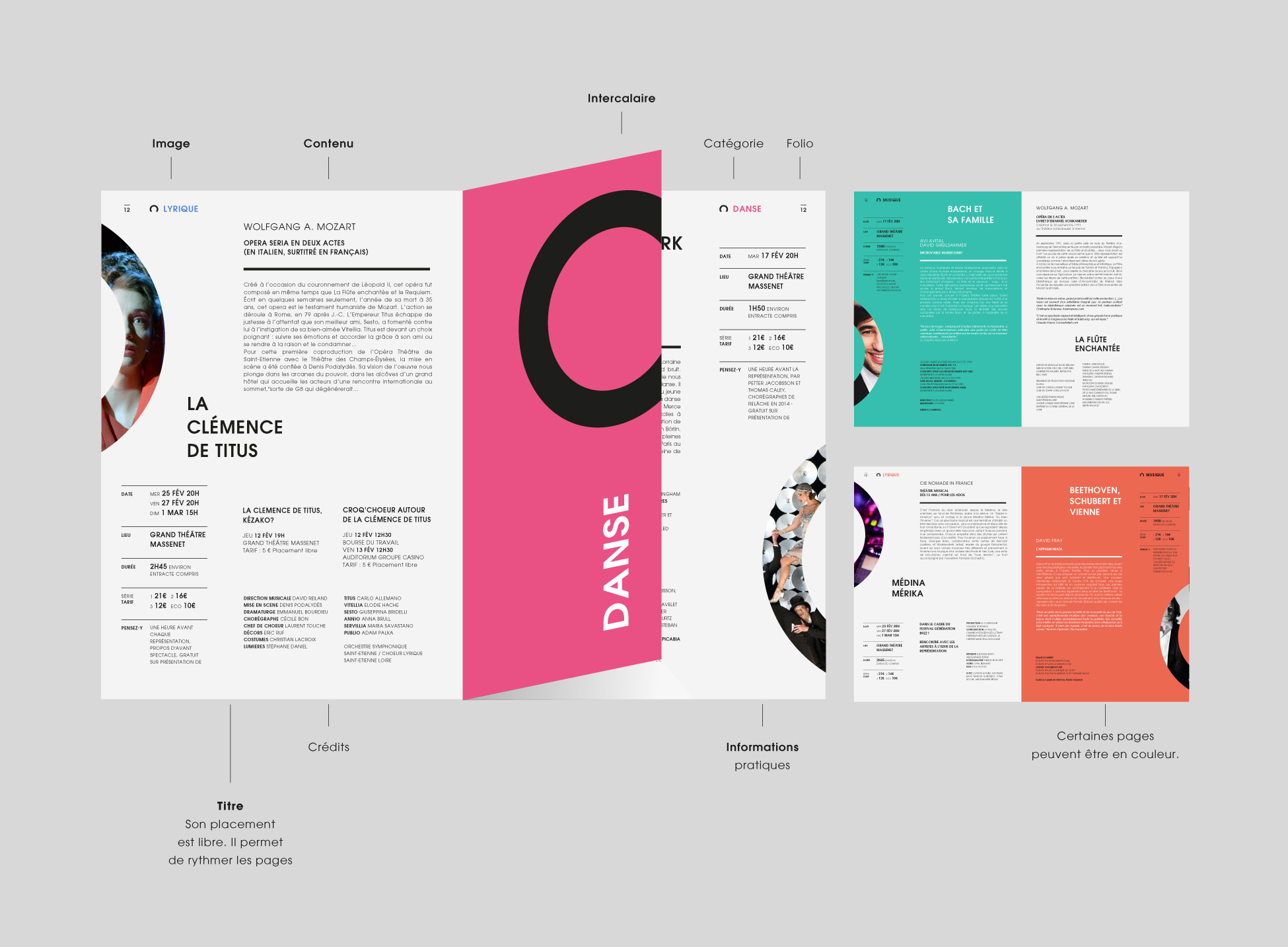
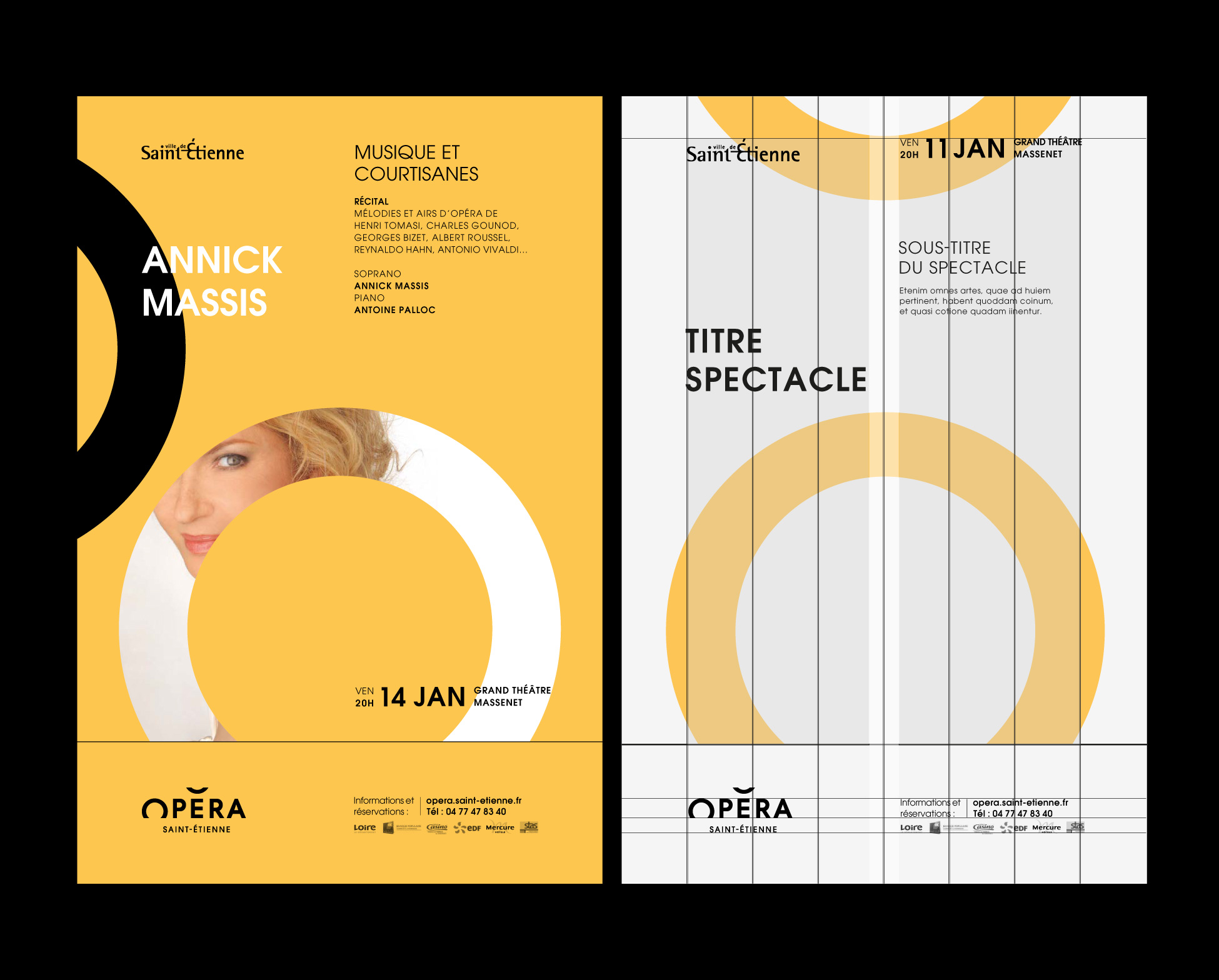
What is special about this programme too is that the start of each chapter serves as a divider. What we have are small booklets less that 4cm wide with a series of portraits inside. Because they are narrower, they make for easy reading as people can find programme chapters more swiftly. The idea may look straightforward on paper, but we have to admit that our favourite printer (Ferréol) tore his hair out a fair few times to put out a programme for less that a euro! Well done to him and his team! Thanks also to Céline (from Graphéine) who fought like a warrior to make printing possible. The result is there for all to see!
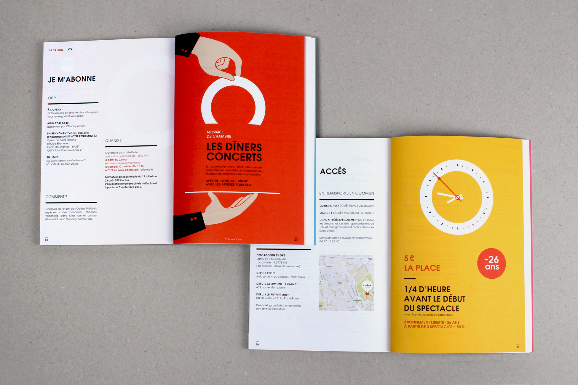

A final cheeky addition - the ticket holder. A simple piece of card folded in 4 with a slit to slip the ticket into. Turning the fold over stops the ticket from sliding out. A very stylish idea which ends up cutting costs too, as it avoids the traditional plastic pouch.

Here are a few photos from the season launch. The same smiles as the ones in the brochure were to be found on the faces of each of the Opera’s collaborators!
Above: the Graphéine team in Lyon, from left to right, Mathias (Creative Director), Céline (Project Manager/Office Manager), Adrienn (Artistic Director) and Jonas (Graphic Designer and Layout Artist)

Thank you to the city of Saint-Étienne and Olivier Barbé (Director of Communication of the City), Éric Blanc de la Naulte (Director of the Opera) and Oumama Rayan (Director of Communications) for trusting us throughout Project and have supported our wildest ideas by unfailing optimism, even when times were apparently untenable! (See: The season brochure was delivered 2 hours before the start of the season!)
Thank you to the entire staff of the Opera have played along, even blush seconds seeing his face 4x3 throughout Saint-Étienne. Promised next year, we change as guinea pigs! (Cf: Orchestra Musicians?)
Thank you and congratulations to Ghislain Mirat, chief master photographer, who was able to make the most of the 50 guinea pigs in 8h of work. Then he had to lose a few thousand hair when it comes to crop all these portraits!
Thank you to Férréol printing and its teams have managed to thwart all our technical pitfalls, and that allowed this booklet to be printed locally in an unbeatable budget.
Finally, in Graphéine, a very very big congratulations to Adrienn, without which the project would never have had the same elegance, Celine, without whom this project would take 12 months instead of 6, Jonas without whom the 150 pages of the program n 'would never have existed, and Philipp, the spiritual son of "Saul Bass" for his genius motion!
PS: If you enjoyed this project, feel free to share it on social networks, and / or like the Behance project page!
https://www.behance.net/gallery/26146543/Opera-Saint-Etienne-Brand-design