

Following Peugeot and Renault in 2021, Citroën recently unveiled its logo of the future, which honors, like its competitors, a logo of the past, for use in all digital.
A look back at the Citroën logos
After 103 years of Citroën's existence, the new 2022 badge is the brand's 10th logo; a reinterpretation by the Stellantis Design Studio (the graphic agency of the car manufacturing group that includes Citroën, Ram, Opel, Maserati, Ds, Lancia, Peugeot, Jeep, Chrystler, Alfa Romeo...) of the 1919 oval with two chevrons.
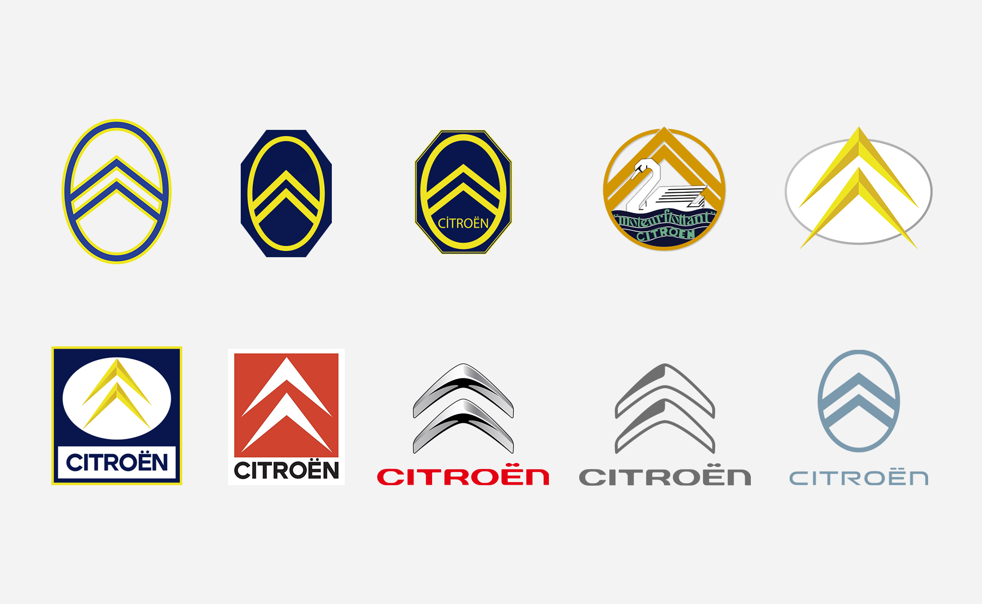
On the very first Citroën logo of 1919, the famous arrows are inspired by the double herringbone-shaped Polish metal gear system of the early 20th century, which the founder André Citroën (still a student) discovered during a visit to his family in Poland. He bought the patent and used the system in French factories. He owes his success to these quieter gears and makes them his brand symbol. Citroën was a forerunner in many areas, with the first industrialized car in Europe, the Type A in 1919, floating engines, front-wheel drive in 1934, the very small front-wheel drive car with the 2CV, and the hydropneumatic "anti-tapcul" suspension (as announced by Jacques Séguéla in the GS advertisement in 1978), the first crossings of the Sahara in a motorized vehicle in 1922 and then of the African continent in a 2CV in 1978, toys for children (small cars and garages), show advertising or an electric car that can be rented without a license. ... in the shape of a toaster; the Citroën ami launched in 2020.
![]()
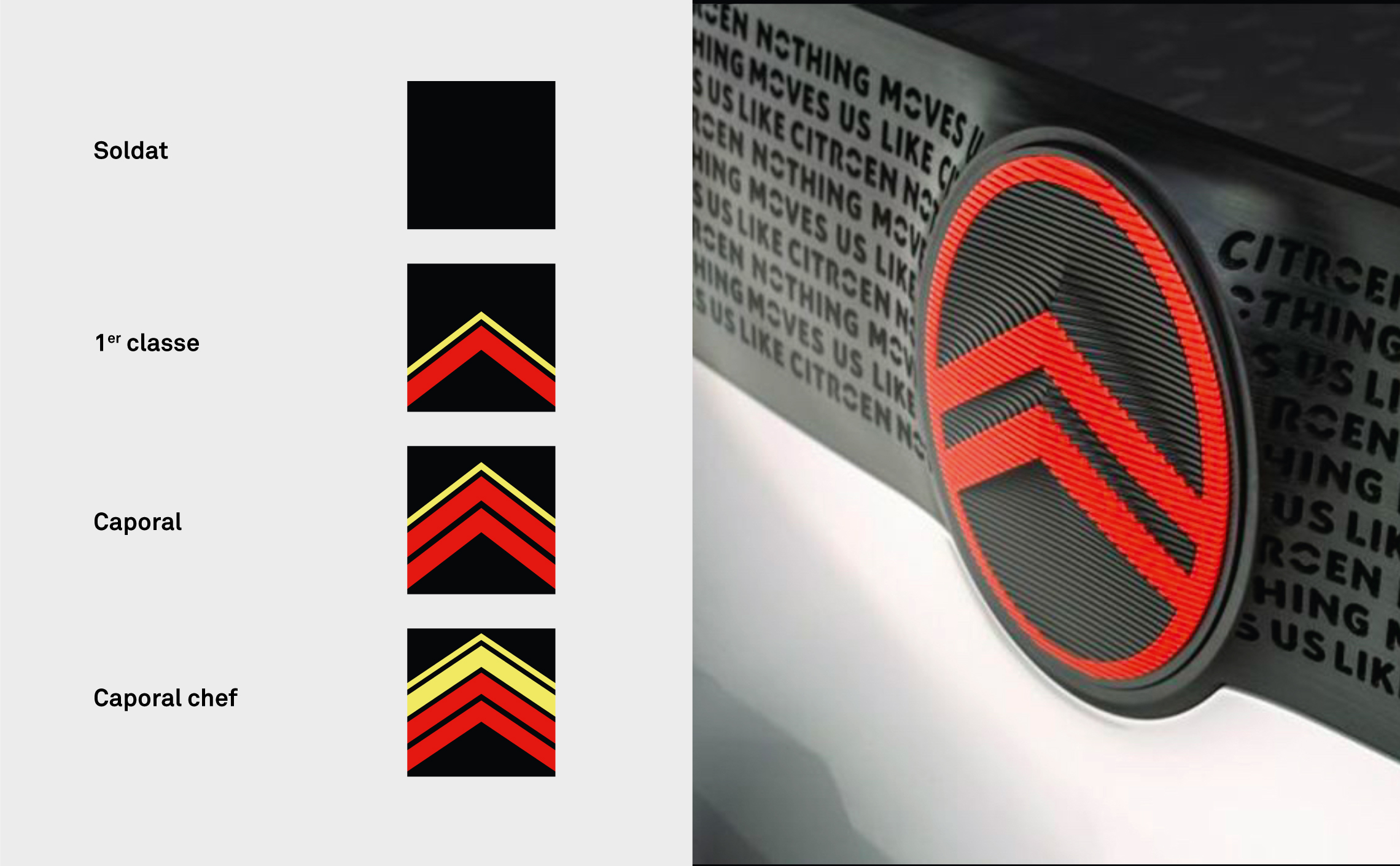
The symbol of the 2 chevrons also reminds us of the insignia of military ranks, notably the corporal, in red, or the sergeant. The first Citroën logo appeared just after the First World War, and although it owes its official origin to the gears, one wonders if it might not also be a nod to Citroën's career as a second lieutenant during his studies at the Polytechnique and to the prosperous post-war years?

In any case, the yellow color is first present on the chevrons, accompanied by a dark blue, which comes either to divert the arrows or in the background of the oval, until 1936. Citroën also used a swan logo for a time when the floating engine was created in 1932 on the Rosalie. The swan is quickly abandoned before returning to the chevrons with this time, in 1959, the oval in the horizontal and the golden or yellow chevrons, not parallel and coming out of the oval.
![]()
The Rosalie and its swan logo, in 1932 (source: Citroën website)
In 1966, the blue square appears on the oval and the chevrons. In 1985 these same arrows were flattened and drawn in white on a red background, and the "wild chevrons see red" as announced in the Séguéla advertisement, to increase the brand's visibility.
On the cars, the logo that was previously on the ventilation grills or the front of the hood is now in the extension of the lines or delineates the end of the hood. 2009 saw the appearance of chevrons with rounded edges that are built in volume and chrome, with the signature of the name in red and a new typography, before going back to flat in 2017 to follow the advent of digital.
![]()
(source : citroën origins website)
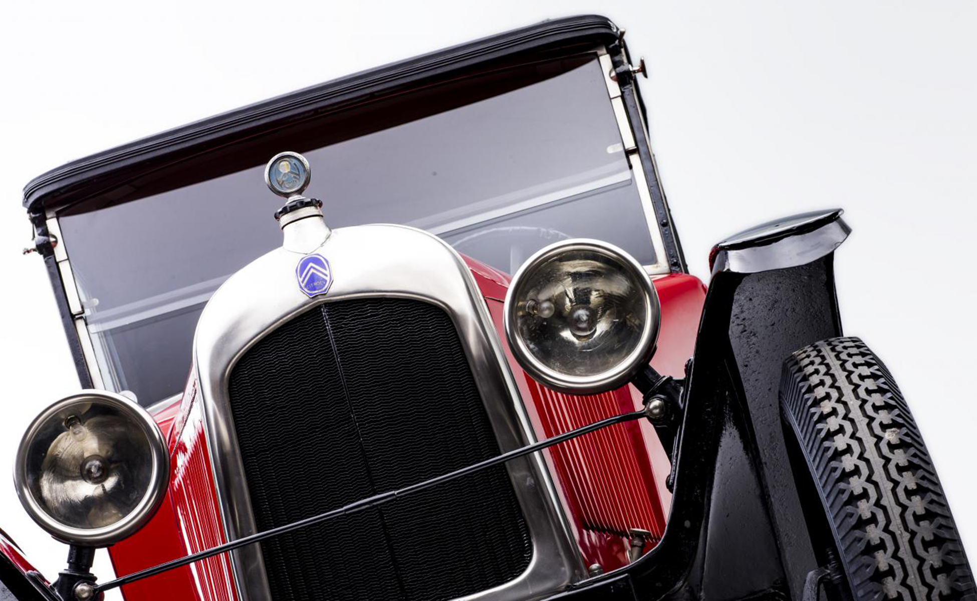
On the 5HP in 1924, the logo is on a blue background.
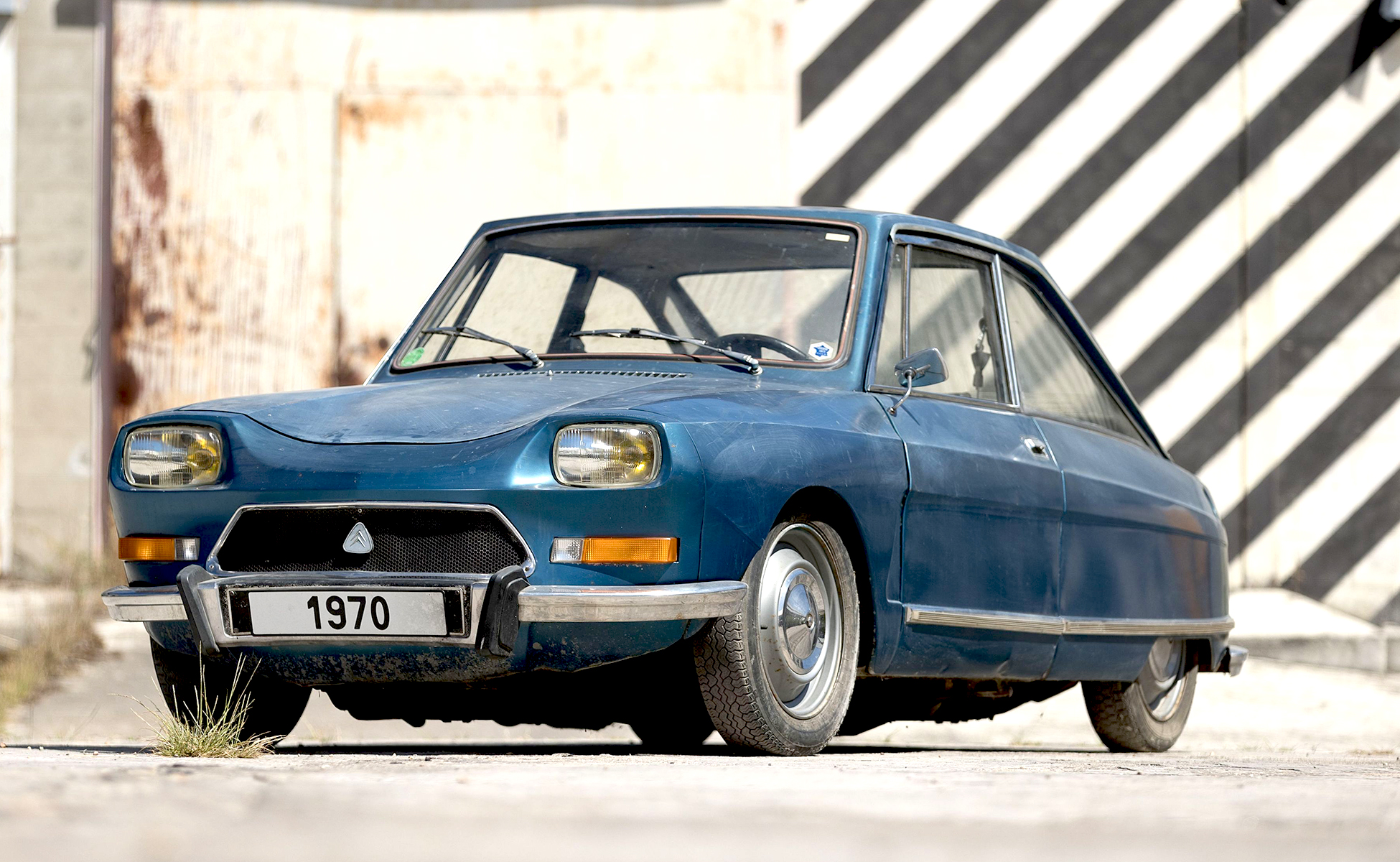
It is declined in a triangle on the m35 in 1969.
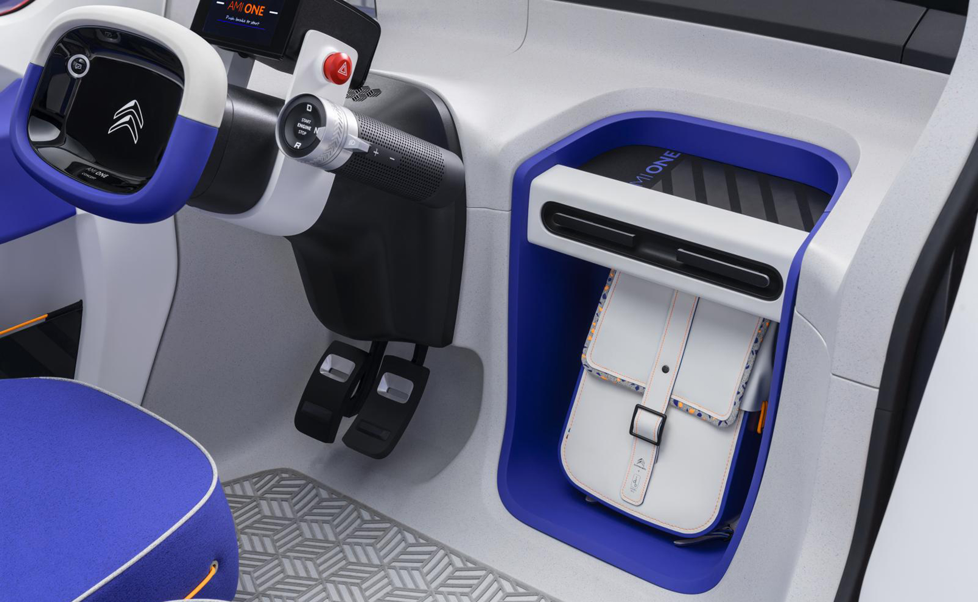
The 2019 ami one features the chrome logo in a 2D version.
The new Citroën logo had already been signed as early as 2019 on the 19_19 prototype below, but it officially makes its debut in 2022: it modernizes and returns to pretty much... its original shape. (The photos are taken from the Citroën website).
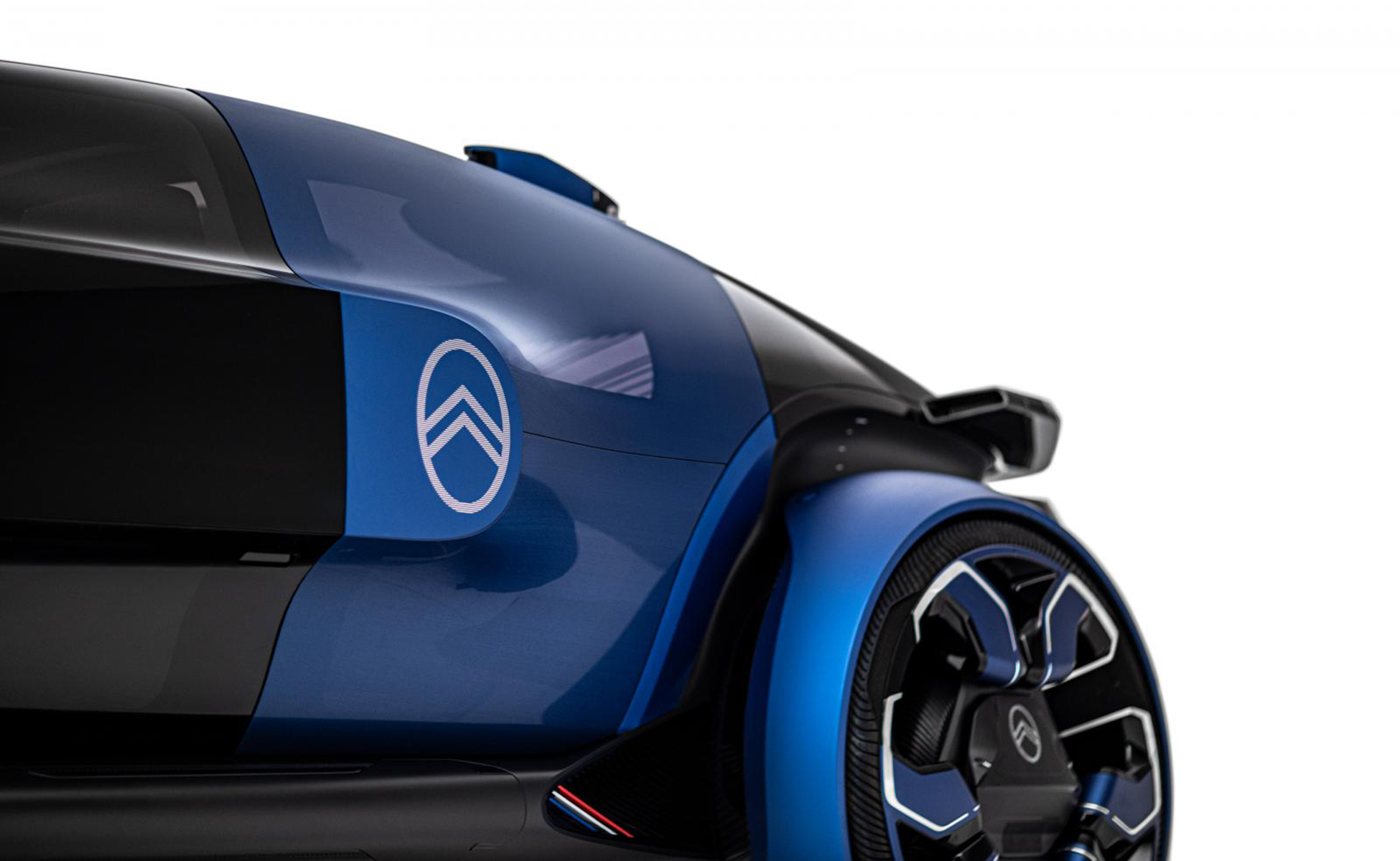
An old retro-futuristic logo that looks younger
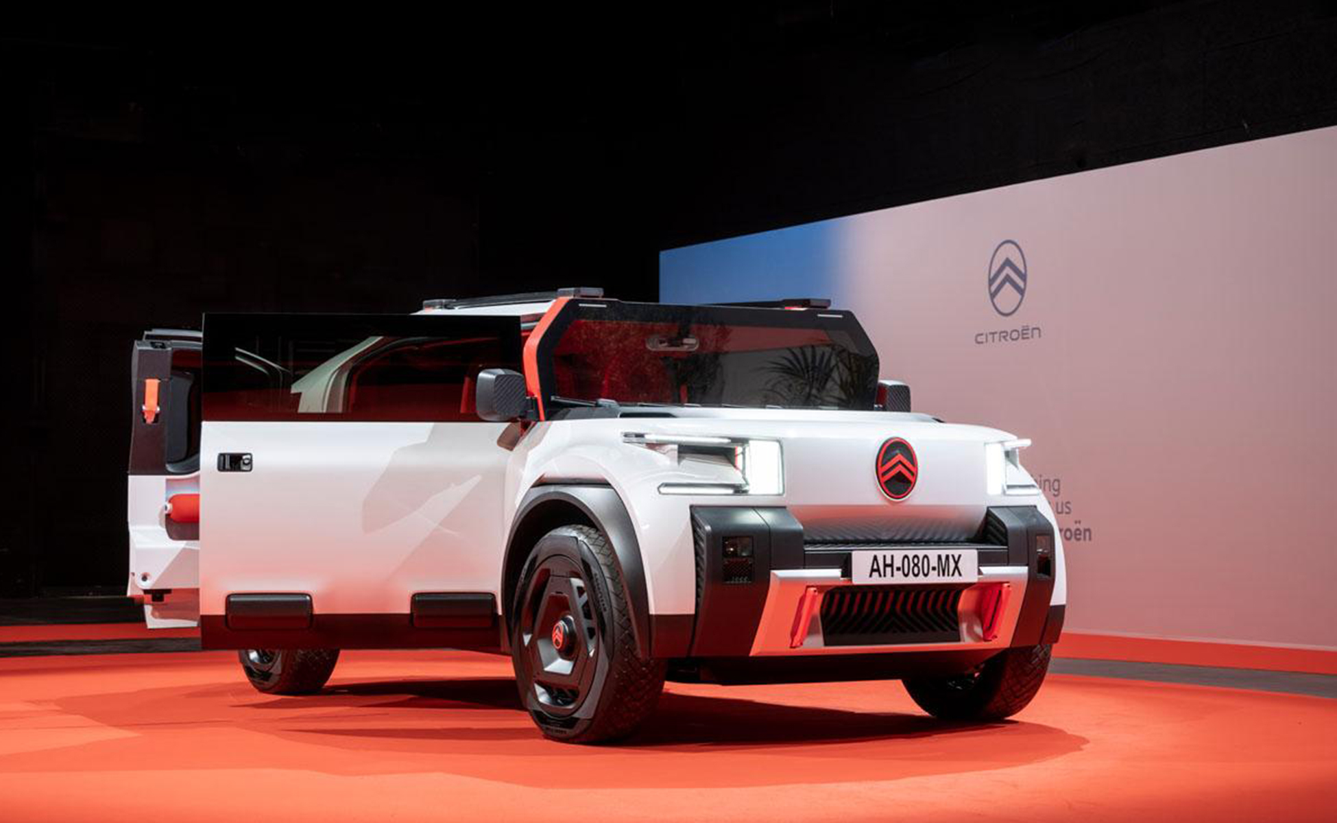
To mark the brand's evolution, Citroën's new logo was officially unveiled alongside the launch of the latest prototype of an electric family car, the Citroën Oli (sounding all-e = all-electric), although it will be rolled out from mid-2023. The Oli features minimalist and very trendy characteristics that propose to make the revolution in electric by doing better with less: less weight for more autonomy (including a honeycomb cardboard roof), recycled, recyclable and repairable parts, a design that optimizes power consumption and temperature on board, a dashboard connected to the smartphone. "Making an electric car is good, but it's not nearly enough" announces the ad, like a manifesto, shouting ENOUGH. Enough is too much, and enough is just enough.
![Voici Citroën Oli [all-ë] et c'est assez](https://i.ytimg.com/vi/KX2m-rWfk5E/hqdefault.jpg)
Le logo signature, comme un emblème, se veut plus léger et économe en énergie, sans chrome, pour "plus de recyclabilité". En 2010 Citroën sortait pourtant son 1er modèle électrique, juste après le lancement de son nouveau logo chromé, et la recyclabilité ne semblait pas encore être un problème d'actualité. C'est peut-être là le signe que la marque veut désormais réellement s'engager vers un changement. Elle a annoncé la création de solutions de mobilité plus responsables et durables. En attendant, la Oli n'est pas en vente et sert simplement à montrer ce que Citroën peut faire en termes d'innovations technologiques pour secouer le marché de l'électrique. Une innovation sur le poids de la voiture électrique semble assez cohérente quand on connaît les problèmes liés au poids des batteries (on ne parlera pas ici des émissions CO2 liées à leur fabrication, on laisse qqf vous expliquer tout ça très bien).
Citroën est "la seule marque automobile qui vend aussi des grille-pains" comme on peut le lire sur leur compte Twitter. Des grille-pains ? Depuis le lancement de leur voiture électrique sans permis Ami, la marque a adopté une communication plus jeune et affirmée, évidemment plus présente sur le web. Le logo permet d'ailleurs de s'amuser digitalement en 3D comme le fait Alexandre Revert.
The signature logo, like an emblem, is intended to be lighter and more energy efficient, without chrome, for "more recyclability". In 2010 Citroën released its first electric model, just after the launch of its new chrome logo, and recyclability did not yet seem to be an issue. Perhaps this is a sign that the brand is now serious about making a change. It has announced the creation of more responsible and sustainable mobility solutions. In the meantime, the Oli is not on sale and simply serves to show what Citroën can do in terms of technological innovations to shake up the electric market. An innovation on the weight of the electric car seems quite coherent when we know the problems linked to the weight of the batteries.
Citroën is "the only car brand that also sells toasters" as you can read on their Twitter account. Toasters? Since the launch of their license-free electric car Ami, the brand has adopted a younger and more assertive communication, obviously more present on the web. The logo allows to have fun digitally in 3D as Alexandre Revert does.

Without making a greenwashing speech, we know above all that the choice of flat in the automotive market comes above all from the needs of the market, which is increasingly turned towards digital. The global brand identity is more adapted and comfortable on digital media, from the showroom to the website, through the interface of the vehicle screens and the mobile application My Citroën App. It's not for nothing that almost all car brands have redesigned their logo in 2D. This is obviously a necessary turn to announce a new turn towards the future.
![]()
![]()
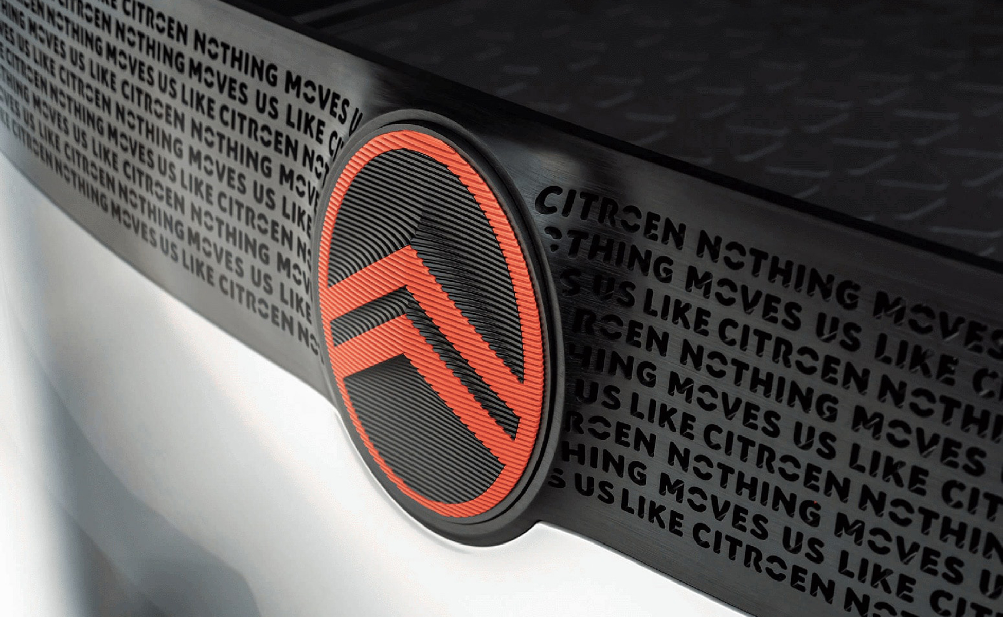
The new Citroën logo with a flat design is a return to the original logo, with a more incisive and futuristic typography with sharp angles. Surprisingly, the logo seems to pull in two opposite directions, with the typeface extending a futuristic trajectory while the emblem reverses to pay homage to the 1919 one. One wonders if the umlaut of the e will be legible when cut on a hood; it disappears completely on the Oli, and one is also surprised to see that the o is cut in two, in a much rounder typeface than the logotype. Finally, the reason why the logo is so big is that it serves as a plug cover for future electric vehicles.
Photos source : autonews - Citroën Oli
The new signature, "nothing moves us like Citroën", adds an emotional dimension to the whole. The sales outlets for the cars are called 'the Citroën house' and the Global Brand Manager speaks of the "warmth and almost human softness of the oval that envelops the chevrons". The idea is to make Citroën a brand of transportation towards modernity and electric, with avant-garde and daring vehicles. If the choice of the logo is not surprising in the market, we expect Citroën to turn the corner in terms of revolutions, as it has always known how to do.

The war of brands
In a shaken automotive market, where historical manufacturers are seeing the arrival of new players taking advantage of the latest innovations (electric cars, hydrogen, no-license cars...) and where consumers are caught between "the end of the world and the end of the month", the deciphering of brand codes often proves to be revealing on the state of mind of these companies. Citroën seems to be adopting a defensive posture by looking back on its brand history.
The legal news of the last few months also reveals this feverishness. In particular, Citroën's legal battle against Polestar, the new brand of the Volvo group. The lawyers of the brand with the chevrons were indignant about the use of a symbol very close to their logo. In this case, the Polestar logo is a stylized polar star, composed of two chevrons head to head.
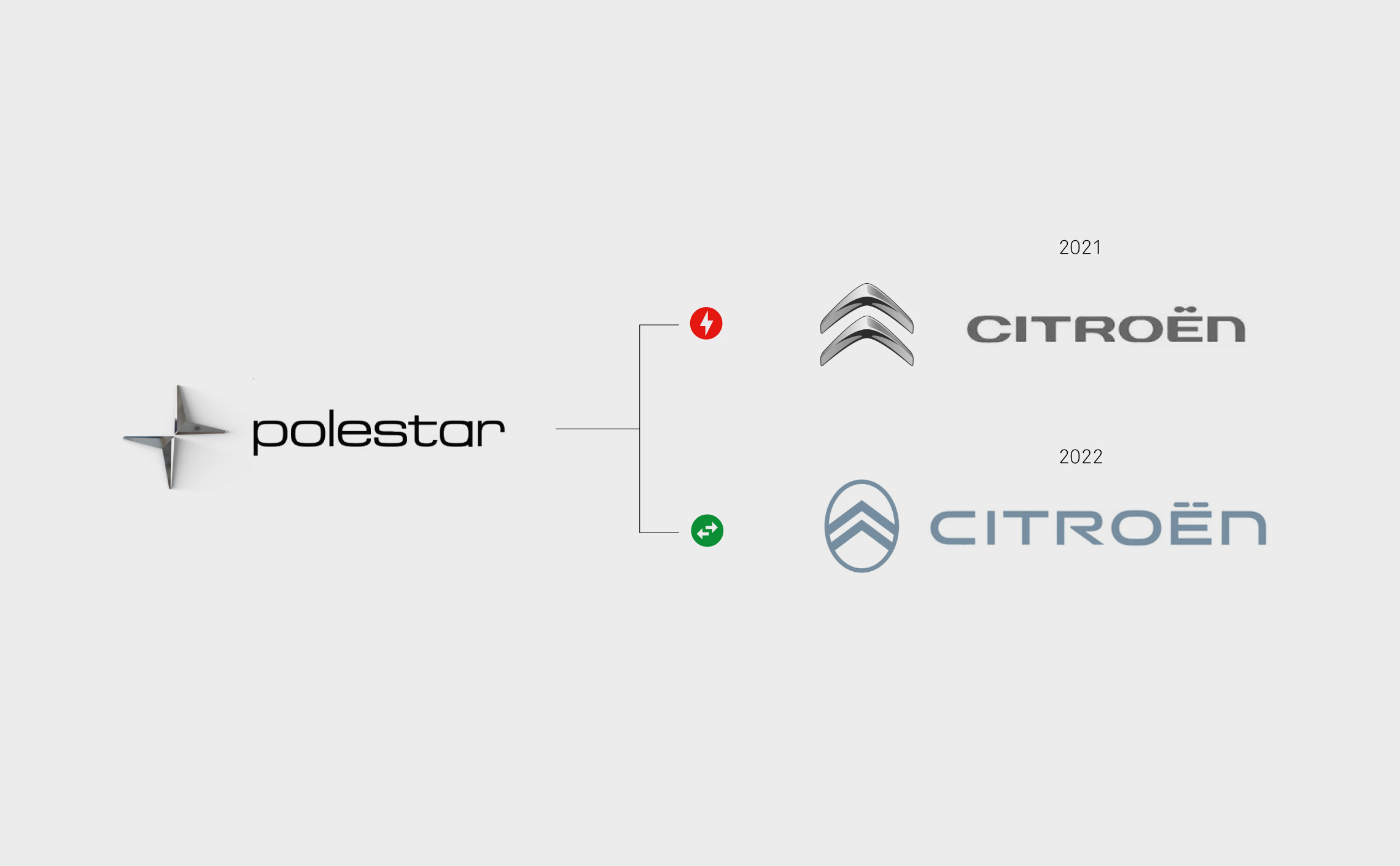
In mid-2020, the Paris court refuses to consider that Polestar was responsible for counterfeiting, but recognizes that it has "damaged the reputation of French brands", thus acknowledging the damage suffered by Citroën. Polestar was ordered to pay 150,000 euros in damages and was prohibited from using its logo in France. This sanction is tantamount to prohibiting the marketing of their cars in France.
The climate was one of legal escalation, with Citroën trying to cancel the trademark at the European level, while Polestar accused Citroën of having plagiarized its rims. The legal battle promised to be fierce, but will die out like a will-o'-the-wisp under the Breton drizzle. In mid-2022, Polestar and Citroën signed a co-existence agreement. It goes without saying that the change of Citroën's logo considerably changed the situation. The confusion between the two brands is much less obvious.
Been hoisted by his own petard ?
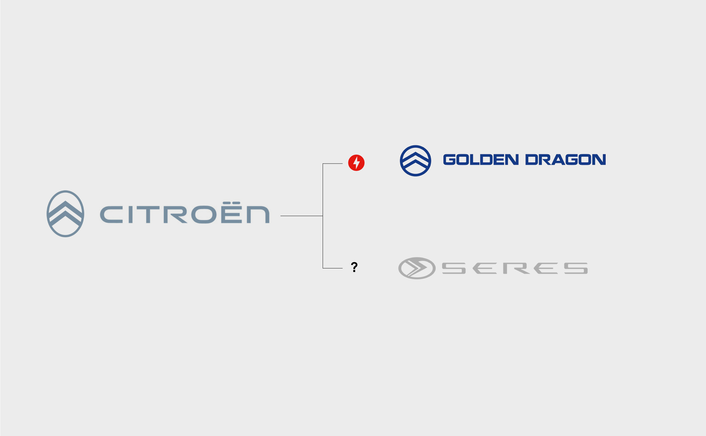
If the teams of the legal department of the brand with the chevrons could finally take a few days off, the lull may be short-lived. We are almost in the situation of the watered down, their new logo is now relatively close to new brands, we think in particular of the Chinese brand Seres or the bus and van manufacturer Golden Dragon. The sarcastic analysts will claim that the Chinese brands are strongly inspired by the brand with the chevrons, this remains to be proven, especially with a sign in its oval version that has not been used for 60 years. Not using a trademark code for more than 5 years means taking the risk of losing one's rights. This means that Citroën's lawyers are not about to take a vacation!