


Typographic classification is a bit like diving into a labyrinth of shapes, serifs and weights. From Thibaudeau to Vox and from one country to another, counting on more than 5 centuries of typographic creations, the borders between typefaces are sometimes complicated to grasp. Nowadays, two tools are available to designers and typographers to recognize typefaces, which are inspired by the classifications of the old typographers and reworked to their liking.
History of typographic classification
Typography has the particularity of being everywhere: in every book, magazine, application, poster or website. It offers itself to the reader's eye, whether he notices it or not, with this ability to escape the gaze of those who do not pay attention to it, making it sometimes inaccessible, sometimes subtle. Initially confined to the circles of the printing industry, typography has transformed itself over the decades into an essential field of visual culture, placing itself at the center of graphic arts and design, juggling art, mathematics, aesthetics and technique.
At a time of open and accessible creation, typography has become a gigantic breeding ground for the best and the worst, offering hundreds of thousands of type styles. The classification of these fonts (or the font of classifications?) has a major stake: if it does not really allow to trace any heritage, it has the merit of facilitating the organization of the whole, and of allowing to "determine influences" as Lewis Blackwell.1
Sorting out the overflow
Nevertheless, typefaces and typographic classifications were not born together. The need to classify typefaces appeared when they became too numerous, around 1850, as René Ponot wrote in his book on the history of typographic classification in 1989. Roman, bastard, French cursive, turn letters, elzevier, gothic, fractured, Egyptian, antique, sans serif, and other fanciful... have made many researchers and typographers turn their heads.
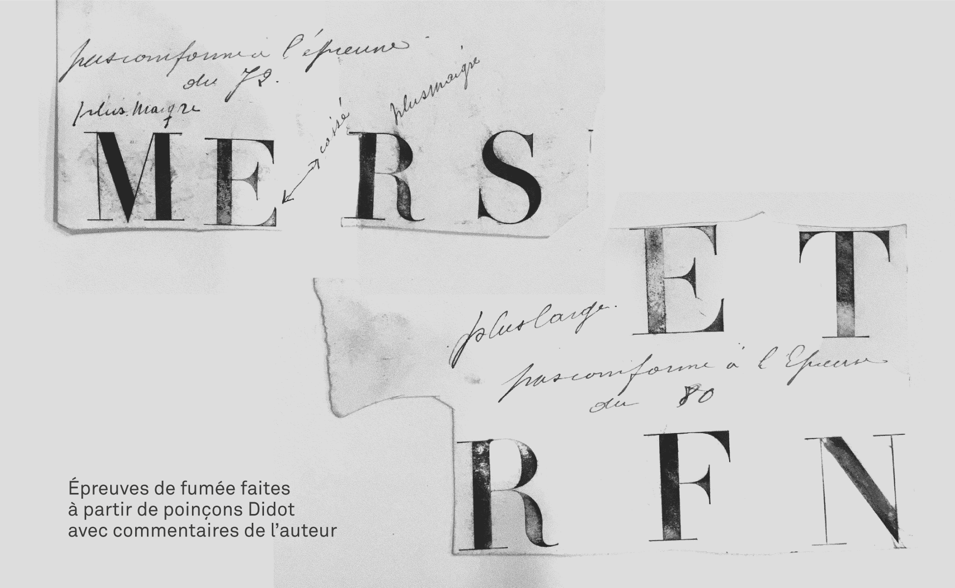
When Didot typefaces appeared at the end of the 18th century, their success was such that they eclipsed the other existing typefaces, which until then had not been classified because they were not numerous enough. The Didot blows a wind of revolution, and Faucheux will say about it: "by its design, the Didot is revolutionary like a guillotine"!

Shortly after, the competition of the letters drawn in lithography gives a hard time to the founders who invent a whole bunch of fanciful characters with the craziest effects (ornamented, shaded...). After 1870, as Ponot always explains in his book, foreign letters and especially German characters invaded the foundries.
Typographic classification by Thibaudeau and in Europe
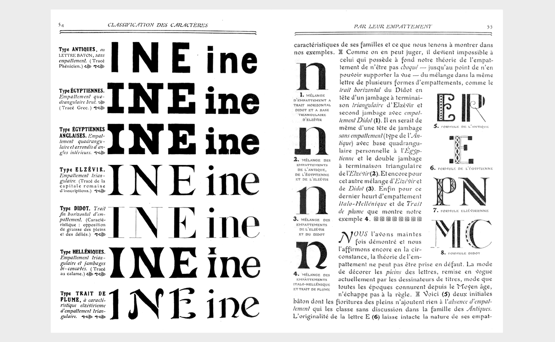
It is mainly through its serifs that a font can be distinguished, whether they are rectangular, triangular, filiform... or absent. The description of a typeface - x-height, fatness, shaft, serifs, point, counterpoint, jamb, etc. - The description of a character - height of x, fat, shaft, serifs, point, counterpoint, jamb, etc. - makes emerge a recognizable style which is attached to a larger grouping. The method has the merit of being efficient, but is not without ambiguity. For example, at what point does the flare of a jamb or diagonal become a serif? The debate remains open.
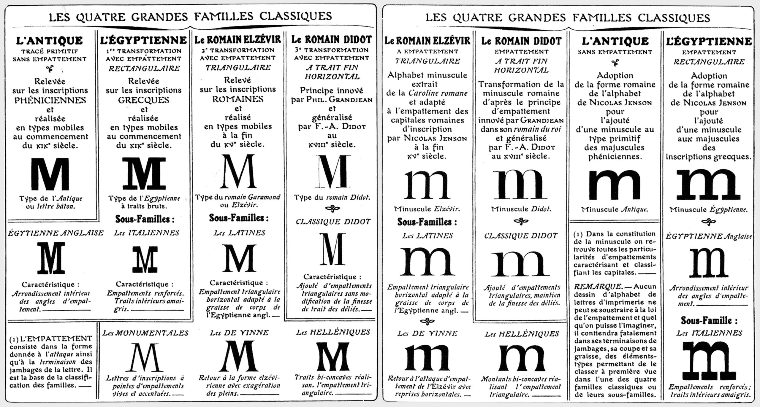
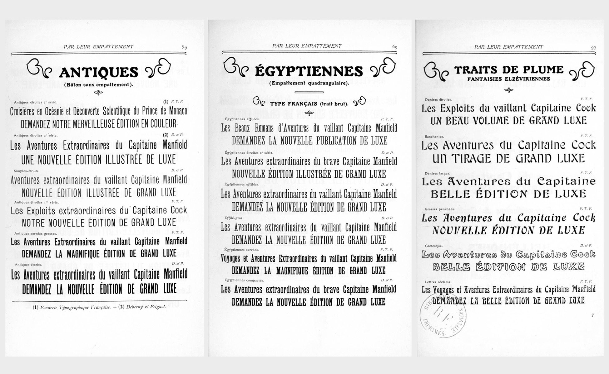
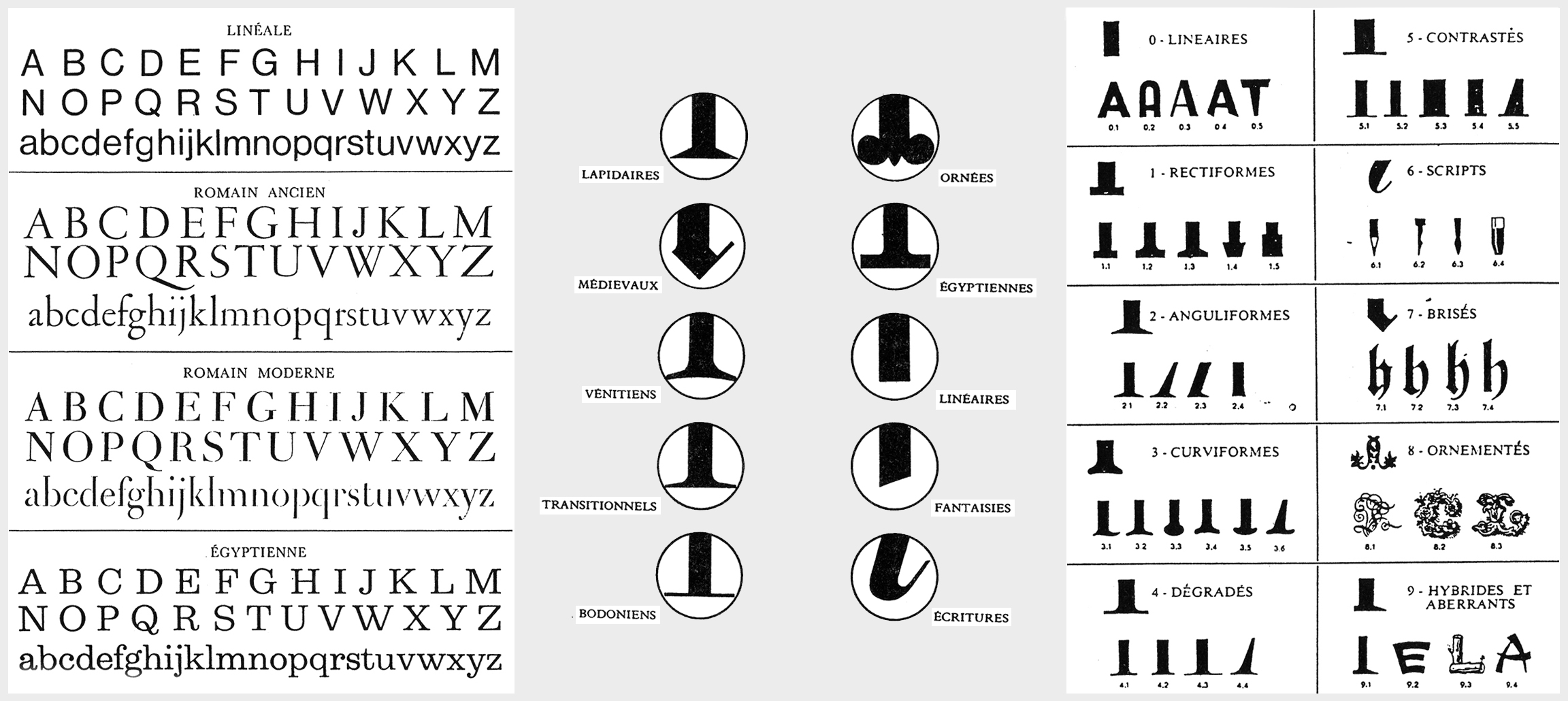
In 1921 F. Thibaudeau classifies typefaces by serifs but also by periods, from the first to the second empire. He distinguishes 4 big families: "elzévir with more or less triangular serifs, didot when they are filiform, egyptian if they are quadrangular, the antique ones being without. All the rest takes place either in the writings or in the fantasies". Problem; this resolutely simple classification is quickly overwhelmed by the multiple new typographies.
Marius Audin distinguishes the gothic from the roman and the cursive in 1929.
The second world war and the industrial revolution that followed brought their share of new typographies. Around 1950, European countries invented their own typographic classifications. But each one is attached to the shape of the letters without thinking of proposing universal families...
Below, the typographic classifications of Jacno (France, 1978), Novarese (Italy, 1957), and Pellitteri (Italy, 1963).
We thus end up with names of typographic classes that do not mean the same thing from one country to another. Ponot explains that "this was the case for Antique, a sans serif typeface in France, and Antiqua, which designates Roman typefaces in Germany. The same is true of our Gothics and the Gothics (sans serif) of the United States."
The Vox-Atypi character classification puts everyone in agreement
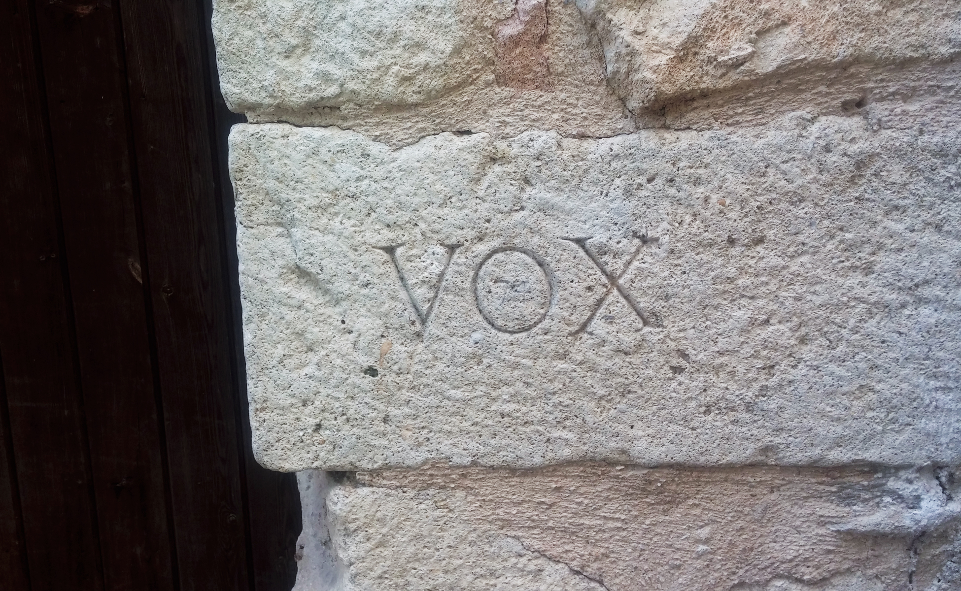
And then comes Maximilien Vox, who elaborates in 1953 a classification of characters with the association of the companions of Lure (of the meetings of Lure) which seems to put (almost) everybody of agreement.
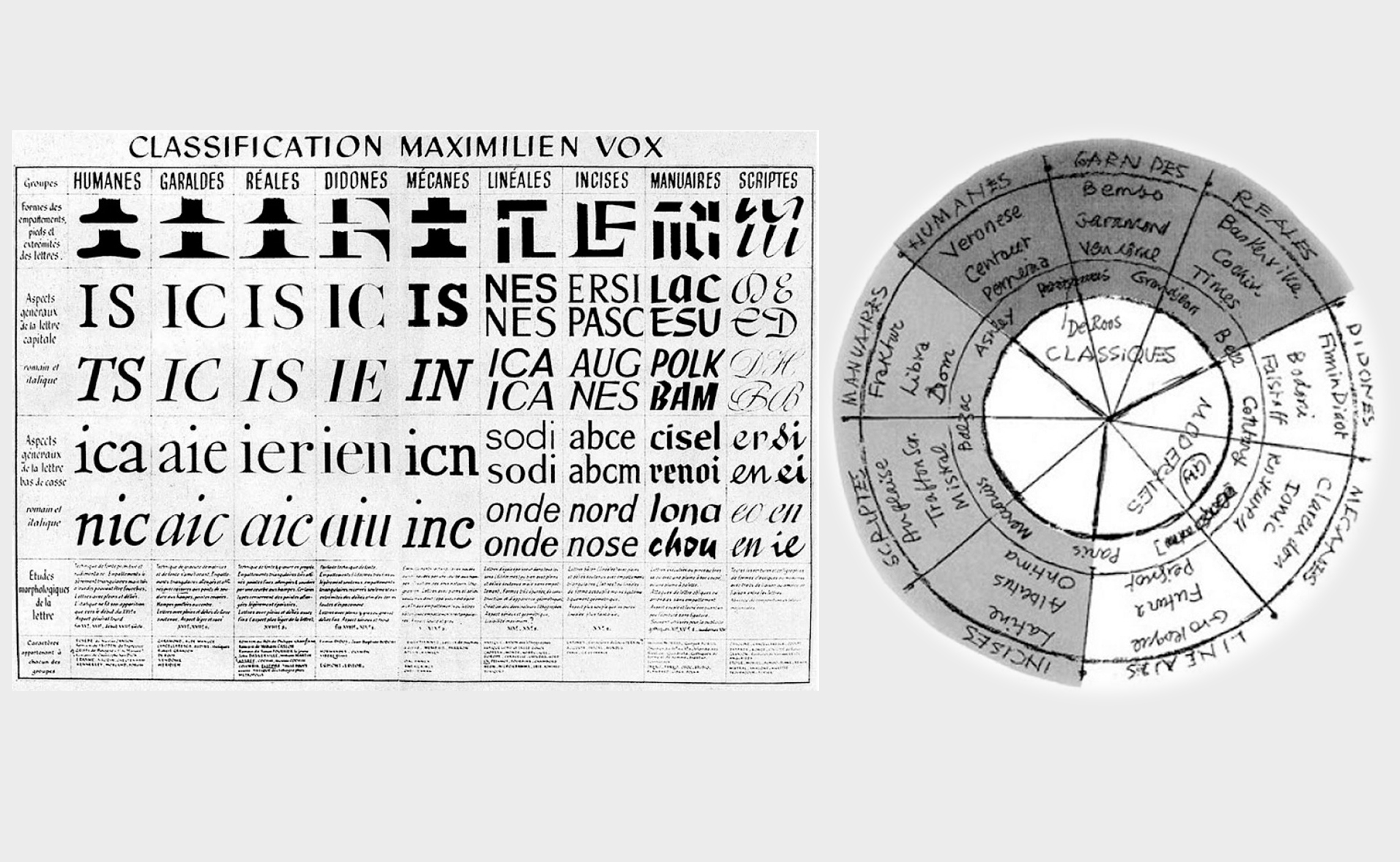
The Vox-Atypi classification defines 10 large families of typefaces, with in addition, as Vox says, "an evidence of biological order" putting forward the fact that "each being has two parents". Thus, each typographic character can have two families, the first one prevailing on the second. Here is a description by René Ponot, completed by Pierre-Yann Lallaizon :
- Group I: the humanes, or typefaces of the early days of printing. Inspired by the Roman tradition, they are based on the writing of the humanist manuscripts of the 15th century, in rupture with the Gothic style of the pre-Gutenberg copyist monks.
E.g.: Horley Old Style, Cloister, Kennerley...
- Group II : the garaldes (from Garamond and Aide Manuce), or Renaissance typefaces. They have some similarities with the Humanes, although they are distinguished by the oblique stroke of their e.
E.g.: Garamond, Bembo, Times New Roman, Sabon...
- Group III : the reales, or typefaces of the 15th century monarchy. They form the transition between the Didones and the Garaldes, although more vertical than the latter.
E.g.: Baskerville, Caslon, Perpetua...
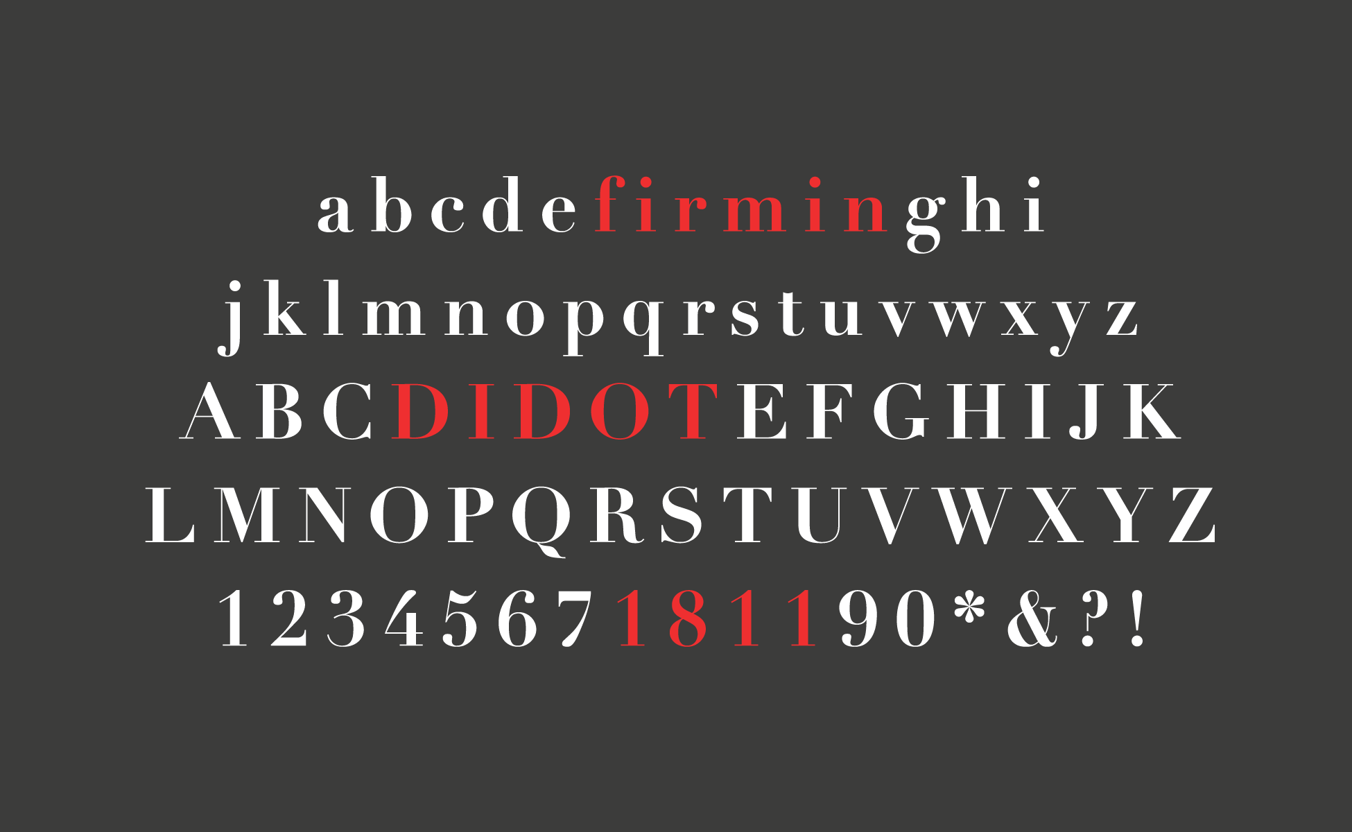
- Group IV : the didones (from Didot and Bodoni) which are the didots of Thibaudeau. They are easily distinguished by their strong contrast between the full and the half-full and their filiform serifs without angulation.
E.g.: Didot, Bodoni, Walbaum...
- Group V : the mechanes, which are the Egyptians of Thibaudeau, remarkable by their thick and square serifs.
Ex : Clarendon, Memphis, Amasis...
- Group VI : the lineal ones, which are the Thibaudeau's sticks or antiques, without serifs. Originally created only in capitals, they appeared at the beginning of the 19th century in catalogs and exist today in lower case.
E.g.: Franklin Gothic, Helvetica, Futura, Univers...
- Group VII: the incises, which recall the monumental inscriptions of ancient Rome. Their serifs are often fine, triangular.
E.g. : Trajan, Albertus...
- Group VIII : the scriptes, or rapid writing characters, freehand, with large romantic embellishments.
Ex : Shelley Andante, Zapfino, Mistral...
- Group IX : the manuaries, or slow writing typefaces, with hand and typefaces where the drawing prevails over the writing.
Ex: Jacno, Ritmo, Banco...
- Group X: the fractures. Entirely gothic, they remind the medieval script and are identical to the first textura of Gutenberg.
E.g. : Fette Fraktur, Goudy Text...
- Group XI : non-Latin characters (Arabic, Hebrew, Greek, etc.)
"These families have been determined from a point of view, in other words, according to the real characteristics presented by the letter templates used in printing, and taking into account the fact that each living being proceeds from two parents and presents hereditary traits that it is enough to know how to recognize. The defect, in our opinion, of the too learned or too subtle classifications proposed until now is not to have been based on this essential notion of filiation or to have reduced it to a simple chronological or aesthetic notion" writes Maximilien Vox in Nouvelle classification des caractères, Estienne, 1954
Character classification is dead: long live character classification!
Lewis Blackwell will then try to add other categories to those of Maximilien Vox, with the aim of palliating the appearance of new forms of writing in connection with the numerical one: the Fantaisistes and Techniques, the Contemporaries... However, he quickly rationalized his approach and gave in to the obvious: "It is no longer possible to stick to a rigid classification system, because current typographic creativity means that certain forms 'get out' of the defined categories. There are no rules, only a series of possible readings of each new typeface, from which we can determine its characteristics. But they are never fixed. There is no longer a classification 'Bible' today, if there ever was one4."
It is undoubtedly on the side of the on-line foundries that one should look. They quickly moved away from the classic Vox-Thibaudeau model to create a more flexible method, based in part on the absence or absence of serifs, but also on the style of the characters themselves. Black [Foundry] has decided to classify its fonts in 6 categories: Sans serif, Serif, Slab, Mono, Blackletter, Script. At Typofonderie, 4 are enough: Serif, Sans serif, Condensed, Extended.
As the number of fonts has exploded, the categorization has been reduced. More simple and flexible, it is often equipped with filters that allow to refine the classification. There are now many possibilities and combinations. For example, at Production Type, if 5 main categories allow to cover the whole catalog (Sans serif, Serif, Slab, Script, Other, that is to say quite close to the Thibaudeau classification), it is especially possible to classify the characters according to their proportions (thickness, height...), their effects (stencil, rounded...), their size (size of the typeface), the reading size (small, large, optical...), the mood (fun, romantic, sport, futuristic...) or, above all, the use (identity, book, packaging, UI...).
Classification Vox: This is the End

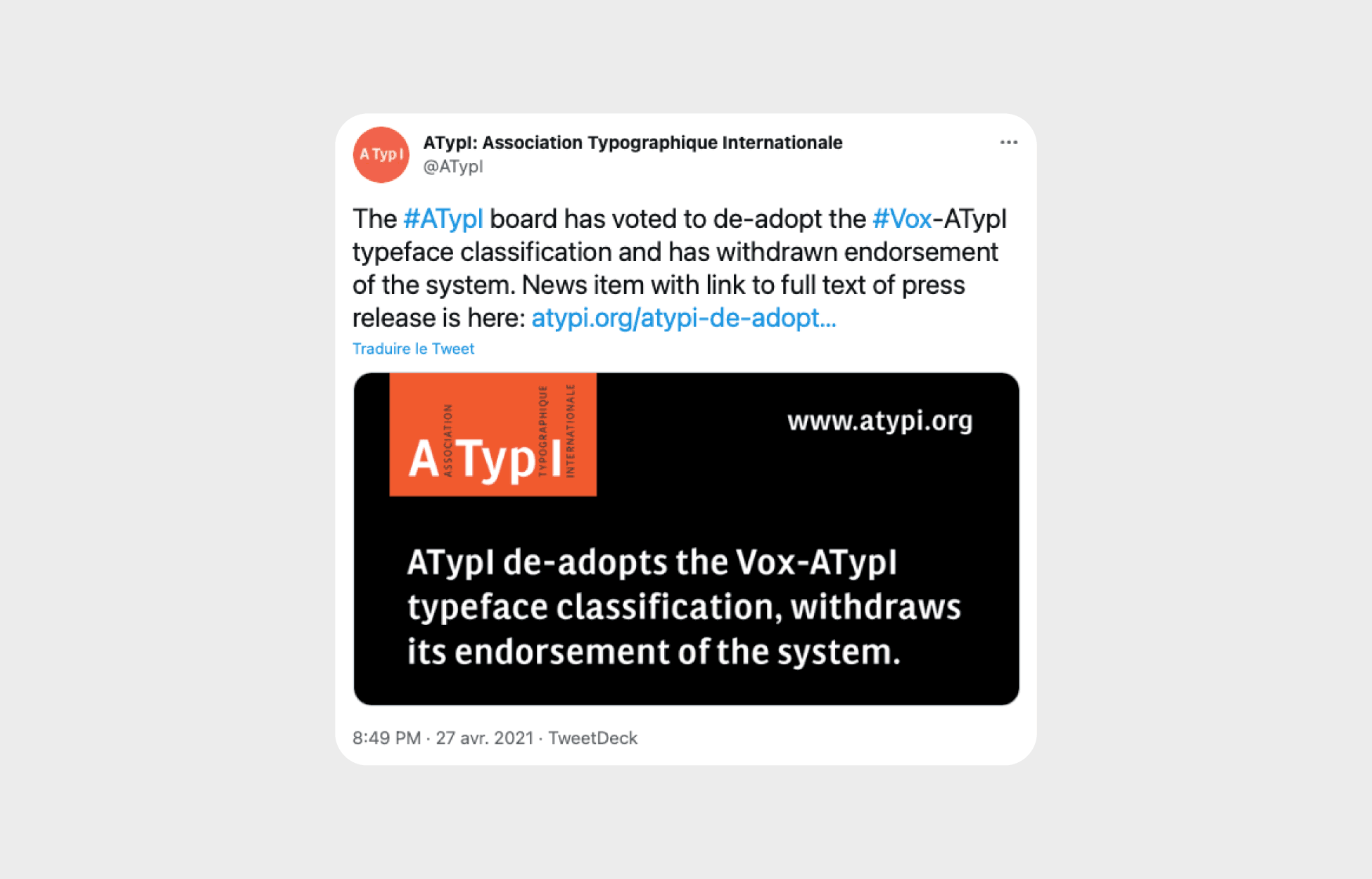
In April 2021, the International Typographic Association (ATypI) announced that it is abandoning the Vox-ATypI classification system and is commissioning a working group to devise a new classification.
The contemporary challenges imply to take into account the numerous existing writing systems, but the Vox classification is limited to "Latin" characters and did not take into account other writing systems such as Cyrillic, Arabic, Hebrew, Asian languages and other writing systems. While the Vox classification and its variants may have suited the needs of Western industries in the mid-20th century, the classification as it exists today is very limited in scope, excluding dozens of typographic cultures.
"I'm excited to start working on more contemporary typeface classification systems" said Carolina Laudon, ATypI board chair. "The Vox-ATypI system may have served its purpose in the past, but it is no longer representative of our community. I look forward to the possibilities of exploring a new character navigation system with our members, partners, collaborators and other experts from around the world."
So an exciting new era is about to begin. More inclusive, more open, richer...
Two typographic classification tools for inspiration
It is from this observation, and in front of the richness of the existing that two typographic tools were created to inspire the designers, to help them in their choices, or to allow them to better (re)know the existing typographic characters.
The Typology color chart to be inspired by French typography
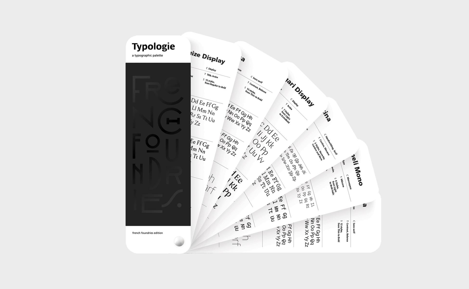
Like a color chart, the Typologie typographic chart offers 130 typefaces from French foundries. At the same time, it is an inventory of the contemporary French typographic creation, a creative medium and a catalog of inspiration. The object required a new reflection on the way to categorize the fonts that appear in it. The choice was made to create six main categories, halfway between the classic system that analyzes the shape of the characters, and the foundry system that determines their use:
- Serif: with serifs, whether triangular, rectangular, filiform...
- Sans serif : without serifs
- Display: mainly titling fonts, dedicated to large sizes
- Expressive: modular, radical, experimental
- Monospace: with fixed caster
- Cursive : including script and handwritten
Here, typefaces are no longer delimited only by the shape of their serifs, but by the use that can be made of them. Serifs can be used for both regular text and branding; displays for a poster title or an app title; sans serifs for a paragraph or packaging. Combined with a set of tags and keywords ("modular", "fantasy", "geometric", "titling", etc.) the typefaces become visual tools left to the free appreciation of each one.
They go beyond the primary codes, no longer affixed in a strict family, but characterized by a multitude of possibilities that are as many tags and filters. Everyone can respect or not the proposed tags and create his own use, independently of the primary proposals of the designer type. The rules are above all made to be broken. Available as a preview on a crowdfunding website, the color chart is currently out of stock.
Typ/o the mobile application to classify and recognize typographies
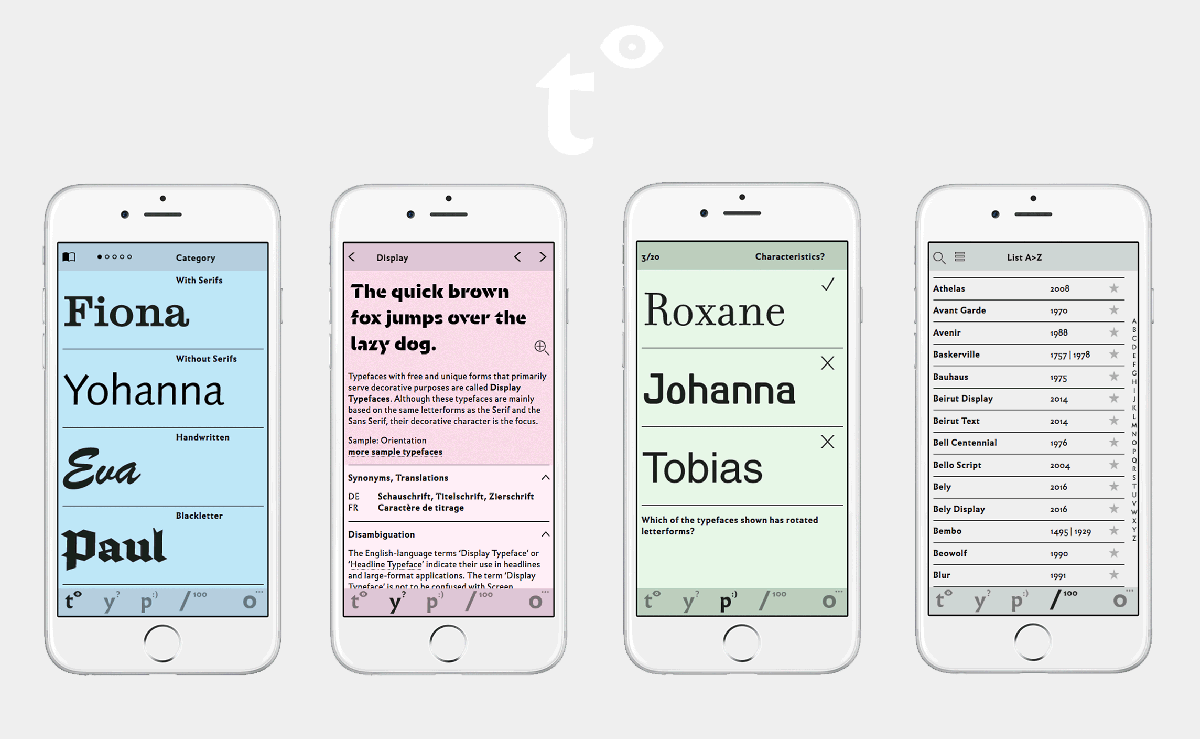

The Department of Design at the FH University of Applied Sciences in Aachen, Germany, recently designed the mobile app, typ/o, which not only provides insight into typographic classification, but also allows for playful learning to recognize typography.
Created in 2020, the typ/o application allows "to facilitate learning in order to recognize typefaces according to their formal principles" as it says on the typ/o website. It is based on various classifications (Din, Vox and British standards) that it has slightly modified. By using the typ/o application (which also works on the web) one learns how the typographies are classified, their history, and how to recognize them via fun quizzes.
The typographies are divided into sections:
- identify (t°) to compare the typefaces we meet every day and learn how to classify them
- learn (y?) collects specific information and the history of the typefaces, while giving their synonym class according to the countries
- play (p:)) allows you to play with the characters by answering quizzes
- fonts catalog (/100) a selection of more than 100 typefaces and their information (designer, year, foundry, class...)
The didactic tool is free. It does not serve to recognize typefaces automatically but to educate the eye to recognize and classify them yourself. Something to shine in society.
For the moment, this mobile application is available in English and German. We can't wait for the French version to be released, because the tool is really well designed, fun and practical.
____
Thanks to Pierre-Yann Lallaizon from studio rectoverso for the texts on the genesis of Typologie and his writing work on typographic classification.
1Lewis Blackwell, Typo du XX e siècle, Flammarion, Paris, 2014, p. 7.
4Lewis Blackwell, Typo du XX e siècle, Flammarion, Paris, 2014, p. 190.