
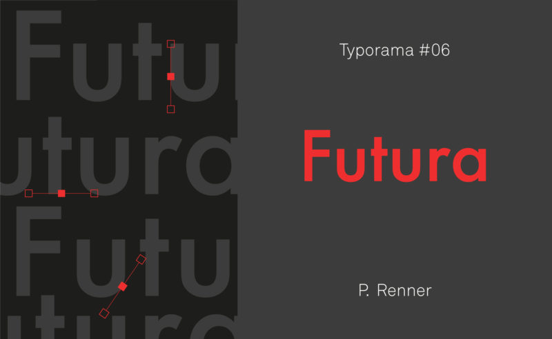
From the Nazis to the moon, Futura is probably the most used typeface in the world, and yet it’s not new!
After 10 years of existence, le Slip français washes its image and puts on a new logo. Simple, basic, more inclusive, but is it enough?
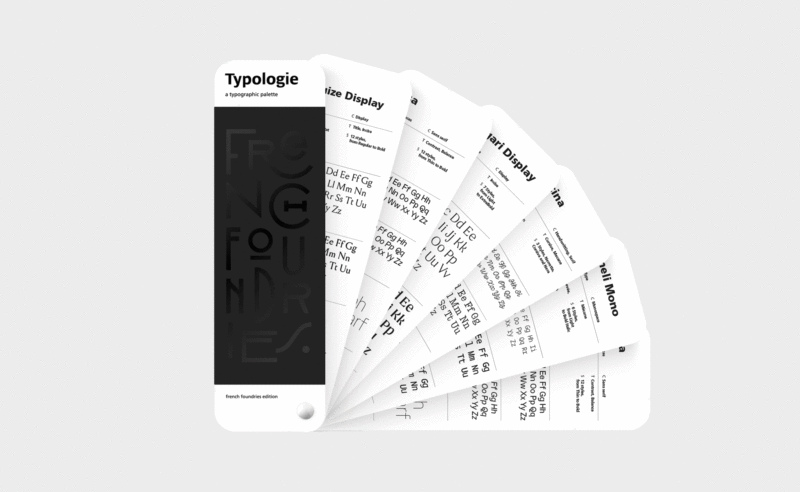
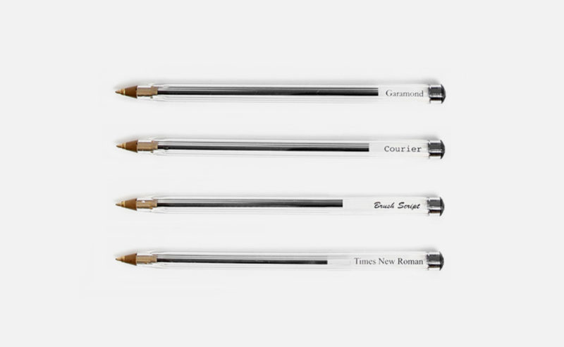
How to see more clearly in the typographic classification and which tools allow to choose and recognize the typographies?
Imagine a silent language, without letters or words, for non-humans. In front of your eyes, the yerkish, a language for communicating with monkeys, takes shape.
Bizarre as well as strange, the Unicode language aims to collect and preserve writings… by standardizing them.
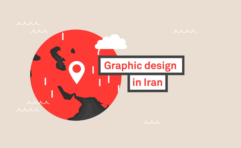
To grasp the genius of Iranian graphic design one must understand its incredible heritage in the arts, and the current upheavals. A short journey from ancient Persia to the most contemporary graphic design.
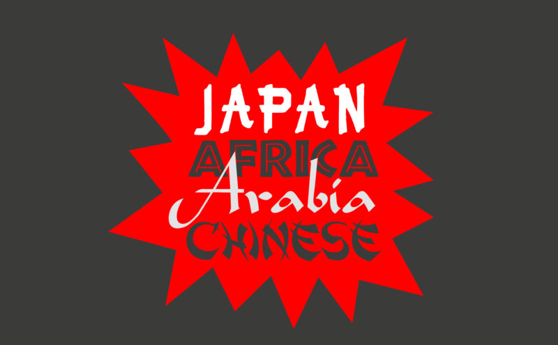
Used mechanically and out of context, certain typographies convey cultural stereotypes. We call them “stereotypographies”.
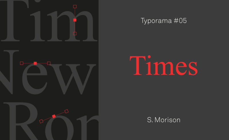
A short history of Times New Roman, the essential typeface designed in 1932 by Stanley Morison for The Times newspaper.
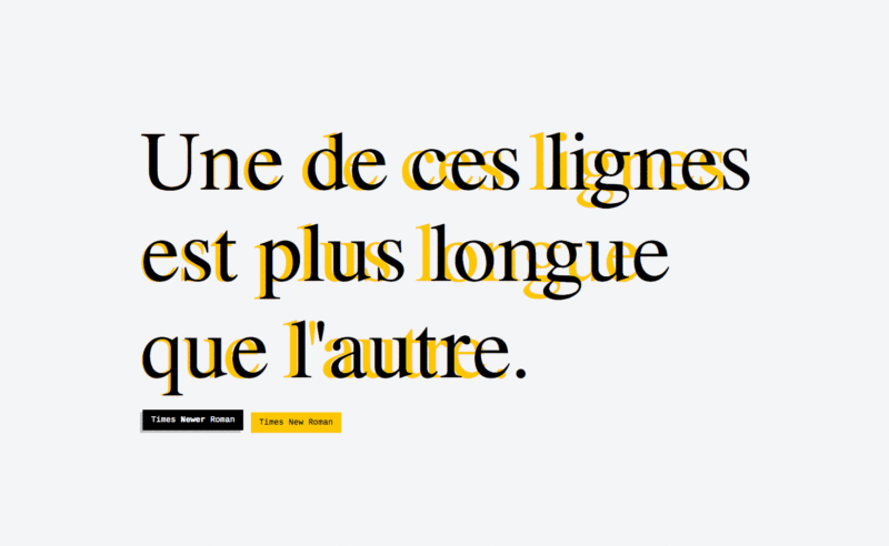
Times Newer Roman is 10% more bulky than its Times New Roman equivalent!
A typeface for cheating!
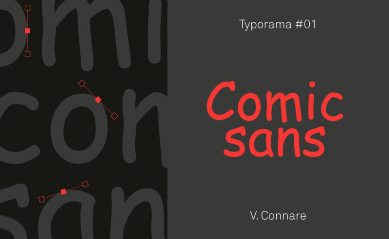
Nothing predicted the Comic Sans MS to become what it is today: a font hated by graphic designers and yet very popular with the general public. Discover its history… and its some qualities.
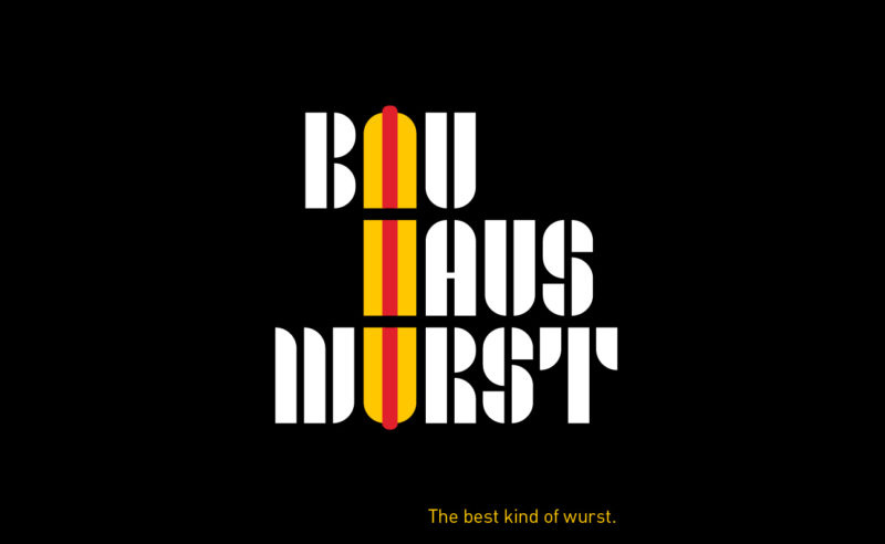
Some in-house Bauhaus posters to pay tribute to the Bauhaus 100th anniversary, and to German sausages. Architecture, typography, gastronomy!
The Duperré School changes its visual identity.
A project designed by L’atelier Ouf ! and the Production Type foundry.
For over 20 years, Gordon Young has been working on the border between art, graphic design and typography. To his credit, he has created dozens of art installations in public spaces, a forest of typographic trees, a wall of wishes in a school and this incredible Comedy Carpet in Blackpool!
Ecology and typography : Garamond typography, the 14-year-old prodigy and $136 million in savings ! Why this equation isn’t entirely true !
Retrospective of Roger Excoffon’s work. Graphic designer, typographer and type designer 1910-1983. The creator of the Banco, Mistral, antique olive typography… but also of the Air France visual identity.
A few weeks ago, we took part in a consultation launched by Paris Métropole (a group of local authorities working together to find solutions to the social, economic and environmental challenges facing their shared territory). The project involved reinforcing the visual identity we had created for them with a graphic charter that could be used for the communication and signage of an exhibition, the creation of its catalog, the execution of their brochures and annual reports, as well as the redesign of their website. Phew, just that!
 San Serriffe typographic Island
 Design, creativity and oblique strategies!
 Tote bag, a new social totem?
 Sister Corita Kent, the Pop Art nun
 Donald Trump, the martyr who makes history
 Maison Léonie Paris – Storytelling, brand design & packaging
 Ox avocats – Brand design
 Twipi Group brand architecture
 Minca coworking – Visuel identity
 République – Grolée-Carnot – Street branding
 How about saying no to video advertising screens in public spaces?
 Oi! In love with a Brazilian ear
 Vasarely, the father of optical art