McDonlads turns over its logo for International Women’s Rights Day…
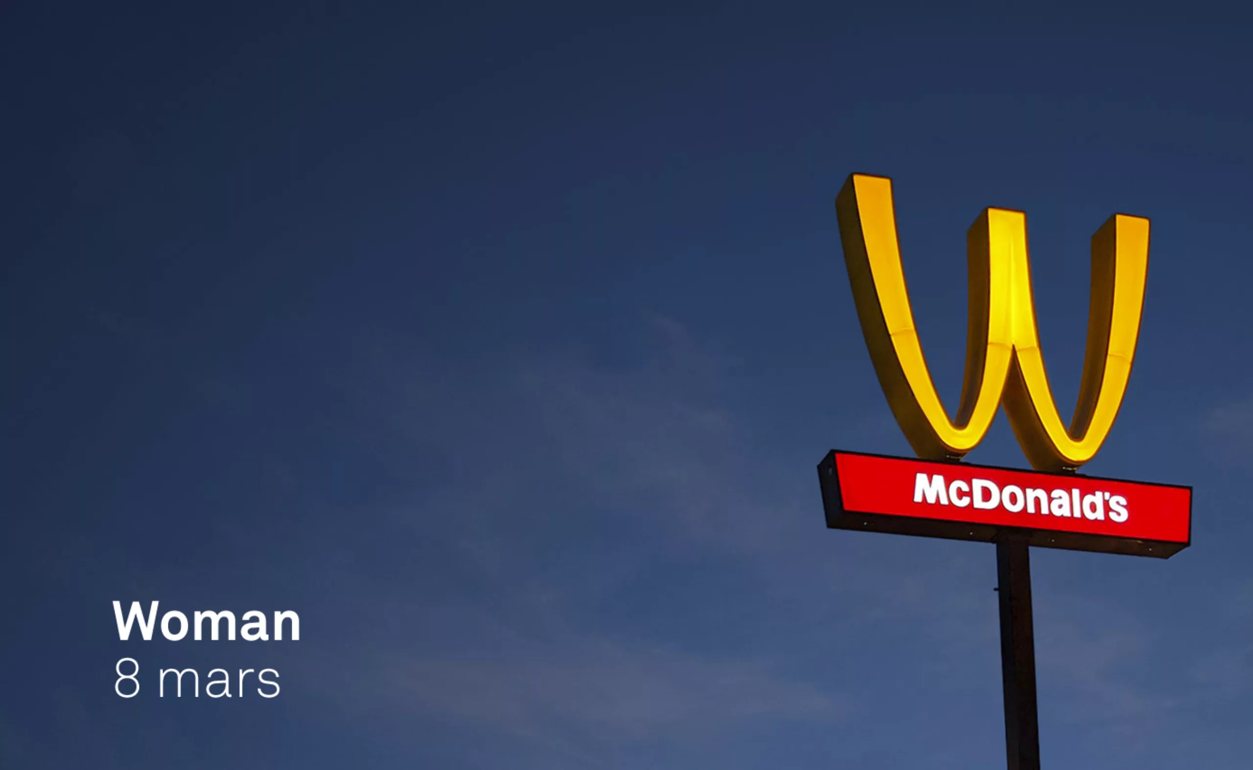
March 8, a McDonald’s logo for women?
It’s always risky to make some fun with a logo.
For International Women’s Rights Day, McDonald’s finds out the hard way.
It all starts with a well-crafted marketing operation:
“What if we flipped the logo over on the arch to change the “m” to “w’ in honor of the Women?”
“Yeah!” Cool! I’m driving the crane!”
Well, that’s a good intention. It’s about recognizing and celebrating the extraordinary contribution of women at Mc Donalds. It is also an opportunity to recall that 6 out of 10 restaurant managers are women.
To make sure everyone knows, they create special packaging, uniforms and bags printed with this “w”. They even make a website and a nice short film…
So far it’s a nice, well-oiled communication operation. Yet…
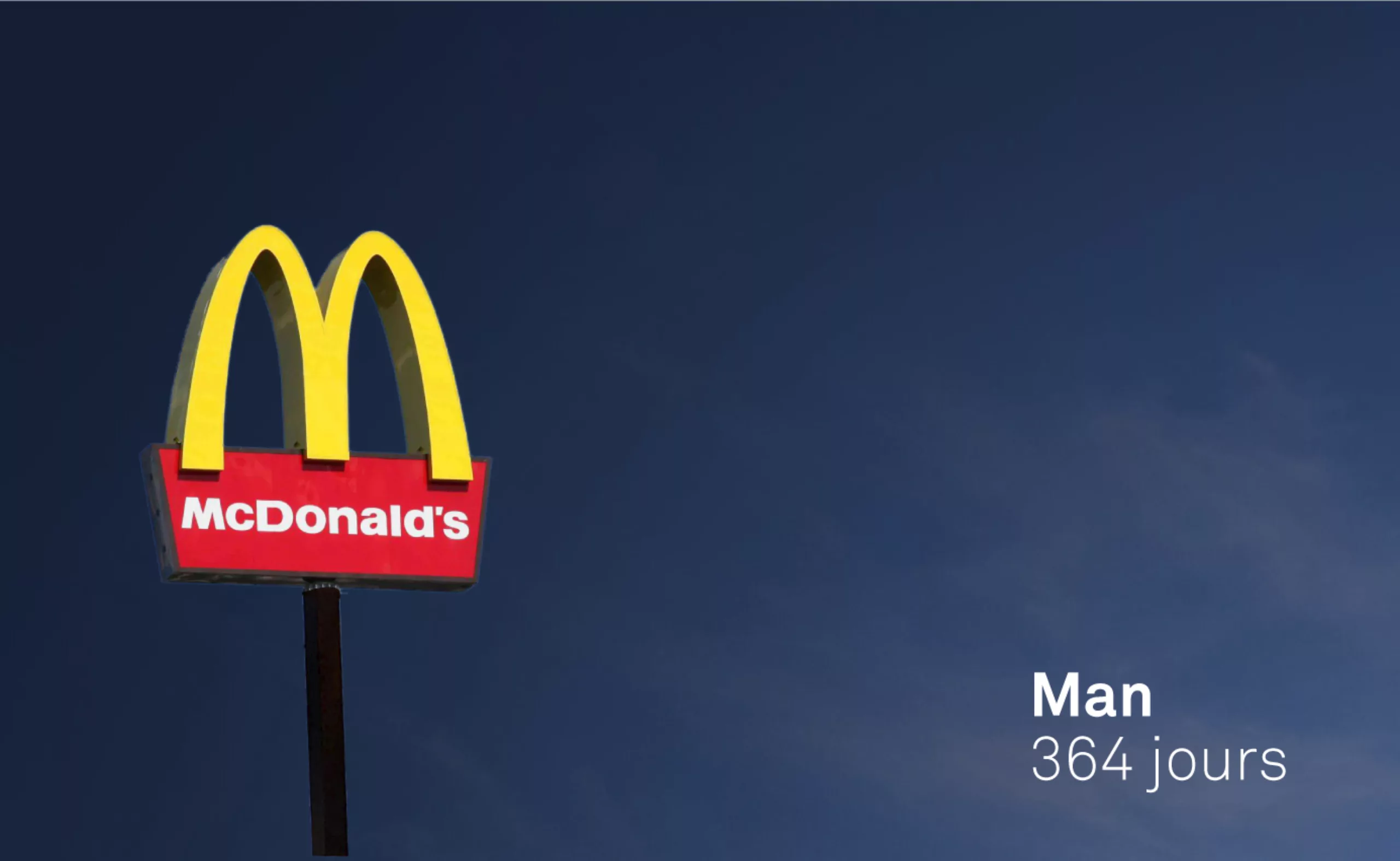
364 days for men?
Communicators, proud of this creative gem, have probably forgotten that an idea can often turn against itself.
On the morning of March 9, four men returned to put things in order. The “W” is back for 364 days the “M” for “Man”!
American social networks have had a field day. But behind this legitimate mockery, little voices have come to the ears of the public, former employees who tell their version of Mc Donalds’ social policy. The reality is that many employees have poorly paid and precarious employment contracts. Working conditions that affect women the most.
In particular “zero hour” contracts, a specificity of American law* which allows an employer to indicate “0h” on the duration of working time. If there is no work, then you are not paid! A type of contract that left many women workers temporarily without income to support their families.
*This type of contract also exists in France, in a restricted way.
A 85B as a logo ?
The opportunity is too good to remind you of the history of this breast shaped logo!
In the 1960s, the firm’s managers consulted experts to determine whether they should change or retain their logo. Eric Schlosser, author of “Fast Food Nation: The Dark Side of the All-American Meal” in 2001, reports the story. At the time, the two large arches were integrated into the architecture of the restaurants themselves. A design consultant and psychologist, Louis Cheskin, is therefore mandated by McDo to establish a diagnosis.
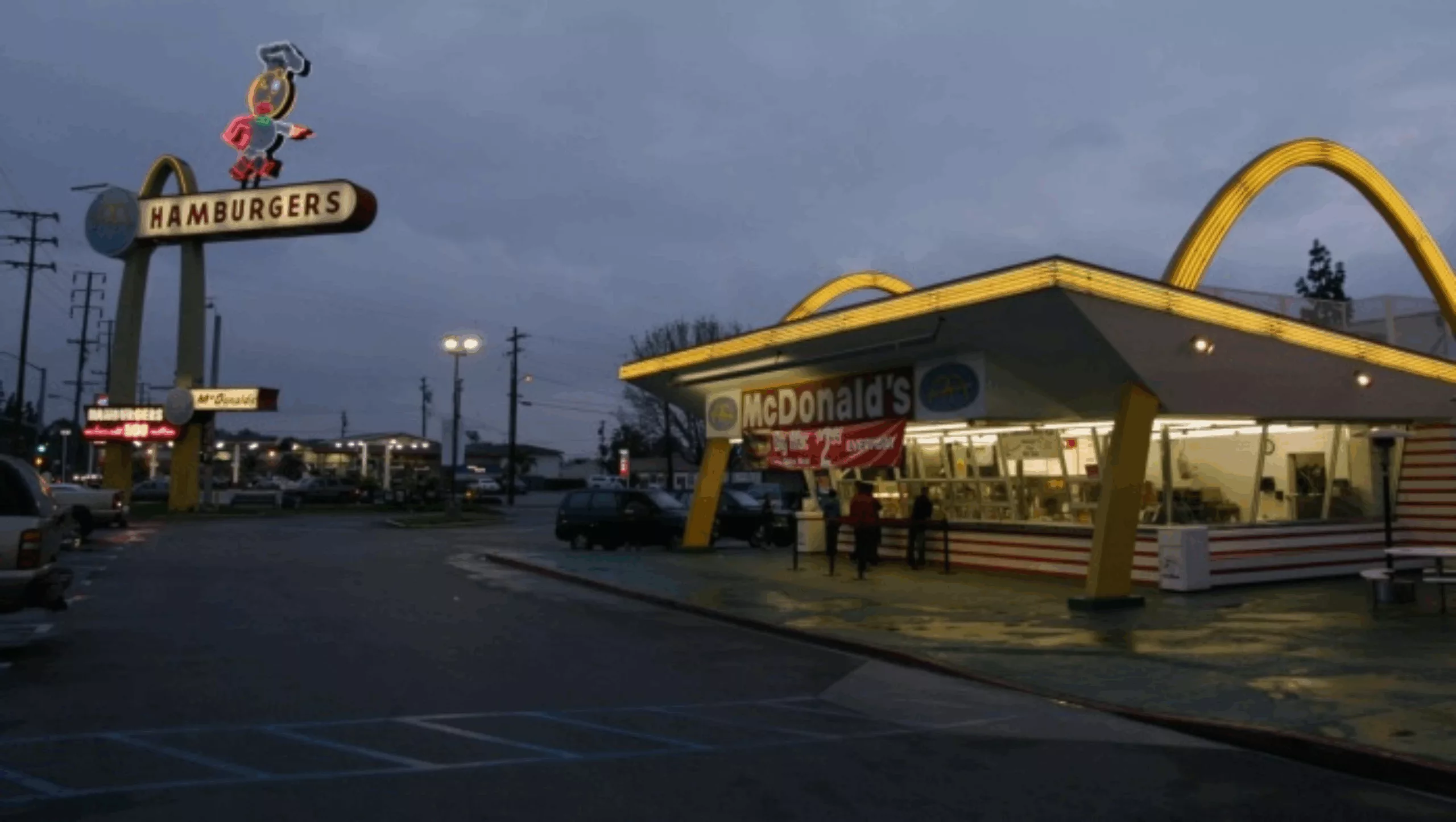
In the’60s, McDonald’s is exploding. They open restaurants by turns, and Ray Kroc, the founder, converts to franchising. This was the beginning of the standardization of restaurants, and the arches were gradually removed. That’s where consultant Louis Cheskin comes in. He persuaded the leaders to keep the symbol of these arches. As a great reader of Freudian theories, convinced that sexuality dictates many of our behaviors, he defends that these arches suggest the shape of a breast, a nourishing form par excellence.
According to him the exploitation of these human urges was to serve marketing and the unconscious association of “mother’s breasts” with this symbol should persuade Americans to eat burgers!
In 1962, this “M” became the official Mc Donalds logo.
A story to inspire the 2019 version of the logo for International Women’s Rights Day?
Well, we prefer to finish with a song…
On the subject
-
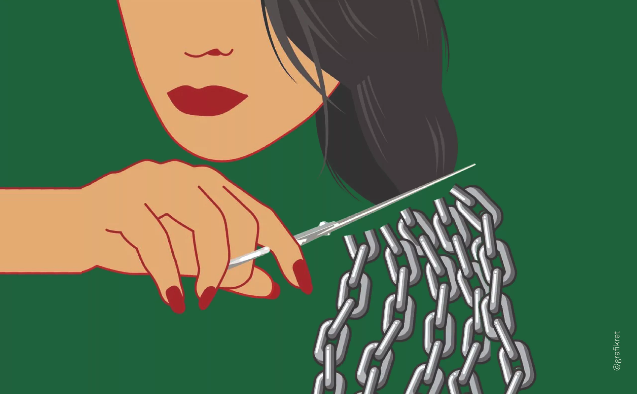
The symbolism of cut hair in Iranian protest posters
In Iran, Mahsa Amini died for a lock of hair poorly concealed behind her headscarf, giving rise to a massive protest movement against the mullahs’ regime. The gesture of a severed lock of hair becoming the symbol of this struggle gives us the opportunity to look back at the many symbolic of hair.
-
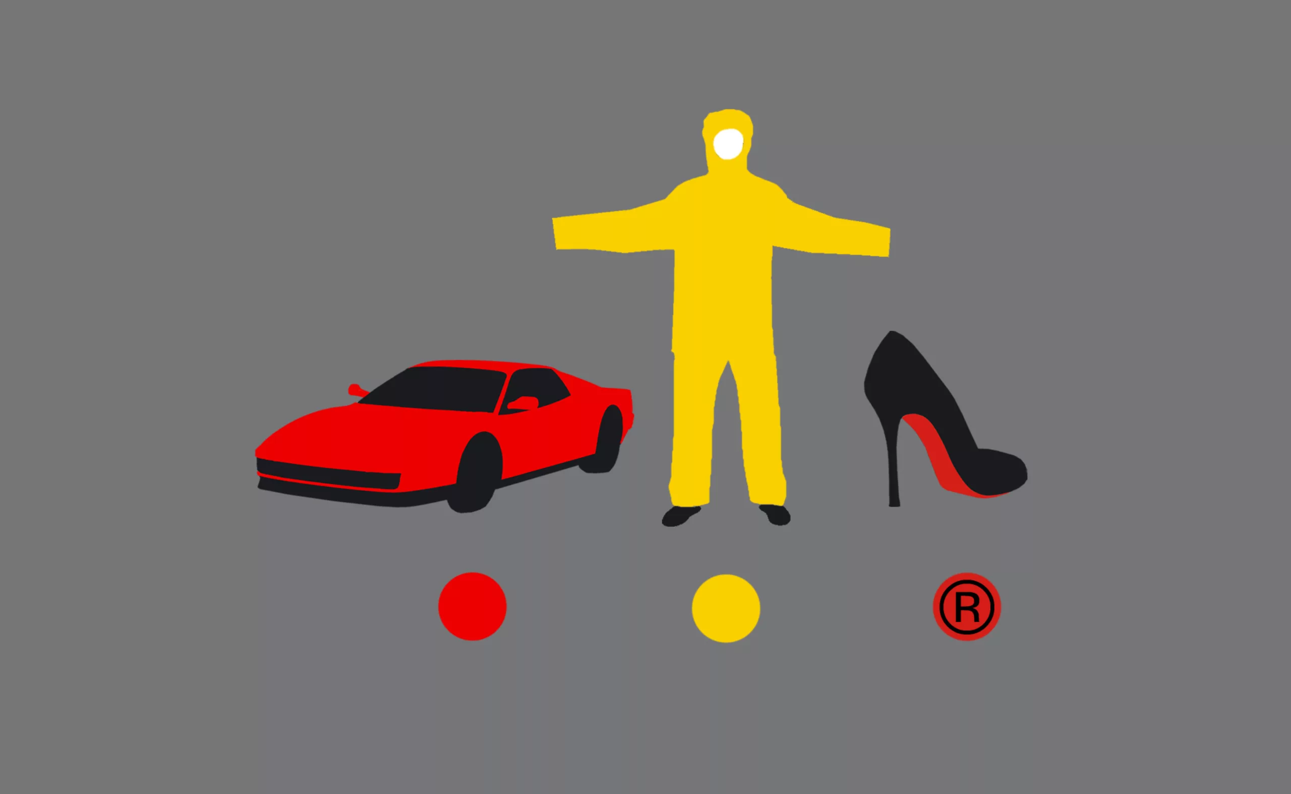
Color and brands are all about identity !
Many brands use colors as symbols to convey their identity. But can we really legally appropriate a color?