Deciphering Total’s new faded logo, becoming TotalEnergies
At the end of May, Total unveiled its new logo, as well as its new identity and name: TotalEnergies. This marks a new strategic turn that seems to go in the opposite direction of their logo... we find that the whole lacks solidity, coherence and sustainability.
A new identity and a new logo for Total: TotalEnergies
On February 9, 2021, Patrick Pouyanné, CEO of Total Group tweeted: "Total will change its name to #TotalEnergies. This name will anchor our strategy of #transformation into a multi-energy group. TotalEnergies is Total, it's every energy, it's all our energy serving our customers!" This change of identity, approved by the vast majority of shareholders, is a way for the oil group -but not only- to "explicitly mark what we want to be: a leader with more energies and fewer emissions, the responsible energy company" stresses the CEO in his video announcing the new name TotalEnergies.
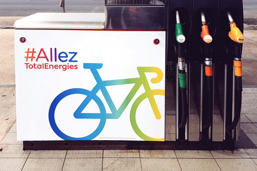
On May 28, Total's new identity was unveiled, as was the new face of the TotalEnergies service station in La Défense:

TotalEnergies's new visual identity, by Carré Noir agency
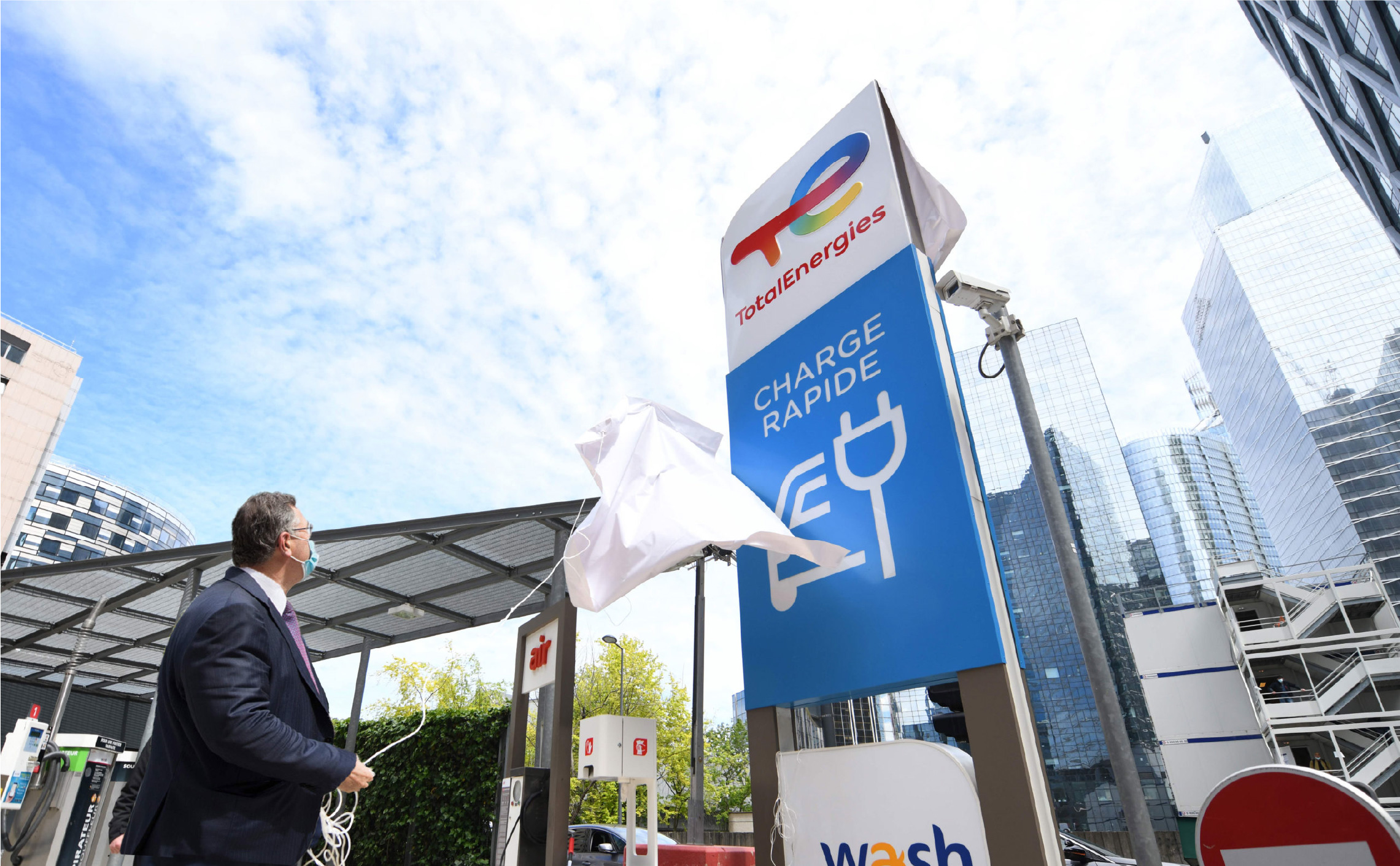
Patrick Pouyanné unveils the first TotalEnergies gas station in Paris' La Défense district bearing the new colors and logo
A new name and a new image for Total:
"Together, they link our past, of which we are proud, and our future.
Together, they say what we want to be: a major force in the energy transition.
Together, they express our own energies, those of all the TotalEnergies teams," wrote Patrick Pouyanné in his announcement letter.
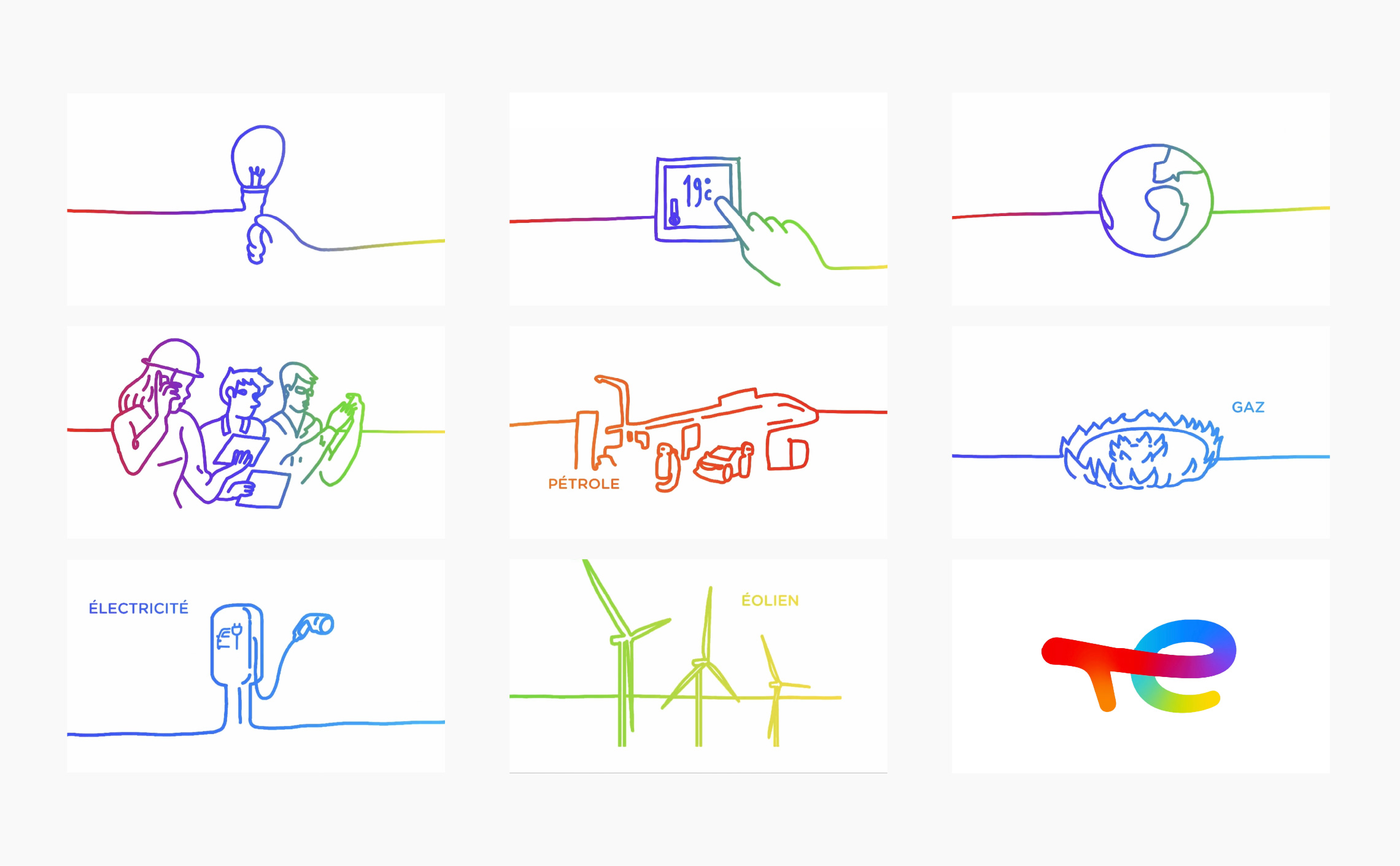
The new identity comes with a "hand-drawn" commercial in rainbow colors, to symbolize "all energies."
It took Carré Noir (Publicis) nine months to deliver this huge and delicate project. Huge in the proportions of the deployment of the new TotalEnergie identity, which will involve the lifting of nearly 16,000 service stations in more than 130 countries around the world and even in the most remote corners, which will require 18 months of work. This is a delicate task, given that Total is one of the most profitable companies in France, and one of the six "supermajors", the world's oil and gas giants. The identity of the group should not leave anyone unconcerned. We can understand the huge strategic, economic and ecological challenge linked to the creation of such a logo, which must necessarily be sustainable, given the astronomical costs of implementation.
TotalEnergies: a logo looking at the past, present and future?
During the brief with Carré Noir, CEO Patrick Pouyanné would have specified that "everything is changing" within the group, from the name to the software, to the internal structure with the creation of new branches such as "One Tech" in R&D and new businesses, and of course the new strategy oriented towards all energies. From a simple initial request for a make-over, the creative agency understood that a little more was required.
However we can question the purpose of this new logo, which is supposed to illustrate Total's energy transition, when the previous one was already doing the job very well, with the introduction of colors -light blue and yellow-orange- which already symbolized Earth's energies. Total's real need here is obviously to become greener in the long term, and this change requires the adoption of a new name, which in turn requires a new image. This strategy has already proven its worth and allows companies to erase an inglorious past (Credit Lyonnais > LCL, Thomson-CSF > Thales, France Telecom > Orange) or to mark a strategic turning point as GDF Suez did by becoming Engie, or SNCF by becoming OUI.
Although now oriented towards renewable energies (it is about time), Total wants to build a logo that keeps a link with the past, oil, while embodying the transition into renewable energies. So there is no desire in this new logo to do greenwashing by portraying itself as a green giant, but rather as a producer of energy in the plural, including oil. As a result, the logo is a colorful festival.
A faded logo
Regarding colors, we must talk about the use of faded... gradient. It was a big design trend in 2019/2020 (eg: Instagram logo) via UX interfaces. Among other things, because new web tools facilitate the use of color gradients (we think of the democratization of the uses of CCS3 from the years 2015, then the arrival of the free shape gradient tool in the CC2019 version). But what's the point of wanting to surf on web codes when displaying 98% in the real world? Finding this trend in a logo as institutional as TotalEnergies shows that it has probably reached its peak long ago. It's the fashion cycle. To take another metaphor, by the time the dads got on Facebook, the teens were long gone on Instagram or Snapshat.
Finally, it is surely that the gradient is not only a question of trend but a visual solution to symbolize the diversity of energy. These are immaterial and therefore difficult to transcribe visually, especially when you want to represent them all. Problem: the new Total logo is based on this gradient and without it, it loses 90% of its meaning. We see here a technical constraint of necessarily having to reproduce the logo in color, which can cause an aesthetic problem on paper posters for example, a logo having most of the time monochrome variants. Not to mention the fact that the gradient rendering increases the costs by excluding many manufacturing and printing processes, and implies the use of four-color process. If this trend were to pass very quickly, then the logo would be good to throw away.
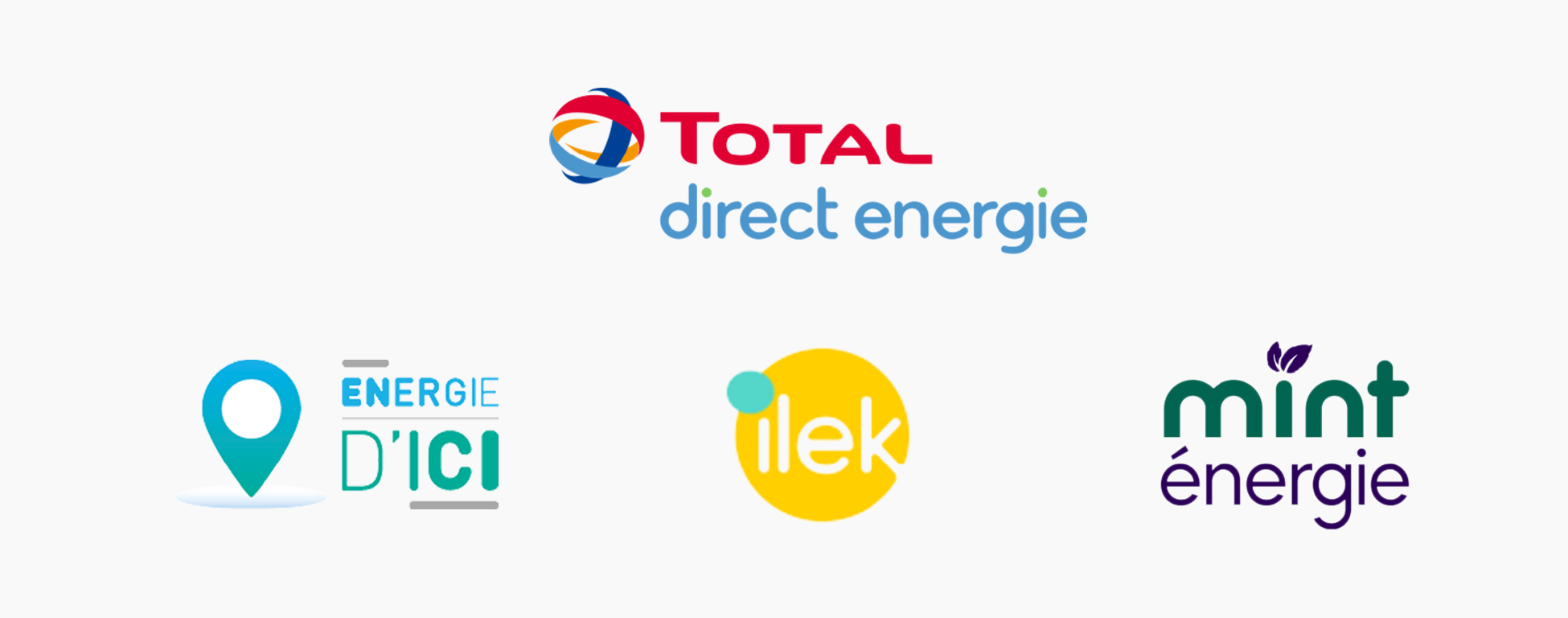
As for the typography, it is the opposite of what Total used to do. Bye-bye knife-cut capital letters, hello rounded lower case. Goodbye monochrome, hello gradients. Goodbye monolithic block, hello movement and lightness. We can say that the change is visible. The new typography reminds us of Gotham Rounded, which " rounded " style is often used in the ecological environment, and especially... by " competitors ", the suppliers of (really) green energy, like Energie d'Ici, Ilek, or mint énergie. It was also the style adopted by Direct Energie, which Total bought in 2018.
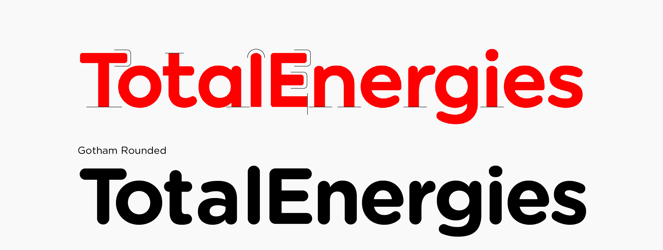
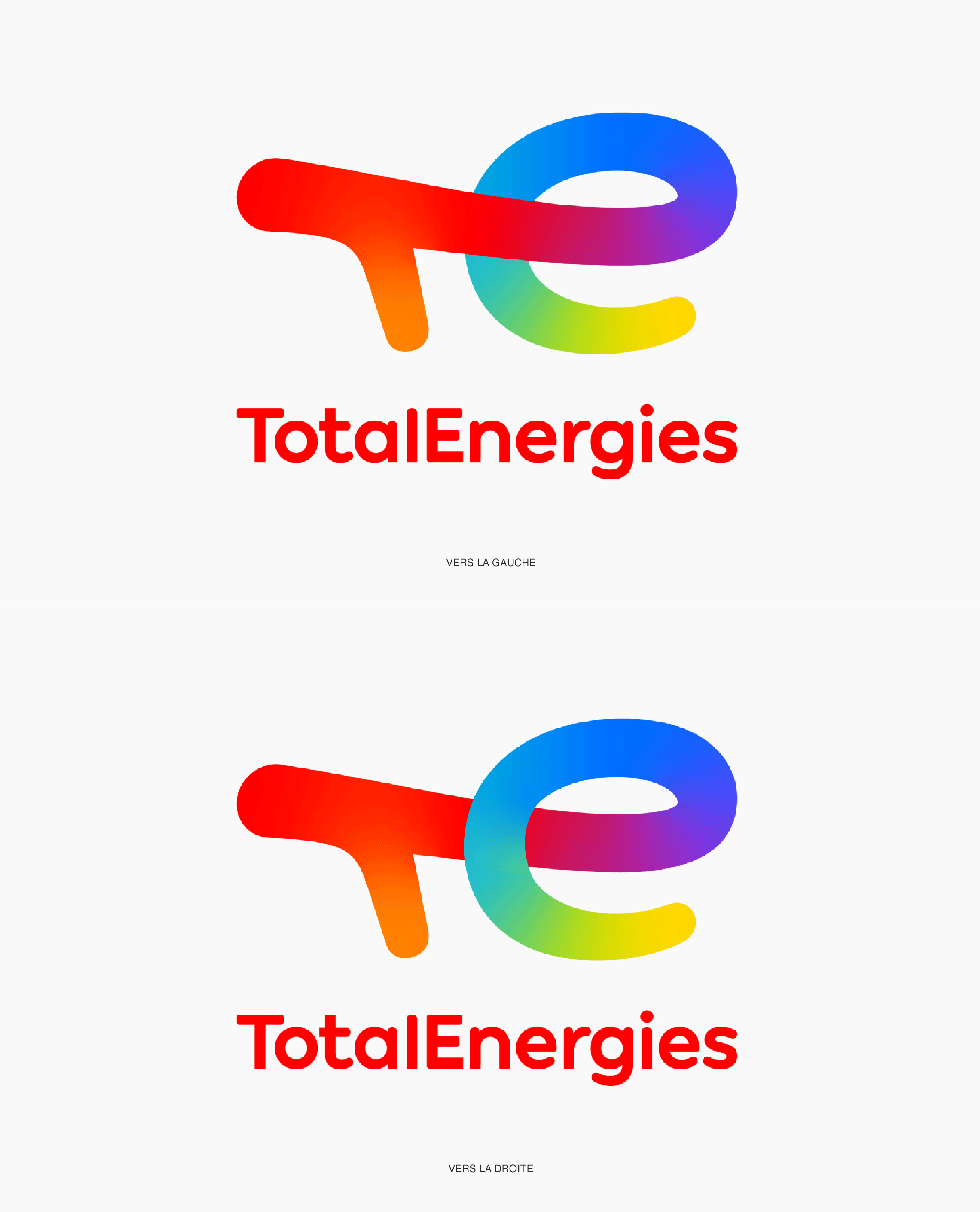
As far as the efficiency of the global message is concerned, we are a little less convinced. The first thing that jumps out at us is this vertical bar of T, a little weak and wobbly because it's not as thick as the others, and which gives an impression of movement towards... the left, like a backward step. Funny idea for a logo that is supposed to face the future! Especially since if you draw this badge with your finger going from left to right -from the past to the future, from oil to green energies- the circle of the e should pass above the bar of the t, and not below. With this movement, the whole logo is dragged in the red, towards oil. Why?
Whereas by simply moving the circle of the e over the T as in our animation below, we would give a more coherent movement to the whole... which would then go to the right, and look towards future. Moreover, the e is in lower case in the logo, but in upper case in the name. Another inconsistency?
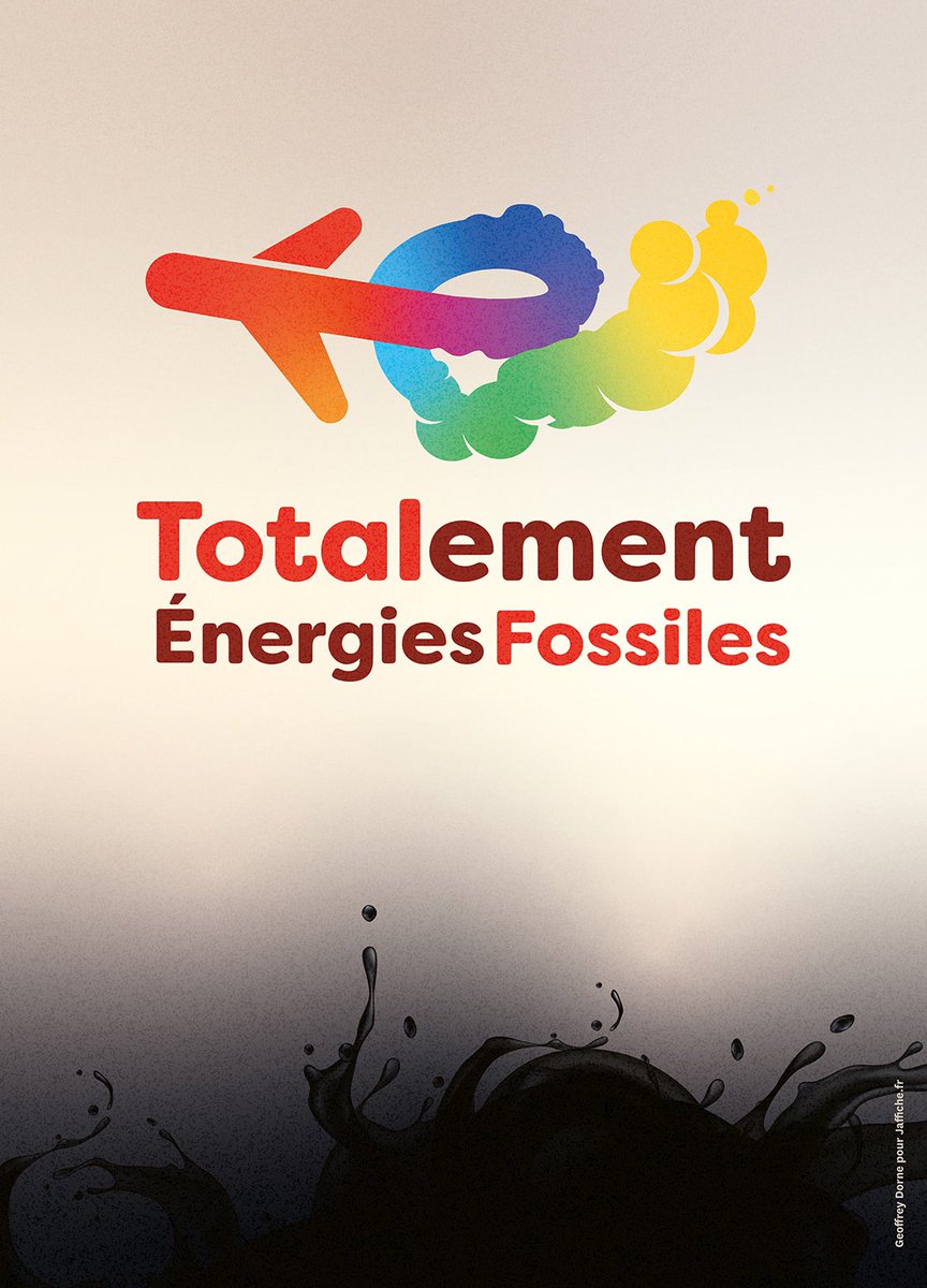
A logo turned towards the past, then? This is exactly what Geoffrey Dorne had fun transcribing in his illustration. A bit easy, of course, but effective.
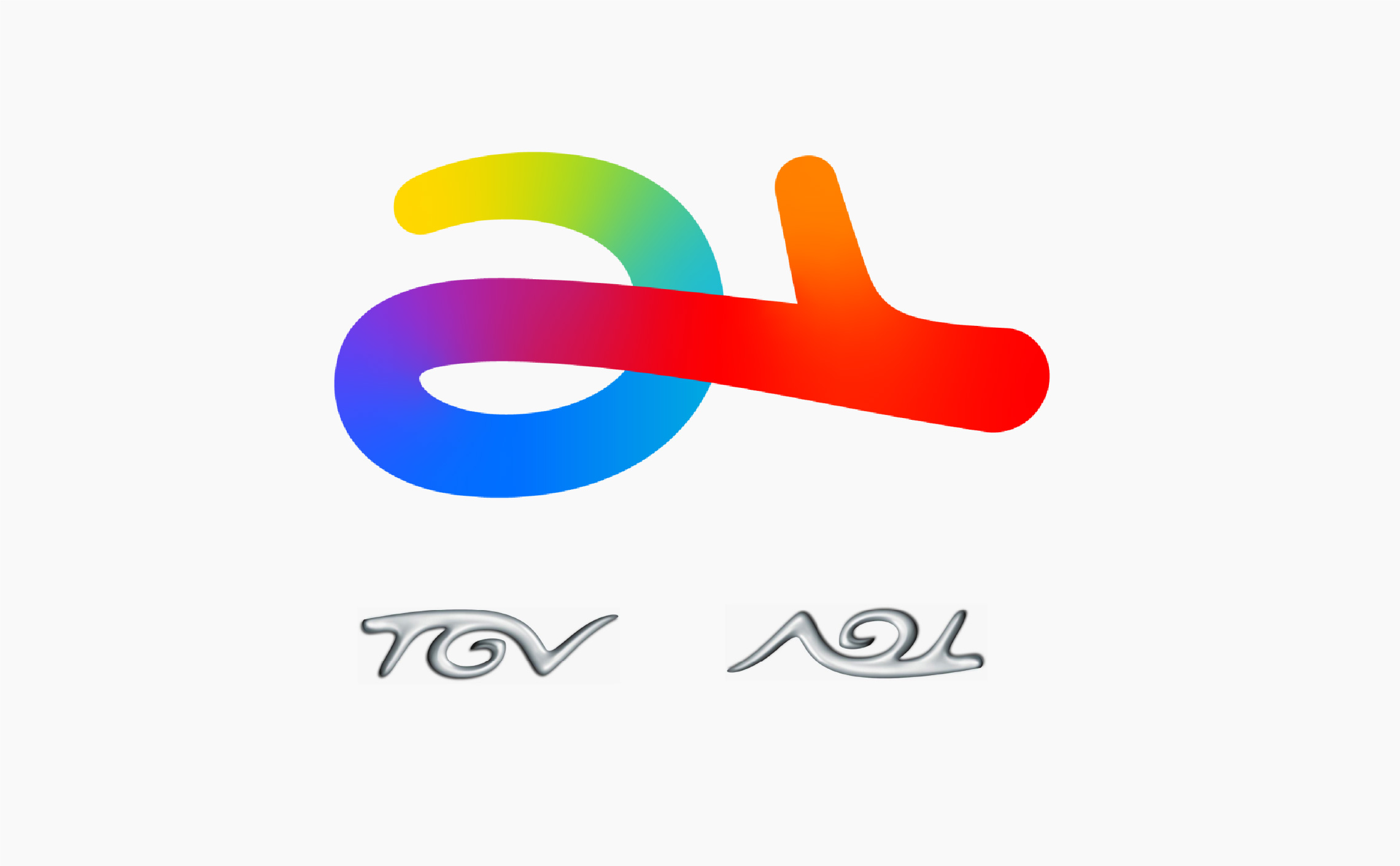
We also saw a certain resemblance with the old TGV logo that turned into a snail. At least, upside down, it goes in the right direction...
New strategic logos
The TOTAL brand and first logo appeared in 1954, to identify the distribution network of Compagnie Française des Pétroles (CFP), which existed since the 1920s. The name TOTAL seems to be a good fit for this entire network, and later for this global company. It is a very easy name to pronounce and understand in many languages. The color red would be a recurring element throughout the evolution of the logo, as well as the bold and bold capital letters; imposing. Red is vital energy: it is oil for Total.

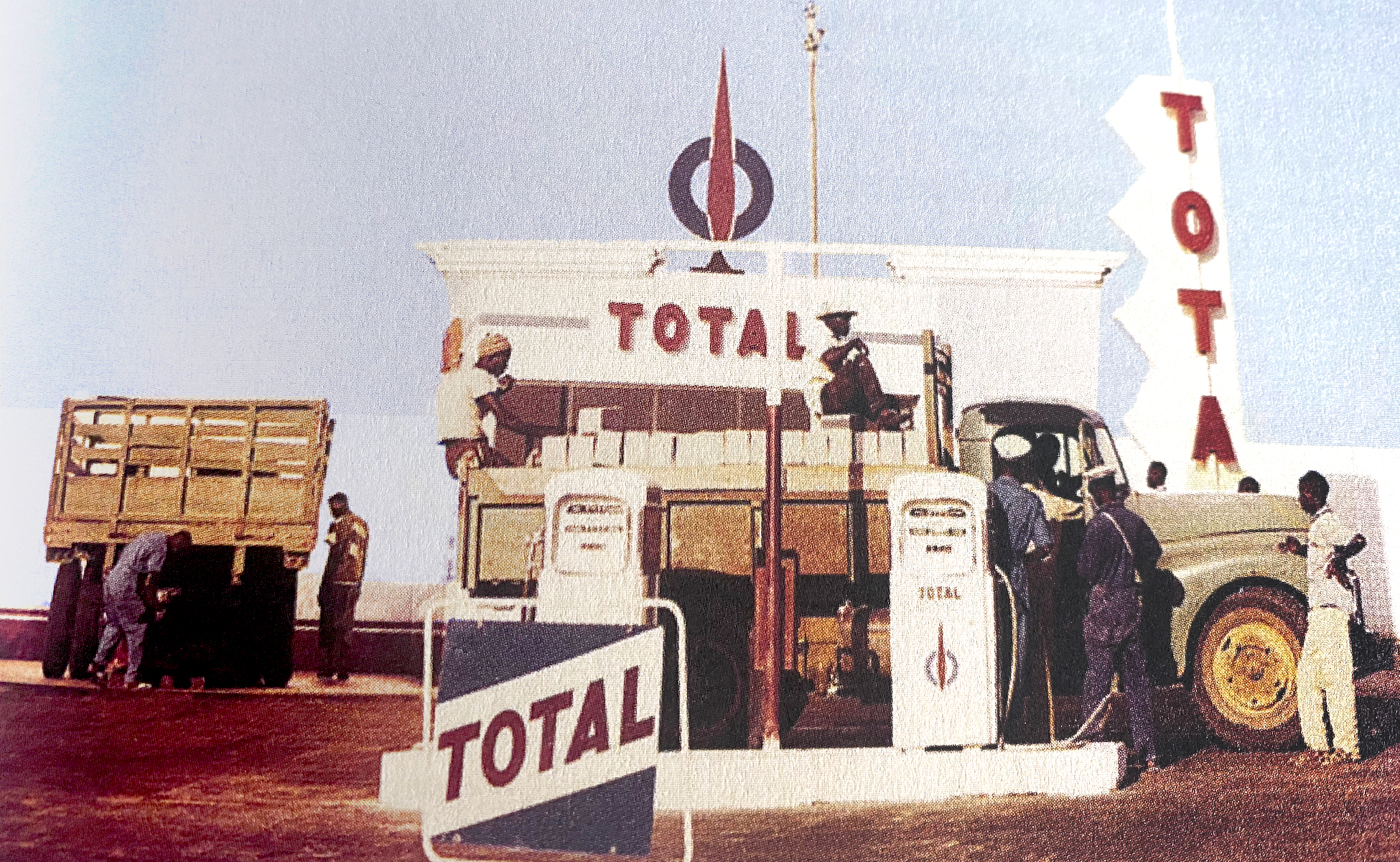
A Total gas station in 1960, Ivory Coast
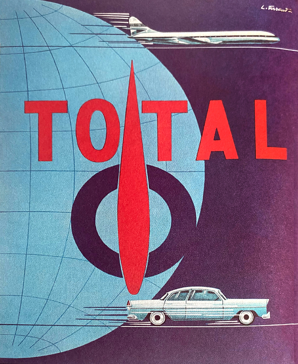
Total ad in 1955 by L. Ferrand
The last change of Total logo and visual identity was 18 years ago, in 2003, following the merging with PetroFina and Elf. This change was significant because the new identity marked a strategic turning point and integrated new colors into the logo for the first time. The name Total was also reintroduced (in slightly less imposing and more dynamic capitals), which had temporarily given way to TOTALFINAELF. The previous logo of 1982, with blue, red and orange diamonds, lasted 21 years. We hope that the new logo will last as long as the previous one, but can't be 100% sure regarding what we said just before.
How come Total is changing its name?
Total says it wants to meet the collective challenge of reducing carbon emissions to keep global warming "well below 2°C" by... 2100, as specified in the 2015 Paris agreements. It is a pity to have waited so long because the IPCC warns that the 1.5°C threshold could be reached within 10 years if nothing is done to reduce these emissions, and this would have dramatic consequences for the climate and life on Earth. The key climate figures from the French Ministry of Ecological Transition indicate that although the energy sector accounts for only 6% of greenhouse gas emissions (GHG) in the world (compared to 47% linked to electricity -understand coal- and 25% linked to transport), energy production has more than doubled in the last 50 years. We also notice the decrease of oil extraction in the world since the 70's, but the increased use of natural gas and nuclear energy.
Facing this galloping energy demand, paired with household consumption and " the increase in the standard of living " (a questionable and ambivalent expression if we take into account the fact that humans live globally much better and longer than before, but contribute to destroy the ecosystem that hosts them and of which they are a part), the world's " solution " does not seem to be to extract less, but rather to draw from other sources...
The company formerly focused on gas extraction, developed new (often controversial) extraction techniques and is now turning to renewable energies, proving for many years that its core business is energy production, in the plural. But as we said earlier, the old logo already announced this multi-energy vocation.
If the Paris agreements have allowed Total to take a turn (or rather: the group has been forced to comply with ecological and economic constraints), we wonder why the new identity waited 6 years to appear. Engie had already taken the step back in 2015. The energy giant nevertheless committed in May 2020 to achieve carbon neutrality in all its activities by 2050 and to reduce those of its customers by 60%, to offset its CO2 emissions on extractions, and to develop 20% of sales of renewable energy by 2040. It is investing in natural carbon sinks or CO2 capture, and is a pioneer in biofuels. It's hard to believe at the moment, considering past (and recent) scandals and its current CO2 production, but who knows?
The new logo of TotalEnergies, looking back to the past, is therefore not aligned with the ambitions of the group, clearly projected towards a position of "leader of the energy transition". But will it be the logo of the second chance? The future will tell, as long as we look together in the same direction!
To end on a humorous note, we note the sarcastic tweet of @Davidov who shared this absurd photo.
Share this post:




 San Serriffe typographic Island
 Design, creativity and oblique strategies!
 Tote bag, a new social totem?
 Sister Corita Kent, the Pop Art nun
 Donald Trump, the martyr who makes history
 Smallicieux – Brand identity
 Saint-Didier-au-Mont-d’Or
 MadeForMed – Brand design
 Green Group of the Senate – Visual Identity
 A king-size stamp for Charles III
 Bauhaus posters and sausages for the 100th Bauhaus anniversary
 How to avoid paying tax with your logo !
 Codex Seraphinianus: the most peculiar book in the world
A silly, confusing and meaningless logo. TOTAL design failure.
Im a professional graphic designer for three decades and although the meaning behind this design is beautiful, it fails completely in the physical application. There are so many more possibilities that would have supported the motivations.
It is rather obvious that the old logo represents the astrolabe of Hermes Trismegistus (aka TOTH-hermes). I’ll let you dig yourself for the new one.
TOTAL, WHY, THIS IS THE WORST. LOGO. EVERRRRRRRRRRR!!!!!!!!!!!!!!!!!!!