Generative visual identity for Bordeaux Métropole

03 January 2015  |   0 Comments   |    |  

The 1 January 2015, a new year begins, and the arrival of Metropolises in the French institutional landscape will show up a batch of new logos. If the Lyon Métropole should arrive within 2 or 3 days. Here to begin the Bordeaux Metropole.

A new logo for Bordeaux métropole

logo-bordeaux-Metropole

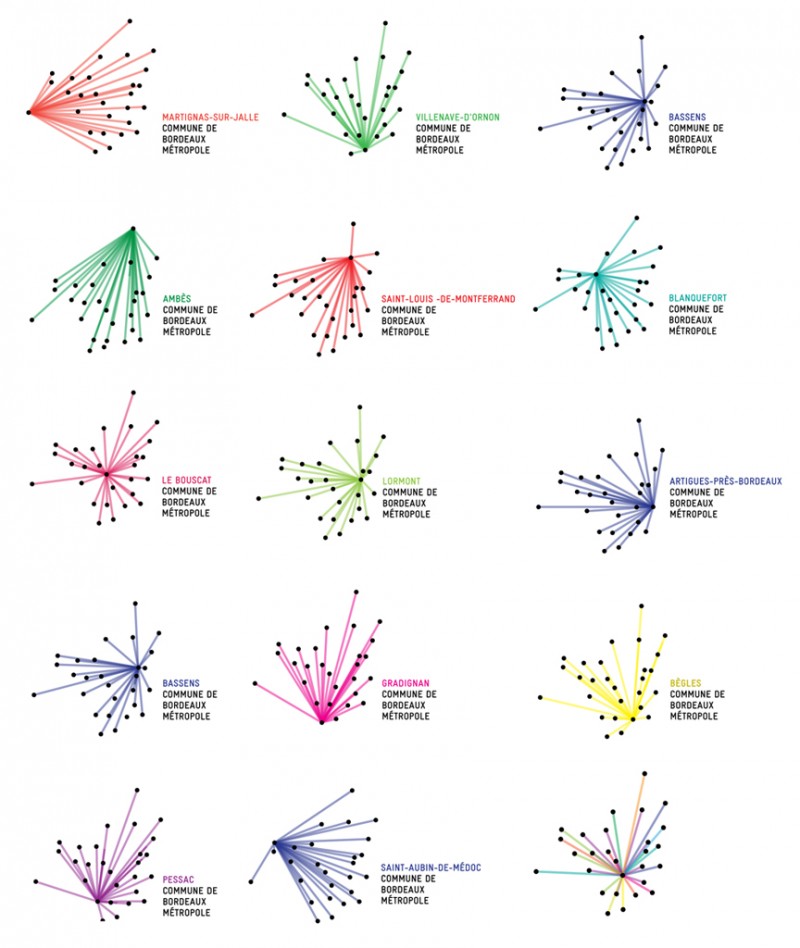
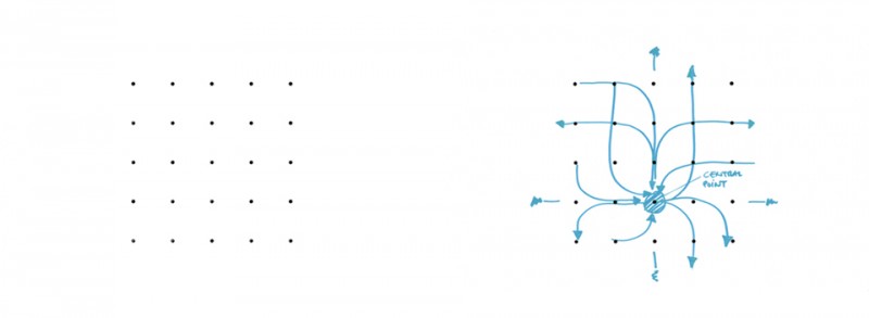
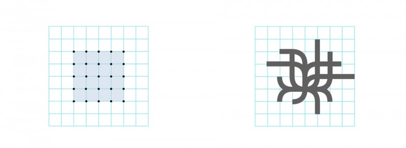
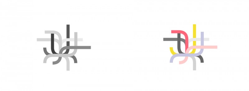
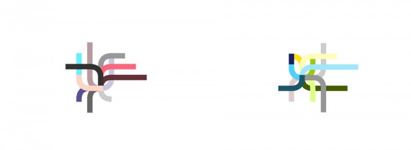
More than a logo, it's a real graphics system which has been proposed by Ruedi Baur. The Franco-Swiss designer, yet very critical in terms of territorial identities, we propose an identity movement in which each of the 28 municipalities of the metropolitan area should be able to identify.

The starting point of this reflection is the geography of the city. Each city is represented by a black dot. These 28 points interconnected by the colored beams is a star whose center varies Common highlighted. The result is a "living" logo that allows every citizen to locate its place of life, while showing his membership in the Metropolis. Thus the logo with the Bordeaux center has not quite the same form as the logo of Parempuyre, Ambes, Gradignan or Saint-Médard-en-Jalles.

systeme-identite-bordeaux-metropole


Each city of the metropolitan area is assigned a color. The general it being multicolored logo. One can not help but think of the puzzle that had to be! The cities of left probably want a red or pink, green environmentalists, the UMP blue ... we know the music in such situations.

Finally, we can say that the system is very simple, very beautiful, very modern. It fits perfectly with the trend of generatives identities.

The generative identities

We know that the issues related to the design of a visual identity are many. The visual identity must simultaneously identify and make a difference, to be recognized for the greatest number and establish a singularity. Therefore, the question of visibility and uniqueness in a public space filled with thousands of logos arises.

Traditionally, visual identity, whether that of a product, brand or organization, is designed on the basis of a number of parameters, usually related to the constraints of its context of use, but especially of production. Since the arrival of the screen has greatly expanded the range of possibilities. We observe today a transformation, both at the bottom as the form of the monolithic archetypal logo we all know. The times and needs have therefore changed. No more single discourse infinitely repeated. Long live the change to take into account the uniqueness of individuals, projects, times and events. And logos can adapt continuously, while maintaining consistency and recognition necessary for a brand. Generative identities can be seen as a response in line with the times and new individual and collective needs.

Discover some generative identities:

The Alumni of Lausanne

How to create a strong identity, while showing the diversity of talent there made? This is the question that arose Polytechnique Fédérale in Lausanne (EFPL), who sees his students scattered around the world after passing through the school.

The association of alumni has designed their visual identity that reflects the diversity of backgrounds: made through a generative design process, these logos are unique, while maintaining a similar overall appearance.

Each logo tells a unique story: Taking as starting point the school, in the center, each curve represents one of the student movement. In the end, more than 100 000 different and customized logos have been generated.

identite-generative-1

identite-generative-2

identite-generative-3identite-generative-4

MIT Media Lab

To mark its 25th anniversary, the MIT Media Lab has developed a new graphic identity. The result is remarkable both for its originality by the complexity of the proposed system, he seduces immediately.MIT-Media-Lab large 40

Designed with a generative design process, this identity is also call for programming, the algorithm. Each member of the Media Lab receives not only a unique and personal logo but also the source code to reproduce it. In the end this identity expresses perfectly the diversity of engineers, artists, designers and scientists who meet in the Media Lab.

MIT_logocolorvariations

OCAD University Toronto

For this new identity, Bruce Mau Design team worked closely together with the team of the Market OCAD University. The concept was born after a series of interviews of students and teachers to fully grasp "that was the school" an inclusive establishment, dynamic and creative.

So was born the idea of visual identity that would be like a "window opening on creativity" of the school. A dynamic and modular system where every year, graduate students are invited to design their logos. In the end, logos library grows from year to year, such as recording ideas and aesthetics of each period.


ocad-logo-generatif

ocad2

ocad10 ocad9 ocad6

Climate Conference in Copenhagen

To continue generative identities, here is the work Okdeluxe who designed the logo of the climate conference in Copenhagen in 2009.

To go further on the subject

Many other examples could have been cited. But if you want to go further on the subject, we can advise the work of Irene van Nes “Dynamic Identities”. A book whose "lenticular cover" presents fifteen dynamic logos!

dynamic-identities

You can browse an excerpt here:


Share this post:


Leave a Reply


Newsletter
Leave us your email and receive your monthly dose of Graphéine in your mailbox.