
A creative sprint for the Olympic Games!
A few months ago, Graphéine's team studied the question of the visual identity of the 2024 Paris Olympic Games. Imagine an impossible timetable (only 3 weeks to send a response....) and all the conditions that we usually denounce (no financial compensation for submitting a project). Nevertheless... it's the Olympic Games! What's more, in Paris, our city capital! So we offered a creative sprint to our teams. 48 hours to find an idea. Here is the project we have collectively came up with.
But first, let's have a look at the context....
The candidature logo
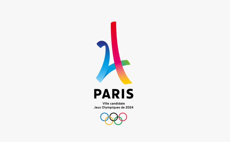
The initial idea of this logo was to create a rallying sign, a collective movement that unites and mobilizes all French people. The Eiffel Tower, which makes up the number 24, play this role. "Dynamic, iconic, aesthetic and symbolic, it conveys a positive message of openness, celebration and modernity. Just like the Games that Paris dreams of offering the world in the summer of 2024," (from the official press release).
The logo is based on an excellent visual trick. The perfect idea to surprise and make a lasting impression. However, once the surprise is over, the effect falls back. This "hand-drawn" spirit perfectly matched the "temporary" mission of this logo. This may refer to a form of "simplicity and modesty" that is very relevant.
We know that the mission of the candidature logo was to promote Paris' ability to mobilize and organize. Now that the Games are awarded, the stakes are changing. It is a question of moving from the affirmation of an ambition to its real realization. If the context (Paris) does not change, the new logo should bring a form of maturity and affirmation, while obviously conveying all the sporting and human values inherent to the project.


 San Serriffe typographic Island
 Design, creativity and oblique strategies!
 Tote bag, a new social totem?
 Sister Corita Kent, the Pop Art nun
 Donald Trump, the martyr who makes history
 Ministry of Justice of the French Republic – Visual Identity
 Abdou lawyers – Visual identity
 Groupe Qualiconsult – Visual identity
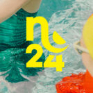 Nuits de Fourvière, festival 2024
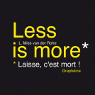 Minimalism is dead !
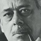 Herb Leupin “A great swissman“
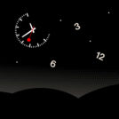 Time and creation #01 : working flat out, a tiring tradition
 A “Disabled” pictogram for women…

I find the corporate image to be the essence of simplicity. 5 well-played lines and a well-conceived visual are the basis of this wonderful work in my humble opinion. You are a constant source of inspiration! Great !!!
Bravo
Quand je vois le logo choisi, j’ai envie de changer de métier :)
hello i love this project, what is the font did u use? thanks!