Barbara Kruger/Supreme: who’s hijacking whom?

The influence of Barbara Kruger's work in the world of graphic art is such that you've already come across either one of her works or a work or identity inspired by it; starting with the logo of the brand Supreme. But in the game of appropriation, the winner is not always the one you think.
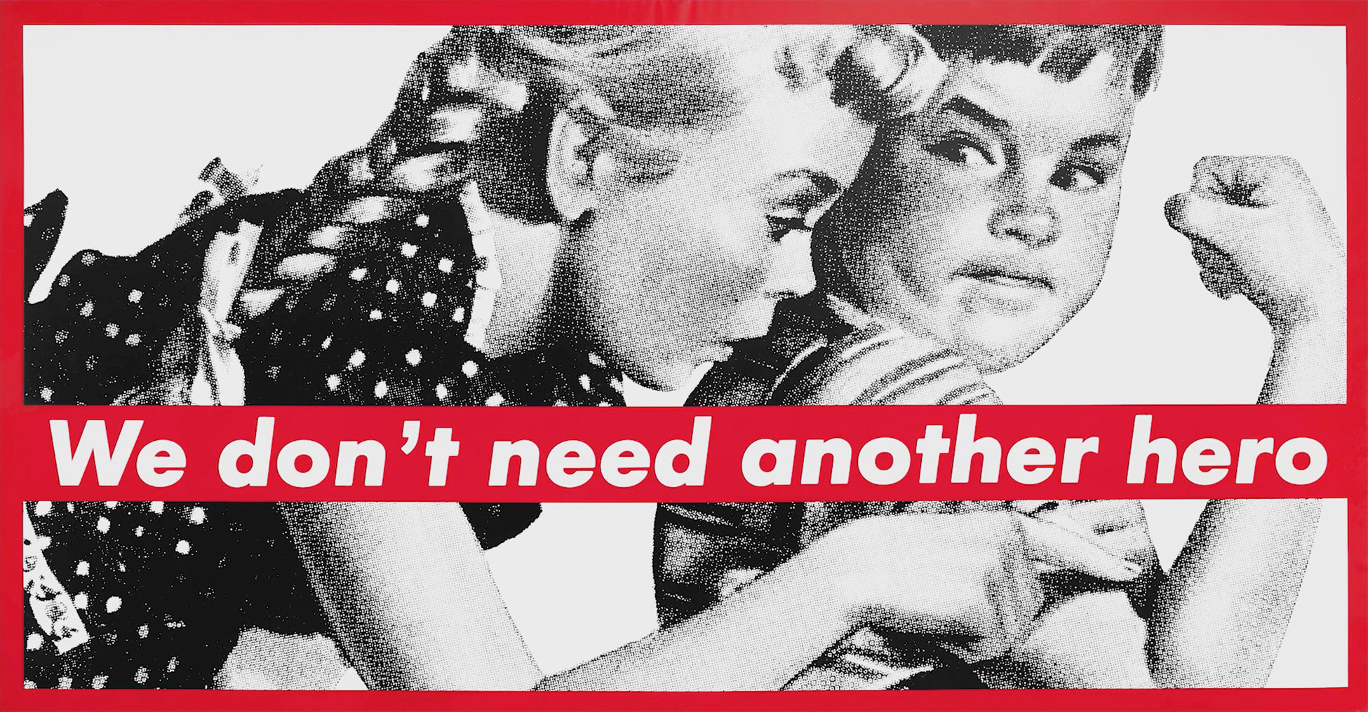
Sharpen your eyes
Barbara Kruger studied for two years at Parson's School of Design in New York and began working as a graphic designer for Mademoiselle magazine, where she became art director after only one year, and for six years. She then went on to design for Aperture and House & Garden magazines. Barbara Kruger learns how to handle images in order to attract the eye thanks to the framing of the photos and the typographical games. She became a visual artist in 1970, but her first handmade productions did not satisfy her. Barbara Kruger stopped teaching for a few years, then started taking photographs.
In 1978 she published a book, Picture/Readings, in which her photos echo her texts, like snippets of conversations, moments of life. This publication set the tone for the works that followed, in which the text dialogues with the image, and which launched her reputation.

Develop her iconic style in red, black and white
With her experience as a graphic designer and her eye as a photographer, she creates in 1979 this famous graphic style that will become iconic: capital letters in Futura Bold or Helvetica Ultra Condensed on a background of advertising images from the 50's that she enlarges on large banners, with three colors: black, red and white. Her first exhibition took place the same year at the P.S.1 Contemporary Art Center at MoMA (New York). On her photomontages she slips large messages that give food for thought: my face is your fortune, your role is to divide and conquer, free love, you kill time.
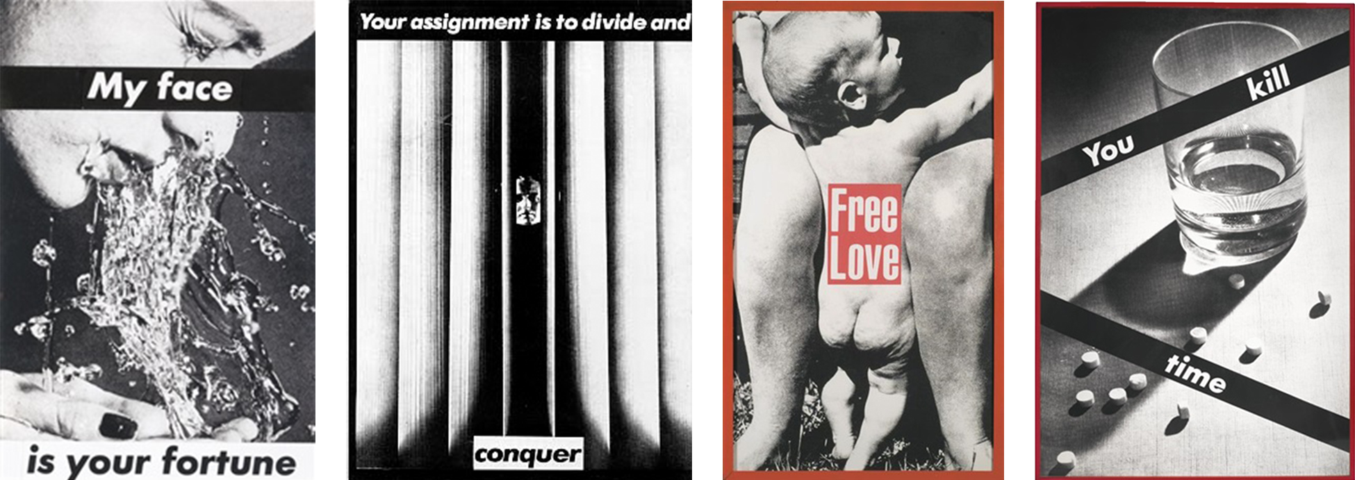
Barbara Kruger's work is engaged, political, philosophical, and sends us back to our consumerist and sexist habits, in a world that is just as much. She allows us to take distance by questioning (among other things) gender, the relationship to power and sex, racism, and our relationship to objects, through images and texts put in resonance. If the association image-text-incitation reminds us of advertising slogans, it allows here to make passers-by think.
The use of the pronoun "I" or "you" makes it possible to include the spectator (and especially the spectatrix!) in his works, and to invite him to question himself on his habits or his situation. Barbara Kruger will say ironically in an interview of 1991 that she is "interested in images and words because they have the specific power to define who we are and who we are not," and that she developed "the power to handle words", because it is "what girls do, failing to be able to handle weapons. She takes up Goethe's sentence, "we are slaves to the objects that surround us" or declines Marilyn's face in the manner of Warhol, by silk-screening impactful words, by contrast.
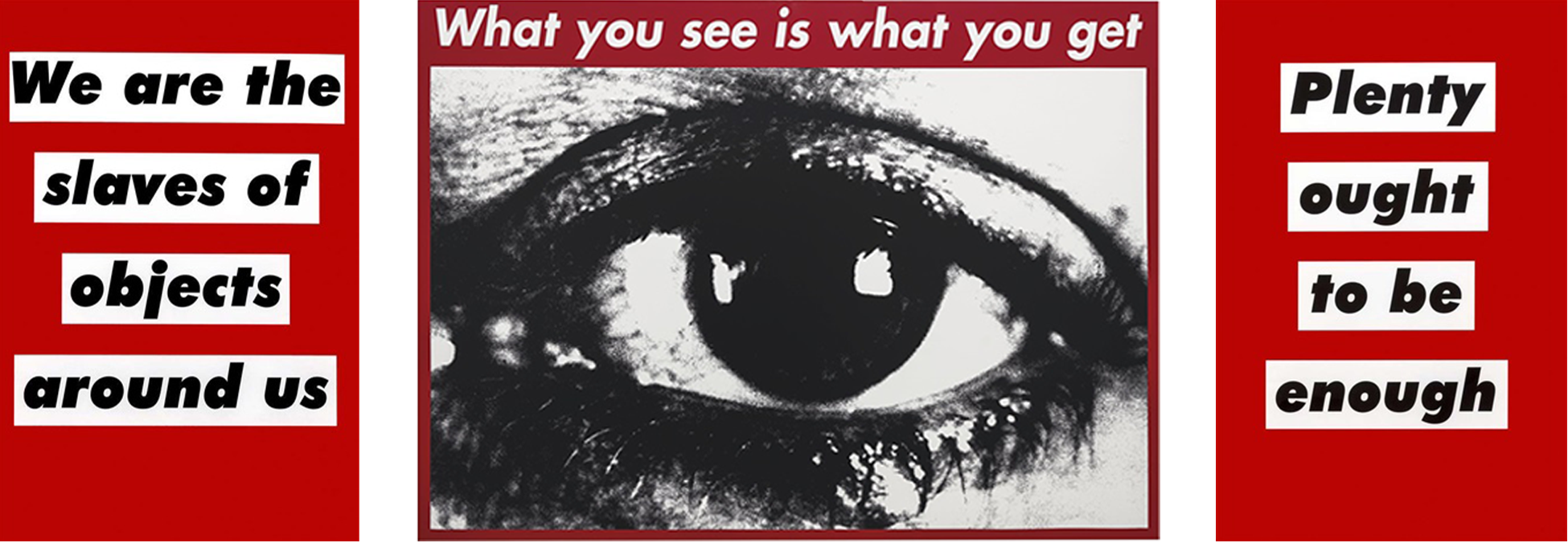

Denouncing the consumer society
Like Warhol, Kruger's art, which can be reproduced en masse thanks to silkscreen or digital printing, questions the very essence of art and intellectual property. Kruger owns neither the rights to the use of the Futura typography, nor the principle of artistic construction of colored text-rectangle on photo, which reminds rather the constructivist collages. From then on, her work deliberately dilutes the boundaries between the artist, the viewer and the work, which is no longer displayed in galleries but as a consumer good, or even an advertisement, while dialoguing with the consumer-collector.
In 1987 Barbara Kruger created one of her most famous works, which remains extremely topical: Untitled (I shop therefore I am). The decade of the 80's is the decade of access to consumer credit and new markets, and the consumer has more and more power. On this work, a hand without precise gender holds a card, like a business card, which mentions: I shop therefore I am, diverting the famous thought of Descartes, "I think therefore I am". She will also print this image on kraft bags for shopping.
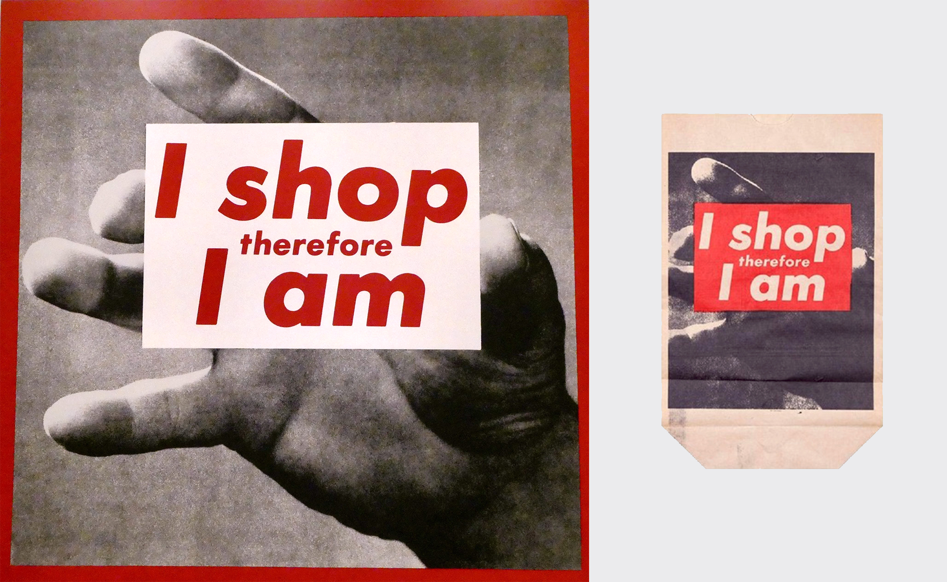
By replacing thought with consumption, Barbara Kruger criticizes the loss of meaning induced by the consumer society, which values having rather than being. She deplores the fact that the human being becomes a robot who no longer thinks but buys to exist. In the same way, she underlines that advertising generates doubts and guilt towards the representation of oneself in an ideal and unattainable world. The frenetic consumption comes to fill this gap between the expectation and the reality, and can contribute to deform this image of oneself.
The red text on a white background is inscribed as a manifesto, using specific markers from marketing strategies. Barbara Kruger first creates a visual contrast between black and white and color, which allows a double reading in two times between the image and the text. The color red, color of danger and desire, stimulates the reptilian brain and irresistibly attracts the eye. The red letters are reminiscent of advertising ads that abuse these techniques to better attract the eye of the consumer and make their message stand out in this visual ocean.
Fighting for women's rights
Two years later, in support of a free-choice abortion march in Washington in 1989, she created her second most influential work: Untitled (your body is a battleground), as anti-abortion waves swept through the United States. It will be declined in French (savoir c'est pouvoir), and even in Polish, to defend the same causes. This silk-screened poster features a female face separated into two equal parts and treated in negative. Taken from an advertising poster, probably a cosmetics ad, this face first denounces the use of the woman's body as a stereotyped product of society, and dictated by its laws. The woman does not belong to herself anymore.
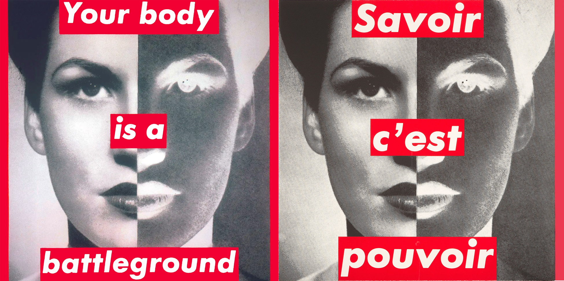
The face cut in two perfectly symmetrical parts illustrates the opposite injunctions that are placed on her face (and more broadly her body), according to the parties. Originally, pro-abortion and anti-abortion. The play of negative colors distorts her face, half angel, half demon, and raises the ambivalences of the posture of the woman, sometimes docile, sometimes fighting.
By taking a step back, we can read more widely the oppositions between women and men, women and the stereotyped view of men on women, the masculinist society that transforms women into objects and women into flesh. The phase "your body is a battlefield" comes to underline the fights which take place on this body, her body, which she must reappropriate above all. Barbara Kruger thus denounces the position and the fights of the woman in a world which considers her only by her appearance. More broadly, she raises the question of the norm and the look that society gives to all those who emancipate themselves from it.
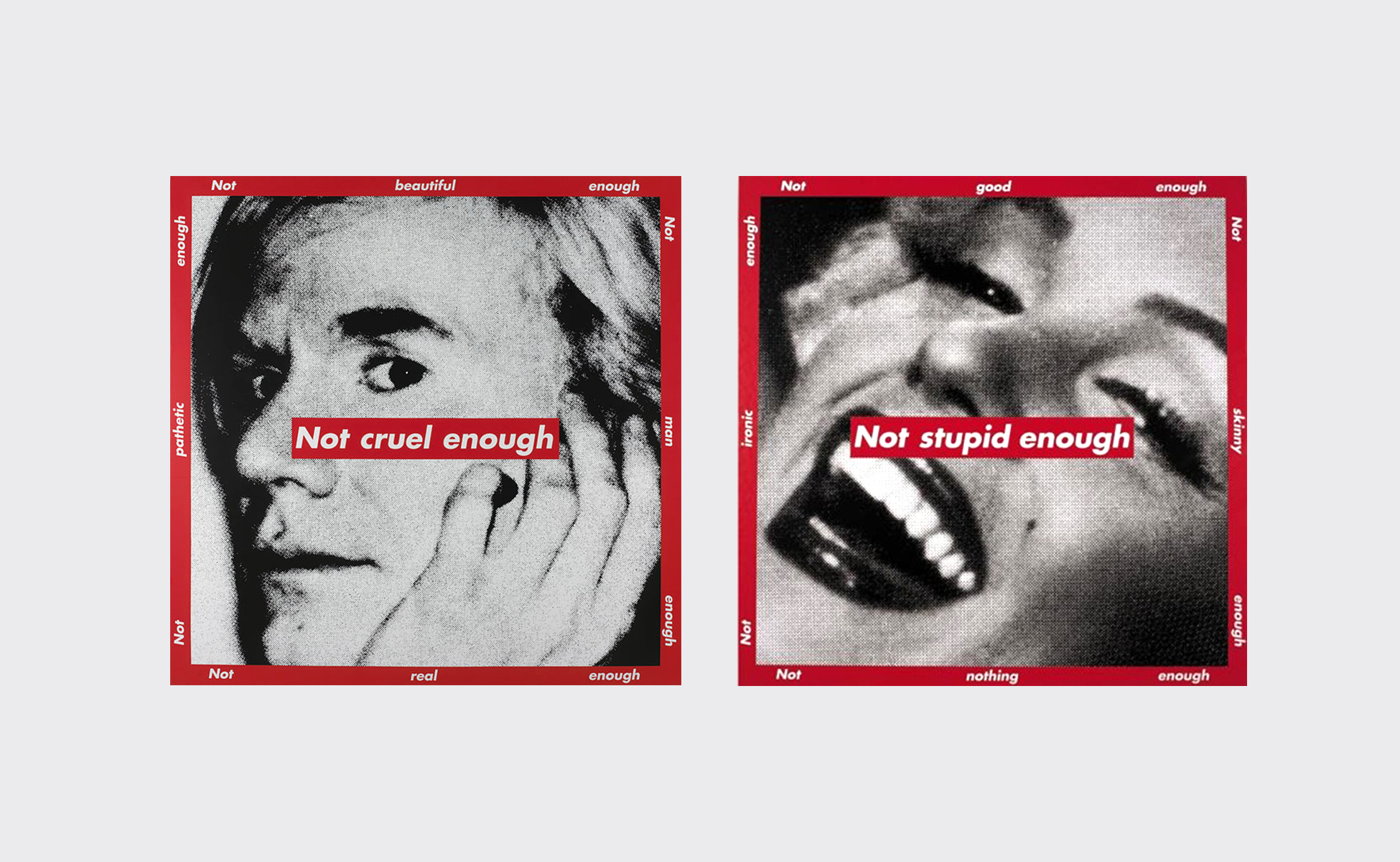
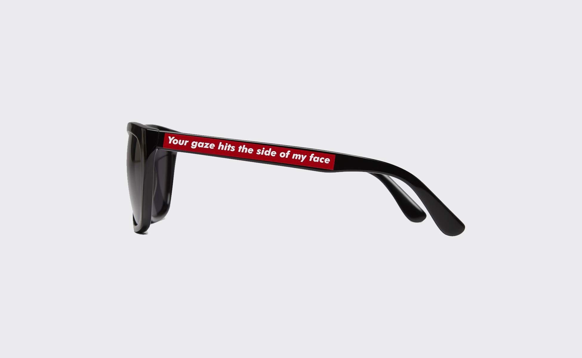
Below, Warhol on the left with the mention "not beautiful enough - not pathetic enough - not man enough - not real enough - not cruel enough" and Marilyn Monroe "not good enough - not skinny enough - not anything at all - not ironic enough - not stupid enough". And the pair of glasses "your look hits my profile", which invites the male gaze, the famous "male gaze" to question itself.
Supreme and Barbara Kruger: same style, different fight!
If reading this article makes you think that this style reminds you of something, you're absolutely right: the Supreme brand. Or maybe you've recently read our analysis of the adopte un mec's logo, also directly inspired by the latter?
In 1994 the founder of Supreme (James Jebbia) was looking for a new logo for his store and his skate and streetwear brand. A brand of men, for men. He lends a book on the work of Barbara Kruger to his graphic designer and the logo is born as if by magic. The Supreme logo is written in white letters, bold and oblique futura on a red background:

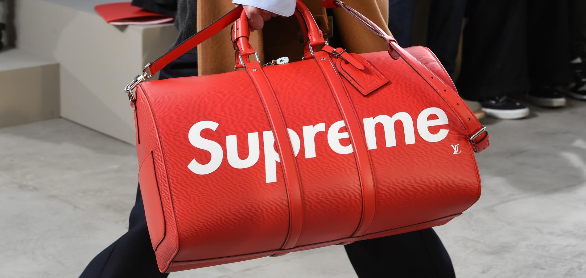
Same letters, but not the same fight. Kruger does not flinch, magnanimous. She doesn't own the rights, and doesn't want to get down to launching legal and financial battles. Especially since it is common among streetwear brands to reappropriate the codes of other brands. In 2000, Supreme tried to take over Louis Vuitton's designs, before being called to order.
22 years later, world-famous brands such as Louis Vuitton, Gucci, Coca-Cola or even the artists Pollock, John Baldessari, Robert Longo and Damian Hirst collaborate hand in hand with Supreme by returning the levers of glory, and without rancor! A skateboard decorated by Damien Hirst bought for $700 and sold for $20,000 a few years later. Barbara Kruger knew how to use art to take sides and denounce injustice, unlike the Supreme brand which uses graphics and art for purely commercial purposes.
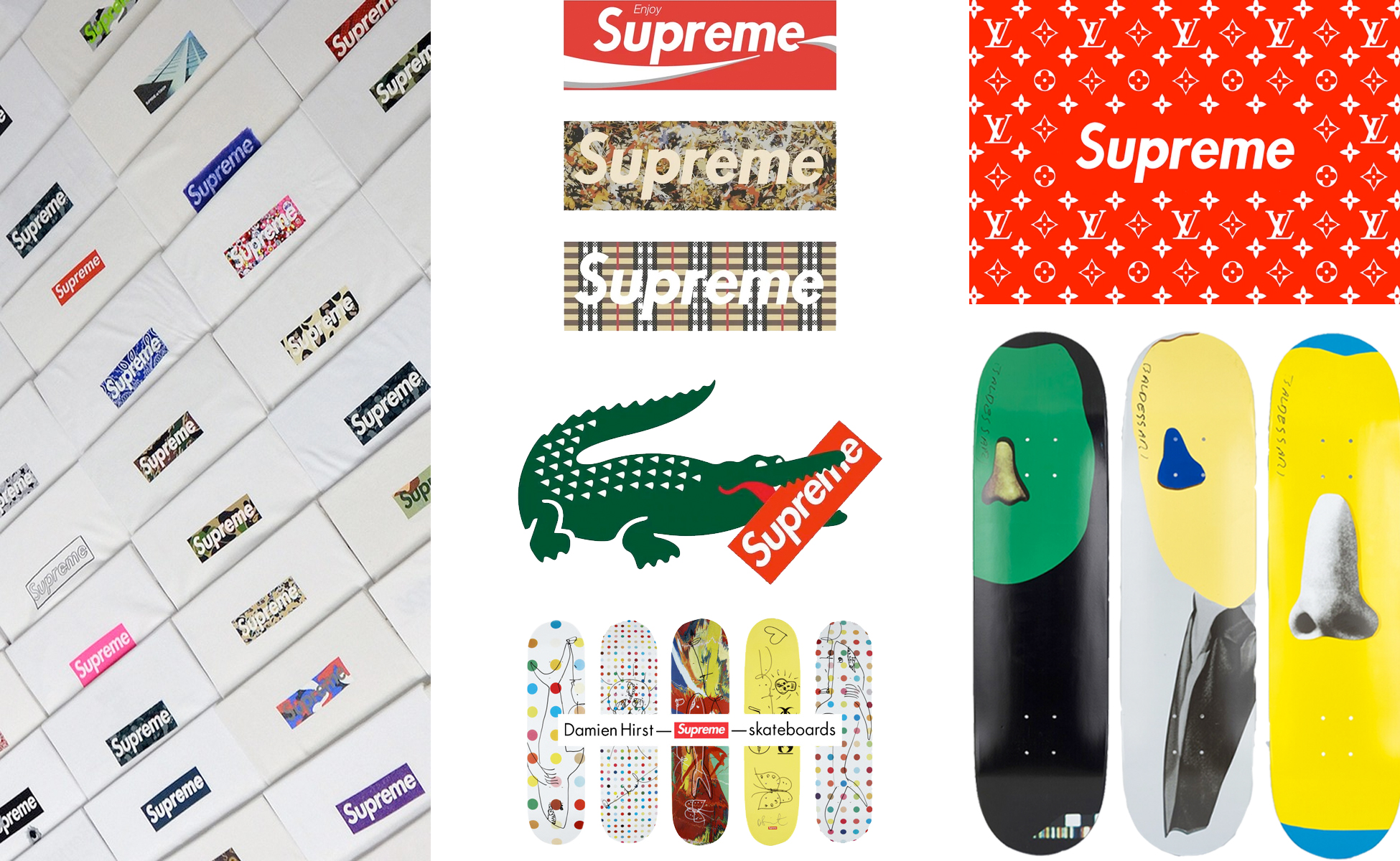
Where the artist Kruger criticized capitalism, consumerism and ambient machismo, Supreme (the coolest brand -according to the generation Y) bathes happily in it. Intended for men, the rare communication campaigns representing women are used to "censor" their private parts with the brand's banner, thus inviting the male gaze to rest on this female body, once again a battlefield and a lever for sexist consumption. There is no second degree in Supreme: the woman is clearly prostituted in commercial object.
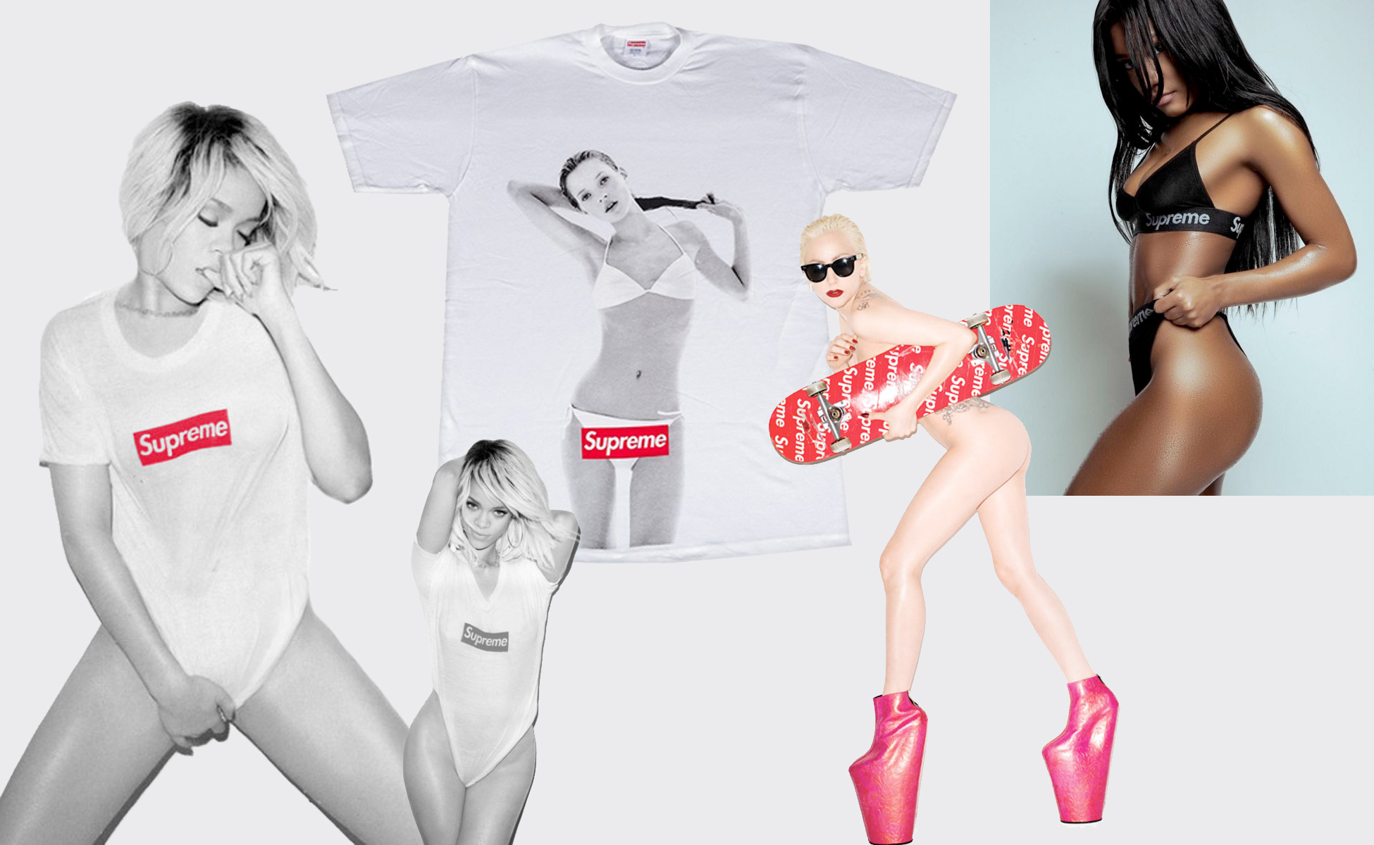
As we said in our article on adopte un mec, "a committed and popular approach often leads to its opposite, Supreme, by imitating Barbara Kruger, operates a technique well known in the world of capitalism (and advertising in general): the recovery. Brands appropriate a discourse from a minority -feminism, anti-consumerism- and inject it into their majority and macho system, which contributes to neutralize it, to phagocytize it, in order to better promote the initial system against which they were fighting."
Who is copying who?
The image of the t-shirt with Kate Moss (above) is itself taken from a Calvin Klein advertisement that Supreme appropriated... To push the envelope a little further, in 2004 the brand Married to the Mob also plays the game of graphic appropriation and launches t-shirts and caps named "Supreme Bitch". The designer got the authorization from his friend Jebbia (founder of Supreme). Rihanna, Cara and a whole bunch of international stars are rushing to wear them. Who's whose bitch? Ironically ironic.
But in 2013 Supreme flips and sues them with a $10 million lawsuit for "counterfeiting, unfair competition and forgery of a designation of origin, logo dilution and trademark infringement"! What's amazing is that the Supreme trademark was only registered in 2011 and the logo... in 2013 at the conclusion of this lawsuit. We feel the bad players afraid to lose at their own game!
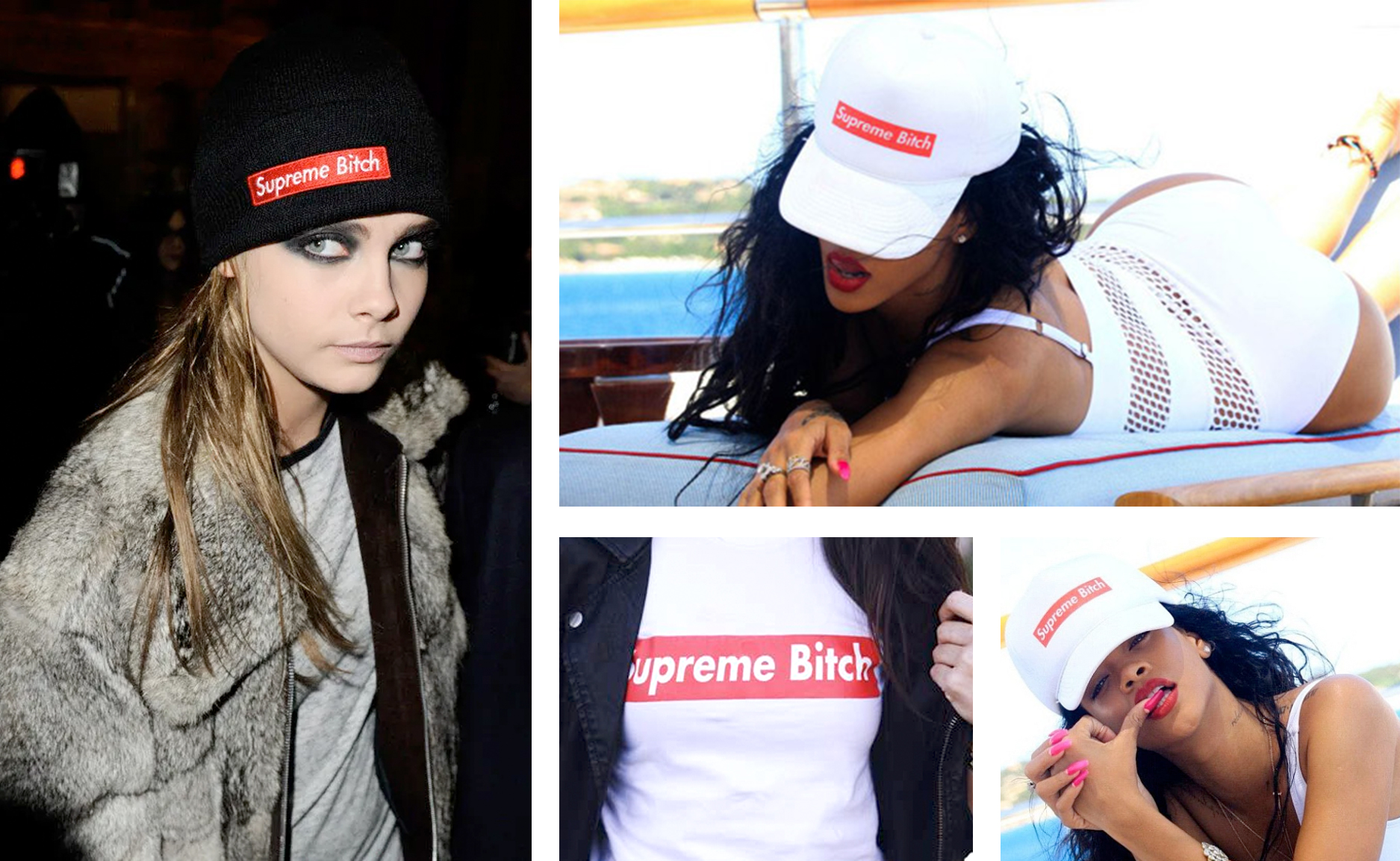
Barbara Kruger reacts this time by deploring a "ridiculous amalgam of small not cool buffoons" who wallow in stories of rights and money. She claims to be "waiting for everyone to come and sue her for copyright infringement." Married to the Mob claimed to have launched "Supreme Bitch" to "criticize and parody the male dominance and misogyny of skate culture guys and the Supreme brand"...
Who is smarter than who?
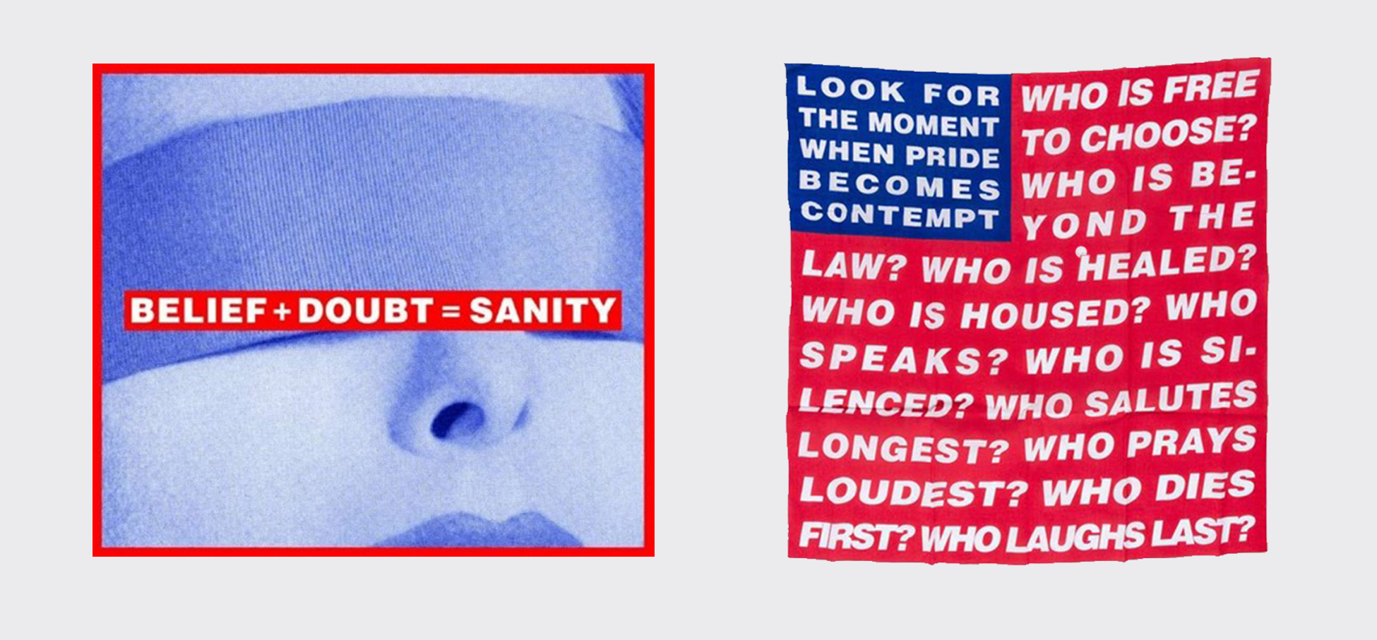
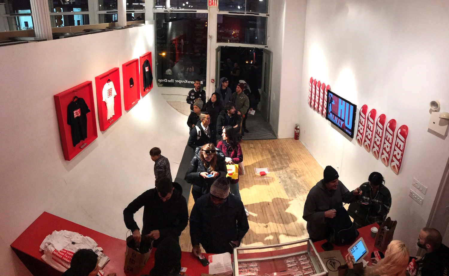
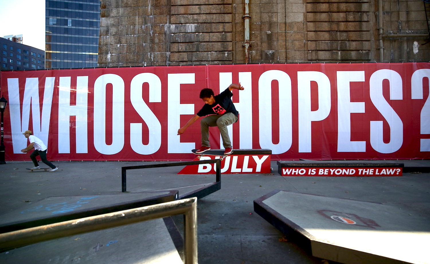
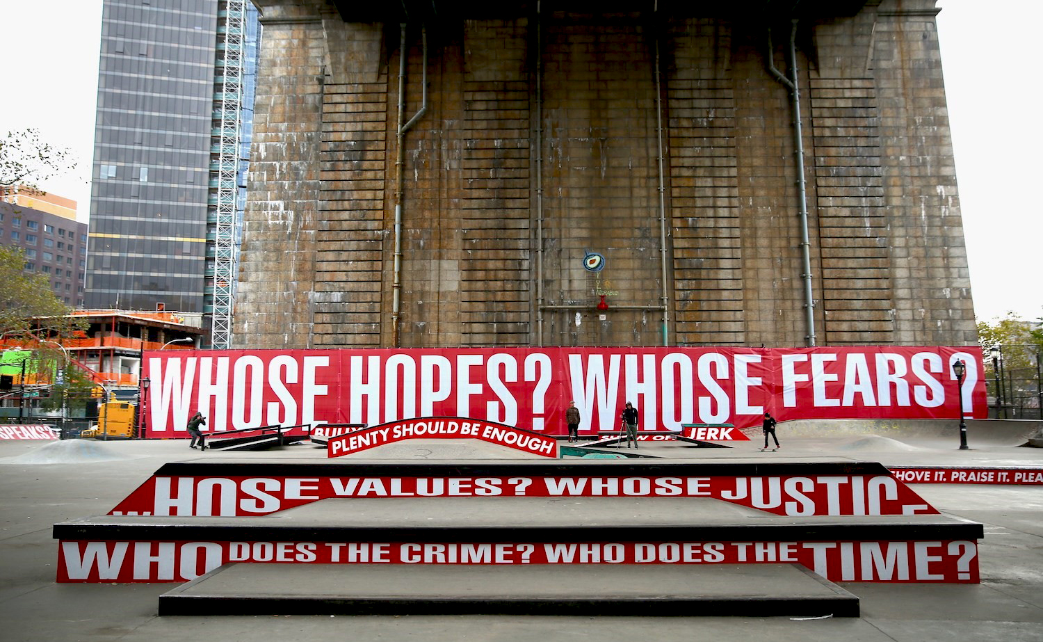
In response, more formally as part of an Art Biennial in 2017, Barbara Kruger launches an installation in a boutique gallery and skate park in New York City, displaying slogans like "who's copying who?" - "who belongs to whom?" - "money talks" - "bully" - "whose values?" - "who's above the law?" or "don't be a jerk", declined on banners, t-shirts (from the brand Volcom) and skateboards, of course. People pay $5 to stand in line in front of what looks like a Supreme store, not knowing that they are ironically caught in the consumer trap.
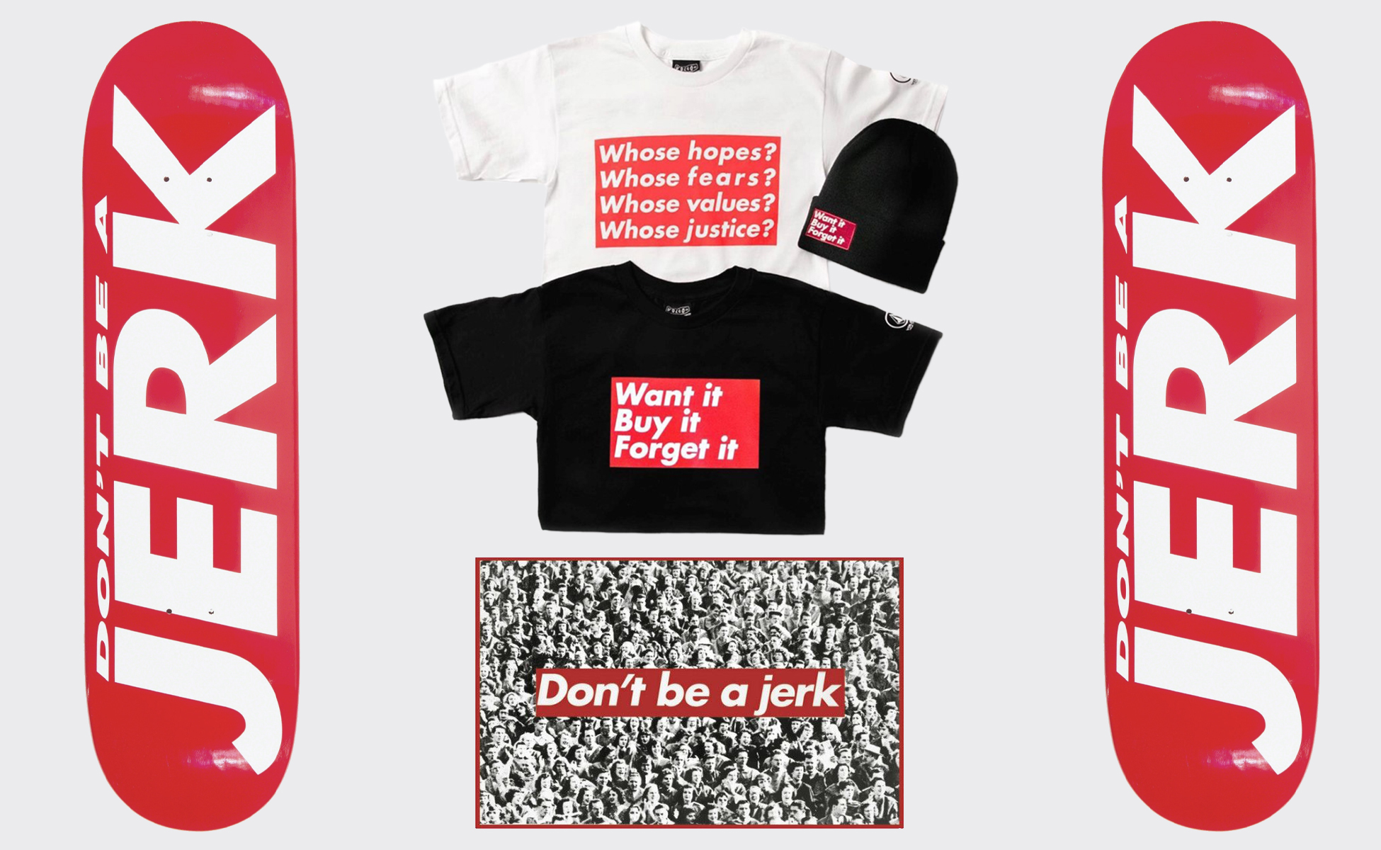
Who is smarter than who? We have our own idea. I guess appropriation has its limits and consequences! Moral: don't be a jerk !
Share this post:



 Sœur Corita Kent, la religieuse Pop Art
 Donald Trump, the martyr who makes history
 A history of mascots
 Y2K trend, the 2000’s style is back
 From surnames to acronyms: creating a brand name from letters
 Université Catholique de Lille – Brand identity
 City of Olivet – Visual identity
 Udice – Naming & Visual identity
 SonoSchool – Brand identity
 L’Autre Soie – Participative visual identity
 John Heartfield, photomontage as a political weapon
 République Grolée-Carnot or the art of creating the event
 Hans-Peter Hort, “bon vivant” and unknown
 Ben Bos, the big “Bos” of dutch graphic design!
 A mad logo for the “Musée des Arts Déco”
Great article! Learnt a lot however, confused on the angle of Married To The Mob? It seems in this article to claim that MTTM is run by men, basically doing the same thing as Supreme. But it is founded by Leah McSweeney? Surely she aligns more with what Barbara Kruger was setting out to do originally.