Josef Müller-Brockmann “swiss style”
Josef Müller-Brockmann (1914-1996)
This week we continue our new section dedicated to the great names of graphic design with Josef Müller-Brockmann.
Müller-Brockmann was born in Switzerland in 1914. He studied graphic design and architecture at the Zurich School of Arts and Crafts. In 1934, he opened his graphic design and illustration studio in Zurich, first as a freelancer, then joined by collaborators from 1936. In 1937, he became a member of the Swiss Werkbund (Swiss Association of Artists and Designers).
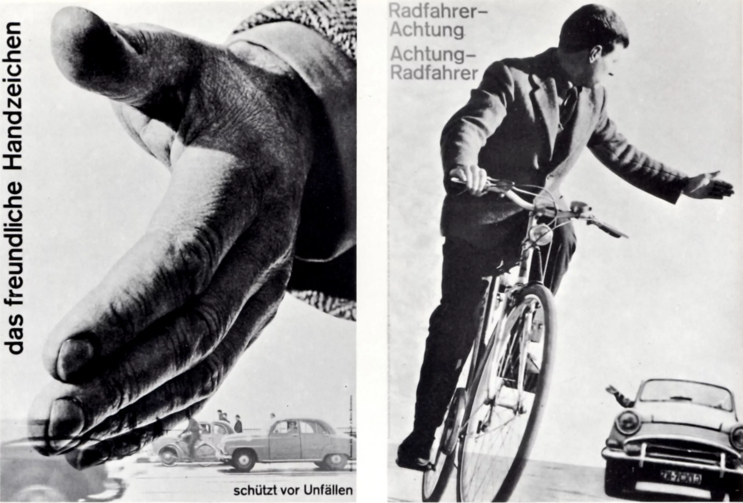
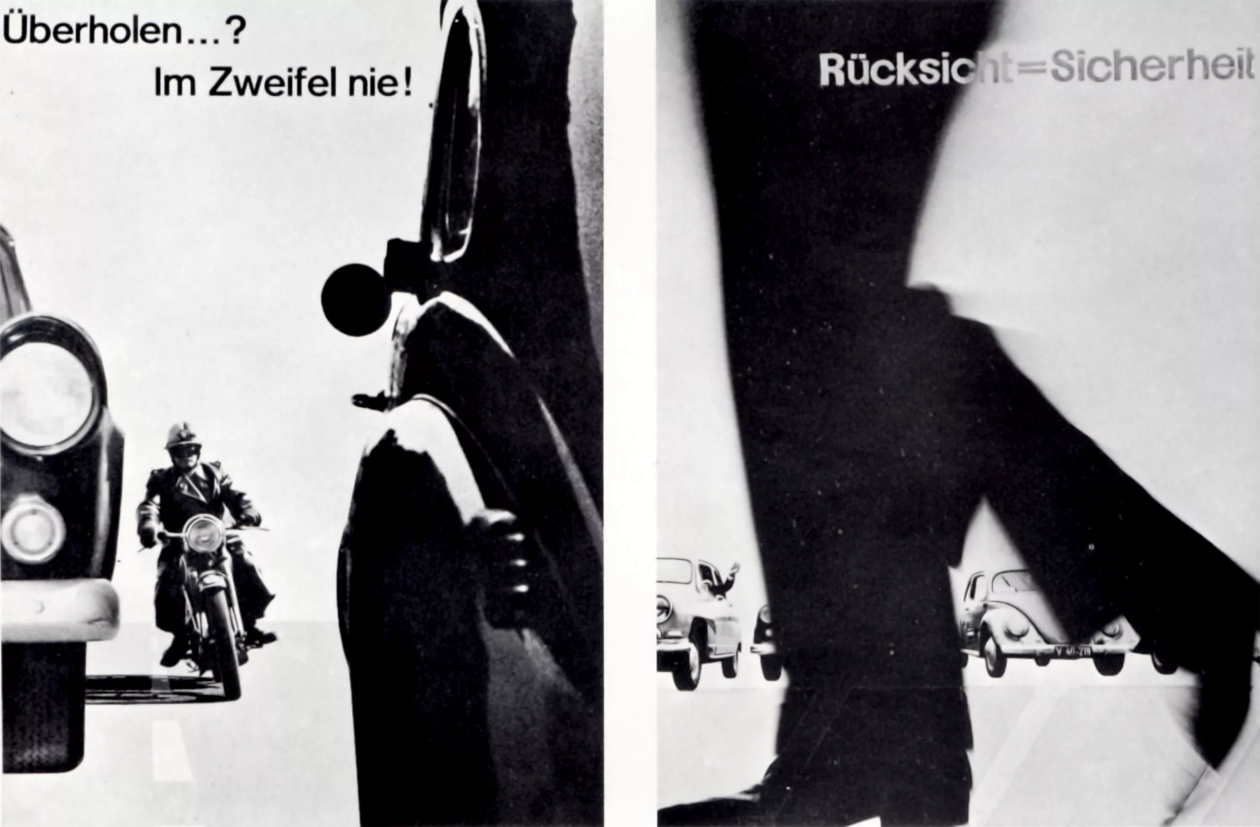
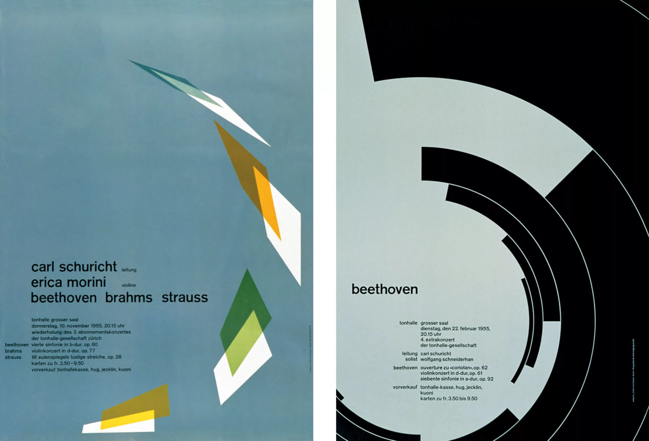
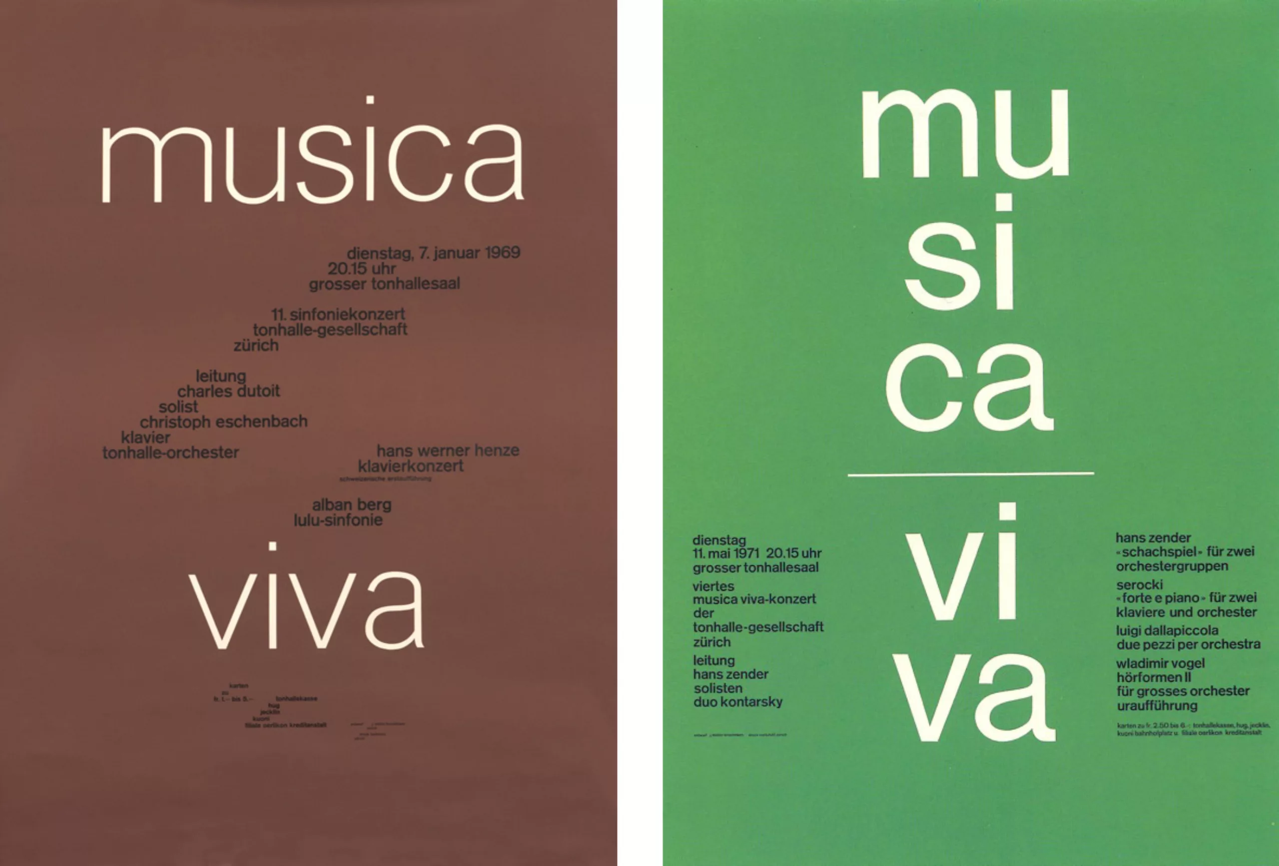
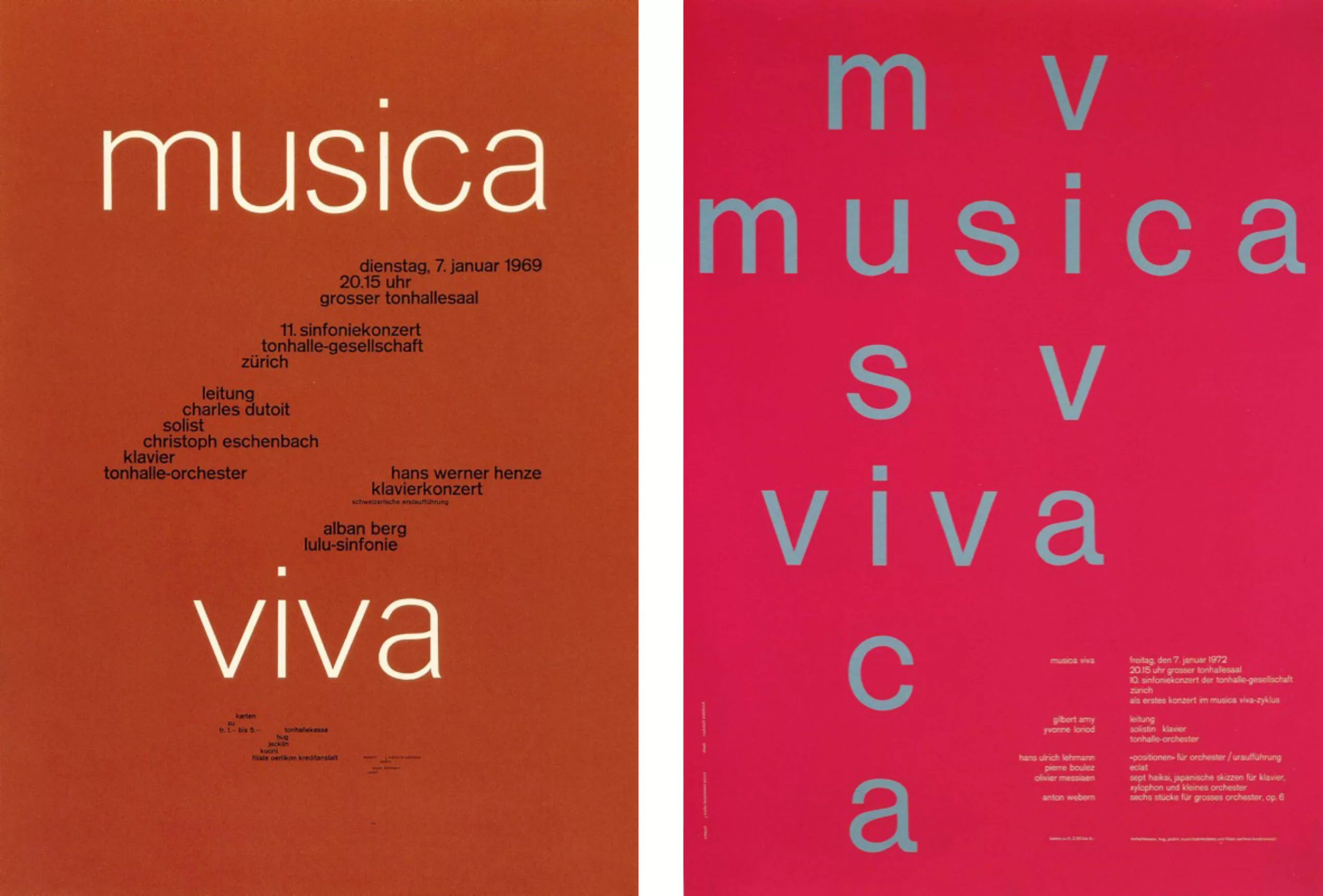
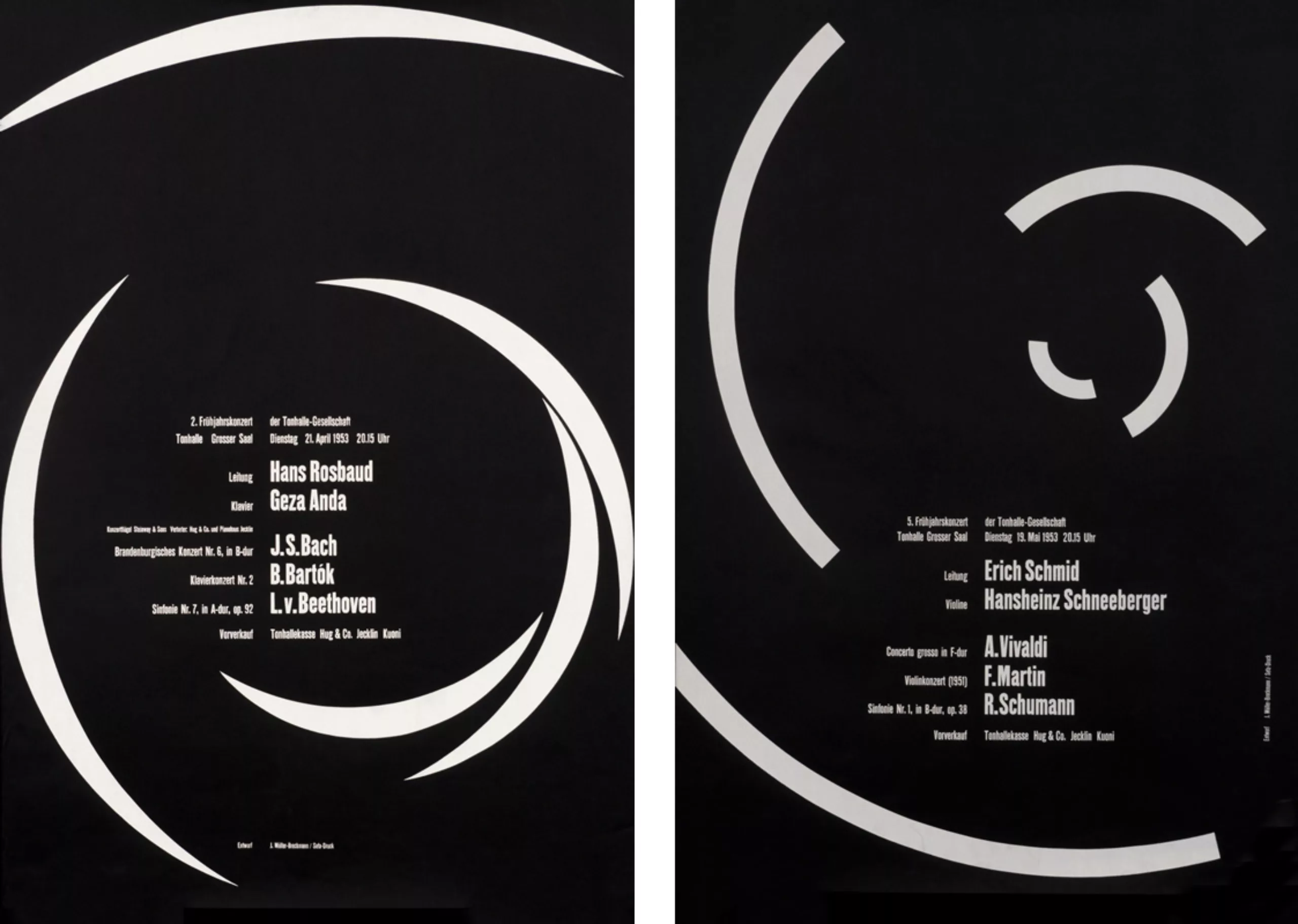
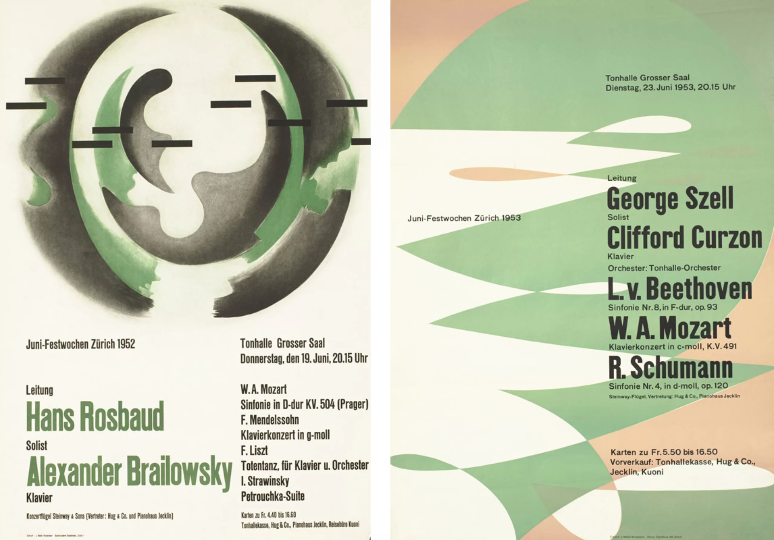
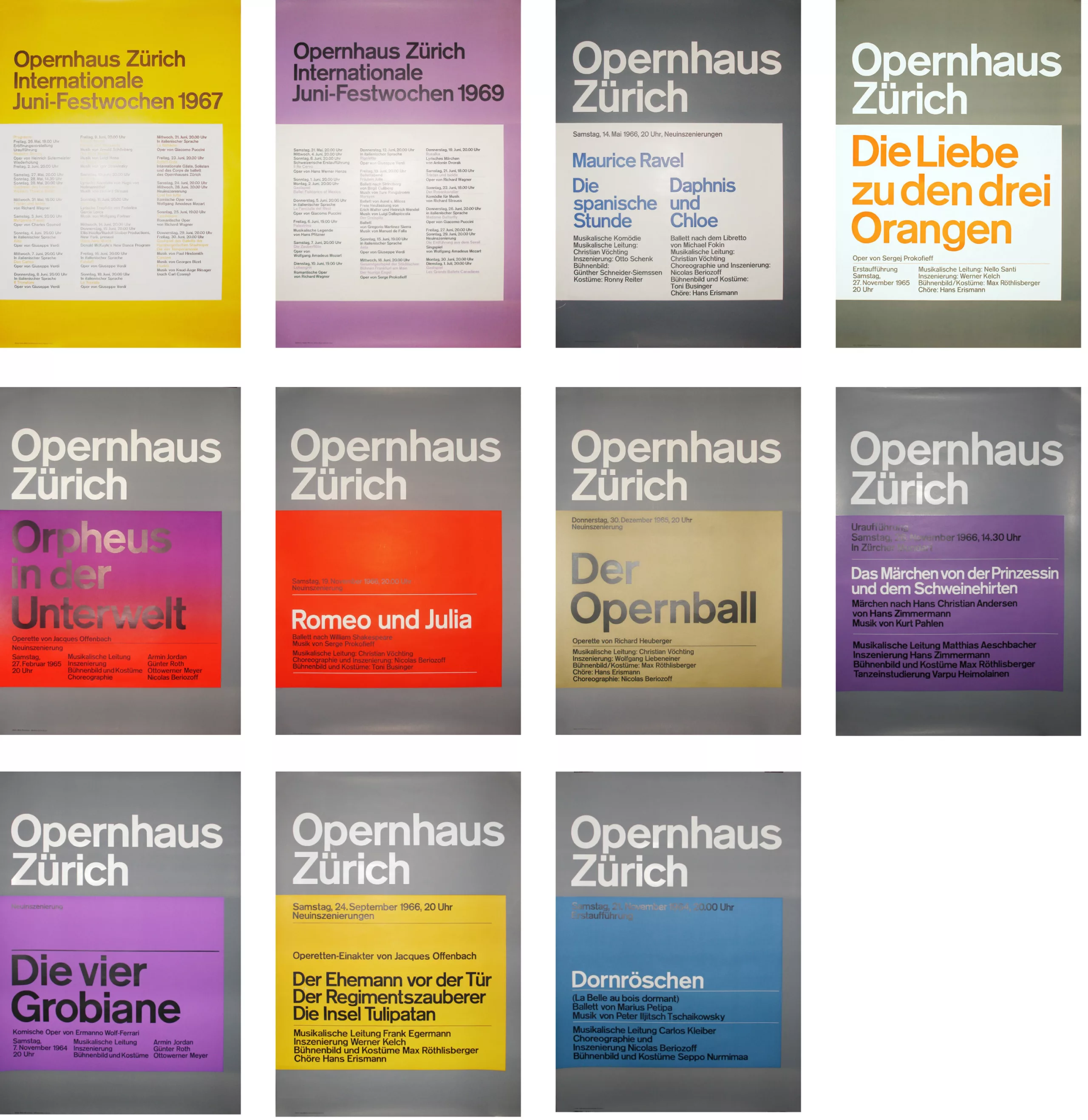
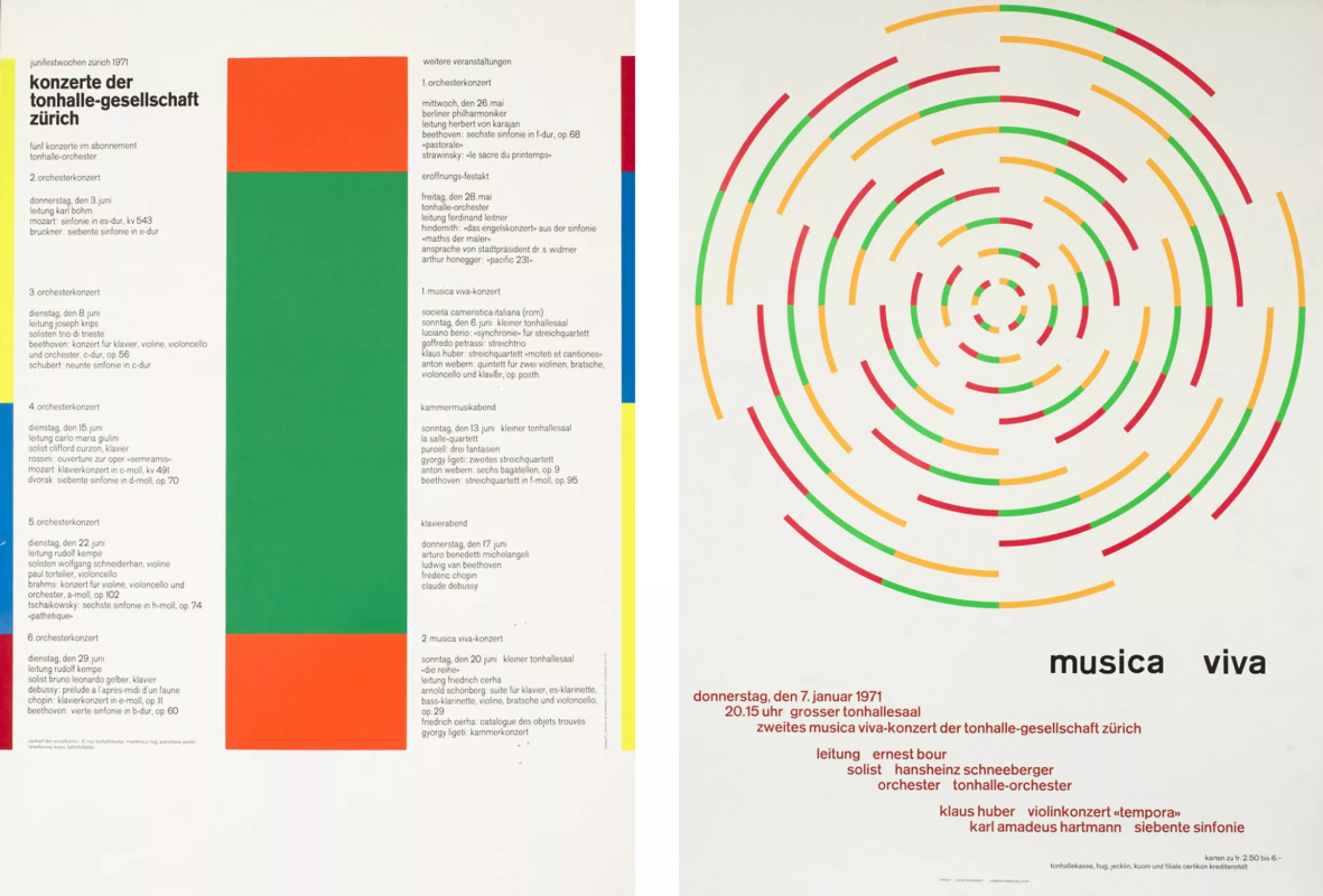
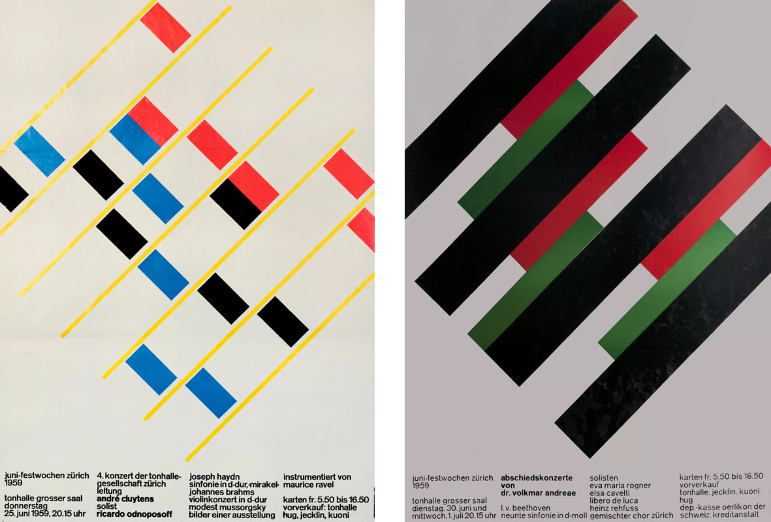
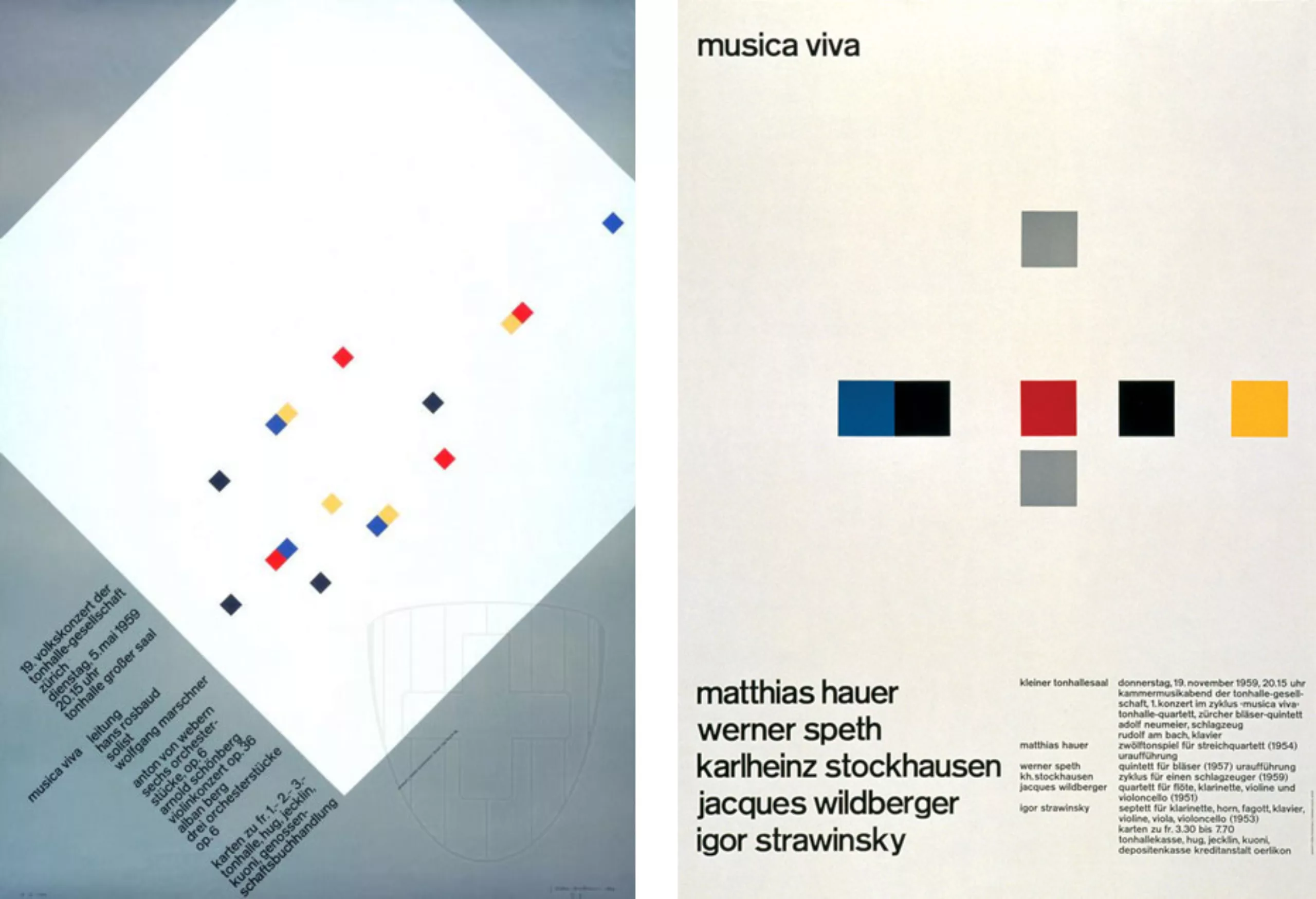
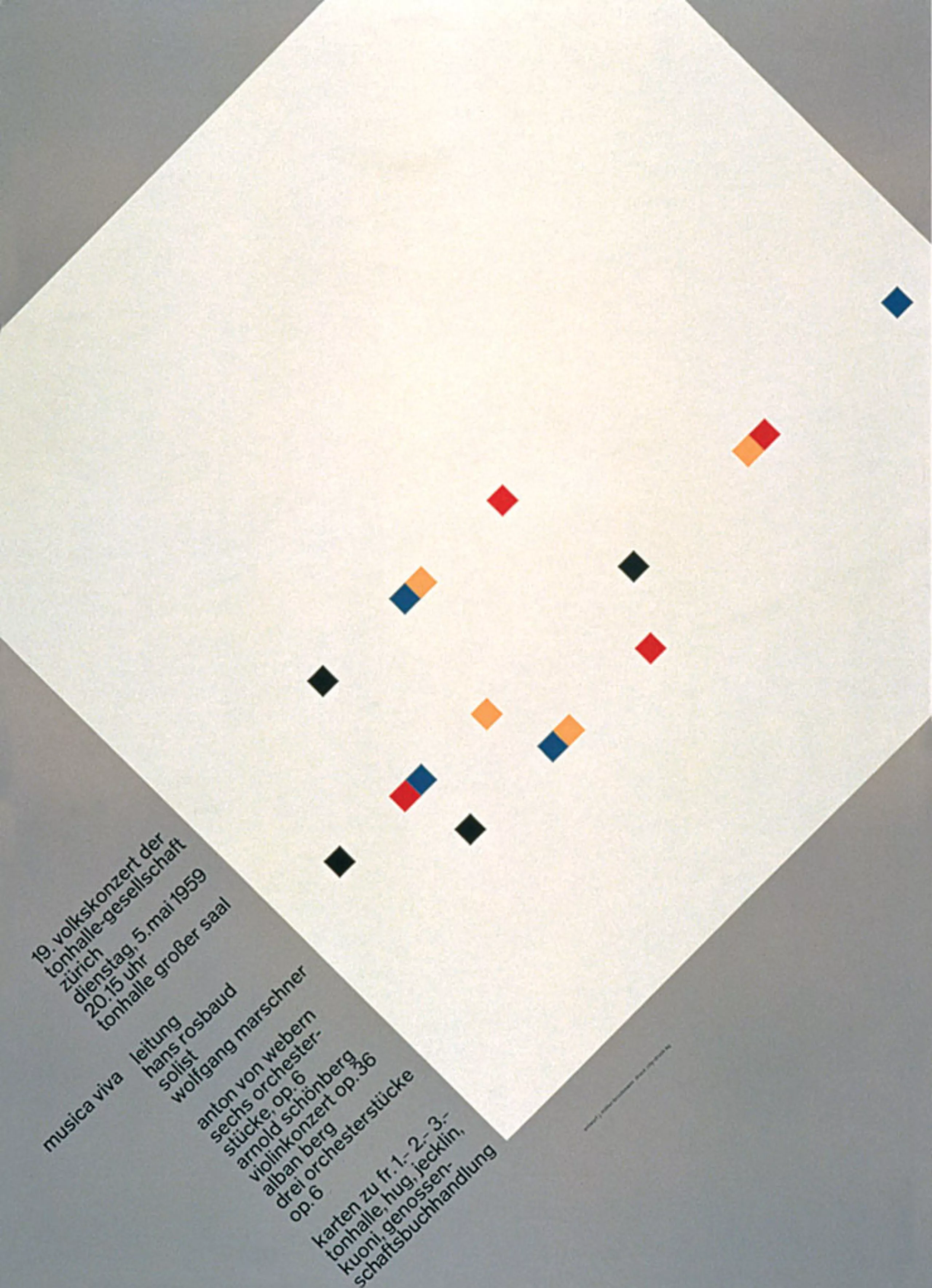
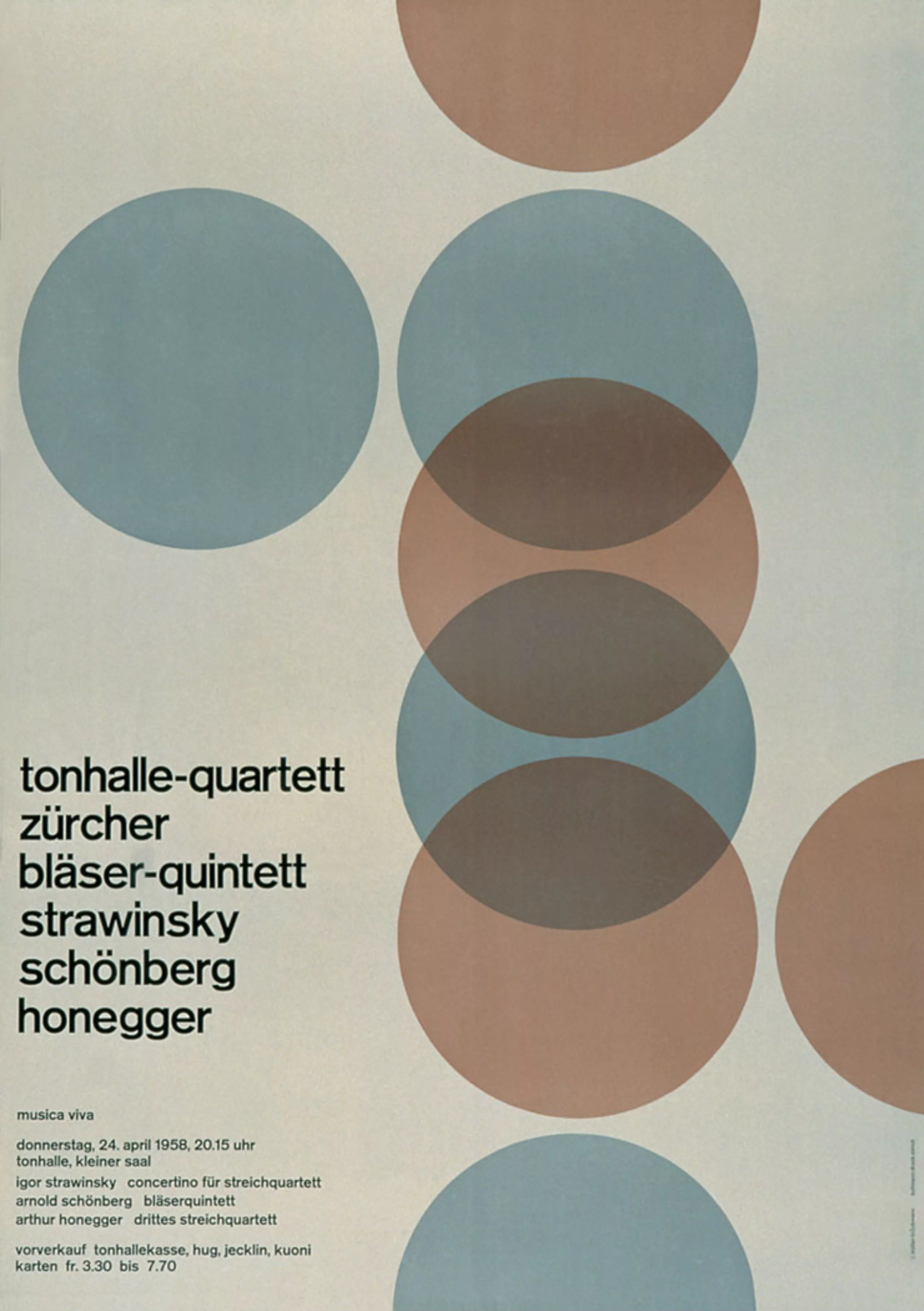
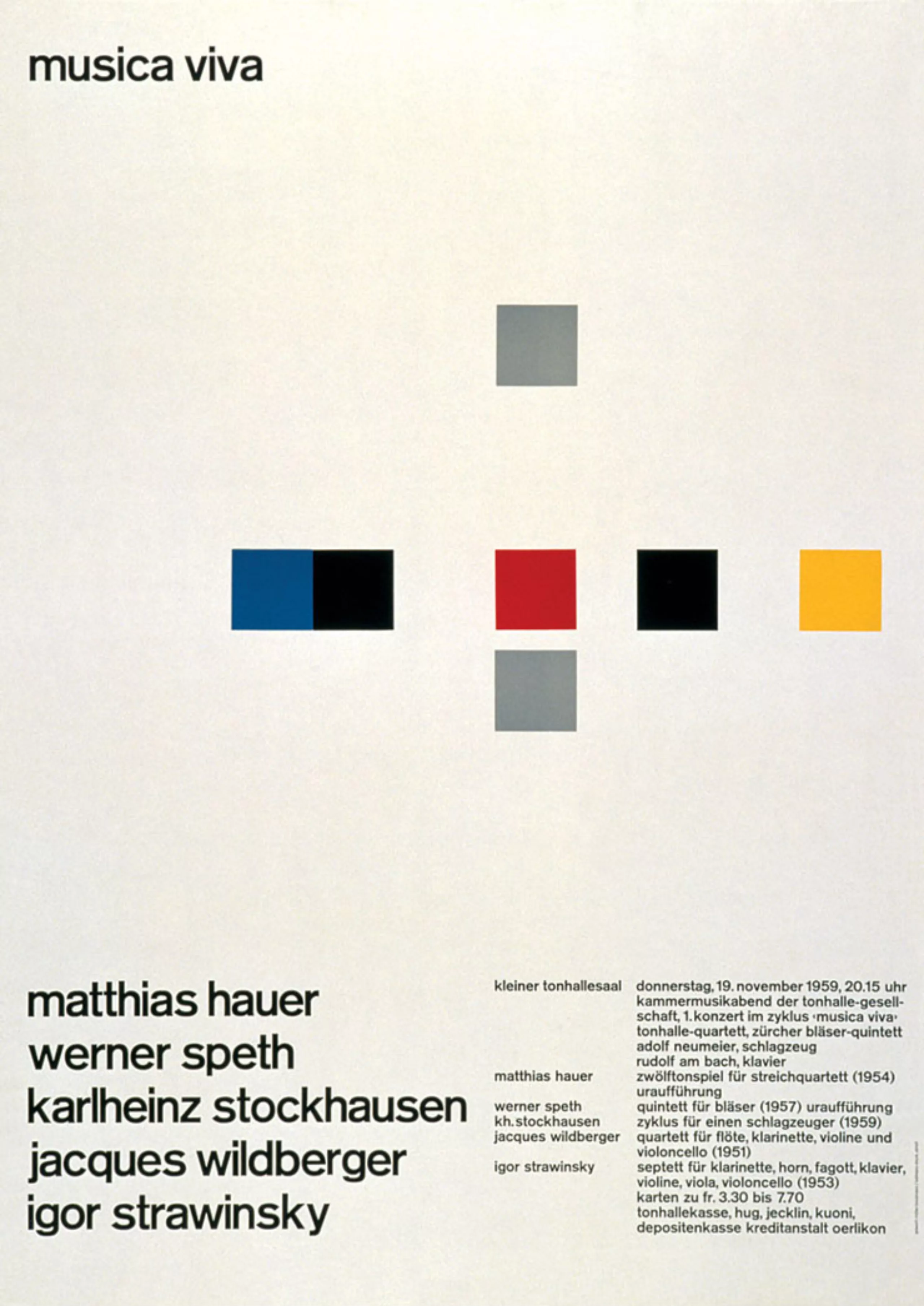
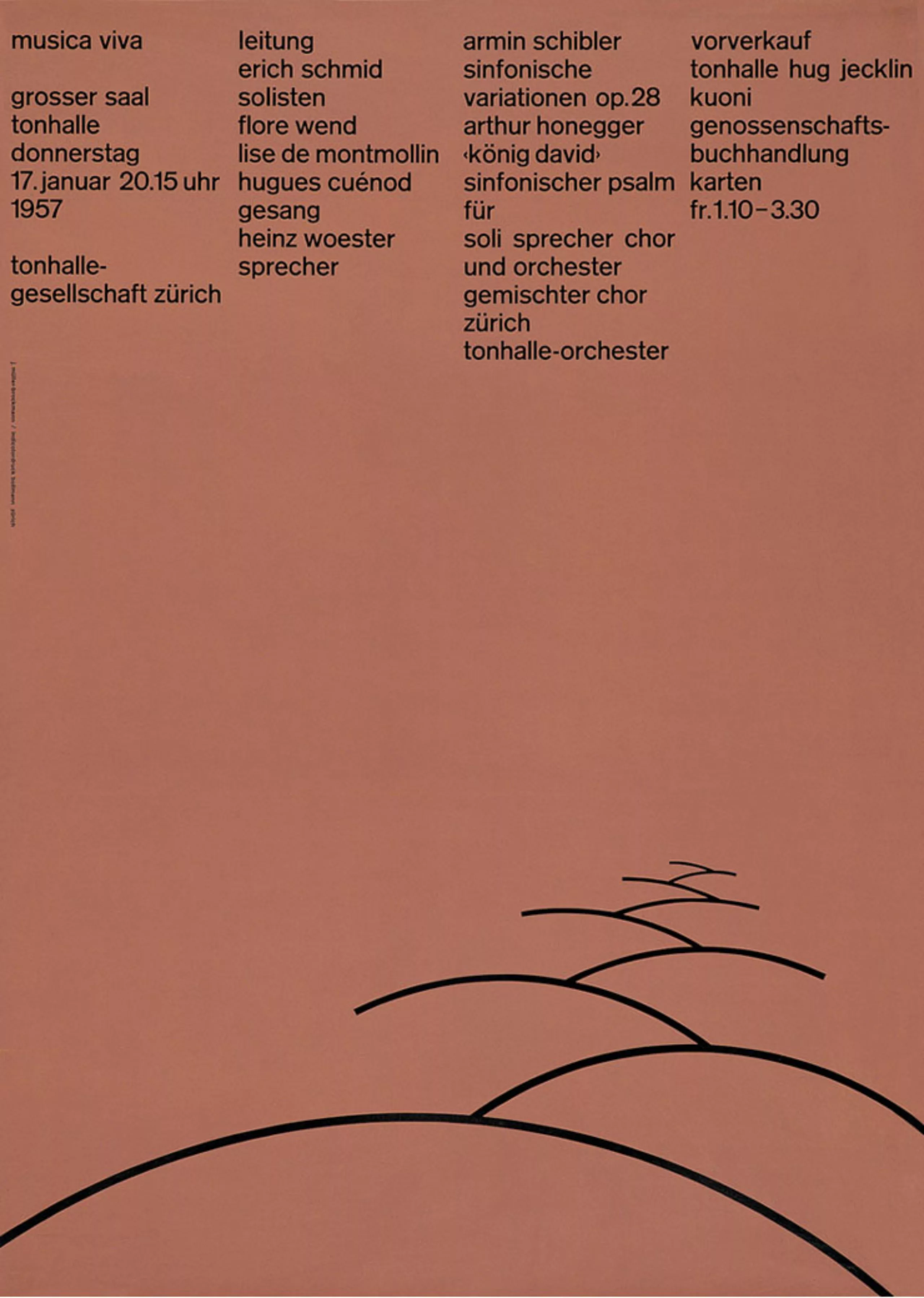
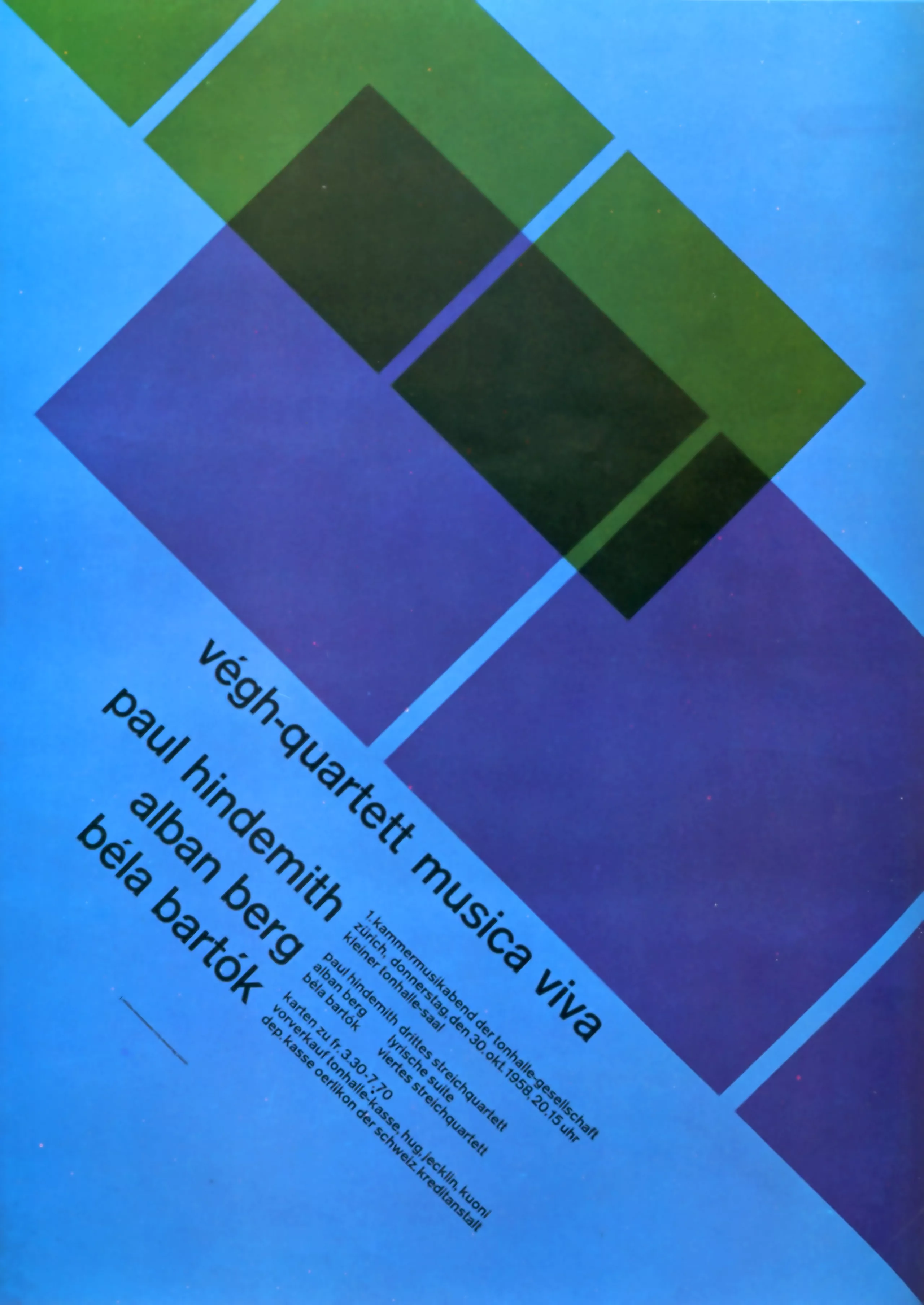
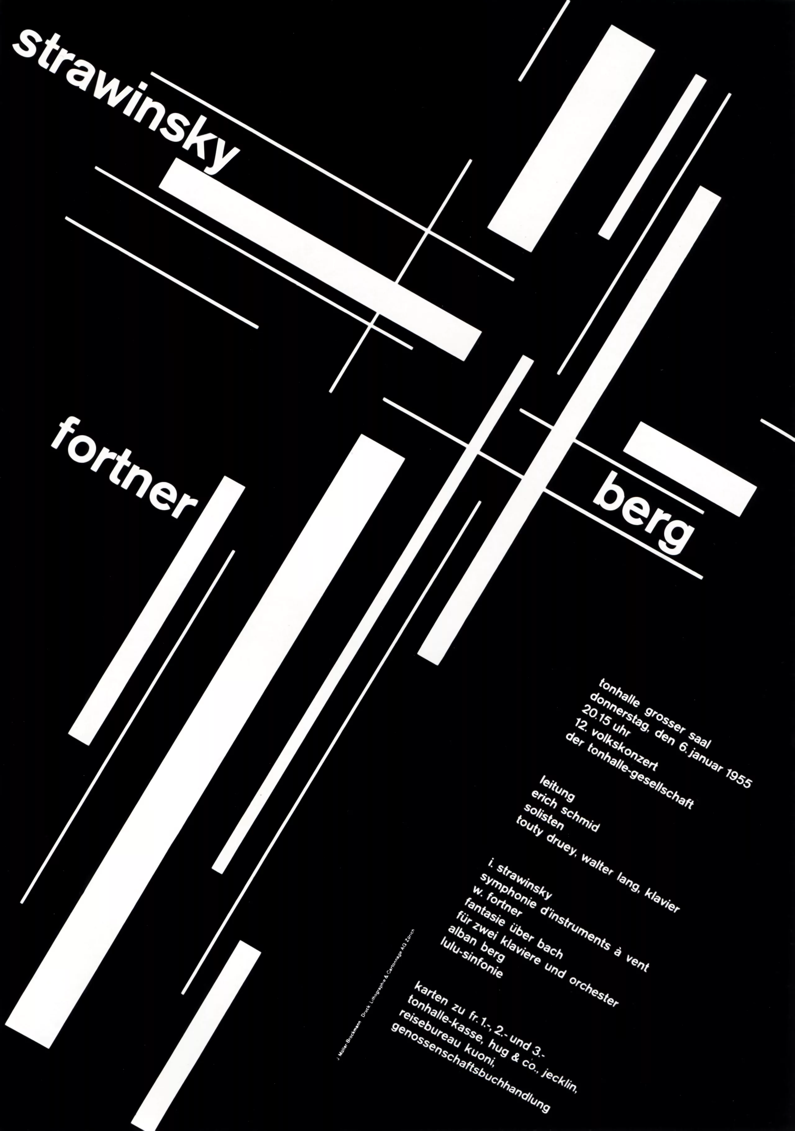
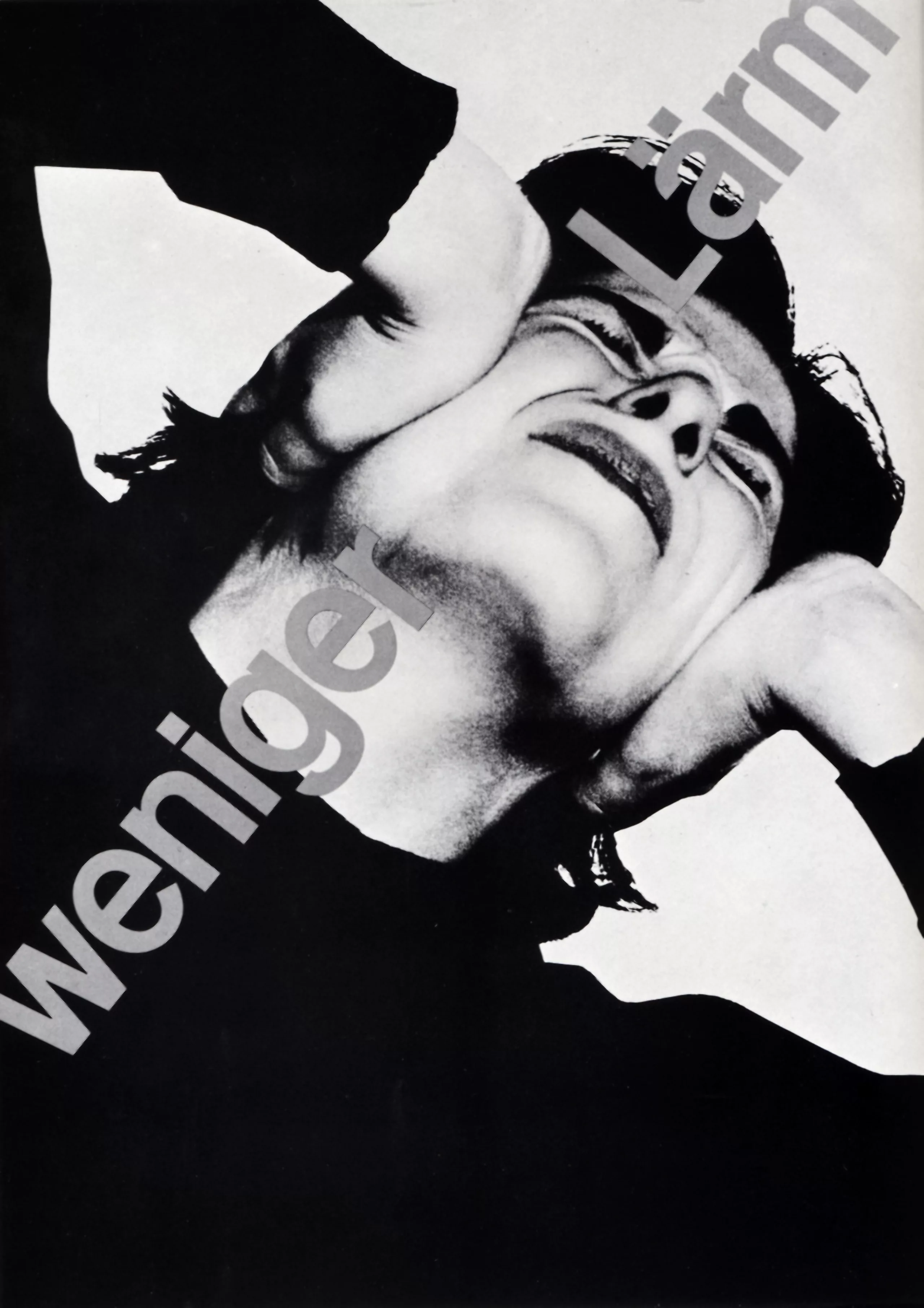
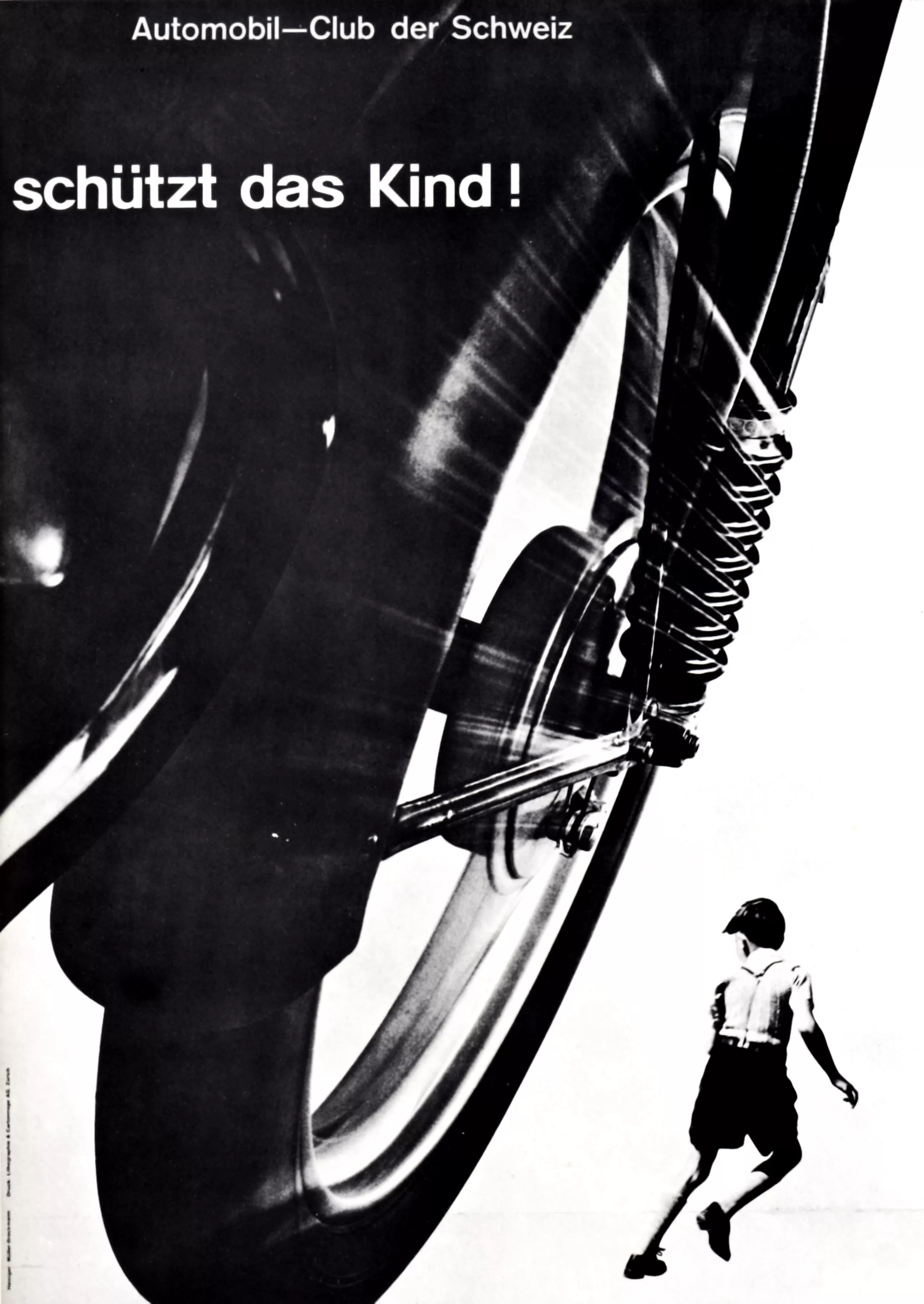
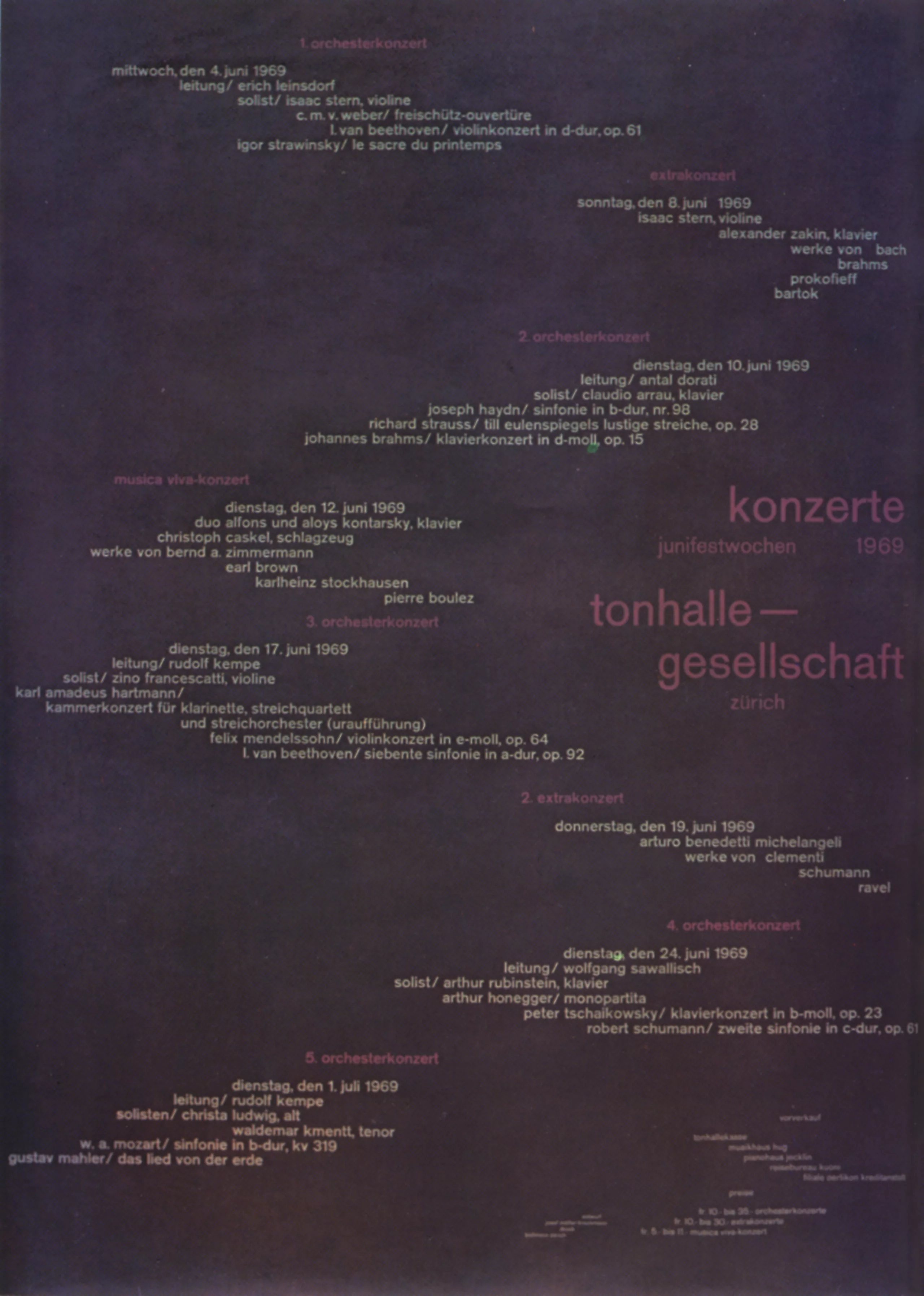
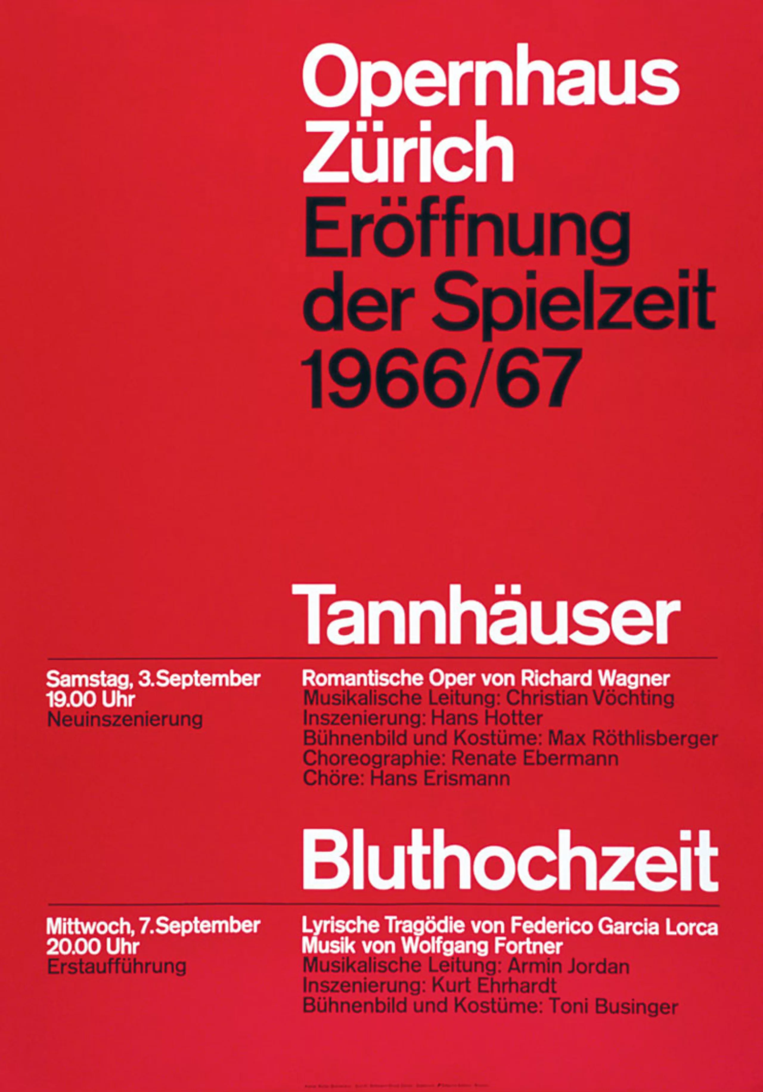
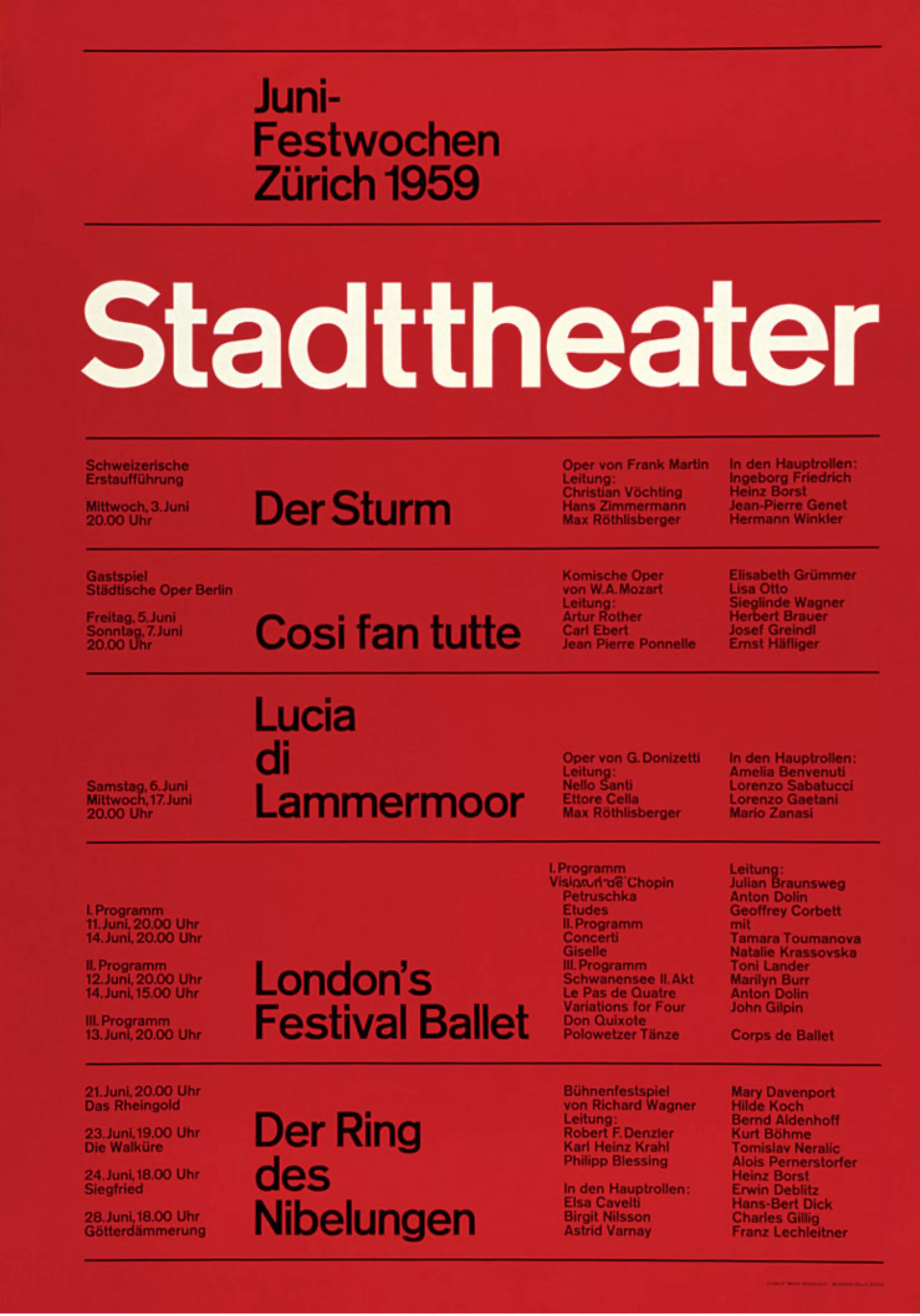
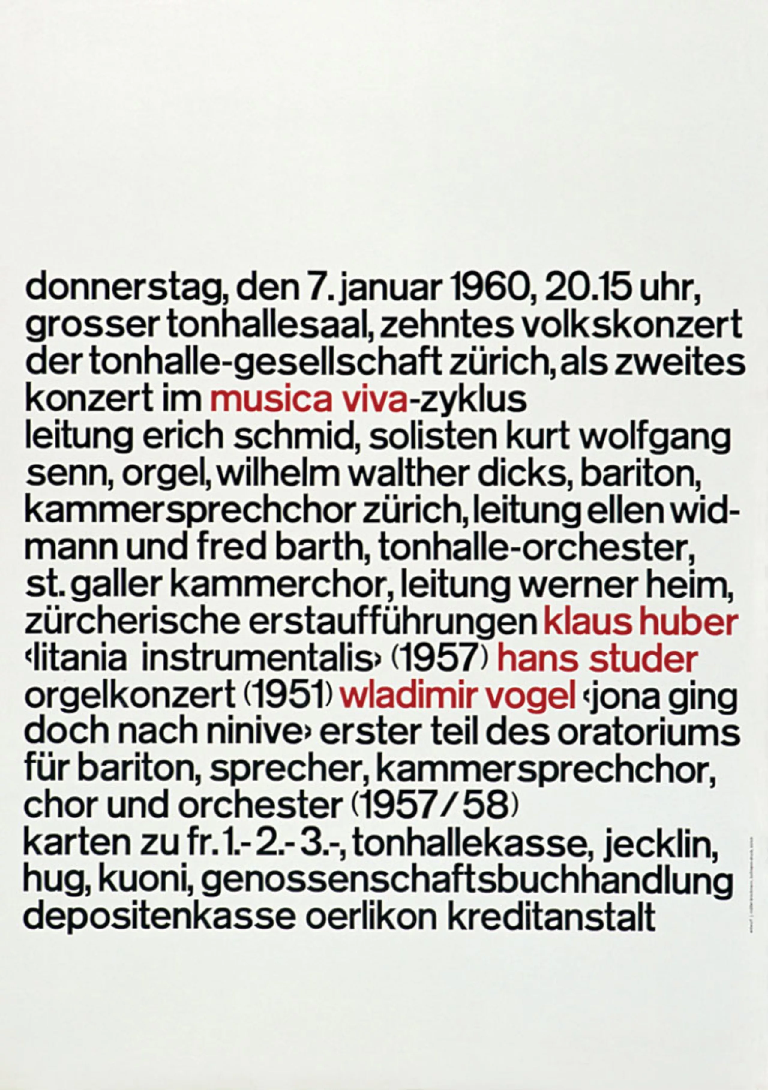
After 1945, Müller-Brockmann concentrated his work on illustration and exhibition design. In 1950, he designed his first poster for the Tonhalle in Zurich. It was at this time that he developed his constructivist approach to graphic design. Little by little, graphic design occupies all its time. His poster “protect the child” for the Swiss Automobile Club and his numerous posters for the Tonhalle in Zurich bring him great fame.
In 1957, he replaced Ernst Keller as professor of graphic design at the Kunstgewerbeschule in Zurich. In 1958, he created the trilingual magazine Neue Grafik / New Graphic Design / Graphisme actuel with designers Richard Paul Lohse, Hans Neuburg and Carlo Vivarelli.
From 1967, he was a consultant for IBM and founded the communication agency Muller-Brockmann & Co. Throughout his career, his work was rewarded with numerous prizes. He died on 30 August 1996 in Zurich.
Graphic designer by accident
“I became a graphic designer by accident,” Brockmann says. “At school, I didn’t like writing much so I started drawing. My teacher was impressed, so I realized I had talent. He suggested that I should pursue an artistic career. So I became an apprentice retoucher in a printing house. It only lasted one day because it wasn’t artistic enough. After that, I was apprenticed to two old architects. With them, it lasted four weeks. Then I went to all the graphic designers I found in the phone book to find out what they had studied. So I enrolled at the Zurich School of Arts and Crafts.“
The father of Swiss graphic design
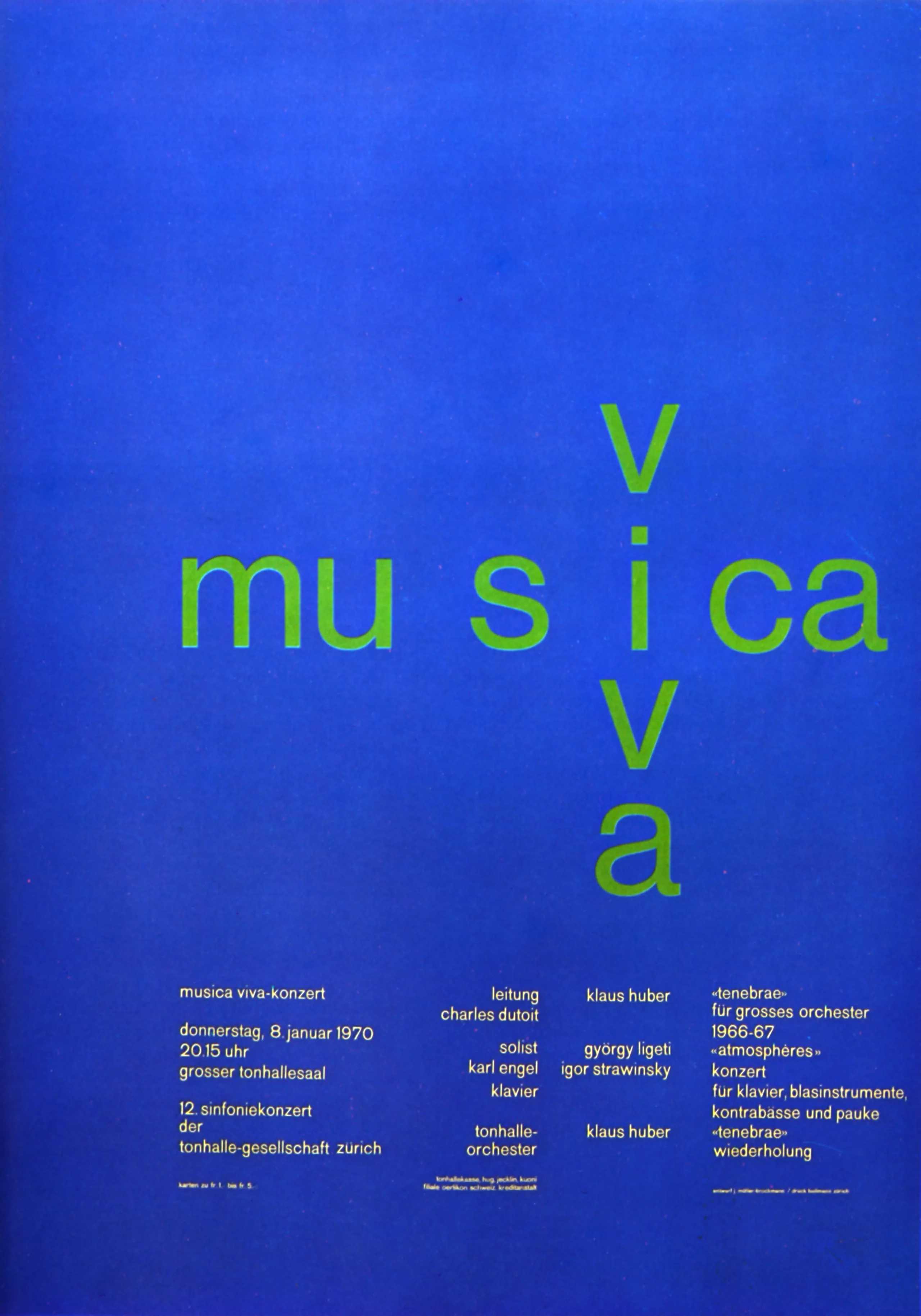
Müller-Brockmann is probably one of the most influential graphic designers in the history of our profession. His work is always taught, studied and published. It is certainly the figurehead of Swiss graphic design (which also takes the name of international style). His work is influenced by Bauhaus and constructivism. Typography and geometry are predominant. His compositions are based on very “rigid” grids which will be his trademark. An economical and rational style!
Not much is known about Müller-Brockmann. The publisher Lars Müller published the only complete monograph shortly before his death. This book is introduced by Paul Rand “himself” (the class!). Lars Müller tries to explain what caused the sudden change in Brockmann’s career, when he moved from illustration to “constructivist” graphics.
At the time, Brockmann was influenced by the work of Hungarian photographer Moholy-Nagy and Jan Tschichold’s manifesto Die neue Typographie. This modernist manifesto proclaims the supremacy of bar typefaces (called grotesk in German). Brockmann was strongly influenced by these rules which he observed throughout his career.
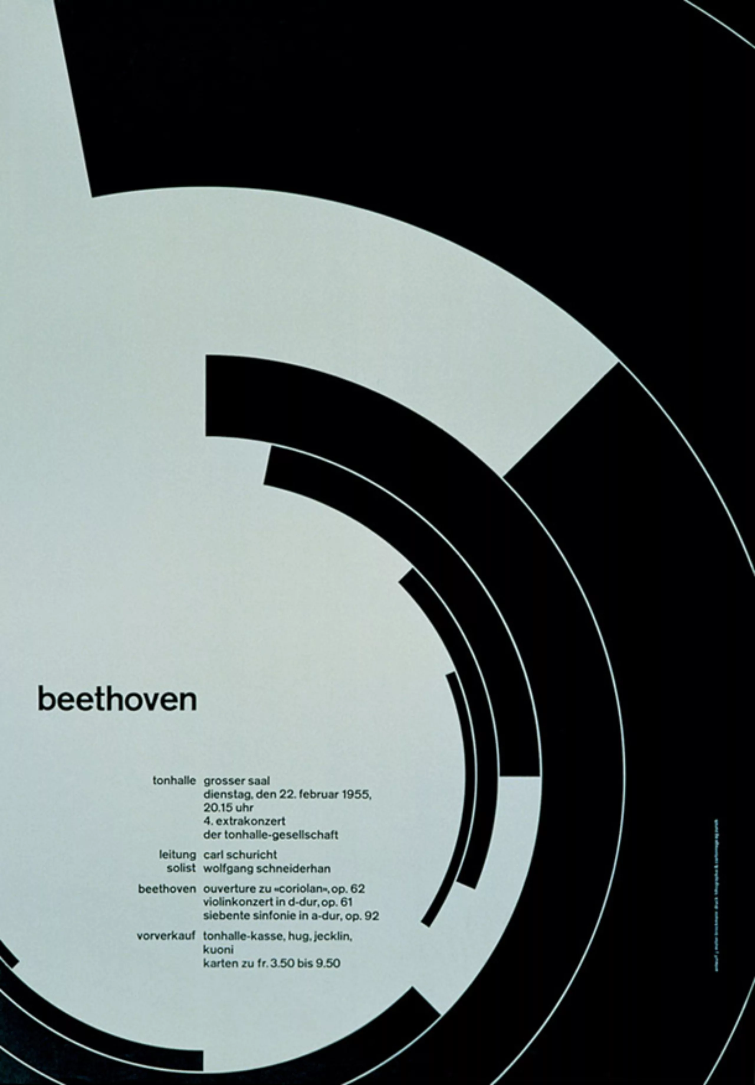
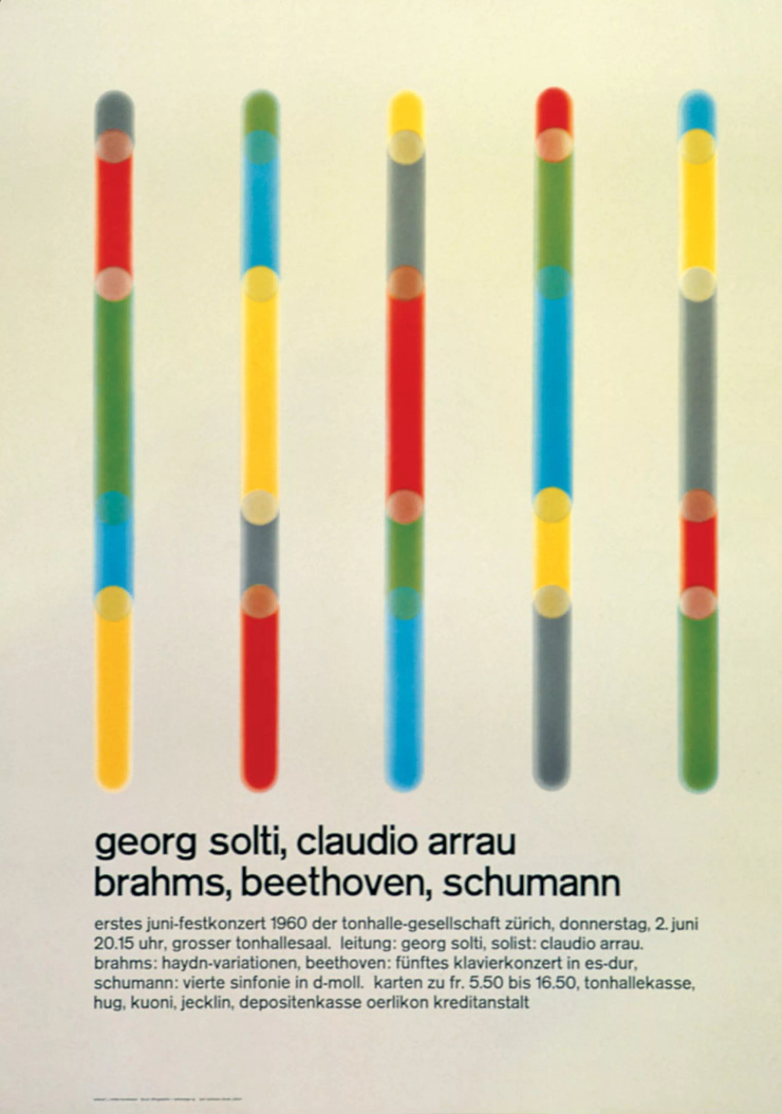
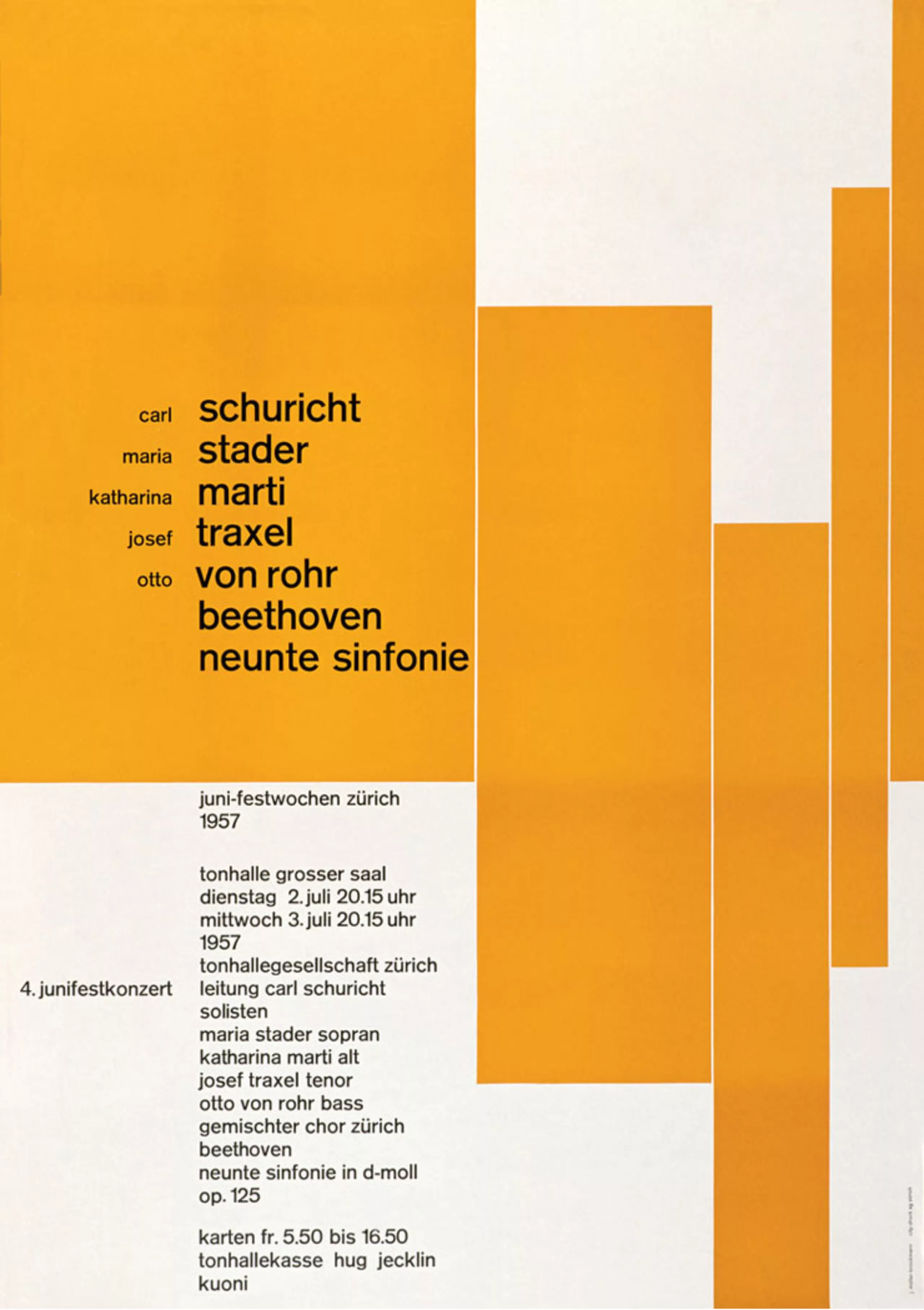
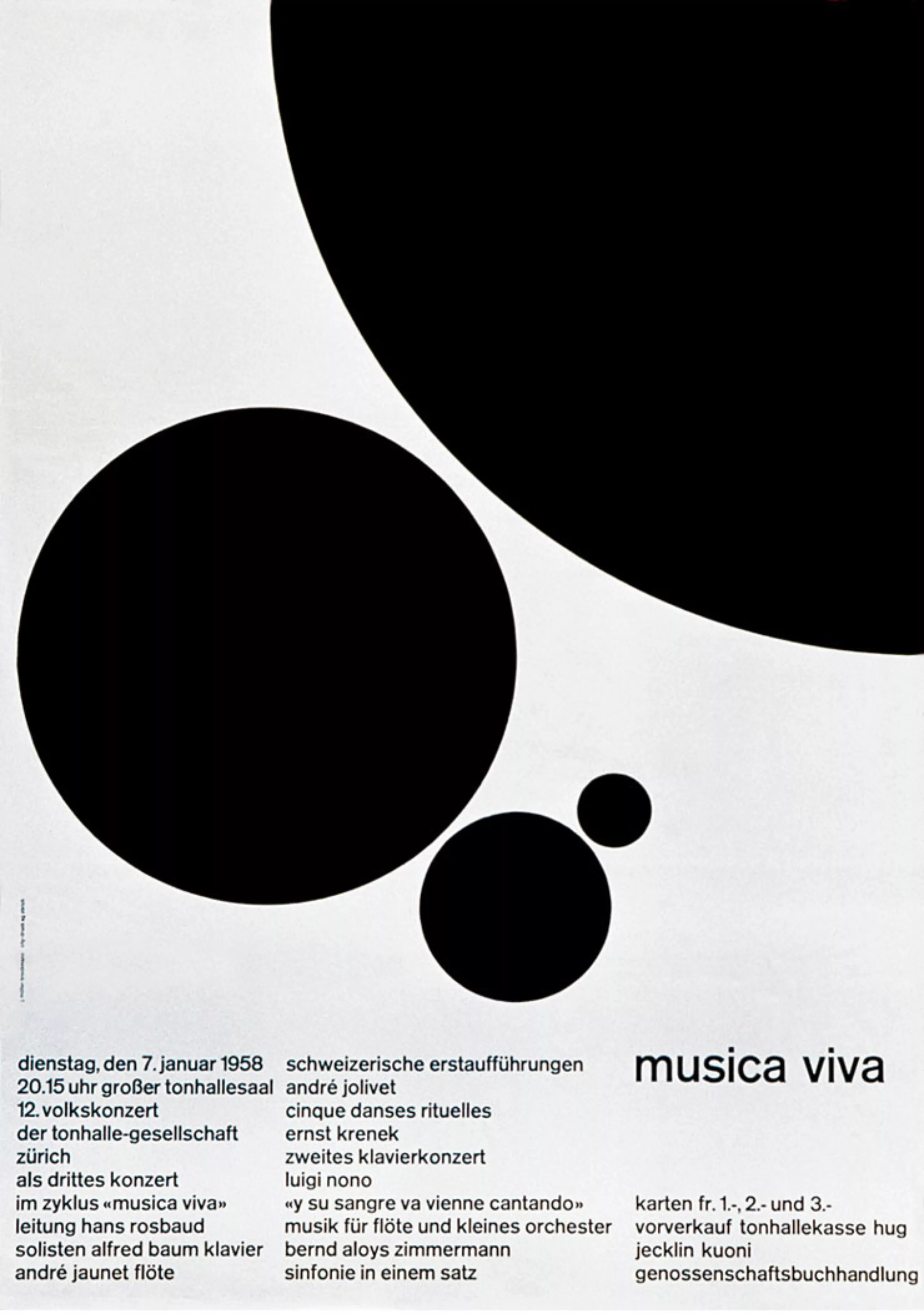
These rules can be summarized by the use of very strict composition grids, objective photographs to avoid emotions, the importance of rhythm, harmony, mathematical and geometric compositions. For example, at that time Brockmann saw music as an abstract art, so he considered his concert posters in an abstract way. The publisher Lars Müller described Beethoven’s poster (1955) as the ultimate example of “musicality in design”.
Brockmann explains his style very effectively: “In my poster, advertising, brochure and exhibition creations, subjectivity is removed in favour of a geometric grid that determines the arrangement of words and images. The grid is an organizational system that makes the message easier to read, this allows you to get an effective result at a minimum cost. With an arbitrary organization, the problem is solved more easily, faster and better. It also allows uniformity that goes beyond national borders (hence the international style!), a boon for advertising that IBM, for example, has benefited from. Information presented as objectively as possible is communicated without superlatives, without emotional subjectivity.“
From the 1960s to the 1970s, the “Swiss style” began to lose its influence. The political climate has changed, the war in Vietnam has gone through it, the Swiss aesthetic is considered cold and authoritarian. The time is at flower-power…
Brockmann probably did not live long enough to see the great return of the “Swiss style” in the 2000s.
The design must be legible
Müller-Brockmann hated <ahref=”https://www.google.com/search?client=safari&rls=en&q=Neville+Brody+poster&oe=UTF-8&um=1&ie=UTF-8&hl=fr&tbm=isch&source=og&sa=N&tab=wi&authuser=0&ei=pCM9UeuiK8r17AavuoGAAw&biw=1212&bih=695&sei=pyM9UfPmFOjB7Ab924CwBg” target=”_blank” rel=”noopener”>Neville Brody’s work. He said: “Some have set themselves the task of making typography unreadable, of making a puzzle out of it. Illegibility seems to become an artistic project. I don’t want to read things like that. The same rational criterion applies to wobbly shapes and fuzzy contours: Can I read these messages faster? No! No! Fonts designed for Neville Brody are not suitable for advertisements and posters. They are exceptions and individual cases should not be the basis for teaching graphics. These alphabets are confused, unattractive and simply bad.”
Un design rigide, mais un homme flexible
Behind this Swiss rigour, obviously hides a man, all those who knew him agree to present the portrait of a humble man with much humour.
In a 1996 interview in Eye magazine, he answered the question “what is your best work”: “The white back of my posters!”.
Again, when the interviewer asks “What does “order” mean to you?” Brockmann humbly answers “a pious wish“, then finally declares that it is “knowledge of the rules that govern legibility“. This statement illustrates well the power of his convictions.
Visual identities
Brockman has worked on many visual identities. The one of the Swiss railways seems exemplary to us. This logo celebrated its 30th anniversary in 2012! It simply symbolizes the Swiss cross and the transport from point A to point B. It also drew the typography which is used for station signage.
When you see the history of this logo (a winged wheel) and the simplicity of Brockmann’s logo, you understand what Swiss functionalism means! Simplicity and efficiency!
Ethics and aesthetics
Josef Müller-Brockmann’s ethical rigour is mentioned in most of the books about him. In the 1950s, he began to stop working for alcoholic beverages, tobacco, war games, the military and politicians. Lärs Müller’s monograph describes in detail when Brockmann suddenly decided to stop working for Turmac cigarettes after learning that nicotine caused cancer.
As early as that time Brockmann liked to say that his work was no longer one of the “harmful products“. More seriously, he says that designers must have a sense of responsibility for the contribution they make to our society. He states that professional ethics is a work that maintains “the intelligence, objectivity, functional and aesthetic quality of mathematical thought”.
“Being a graphic designer” by Josef Müller-Brockmann (1914-1996)
This is a text written by Müller-Brockmann in 1973, originally published in “Graphic Designers in Europe”. This book has not been published for 40 years, so we allow ourselves to share this text. It is obviously necessary to place these remarks in their contexts in the 70s.
It was as difficult for our teachers as it is for us to imagine tomorrow’s world in its relation to scientific developments. Additionally, national, political, racial and religious prejudices do not facilitate dialogues at an international level. If it is assumed to be true that onethird of the world’s population is starving and that one and a half milliard people are living in conditions unworthy of human beings, it would appear to follow that the survival of this planet depends upon the attitude of governments to these problems.
We are not aware of these things in our daily work but we are capable of helping, however modestly, by thought and action. It would therefore seem desirable to try to indoctrinate the younger generation to induce in them an attitude of mind that puts the general welfare before their own interests. The logical consequence of this would be aimed at achieving harmony between national and international levels.
Up to the present time, creative design would not seem to have endowed functional shape with significance. During his training, the draftsman learns to establish a link between producers and consumers by means of a conventional image. His concept of communication leads him to aim at those designs that “best” sell the ideas or products concerned. Present teaching places its emphasis on original ideas and the impact of the composition. It neglects the study of the society in which we live and in particular its legitimate right to objectivity in publicity information. It pays more attention to graphic form than to its deeper significance. When the educators take up the study of this aspect, the form of composition will be clearly modified. If all that is necessary to publicize a good product or a positive idea, it will suffice to make the item concerned the center of the composition. The message will reach a maximum power of expression if the abject or idea is presented aesthetically and efficiently with a minimum of accompanying design. Both subjective ornament in the sense of illustrative exaggerations and over-objective presentation must be avoided. Graphics should if possible become an anonymous vehicle for the message to be transmitted. This concept gives the artist a new angle of vision.
A draftsman can use the resources of science and technology to provide a clear view of the interior structure of things and the basis of their specific meanings. The optical, acoustic, kinetic, and spatial aspects ofthese possibilities in composition are novel and fascinating. The verbal text is given a convincing and interesting pictorial support.
In every field of artistic research, creative individuals are in a position to express their concepts, by all the means available to them, with bath present and future validity. Once the problem of informing has been solved on the practical, objective, and aesthetic levels, the language of form will burst the bounds of traditional understanding and become a universal language. It is in this direction that the pointers to the future lead. Let us hope that they will rapidly produce reality.
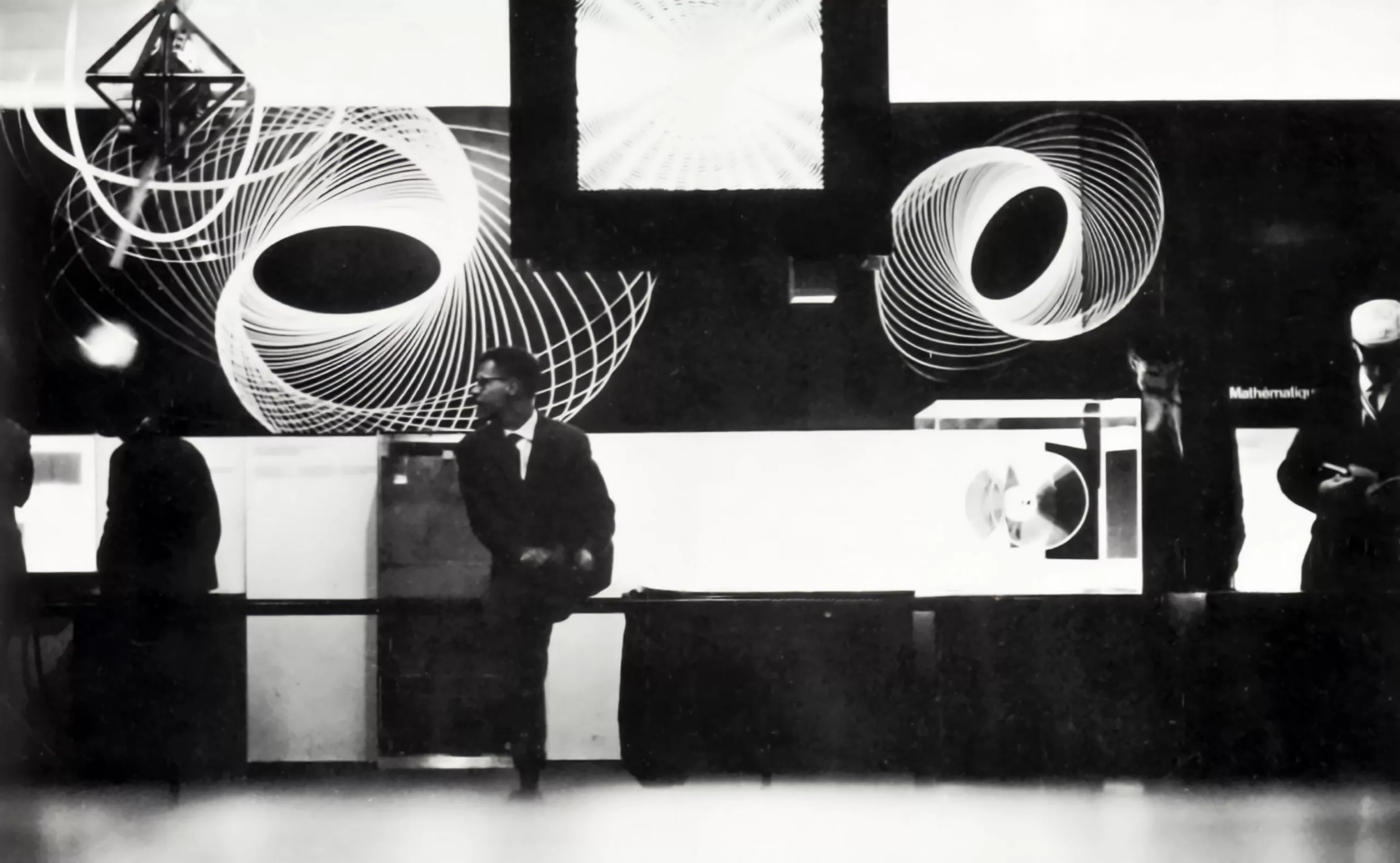
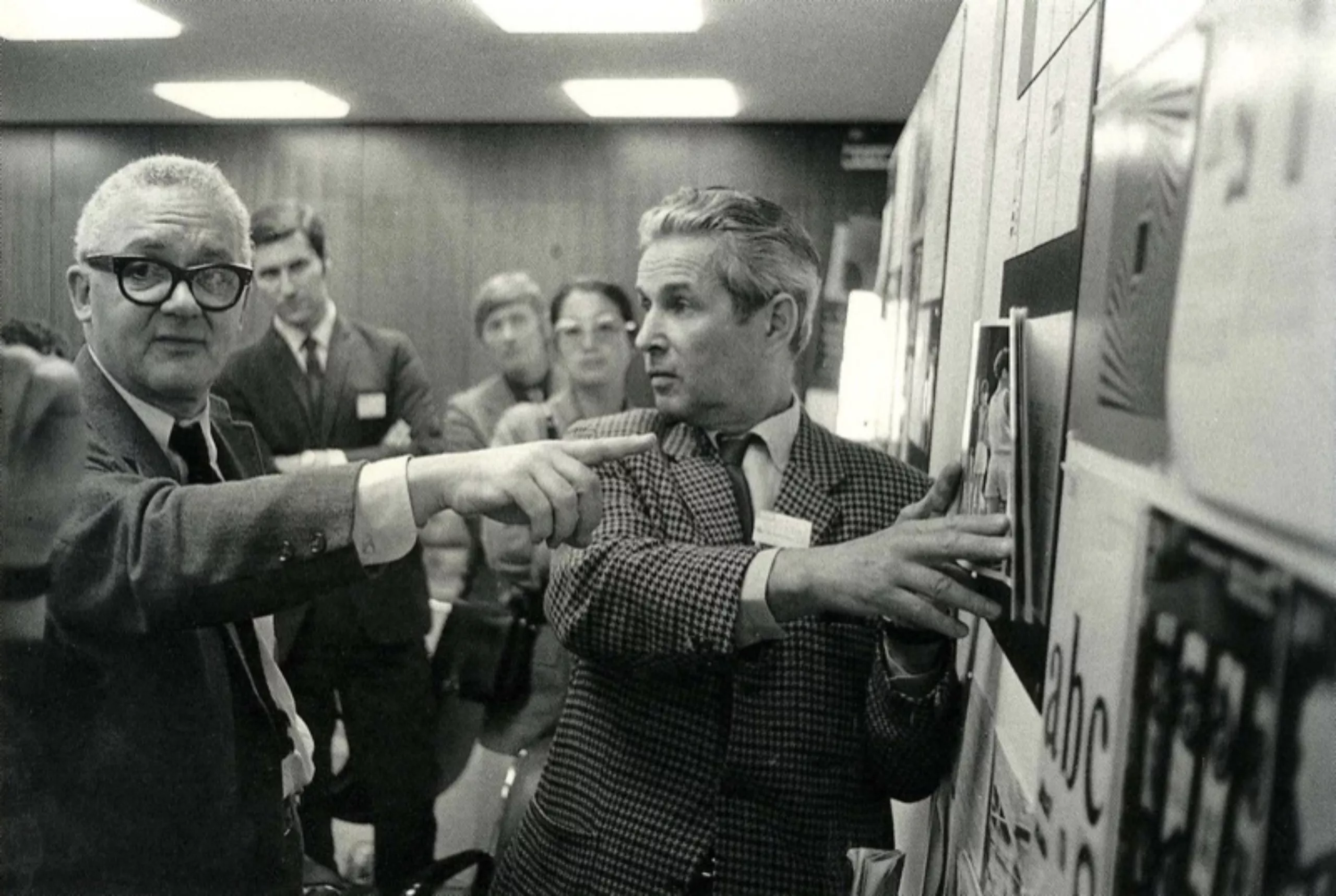
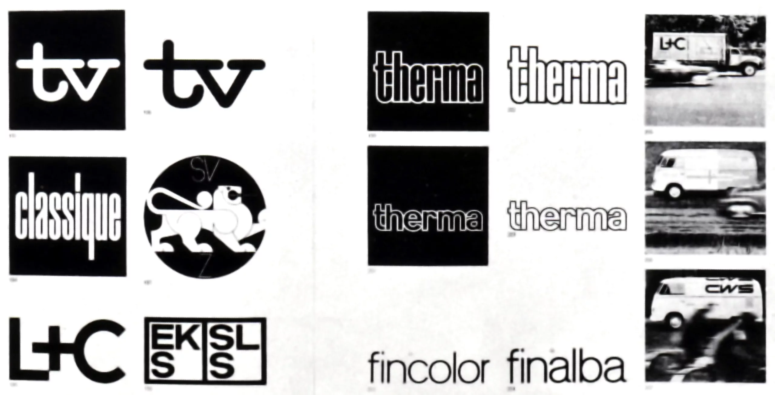
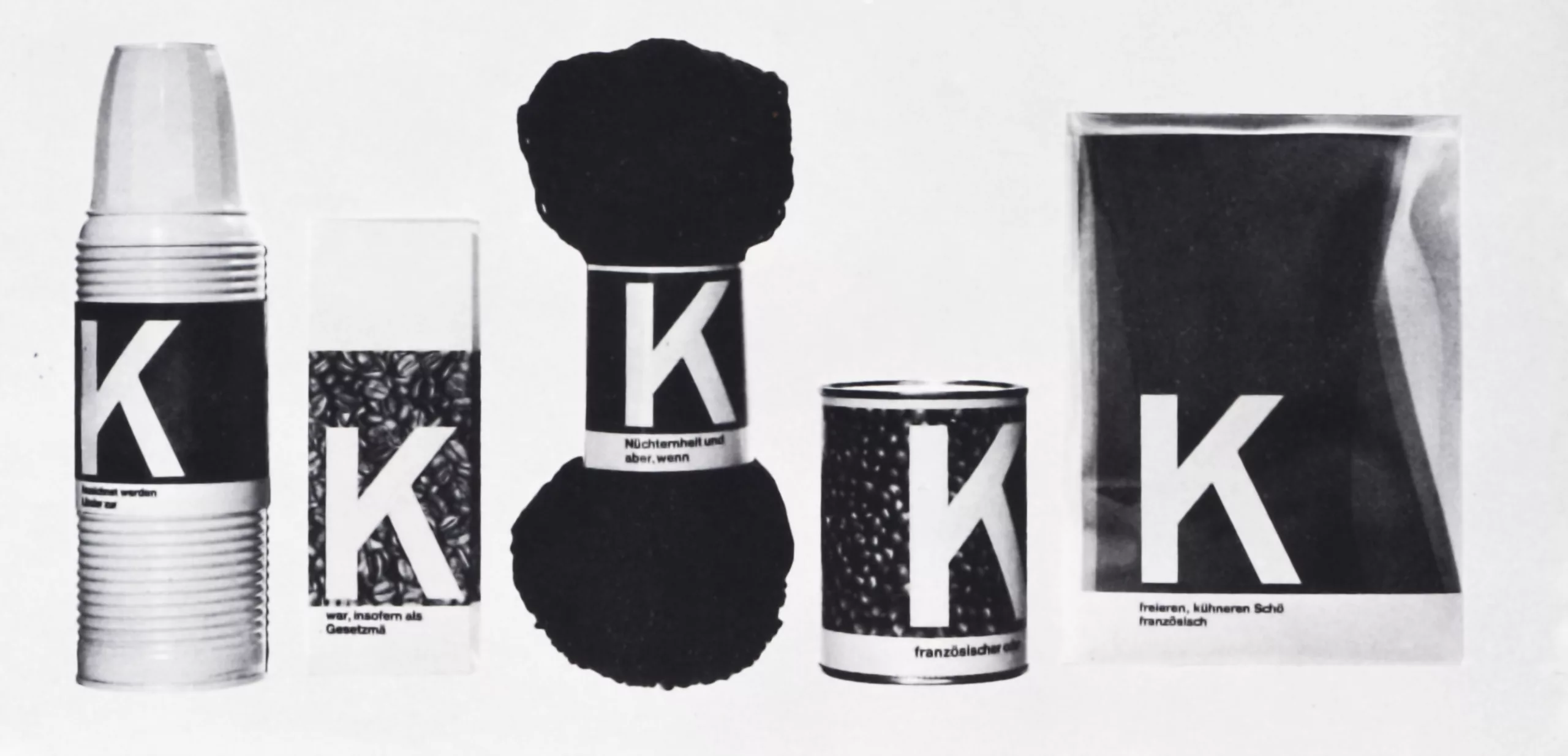
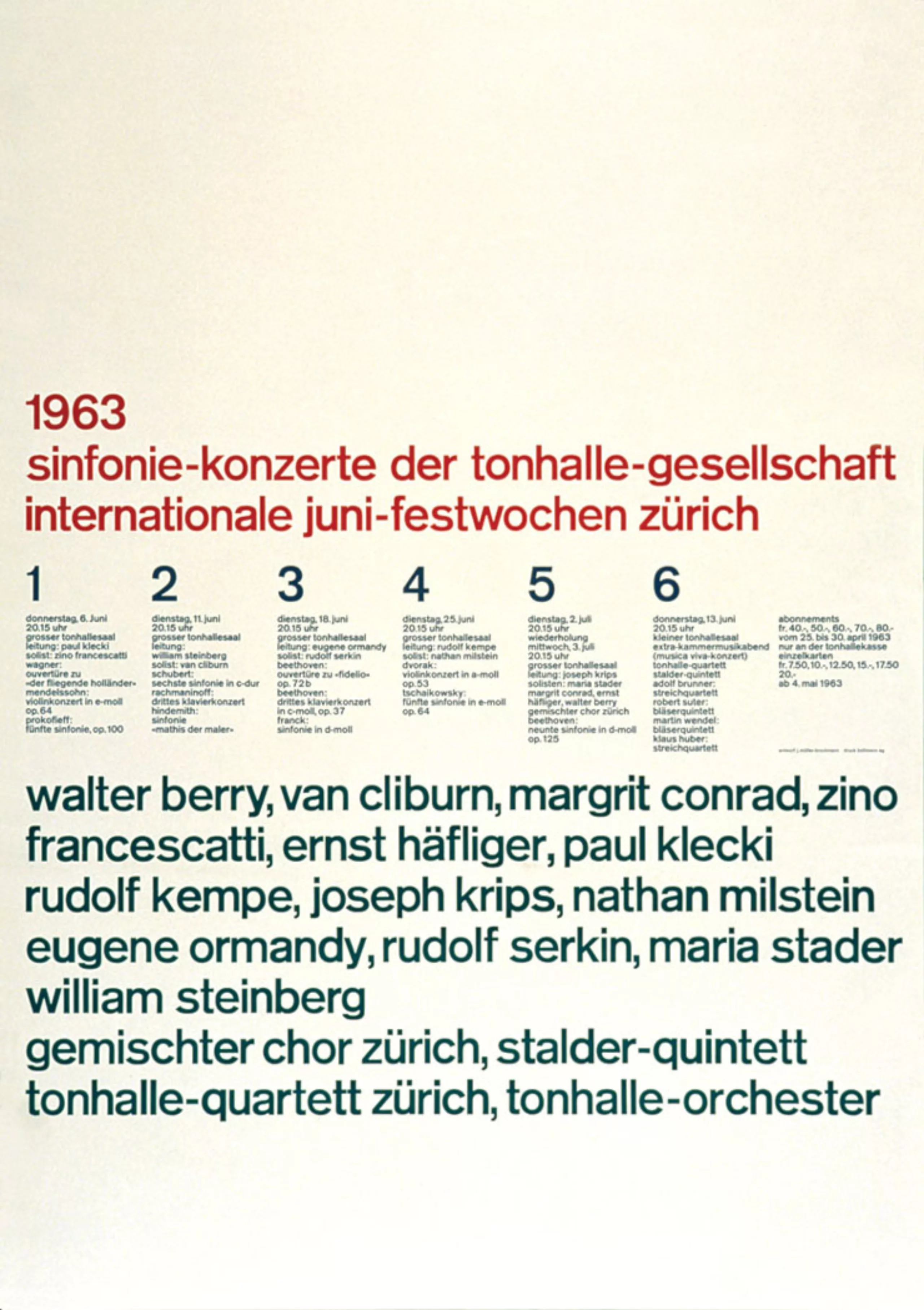
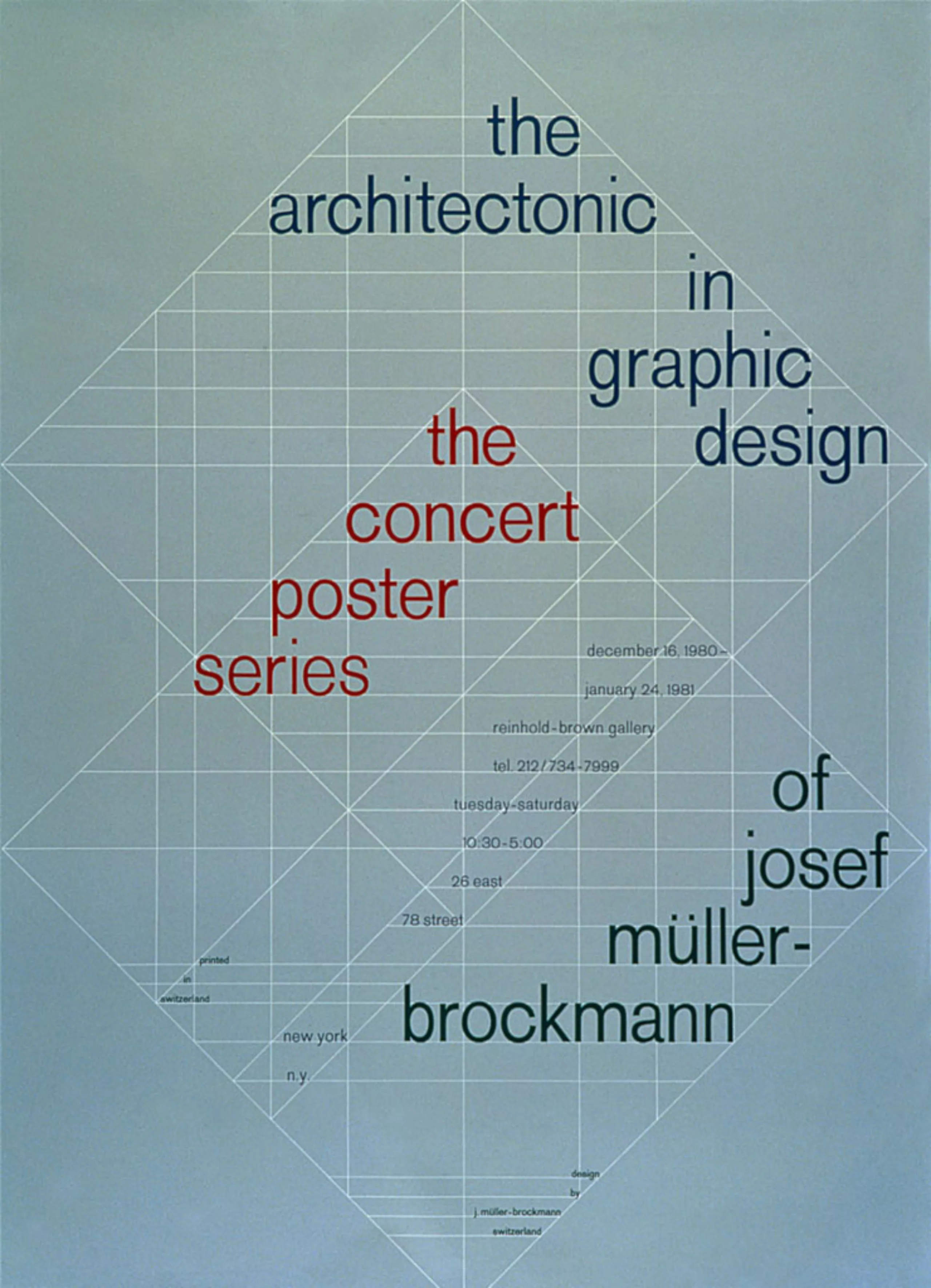
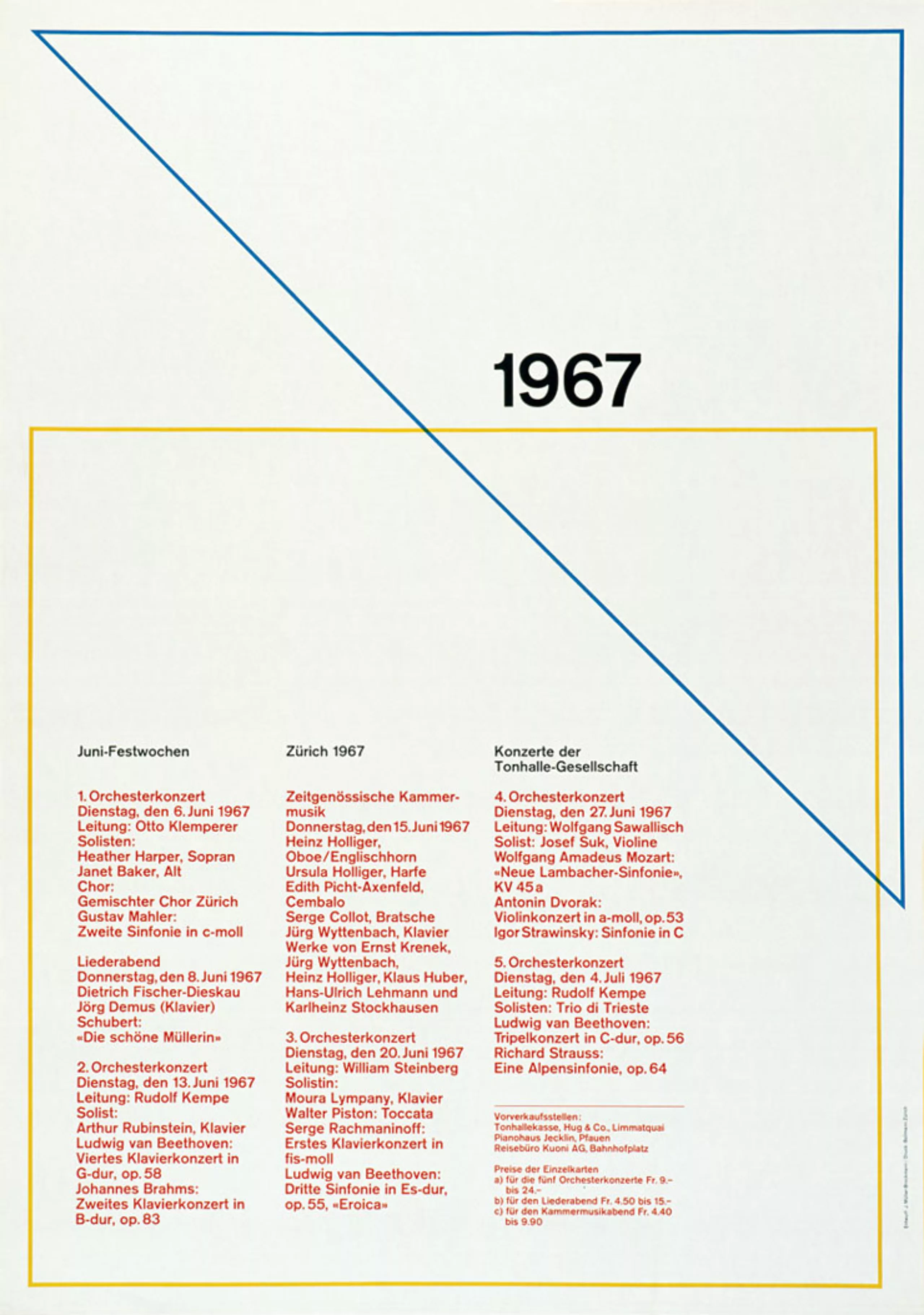
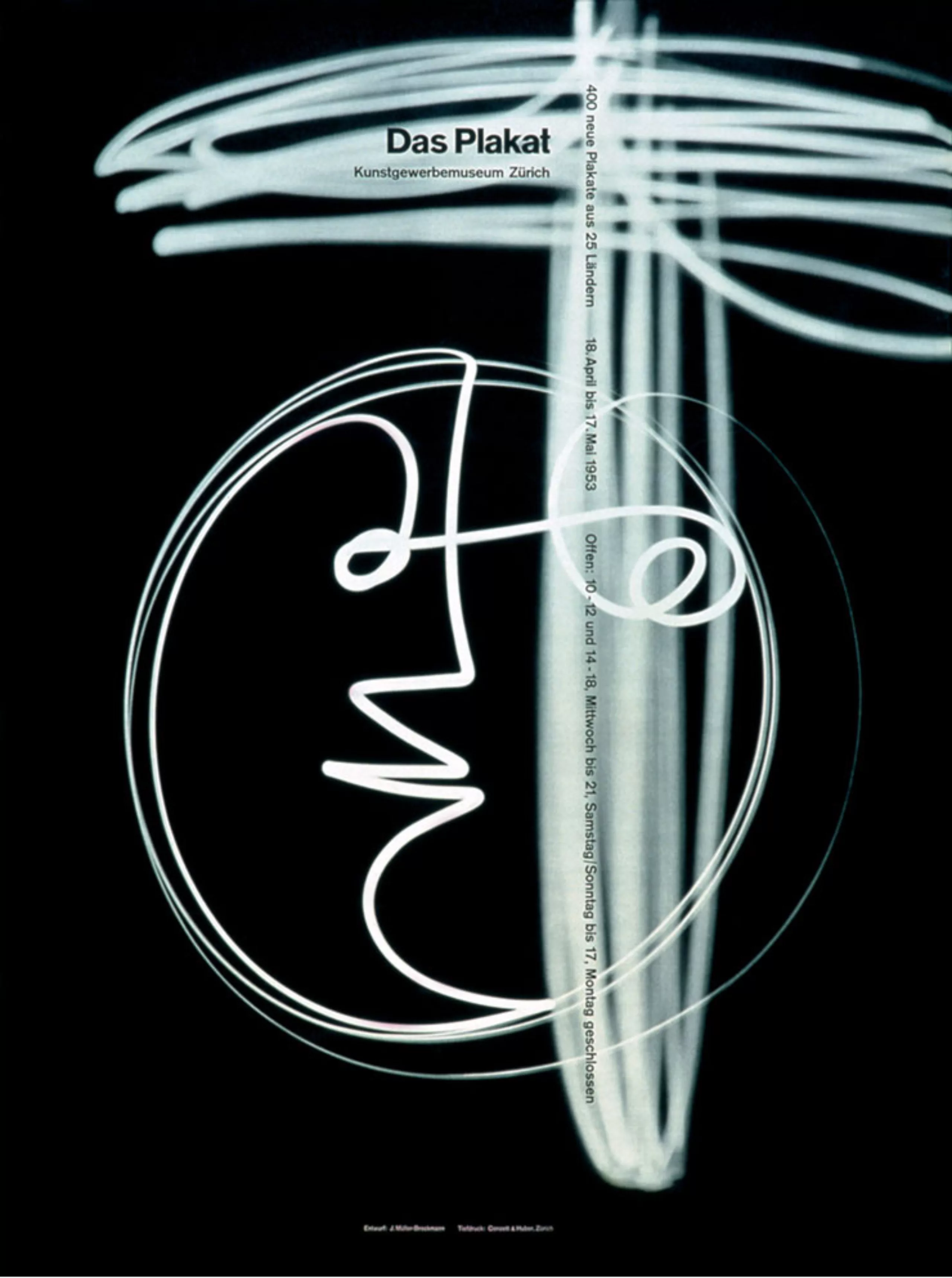
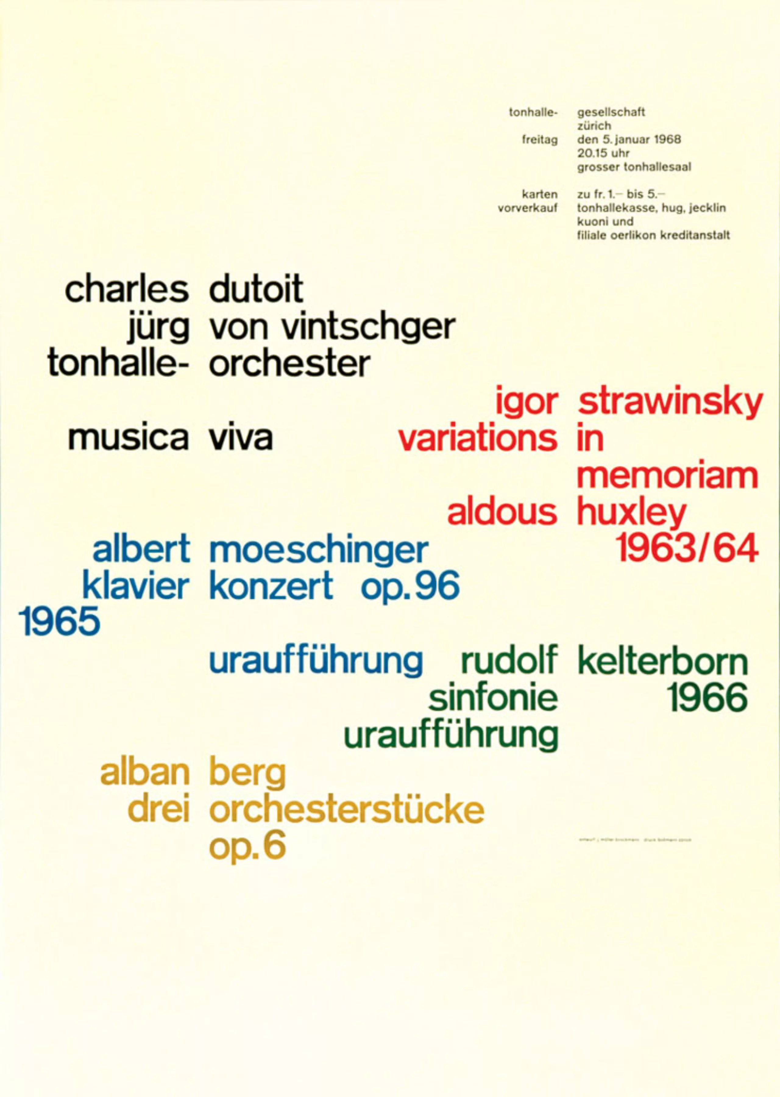
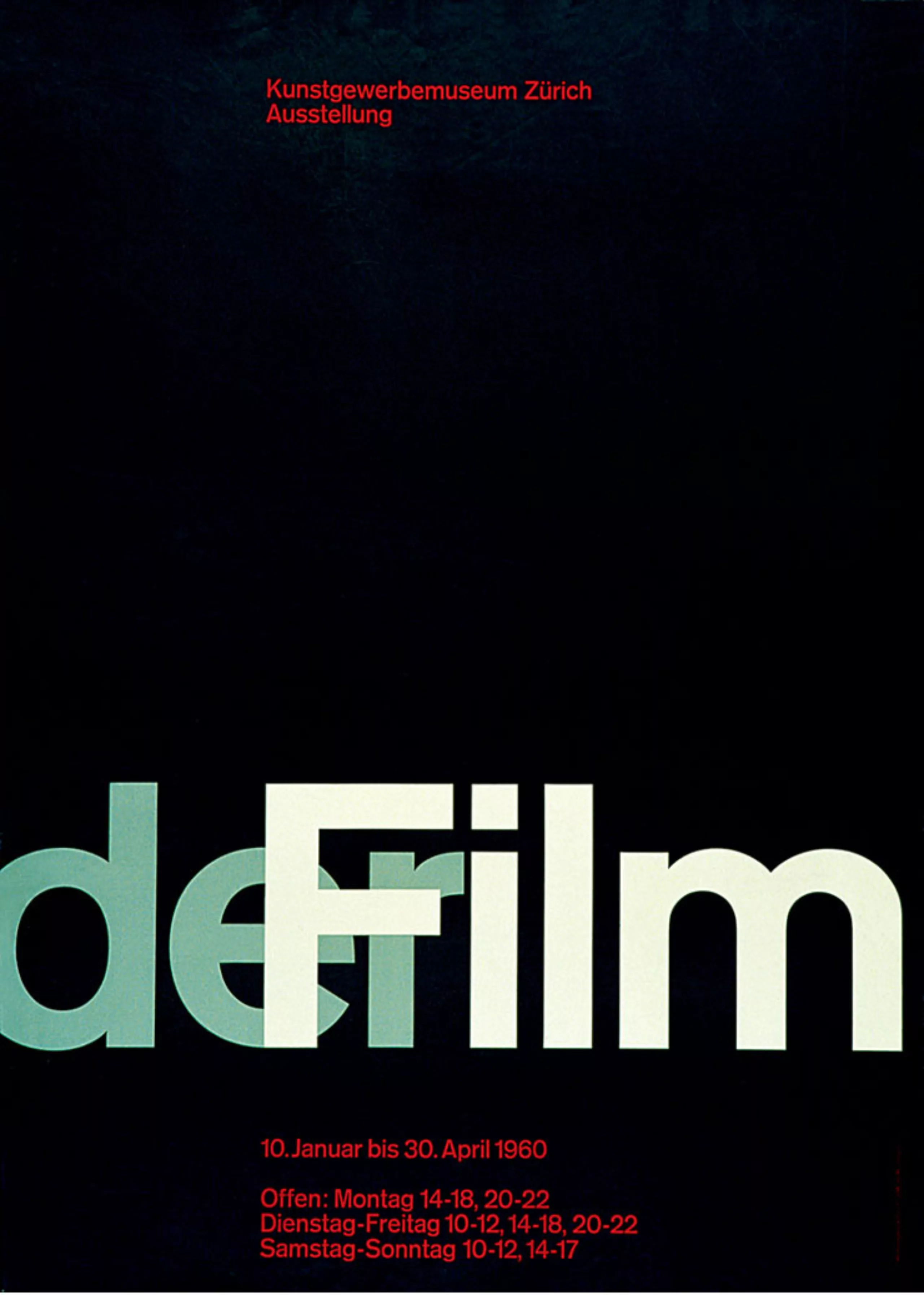
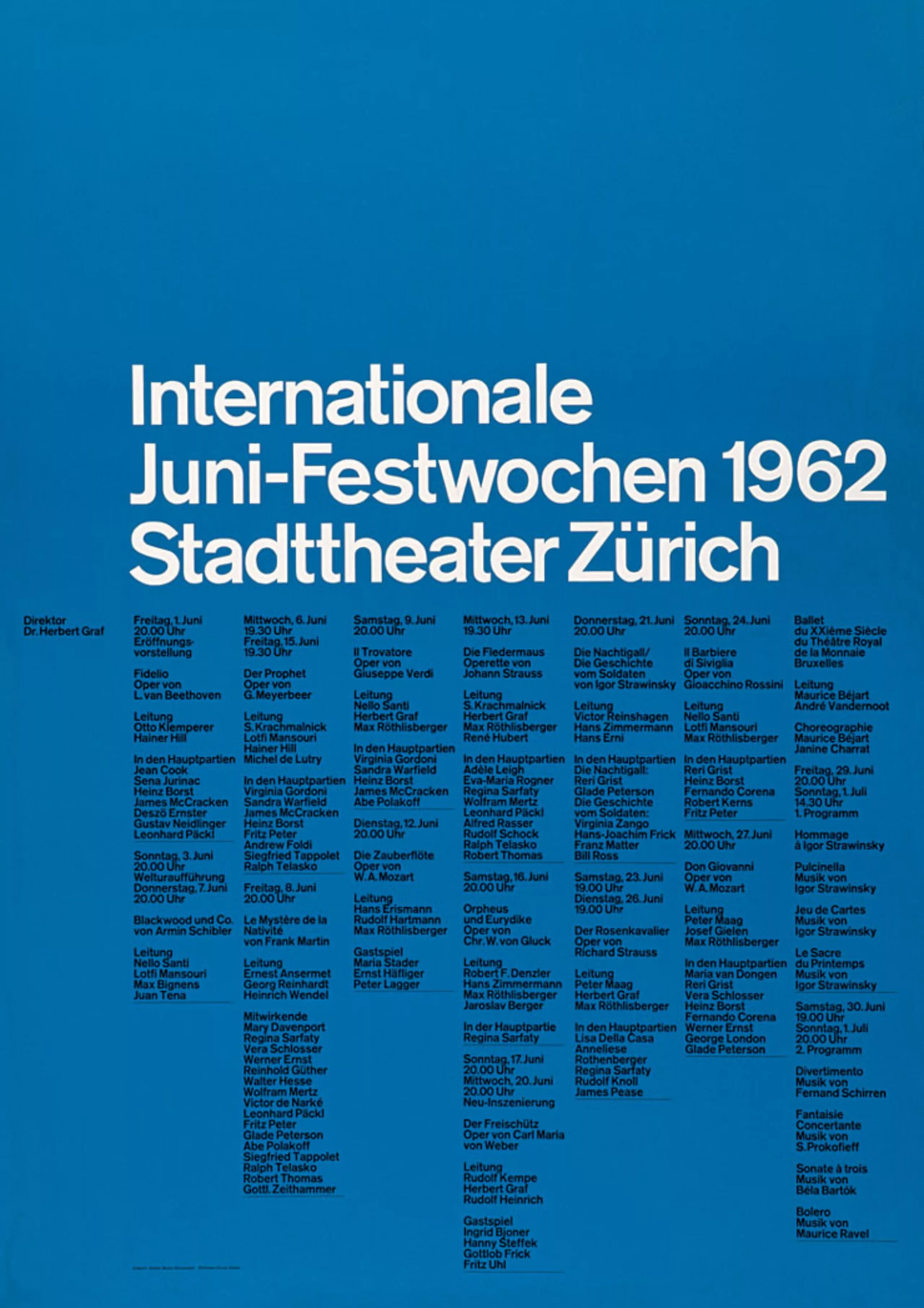
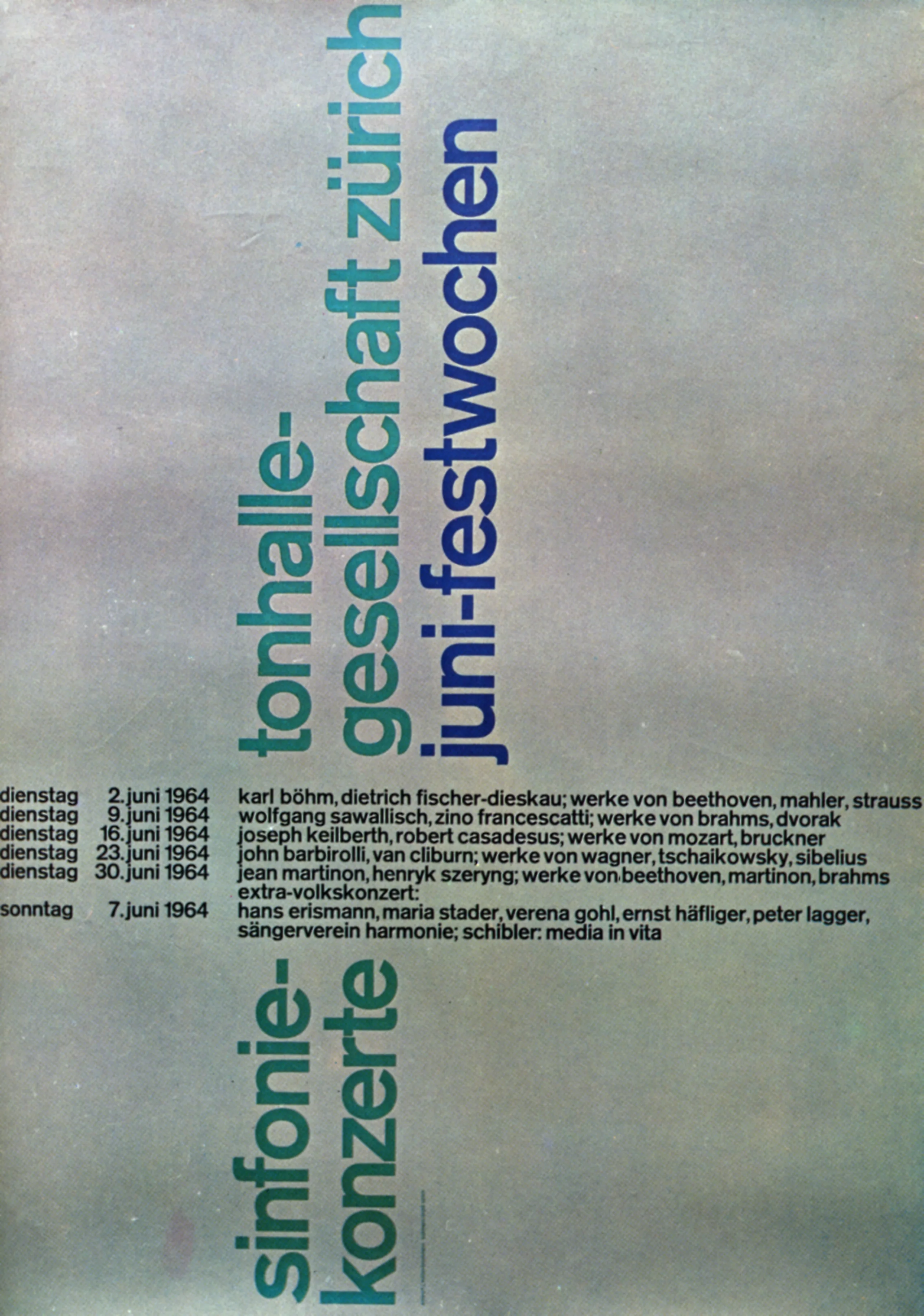
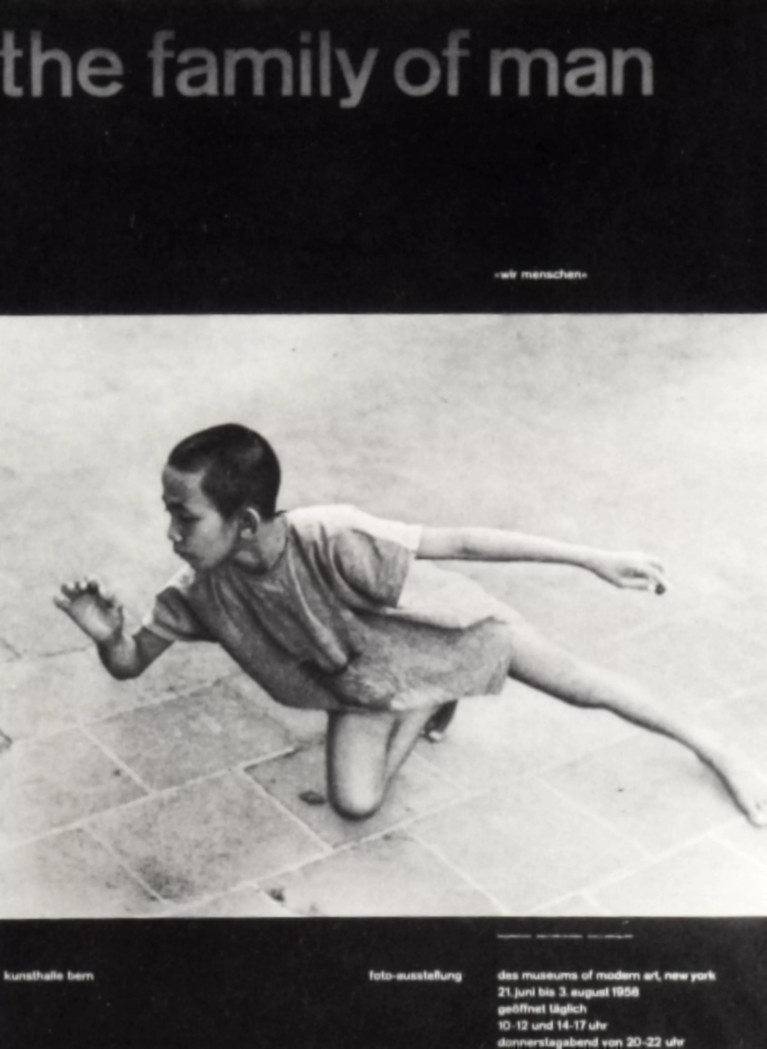
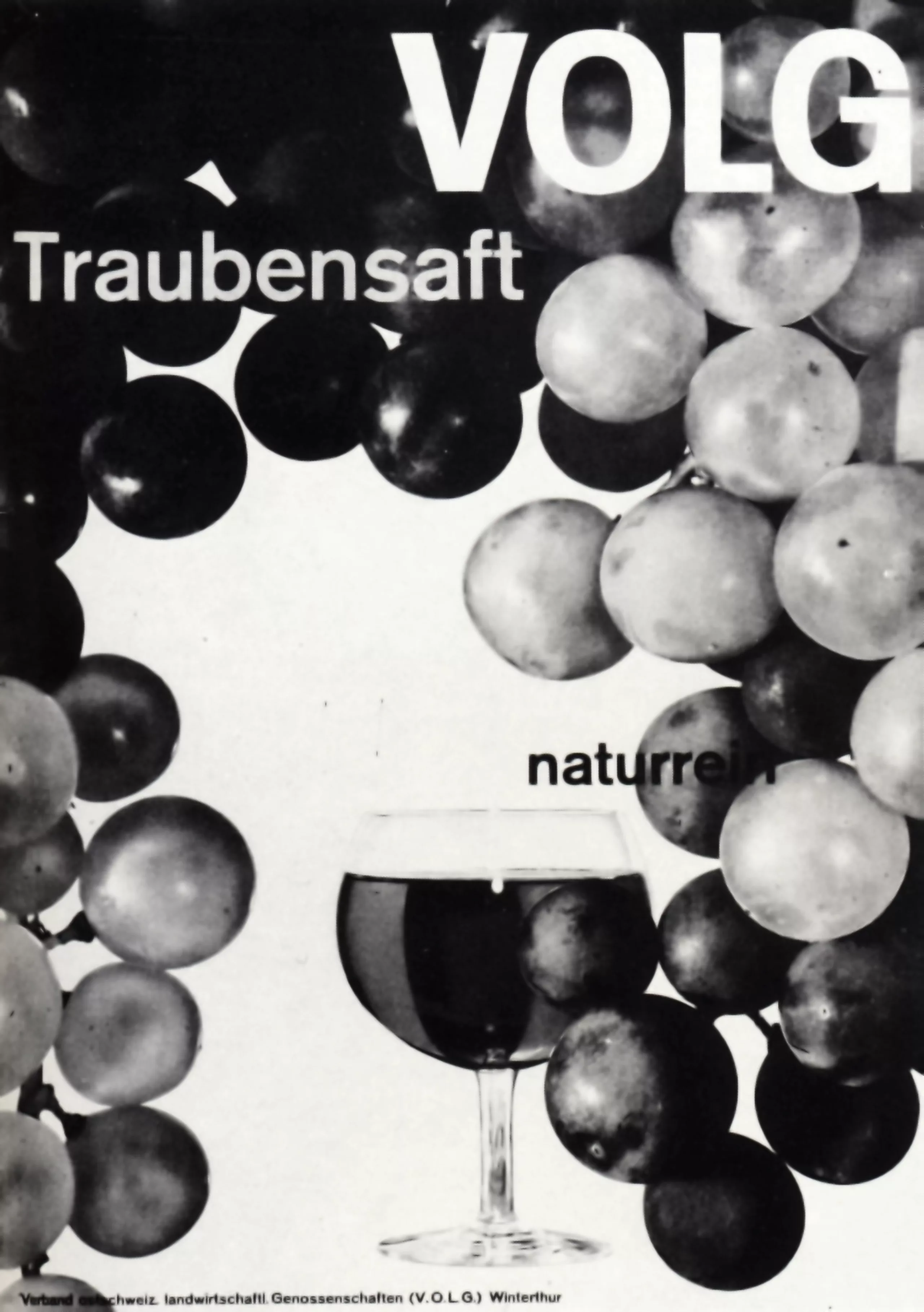
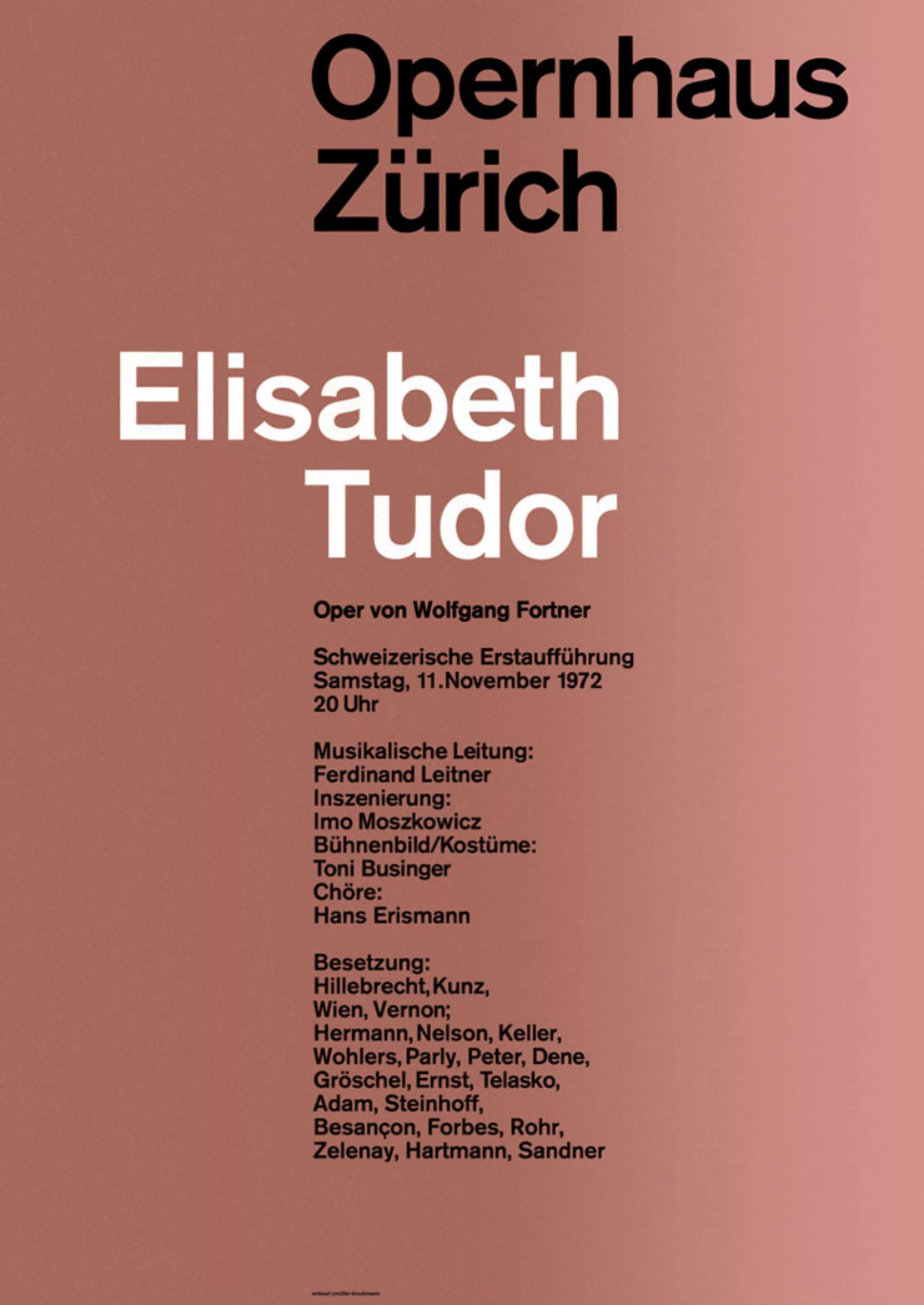
In pictures
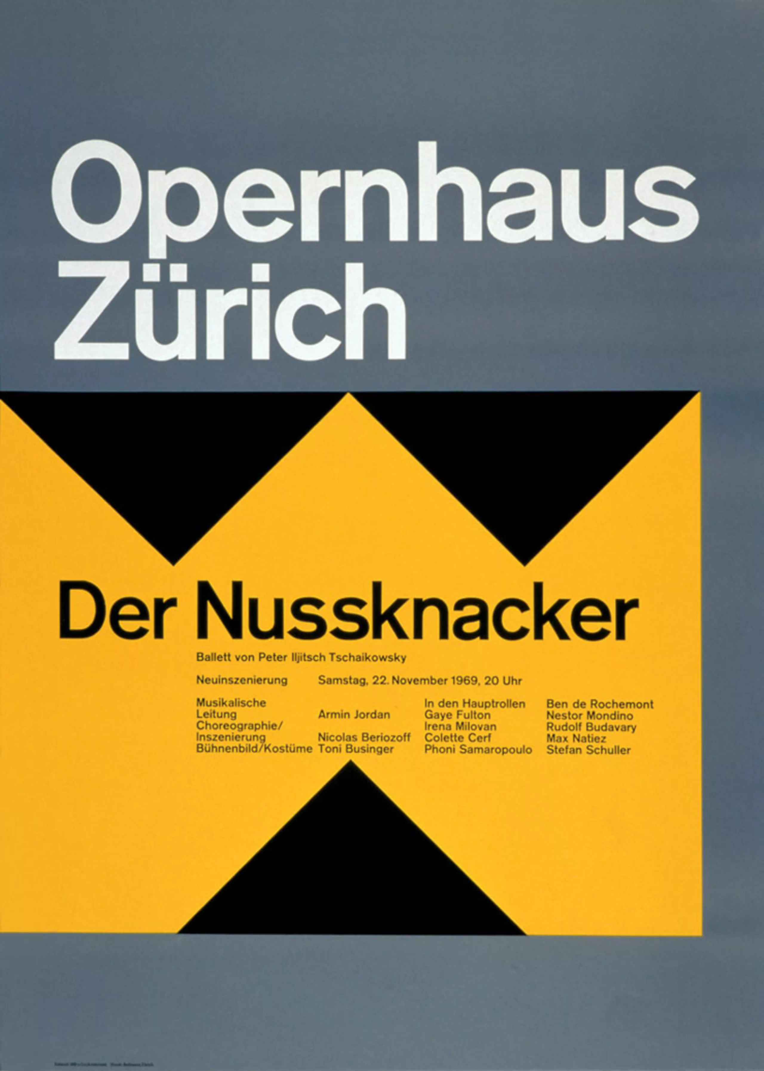
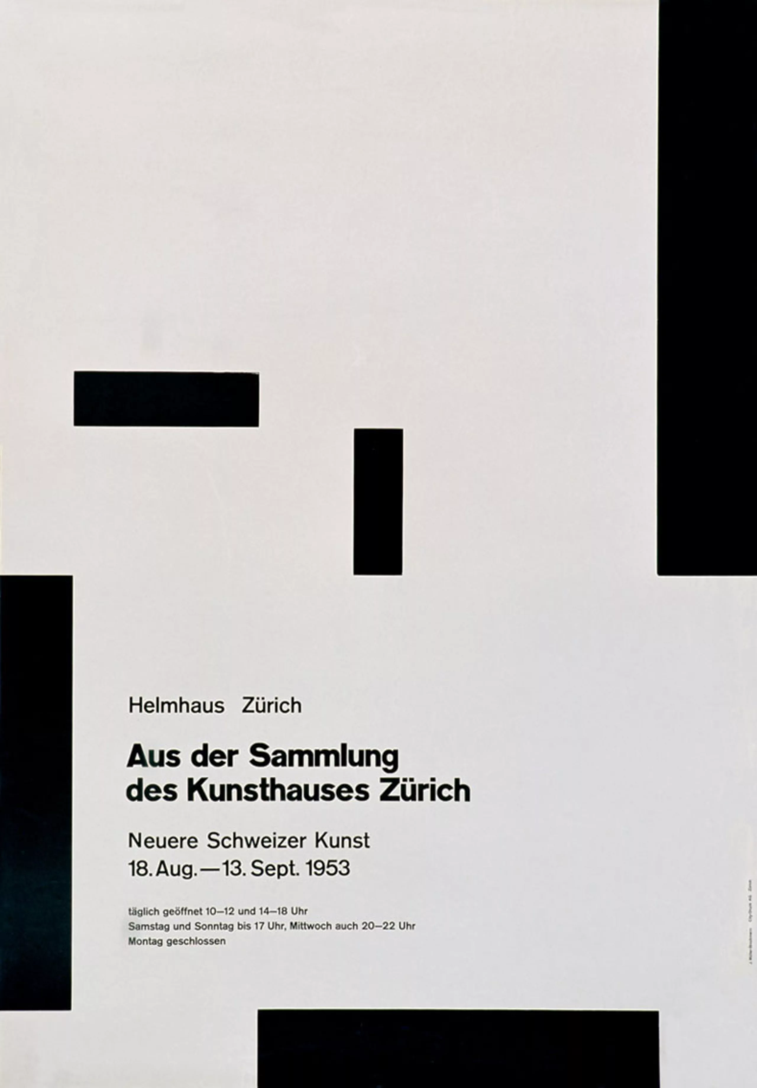
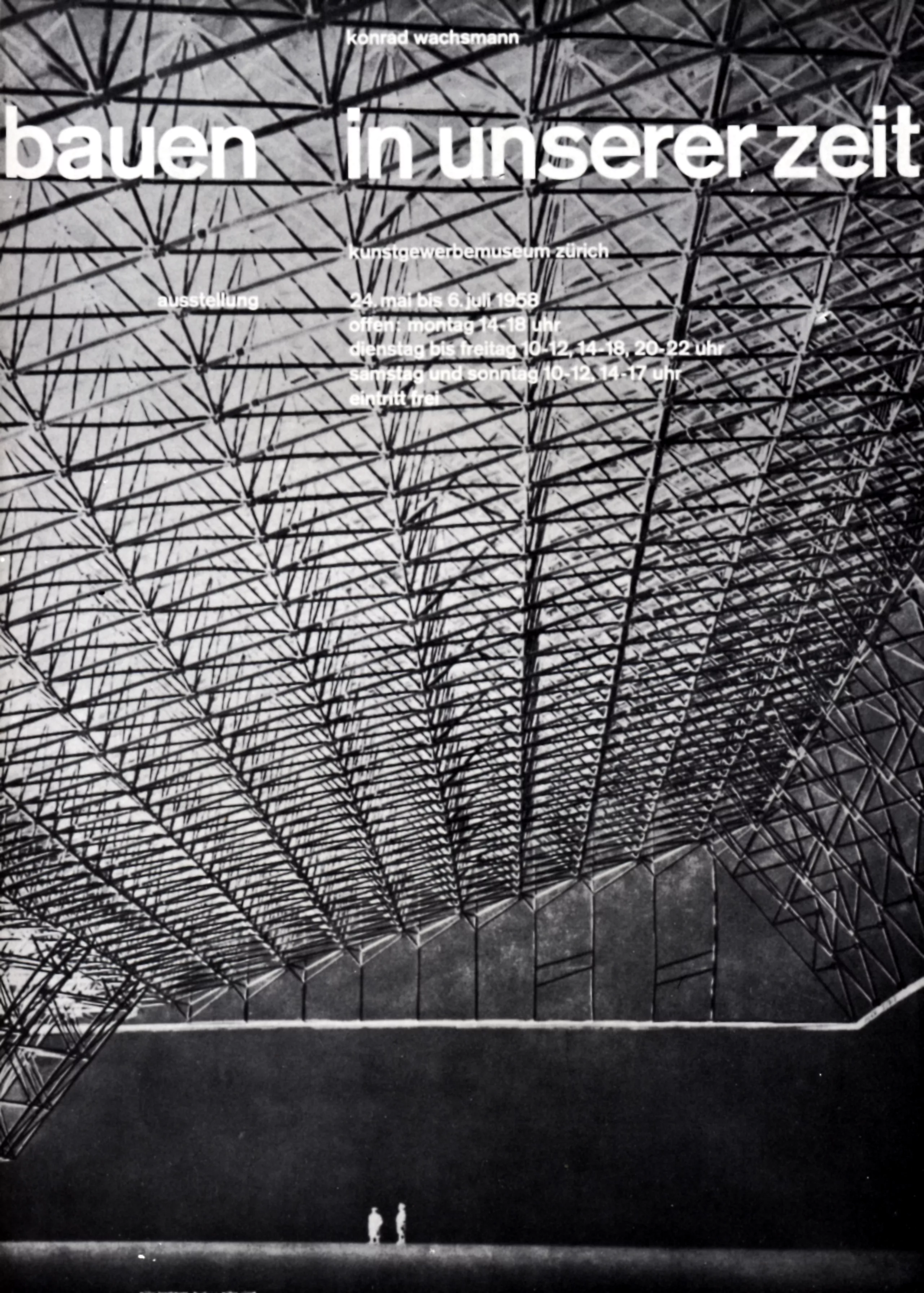
Here is a gallery presenting Müller-Brockmann’s work closer:
Sources
- “Graphic Designers in Europe” 1973
- http://eyemagazine.com/feature/article/reputations-josef-muller-brockmann
- http://www.internationalposter.com/artist-detail.aspx?id=450
- http://www.blanka.co.uk/Design/Muller-Brockmann
- http://guity-novin.blogspot.fr/2011/07/chapter-42-swiss-grade-style-and-dutch.html