
Search Results for: typorama
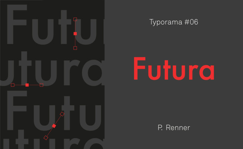
From the Nazis to the moon, Futura is probably the most used typeface in the world, and yet it’s not new!
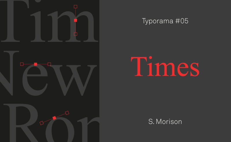
A short history of Times New Roman, the essential typeface designed in 1932 by Stanley Morison for The Times newspaper.
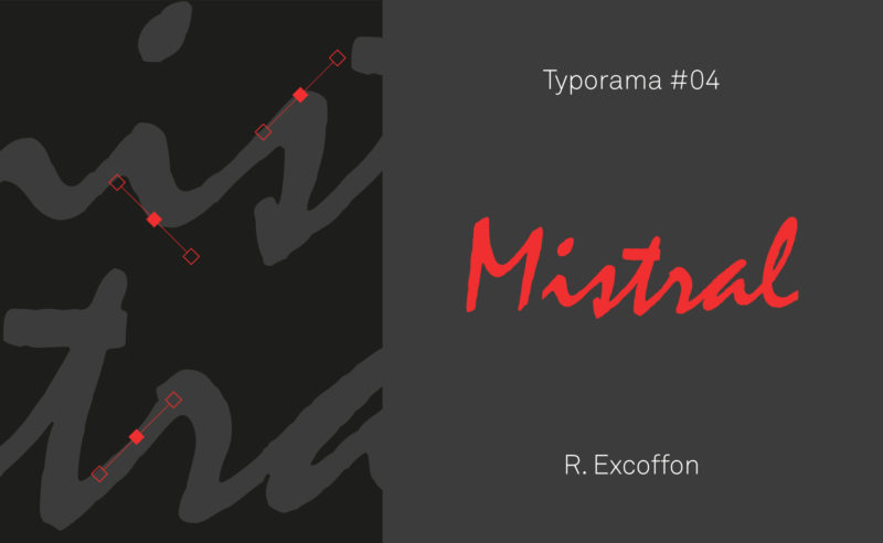
The Mistral ! This typeface which shares its name with a cold wind, but which breathes Provence, is without question the favorite typeface of bakers, butchers, craftsmen… Its name alone is enough to awaken an imaginary world as old-fashioned as it is modern!
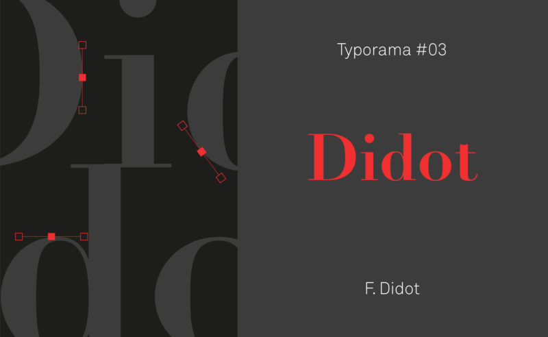
Didot was for a long time the spearhead of French typography. Let’s discover how this bicentennial typeface managed to combine finesse and elegance to cross the centuries, and remain at the forefront of fashion!
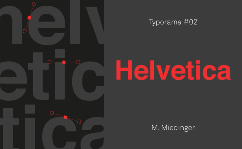
Let’s discover Helvetica, a typeface that can’t be ignored! Its longevity, influence and neutrality mean we love it as much as it annoys us.
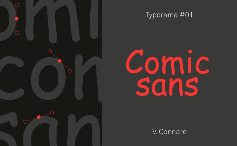
Nothing predicted the Comic Sans MS to become what it is today: a font hated by graphic designers and yet very popular with the general public. Discover its history… and its some qualities.
How to see more clearly in the typographic classification and which tools allow to choose and recognize the typographies?
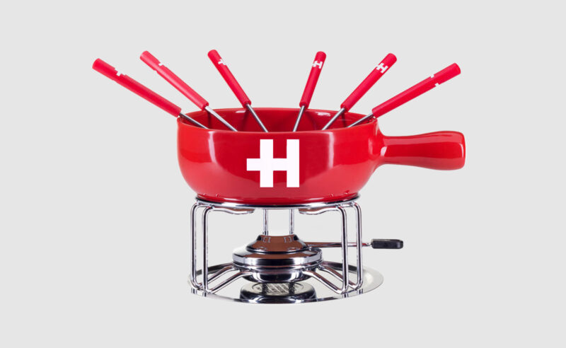
Helvetica, as an icon, has become a brand: you can now drink, wear or even smell Helvetica.
Imagine a silent language, without letters or words, for non-humans. In front of your eyes, the yerkish, a language for communicating with monkeys, takes shape.
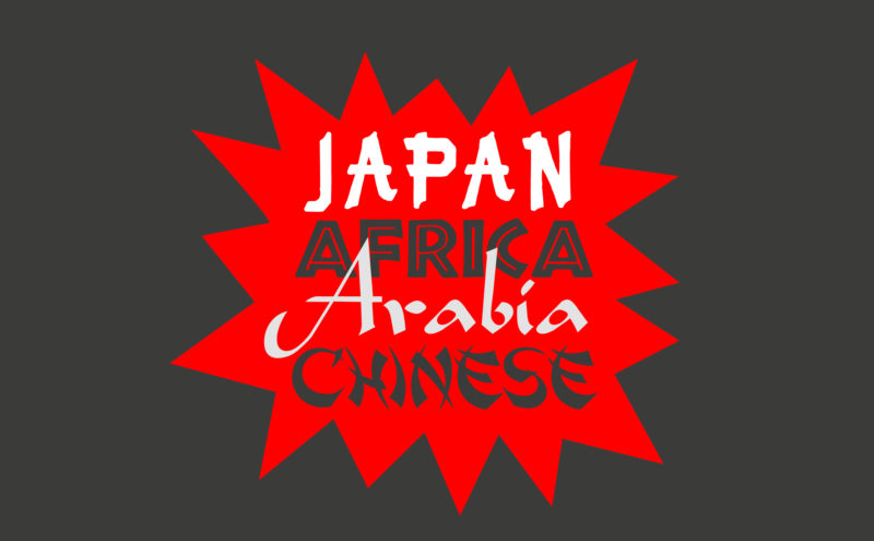
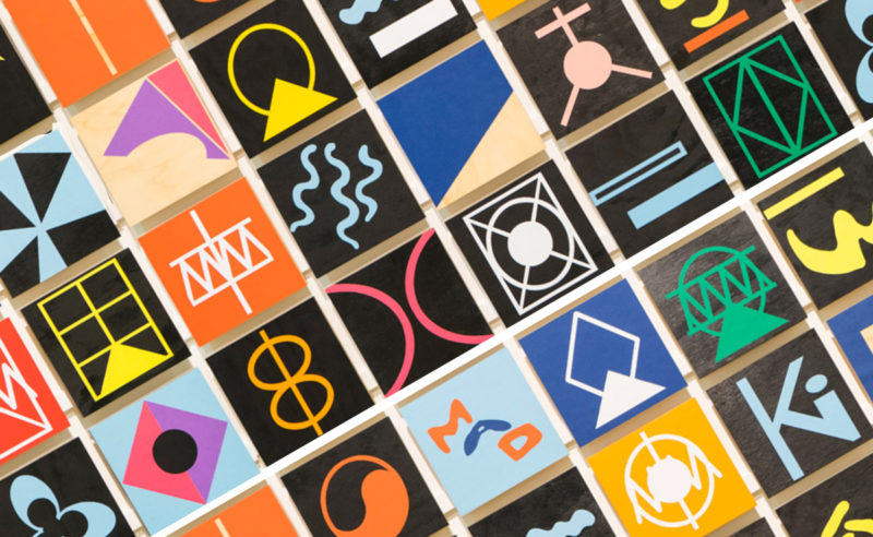
Used mechanically and out of context, certain typographies convey cultural stereotypes. We call them “stereotypographies”.
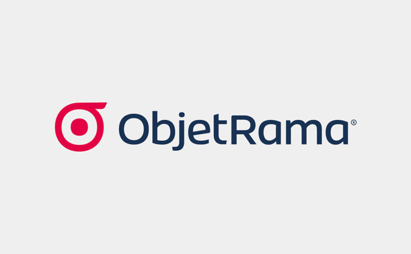
More elegant and timeless, Graphéine moves the brand identity of ObjetRama, the French leader in the distance selling of customized goods, up-market.
 San Serriffe typographic Island
 Design, creativity and oblique strategies!
 Tote bag, a new social totem?
 Sister Corita Kent, the Pop Art nun
 Donald Trump, the martyr who makes history
 Heyraud – Visual identity
 Paris Observatory – Brand design
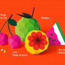 Pérouges Spring Festival 2014 – Poster design
 ABP Publishing – Brand identity
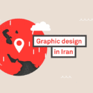 The genius of Iranian graphic design
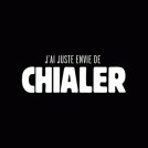 I just want to cry!
 Rolland Garros in the spotlight
 Back to the future for the new Citroën logo