My client is a graphic designer
Clients' feedback!
Our mailboxes are filled with these. We anxiously wait for them. Say hi to clients' feedback!
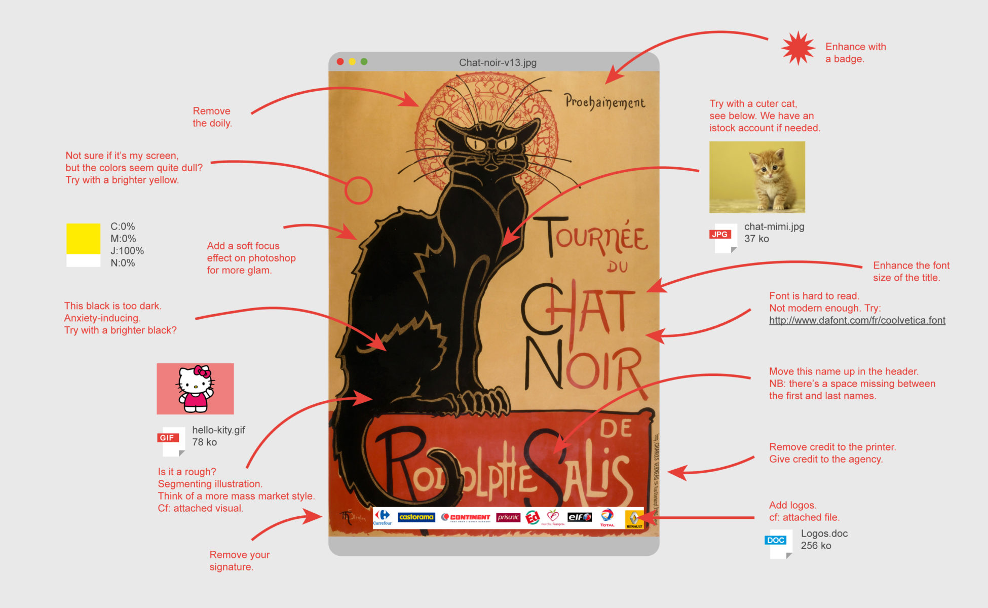
We must admit clients are not always wrong. True, the cat on this poster is anxiety-inducing, let's put a "lol cat" instead.
More seriously; an excess of marketing, consensus, and politically correct were never behind a memorable project.
Based on an initial idea of @MarieJulien we've imagined clients' feedback on other iconic posters. The tone is exacerbated and any resemblance to real and actual feedback is purely coincidental.
Click on the images for HD resolution!
A black kitten?
Tournée du Chat noir (Black Cat on tour) is a poster from Swiss painter Théophile-Alexandre Steinlen painted in 1896 to promote the Parisian cabaret Le Chat noir (the Black Cat), created by Rodolphe Salis in Montmartre. No need to say that this music hall was the most famous of all amongst the bohemian and literari from Paris by the late 19th century.
Rumor has it that in 1881, Rodolphe Salis is visiting a venue in the idea of opening his cabaret. Greeted by a stray cat, that is meowing on top of a street light, he decides to adopt the cat and to turn him into a mascot. Of course the cat was black... and the cabaret's name was all set!
Telling this story we almost forget to talk about the graphic designer behind the poster, Théophile-Alexandre Steinlen. He was an arnachist painter-sculptor-illustrator... and also a cat expert.
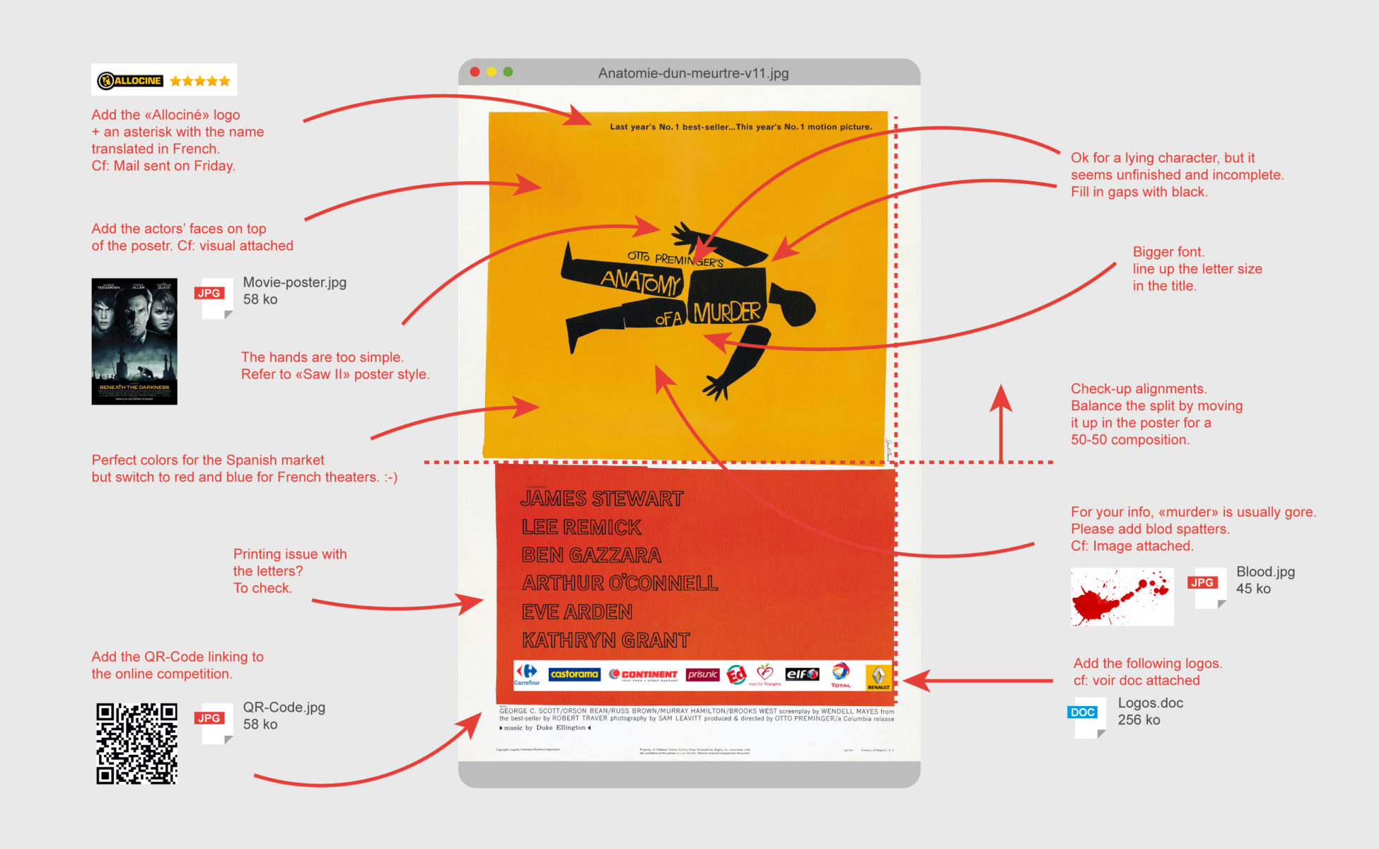
Blood, please!
Saul Bass, american graphic designer (1920-1996) is famous for his work in the film industry. He's collaborated with the best film directors, both creating film credits and film posters. This remind us that we have to write about his work later on the blog. Posters he did at his time were completely revolutionary. Unlike Hollywood trends, where all essential parts of the movie appear on the poster (mainly actors' faces in action), Bass chose to capture and represent the essence of the movie in a minimalistic graphic style.
The poster can be understood right away. Each of his creations are graphic masterpieces.
Unfortunately, 50 years later we regret the poor graphic quality of movie posters. We'll blame it on client feedback.
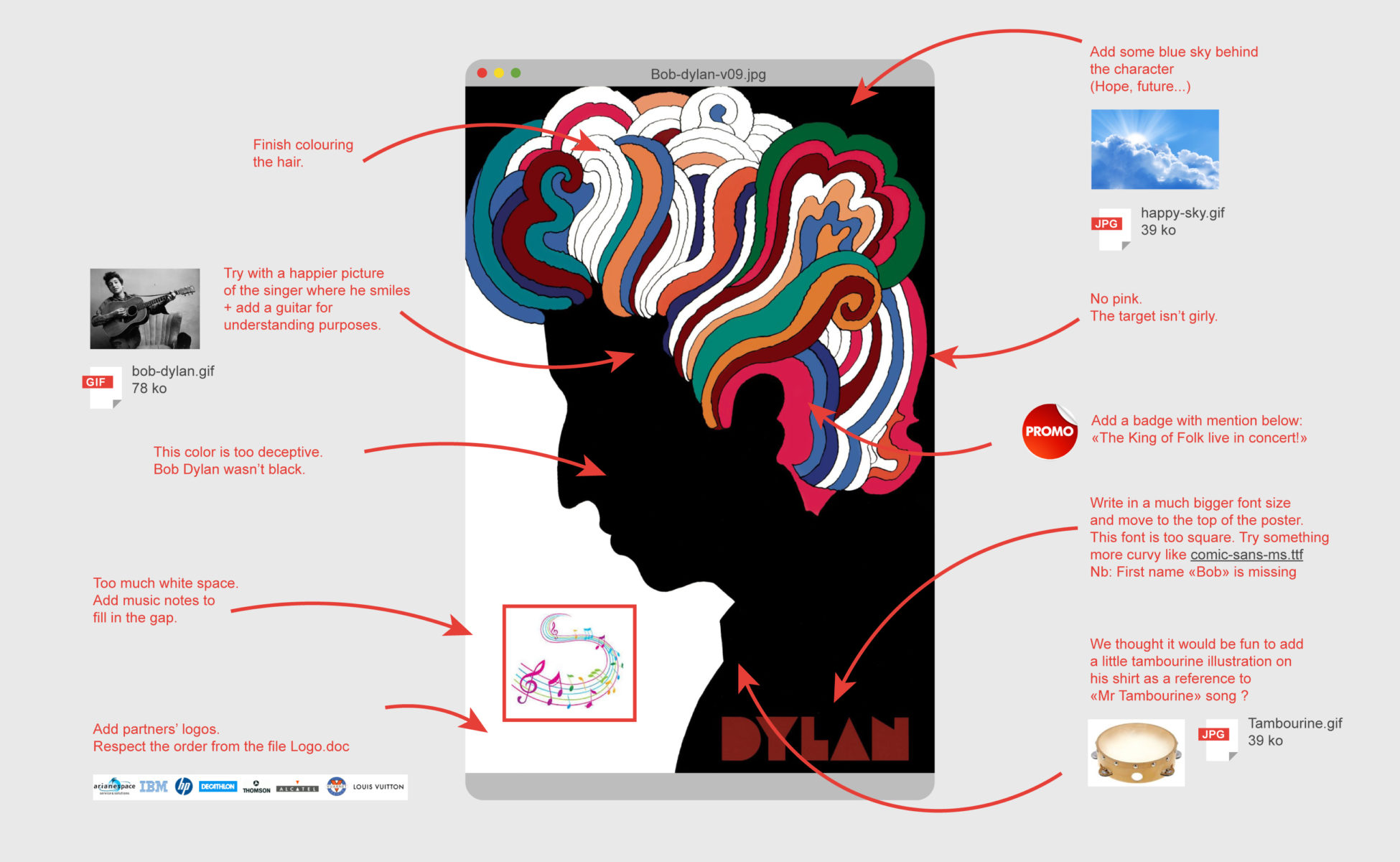
Dylan isn't black!
Originally, this poster was included as a bonus in a CD compiling the best of Dylan's songs. It was back in 1967. Since then, this image and the "I love NY", has entered the graphic design Pantheon. Credit given to Milton Glaser. To make a long story short, Dylan was ending his contract with the record company at that time, so he couldn't care less for Milton. Actually, he didn't even give him feedback at all.
A project without client feedback! What a blast!
On a side note, Milton Glaser took inspiration from a self-portrait from Marcel Duchamp to create this poster.
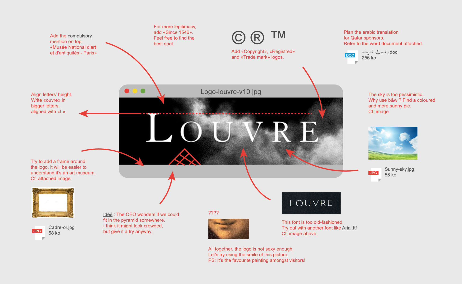
Moody Lisa
For April's fool last year we already had fun with the Louvre logo. Spare the rod and spoil the child. This logo is a cornerstone in graphic design, signed by the Grapus collective. It's a rare example of a logo which highlights nothing about the place itself, but poetically embodies the silver lining fostered by the Louvre, opening our minds on culture.
For the record, and thanks to the client for once, we owe this logo to a client feedback ! During the creation process, Grapus Atelier had designed a logo with a stylized pyramid, in a "Centre Pompidou" style. Hopefully, the megalomany of architect Ieoh Ming Pei made things shift. He didn't stand that someone else could draw his pyramid. He thus prohibited the museum to use it in the logo.
While gaving the logo a second try, Grapus found this bright idea.
Share this post:





 Donald Trump, the martyr who makes history
 A history of mascots
 Y2K trend, the 2000’s style is back
 From surnames to acronyms: creating a brand name from letters
 The smart set of ambigrams, graphic symmetry and word reflections
 Nuits de Fourvière, édition 2024
 Festival ZERO1 – Brand identity
 Louise Michel Social Centre – Visual identity
 City of Nevers – Visuel identity
 Groupe Cheval, comitted land developers – visual identity
 Heliophore, the animated paper
 Évry University open day: reveal your professional future!
 Jacno, “Five capital letters!”
 The smart set of ambigrams, graphic symmetry and word reflections
 Creating a layout grid in Illustrator

This is so on-point that it nearly isn’t funny. And it reminds me why I nearly stopped web design completely (only still doing it to help a good client or maintain a good professional relationship). Great job imitating life!
i m laughing and crying at the same time
Shared on Facebook for a few of my friends who are graphic designers. Nicely done.
What a great way to learn of design! Thank you so much for sharing this.
Honesty is the new funny. Enjoyed read this piece
HAHAHAHA. I can only imagine the life of a graphic designer.
That’s a really nice article……#loove it
Your work is more accurately perfect and point out instances without beating about the bush. That’s a kind needed in a business partnership.
Though it’s like being placed in a jungle as in lost, I sense the sincerity and accuracy in your demonstrations. I didn’t look at the information but the way of handling issues to deal with.
Great article. Art novices like me will just smile and say it can’t be more beautifully written!
Nice piece
Hey, at least they attached what they wanted…. :S
Wish I could show all these comments to a stuck up client who I ultimately had to fire. Imagine that! A FIRST!
Genius
I love the one where they say ‘remove your signature’ that did make me laugh
If anyone needs me, I’ll be the one curled up in the fetal position, in the corner. (This strikes too close to home…shiver.)
stood to applaud!!!!!!!
…and the sad sad reality is that they are “right”
I love the disclaimer. I went looking for it after eyeing the samples. Thanks
Funny article and so right on many levels. A few corrections though to Milton Glasier’s Dylan poster info: CD’s did not exist in 1967 and Dylan did give feedback. He killed the design when first presented. See this article for some additional insight: http://www.printmag.com/illustration/another-side-of-bob-dylan-milton-glaser-and-that-famous-poster/
THIS. IS. REAL.
When you work the UI department for a web company, this happens all the time. We designers had an acronym LDAD (Lay Down And Die), for the bad attitude we’d descend to when we’d been in the job too long, for the moment you found yourself saying, “Fine. You want the corporate sponsor’s logo to be where the main figure’s head is right now only twice as big? You want to change the font to “something friendly like Comic Sans”? Fine.”
This reminds me of the video showing how Microsoft might design the iPod box. https://www.youtube.com/watch?v=EUXnJraKM3k
It’s so true. I need to go cry now..
This has made my day!
Very funny, very clever, and unfortunately – very true to real life in the advertising and design business.
If I had a nickel…
You have captured the essence of client feedback. We need articles like this to know we’re not alone in our struggle to create great commercial design. Well done, great read.
The same’s happening with day by day… Really good job
Very well done, agree! Just a little addon: always and only at the finishing period! If you inquiring about any kinda idea or maybe a complex notion…usually they dont have any.
Oh my fucking god, that is so true..
Génial!
As for me personal: as I write a lot of copy (mostly press releases)… client feedback is often similar if not even more aberrant
Equally true for the web.
Well done.
There must be a behavioural psychology term that explains people’s need to have an opinion about visual communications when they’re in a group.
I would like to subscribe to your email notifications.
Thank you