
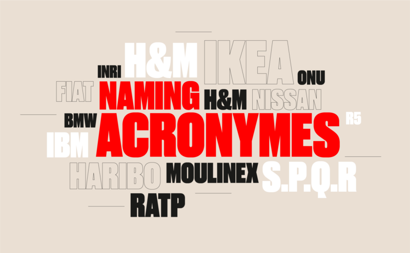
From founders’ surnames to initials and acronyms, brand names have always oscillated between abstraction and familiarity.
After 10 years of existence, le Slip français washes its image and puts on a new logo. Simple, basic, more inclusive, but is it enough?
Total has changed its name, with a new logo and a new identity: TotalEnergies. Is this a faded strategy to go green without denying its past?
Peugeot reveals its new logo, a revival of the 1960 logo.
An astonishing or worrying positioning? Here are a few insights.
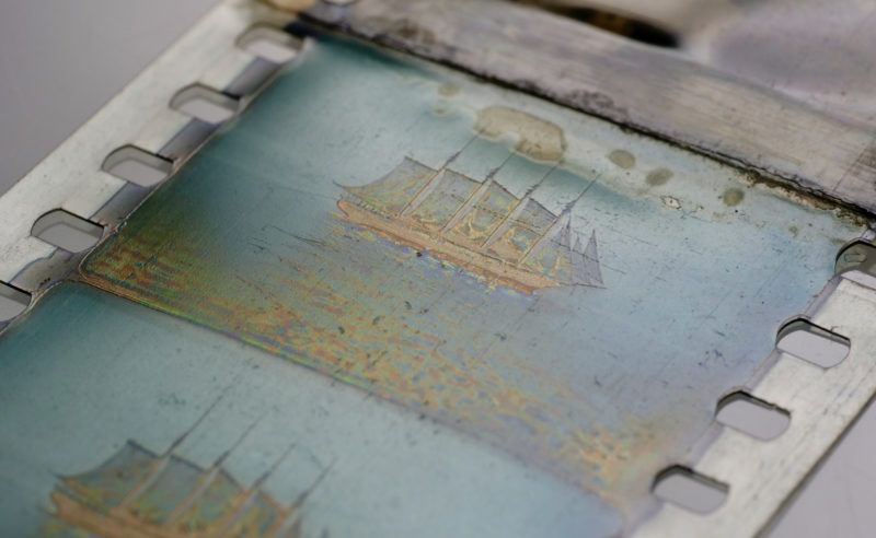
A furtive glimpse of some of the techniques used in the early days of colour photography, from the Lumière brothers to Louis Dufay, the forgotten inventor.
If Louis Dufay’s name has fallen into oblivion, one of his inventions will be remembered: the heliophore, the kinetic paper that shone in the 60s.
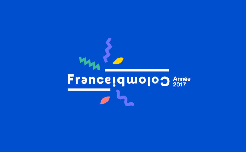
Visual identity project for the 2017 Franco-Colombian cultural season.
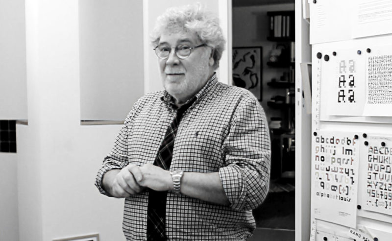
Every day, millions of french people see Étienne Robial’s work. In this article we decode, in plain language, a long career in graphic design, from Canal+ to Inrockuptibles.
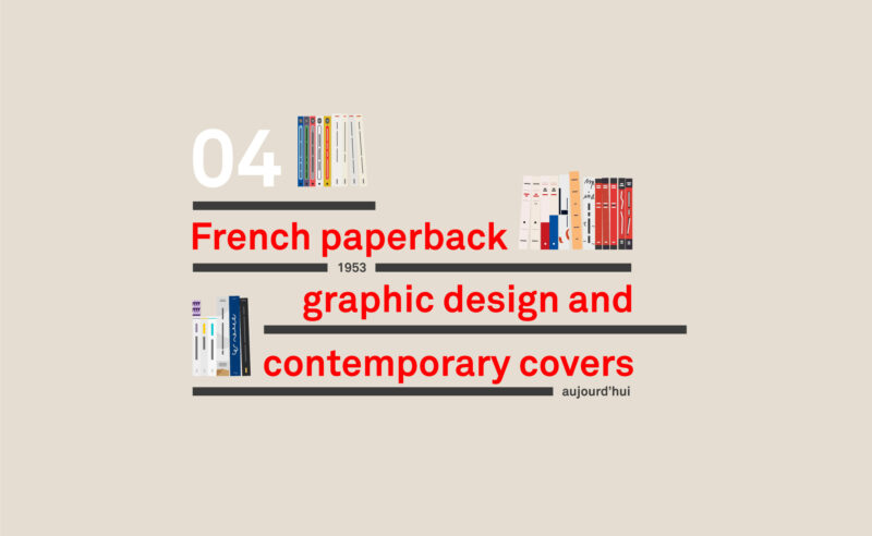
Last chapter on french publishing houses, the split between Poche and Folio, the graphic inventors, and the return of the beautiful independent book.
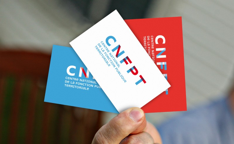
This proposal is based on the notion of territories. The mesh of frames, their intersection and superimposition are intended to reflect the density and diversity of this landscape: communes, communities of agglomerations, départements, regions, men, women…
It reflects the idea of the network created by the CNFPT through its twenty-nine regional delegations and their departmental branches, its four schools and its higher training institute.
These intersecting lines also echo the links that CNFPT creates between local authorities and their employees.
 San Serriffe typographic Island
 Design, creativity and oblique strategies!
 Tote bag, a new social totem?
 Sister Corita Kent, the Pop Art nun
 Donald Trump, the martyr who makes history
 BTP Consultants – Visual identity and brand architecture
 AZA Architecture Paris – Visual identity
 Chaumont festival goes bazooka
 Dick Bruna, minimalist graphic designer and father of the most famous rabbit on the planet
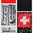 Happy Helvetica to you!
 Visual identity project for Sup de com
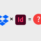 Dropbox and Indesign: the end of broken links!