

Both a visual or life discipline, minimalism has become a questionable trend and consists in simplifying to keep only the essential.
We are entering the “time of the tribes”. Let’s discover the impact of this post-modernity for the logos and visual identities of brands and companies.
What is a cult and timeless logo? We take advantage of an invitation to decipher the Algeco logo to look at the case of “iconic” logos.
At the beginning of January, the city and the department of Paris merged, the opportunity for the capital city to review its visual identity.
Here is the analysis of this logo made by Carré Noir.
Discover what we had imagined for the visual identity of the City of Paris.
The symbol of the Nave was redesigned and inserted directly inside the word Paris.
The Duperré School changes its visual identity.
A project designed by L’atelier Ouf ! and the Production Type foundry.
Bye bye red square from the Cité des sciences, glory to you for having rendered service to science and the graphic nation.
Welcome to serious business…
Hungary and the Heineken beer brand are at loggerheads.
The Hungarian parliament wants to pass a law banning the commercial use of the red star.
A law aimed directly at Heineken…
New visual identity for the Gaîté Lyrique, a nice logo to start 2017.
Yorgo Tloupas, our hexagonal madmen has struck again!
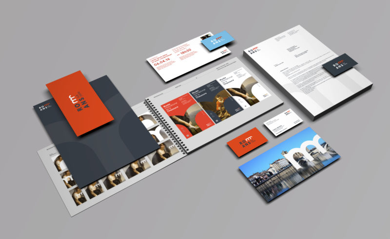
New visual identity of the City of Romans-sur-Isère. Romanesque art and ravioles on the menu.
We tell you how the logo for the Rio 2016 Olympic Games came about, and more importantly, how to make a logo by walking on water…
The CPU has chosen to make its three letters the heart of its new visual identity. The design and composition of these letters are intended to create an impacting symbol and adapted to today’s communication tools.
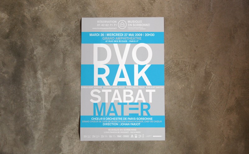
Visual identity for the University of Paris Sorbonne choir and orchestra
 San Serriffe typographic Island
 Design, creativity and oblique strategies!
 Tote bag, a new social totem?
 Sister Corita Kent, the Pop Art nun
 Donald Trump, the martyr who makes history
 Spring Festival of Pérouges 2017 – Poster design
 Groupe iliad – Visual identity
 Pépite Écrin – Communication campaign
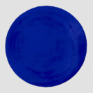 Black and blue: registered and exclusive colors?
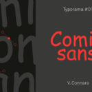 Typorama #01 : The Comic Sans MS
 Happy and creepy Halloween ! A Cassandre tribute…
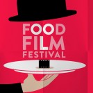 Food Film Festival poster… Cinema and gastronomy !
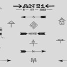 Hobo signs, the secret language of America’s wanderers