
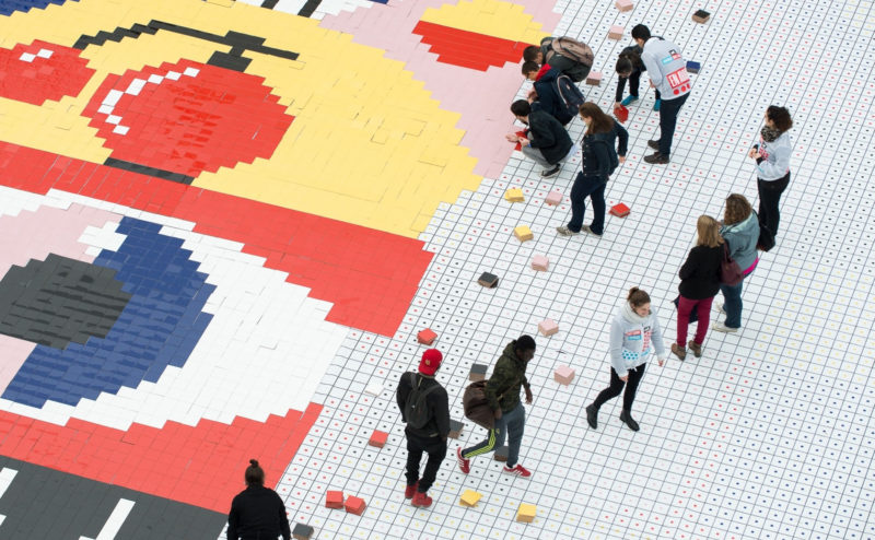
Discover 3 commercial entertainment operations that goes off the beaten track!
A floating garden, a giant participatory fresco or a giant ball pool!
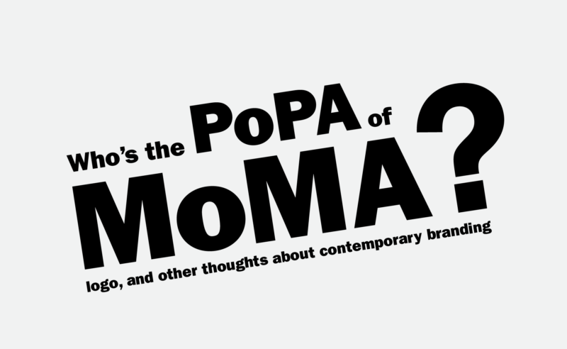
Le MoMa est un musée incontournable et son logotype est devenu une référence de l’identité visuelle et du branding culturel. Découvrez la personne à l’origine de cette création graphique qui réconcilie génie et simplicité.
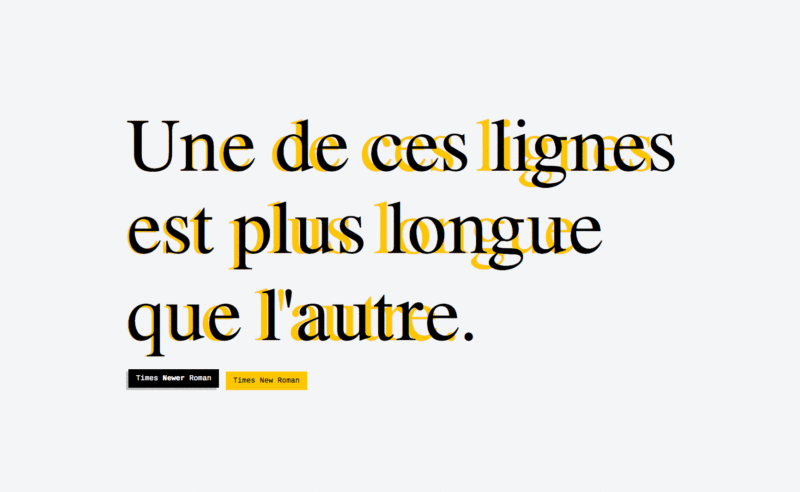
Times Newer Roman is 10% more bulky than its Times New Roman equivalent!
A typeface for cheating!
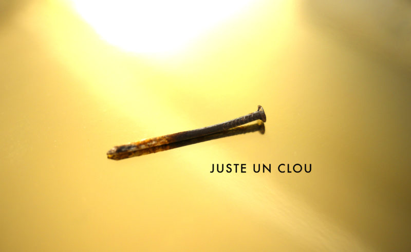
No mercy for Juste un Clou, the luxury bracelet that makes our skin crawl. From the 70s to today, a look at the evolution of the world of luxury.
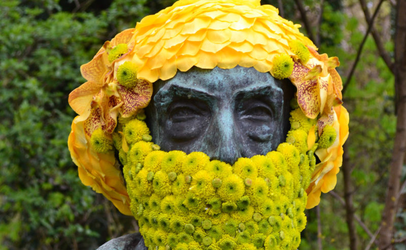
Get out and create in and with nature, that’s what land artists do. Here’s a brief overview of land art, to get some fresh air.
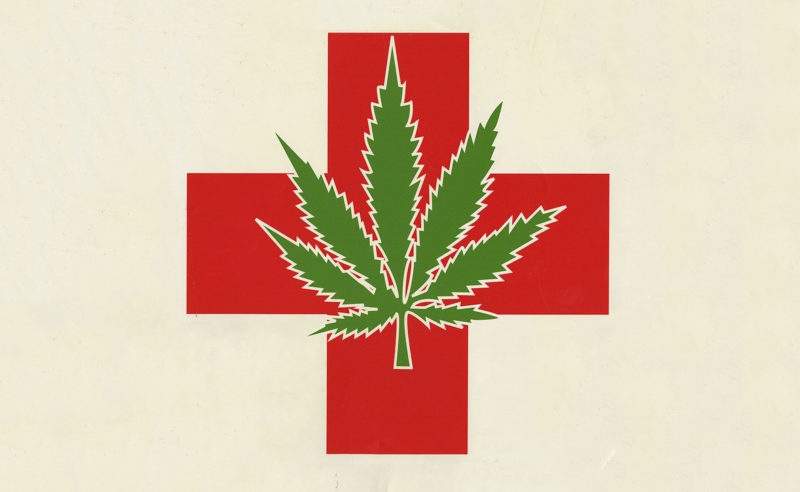
With the superpowers found in this medicinal plant, cannabis is gradually freeing itself from the codes of the high kingdom. History and analysis.
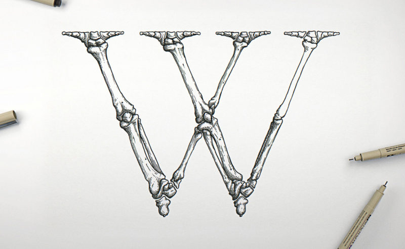
Passionate about typography and anatomy, Swedish artist Björn Johansson has dissected Garamond typefaces to create a bony alphabet. From Tory to Vitruvius, letters take shape.
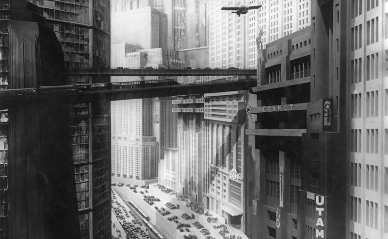
Robida, Verne, Schuiten… Here is an overview of the representations of writers, draughtsmen, scriptwriters and architects who have contributed to dreaming of the city of the future in a utopian impulse, or to underline its limits.
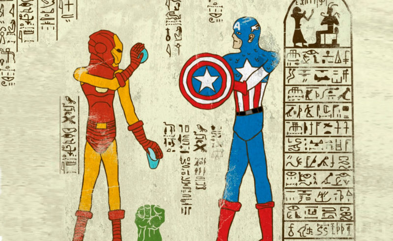
The graphic designer and illustrator Josh Ln had fun imagining “super-hiéroglyphs”.
Totally influenced by geek culture, he offers us a uchronic and eccentric reinterpretation of Egyptian history.
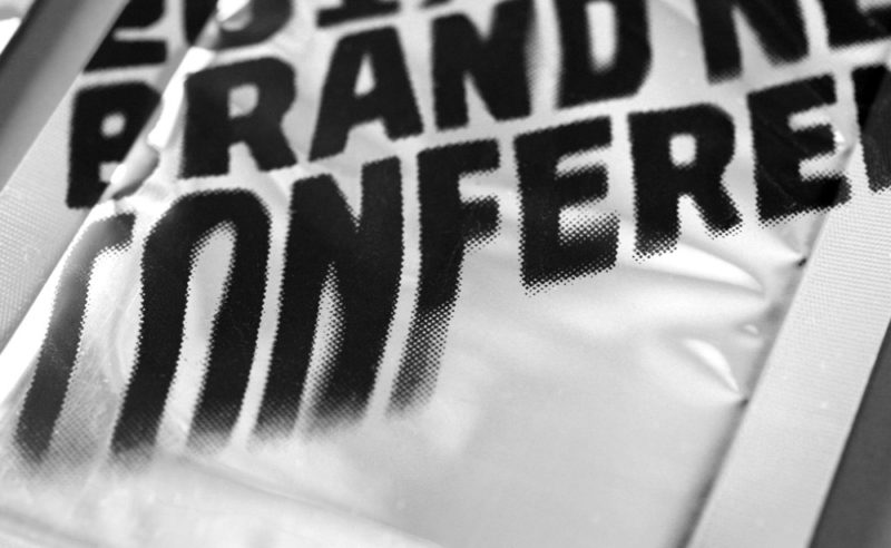
The Brand New Conference is an annual 2-day event that brings together the crème de la crème of influential graphic designers and during which brand identity and logos are discussed. An American-style must-have led by a couple of designers who create a new identity for each edition.

It’s an article about advertising screens, attention-grabbing ecology, JC Decaux, cheap stares… and above all these “Local Advertising Regulations” that are being voted on just about everywhere in France, and against which each of us can take action !
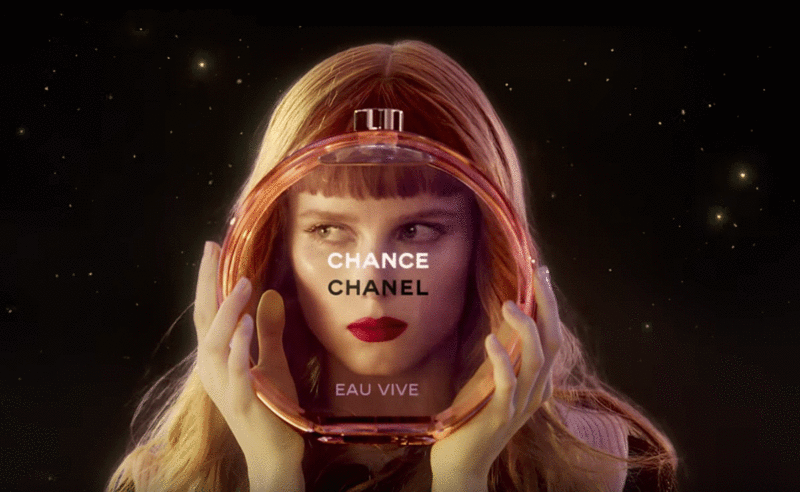
Advertising sometimes offers us UFOs that seem to escape simple marketing specifications to project us towards an unexpected elsewhere. Here’s an analysis of the symbolic mystery of Chanel’s latest Chance perfume ad, directed by Jean-Paul Goude in 2016.
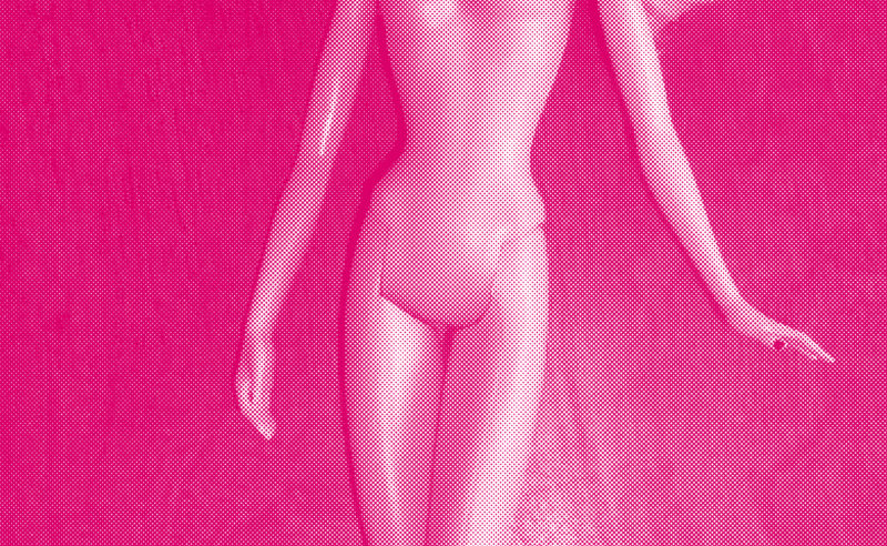
De l’art imberbe à Freud, en passant par les règles bleues des publicités, le sexe féminin fait honte, surtout parce que l’on l’a tant caché. Le voici qui sort enfin de l’ombre et brise peu à peu les tabous.
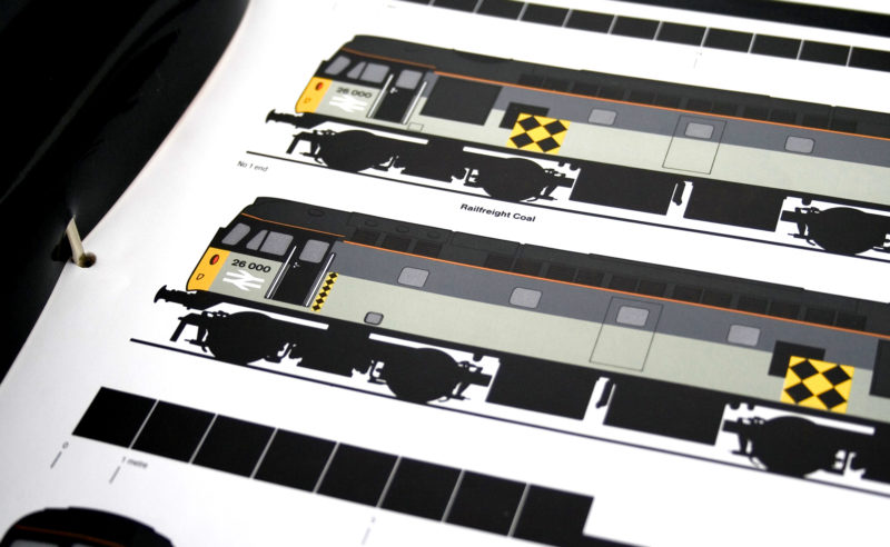
With their modern, minimalist and lively identity, Railfreight’s rail freight badges will leave their mark on the British transport landscape for a long time to come. So much so, in fact, that they have become designers’ favorite trains!
For over 20 years, Gordon Young has been working on the border between art, graphic design and typography. To his credit, he has created dozens of art installations in public spaces, a forest of typographic trees, a wall of wishes in a school and this incredible Comedy Carpet in Blackpool!
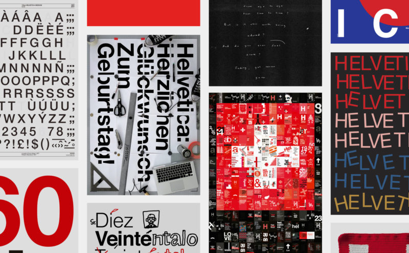
Happy birthday Helvetica! The spanish studio Husmee has invited a selection of international studios to create a tribute poster to celebrate the 60 years of the creation of the famous typography.
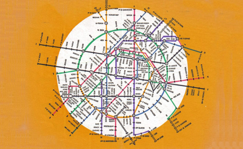
A concentrate of the evolution of the Paris metro map and beyond, in which we also talk about spaghetti, beer and futuristic cities.
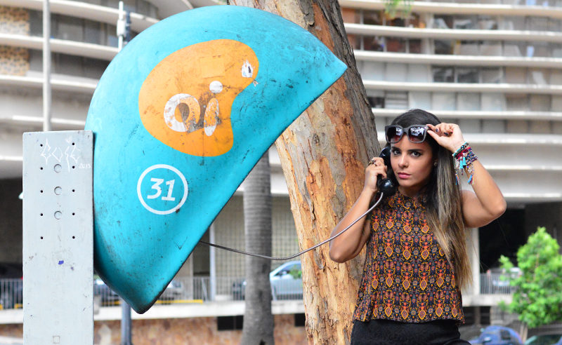
Let’s fly to Brazil to meet a local star. It’s neither the Cristo Redentor, nor Gilberto Gil, Pelé or even Giselle Bündchen. We will talk about curves though, but introduce you to the famous orelhões, the Brazilian phone booth of Oi -the local phone company.
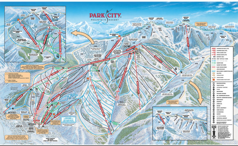
Un métier rare comme le yéti : dessinateur de pistes de ski.
Sans le savoir, vous avez très probablement déjà vu des oeuvres de Novat.
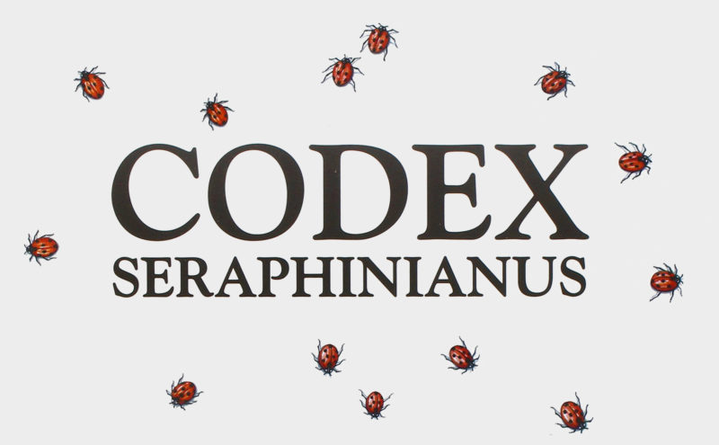
The Codex Seraphinianus is considered by some as the strangest book ever published. A unique, beautiful, confusing… and above all indescribable art book!
 San Serriffe typographic Island
 Design, creativity and oblique strategies!
 Tote bag, a new social totem?
 Sister Corita Kent, the Pop Art nun
 Donald Trump, the martyr who makes history
 Villefontaine Design School – Brand identity
 La Poule Noire Brewery – Brand design
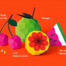 Pérouges Spring Festival 2014 – Poster design
 Bourg-en-Bresse National Theatre – Communication
 Happy and creepy Halloween ! A Cassandre tribute…
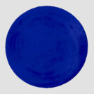 Black and blue: registered and exclusive colors?
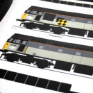 Railfreight visual identity (1987)