
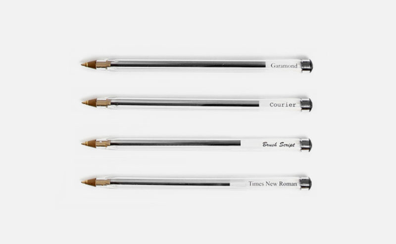
Ecology and typography : Garamond typography, the 14-year-old prodigy and $136 million in savings ! Why this equation isn’t entirely true !
The story of the Nasa logo. How the meatball beat the worm ! A unique opportunity to delve into the history of this famous visual identity.
After eight eventful seasons, the Dexter series has just come to an end. (You can continue reading this article without fear, it’s guaranteed spoiler-free!) It’s hard to come back down after being inside the head of a serial killer for so long. Will you miss it? I’m not so sure.
Ah the pleasure of rummaging through a crate full of Legos in search of the right brick and the right color – a real Proust’s Madeleine !
As you probably know, graphic designers are big kids, and they love to play this timeless construction game. The return in force of a certain “minimalist wave” mingled with regressive geek culture has given rise in recent years to a sudden appearance of creation and various reinterpretations of popular icons based on lego.
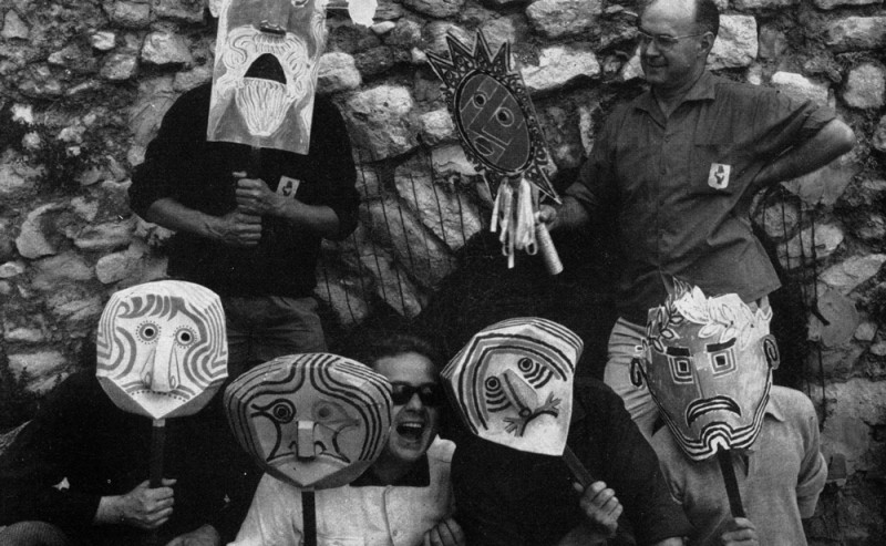
Les Rencontres de Lure. For 61 years, strange wackos have been meeting every summer in “Lurs-en-Provence” to redo the typography in particular and the world in general. In a climate of camaraderie, under the Provençal sun, perched on a rock, all the faces of typography are discussed.
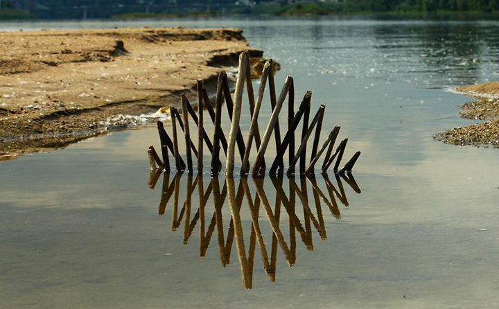
Land Art, artistic installations, sculptures and photographs. Ludovic Fesson’s art invades the banks of the Loire.
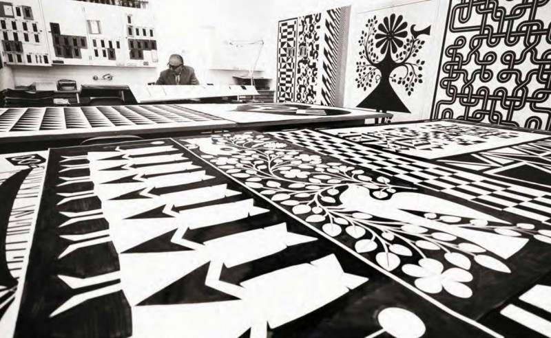
Textile designer, graphic designer, furniture designer… nothing is colorful enough for this Italian-American!

Flat design versus Skeumorphism, a brief analysis of the latest trends in web design and communication. Google, Apple and Microsoft, 3 case studies under the microscope!
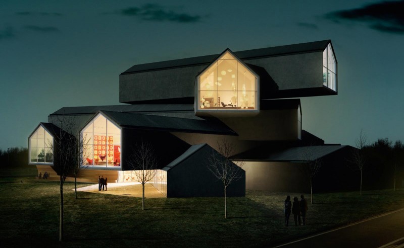
Visit of the Vitra Design museum near Basel. A delight of architecture, Pop Art, design furniture… and also graphics!
In 1980, Daniel Lelong, director of the gallery of the same name, suggested to the French Tennis Federation that they entrust the design of the poster to a great name in contemporary art. Valeria Adami signed the 1980 poster. Today, David Nash has signed the 34th poster in this collaboration.
A brief review of the Saint-Étienne Design Biennial. Of course, it’s difficult to give you an exhaustive account of this event, which brings together several hundred exhibitions all around Saint-Étienne, let alone when visiting it with two little girls aged 3 and 5! In this context, I can already announce the 2013 design prize awarded by them : the Barbie-Foot !
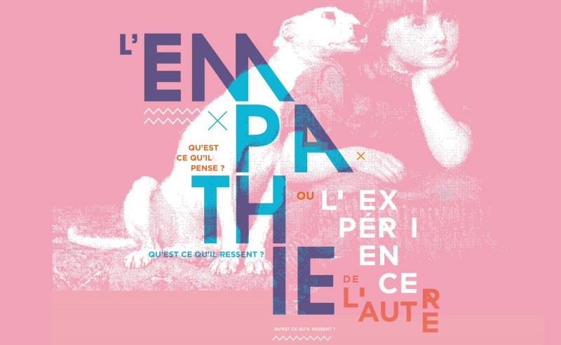
Design and empathy, a reflection that brings together all areas of society. Whether it’s putting ourselves in the user’s shoes to understand and anticipate their needs, or enabling and supporting new forms of social bonding, empathy has been at the heart of the design discipline since its origins.
Müller-Brockmann is one of the most influential graphic designers in the history. His work is always taught, studied and published. It is certainly the figurehead of Swiss graphic design (which also takes the name of international style). His work is influenced by Bauhaus and constructivism. Typography and geometry are predominant.
A short history of the word Branding.
Brander, brandir, branler… when etymology sheds light on the meaning of words!
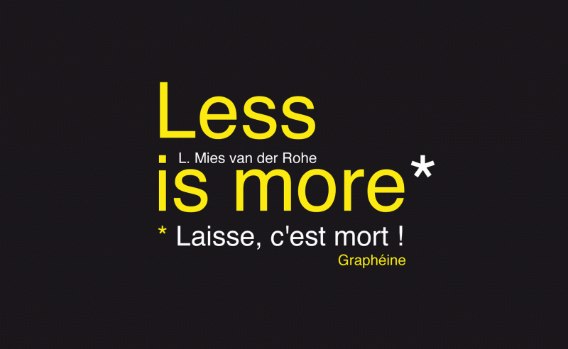
Less is more, or “laisse, c’est mort” ?
In graphic design, as in architecture, we’ve been oscillating for centuries between two paths… minimalism or baroque… simplicity or visual overload.
Fortunately, as I turned down an alleyway, I came across the “Istanbul Design Center”. It’s a school of applied art, a venue for exhibitions, workshops and conferences, a publishing house… in short, just what I was looking for!
A few posters have piqued my curiosity!
Unfortunately, I had to drop in outside opening hours… not a single student, just a calligraphy teacher who suggested I drop in again the following week… sniff… So it’s back in France that I find out more about this place and discover an amazing communication made by the founder of this place: Faruk Akın ( with a “ı” without a dot ! like in our Graphéıne logo! :-) )
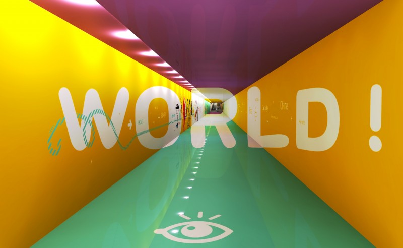
Here’s the project (not selected… sniff…) we presented during the consultation for the “Design of a communication territory for Terminal 3” at Lyon St-Exupéry airport. In anticipation of the boom in low-cost traffic, Lyon airport is extending the infrastructure of Terminal 3. As part of this project, a new building will be constructed. Located on the runways, it will be joined by an aerial and then an underground gallery. One of the challenges of this call for tender was to design the connecting gallery. The aim was to create a pleasant, reassuring and entertaining space, while reducing the perceived length of the route (250 meters).
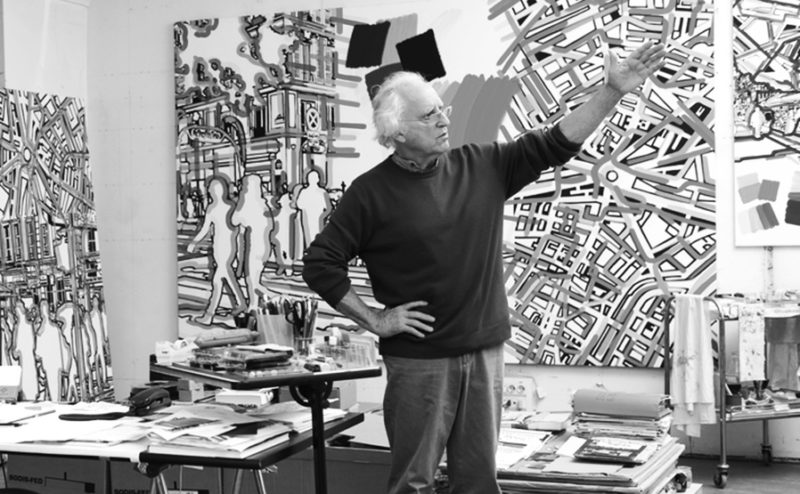
Gérard Fromanger’s name conjures up a series of motifs, figures and events that trace the history of post-war France. An essential artist of narrative figuration.
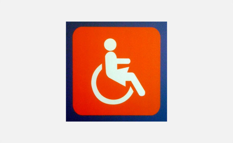
The disabled pictogram was born in the 60s in the context of the international disability rights movement.
It represents a fight for the widest possible accessibility to places and buildings. Today, it’s feminized… for a new fight!
 San Serriffe typographic Island
 Design, creativity and oblique strategies!
 Tote bag, a new social totem?
 Sister Corita Kent, the Pop Art nun
 Donald Trump, the martyr who makes history
 City of Olivet – Visual identity
 LIBELLA – Visual identity
 Pépite Écrin – Communication campaign
 Sanctuary – Identité visuelle
 Colorful #2022
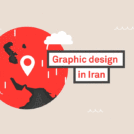 The genius of Iranian graphic design
 The Great Cassandre 1901/1968
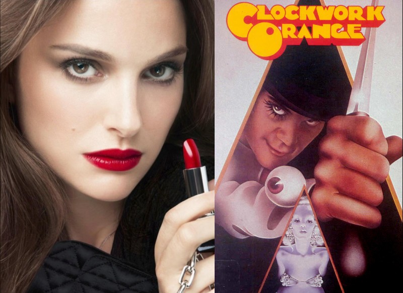
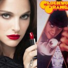 Natalie Portman, serial killer for Dior Rouge