
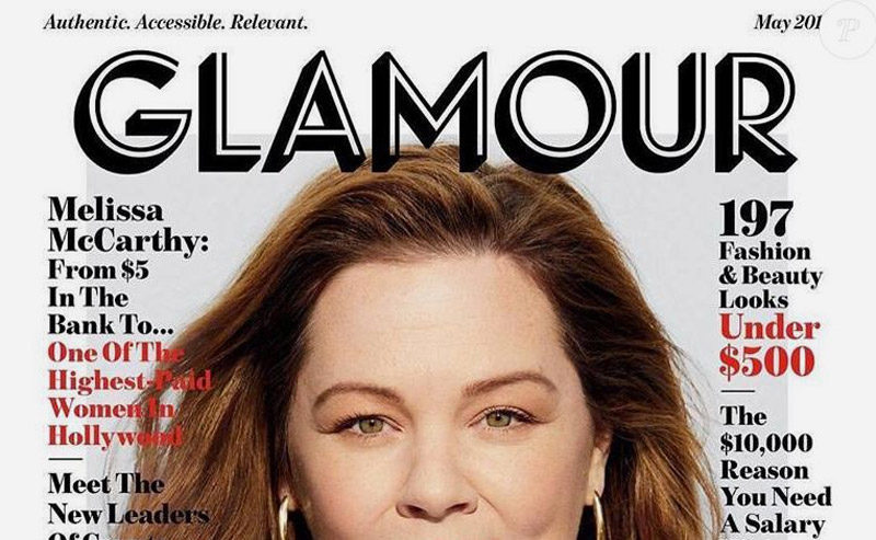
The women’s magazine Glamour changed its logo and layout several times before taking a radical turn in early May. Glamour displays a new logo in the United States, a new model in France, and a promise of less “girly” content.
8 errors are hidden in the Tinder logo! Can you find them?
Here’s a short and fun presentation of the tinder logo, where we’ll not be tender.
The Duperré School changes its visual identity.
A project designed by L’atelier Ouf ! and the Production Type foundry.
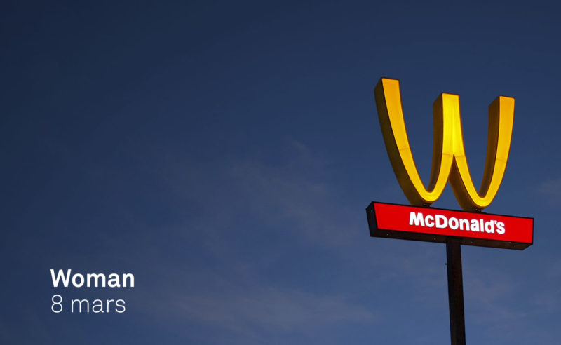
McDonlads turns over its logo for International Women’s Rights Day… not sure it’s really a feminist act!
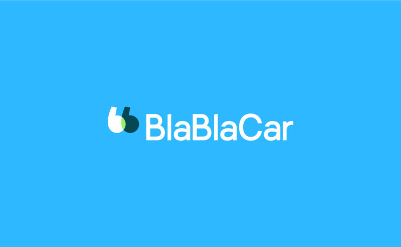
BlaBlaCar, the European carpooling start-up bringing drivers and passengers together, is adorned with a new talking logo.
After 2 years of public competition, Russia unveils its new tourist logo to illustrate the country internationally. An identity with supremacist accents that tells the story of Russia.
A new visual identity for the Musée des Arts Décoratifs that becomes “MAD”… Fashion, Arts, Design!
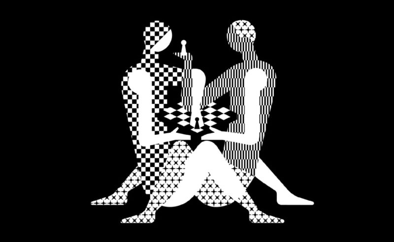
The next World Chess Championship should please chess players… and Kamasutra fans. Here is the new identity of the World Chess, with a “hot” poster.
France Télévisions and all its channels are about to change their visual identity!
A story of a dot. Period.
Bye bye red square from the Cité des sciences, glory to you for having rendered service to science and the graphic nation.
Welcome to serious business…
Ebay reveals its new visual identity, with taste of already (too) seen!
It’s clean. It’s corporate. But what the hell it’s boring.
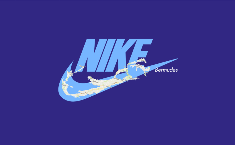
When you want to cheat the tax, there’s nothing like a good logo!
Let’s take a look at Nike (among others), a champion in this field.
Hungary and the Heineken beer brand are at loggerheads.
The Hungarian parliament wants to pass a law banning the commercial use of the red star.
A law aimed directly at Heineken…
New visual identity for the Gaîté Lyrique, a nice logo to start 2017.
Yorgo Tloupas, our hexagonal madmen has struck again!
European panorama of regional visual identities.
Is there a Yalta of graphic design ?
We tell you how the logo for the Rio 2016 Olympic Games came about, and more importantly, how to make a logo by walking on water…
Facebook’s visual identity redesign led by the American designer Ben Barry between 2009 and 2015. Logo, typography, colors, icons…
Presenting the new logo for restaurant “Quick”. My first thoughts go immediately to the previous logo that has lived 22 years.
New visual identity of Bordeaux Metropole. An opportunity to examine the generative visual identities.
 San Serriffe typographic Island
 Design, creativity and oblique strategies!
 Tote bag, a new social totem?
 Sister Corita Kent, the Pop Art nun
 Donald Trump, the martyr who makes history
 Festival ZERO1 – Brand identity
 Opéra Fantastico – Visual identity
 A good illustrator idea !
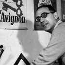 Jacno, “Five capital letters!”
 Pierre Bernard & Grapus, “Graphic design of public utility”, 1942/2015
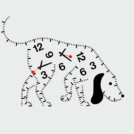 Time and creation #03 : in search of creative time