
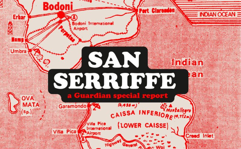
Discover how The Guardian tricked its readers into inventing the island of San Serriffe, a fictional republic born of a typographic April Fool’s joke that has become cult status. Between subtle satire and typographic wordplay, immerse yourself in one of the most brilliant journalistic hoaxes of the XXᵉ century.
Burberry’s new logo revives the brand’s coat of arms by adopting an antique typography and recovering its knight.
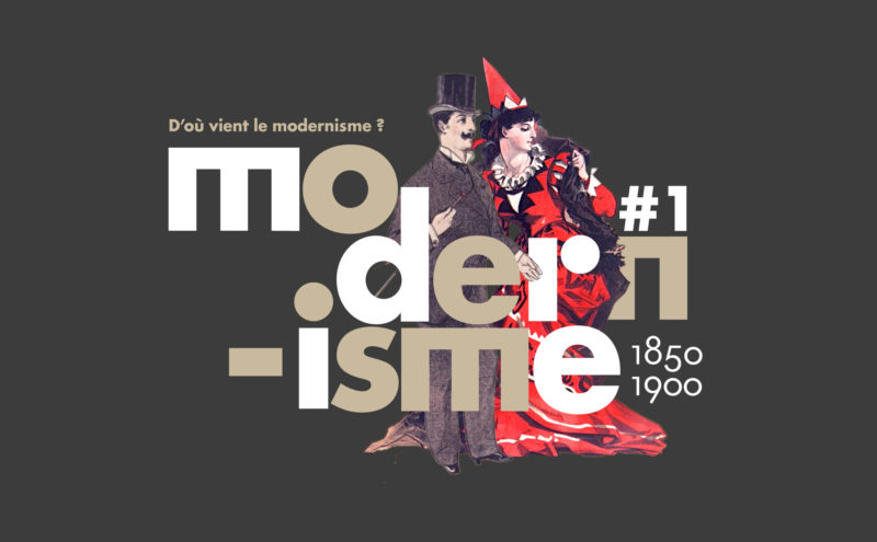
Episode #1. To understand modernism, we need to understand its relationship with modernity, and its meteoric rise at the end of the 19th century.
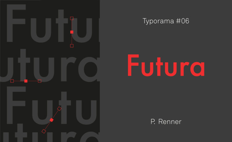
From the Nazis to the moon, Futura is probably the most used typeface in the world, and yet it’s not new!
What is a cult and timeless logo? We take advantage of an invitation to decipher the Algeco logo to look at the case of “iconic” logos.
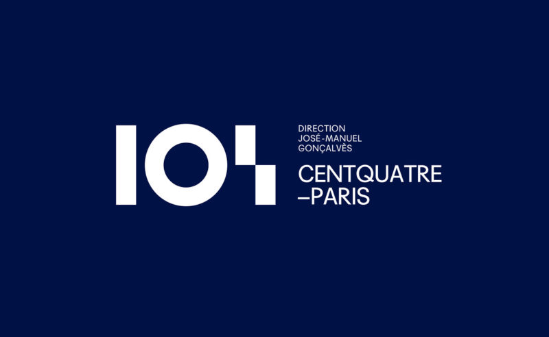
Découvrez nos recherches graphiques pour l’identité visuelle du CentQuatre-Paris.
Logos et charte graphique pour un centre culturel.
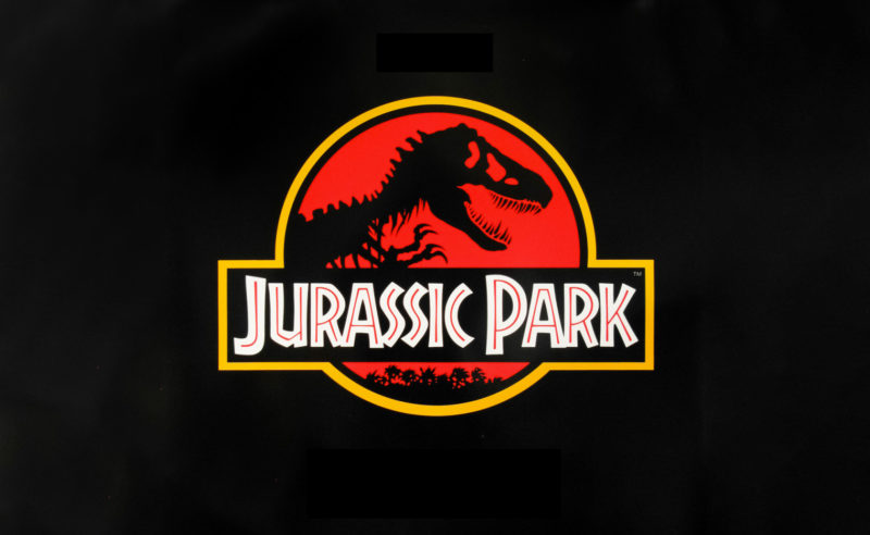
It took 68 million years to resurrect a T-rex, and almost as long to create the Jurassic Park logo. Here is his wicked adventure.
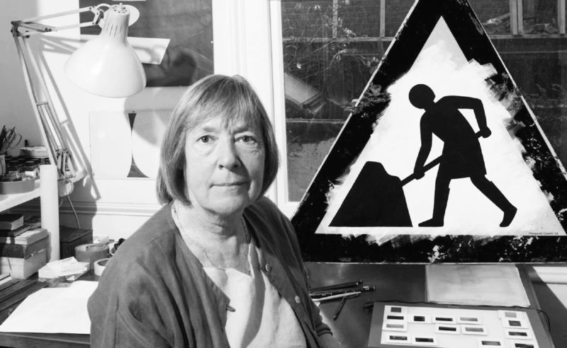
By designing UK’s road signs, Margaret Calvert’s discreet work helped to save hundreds of thousands of lives in the United Kingdom.
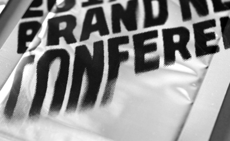
The Brand New Conference is an annual 2-day event that brings together the crème de la crème of influential graphic designers and during which brand identity and logos are discussed. An American-style must-have led by a couple of designers who create a new identity for each edition.
The Duperré School changes its visual identity.
A project designed by L’atelier Ouf ! and the Production Type foundry.
For over 20 years, Gordon Young has been working on the border between art, graphic design and typography. To his credit, he has created dozens of art installations in public spaces, a forest of typographic trees, a wall of wishes in a school and this incredible Comedy Carpet in Blackpool!
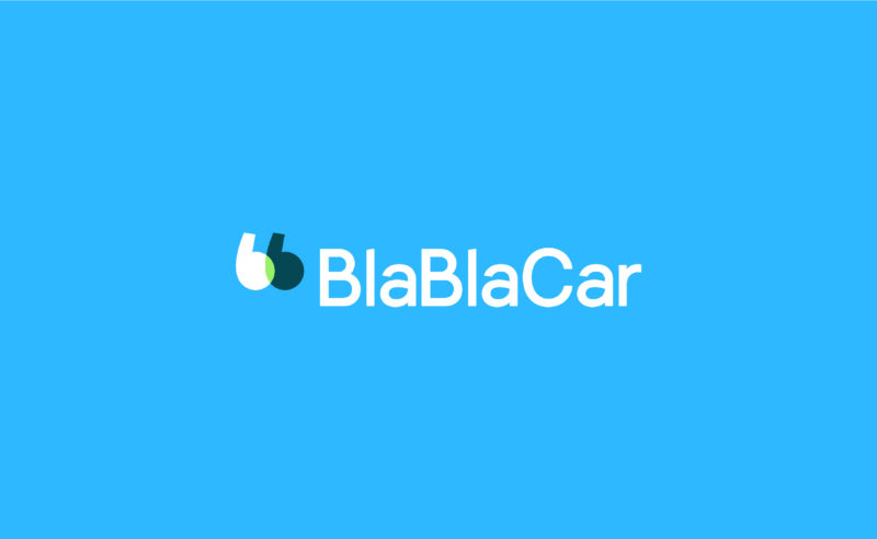
BlaBlaCar, the European carpooling start-up bringing drivers and passengers together, is adorned with a new talking logo.
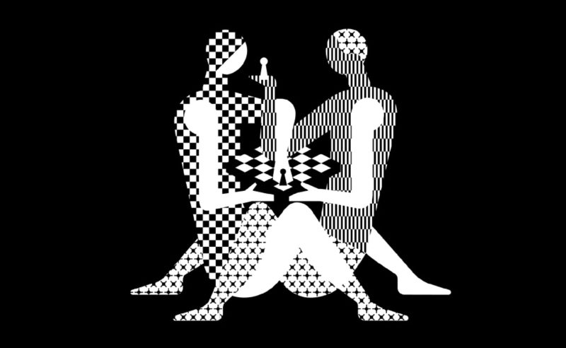
The next World Chess Championship should please chess players… and Kamasutra fans. Here is the new identity of the World Chess, with a “hot” poster.
Bye bye red square from the Cité des sciences, glory to you for having rendered service to science and the graphic nation.
Welcome to serious business…
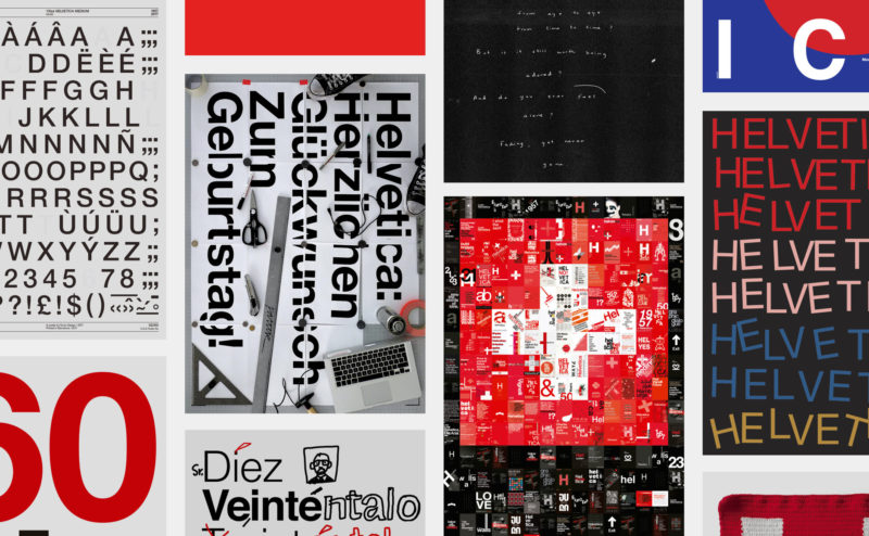
Happy birthday Helvetica! The spanish studio Husmee has invited a selection of international studios to create a tribute poster to celebrate the 60 years of the creation of the famous typography.
Facebook’s visual identity redesign led by the American designer Ben Barry between 2009 and 2015. Logo, typography, colors, icons…
Brand identity design for Abbaye de Fontevraud. An abbey, a hotel, a restaurant, a cultural scene…
Visual identity project for the Musée des Confluences in Lyon, France. Full presentation of our creative approach, from research to final project.
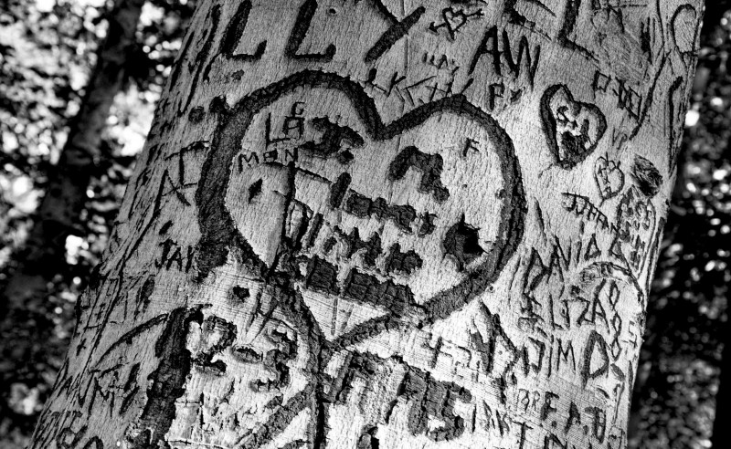
At first, you want to say “I love you” with a penknife… Whatever the moral is, we engrave a few letters with the tip of a N°2 opinel, and let time do its work: light, regular, bold, extra-bold…
 San Serriffe typographic Island
 Design, creativity and oblique strategies!
 Tote bag, a new social totem?
 Sister Corita Kent, the Pop Art nun
 Donald Trump, the martyr who makes history
 Châtelet, Musical Theater of Paris – Brand identity system
 AZA Architecture Paris – Visual identity
 Klara energy, proud to be responsible
 Heyraud – Visual identity
 Hans Hillman, “poster art without fuss”!
 Saint-Étienne Opera house: Emotion in the foreground!
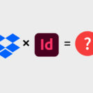 Dropbox and Indesign: the end of broken links!
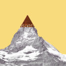 Toblerone’s new mountain: when packaging brands a territory